Style Book
The Style Book is a built-in preview panel in the Neve Customizer that gives you a live, at-a-glance view of your site's global styles — and lets you jump directly to any styling option with a single click.
📝 Note: The Style Book is available in recent versions of Neve. If you do not see the Style Book icon in your Customizer, make sure your theme is up to date.
In this article
How to Access the Style Book
- Log in to your WordPress Dashboard.
- Navigate to Appearance > Customize to open the Customizer.
- Look for the Style Book icon in the Customizer panel — it appears near the top of the panel, alongside the other Customizer controls.
- Click the Style Book icon to open the Style Book preview.
The live preview area will update to display a dedicated Style Book canvas showing your site's current global styles applied to common UI elements.
💡 Tip: You do not need to navigate away from the Customizer to use the Style Book. It opens inline, so you can switch between the Style Book and your normal page preview at any time.
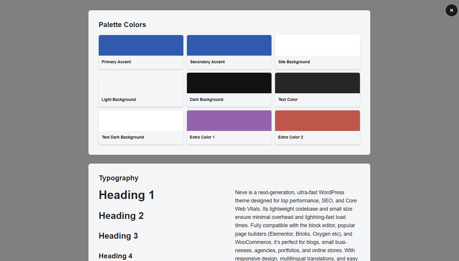
What the Style Book Shows
The Style Book renders a live preview of the most common elements found on any WordPress site, all styled with your current global settings. This makes it easy to see how design changes affect the look of your content before publishing.
The Style Book preview includes the following elements:
- Headings — H1 through H6 tags, rendered with your current heading typography settings (font family, size, weight, and more).
- Paragraphs — Body text displayed with your general typography settings applied.
- Buttons — Primary and secondary button styles as configured in your Buttons settings.
- Forms — Common form fields (text inputs, textareas, dropdown) styled with your theme's current form styles.
📝 Note: The Style Book is a read-only visual preview — you cannot edit elements directly on the canvas. To make changes, click an element to be taken to its settings panel (see the section below).
Navigating to Style Settings
The Style Book is not just a passive preview — it is interactive. Clicking any element displayed in the Style Book canvas will automatically open the corresponding settings panel in the Customizer sidebar, so you can adjust that element's styles without hunting through menus.
For example:
- Clicking a heading jumps to Appearance > Customize > Typography > Headings.
- Clicking a paragraph or body text jumps to Appearance > Customize > Typography > General.
- Clicking a button jumps to Appearance > Customize > Global > Buttons.
- Clicking a color swatch or color-dependent element jumps to Appearance > Customize > Global > Colors & Background.
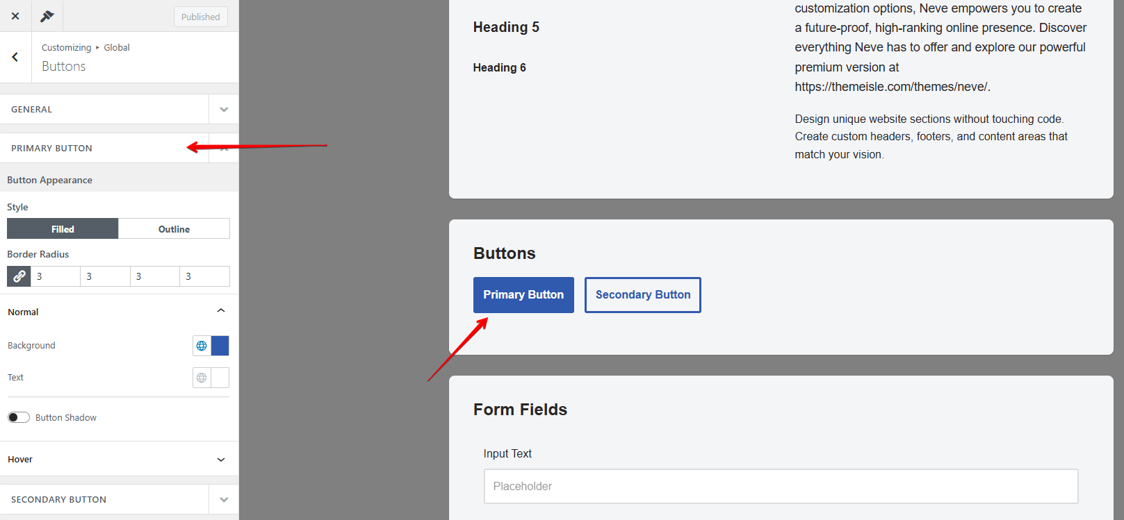
After making your changes in the settings panel, the Style Book canvas updates in real time so you can see the result immediately.
💡 Tip: Use the Style Book as a starting point whenever you set up a new site or switch color palettes. Click through each element type to quickly audit and fine-tune all your global styles in one session.
Related Documentation
To learn more about the individual style settings accessible through the Style Book, see the following guides:
- Neve Typography — Configure font families, sizes, weights, and spacing for headings, body text, and more.
- Global Colors in Neve — Create and manage site-wide color palettes that apply across all elements.
- Neve Buttons — Customize the appearance of primary and secondary buttons across your site.