The Logo & Site Identity Component - Neve Header / Footer Builder
For more details check out the full Neve documentation and Neve PRO documentation.
📝Note: This component is part of both Neve and Neve PRO.
The Logo & Site Identity component increases your website's credibility by displaying a unique profile.
In this article
Using the Component
1. Add the component into the header, by clicking on the ➕ button.
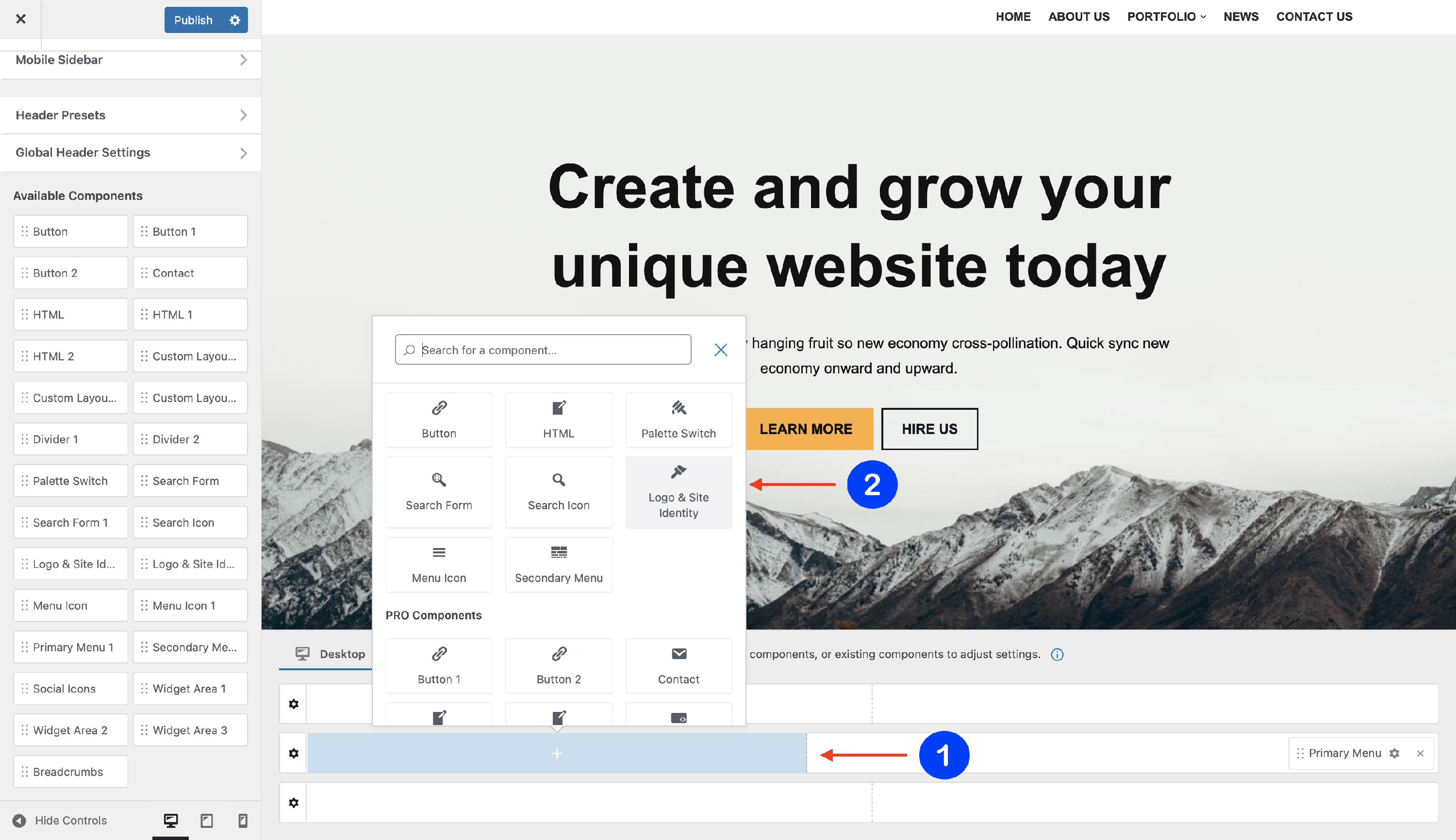
2. Open the component's settings to customize it, by clicking on the ⚙️ icon.
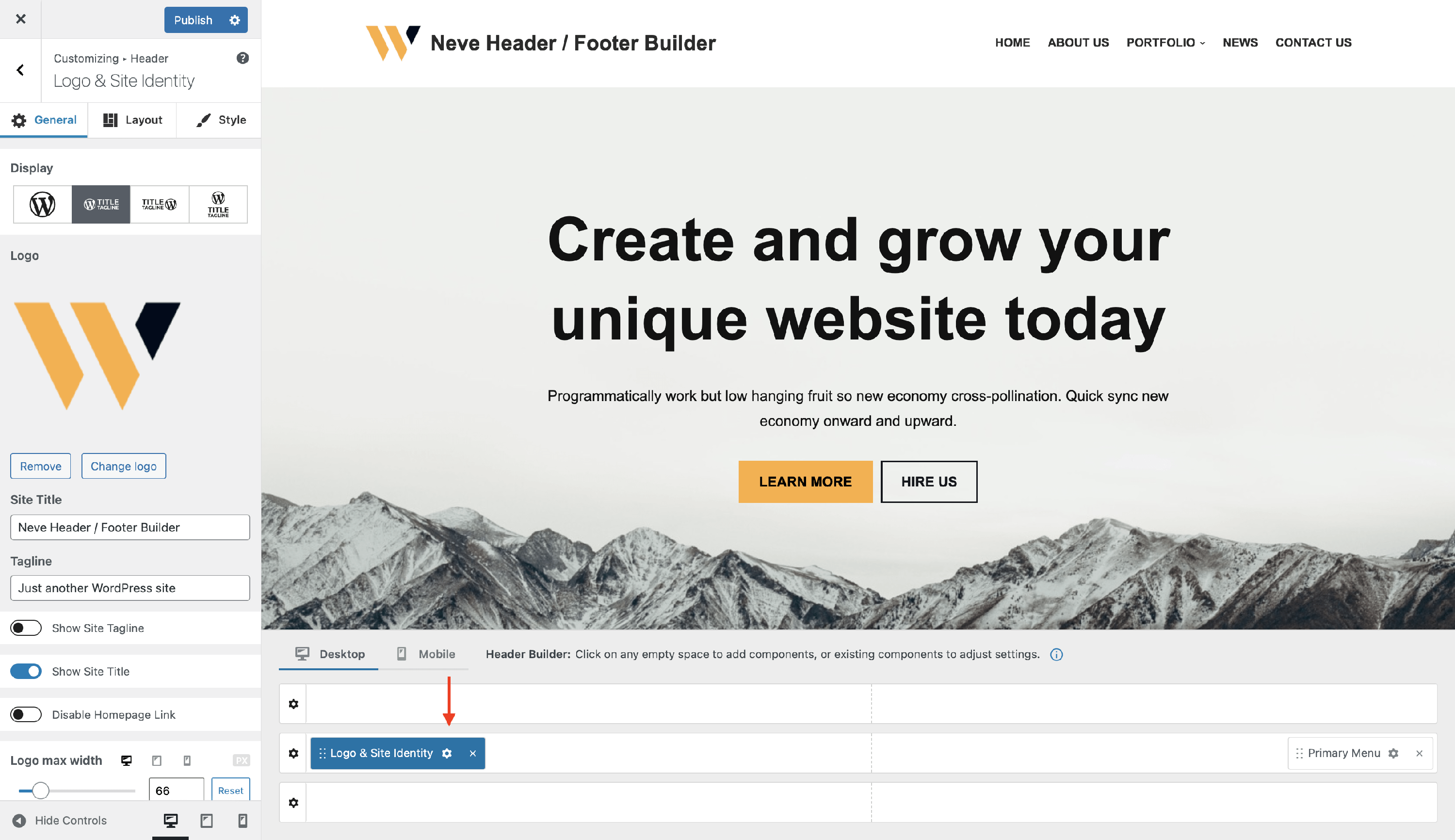
📝 Note: When using Neve PRO, this component has two available instances: Logo & Site Identity and Logo & Site Identity 1.
Customizing the Component
There are three panels with customizing options for this component, which allow you to create the desired header / footer:
General Panel
When you click on the ⚙️ icon, the General tab will appear on the left side. It consists of many options regarding the component.
Display
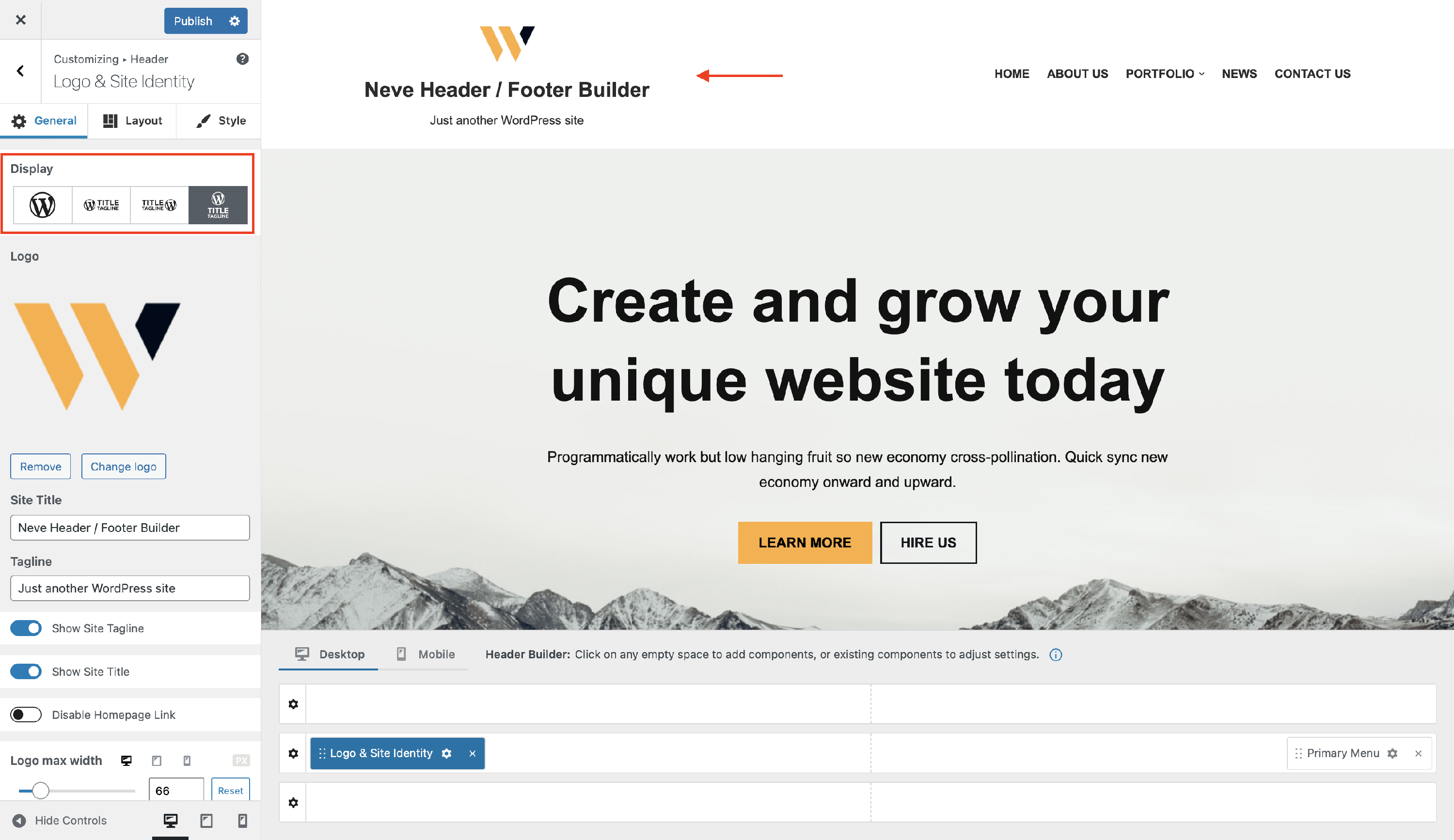
If you want to change the logo position, select one of the four possible appearances you can choose from:
- just the logo
- logo followed by the site identity
- site identity followed by the logo
- logo and site identity one below the other
Logo
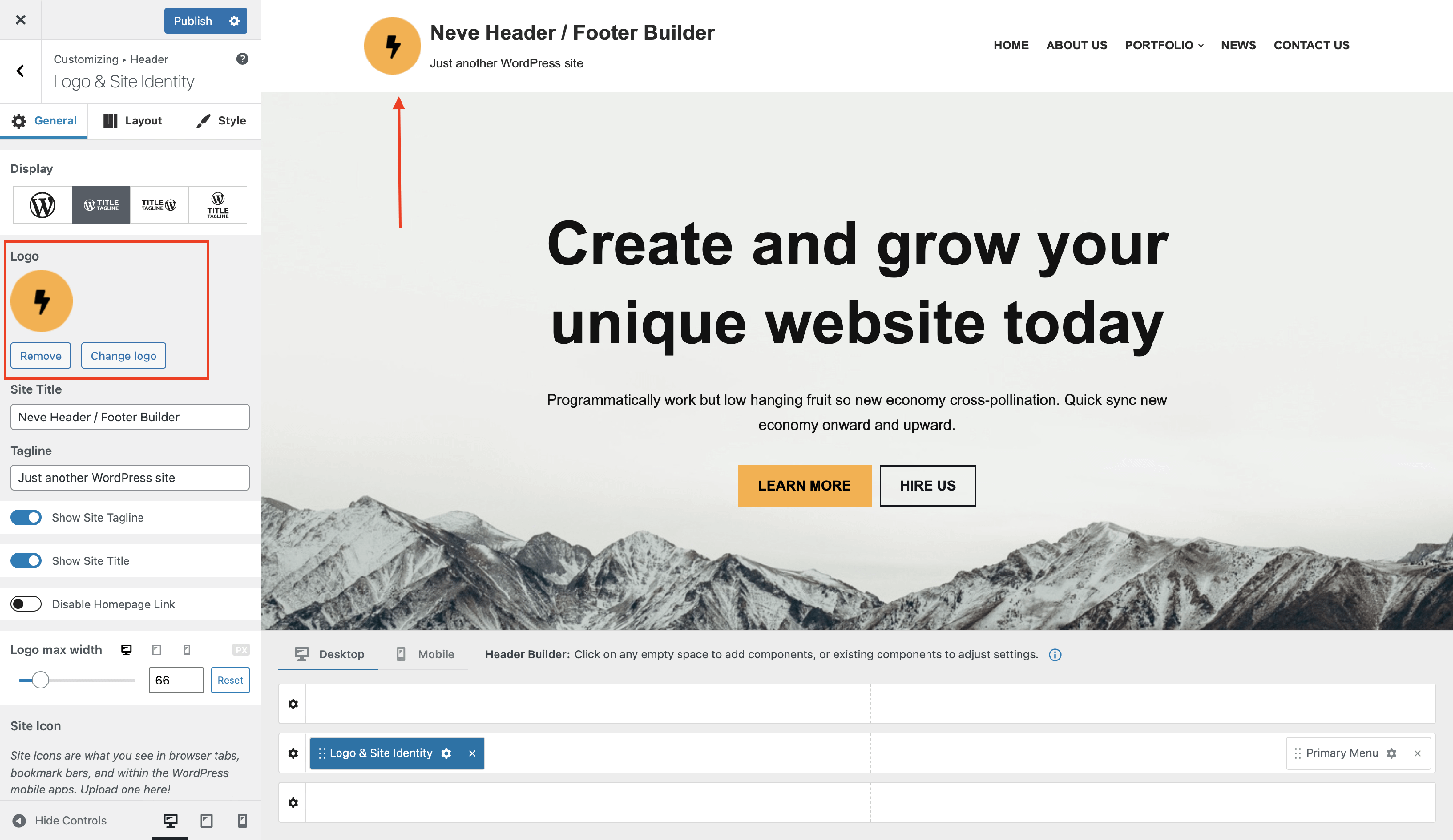
To upload the logo, just click on the “Change Logo” and select your new logo.
Site Title
Insert the website's title into the corresponding field.
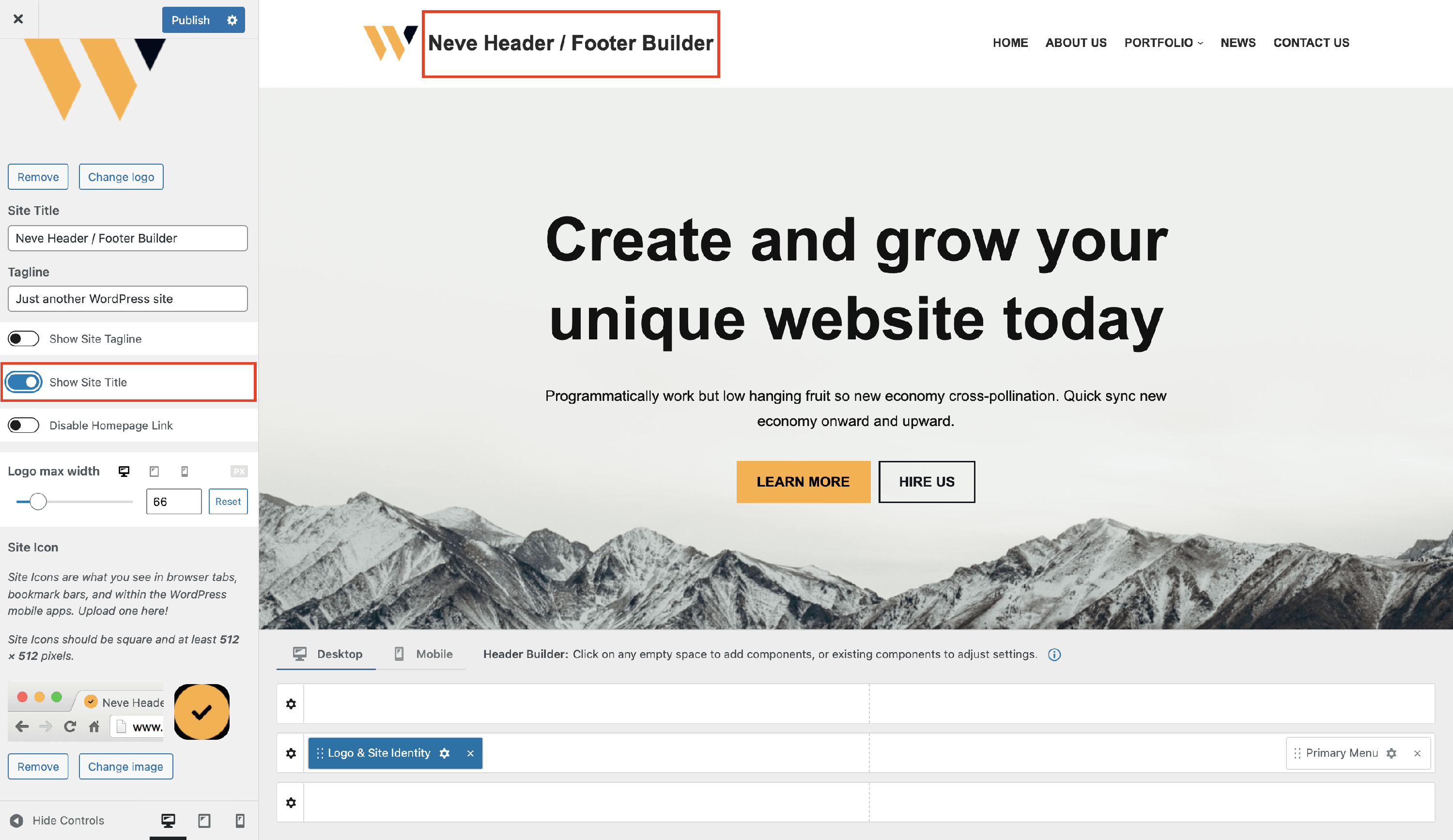
You can also choose to hide the site's title, by disabling the option Show Site Title.
Site Tagline
Insert the website's tagline into the corresponding field.
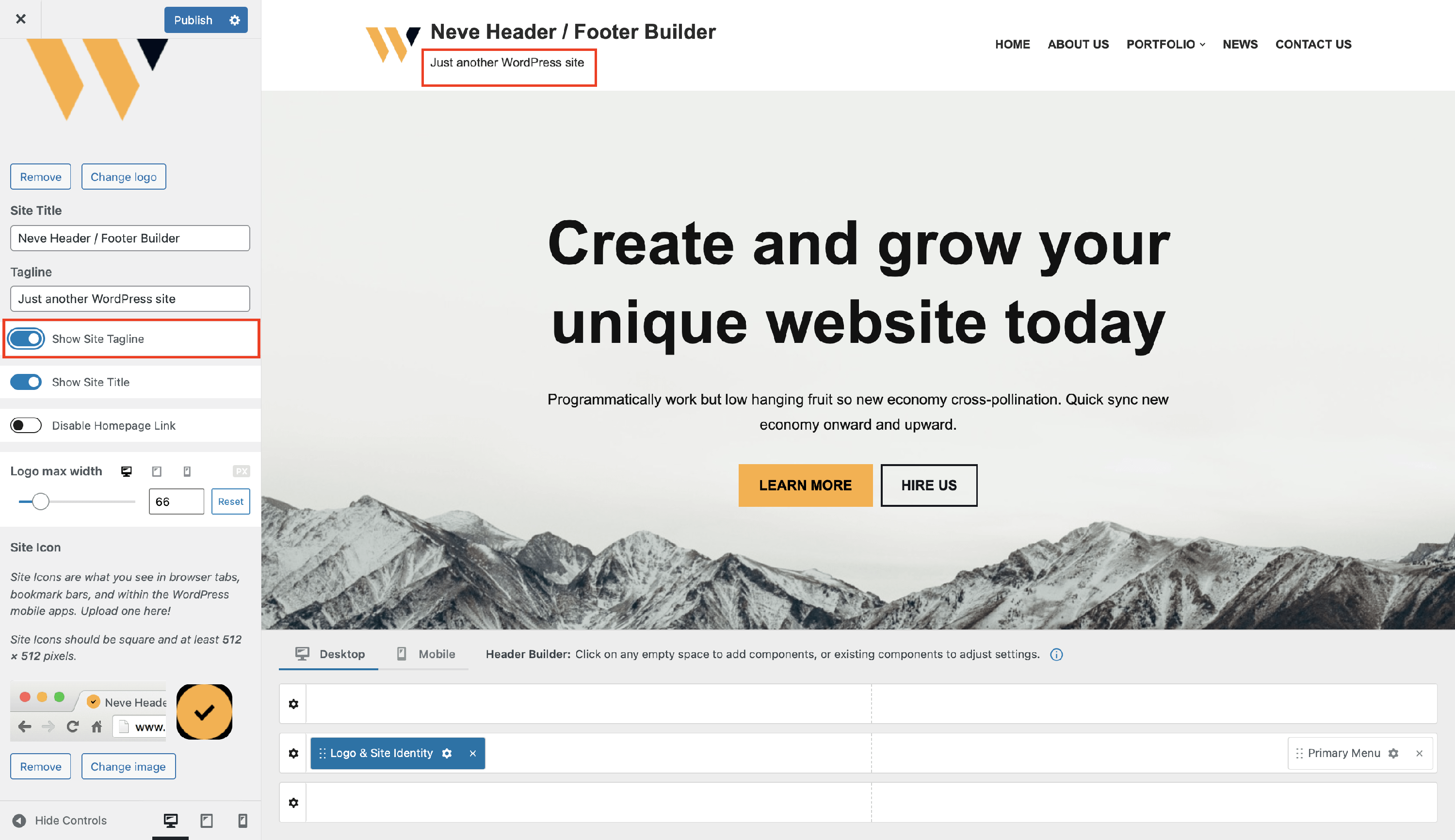
You can also choose to hide the site's tagline, by disabling the option Show Site Tagline.
Remove the link from the Logo & Site identity
By default, the Logo & Site Identity component is linking to the homepage of the site.
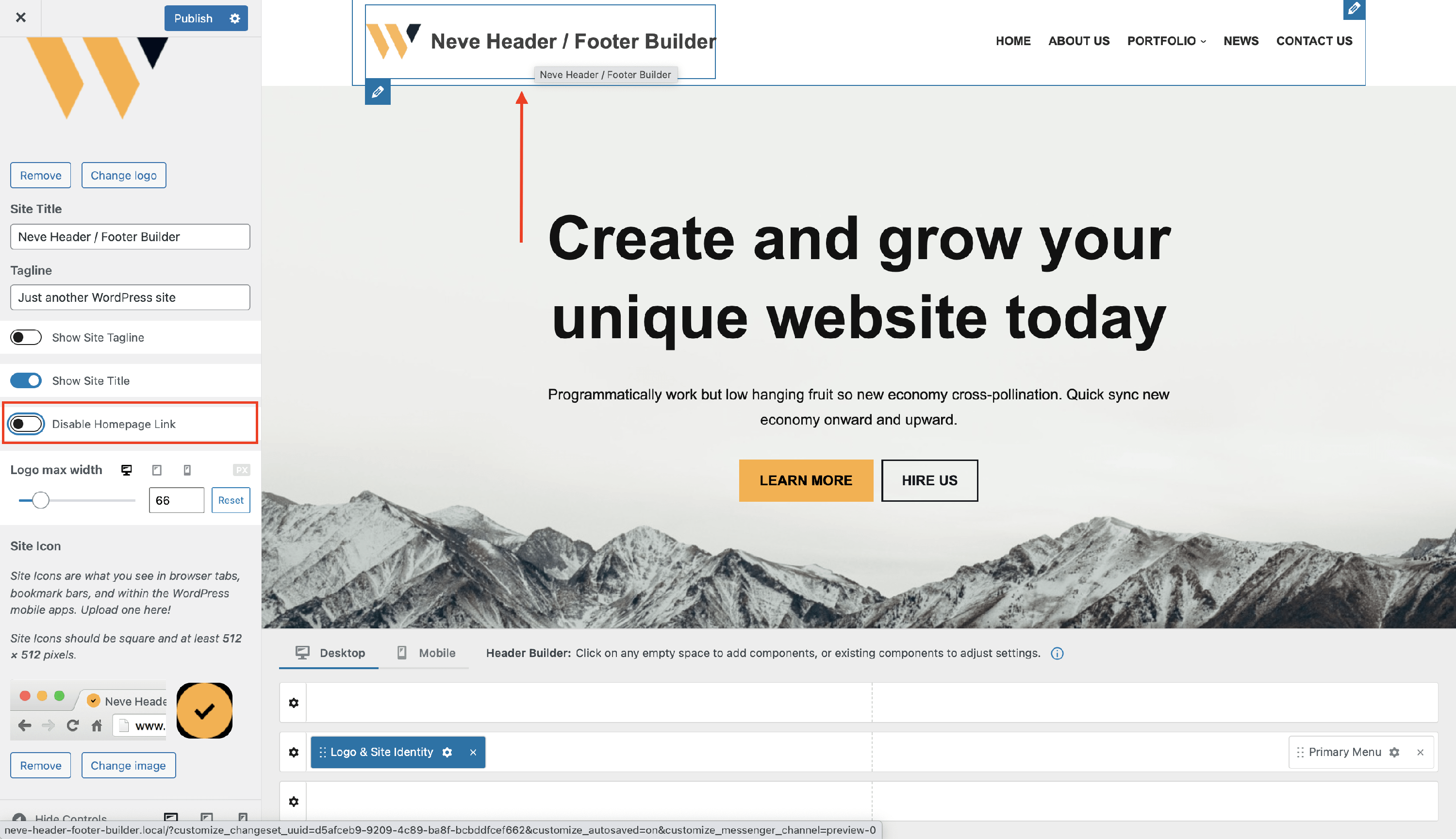
To remove this link, find the Disable Homepage Link option and click on it to enable it.
Logo max width
In order to change the size of the logo, use the slider of the Logo max width option.
- select the new width option (in px, em, or rem).
- by clicking on the small Desktop / Tablet / Mobile icons near the option, you get to change the width based on each device, meaning you can have different sized logos on different devices.
- you can undo the changes, by clicking on the reset button.
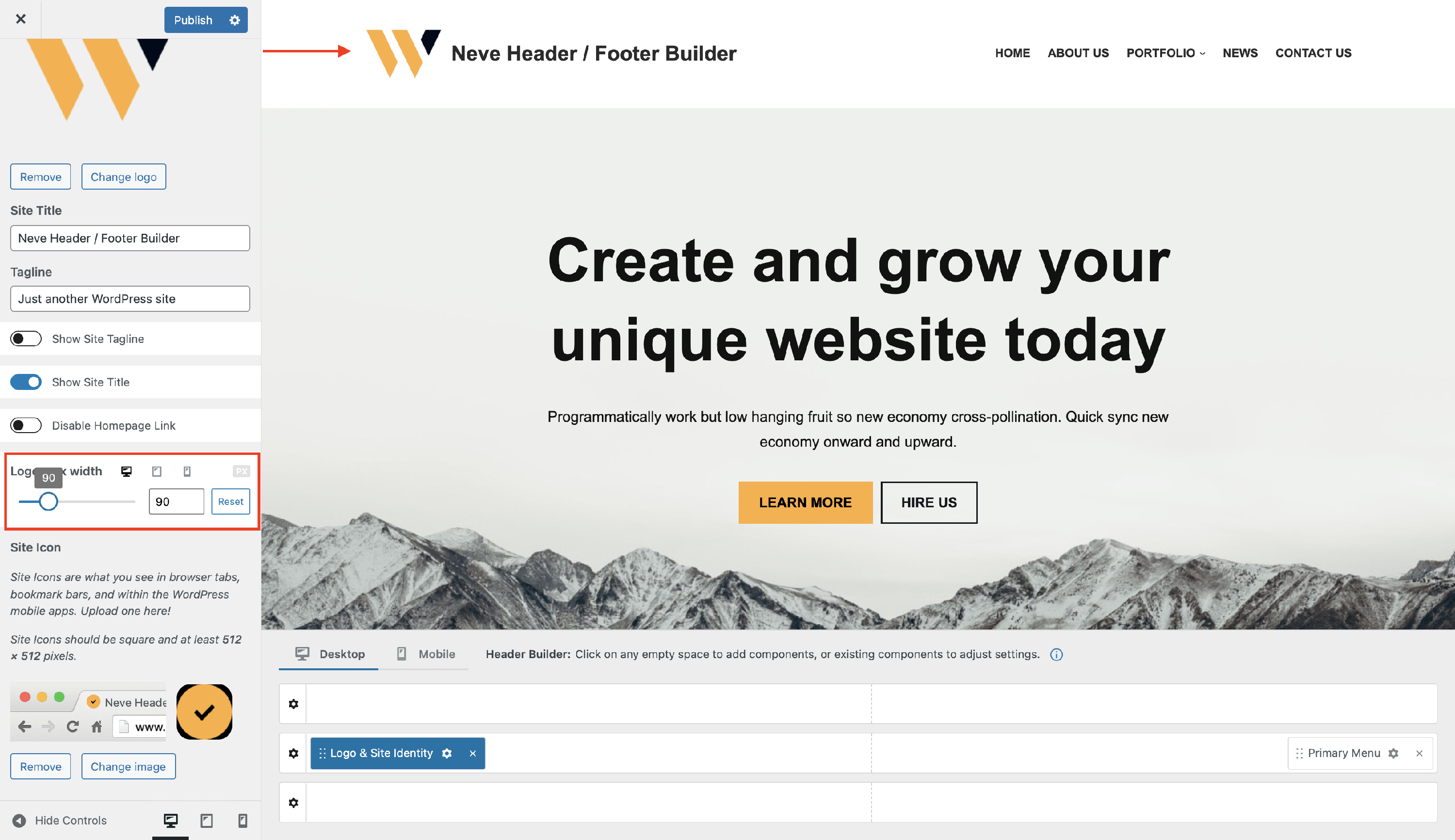
📝 Note: By changing the size of the logo, the height of the row will be automatically adjusted.
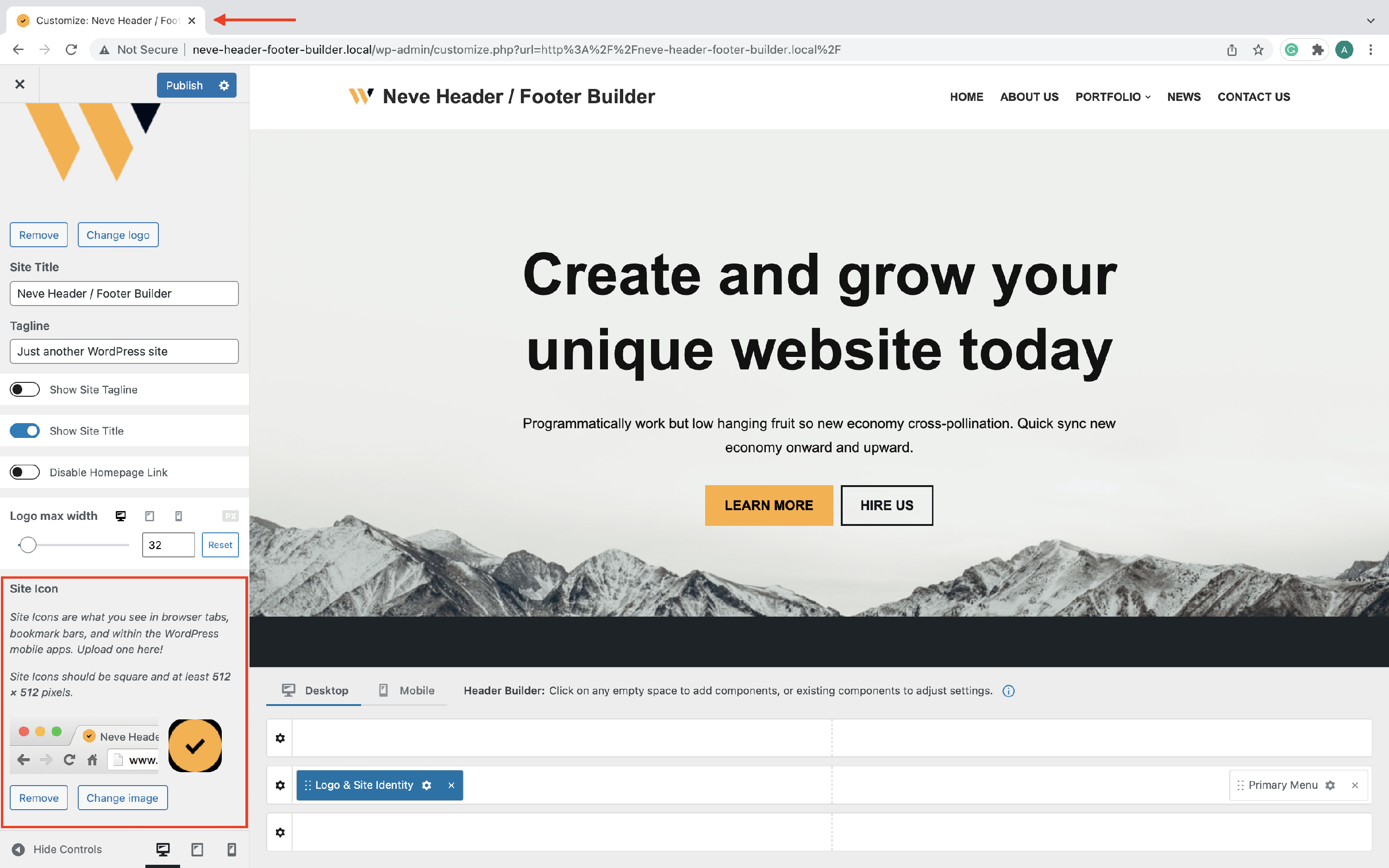
Site Icon (Favicon)
Site Icons are what you see in browser tabs, bookmark bars, and within the WordPress mobile apps.
- Site Icons should be square and at least 512 × 512 pixels.
To upload a Site Icon, click on the Select site icon button and upload your image.
Layout Panel
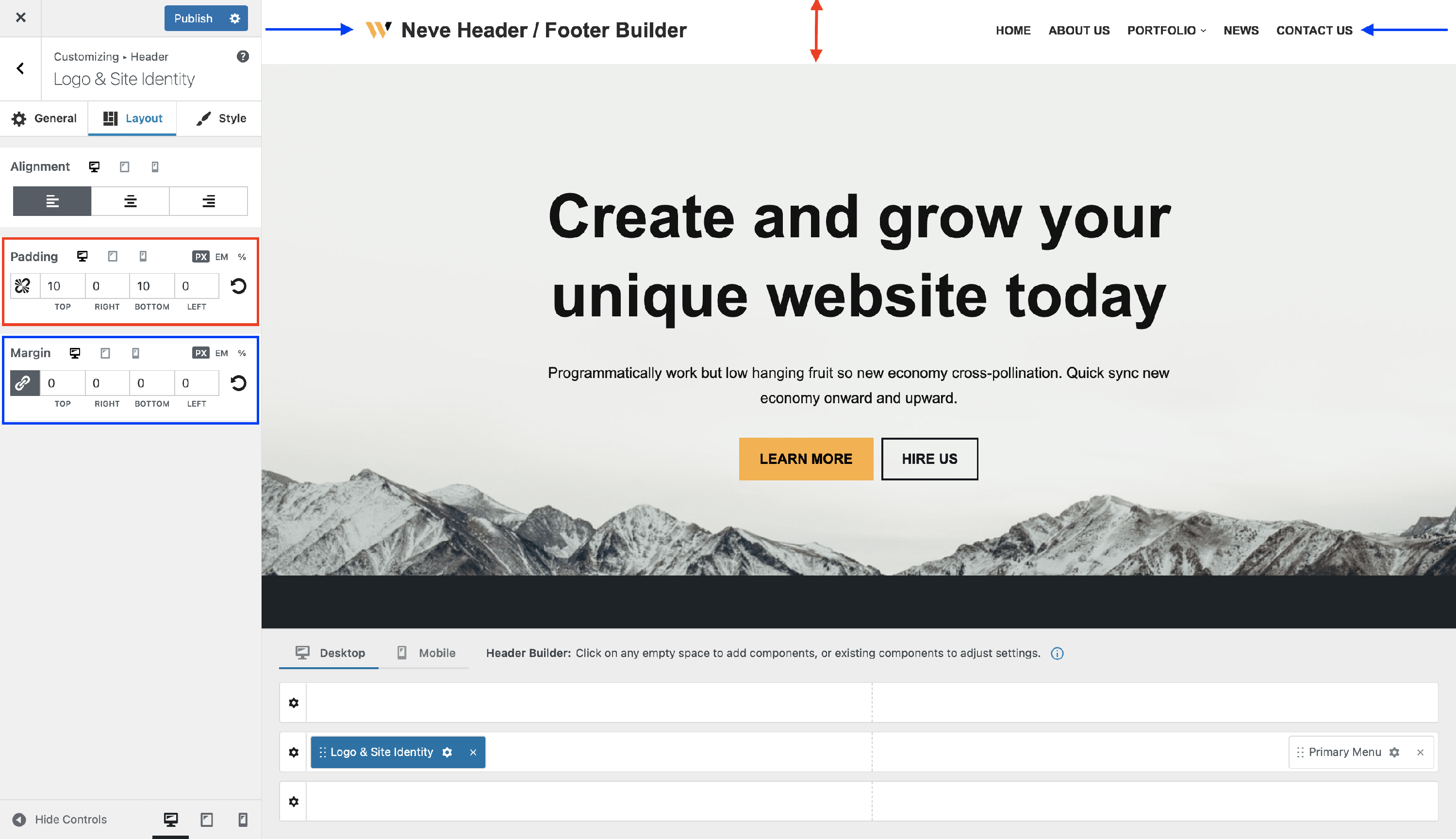
The layout options allow the following adjustments:
- Alignment - it will change the alignment of the Logo & Site Identity component, with three available options: left / center / right ( Desktop | Tablet | Mobile ).
- Padding and Margin - available in PX, EM, REM, and %, with a link button that helps establish the same dimension for all the directions ( Desktop | Tablet | Mobile ).
Style Panel
Customize the Logo & Site Identity component by changing the text color. You can choose from Neve's Global colors, to keep the same color pallet, or pick your custom color. Apart from this, you can adjust the site title font size. Adjusting the font family requires Neve Pro.
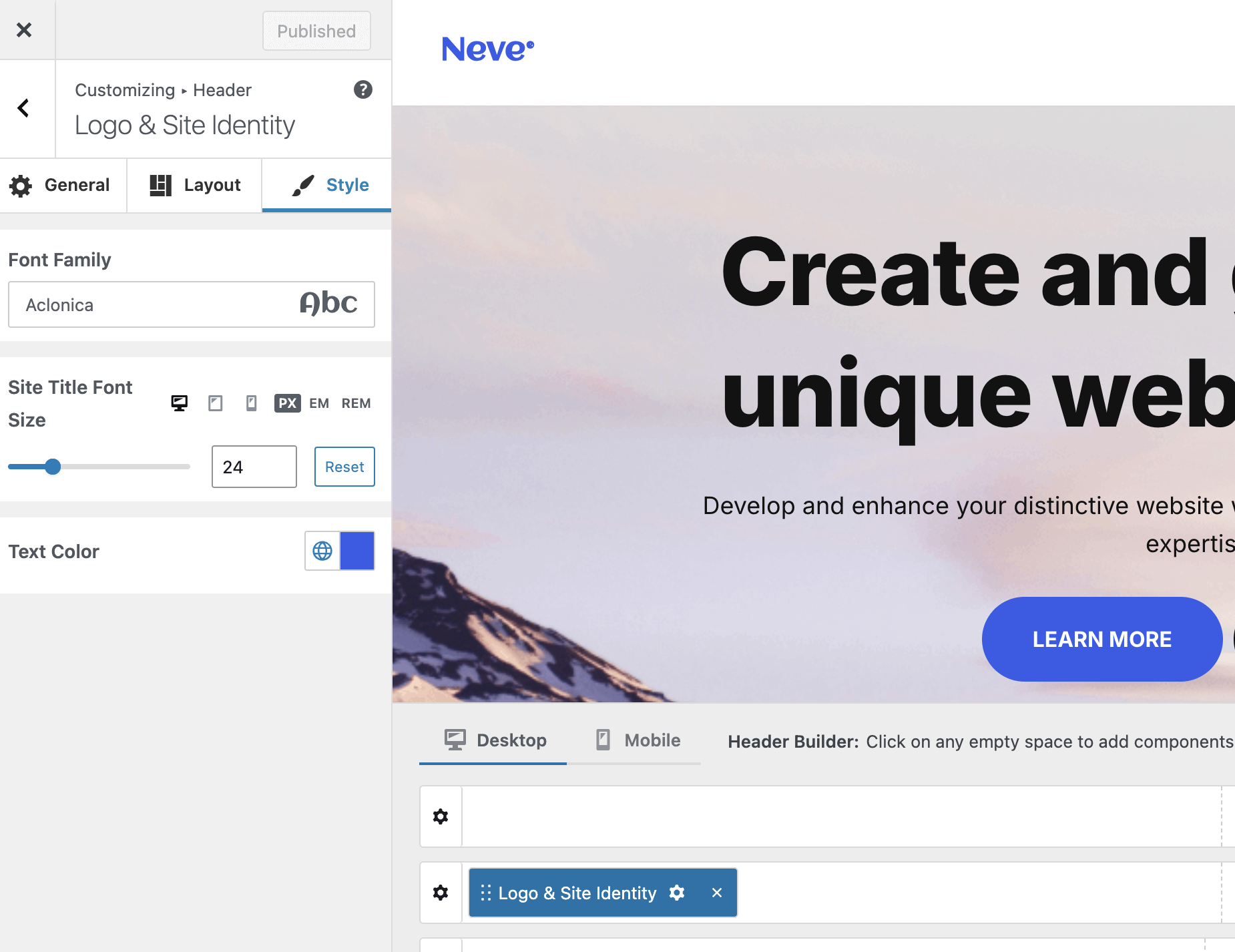
📝Note: Check this doc about Global Colors in Neve for further details.
Troubleshooting
Troubleshooting unexpected logo styles
The Logo & Site Identity component does not include a built-in box-shadow control. If a shadow appears around your site logo, it is not coming from a Neve setting — it is almost certainly caused by CSS applied elsewhere on the site.
Common sources to check:
- Additional CSS: go to Appearance > Customize > Additional CSS and look for any rule that targets broad selectors such as
img,img.wp-image-*, or.wp-block-image img. A rule likeimg { box-shadow: ...; }applies to every image on the site, including the logo. - Block or synced-pattern styling: open the block or synced pattern that contains your logo in the WordPress block editor and check its Advanced > Additional CSS class(es) field or any inline styles added through the block's style panel.
- Third-party plugins: some page-builder or styling plugins inject global image styles. Temporarily deactivate suspect plugins to isolate the cause.
To confirm the source, use your browser's developer tools: right-click the logo image, choose Inspect, and look at the Computed styles panel for box-shadow. The panel shows which rule is responsible and where it is defined.
Remove an unwanted logo shadow
Preferred fix — remove or narrow the original rule
If you find a broad rule such as img { box-shadow: ...; } in Appearance > Customize > Additional CSS, consider removing it or rewriting it to target only the images that actually need the shadow. Removing box-shadow on all images should only be done if that is the intended site-wide design.
Temporary override — scope the reset to the logo only
If you need to remove the shadow from the logo without touching the original rule, add the following snippet to Appearance > Customize > Additional CSS:
.neve-site-logo {
  box-shadow: none !important;
}
The !important declaration is required to override a rule that already uses !important, or to take priority over a more general selector. After saving, click Publish in the Customizer and then clear any caching plugin or hosting-level cache so the change takes effect on the live site.
📝 Note: .neve-site-logo is the default class applied to the logo image by Neve. If this snippet does not remove the shadow, use your browser's developer tools to inspect the logo element and confirm the exact class or selector that applies to it, then adjust the CSS rule accordingly.
Two Logos
- It is also possible to create a website using two different logos, and here is a video.
Shrinking Header
- It can be combined with the Sticky header option to obtain a shrinking effect for the header.
SVG file as Logo
- You can upload SVG files as logos. Here is a dedicated doc about how to do this.
Translating the logo in Neve
- You can translate Neve's logo using the Polylang plugin. Here is dedicated documentation about this.
Palette Switch - Logo Mode
The Palette Switch component gives you the opportunity to adapt the logo & site identity component, to fit both light and dark modes.
📝 Note: You will be able to see the changes only if you use the Palette Switch in the header / footer builder.
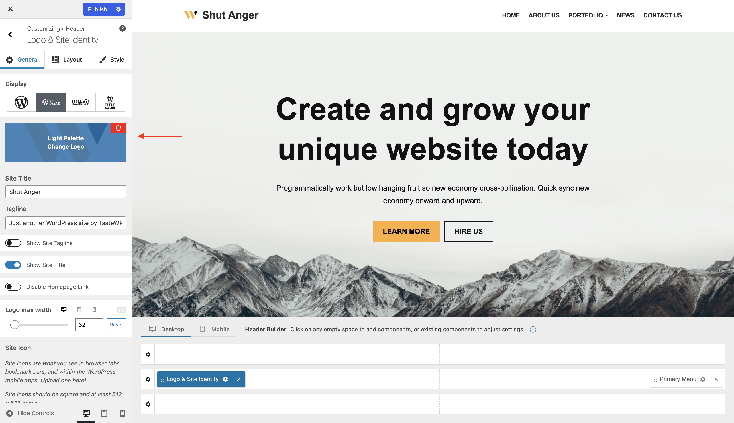
Before adding the Palette Switcher, there is nothing changed, except for the title that appears on hover:
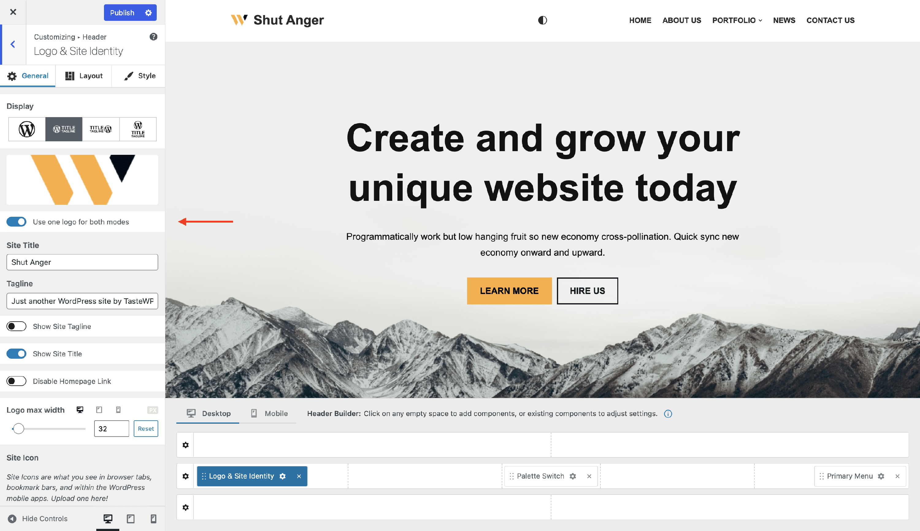
After adding the Palette Switcher a new toggle will appear under the logo:
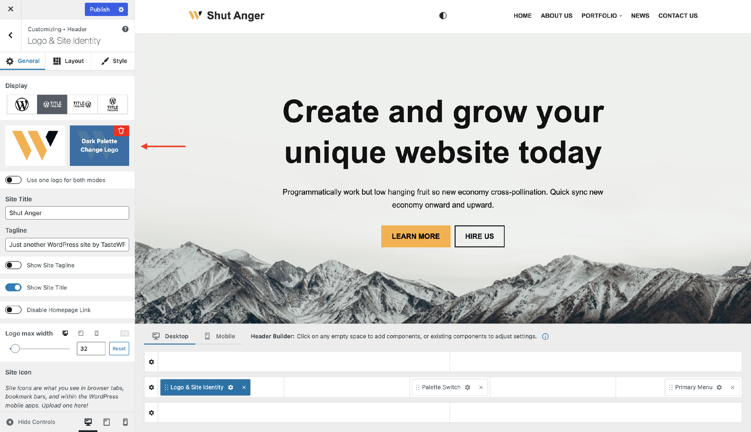
If you disable the option to use one logo for both modes, a new logo will appear and it can be different from the one set for the light mode:
Result
- Light Mode
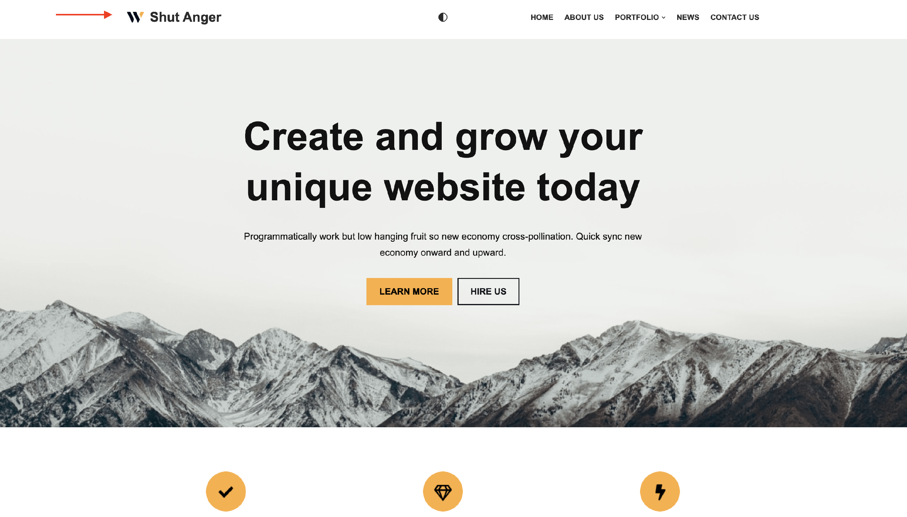
- Dark Mode