The Primary Header Menu Component - Neve Header / Footer Builder
For more details check out the full Neve documentation and Neve PRO documentation.
📝Note: This component is part of both Neve and Neve PRO.
The Primary Menu component is the easiest to use menu component, with many customizations available.
In this article
Using the Component
1. Start by adding the component into the rows, by clicking on the ➕ button and selecting the component.
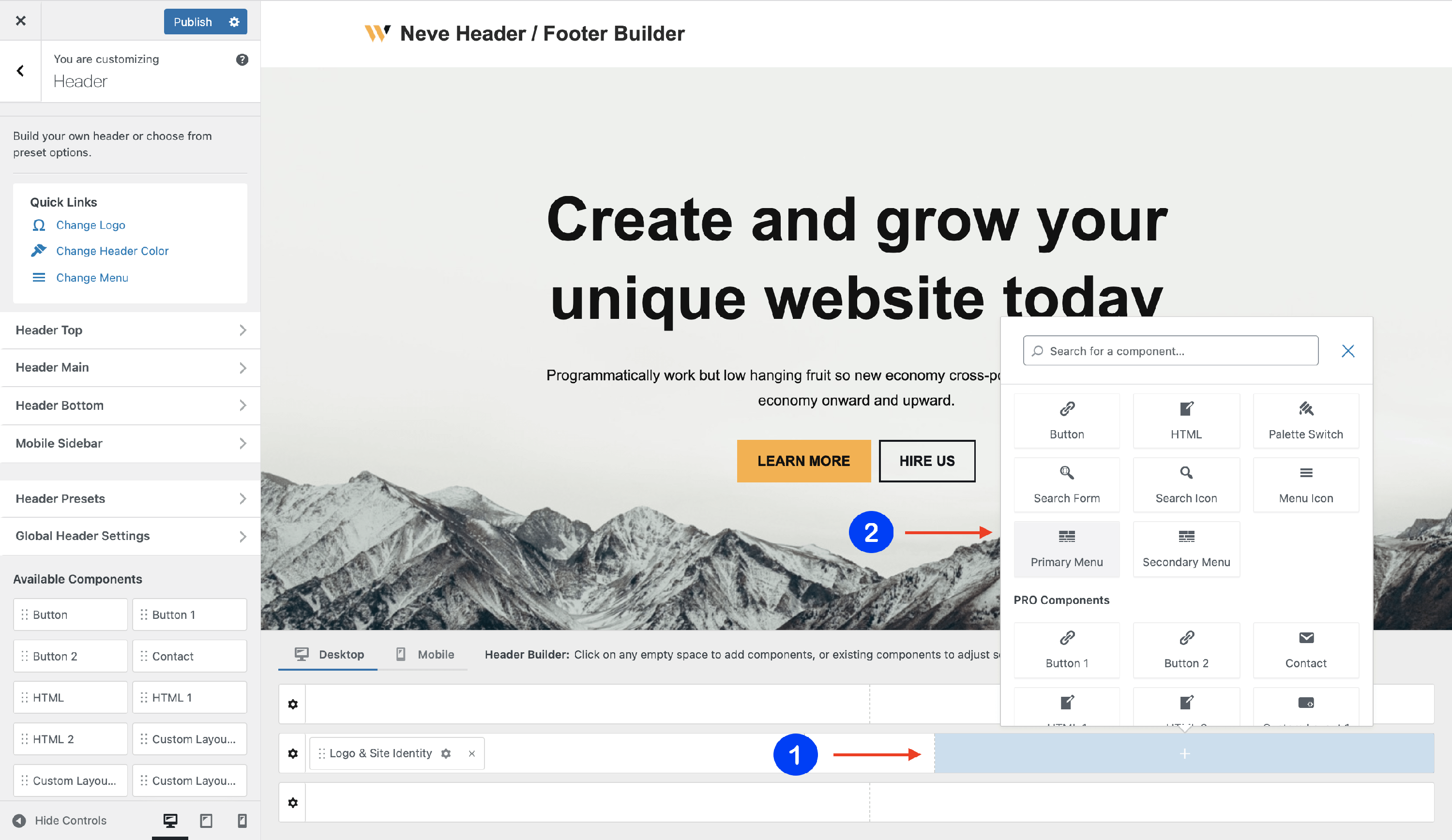
2. Open the component's settings to customize it by clicking on the ⚙️icon.
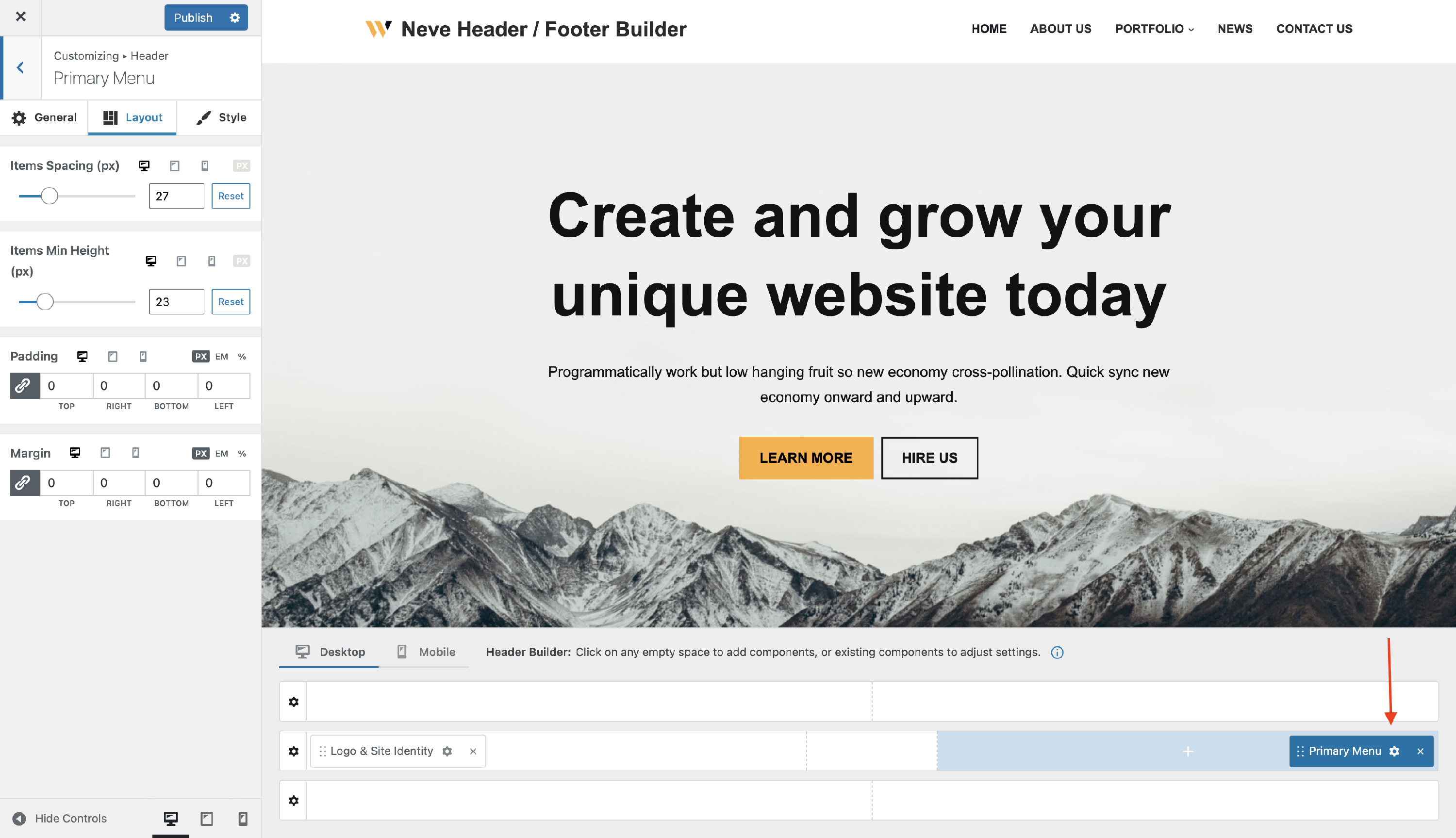
📝 Note: When using Neve PRO, there are three instances available for this component: Primary Menu, Primary Menu 1, and Primary Menu 2.
Customizing the Component
There are three panels with customizing options for this component, which allow you to create the desired header / footer:
General Panel
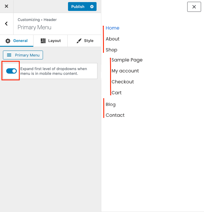
When you click on the ⚙️ icon, the General tab will appear on the left side.
- create your Primary Menu - you will be directed to the Menus location in Customizer, where you can create / edit a new menu and assign it as Primary Menu.
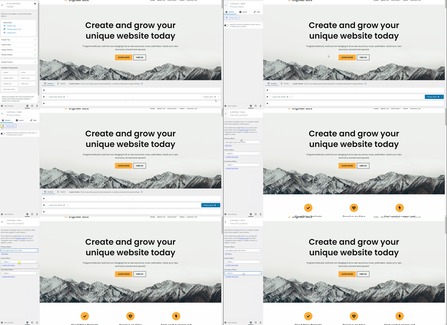
- expand the first level of the dropdowns when the menu is in the mobile menu content - enable / disable.
Layout Panel
The layout options allow the following adjustments:
- Items Spacing and Items Min Height (px) - adjust the space between menu items and the top / bottom space, with responsive controls.
- Padding and Margin - available in PX, EM, and %, with a link button that helps with establishing the same dimension for all the directions ( Desktop | Tablet | Mobile ).
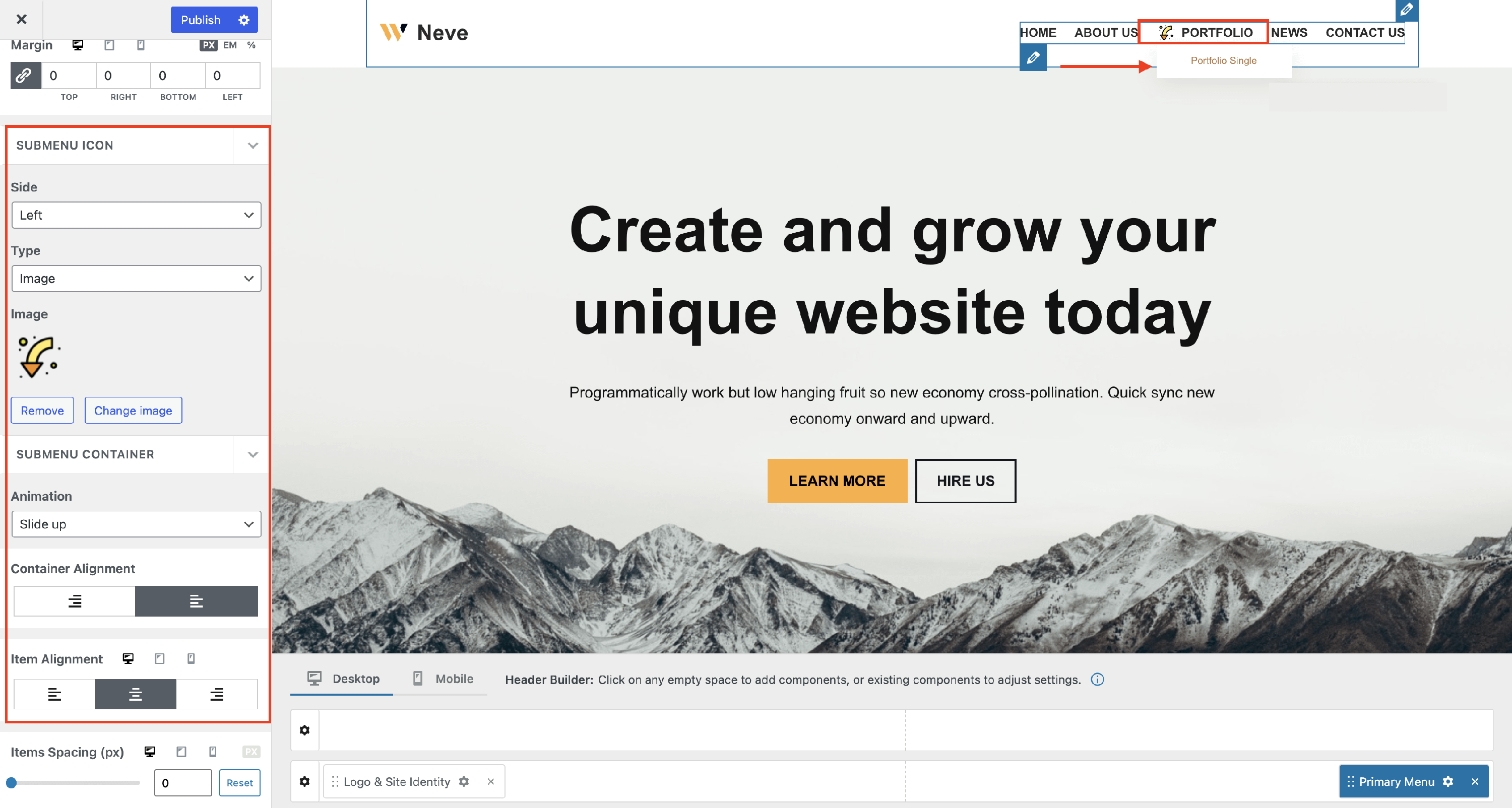
- Submenu Icon - you can change the side where it appears, select a different icon/caret or even insert an image. Here you can find more images in this direction.
- Submenu Container - control how the dropdown panel opens, where it sits, and how its items are arranged:
- Animation - select a different animation for the moment when the submenu opens.
- Container Alignment - choose which edge of the parent menu item the dropdown panel lines up with. This option applies to all screen sizes.
- Item Alignment - align the content inside the submenu items to the left, center, or right, with responsive controls.
- Items Spacing - adjust the space between the submenu items, with responsive controls.
Neve Pro required: The Submenu Icon and Submenu Container options above are available only with the Neve PRO addon active.
💡 Tip: Container Alignment moves the whole dropdown panel, while Item Alignment only changes how the content sits inside it. Right lines the panel up with the right edge of its parent menu item. Left starts the panel at the left edge and opens it towards the right. Choose the option that matches your design.
Style Panel
The Style panel contains more areas of use regarding colors or appearance, typography, and submenu style.
Custom colors for the Primary Menu items
Hover Skin Mode - four skin modes are available for the primary menu. These are styles that apply while hovering over the menu items.
Color - create a homogenous look of the menu by selecting colors for items, active item, or item hover mode. You can choose one of the global colors ( theme's default colors ) by clicking on the 🌐 button.
📝 Note: This is an article about Global Color in Neve.
💡 Tip: If a submenu item's parent does not display the active item color while its page is open, see How to create a submenu in WordPress for how the submenu item's link needs to be set up.
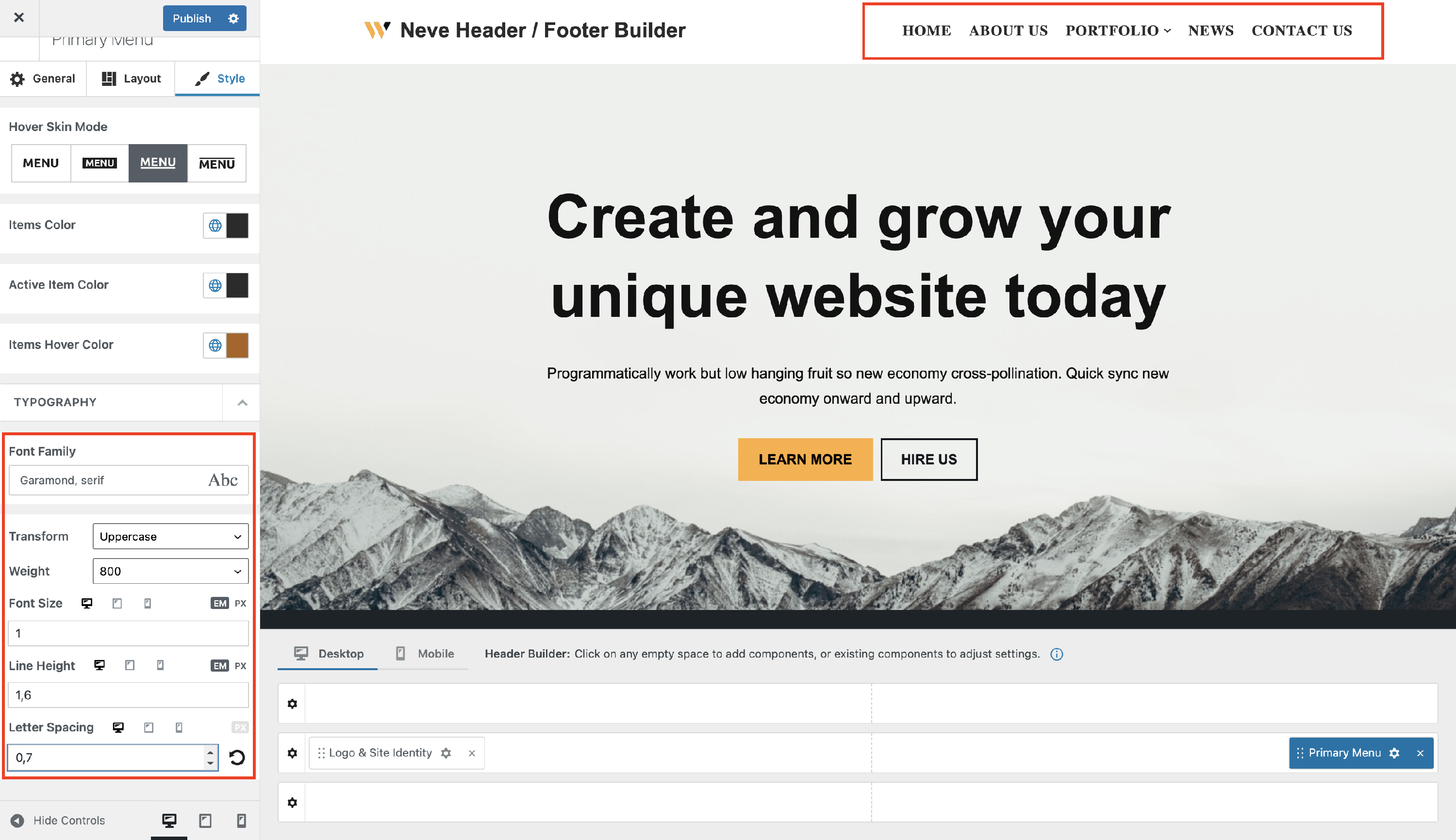
Custom typography for the Primary Menu items
- Font Family - with a vast list of fonts to choose from.
- Transform - None / Capitalise / Lowercase / Uppercase.
- Weight - None / 100 to 900.
- Font Size, Line Height ( in EM / PX / REM ), Letter Spacing ( in PX ) - along with a reset button ( Desktop | Tablet | Mobile ).
Submenu appearance settings
Neve Pro required: The submenu appearance settings below are available only with the Neve Pro addon active.
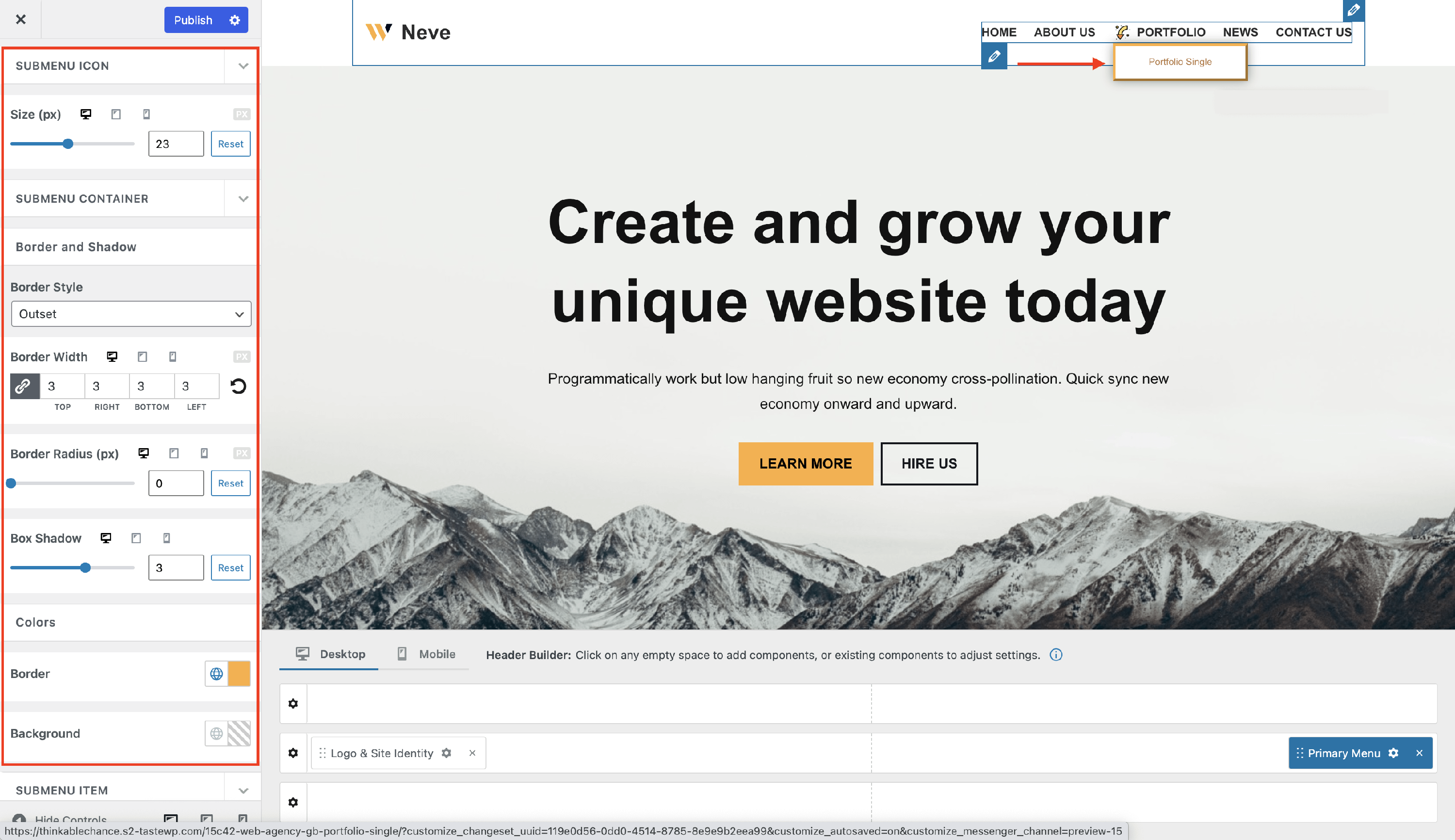
- Submenu Icon - adjust the size of the previously set icon. This might be very important if you have inserted an image.
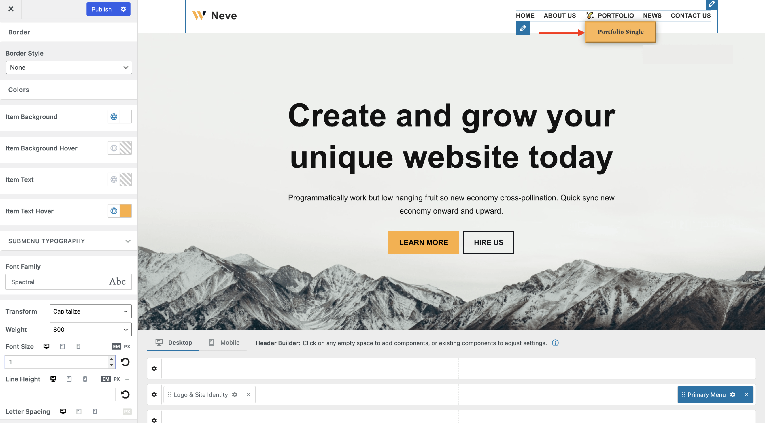
- Submenu Container - highlight the submenu using borders and shadows.
- Submenu Item - pick a different hover skin mode for the submenu items, add a new border, and modify the color of the background and item text on normal and hover mode.
- Submenu Typography - create a different appearance for the submenu, using other typography settings.