The Payment Icons Component - Neve Header / Footer Builder
📝Note: This component is part of the Neve Header / Footer Builder.
The Payment Icons increase your website's accessibility by adding payment details, useful in case of buying.
The Payment Icons component is accessible only if you have installed and activated the WooCommerce plugin, starting with the Business plan of Neve.
Using the Component
1. Start by adding the component into the rows, by clicking on the ➕ button and selecting the component.
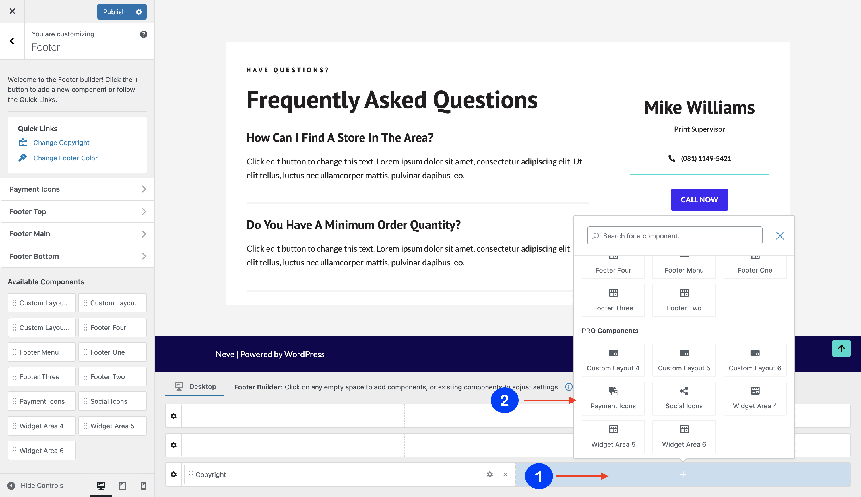
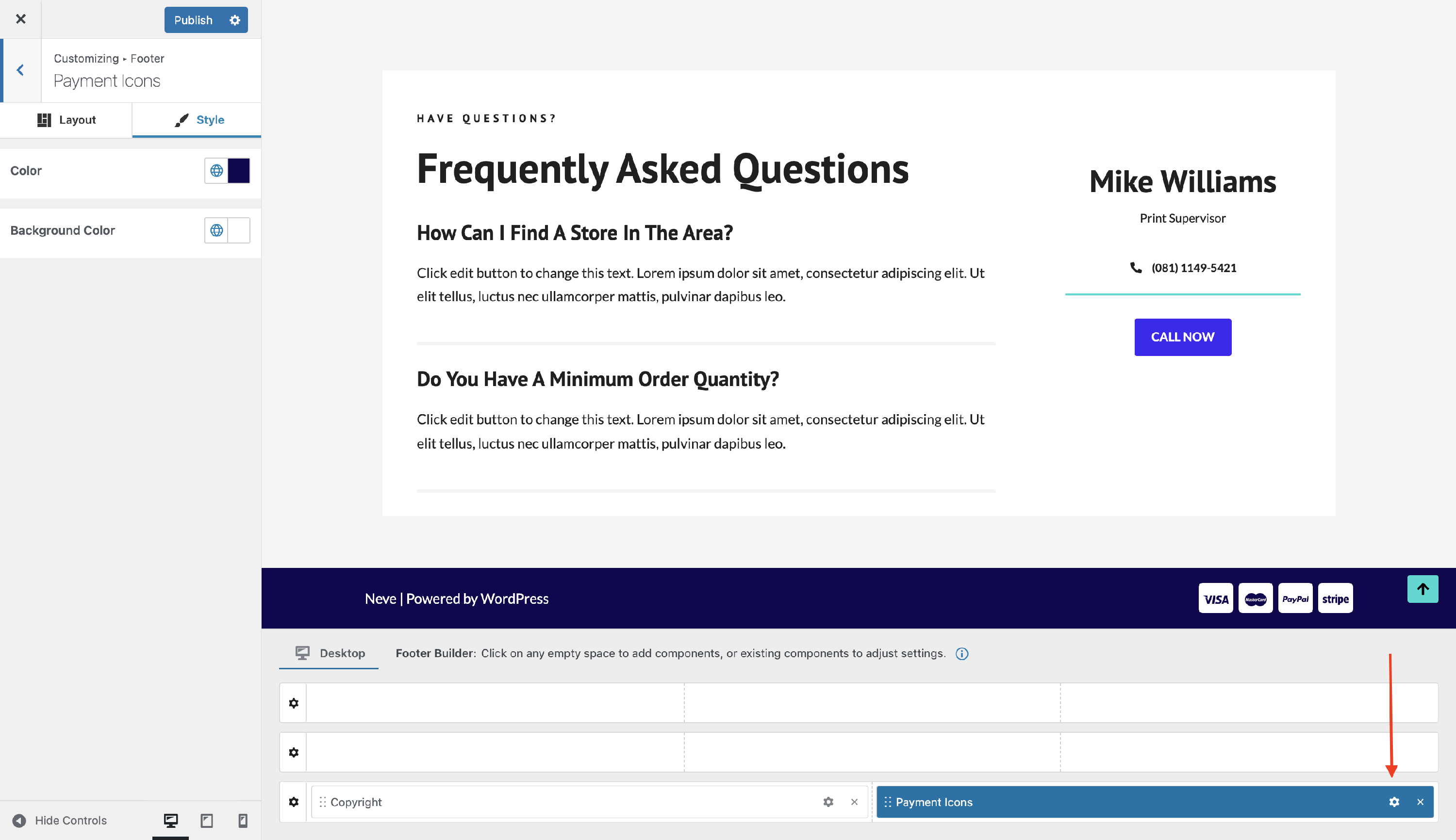
2. Open the component's settings to customize it, by clicking on the ⚙️icon.
Customizing the Component
There are two panels with customizing options for this component, which allow you to create the desired header / footer:
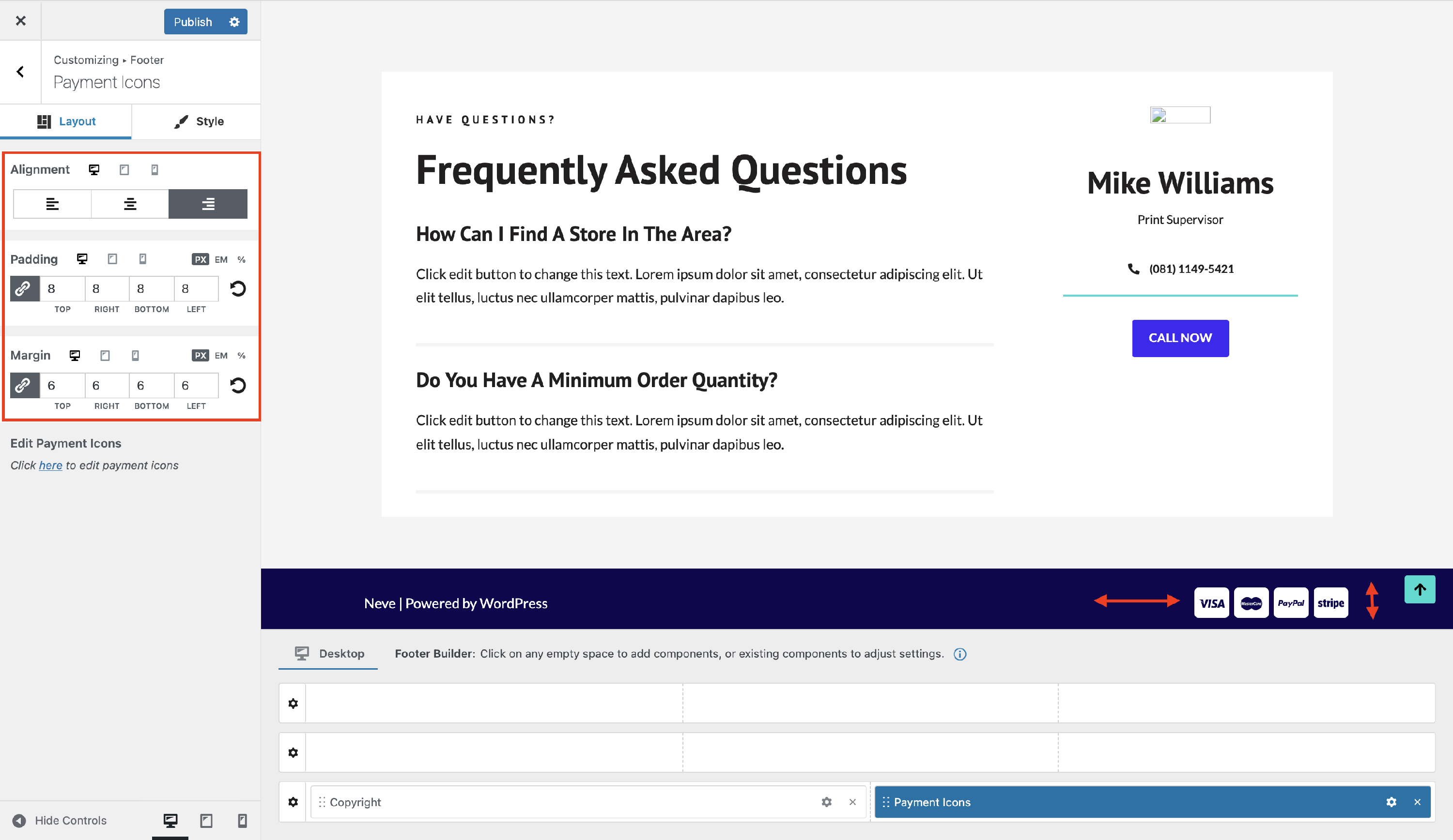
Layout Panel
The layout options allow the following adjustments:
Alignment - choose from the available orientations ( right / center / left ).
Padding and Margin - available in PX, EM, REM, and %, with a link button that helps establish the same dimension for all the directions ( Desktop | Tablet | Mobile ).
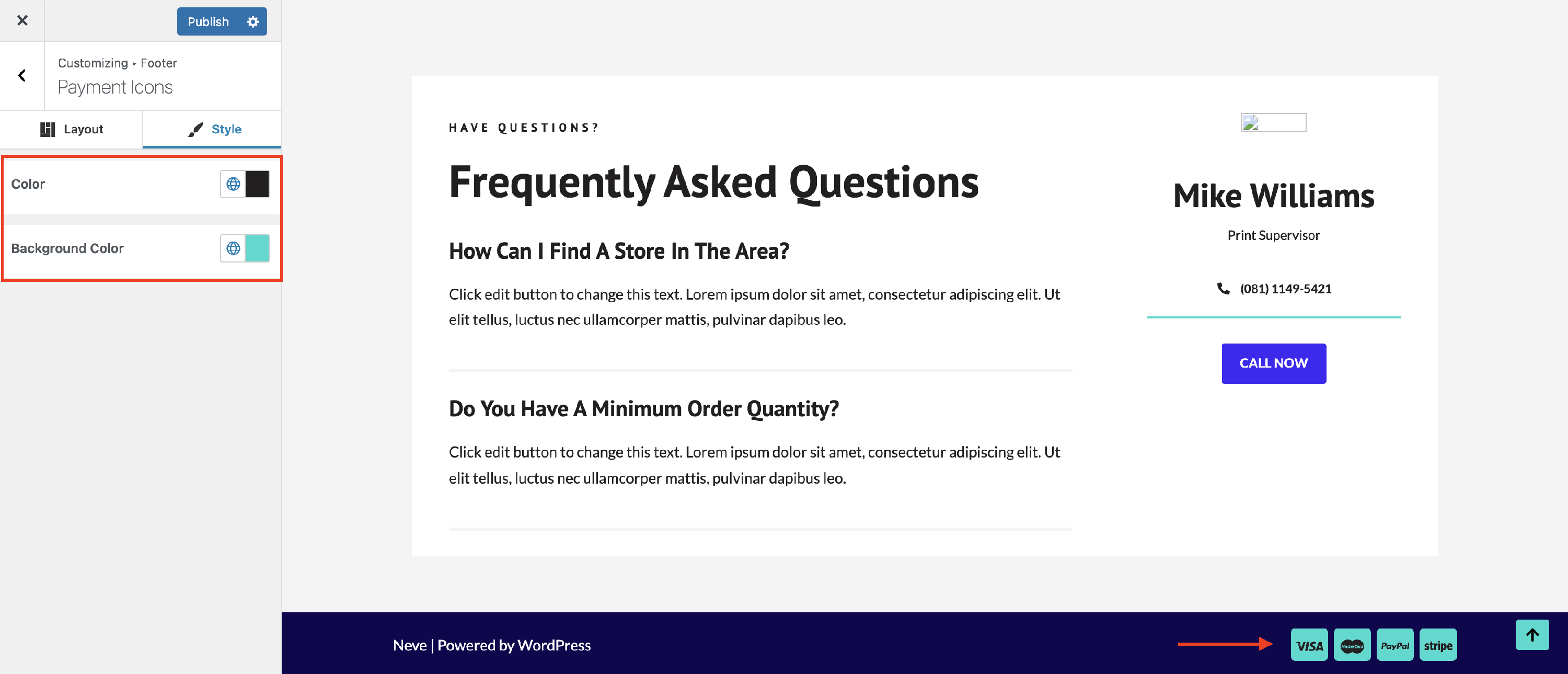
Style Panel
The Payment Icons component can be styled through the following options:
- Color - set the color of the text that appears over the icons.
- Background Color - modifies the background color of the icons.