The Button Component - Neve Header / Footer Builder
For more details check out the full Neve documentation and Neve PRO documentation.
📝Note: This component is part of both Neve and Neve PRO.
The Button component is very useful to ensure navigation into the website's pages, for sections like "Read More" or many others.
In this article
Using the Component
1. Start by adding the component into the rows, by clicking on the ➕ button and selecting the component.
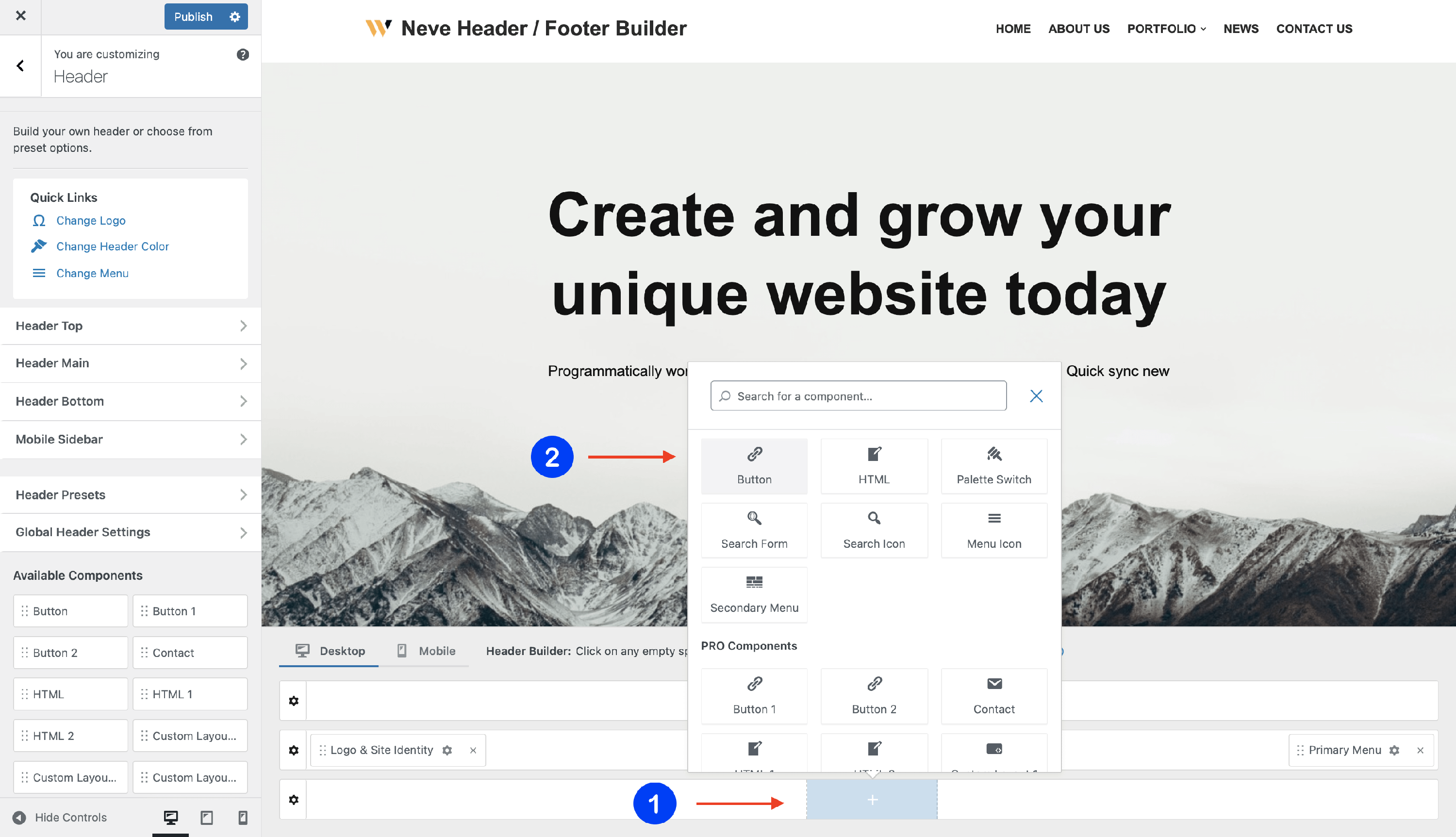
2. Open the component's settings to customize it, by clicking on the ⚙️icon.
📝 Note: When using Neve PRO, this component has three available instances: Button, Button 1, and Button 2.
Customizing the Component
There are three panels with customizing options for this component, which allow you to create the desired header / footer:
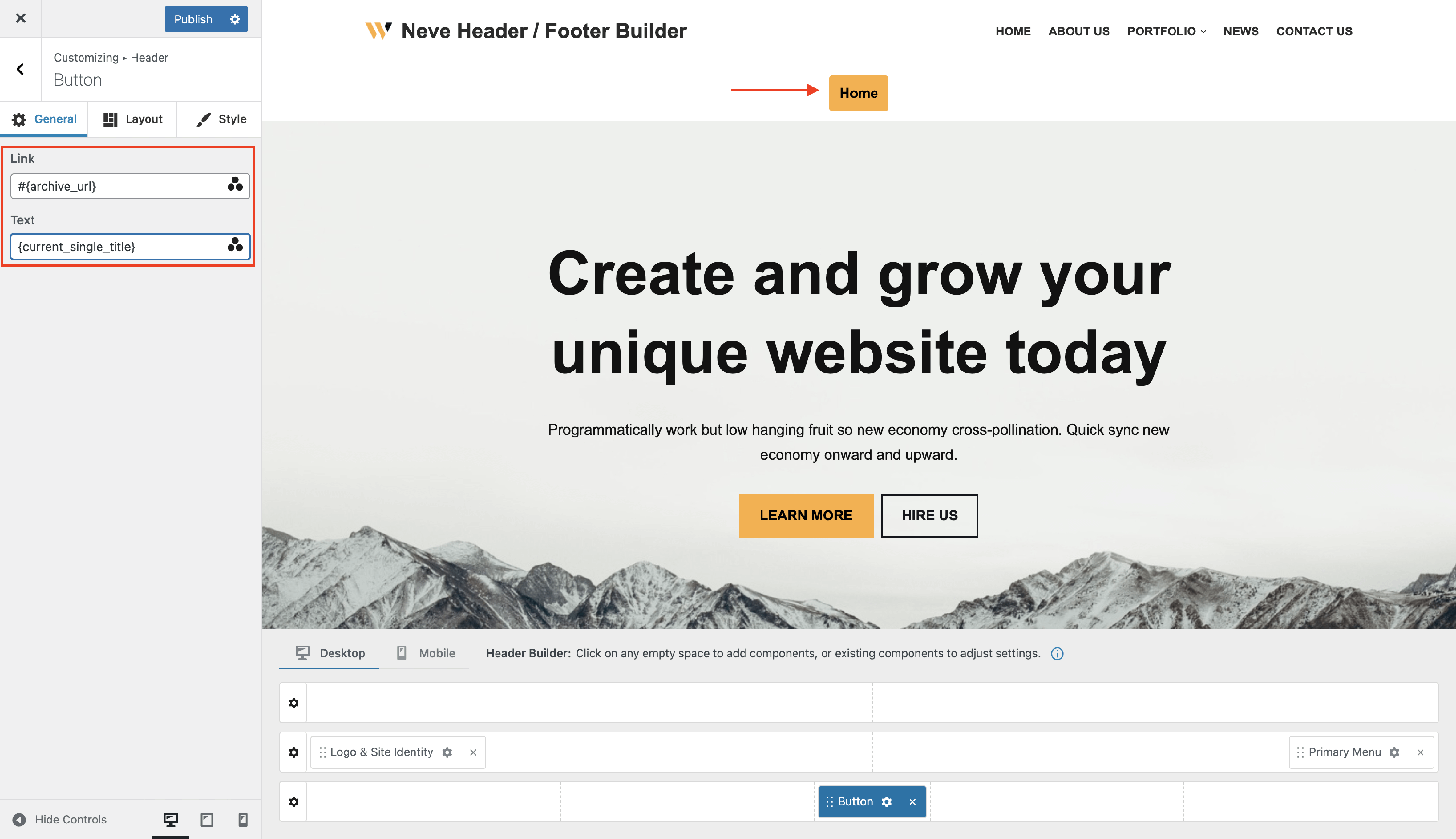
General Panel
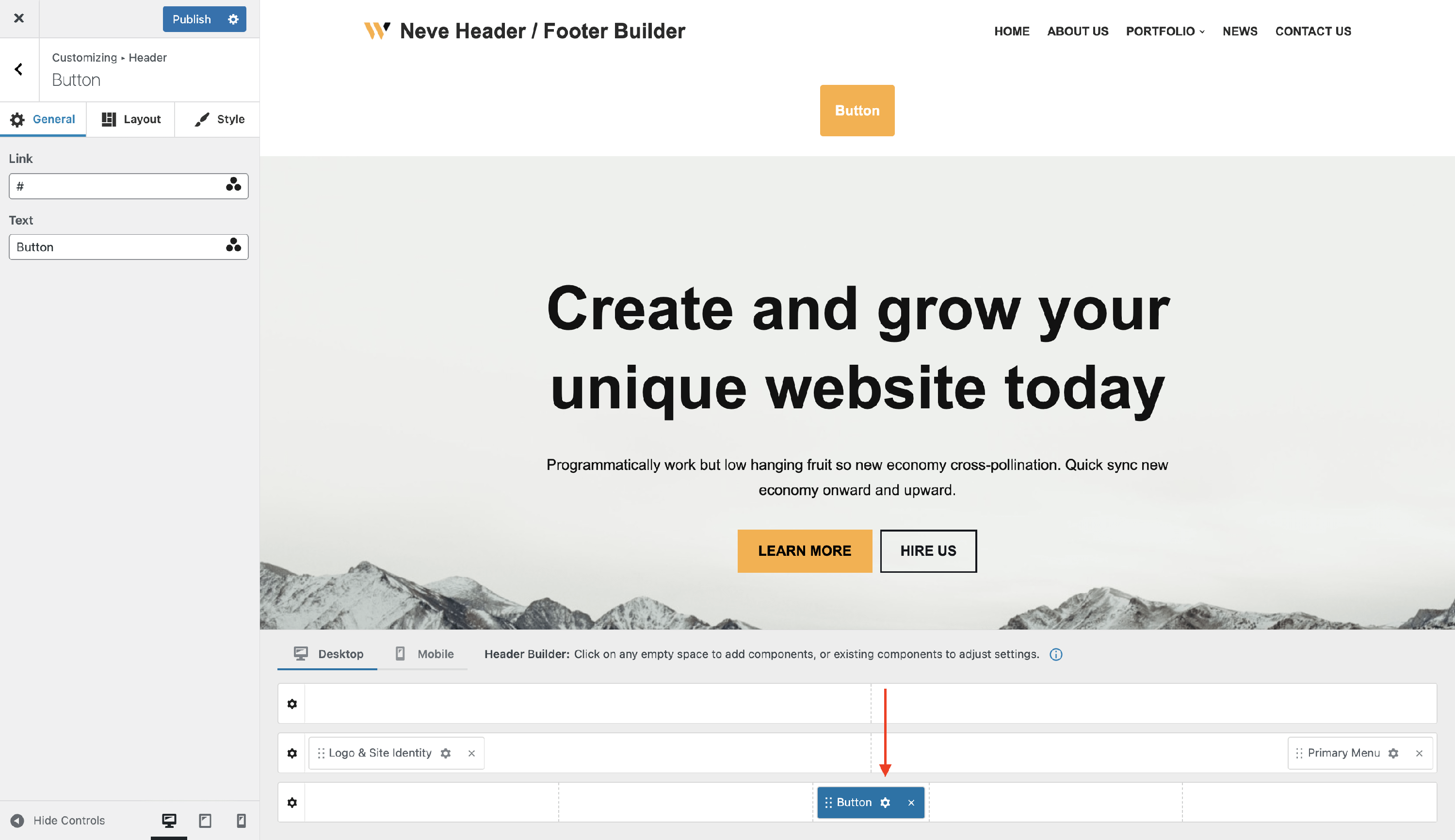
When you click on the ⚙️ icon, the General tab will appear on the left side. From there you can add any widget from the library, by clicking on the ➕ button.
- Text - choose a suitable text to appear on the button label.
- Link - insert the link of the page that the button must open.
- it can be an URL, mailto action (for e.g mailto:someone@yoursite.com), or tel button (for e.g tel:123-456-7890).
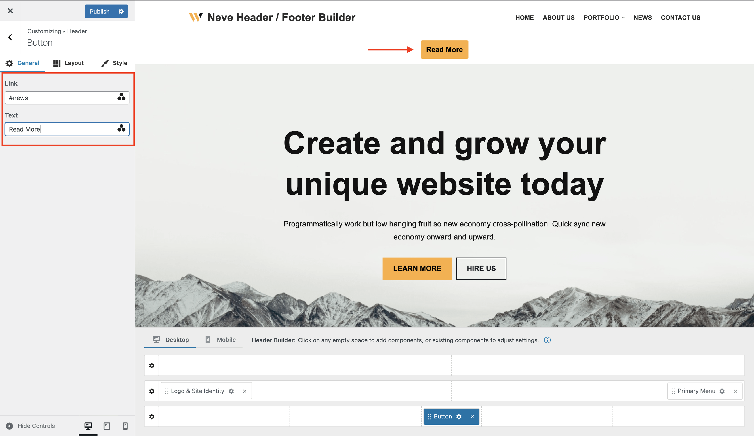
The three dots triangle you can see at the end of the rows is for the Dynamic Tags:
For both the Text and Link options, you have the option of entering your own custom text or using dynamic tags.
Dynamic Tags draws content from the website, or from the current page/post, changing dynamically according to the Page or Post it’s on.
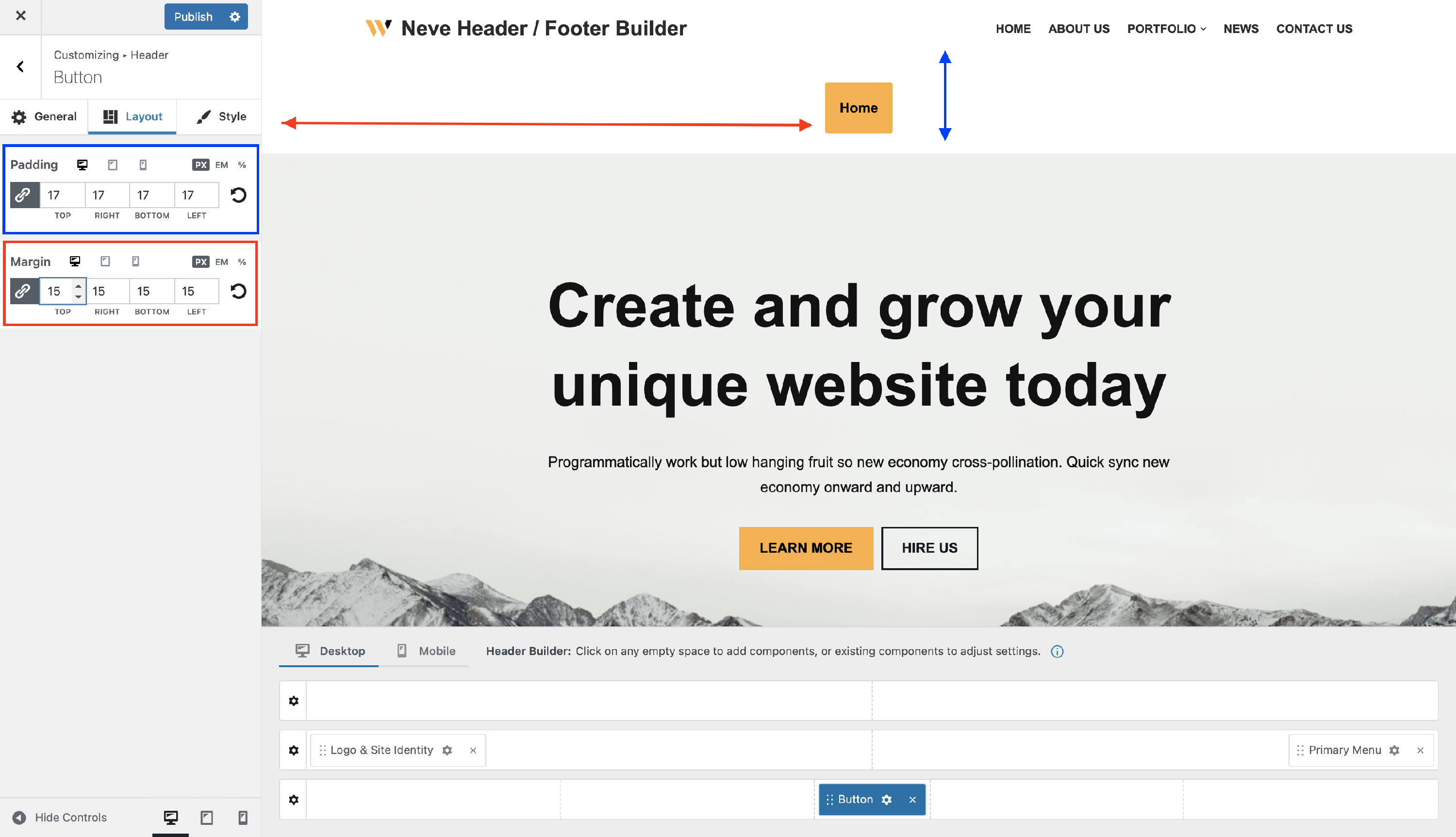
Layout Panel
In the Layout tab, you have access to advanced positioning options like:
- Padding and Margin - available in PX, EM, REM, and %, with a link button that helps establish the same dimension for all the directions ( Desktop | Tablet | Mobile ).
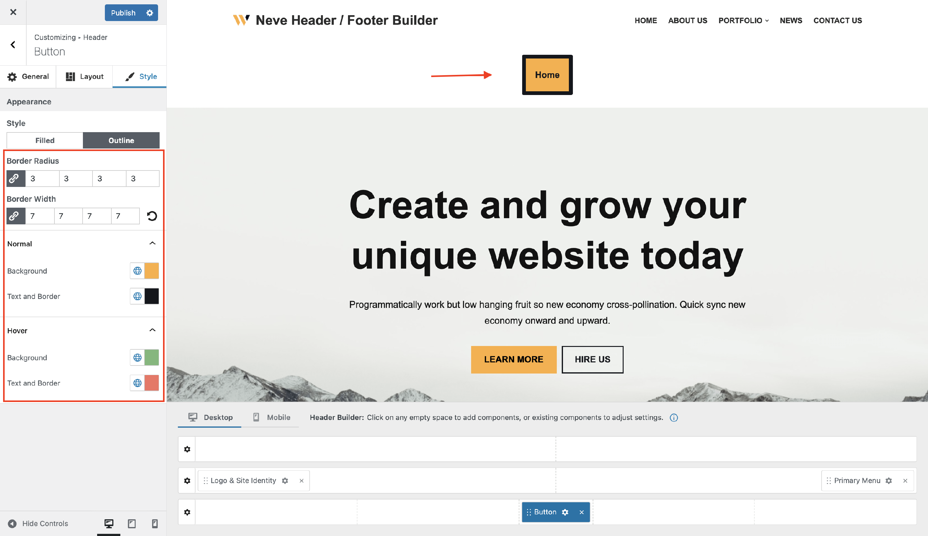
Style Panel
In the style tab you can choose between two styles for the button:
- Filled - with color options for normal and hover mode, and also with border radius adjustments.
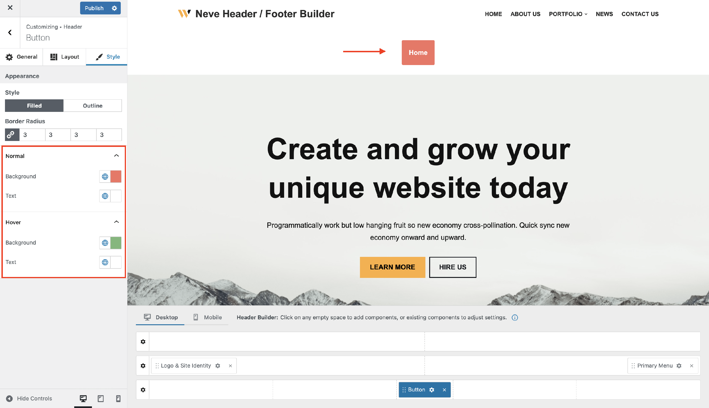
- Outline - with color options for normal and hover mode, and also with border radius and border width adjustments.