
Neve Mobile Menu Not Opening, Not Displaying Menu Items, or Always Expanded
If tapping the hamburger icon on your Neve site does nothing, the mobile menu opens with no menu items inside, or your menu links appear as a permanently expanded list with no hamburger icon at all, this guide will help you identify the cause and resolve it.
In this article
Symptoms
You may be affected by this issue if you notice the following:
- Tapping the hamburger icon does nothing on your phone or tablet.
- The issue happens in one mobile browser, such as Safari on iPhone or iPad, even though the same menu works elsewhere.
- The mobile menu panel opens when you tap the hamburger icon, but contains no menu items.
- Colors, spacing, and styles appear correctly in the panel — only the menu items are missing.
- Your menu links appear as an expanded list directly in the mobile header, and there is no hamburger icon to tap.
- The mobile menu never collapses, so the links push your page content further down the screen.
- The menu displays correctly on desktop, but not on mobile.
- The issue persists even after saving or re-assigning the menu in Appearance > Menus.
Cause
There are two different causes behind these symptoms, and the hamburger icon tells you which one you are dealing with. The Menu Icon component opens the Mobile menu content area; the Primary Menu component must be placed in that area for the links to appear after the icon is tapped.
If there is no hamburger icon and your links are already visible, the cause is the mobile header layout. The Primary Menu component is placed directly in one of the mobile header rows instead of in Mobile menu content, the area that the Menu Icon opens. A menu placed in a header row renders straight into the page, so it is always visible and has nothing to toggle it. This is a valid Header Builder arrangement, so Neve does not flag it as an error — it simply displays the menu where you put it.
If the hamburger icon is present but the menu is empty or does not respond, first confirm that Primary Menu is inside Mobile menu content. If that placement is correct, the cause is usually a plugin conflict. Certain third-party plugins — especially plugins that modify JavaScript loading, page output, page titles, SEO metadata, or caching behavior — can interfere with how Neve opens and renders the mobile menu. Depending on the conflict, one of two things usually happens:
- The mobile panel opens, but the menu items do not appear.
- The hamburger icon becomes unresponsive because the script that should open the mobile panel does not run correctly.
Plugins in the SEO or title-management category (such as Title Manager) are known to trigger the empty-panel behavior. Performance and caching plugins with JavaScript optimization features can also stop the hamburger toggle from responding. SiteGround Speed Optimizer is one example that has been observed in this kind of troubleshooting.
Fix
Work through the steps below in order. Stop as soon as your mobile menu opens correctly and your menu items appear.
Step 1: Verify Menu Assignment
Before testing for conflicts, confirm that a menu is correctly assigned in both of the following places.
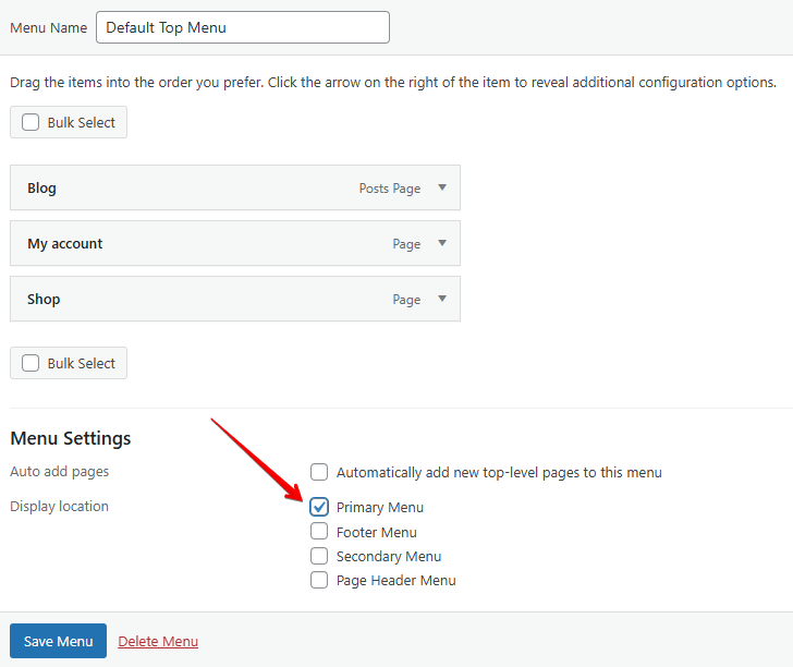
- In your WordPress Dashboard, go to Appearance > Menus.
- Open the menu you want to use on mobile and confirm it is assigned to the Primary Menu location. Click Save Menu.
- Go to Appearance > Customize and open the Header Builder.
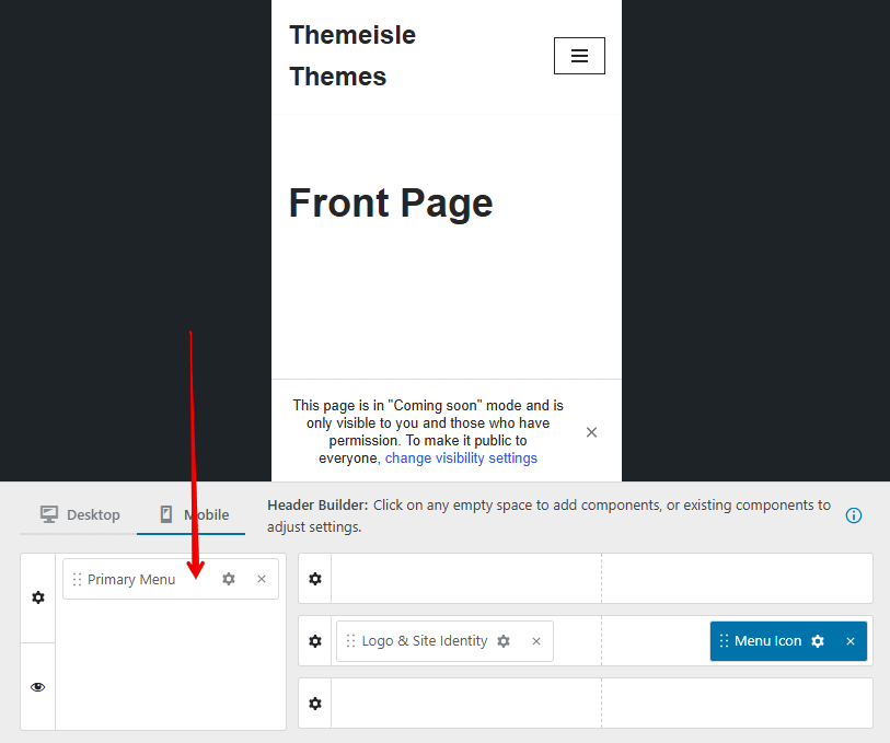
- Switch to the Mobile view and confirm that the Menu Icon component is in a visible mobile header row and the Primary Menu component is inside Mobile menu content. If Mobile menu content is collapsed, click Show next to it. If Primary Menu is missing, click the plus control in Mobile menu content, select Primary Menu, and place the Menu Icon in a visible mobile header row such as Header Main.
- Click Publish to save any changes.
📝 Note: The Primary Menu component always displays whichever menu is assigned to the Primary Menu location in Appearance > Menus. There is no separate menu picker on the component itself, so if the wrong links appear, change the assignment in Appearance > Menus. For full instructions on setting up the Header Builder for mobile, see Header Builder on Mobile Devices and Primary Menu.
Step 2: Check the Mobile Header Layout Before Testing for Conflicts
Before you start deactivating plugins, look at your site on a phone and check whether a hamburger icon is there at all. This one detail decides which half of this guide applies to you.
- No hamburger icon, and your menu links are already visible — this is a header layout problem. Follow the rest of this step, then stop. Do not run a plugin conflict test.
- The hamburger icon is present, but tapping it does nothing or opens an empty panel — inspect Mobile menu content first. Proceed to Step 3 only if the Menu Icon is in a visible mobile header row and the Primary Menu is inside Mobile menu content, but the icon still does not respond.
If the Menu Is Always Expanded and the Hamburger Icon Is Missing
Two separate components produce a working mobile menu, and each one has to sit in the right place:
- The Menu Icon component draws the hamburger icon. It belongs in a visible mobile header row, such as Header Main.
- The Primary Menu component holds your links. It belongs in the Mobile menu content area, which is the panel the Menu Icon opens.
If the Primary Menu is in a header row instead, there is no hamburger icon and the links render in the header as a permanently expanded list. To correct the arrangement:
- In your Dashboard, go to Appearance > Customize and open the Header panel.
- Switch to the Mobile view using the Desktop | Mobile toggle at the top of the builder.
- Remove the Primary Menu component from Header Main, or from whichever row currently holds it.
- Add the Menu Icon component to Header Main.
- Find the Mobile menu content area to the left of the header rows. If it is collapsed, click Show next to it.
- Add the Primary Menu component to Mobile menu content.
- Click Publish.
- Clear your caching plugin cache, your hosting or server cache, and any CDN cache, then reload your site on your phone.

📝 Note: Neve refers to this area by two names. The Header Builder labels it Mobile menu content, while its own settings panel is titled Mobile Sidebar. Both names mean the same area — the panel that opens when the Menu Icon is tapped.
💡 Tip: Rather than arranging the components yourself, you can apply a ready-made layout from Appearance > Customize > Header > Header Presets. Every preset already places the Menu Icon in a mobile header row and the Primary Menu in the mobile menu content area.
Step 3: If the Hamburger Icon Does Not Respond at All
If tapping the hamburger icon does nothing, the menu markup may still be present, but the script that opens the panel may be blocked by a plugin conflict or JavaScript optimization setting.
- Test the menu on the affected mobile device and browser first.
- Then test the same page in another mobile browser or in your desktop browser's responsive design mode.
- If the issue only happens in one mobile browser, do not assume Neve alone is the cause. Browser-specific symptoms can still be triggered by caching or optimization settings on your site.
📝 Optional check: If you are comfortable using your browser's developer tools, you can temporarily add the is-menu-sidebar class to test the panel state. If that opens the mobile panel, the menu styling is likely fine and the problem is more likely the JavaScript event that should open the menu.
Step 4: Run a Plugin Conflict Test
If the menu assignment is correct, your mobile header layout is correct, and the mobile menu is still empty or the hamburger icon is still unresponsive, a plugin conflict is the most likely cause.
- In your Dashboard, go to Plugins > Installed Plugins.
- Deactivate all plugins except Neve and Neve Pro (if installed).
- Open your site on the affected mobile device or browser and check whether the hamburger icon now opens the menu and displays the menu items.
- If the menu works again, a deactivated plugin was causing the conflict. Reactivate your plugins one at a time, checking the mobile menu after each reactivation.
- When the menu stops working again, the plugin you just reactivated is the source of the conflict.
⚠️ Important: Start your reactivation testing with performance plugins, caching plugins, JavaScript optimization plugins, SEO plugins, title management plugins, and any plugin that modifies page output or metadata — these are the most common sources of this conflict.
Step 5: Check Performance and JavaScript Optimization Plugins
If you use a performance or caching plugin, temporarily disable its JavaScript optimization features before testing again.
- Open your performance or caching plugin settings.
- Temporarily disable any feature related to:
- JavaScript minification
- JavaScript combination or aggregation
- JavaScript
deferordelay - Front-end script optimization or script-loading delays
- Save the changes.
- Clear the plugin cache, your hosting or server cache, any CDN cache, and your browser cache.
- Retest the hamburger icon on the original phone or tablet where the issue happened.
⚠️ Important: Some optimization plugins keep serving already-optimized files until all caches are cleared. If you skip the cache-clearing step, you may get a false negative and think the setting change did not help.
SiteGround Speed Optimizer is one observed example of a plugin whose JavaScript optimization settings can interfere with the mobile menu toggle. If disabling those features fixes the issue, re-enable the settings one at a time until you find the specific option causing the conflict.
Step 6: Switch to a Default Theme Temporarily
If deactivating all plugins does not resolve the issue, a child theme or theme customization may be involved.
- In your Dashboard, go to Appearance > Themes.
- Activate a default WordPress theme such as Twenty Twenty-Four.
- Check the mobile menu behavior on your site.
- If the issue is gone, switch back to Neve and review any custom code added to your child theme's
functions.phpor through a CSS/JS customization plugin.
Common Culprits
The following types of plugins are known to conflict with Neve's mobile menu rendering:
- Title management plugins — plugins that alter page
<title>output or inject custom metadata into page headers. The Title Manager plugin has been specifically identified as a source of this conflict. - SEO plugins with aggressive output buffering or page title rewriting.
- Performance or caching plugins that modify HTML output before it is sent to the browser.
- JavaScript optimization plugins or features that minify, combine, defer, or delay the scripts responsible for the mobile menu toggle. SiteGround Speed Optimizer is an observed example in this category.
If you identify a conflicting plugin, you have two options:
- Keep the plugin deactivated and look for an alternative that does not interfere with Neve.
- Contact the conflicting plugin's support team to report the incompatibility.
Verification
After applying the fix, confirm that the mobile menu is working correctly:
- Open your site on the original phone or tablet and in the original browser where the issue happened.
- Confirm that the hamburger icon is the only part of the menu visible when the page first loads, and that no menu links are showing yet.
- Tap the hamburger icon and confirm that the mobile menu panel opens immediately.
- Confirm that your menu items appear inside the panel and are tappable.
- Navigate to a few pages using the mobile menu to ensure links work as expected.
- Compare the result in another browser or in your browser's responsive design mode to confirm the fix is consistent.
💡 Tip: If the menu still does not open or your items still do not appear, clear your browser cache and any site-level caching again before testing. Browser-specific symptoms can still come from optimization settings that have not fully cleared yet.
If you have confirmed there is no plugin conflict and the mobile menu is still empty, unresponsive, or permanently expanded, contact Themeisle support with details about your WordPress version, Neve version, active plugins, caching or optimization settings, and the device/browser where you tested the issue. Mentioning which components you have in each mobile header row helps speed up the diagnosis.
Related articles: