
How to automatically expand sub-menu items on mobile
Use Neve's Primary Menu control to automatically expand first-level mobile submenus, or turn it off if they open unexpectedly.
📝Note: This guide only works for Neve and Neve PRO. Trying the following steps with other themes might not work as expected.
In this article
What do I need to do?
- In your WordPress dashboard, go to Appearance > Customize, then open Header.
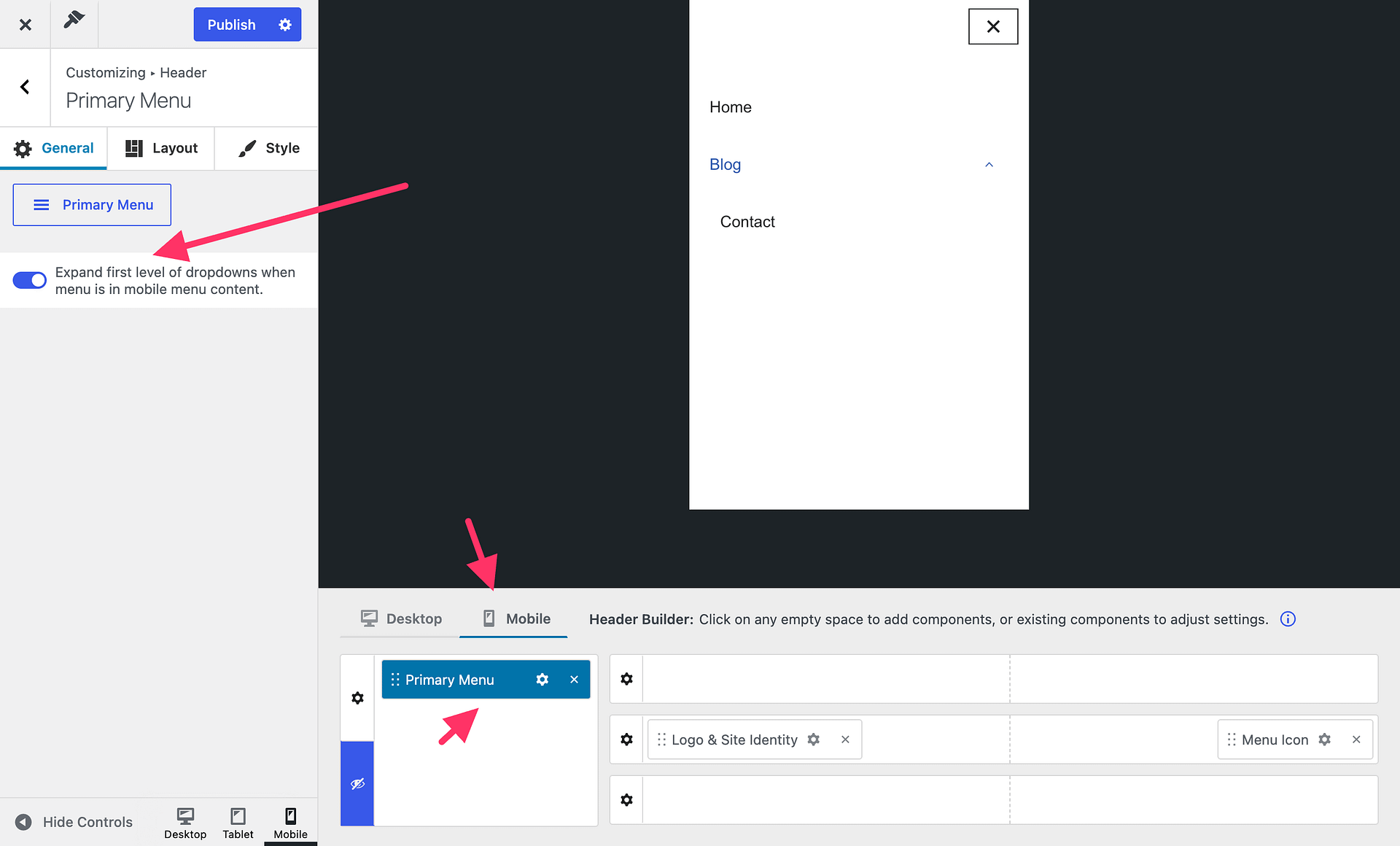
- Switch the Header Builder to Mobile. If Mobile menu content is hidden, click Show to reveal it.
- In Mobile menu content, open the Primary Menu component's settings by clicking its gear icon. If the component is not there, add it using the plus control in Mobile menu content.
- In the General panel, find the option that expands first-level dropdowns in Mobile menu content. Enable it to open those submenus automatically, or disable it if they are opening unexpectedly and should stay collapsed until a visitor opens them.
- Click Publish to save your change.
For more about placing components and editing menus, see Header Builder on Mobile Devices and the Primary Menu component.
How will it look like?
When the Primary Menu is in Mobile menu content, enabling the option expands its first-level dropdowns automatically when a visitor opens the mobile menu. Disabling it leaves those dropdowns collapsed until the visitor opens them. This setting does not control whether the entire menu panel opens or automatically expand every nested submenu level.