The Cart Icon Component - Neve Header / Footer Builder
For more details check out the full Neve documentation and Neve PRO documentation.
📝Note: This component is part of both Neve and Neve PRO.
The Cart Icon component is accessible only if you have installed and activated the WooCommerce plugin.
In this article
Using the Component
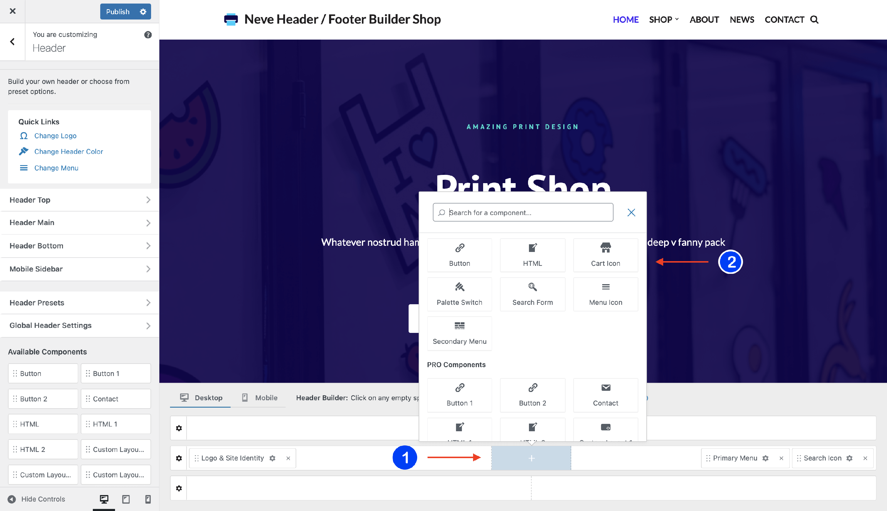
1. Start by adding the component into the rows, by clicking on the ➕ button and selecting the component.
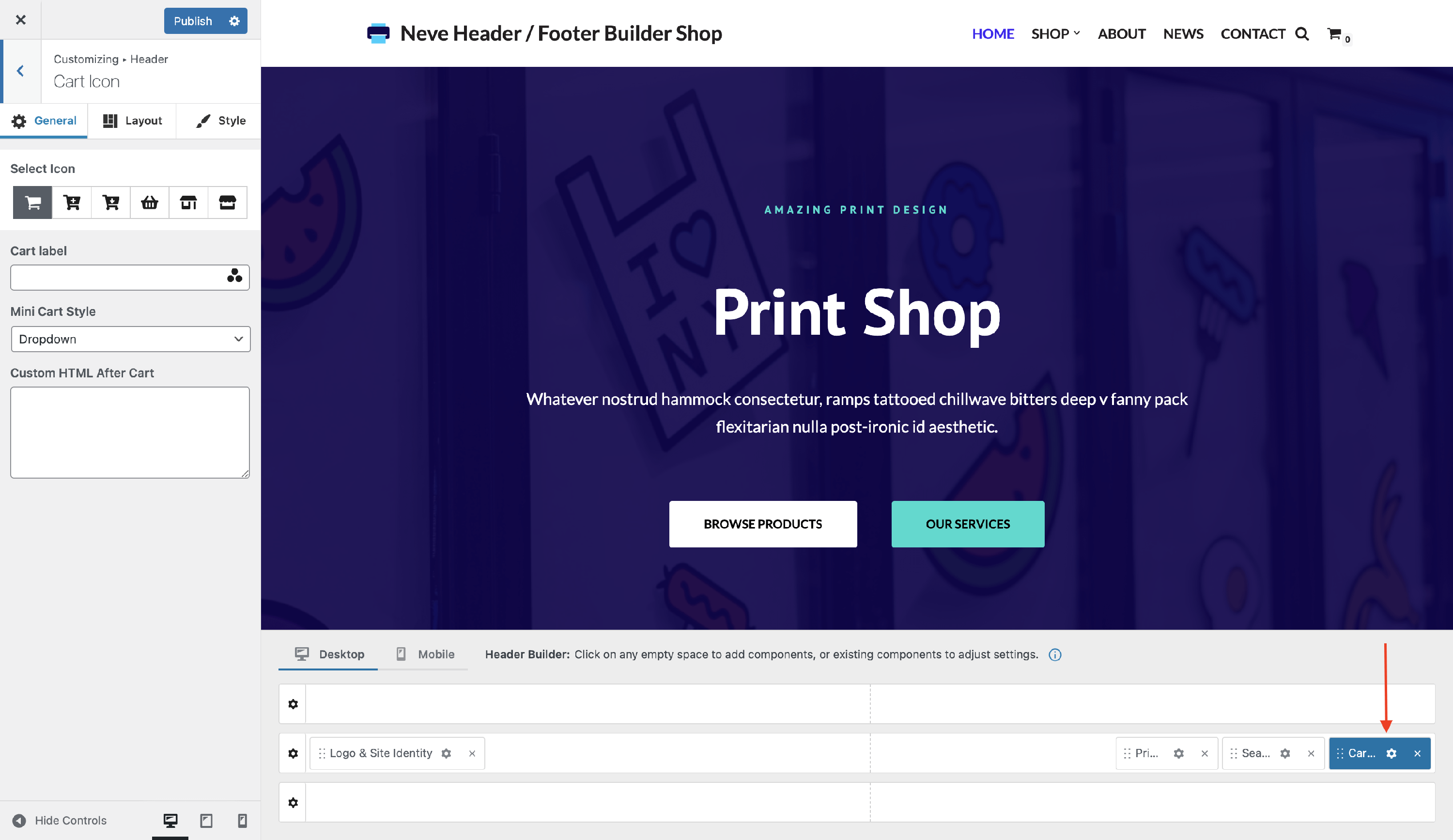
2. Open the component's settings to customize it, by clicking on the ⚙️icon.
Customizing the Component
There are three panels with customizing options for this component, which allow you to create the desired header / footer:
General Panel
Please note the settings within the General tab of this component are available only with the Sparks plugin or the Neve Pro Business/Agency license tier.
When you click on the ⚙️ icon, the General tab will appear on the left side. From there you can add any widget from the library, by clicking on the ➕ button.
- Select Icon - choose to use a different cart icon, from the provided list.
- At the end of the row with icons, you will find another button that works as a slider. Once you click on it, it will open an editor area that allows you to add custom SVG code.
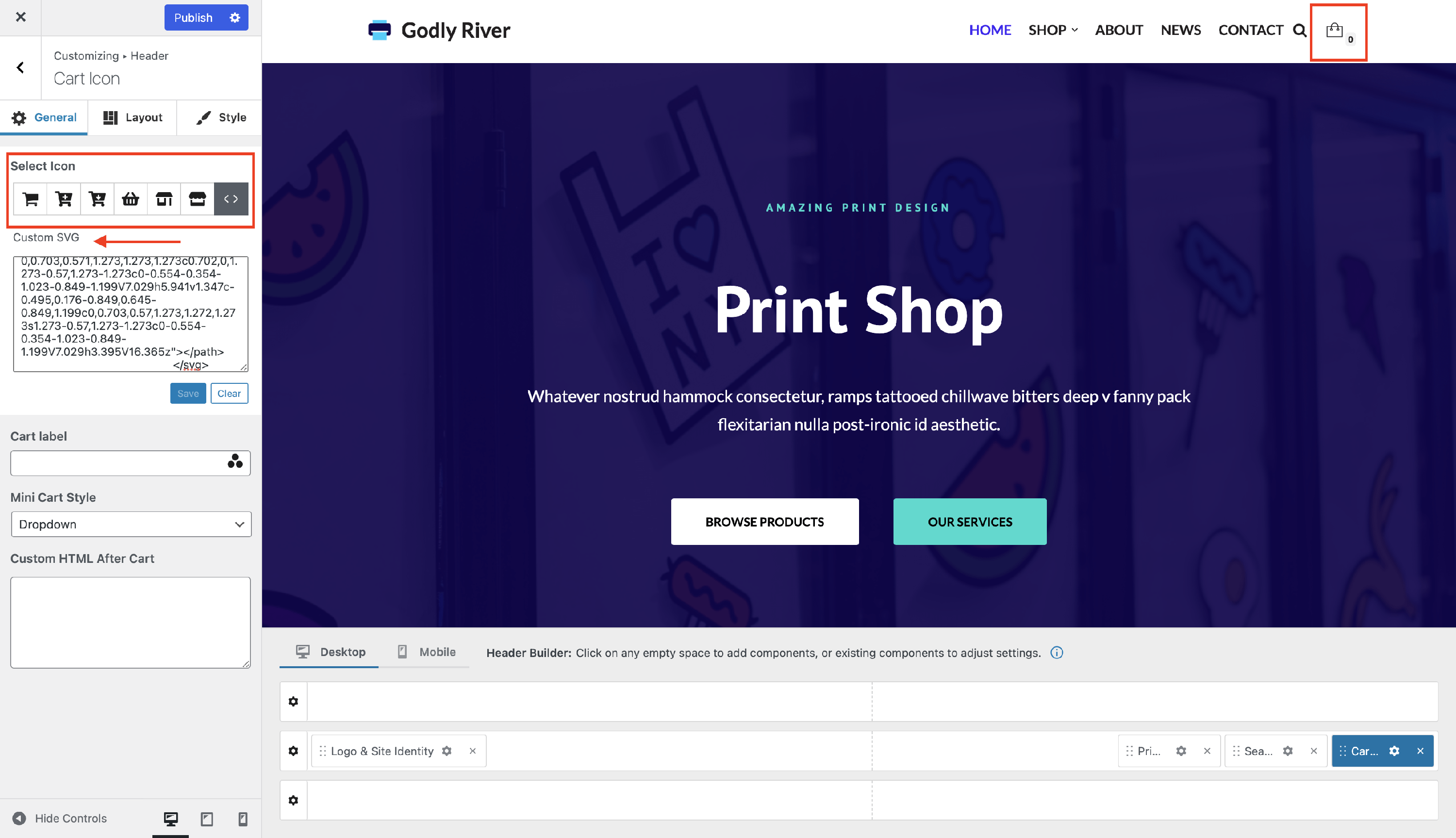
📝 Note: The icon will be visible only after you click on the Save button.
- Cart label - a piece of text that will display just before the cart icon. If you want to display a dynamic value like the total amount from the cart, for e.g., you can use Dynamic Tags.
- To get access to the Dynamic Tags click on the three dots shaped like a triangle from the Cart label input.
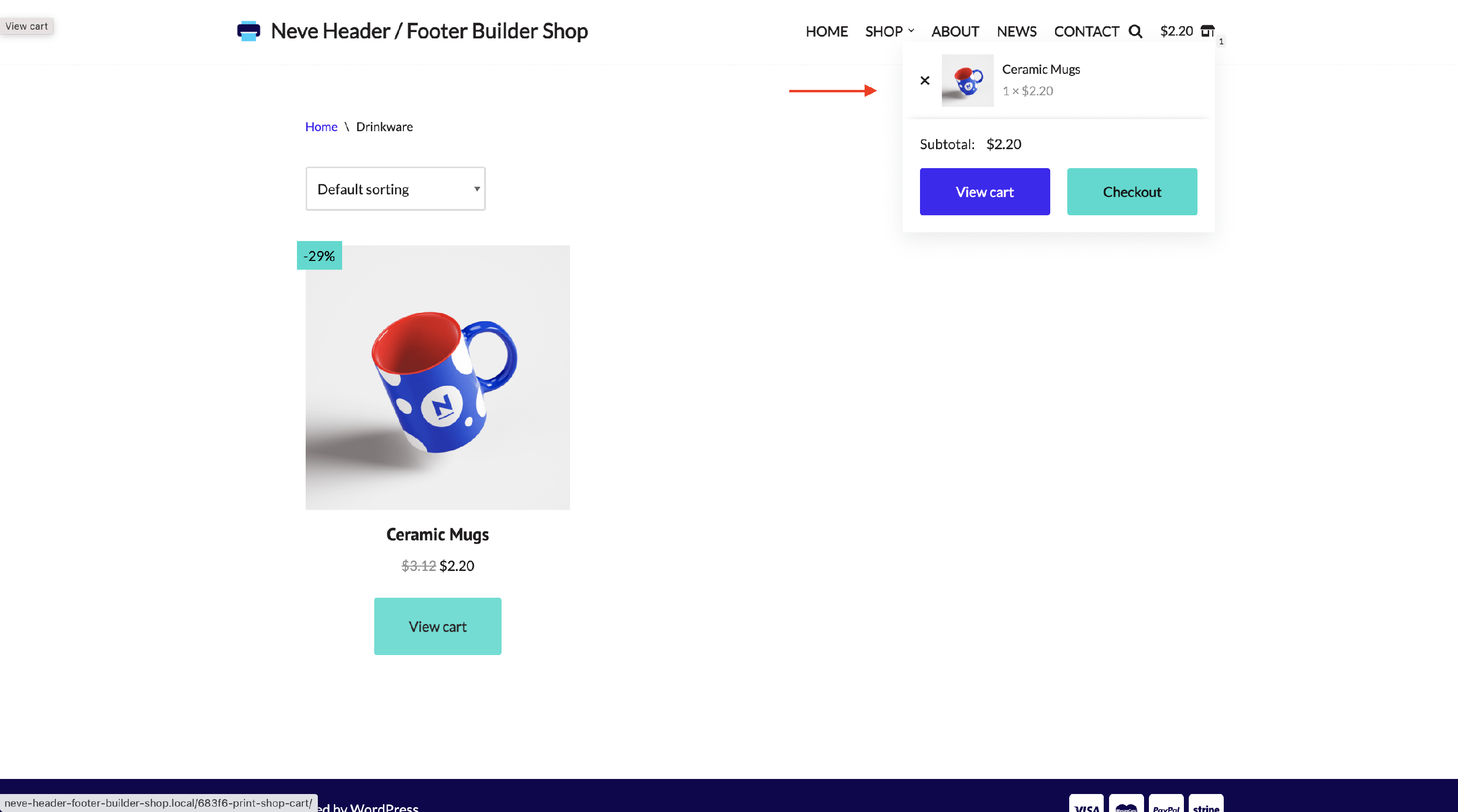
- Mini Cart Style - by default, a mini cart is displayed as a dropdown, letting users see what's in their cart at that moment. On desktop, the dropdown opens when hovering over the cart icon. On mobile devices, the dropdown opens when tapping the cart icon and closes when tapping the icon again or tapping outside the cart. From here, you can change this behavior.
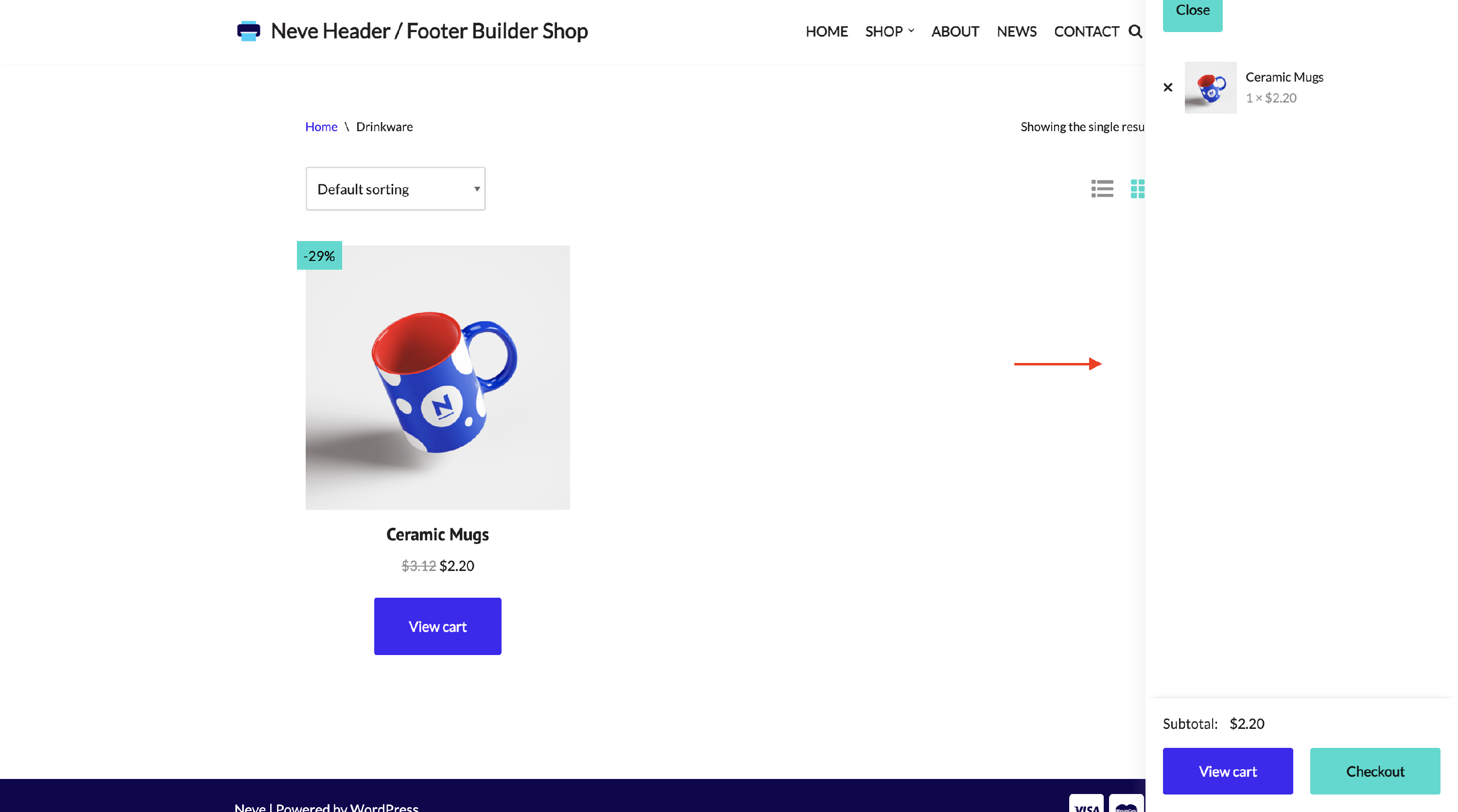
- By selecting Off Canvas, clicking or tapping the cart icon opens the mini cart from the right side as a sidebar on desktop and mobile devices.
By selecting Link, clicking on the cart icon, the user will be redirected to the Cart page.
Custom HTML After Cart - an area that allows HTML code and shortcodes, and will display at the end of the mini cart.
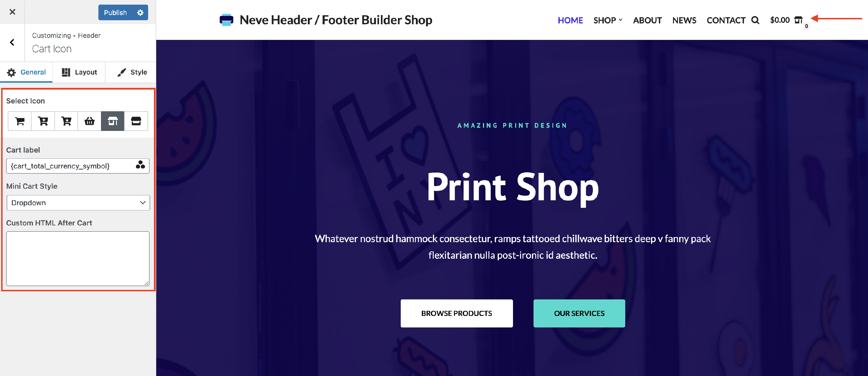
📝 Note: When the Mini Cart Style is set to Dropdown or Off Canvas, it is displayed automatically after a product is added from the shop or a product archive.
Layout Panel
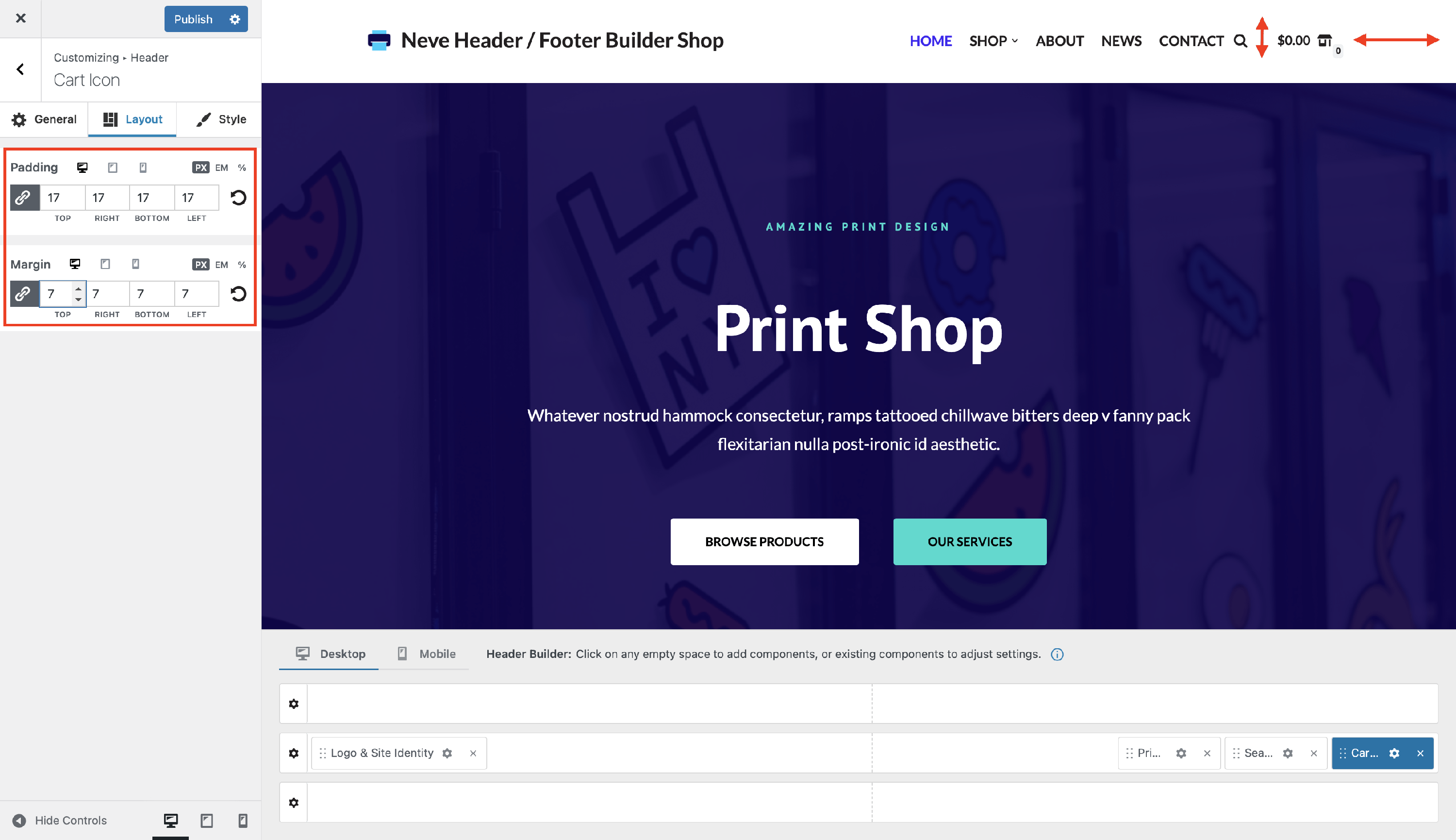
The layout options allow the following adjustments:
- Padding and Margin - available in PX, EM, REM, and %, with a link button that helps establish the same dimension for all the directions ( Desktop | Tablet | Mobile ).
Style Panel
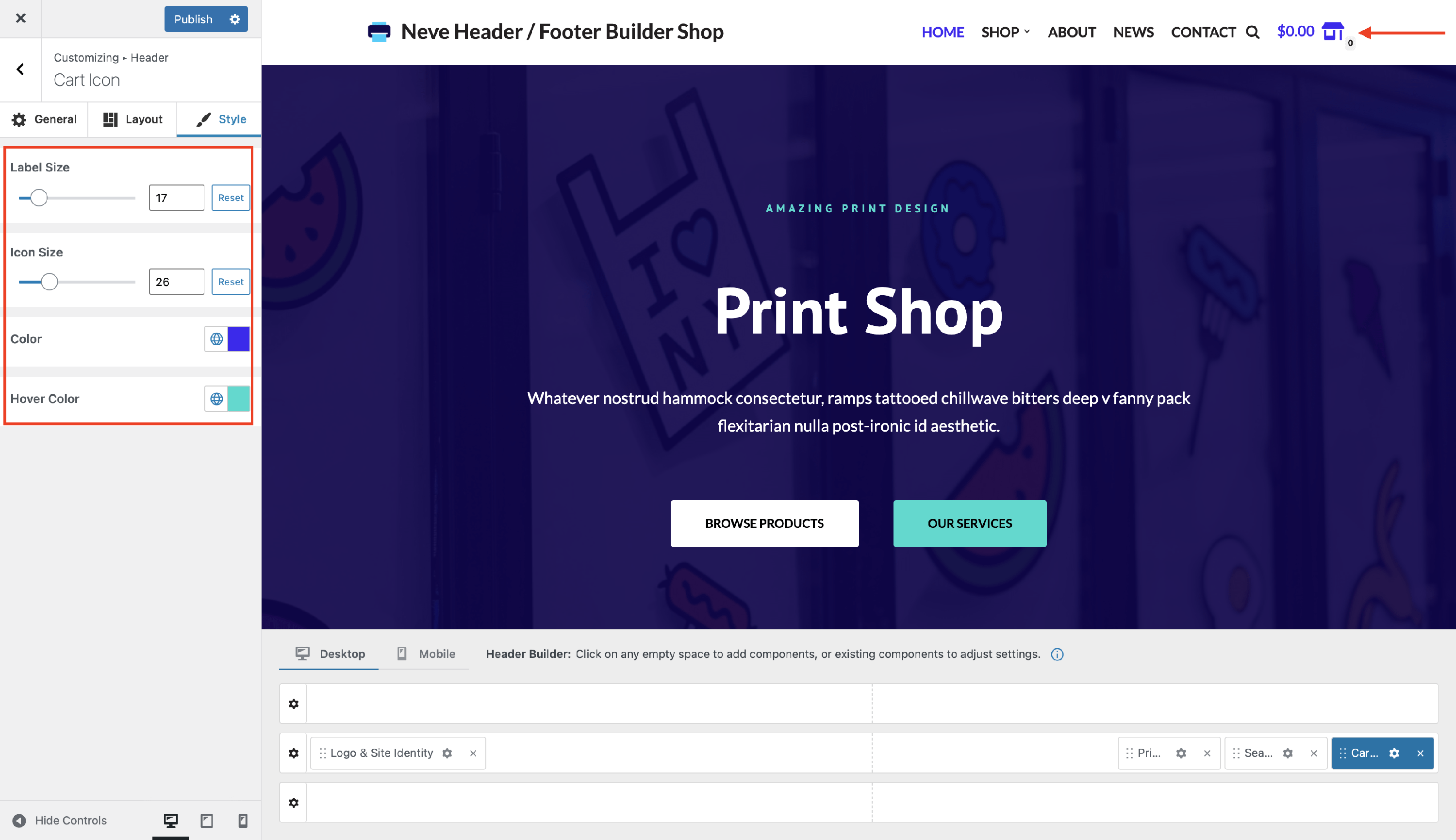
Styling for the Cart Icon component includes:
- Label Size - adjust the size of the label, to suit your needs.
- Icon Size - modify the size of the icon or undo the changes with the reset button.
- Color - add a proper color to the cart icon.
- Hover color - add a different color when you hover with the mouse.