
Neve Mega Menu (Pro)
📝Note: Neve Mega Menu is part of the Neve Pro which you can get from here.
The Mega Menu of Neve allows you to present the sub-items of a certain panel in a better preview, add icons to the menu items, and also customize them with the Menu Item Settings.
In this article
Activating the Module
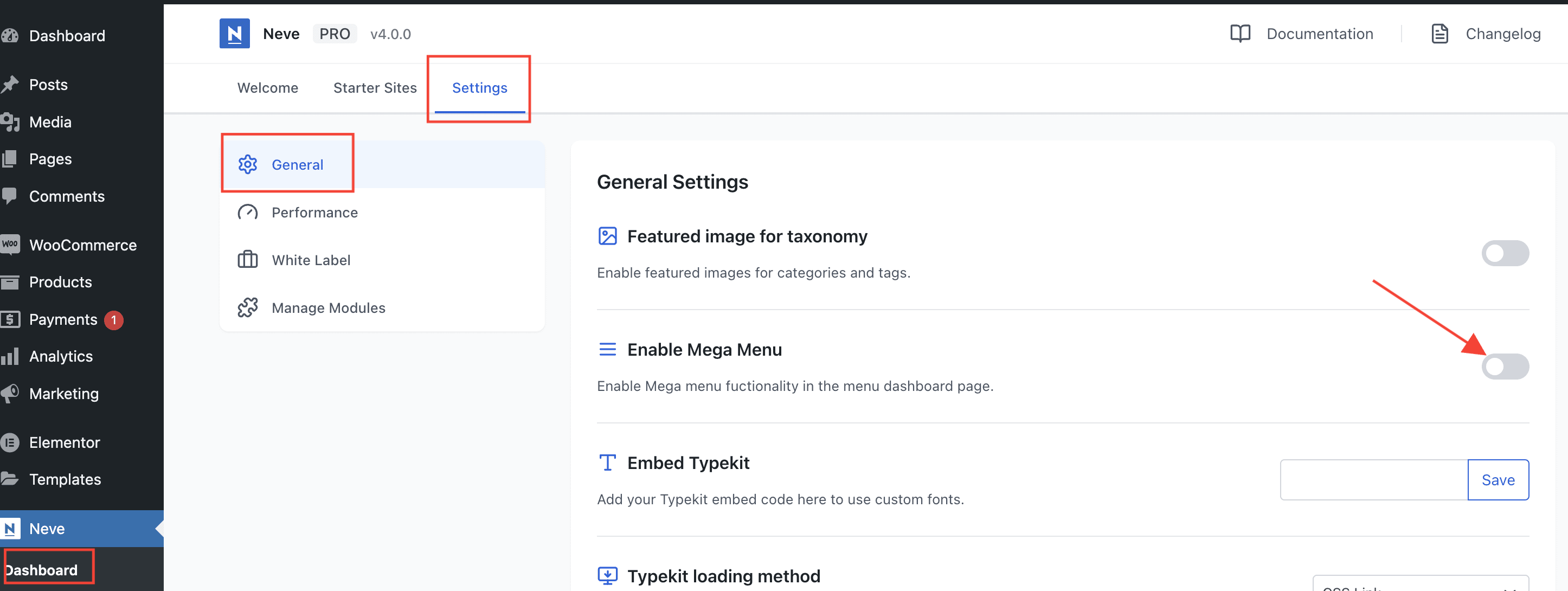
1. Install the Neve PRO plugin, using these instructions.
2. Navigate to Neve > Dashboard > Settings.
3. Under the General tab, enable the Mega Menu option.
Using the Module
After enabling this module, navigate to Appearance > Menus and take a look at the Menu Structure. This generates buttons that allow the user to add icons to the menu items.
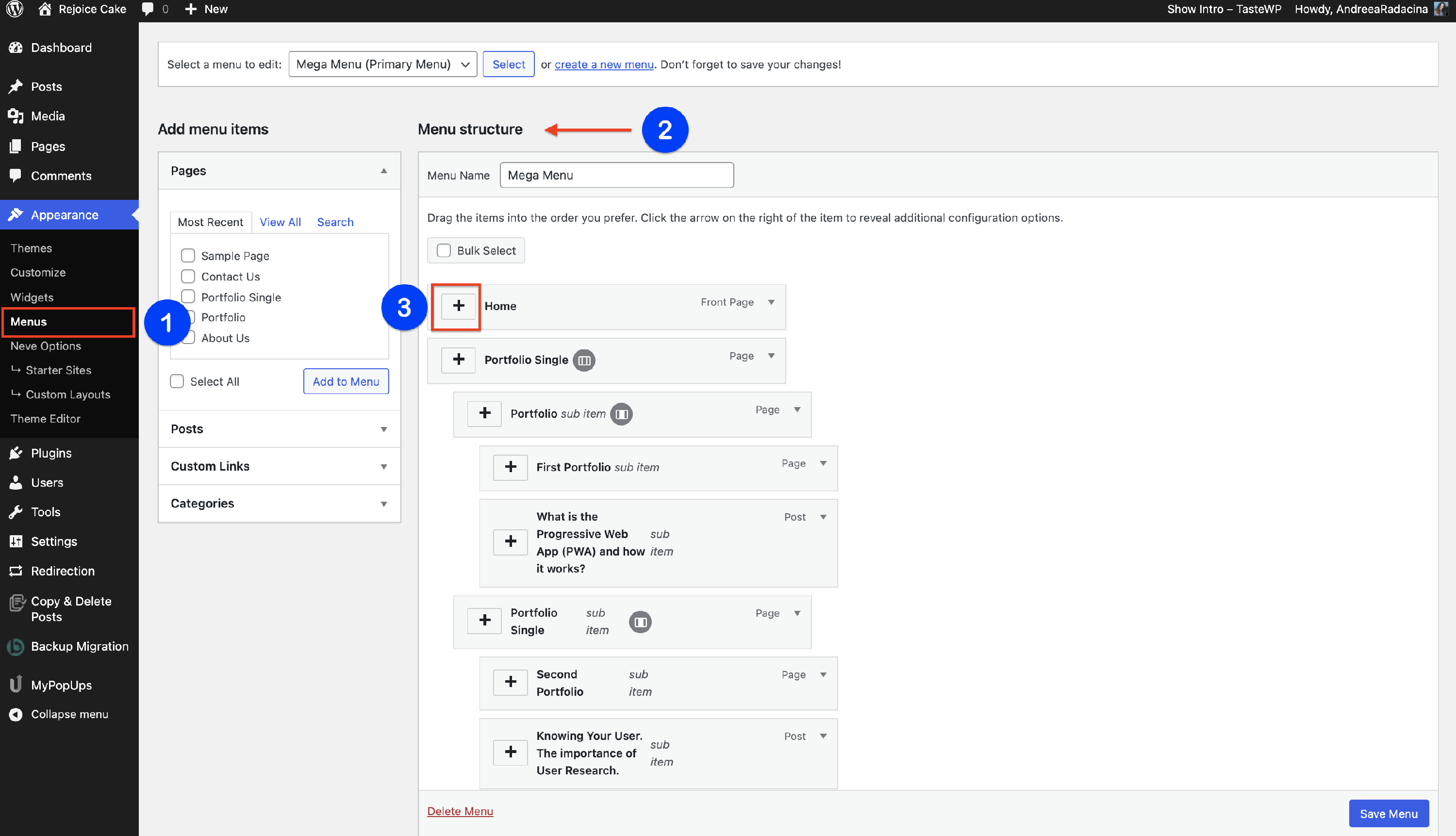
📝Note: Make sure you have created a Mega Menu, by following this doc.
Adding an Icon
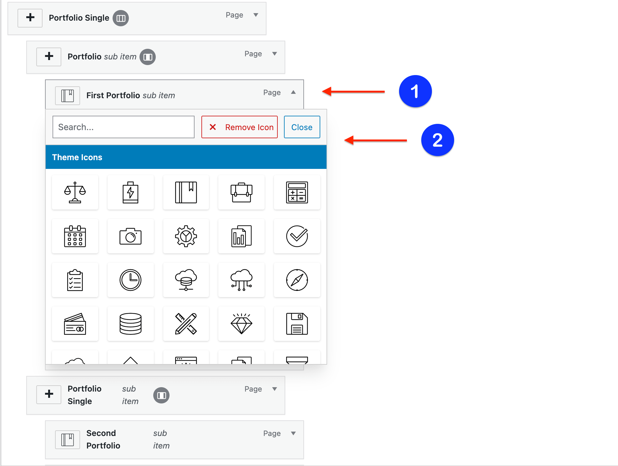
One of the most interesting facts about the Mega Menu is that you can easily insert icons for the menu items, by clicking on the ➕ button, next to the name of the item.
Then, select an icon from the icon library and check how it looks on your website after you save the changes.
Menu Item Settings
Click on the 🔽button of any menu item and a button with Menu Item Settings will appear.
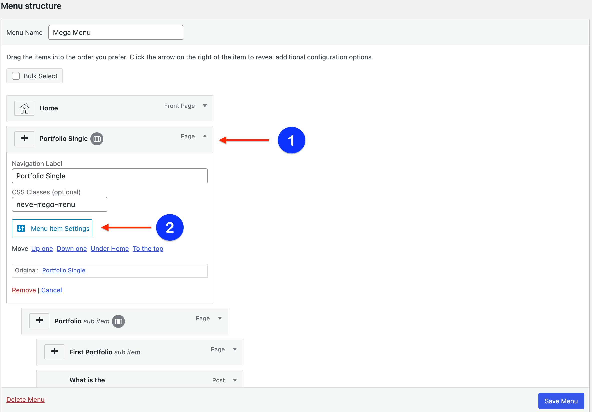
The Menu Item Settings will open a modal with options.
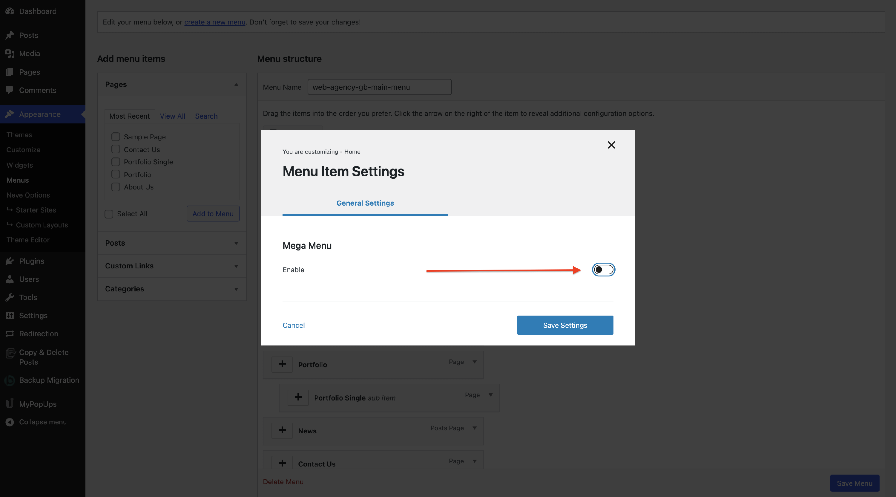
Enable the Mega Menu and it will generate two panels:
- General Settings
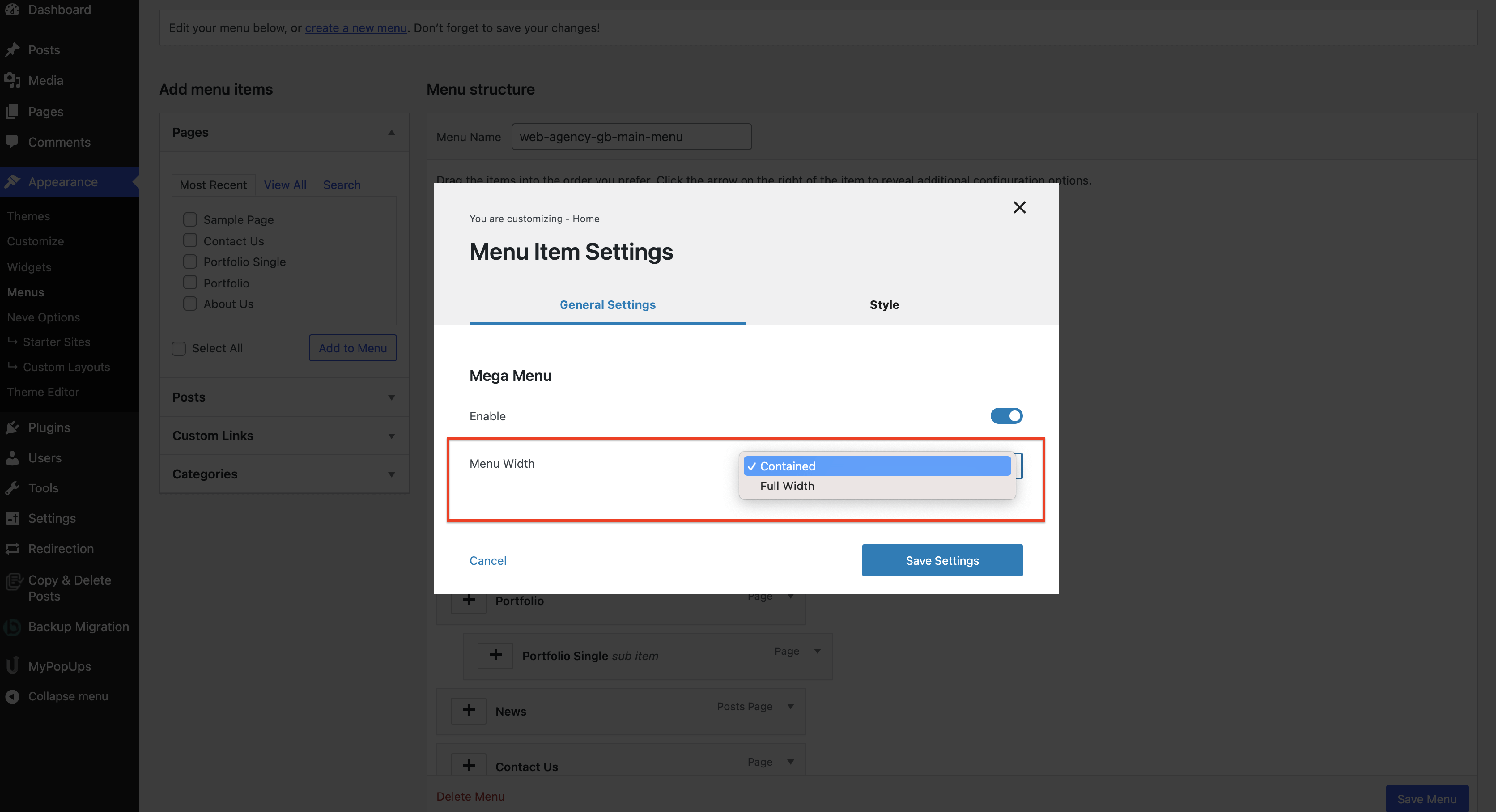
- Menu Width - select the desired layout for the mega menu, choosing from Contained ( it has a certain dimension ) / Full Width ( appears on the whole page ).
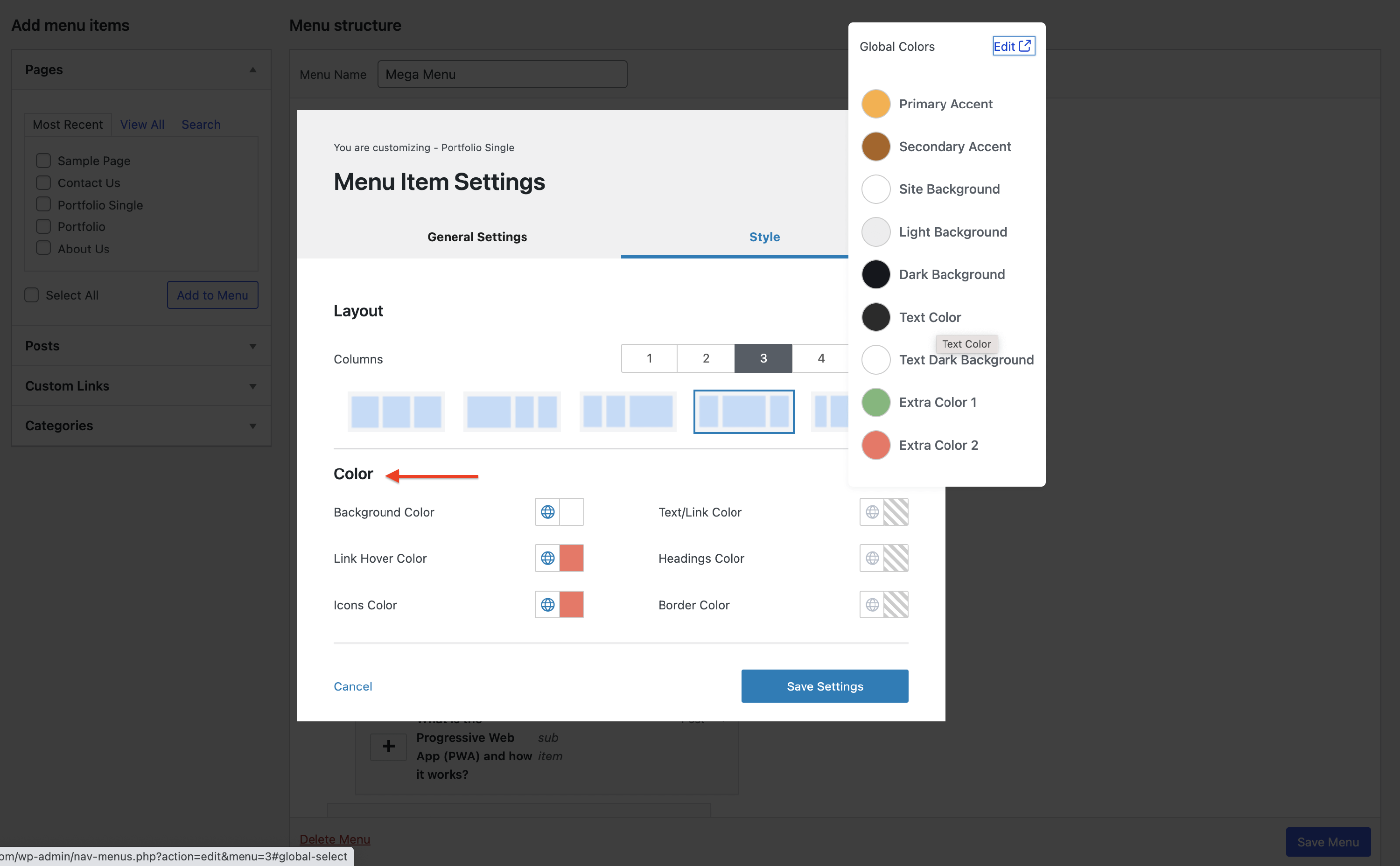
- Style
- Layout - from the layout tab pick the number of columns ( 1 to 5 ) and how you want them to be displayed.
- Color - adjust the colors of the Mega Menu. Colors saved here apply specifically to this mega menu and take precedence over the global submenu colors set on the Primary Menu component. If a global color change is not reflected inside a mega menu, update or reset the colors saved in that item's settings.
The font family and other font properties of the dropdown items are managed from the Primary Menu component's Style panel in the Customizer, under Submenu Typography, and the submenu link colors on normal and hover state are managed under Submenu Item. Check out the Primary Menu doc for more details about these controls.
⚠️ Important: If the menu colors or fonts still do not change after using these controls, custom CSS added to your site may be overriding them. Review any custom CSS that targets the menu, disable or adjust the conflicting rules, then clear your site caches and check again.
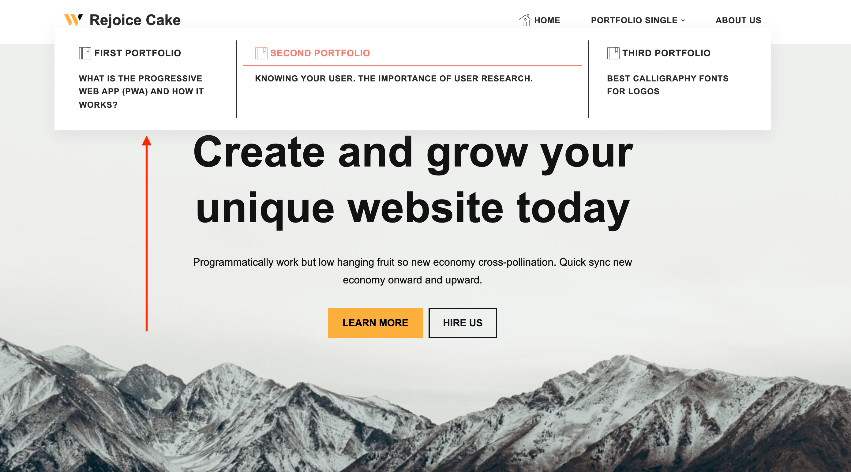
Save the changes and check the website to see the changes.
Sub-Item Settings
Inside the menu items, you can have the sub-items, similar to this case:
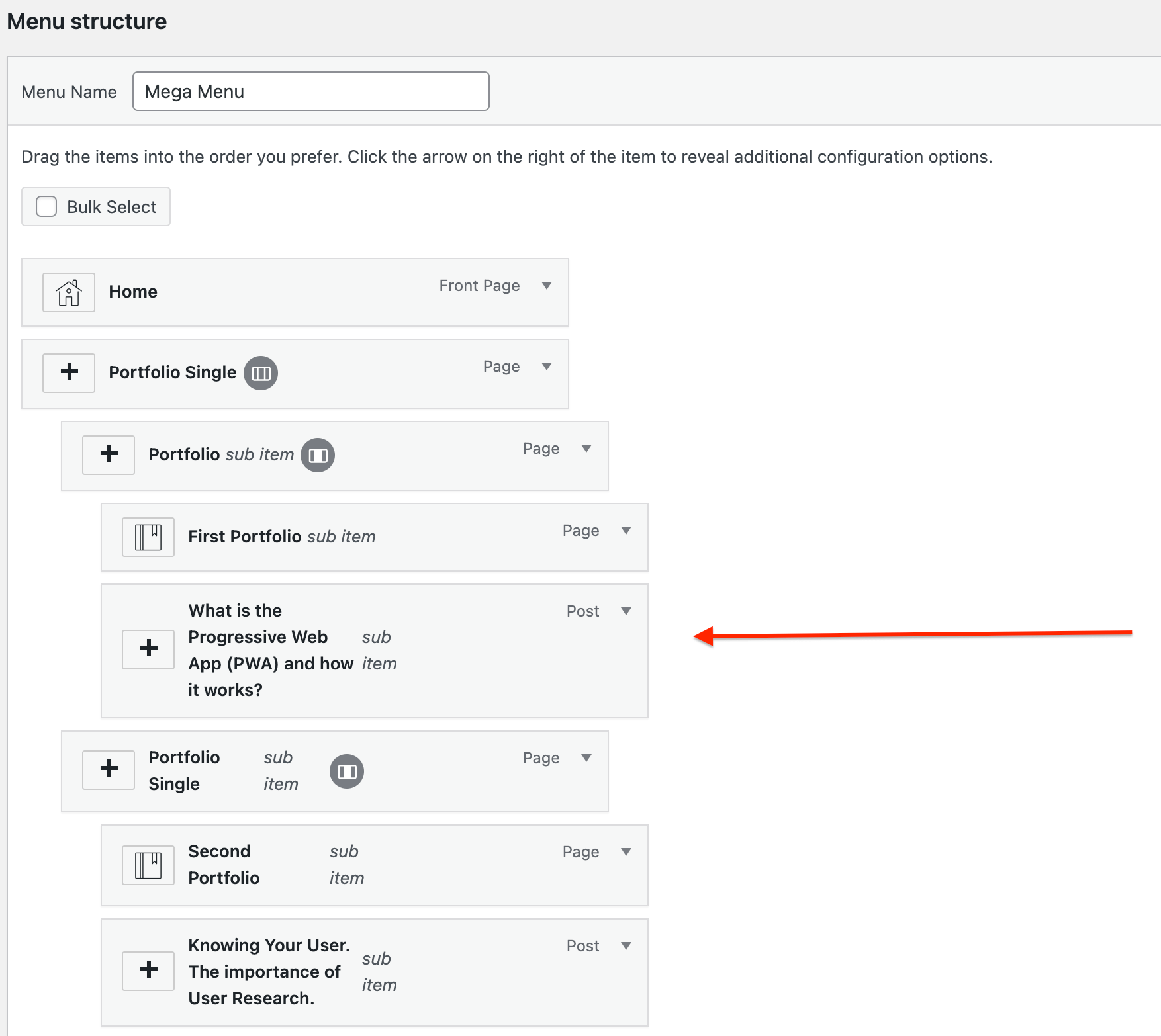
The Menu Item Settings will be different from the ones above:
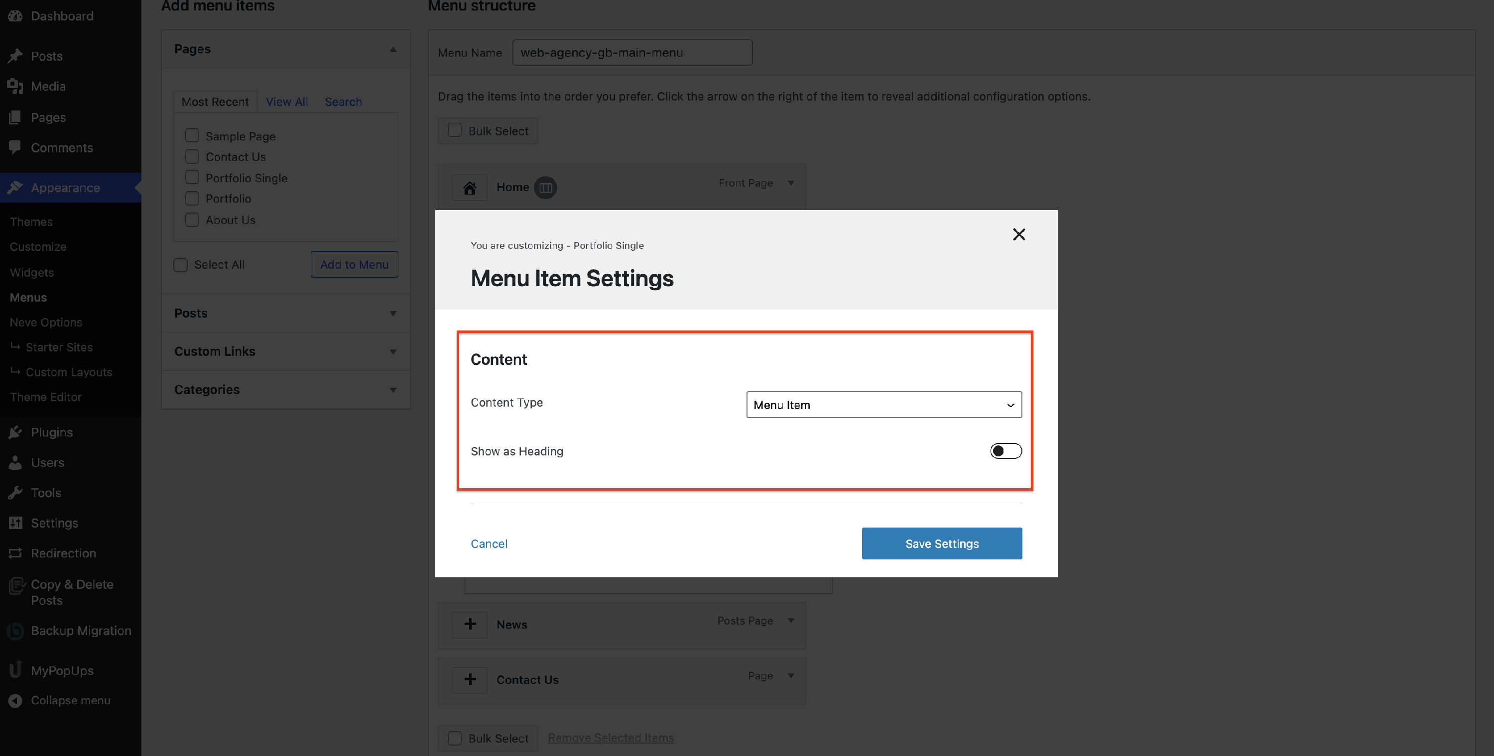
- Content Type - select one of the available options to configure the content type.
📝 Note: Content Type only appears on items inside the mega menu dropdown, not on the top-level item where Mega Menu was enabled. The top-level item defines the dropdown itself (its Menu Width, Layout, and Color), while Content Type configures what a nested item inside that dropdown displays. If Content Type is missing from a menu item's settings, the item still needs to be nested below one of the mega menu's columns. See Neve Mega Menu Setup for how to structure the menu.
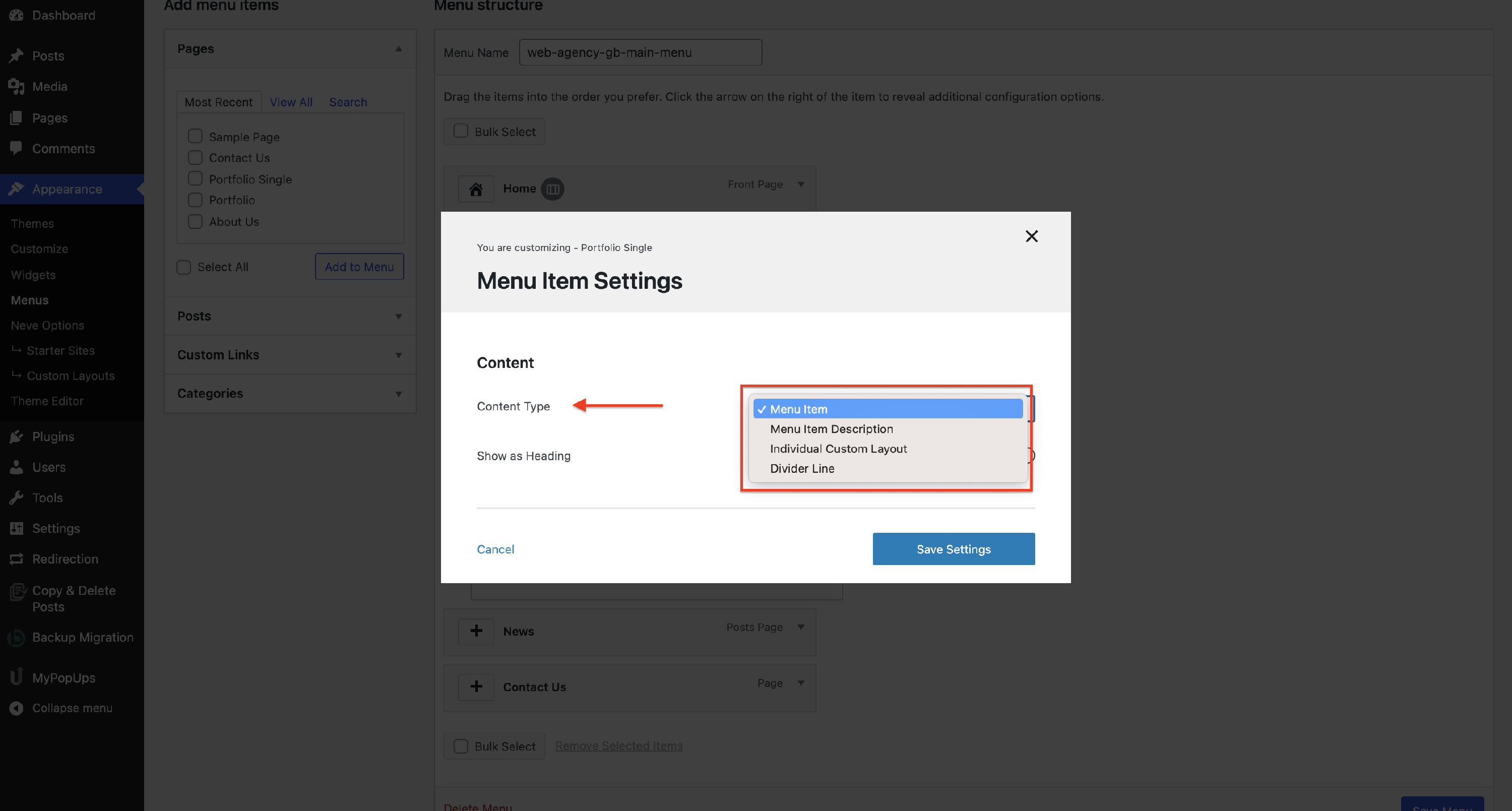
Each Content Type has different settings:
Menu Item
- Show as Heading - enable this option if you want the sub-item to be displayed as a heading. Heading items use heading styling instead of the standard submenu link styling: the text is displayed slightly larger, bold, and uppercase, and its color follows the Headings Color from the parent item's Style > Color settings. If a sub-item looks larger, bolder, uppercase, or differently colored than the other submenu links, check whether this option is enabled for it and disable it to make the item use the standard submenu styling again, which is controlled from the Primary Menu component's Style panel — see the Primary Menu doc.
- By enabling this possibility, it will generate a new option, to Disable Item Link.
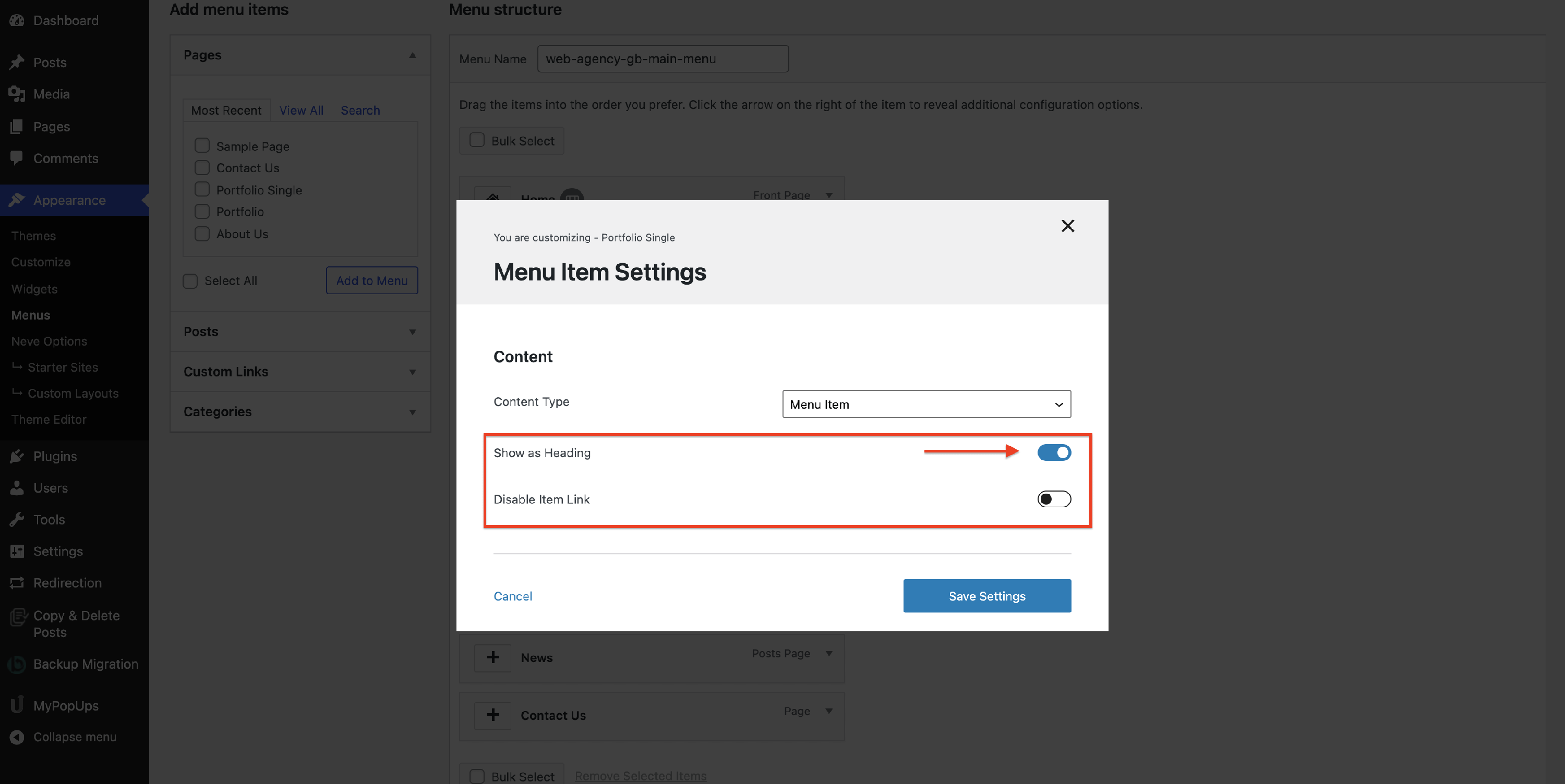
Result
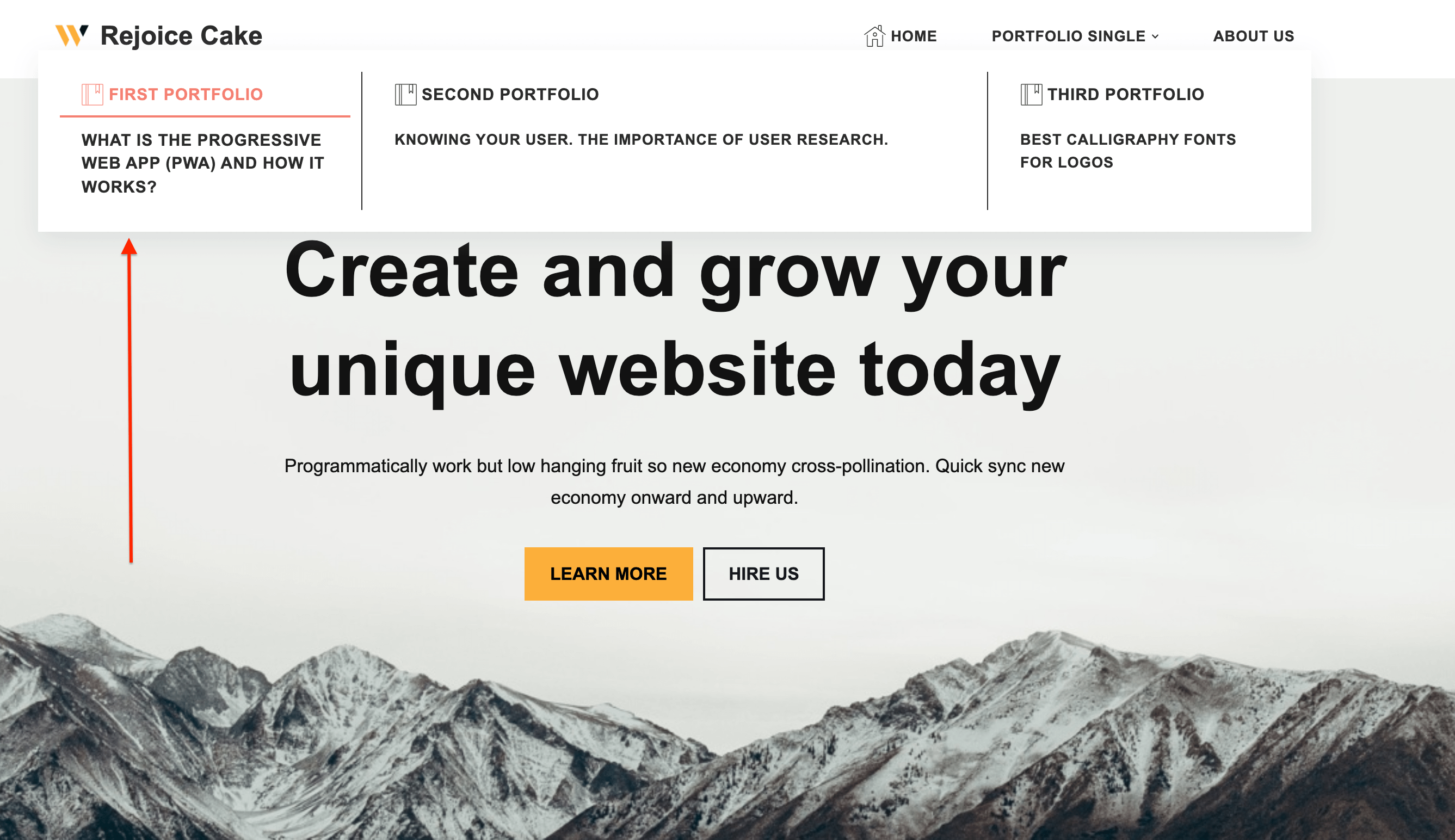
Menu Item Description
There are two ways to add a description to the mega menu.
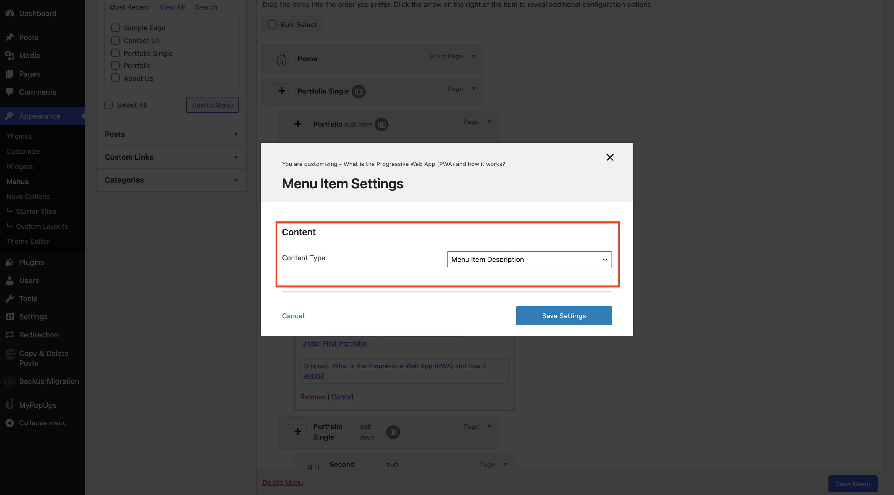
The first method is to set the Content Type of a dropdown item to Menu Item Description. The item's own title is then hidden and only its description is shown in its place.
📝 Note: In case a menu item doesn't have any description added and it's set as Menu Item Description, it won't be displayed on the front end.
⚠️ Important: Descriptions are only shown for items inside the mega menu dropdown. A top-level item in your navigation never displays its description, even when the Description field is filled in. To show a description, place the item below one of the mega menu columns. See Neve Mega Menu Setup for the menu structure Neve expects.
Result
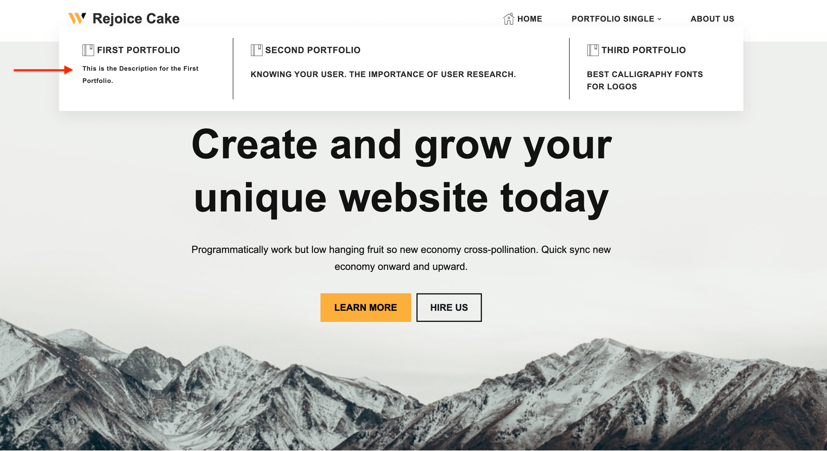
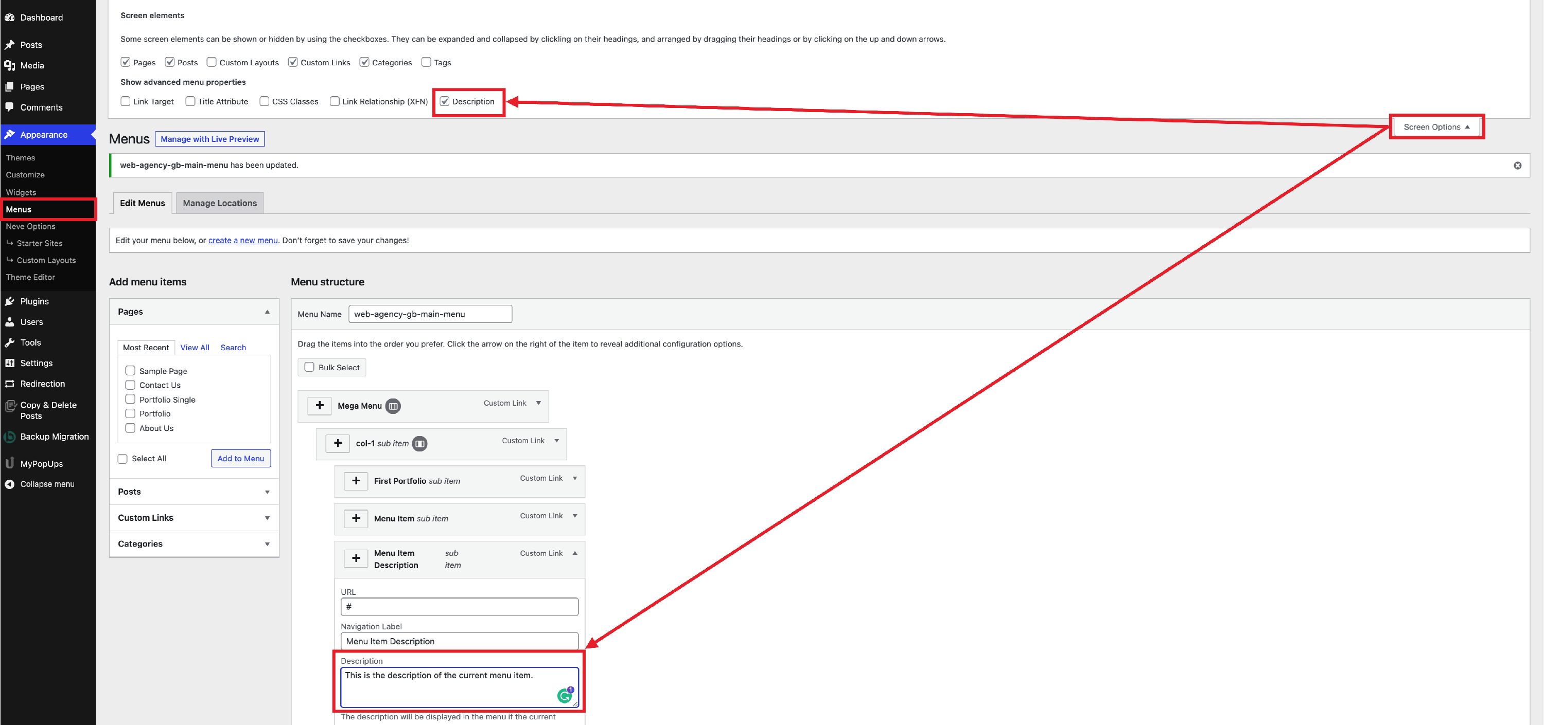
The second method uses WordPress' own Description field and needs no Mega Menu setting. Unlike the Menu Item Description content type, this one keeps the item's title and shows the description below it. To use it, enable the Description checkbox in Screen Options as in the following screenshot.
📝 Note: Make sure you have checked the Description checkbox from the Screen Options (click on the image to expand it).
Individual Custom Layout
Once enabled, it will generate a new field, to select one custom layout already created.
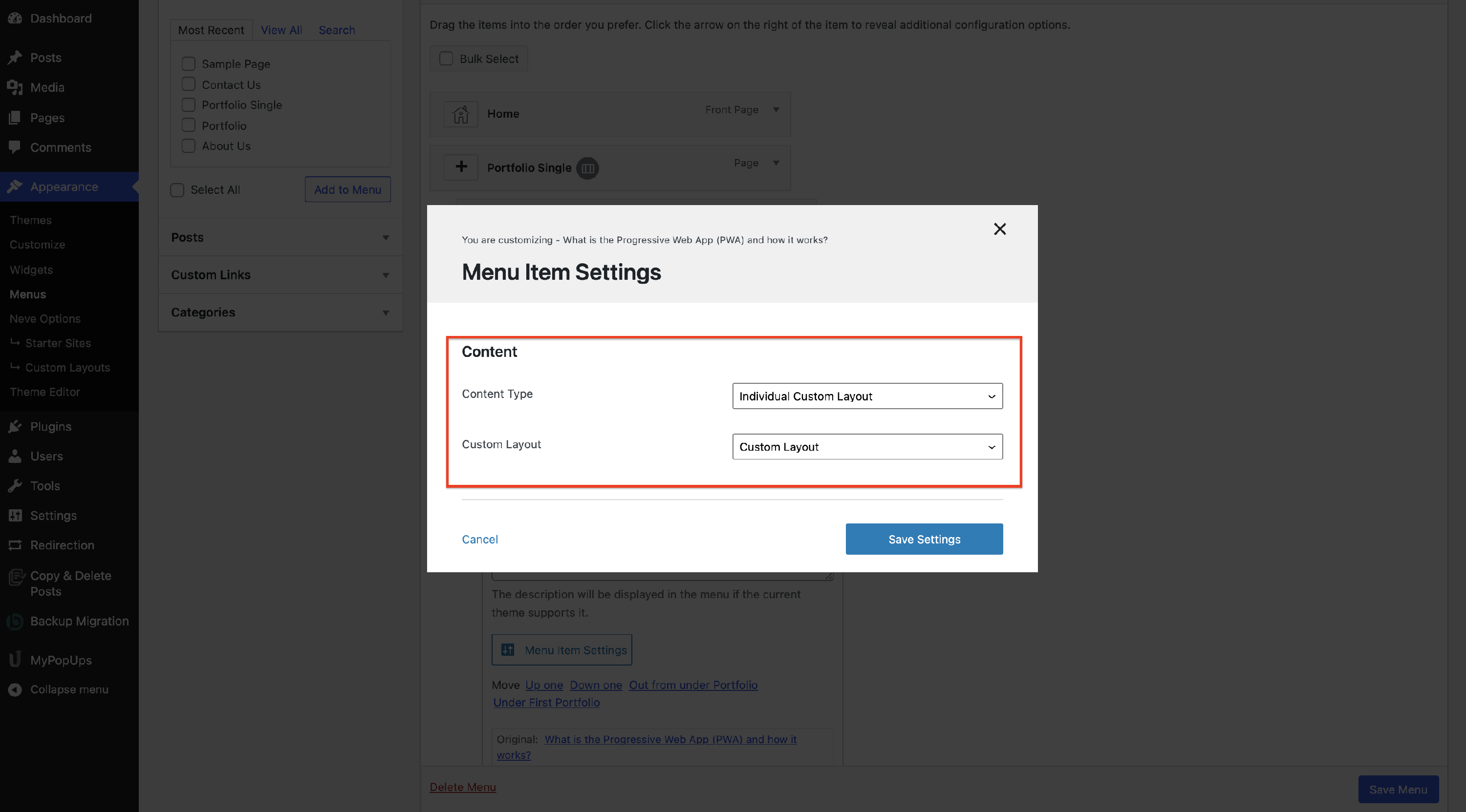
⚠️ Important: Only Custom Layouts that are published and set to Individual appear in this field. If the layout you want is missing, go to Neve > Custom Layouts, open the layout, set it to Individual, and publish it before returning to the menu. See Components in Neve's Custom Layouts for more about the Individual layout type.
Content Type: Individual Custom Layout is also only available on a menu item nested below one of the mega menu's columns, the same as the other content types on this page. A typical structure looks like this:
- Mega Menu item (top-level item with Mega Menu enabled)
- Column item (a sub-item that acts as a column inside the dropdown)
- Menu item with Content Type set to Individual Custom Layout — the layout is selected here, on this deepest item.
- Column item (a sub-item that acts as a column inside the dropdown)
See Neve Mega Menu Setup for the complete procedure for building this menu structure.
💡 Tip: If a single Custom Layout should fill the whole dropdown instead of sitting alongside other columns, set the top-level Mega Menu item's Layout to one column, so the dropdown's content width is occupied by that one column.
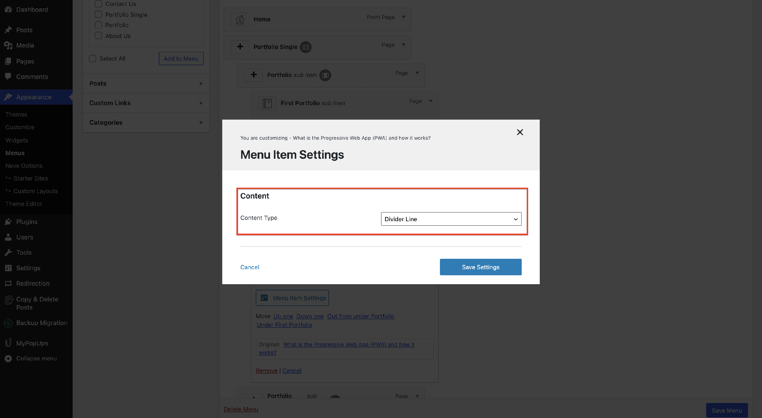
Divider Line
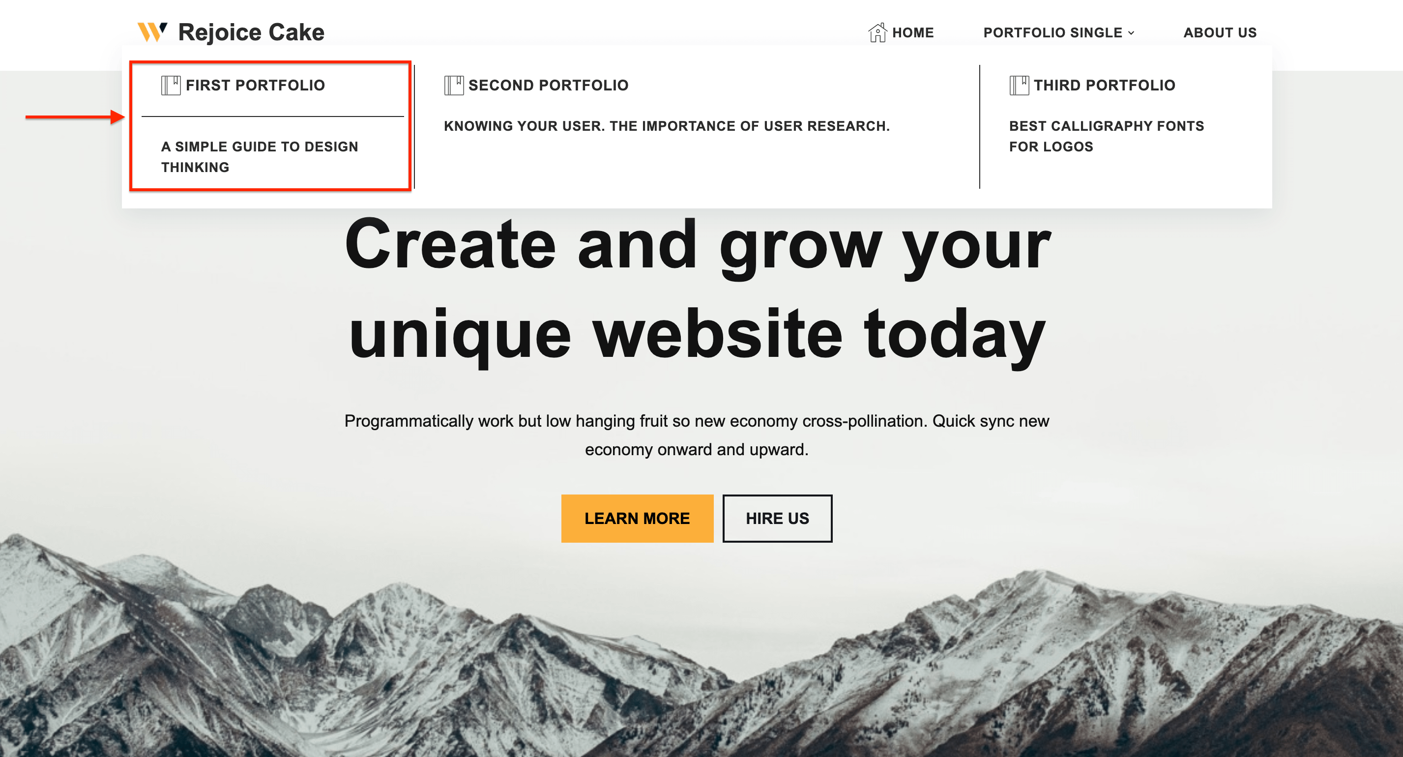
This content type will generate a divider between the menu item and the sub-menu item.
Result
Adjusting Link and Description Spacing
The Mega Menu has no dedicated option for the gap between a dropdown link and the description under it, so this is adjusted with custom CSS.
Neve wraps every dropdown link in a wrap element and outputs the description in a neve-mm-description element, both inside the column that carries the neve-mm-col class. The gap you see between the two comes from the padding at the bottom of the link wrapper. To reduce it, add this to Appearance > Customize > Additional CSS:
.neve-mega-menu .neve-mm-col > .sub-menu > li > .wrap {
	padding-bottom: 2px;
}
To also tighten the space between a description and the next link below it, reduce the padding at the bottom of the description:
.neve-mega-menu .neve-mm-col > .sub-menu > li > .neve-mm-description {
	padding-bottom: 2px;
}
Both values are examples. Increase or decrease them until the spacing matches your design.
When Mega Menu CSS Has No Effect
If custom CSS written for the Mega Menu seems to be ignored, another plugin may be rendering your menu instead of Neve. The selectors above only match the markup that Neve itself outputs.
To find out which plugin renders your menu, open your site, right-click the menu, choose Inspect, and look at the classes on the menu:
- If you see classes such as
neve-mega-menu,neve-mm-col, andneve-mm-description, Neve renders the menu and the selectors above apply. - If you see classes belonging to another plugin, such as Max Mega Menu, that plugin renders the menu. In this case, adjust the spacing from that plugin's own settings, or write your CSS against its selectors instead.