The My Account Component - Neve Header / Footer Builder (PRO)
For more details check out the full Neve documentation and Neve PRO documentation.
📝Note: This component is part of Neve PRO.
The My Account component is accessible only if you have installed and activated the WooCommerce plugin.
In this article
Using the Component
Before adding the component, make sure WooCommerce is configured with one assigned account page:
- WooCommerce must be active, and you should set the account page in WooCommerce > Settings > Advanced > Page setup > My account page.
- WooCommerce uses account endpoints (such as Dashboard, Orders, Addresses, Account details, and Logout) under that single page, so you don't need to create a separate WordPress page for each account area.
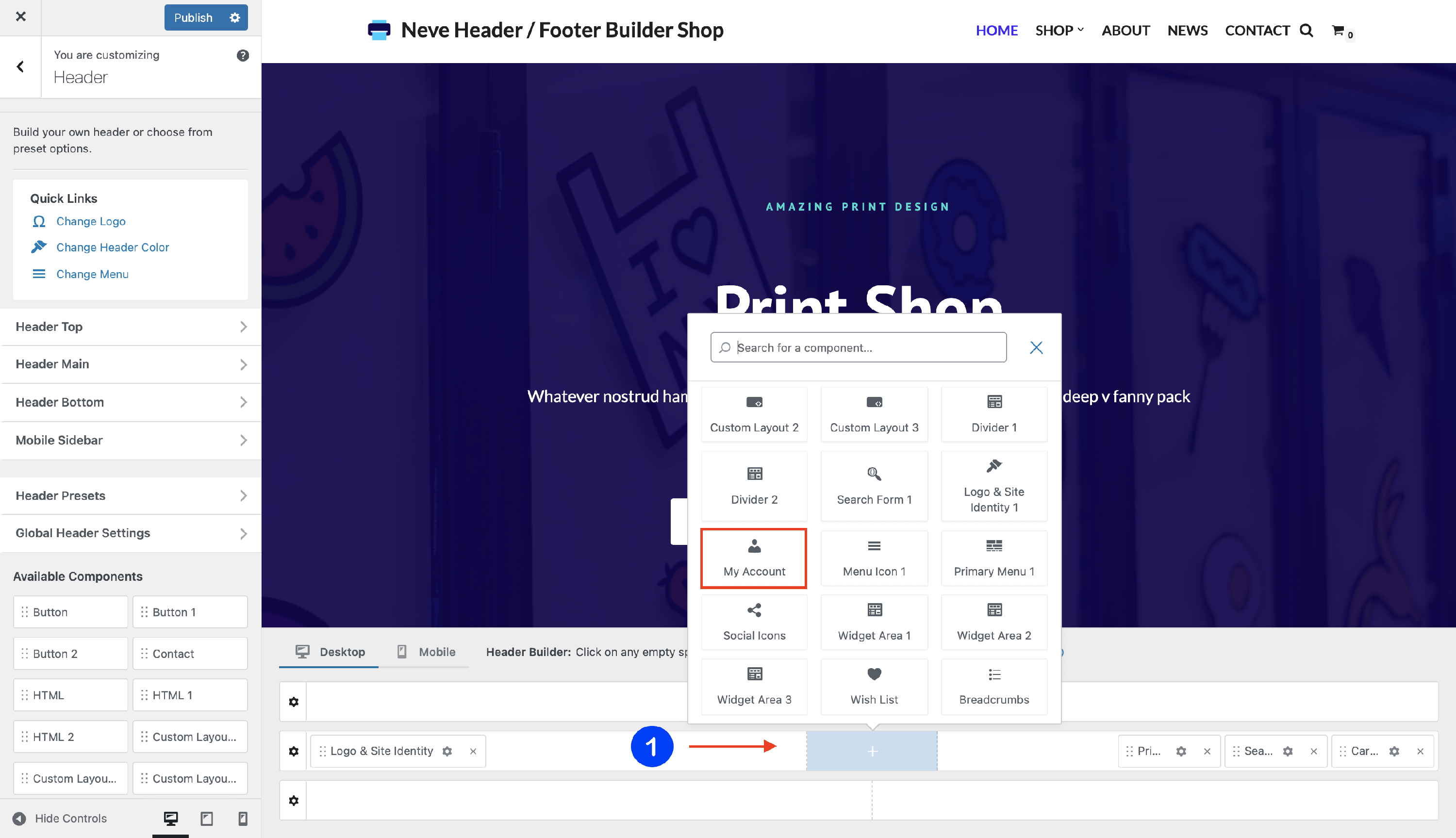
1. Start by adding the component into the rows, by clicking on the ➕ button and selecting the component.
2. Open the component's settings to customize it, by clicking on the ⚙️icon.
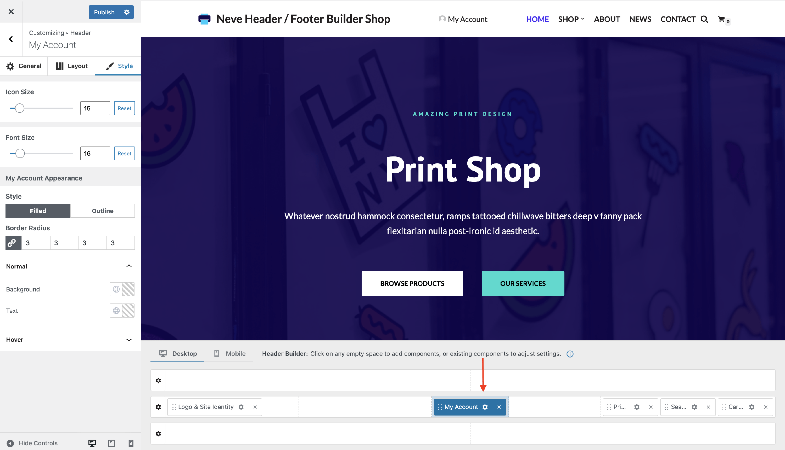
Customizing the Component
There are three panels with customizing options for this component, which allow you to create the desired header / footer:
General Panel
When you click on the ⚙️ icon, the General tab will appear on the left.
- Select Icon - choose to use a different icon from the provided list.
- Under the icons already provided, you will find 2 buttons. By default, it is set to ❌, meaning you only see the established icons. Once you click the other button, it will open an area that allows you to add custom SVG code.
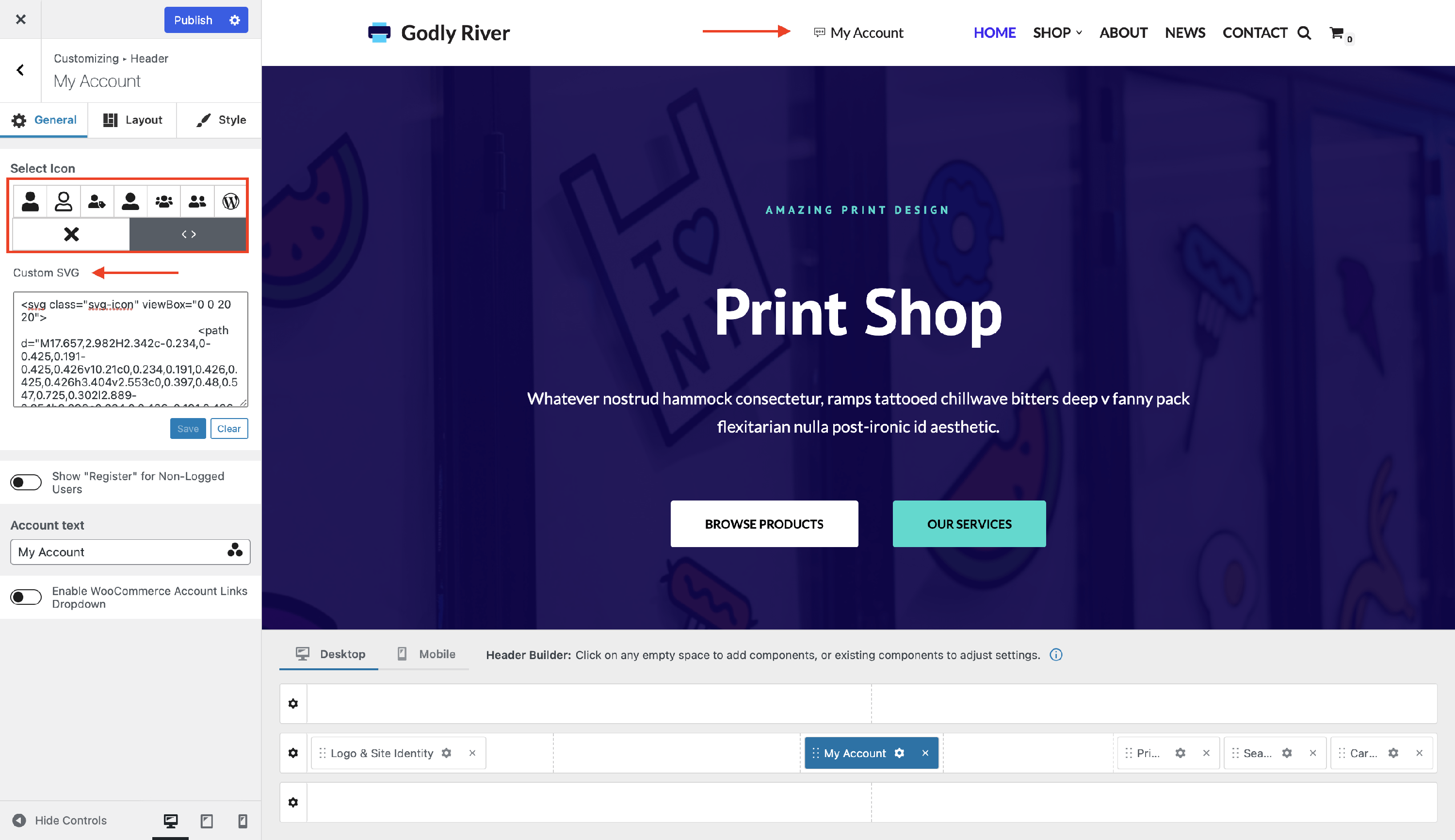
📝 Note: The icon will be visible only after you click on the Save button.
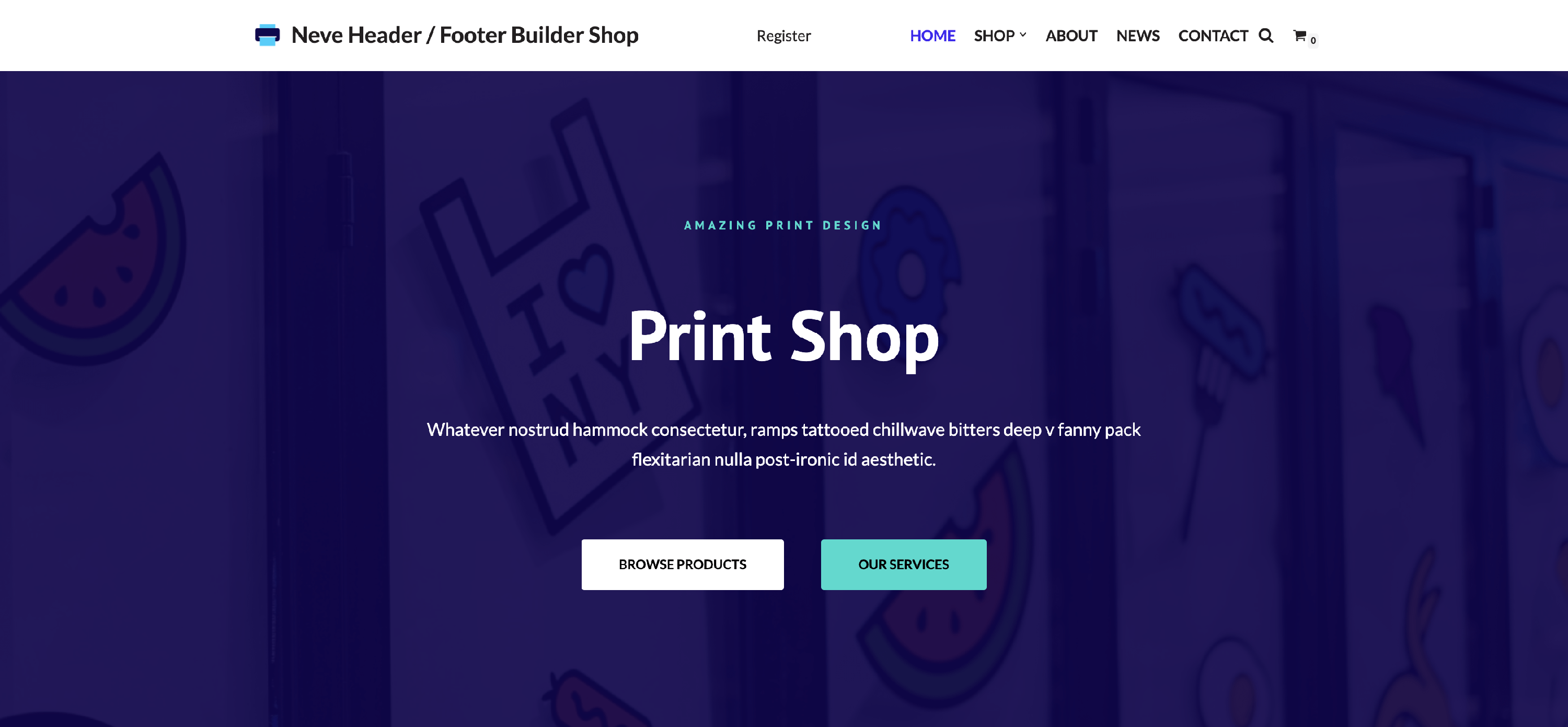
- Show "Register" for Non-Logged Users - if this option is enabled, when a not logged-in user visits the site, they will see a "Register" message (that can be changed from the Register label option) instead of the My Account icon.
- This controls how the My Account component appears in the header/footer for logged-out users. To let visitors actually create accounts, WooCommerce registration must also be enabled (in WooCommerce > Settings > Accounts & Privacy, under Account creation, enable On "My account" page).
- You can customize the Register label and
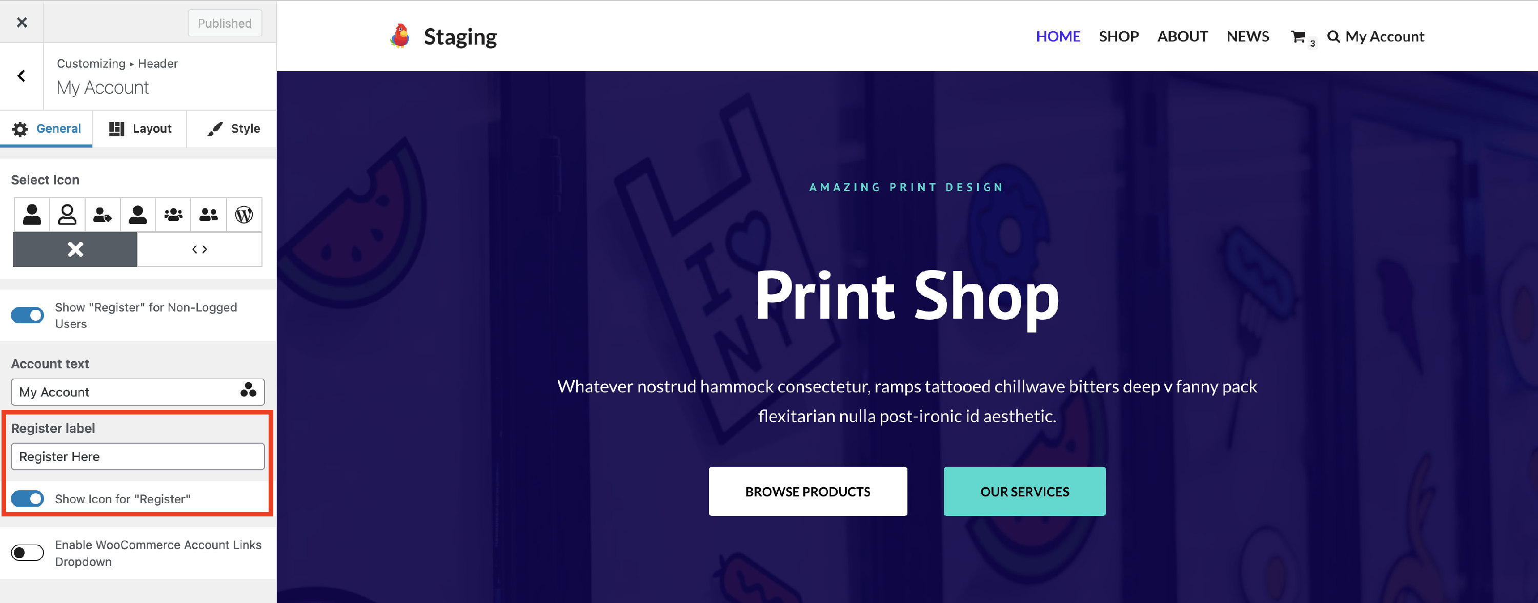 show an icon by enabling the specific option. If you leave the register label empty, only the icon will be shown.
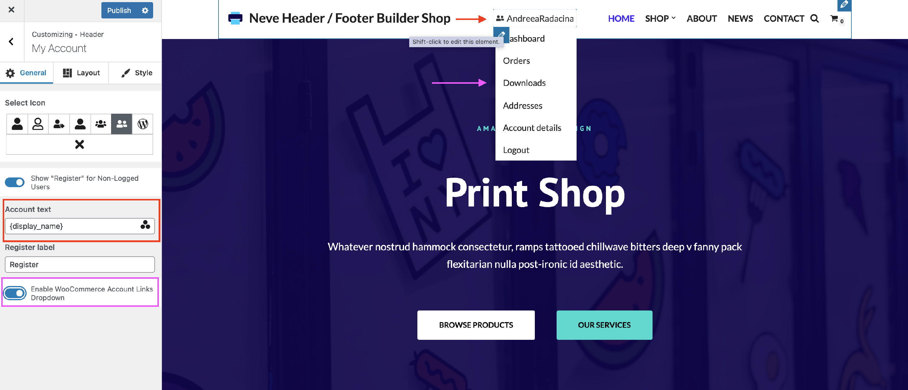
- Account text - a piece of text that will display just after the account icon. If you want to display a dynamic value like the logged-in user's name you can use Dynamic Tags.
- To get access to the Dynamic Tags click on the three dots shaped like a triangle from the Account text label input.
- Enable WooCommerce Account Links Dropdown - if this option is enabled, on hovering over the account icon, a dropdown menu will open with links for the following pages: Dashboard, Orders, Downloads, Addresses, Account details, and Logout.
- These links are generated from WooCommerce account endpoints attached to the assigned My account page. You don't need to add those destinations as separate header menu items.
Layout Panel
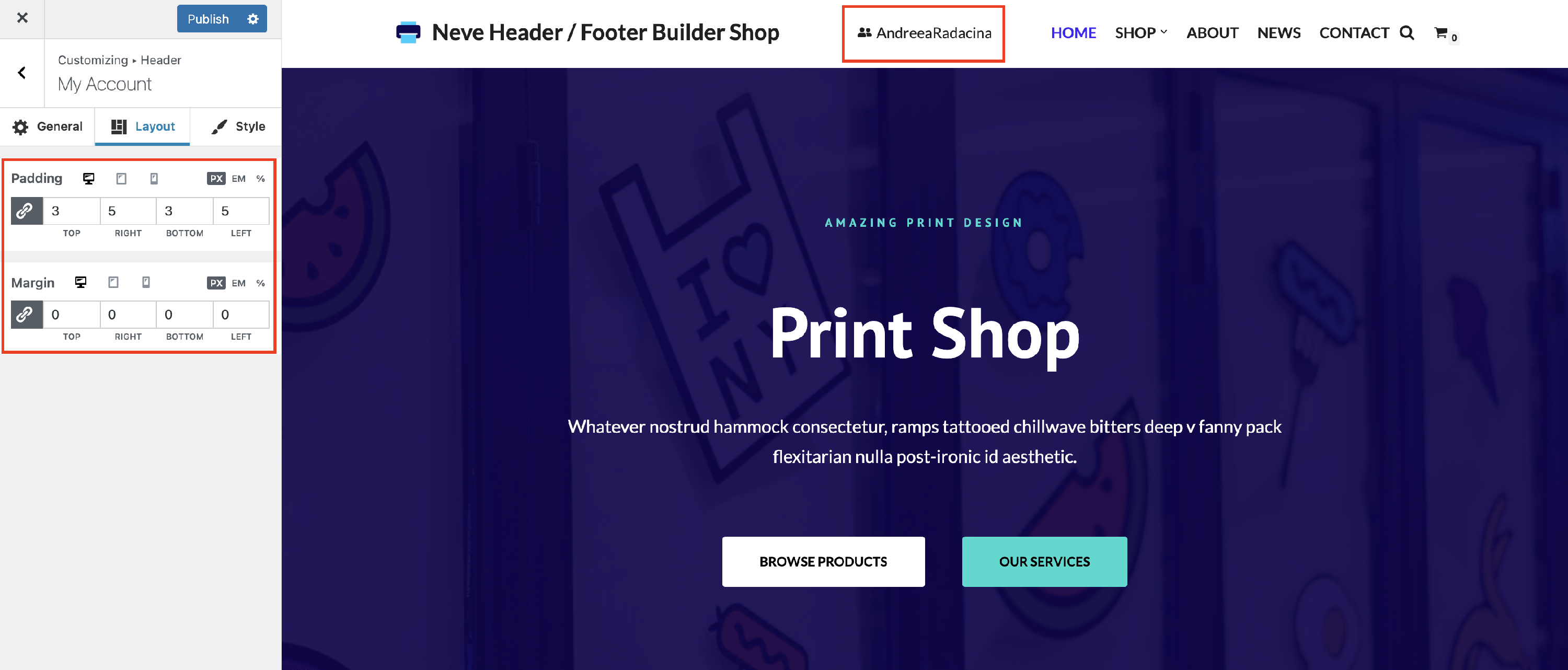
The layout options allow the following adjustments:
- Padding and Margin - available in PX, EM, REM, and %, with a link button that helps establish the same dimension for all the directions ( Desktop | Tablet | Mobile ).
Style Panel
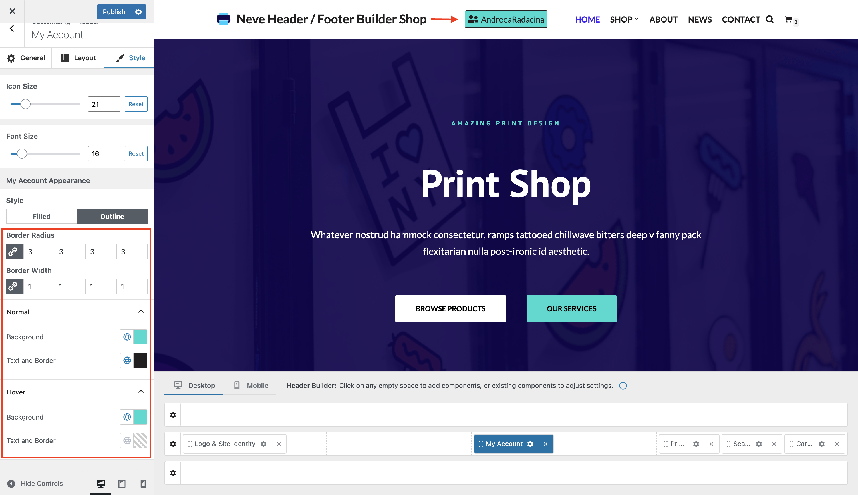
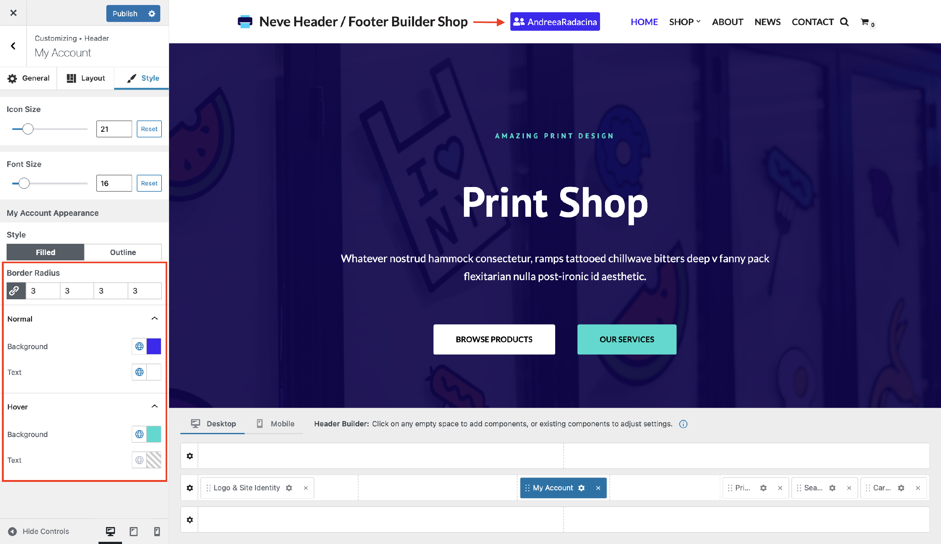
Styling for the My Account component includes:
- Font Size - adjust the size of the label, to suit your needs.
- Icon Size - modify the size of the icon or undo the changes with the reset button.
You can choose between two styles for the My Account icon:
- Filled - with color options for normal and hover mode, and also with border radius adjustments.
- Outline - with color options for normal and hover mode, and also with border radius and border width adjustments.