The Advanced Search Icon Component - Neve Header / Footer Builder
The Advanced Search Icon component is a Neve PRO Header / Footer Builder element that adds a clickable search icon to your header or footer, expanding into a search field when activated. It is available only with Neve PRO and requires a compatible translation or search plugin for full functionality.
For more details check out the full Neve documentation and Neve PRO documentation.
📝Note: This component is part of just Neve PRO.
In this article
Using the Component
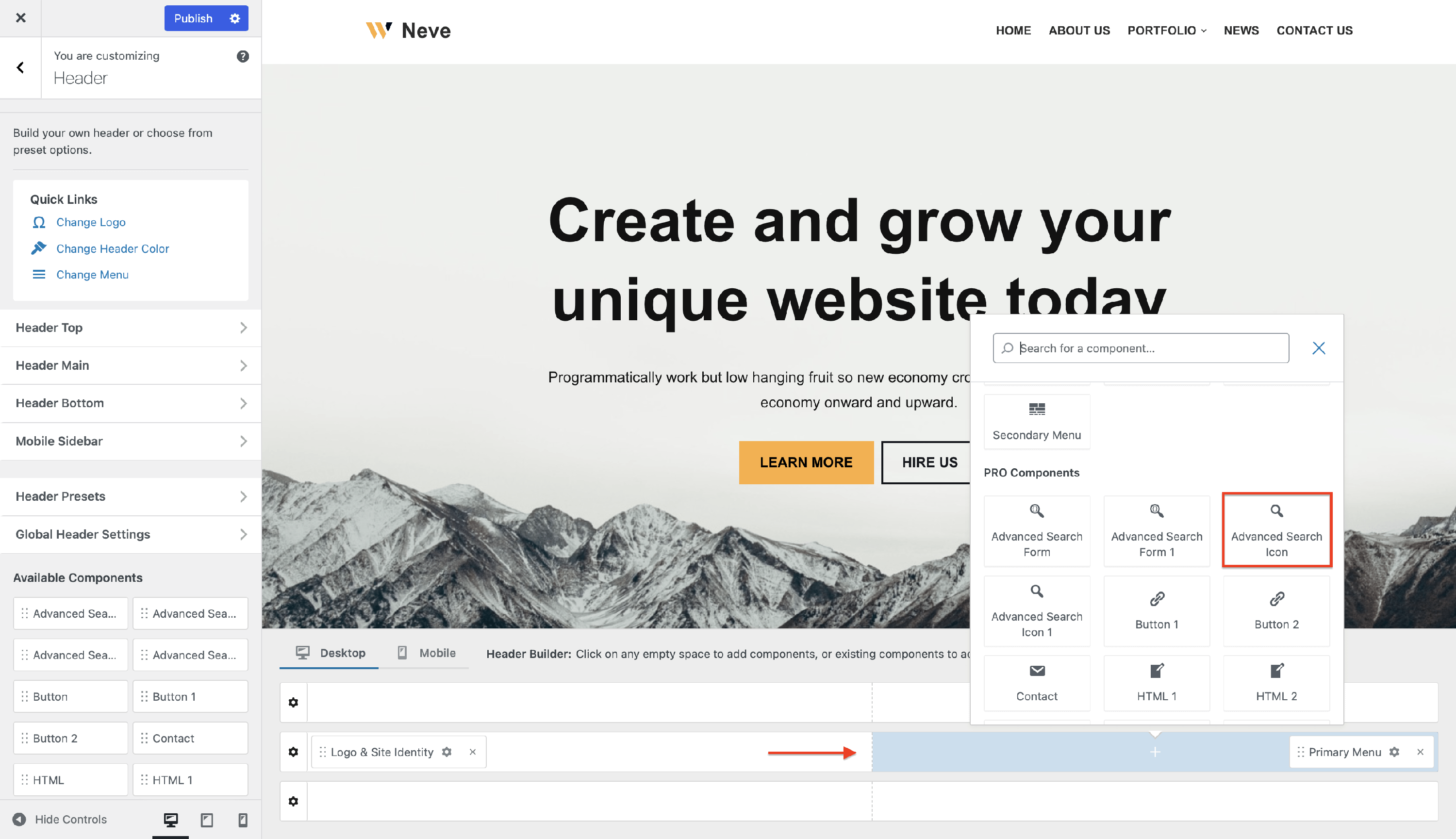
1. Start by adding the component into the rows, by clicking on the ➕ button and selecting the component.
2. Open the component's settings to customize it by clicking on the ⚙️ icon.
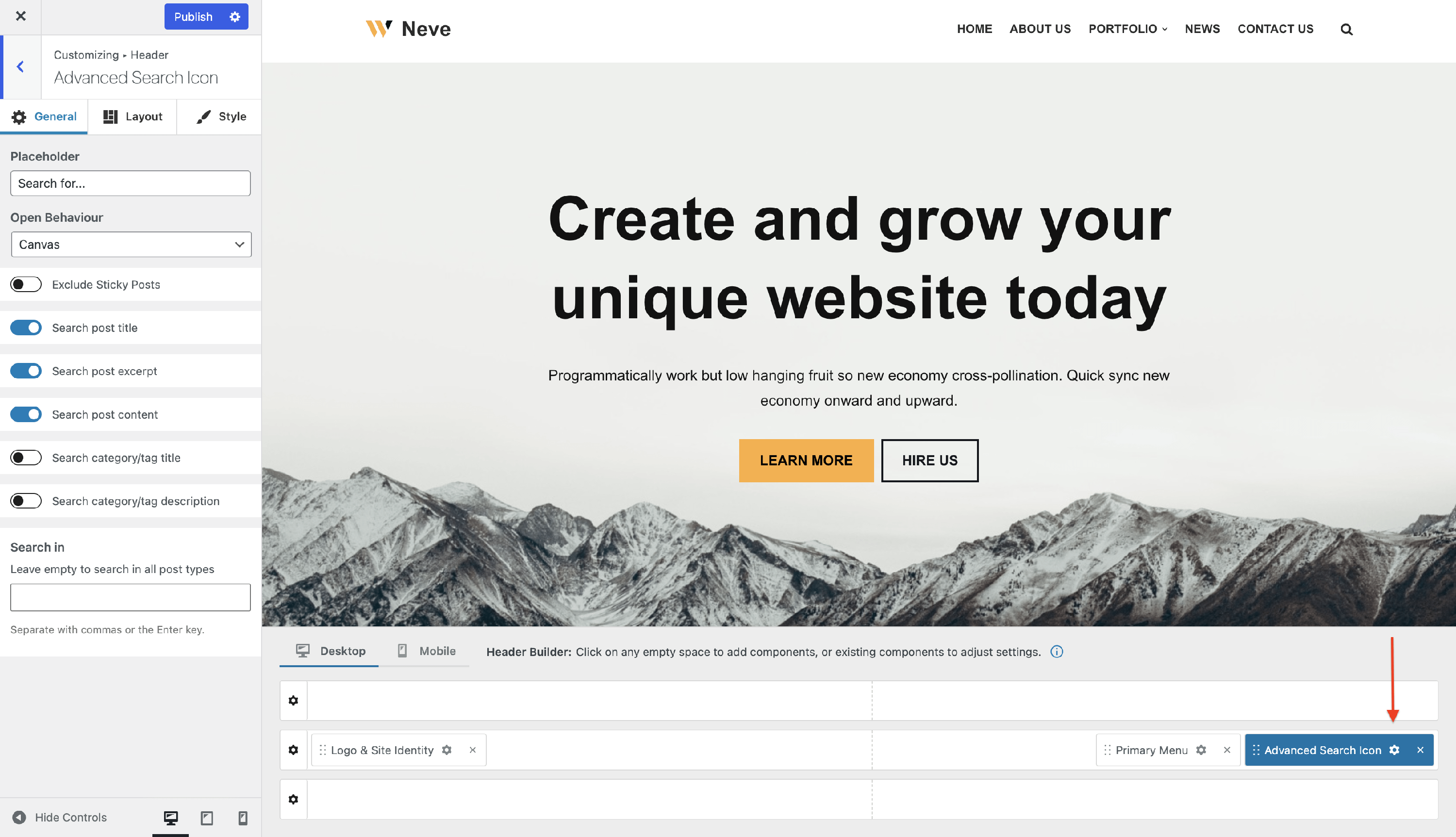
📝 Note: This component has two available instances: Advanced Search Icon and Advanced Search Icon 1.
Customizing the Component
There are three panels with customizing options for this component, which allow you to create the desired header / footer:
General Panel
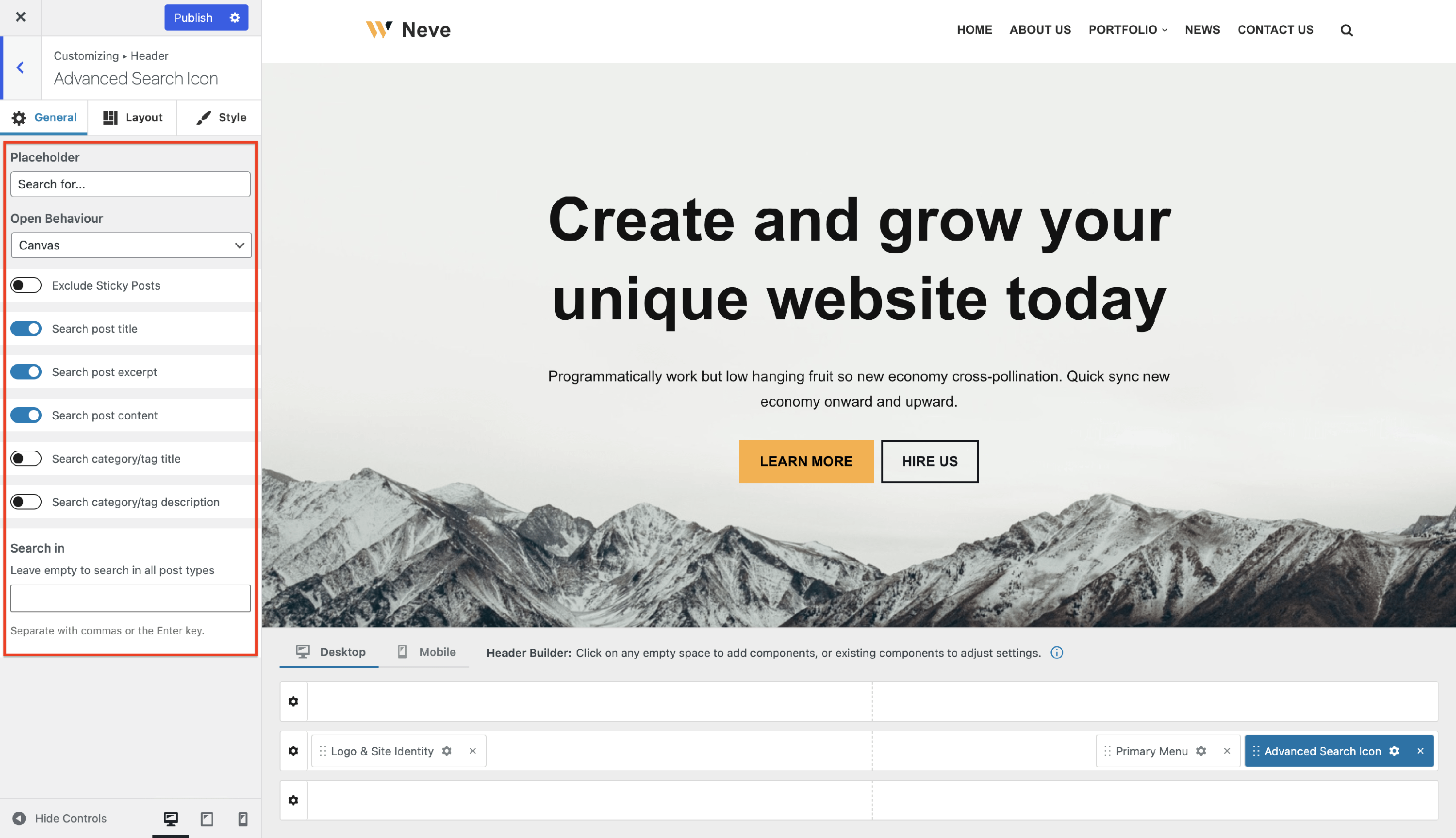
Placeholder - this option allows the user to add the desired text that will appear on the blank field of the Search Icon:
Open Behavior - there are three options available for the open behavior of the Search Icon: Minimal, Float Above Header, Canvas.
Exclude Sticky Posts - these are the posts that appear at the top of your blog page if you have previously set them.
Search options - extend the search through your website to post title, post excerpt, post content, category / tag title or description, by enabling any of these options from the tab. You can also restrict the search area to specific post types by picking them from the list.
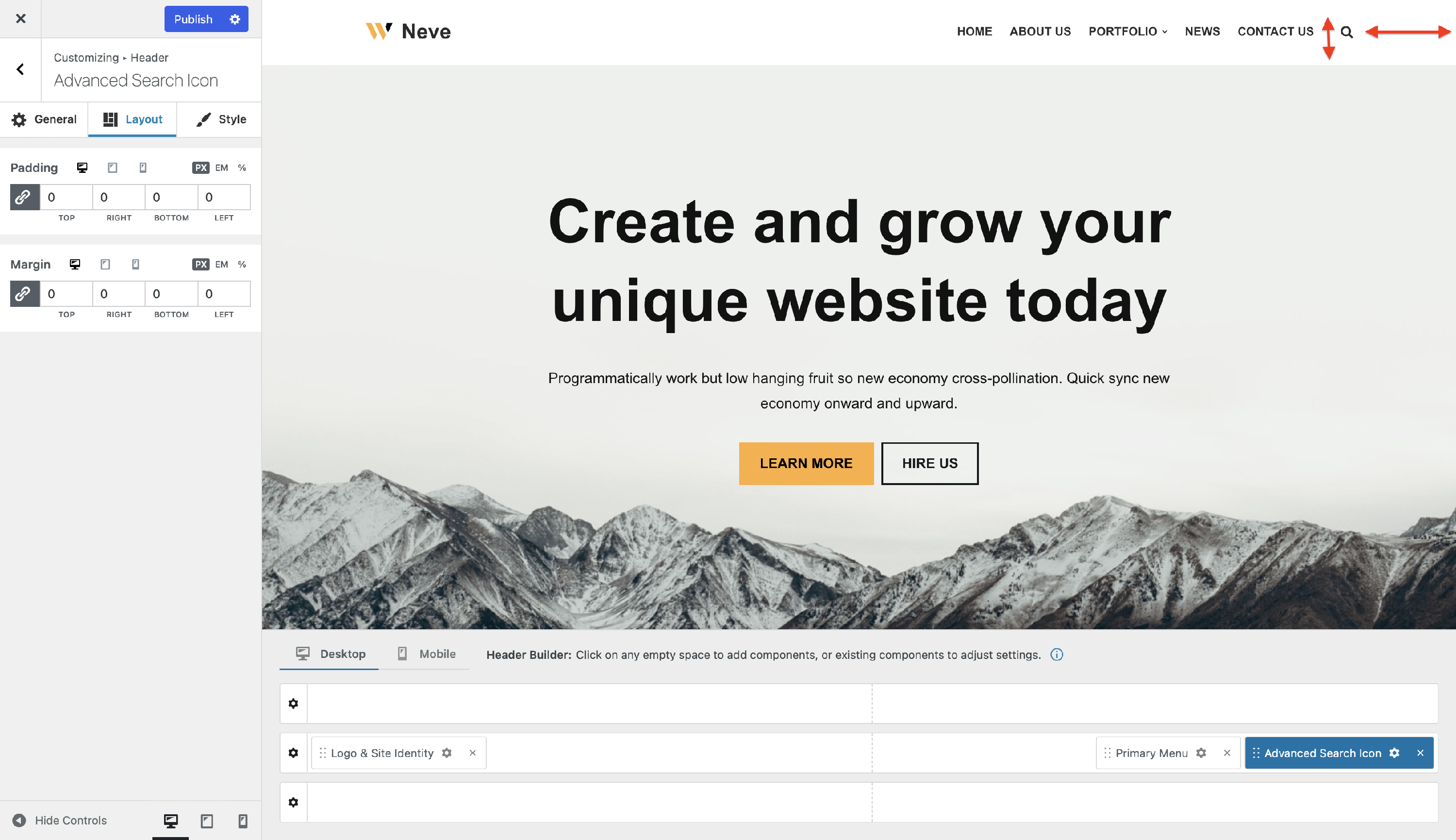
Layout Panel
In the Layout tab, you also have access to advanced positioning options like Padding and Margin, available in PX, EM, REM, and %, with a link button that helps establish the same dimension for all the directions ( Desktop | Tablet | Mobile ).
Style Panel
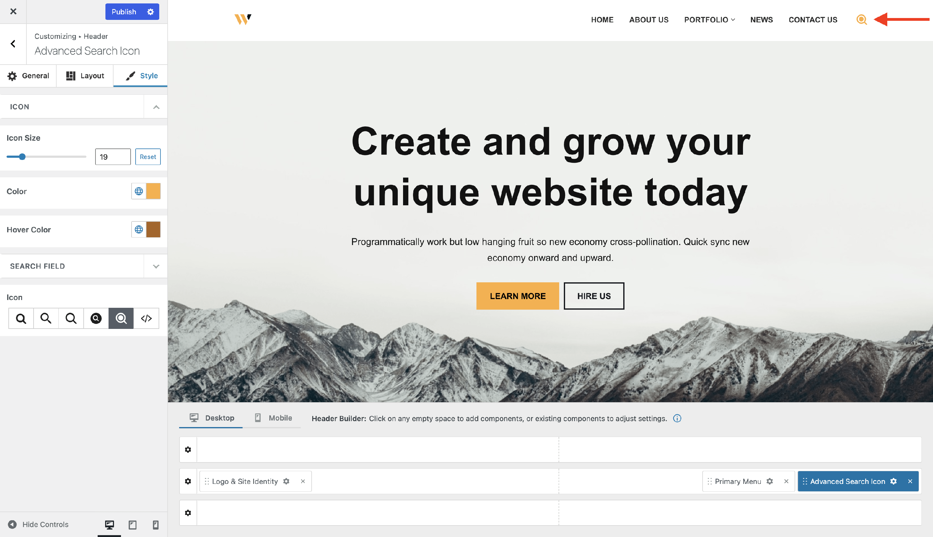
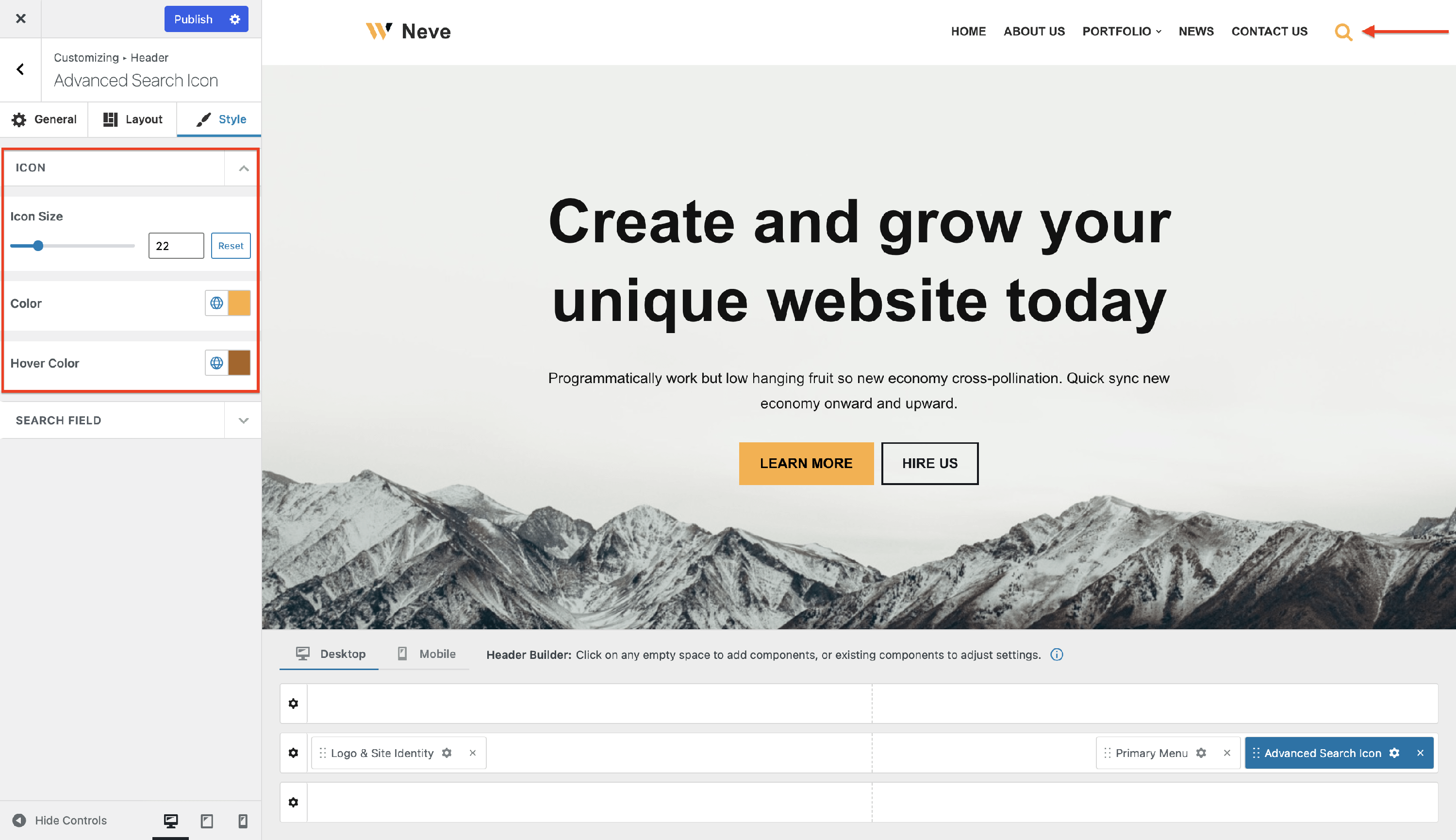
Icon - in this area you will find options that will be applied only to the search icon:
- Icon Size - sets the size of the 🔍, and it has a reset button, to undo the changes
- Color - sets the color of the 🔍 and you can choose one of the global colors ( theme's default colors ), by clicking on the 🌐 button.
- Hover Color - sets the color of the 🔍 when you hover with the mouse, and you can choose one of the global colors ( theme's default colors ), by clicking on the 🌐 button.
Search Field - in this area, you will find options that will be applied to the field that appears after clicking on the search icon:
- Height - sets the height of the search field (in PX, EM, or REM), with a reset button ( Desktop | Tablet | Mobile ).
- Font Size - sets the size of the text that appears as placeholder (in PX, EM, or REM), with a reset button ( Desktop | Tablet | Mobile ).
- Border Width - sets the width of the border (in PX), having the link option, to change the values at the same time ( Desktop | Tablet | Mobile ).
- Border Radius - rounds the corners of the field (in PX), and has the link option, to change the values at the same time.
- Background color - sets the color of the search field, and you can choose one of the global colors ( theme's default colors ), by clicking on the 🌐 button.
- 📝__Note: You can boost the component's appearance by using the Gradient option that can be accessed from the background color tab.
- Text and Border - sets the color of the text inside the field and border, and you can choose one of the global colors ( theme's default colors ), by clicking on the 🌐 button.
- Icon - in this area you can change the appearance of the icon by selecting a predefined one or by adding a custom SVG code: