The Footer Menu Component - Neve Header / Footer Builder
📝Note: This component is part of the Neve Header / Footer Builder.
The Footer Menu component is helping the user to easily access some important locations of your website.
Using the Component
1. Start by adding the component into the rows, by clicking on the ➕ button and selecting the component.
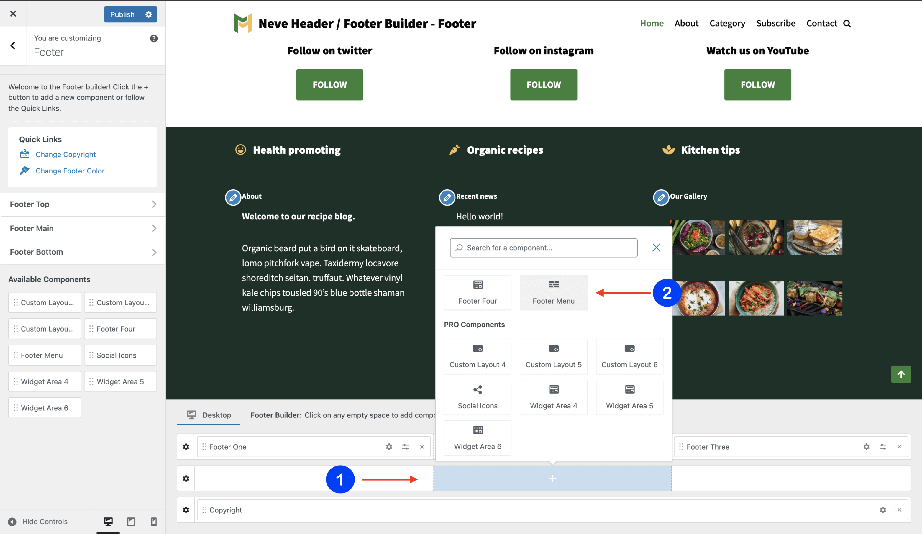
2. Open the component's settings to customize it, by clicking on the ⚙️icon.
Customizing the Component
There are three panels with customizing options for this component, which allow you to create the desired header / footer:
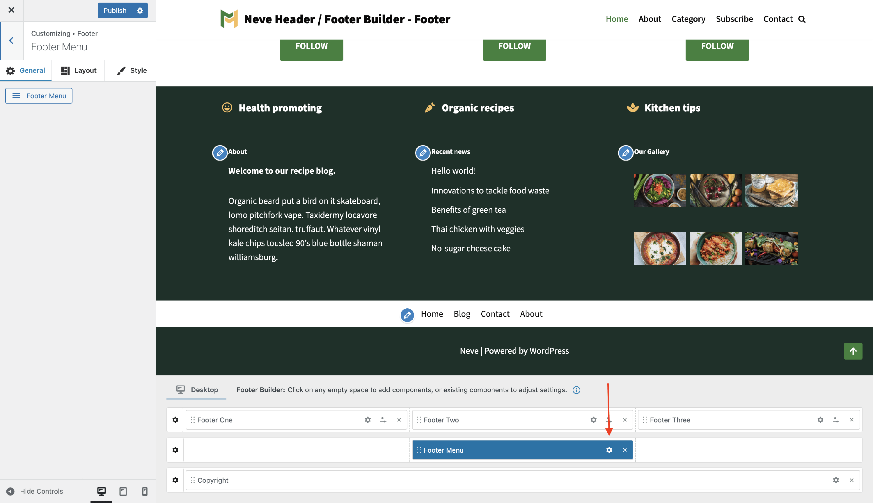
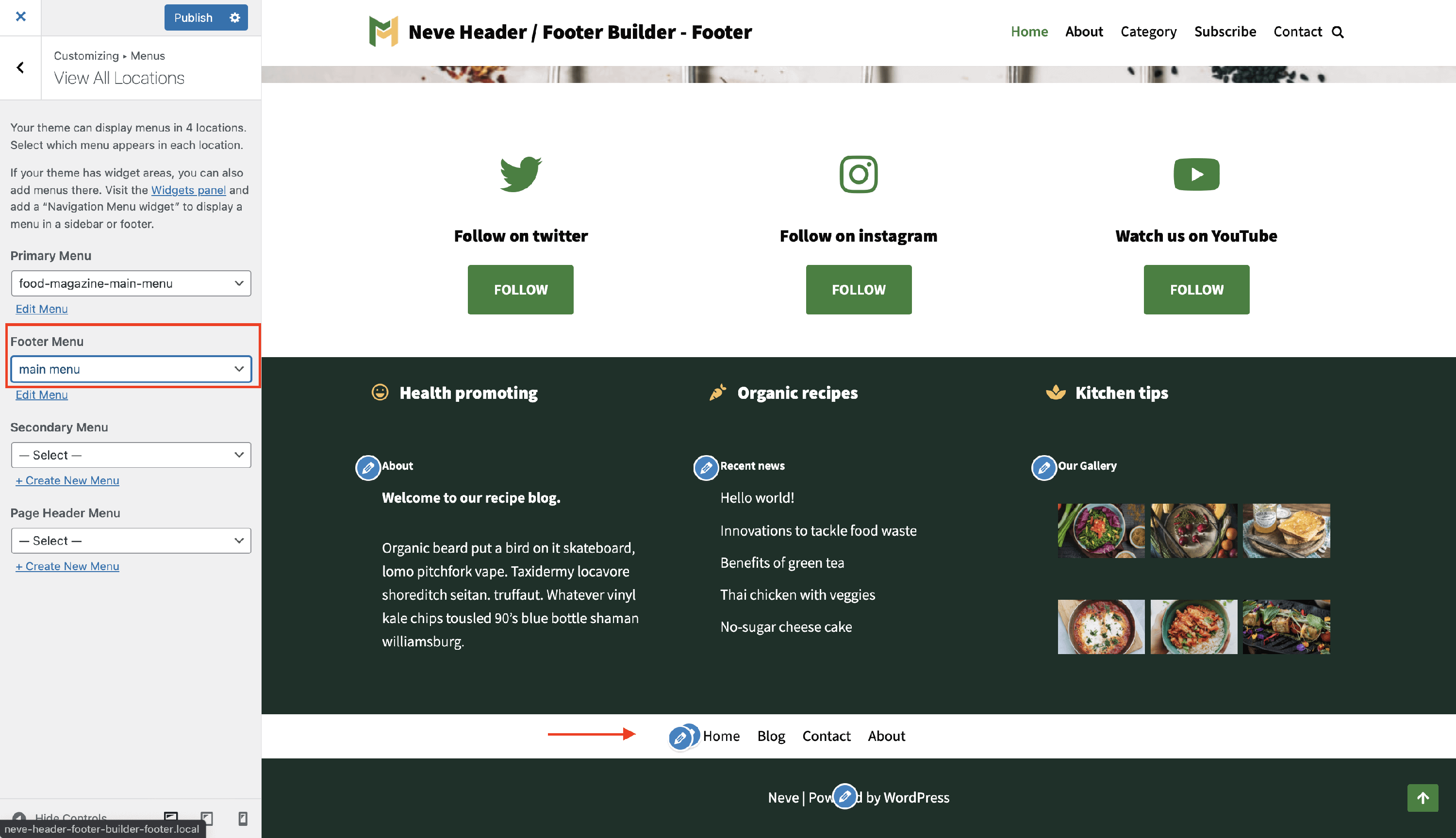
General Panel
When you click on the ⚙️ icon, the General tab will appear on the left side.
- create your Footer Menu - you will be directed to the Menus location in Customizer, where you can create / edit a new menu and assign it as a Footer Menu.
Layout Panel
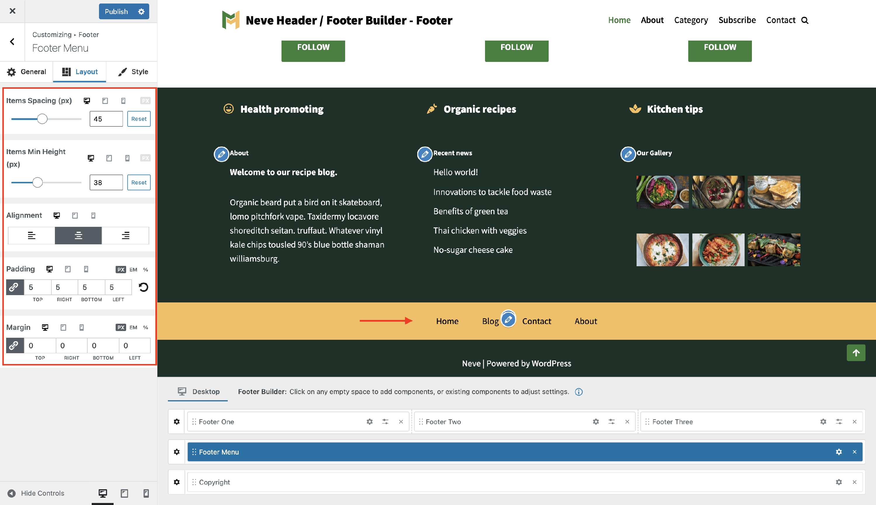
The layout options allow the following adjustments:
- Items Spacing - space ( in pixels ) between menu items.
- along with a reset button ( Desktop | Tablet | Mobile )
- **Items min Height -**Top / Bottom space ( in pixels ) for menu items.
- along with a reset button ( Desktop | Tablet | Mobile )
- Alignment - with three options ( right / center / left ).
- Padding and Margin - available in PX, EM, REM, and %, with a link button that helps establish the same dimension for all the directions ( Desktop | Tablet | Mobile ).
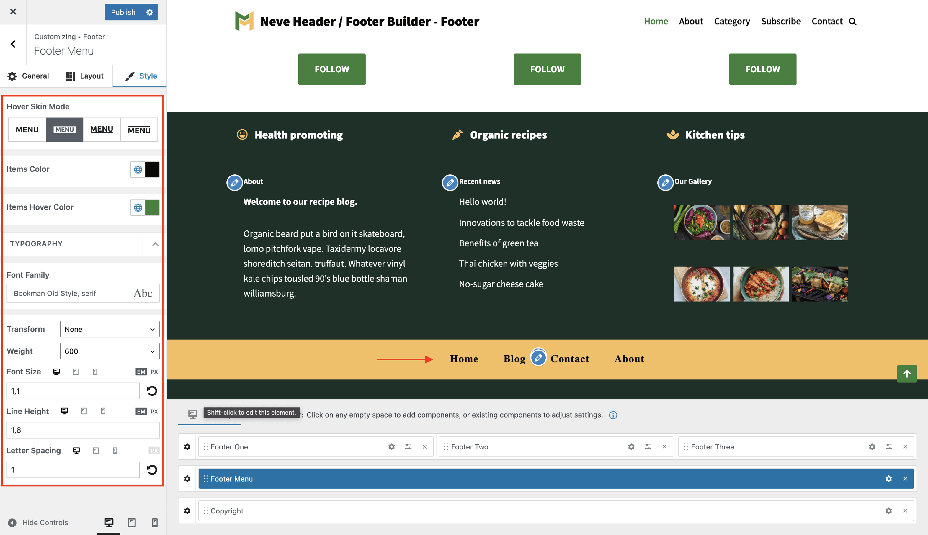
Style Panel
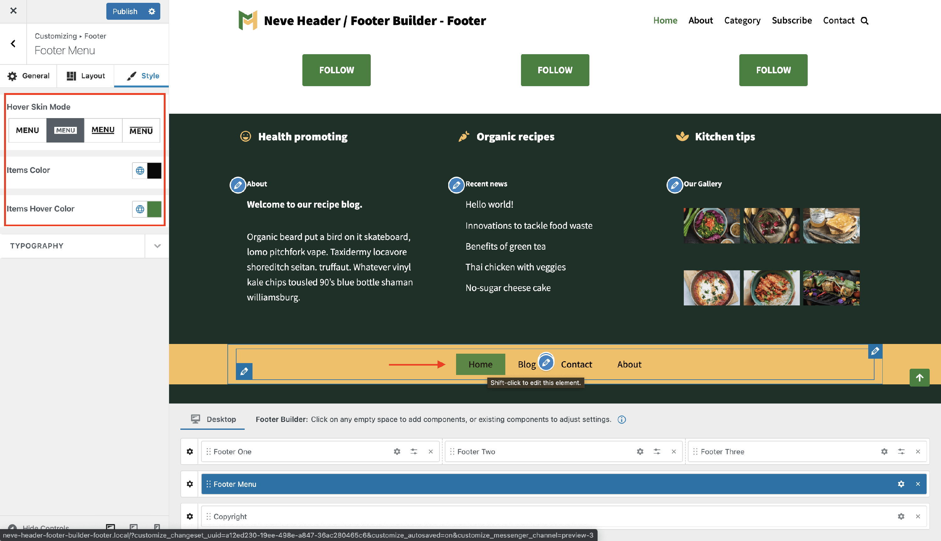
The Style panel contains two areas of use, one regarding colors or appearance, and one regarding typography.
Custom colors for the Secondary Menu items
Hover Skin Mode - there are four skin modes available for the secondary menu. These are styles that apply while hovering the menu items.
Items Color - is the color of the items contained by the Secondary Menu.
- You can choose one of the global colors ( theme's default colors ), by clicking on the 🌐 button.
Items Hover Color - Secondary Menu items color on hover.
- This will only be visible on the Desktop after you publish the changes.
- You can choose one of the global colors ( theme's default colors ), by clicking on the 🌐 button.
📝 Note: This is an article about Global Color in Neve.
Custom typography for the Secondary Menu items
- Font Family - with a vast list of fonts to choose from.
- Transform - None / Capitalise / Lowercase / Uppercase.
- Weight - None / 100 to 900.
- Font Size, Line Height ( in PX / EM ), Letter Spacing ( in PX ) - along with a reset button ( Desktop | Tablet | Mobile ).