
Why isn't my site responsive with Hestia Pro theme
Hestia Pro theme has many layout options. If your site looks narrow on mobile devices, it might be because the initial container width values were changed, which can squeeze wide content on smaller screens.
To fix this:
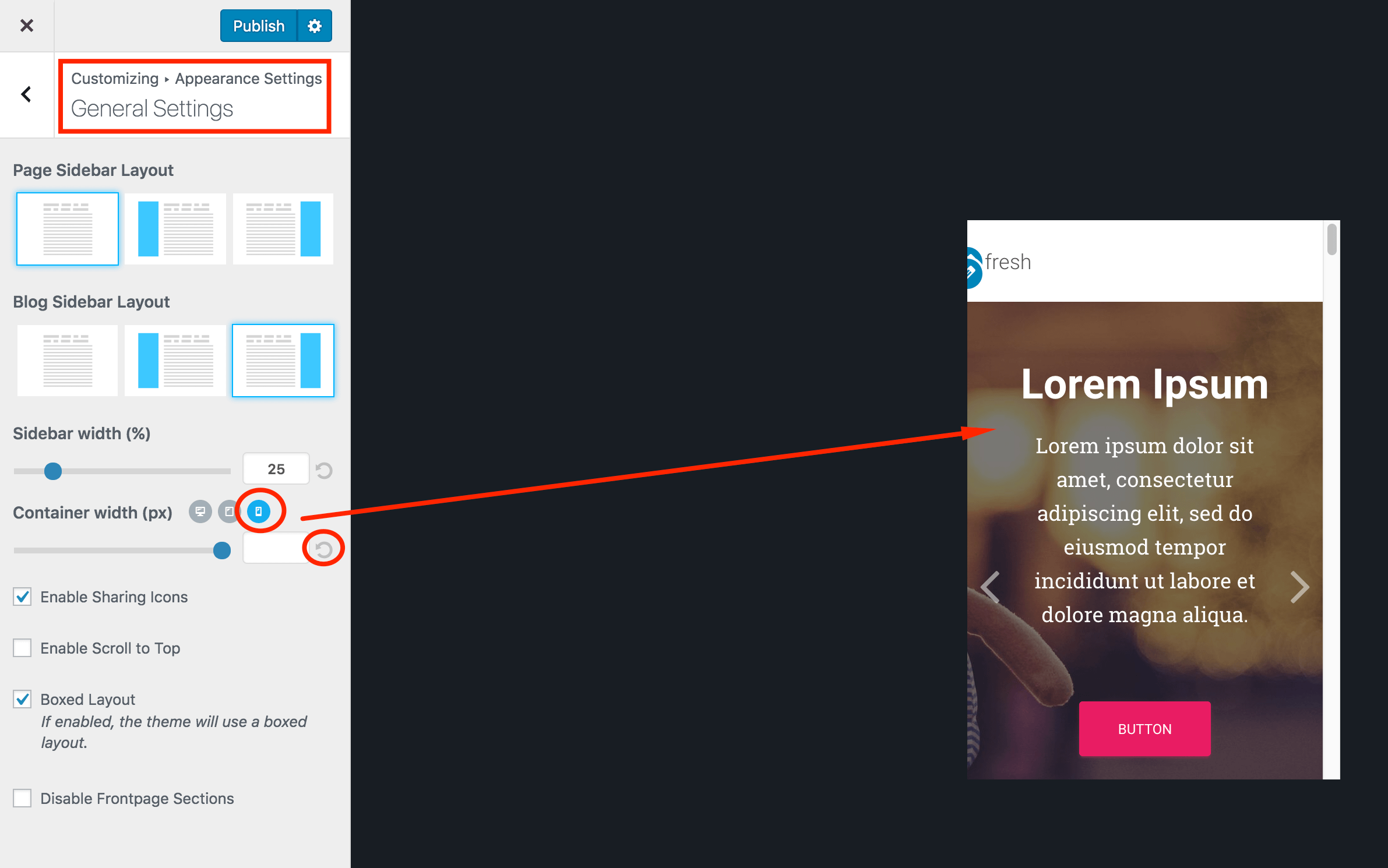
- Navigate to Appearance -> Customize -> Appearance Settings -> General Settings.
- In Container width (px), switch between Desktop, Tablet, and Mobile, then use the ↺ reset control for each one.
- Default values are: Desktop: 1170, Tablet: 992, Mobile: 748.
- Click Publish in the Customizer, clear any site cache or caching-plugin cache, then check the affected page in a mobile or responsive view.
If the issue is limited to one page with wide embedded content (for example, a calendar), edit that page and choose the Page Builder Full Width template. This removes the sidebar, title, and theme padding so the content can use the available page width.