
Typography Options in Hestia Pro
Hestia Pro gives you fine-grained control over typography, including font families, font subsets, and responsive font sizes for desktop, tablet, and mobile.
In this article
Typography Options
Hestia offers control over the Headings and Body Font Families, offers the possibility to choose a Font Subsets and Font Size options for the Frontpage sections and inner pages.
Better control over the Font size Options
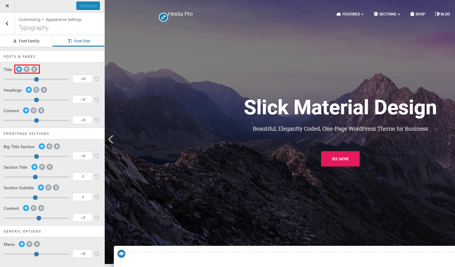
Hestia Pro offers you control over the font size options for each specific mode: Desktop, Tablet, and Mobile. By default, the changes will take place on the desktop. To make any changes to the tablet or mobile view, you just need to click on their corresponding icons, near each control and change the font size according to what you need.
This way, you can better adapt your content for each device, as there are times when you need to have different font sizes for different devices.
Styling an individual block's typography
The typography options above set your site-wide and front-page defaults from the Customizer. They do not change the font of a single block you add in the WordPress block editor, such as a Paragraph or Heading inside custom homepage columns. Each block has its own typography controls in the editor.
To change the font size of one text block:
- In the editor, select the exact Paragraph or Heading block you want to change. If the text sits inside a Columns, Column, or Section block, open List View and click the text block itself so you don't select its container instead.
- Open the block settings sidebar with the gear icon, then use the block's Typography controls to set the size. These controls are in the sidebar, not in the floating toolbar that appears directly above the block.
- If Font size is not shown, open the options menu (the three-dot icon) in the Typography panel and enable it.
📝 Note: These per-block controls come from the WordPress block editor and affect only the selected block. Use Hestia's Customizer typography options above to change site-wide and front-page text.
Troubleshooting: Fonts not updating on mobile
If you've adjusted font sizes for mobile but the changes aren't visible on your site, follow these steps:
- Confirm the mobile icon is selected and changes are published. In the Customizer, make sure you clicked the mobile device icon before adjusting the font size, then click Publish to save your changes.
- Clear your browser cache. Your browser may be serving a cached version of the page. Open the page in an incognito/private window or force-refresh the page (usually Ctrl + Shift + R on Windows or Cmd + Shift + R on Mac) to verify the changes.
- Clear your site cache. If you use a caching plugin (such as WP Super Cache, W3 Total Cache, or WP Rocket), go to its settings and clear the cache so the updated styles are served.
- Purge your CDN cache. If your site uses a CDN (such as Cloudflare or BunnyCDN), log in to your CDN dashboard and purge the cached files so the new font settings propagate to all visitors.
💡 Tip: If you're unsure whether the changes are live, test on a different device or use your browser's built-in developer tools to simulate a mobile viewport.
Font size options for the menu
In Hestia Pro, you have the possibility to also update the font size for the primary and footer menu links ( specifically for desktop, tablet, and mobile ).