The My Account Component - Neve Header / Footer Builder (PRO)
For more details check out the full Neve documentation and Neve PRO documentation.
📝Note: This component is part of Neve PRO.
The My Account component is accessible only if you have installed and activated the WooCommerce plugin.
🧰Using the Component
1. Start by adding the component into the rows, by clicking on the ➕ button and selecting the component.
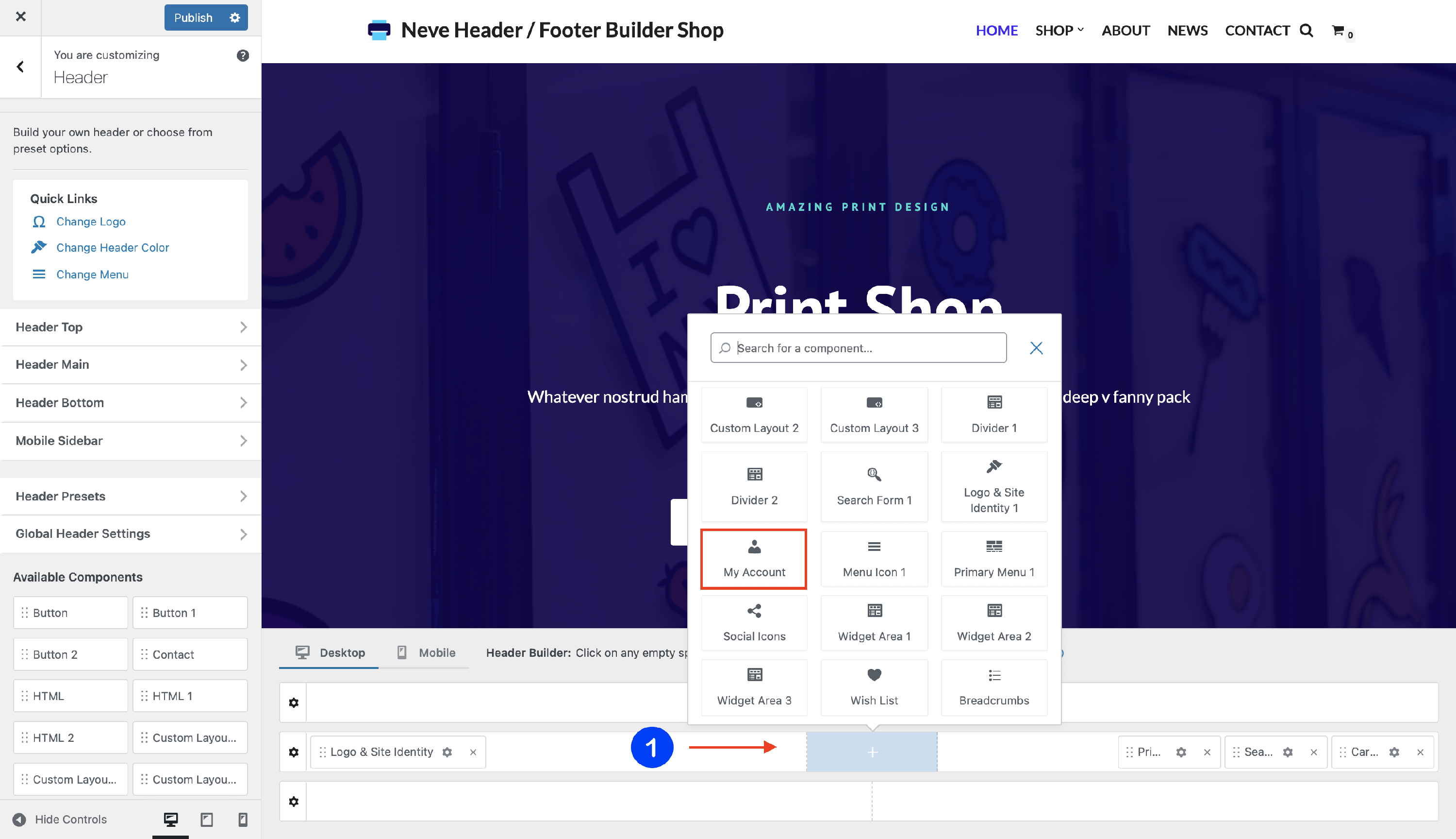
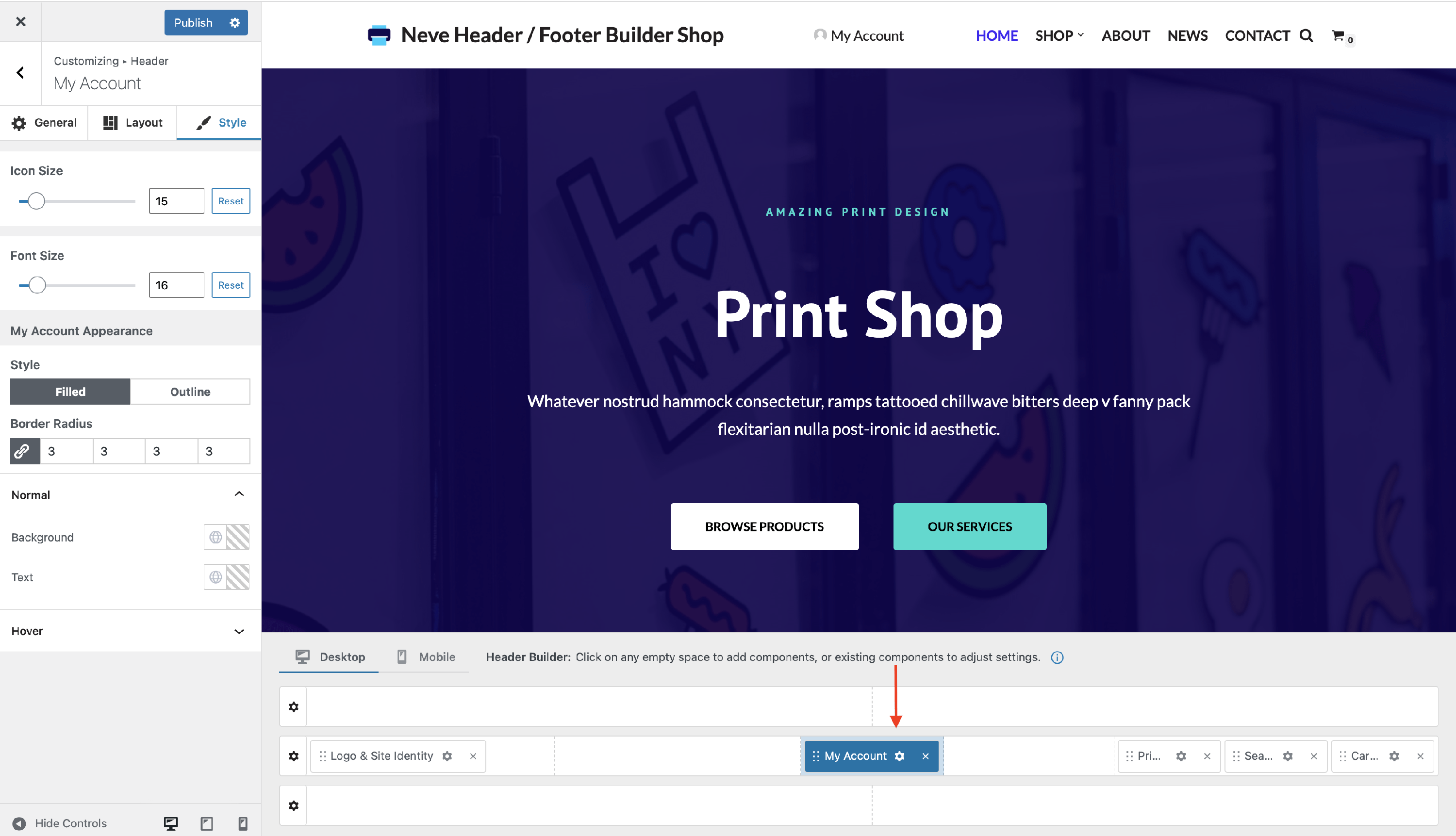
2. Open the component's settings to customize it, by clicking on the ⚙️icon.
🔮Customizing the Component
There are three panels with customizing options for this component, which allow you to create the desired header / footer:
⚙️General Panel
When you click on the ⚙️ icon, the General tab will appear on the left.
- Select Icon - choose to use a different icon from the provided list.
- Under the icons already provided, you will find 2 buttons. By default, it is set to ❌, meaning you only see the established icons. Once you click the other button, it will open an area that allows you to add custom SVG code.
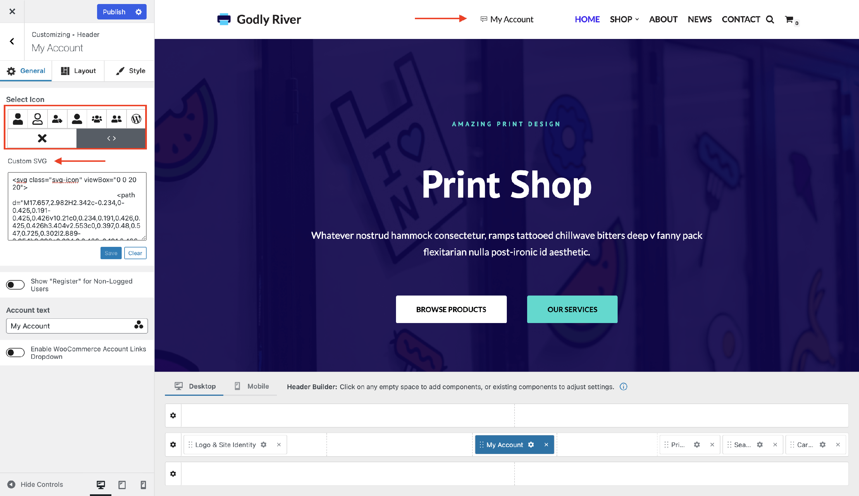
📝 Note: The icon will be visible only after you click on the Save button.
- Show "Register" for Non-Logged Users - if this option is enabled, when a not logged-in user visits the site, they will see a "Register" message (that can be changed from the Register label option) instead of the My Account icon.
- You can customize the Register label and
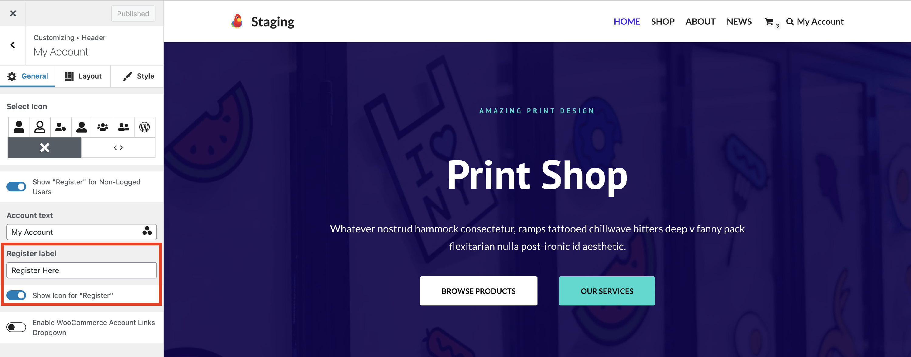 show an icon by enabling the specific option. If you leave the register label empty, only the icon will be shown.
- You can customize the Register label and
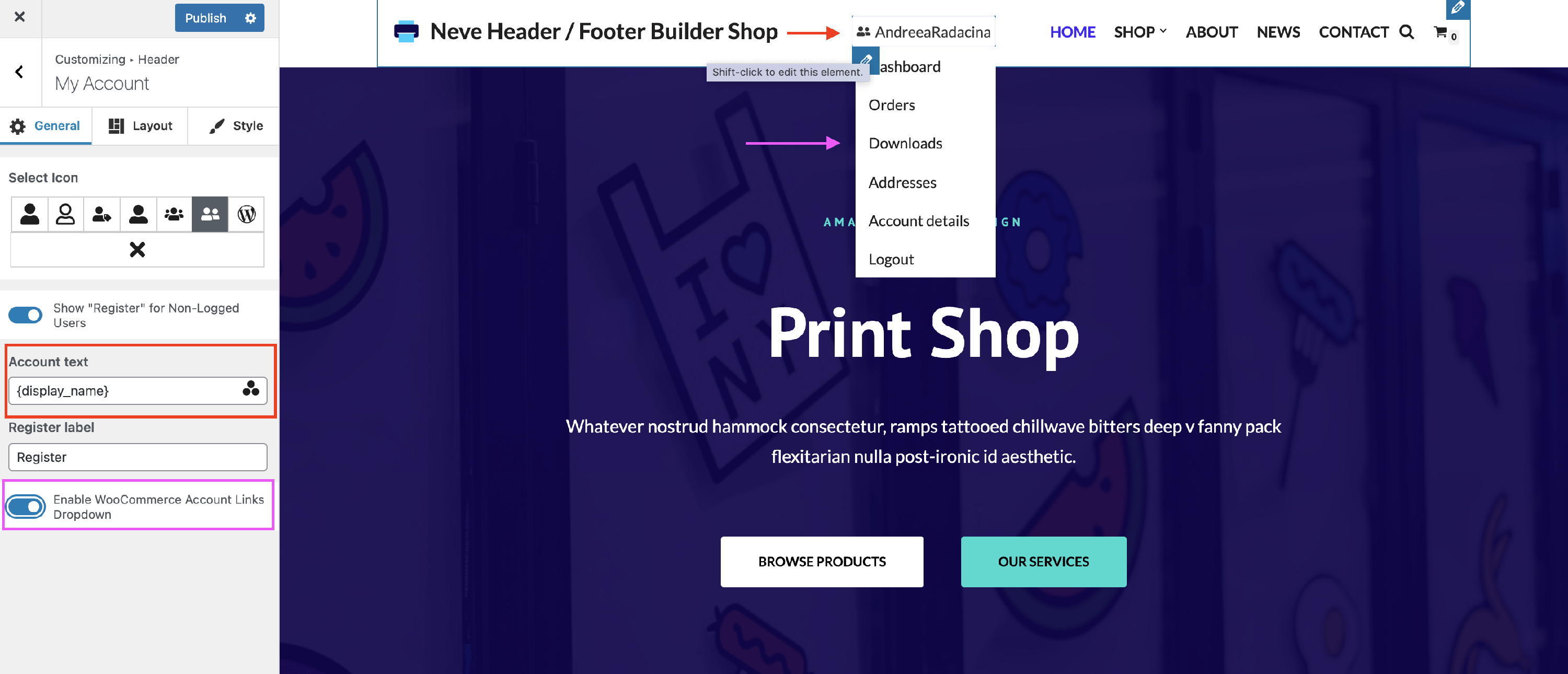
- Account text - a piece of text that will display just after the account icon. If you want to display a dynamic value like the logged-in user's name you can use Dynamic Tags.
- To get access to the Dynamic Tags click on the three dots shaped like a triangle from the Account text label input.
- Enable WooCommerce Account Links Dropdown - if this option is enabled, on hovering over the account icon, a dropdown menu will open with links for the following pages: Dashboard, Orders, Downloads, Addresses, Account details, and Logout.
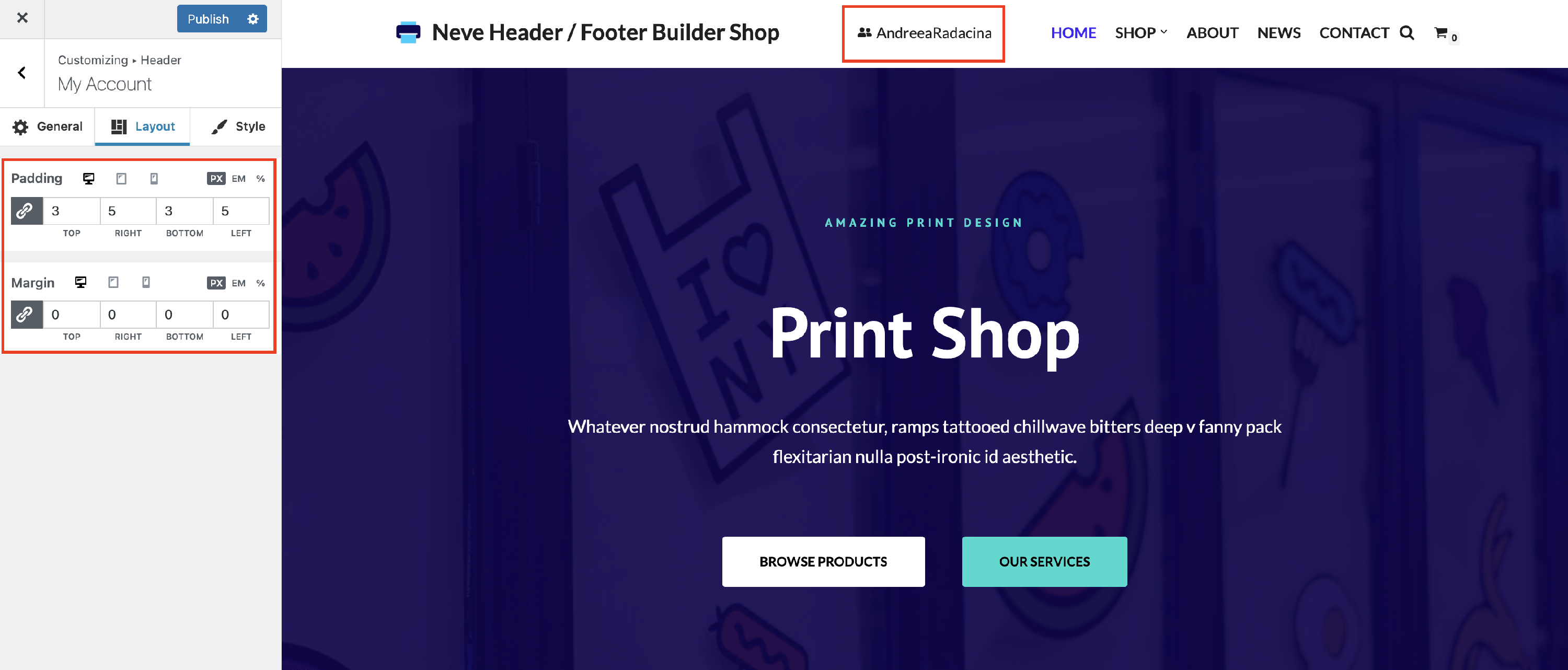
📐Layout Panel
The layout options allow the following adjustments:
- Padding and Margin - available in PX, EM, REM, and %, with a link button that helps establish the same dimension for all the directions ( Desktop | Tablet | Mobile ).
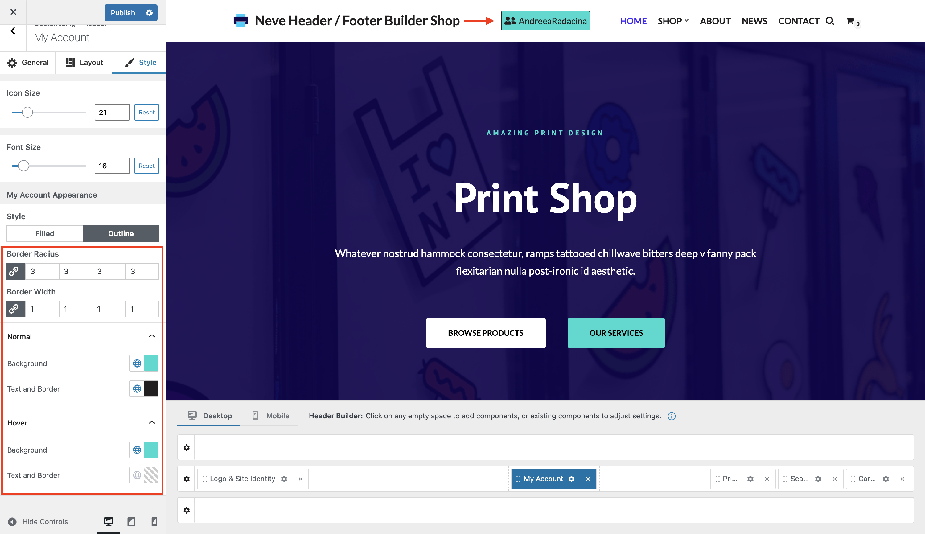
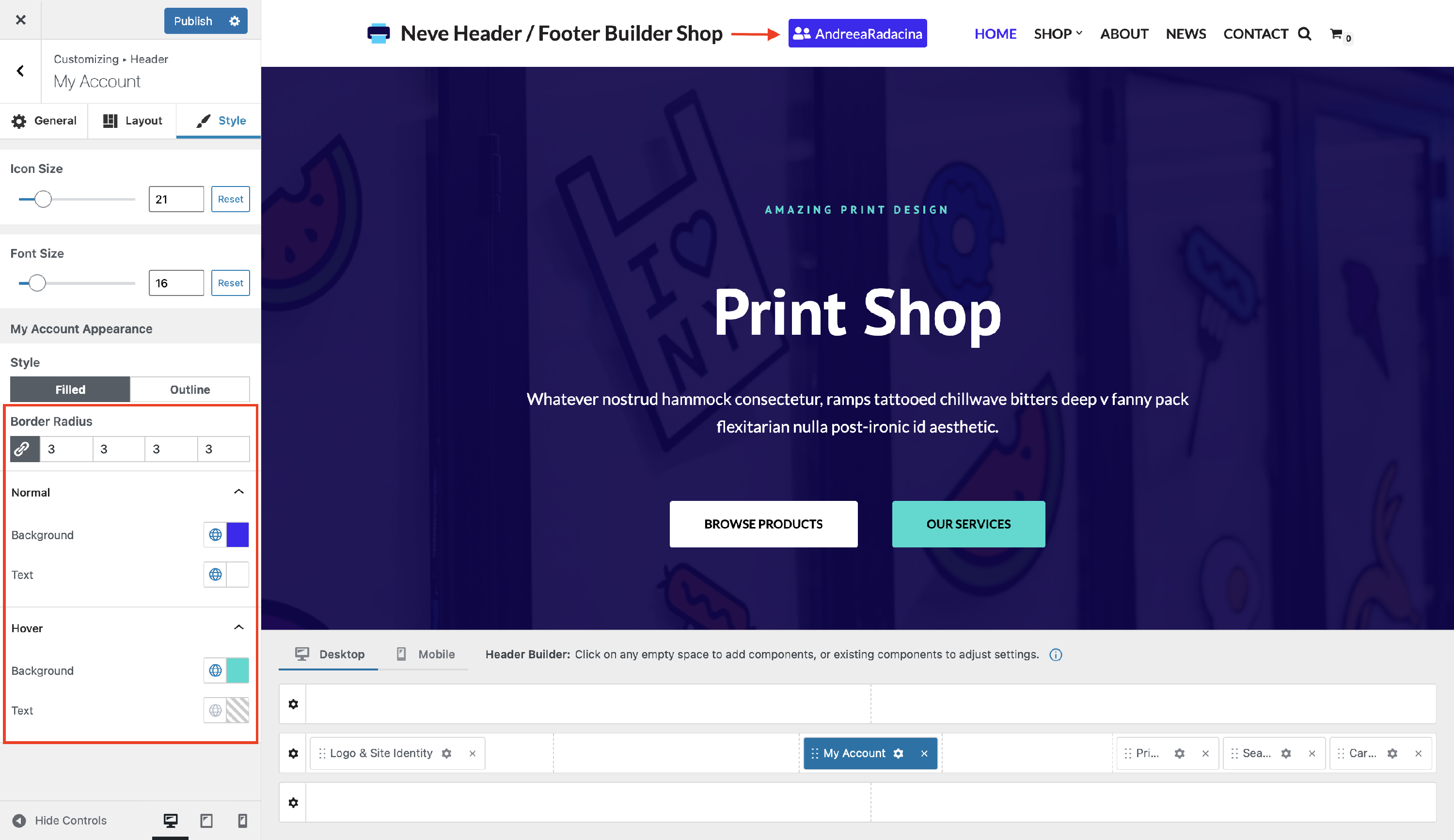
🖌 Style Panel
Styling for the My Account component includes:
- Label Size - adjust the size of the label, to suit your needs.
- Icon Size - modify the size of the icon or undo the changes with the reset button.
You can choose between two styles for the My Account icon:
- Filled - with color options for normal and hover mode, and also with border radius adjustments.
- Outline - with color options for normal and hover mode, and also with border radius and border width adjustments.