The Posts Block
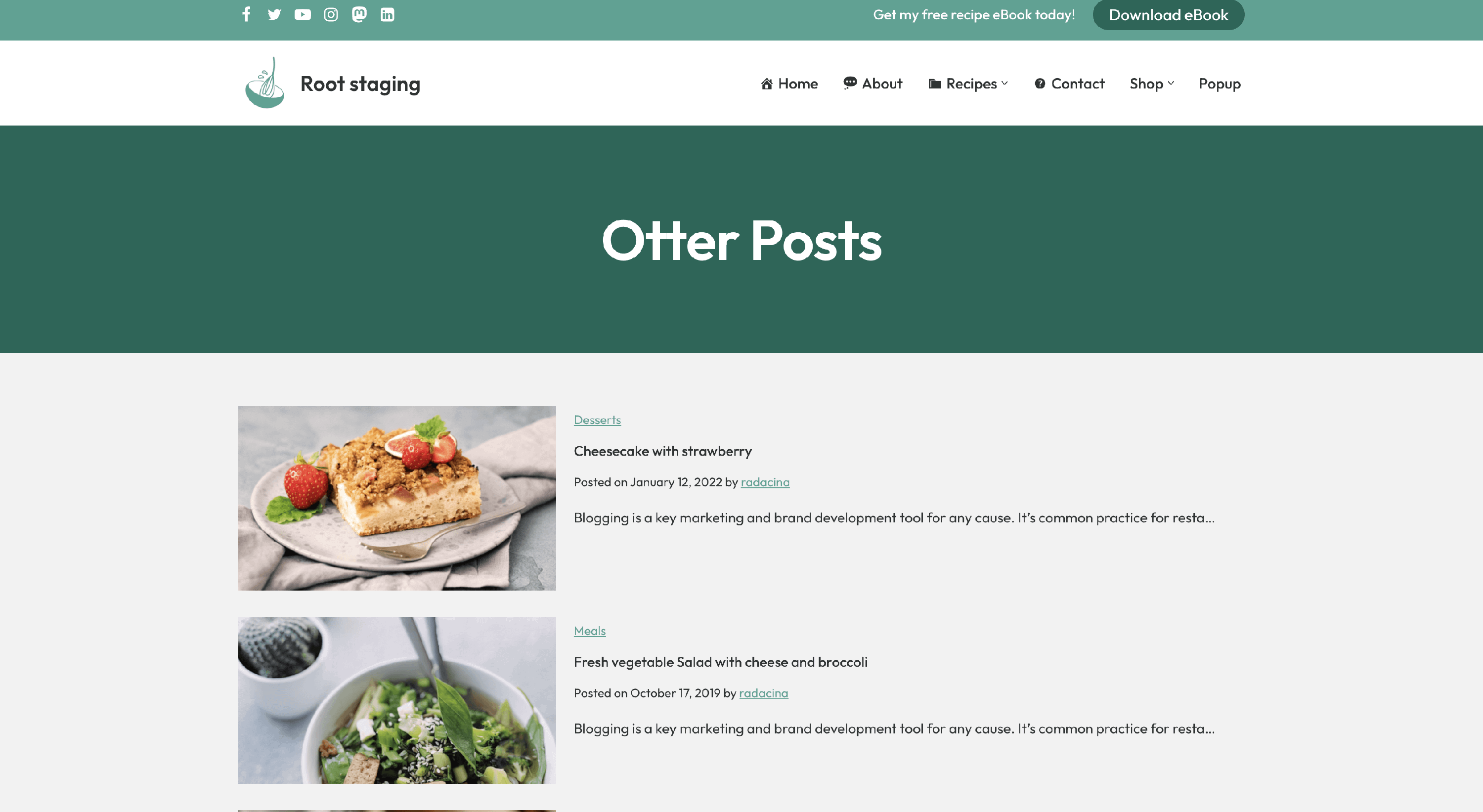
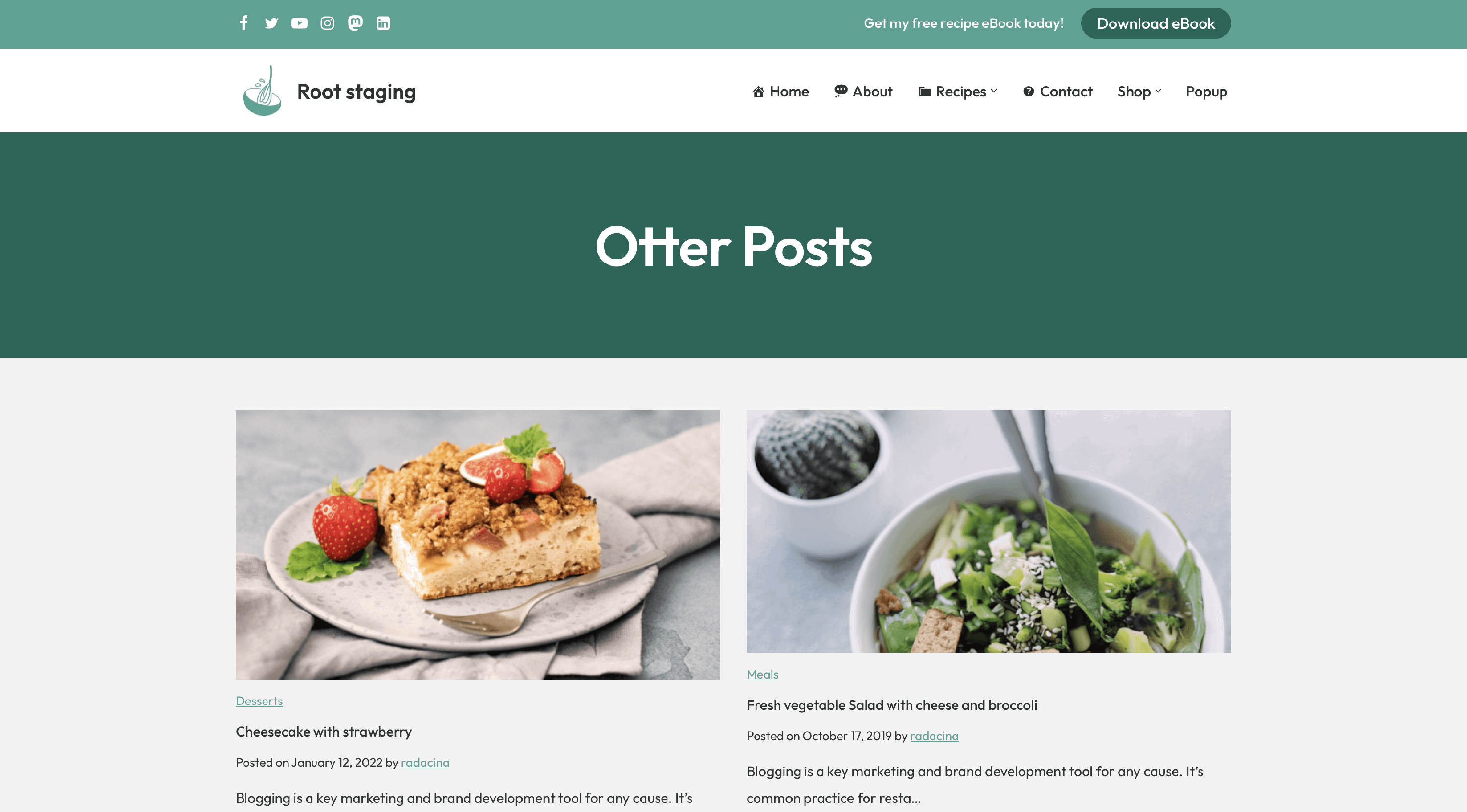
The Posts block allows displaying a certain number of posts on different pages. It can be useful when you want to showcase only a certain number of posts on the homepage, for example.
In this article
📝 Note: These blocks are part of the Otter Blocks plugin, which you can get from here.
📝 Note: The blocks' appearance can be improved using the Otter features, such as Transform to Sticky, Visibility conditions, Dynamic Values or Images, as well as Counting / Typing / Loading animations, and 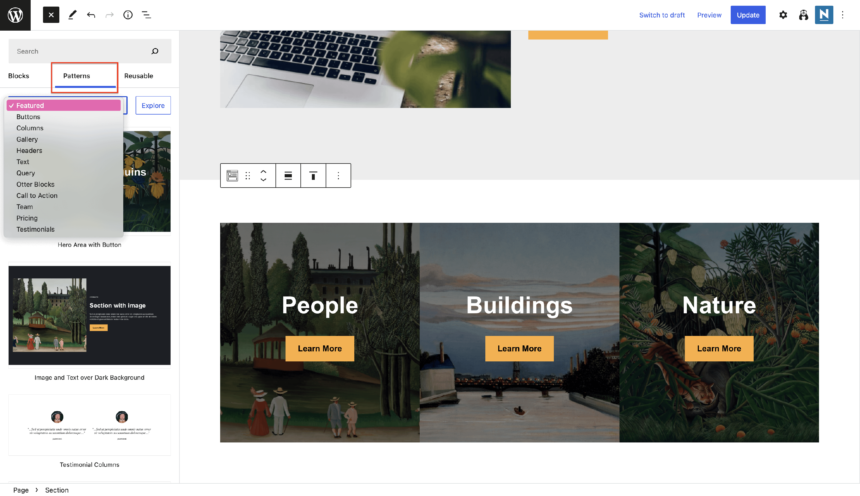 Patterns.
Settings Tab
Layout
- Post type - from this area, you can select what type of content you want to display. It covers not only WordPress posts but also pages, products, feed categories, etc.
- Layout - choose from two available formats: Grid/List.
- Columns - control the number of columns in the grid layout.
- Content alignment - decide how to align all the elements of the posts.
Settings
- Order By - select the order of the posts to be displayed: Newest to oldest / Oldest to newest / A - Z / Z - A / Random.
- Categories - display only posts from certain categories, separated with commas or Enter key.
- Number of items - choose the number of items to be displayed.
- Offset - number of posts to displace or pass over.
- Enable Featured Post - will showcase one featured post above the other posts in the layout. it can be the latest post or the sticky post.
- Enable Pagination - if the number of items is much smaller than the total number of posts, you can use pagination to allow access to the others easily.
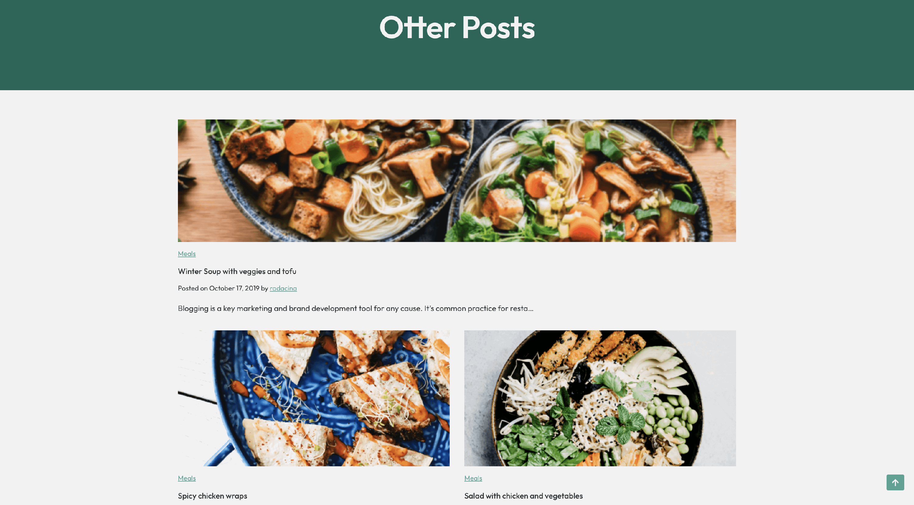 📝Note: Please note that if the feature post is enabled, the pagination will no longer work.
Elements
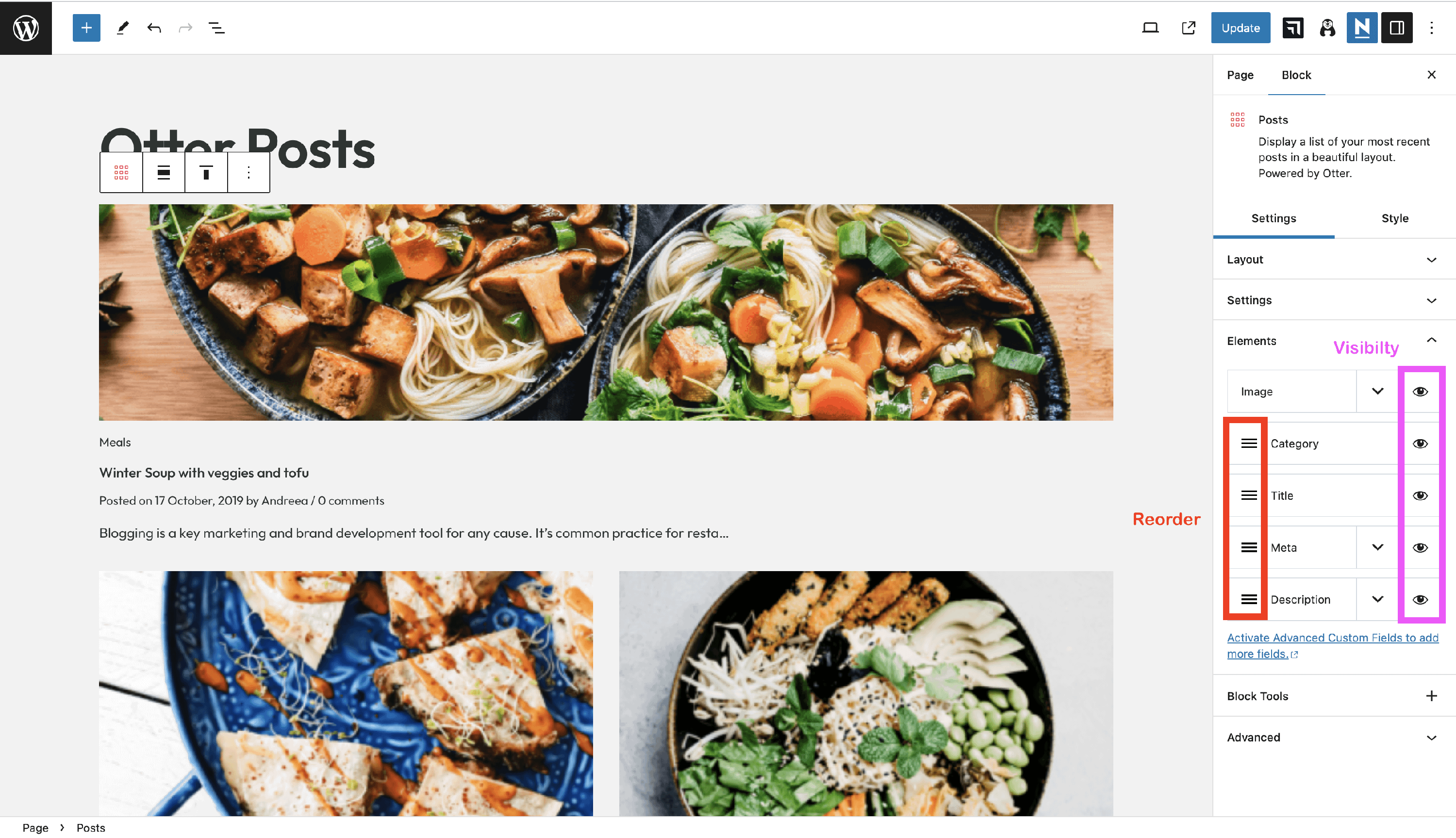
- Customize the Image / Category / Title / Meta / Description
- Visibility - control the visibility of the elements by clicking on the 👁️ icon.
- Reorder the elements with a drag-and-drop movement. The Image element is pinned in place and cannot be reordered.
Under the Elements tab, you will find a lot of options to customize the elements of the post. You can rearrange the order of the posts' elements or change their visibility.
Image
- Image Size - selects the WordPress-generated image size used by the block (for example, thumbnail, medium, or large). Different registered sizes crop images to different dimensions at upload time, so choosing the right size ensures the block pulls consistently sized images for every post.
- Image Ratio - controls how images are presented within the post grid by enforcing a uniform aspect ratio (the available options are 1/1, 3/2, 16/9, and 2/1). The block crops each image to this ratio using CSS, so all post images appear at the same height regardless of their original dimensions. Leaving this setting at its default value lets images render at their natural ratios, which can cause them to appear uneven across the grid.
Meta
This panel contains the available meta and option to enable / disable them: Display post date, Display last updated date, Display author, Display comments, Display Category.
Description
- Excerpt Limit - limits the length of the post's content in the block.
- Display read more link - enable this option to add the Read More link.
📝 Note: To add more fields, activate the Advanced Custom Fields plugin. Otter Pro is also required for this.
Style Tab
Inside the style tab, you can control the individual posts' style (default/boxed/tiled) and typography options for title/description/meta/pagination size. Except for the pagination, all the others can be adjusted for each device (mobile/tablet/desktop).
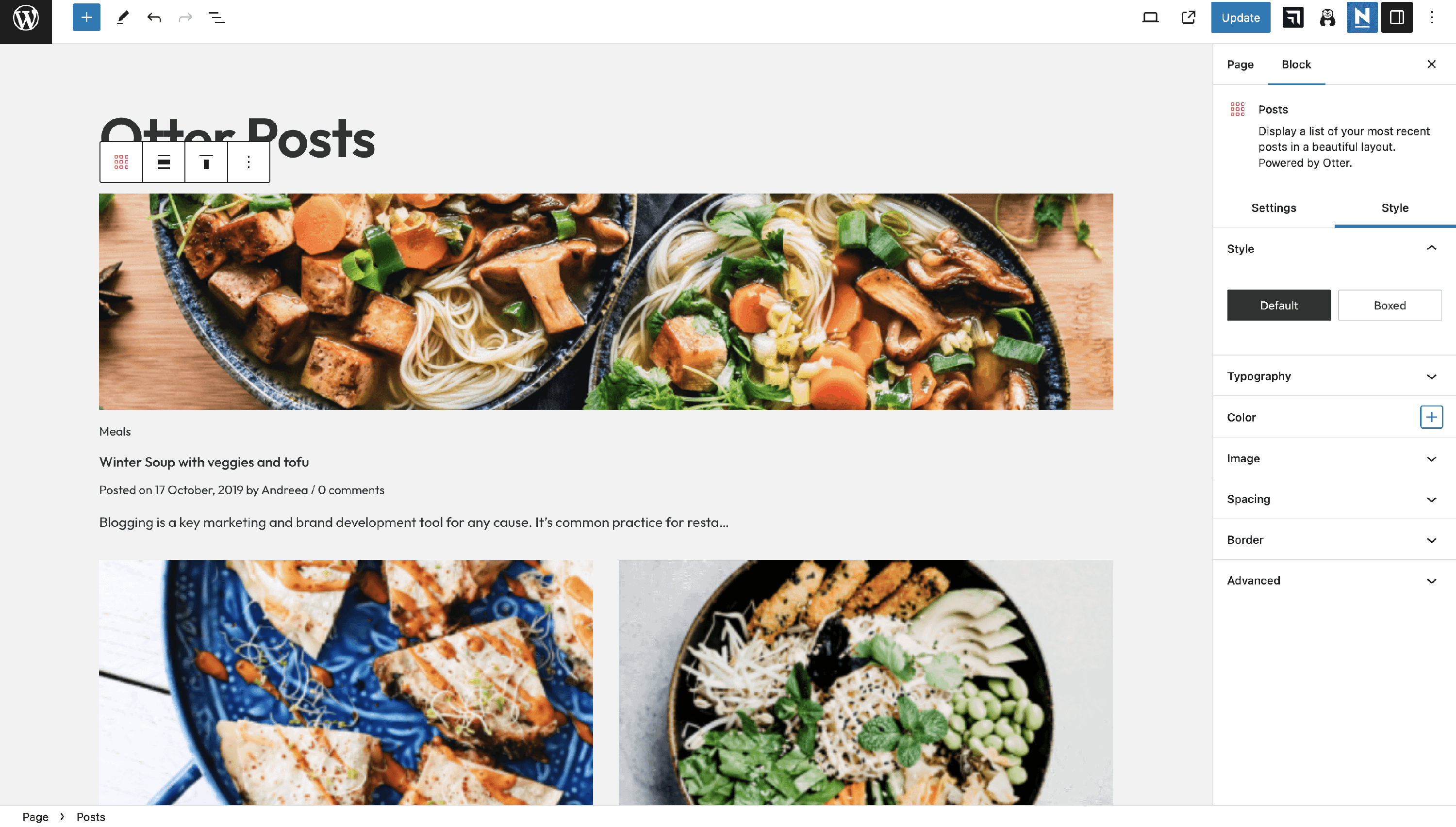
Colors can be controlled by clicking on the plus sign. In this way, you can select different colors for elements like text, background, border, pagination link/background/border/active link/active background/ hover link. hover background/hover border/active border.
Image settings can also be configured from this place: border-radius or shadow settings.
From the Spacing accordion, you can control the column gap and row gap. content padding, space between posts, pagination gap/padding/container margin.
The border customizations include width settings, radius, pagination border-radius, pagination border width, as well as shadow settings.
📝 Note: The Otter Posts block is available to create FacetWP-compatible listings.
Troubleshooting
Fix uneven or misaligned post images
If the images in a Posts block grid have different heights or appear vertically misaligned — even when all source images appear to have the same dimensions — check the Image Size and Image Ratio settings.
WordPress generates multiple image sizes at upload time, and different registered sizes produce different pixel dimensions. When Image Ratio is not set, each post image renders at its natural proportions, so images with different aspect ratios (or from different registered sizes) appear at different heights across the grid.
To fix this:
- In the page editor, click on the Posts block to select it. If you cannot select it directly, open the List View panel (the three-line icon in the top toolbar), locate the Posts block in the list, and click it there.
- In the block sidebar on the right, go to Settings > Elements and expand the Image section.
- Set Image Ratio to a consistent value such as 1/1, 3/2, 16/9, or 2/1. This forces all post images to the same aspect ratio, regardless of their original dimensions.
- Optionally, adjust Image Size to use a larger registered size (for example, large) so the block pulls higher-resolution images.
- Preview the page and confirm that all post images now appear at a consistent height.
📝 Note: The Image Ratio setting crops images visually using CSS — the original uploaded images are not affected.
Posts block grid cards and featured images keep equal column widths even when a post has a long title, including a word without spaces. This applies with Otter Pro too. Image Ratio controls image height and cropping, not the width of the grid columns.