
How to use roles for your series in Visualizer
Visualizer supports different roles that can be assigned to your chart series.
Each role has its own purpose and each of them offers a unique way in which your users will interact with your charts.
NOTE: The roles are explicitly defined here in this doc.
In this article
Each role from the list above will be presented using the Line chart or the Column / Bar charts.
Important note: In the process of creating the charts, after adding the data for the chart and just before choosing the custom role ( annotation, certainty etc ) column/s, the chart will display an error "All series on a given axis must be the same data type". This is normal and will go away after the column/s with the special roles are defined, and the chart is saved.
1. Annotation
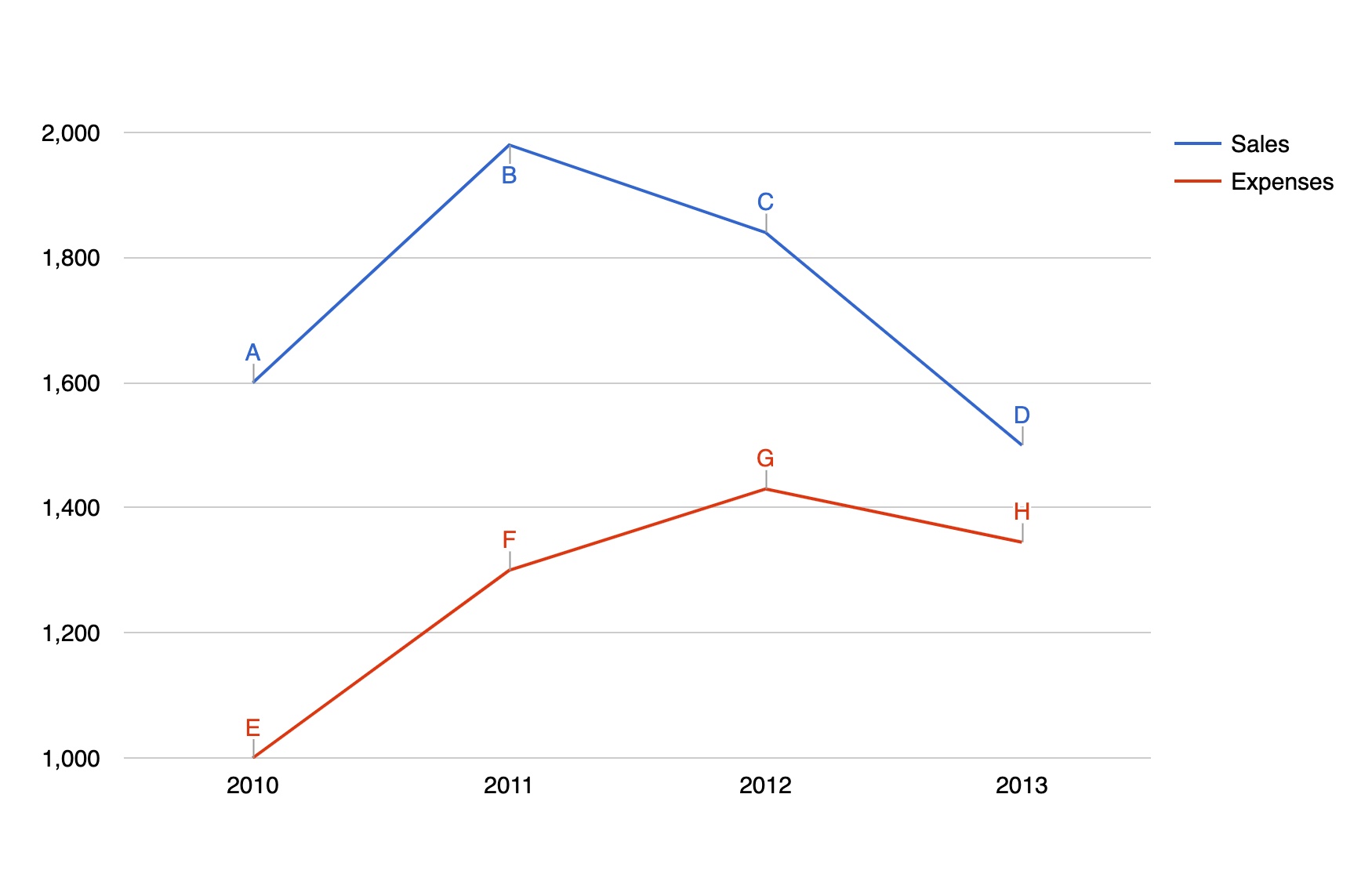
Using the annotation role, we can display custom text near some data points on the chart. The text displays by default, without any user interaction.
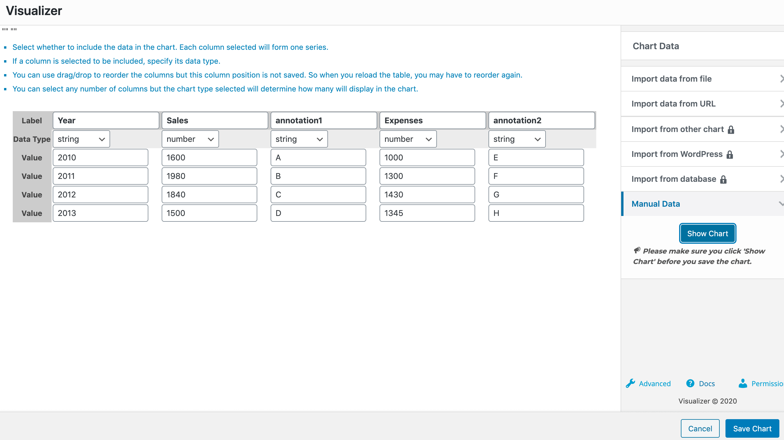
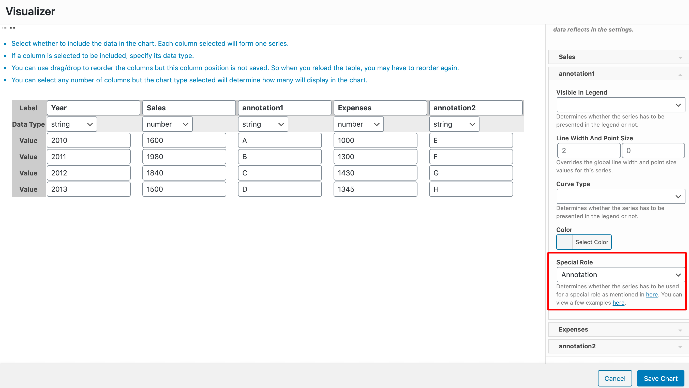
For this example, we have a line chart, with three columns Year ( of type string ), Sales ( of type number ), and Expenses ( of type number ). After each of the Sales and Expenses columns, we have a dedicated column we've named Annotation ( of type string ) which is used as the annotation column of the chart. For that to happen, you must go to the Settings tab > Series Settings > Select each of the Annotation columns and for them choose the Annotation Special Role.
2. Annotation Text
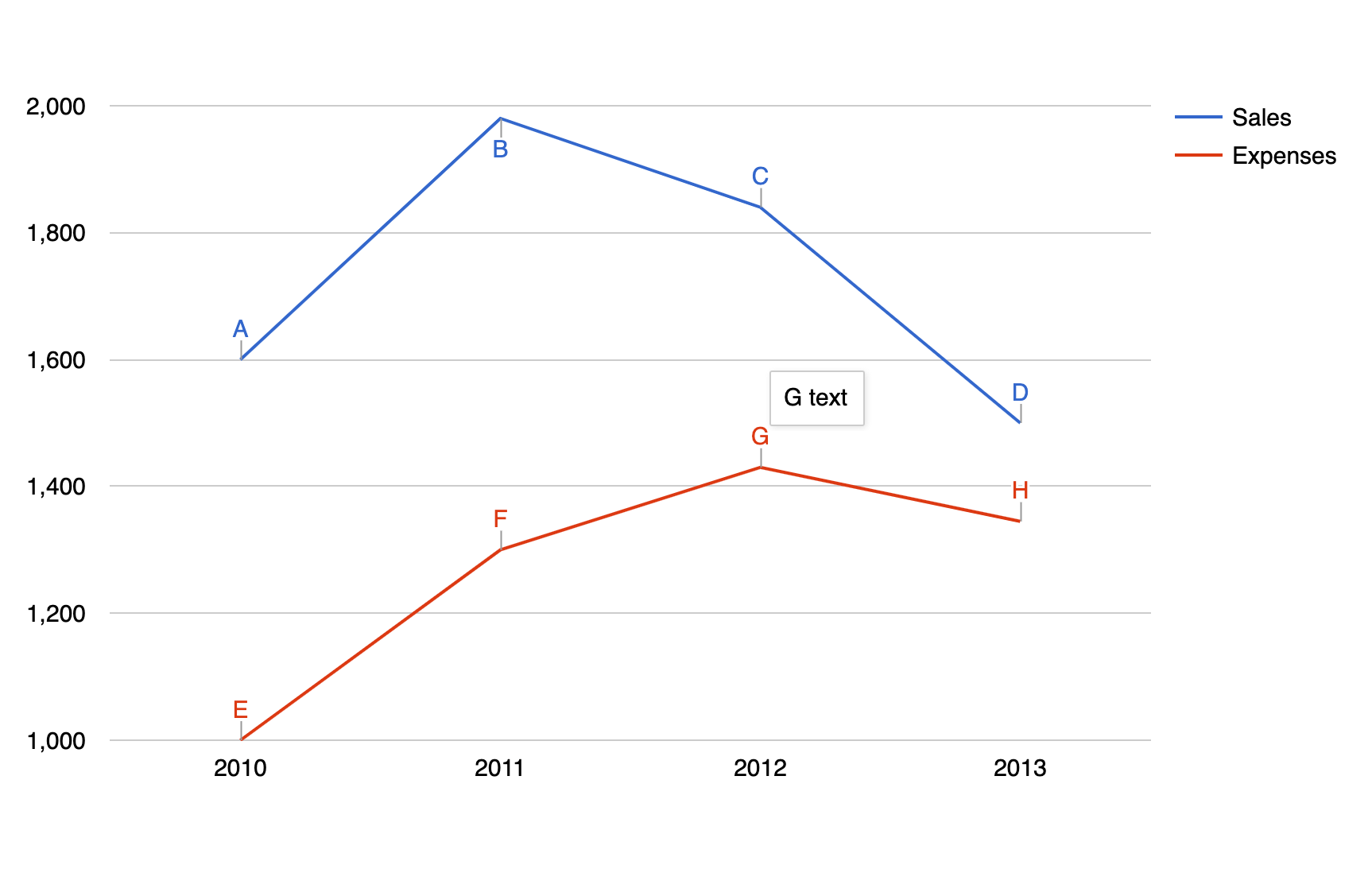
Using the annotation text role, we can extend the functionality of the annotation role, by also displaying custom text near some data points on the chart on hover.
Note: If you have an annotationText column in your chart, you must also have an annotation column.
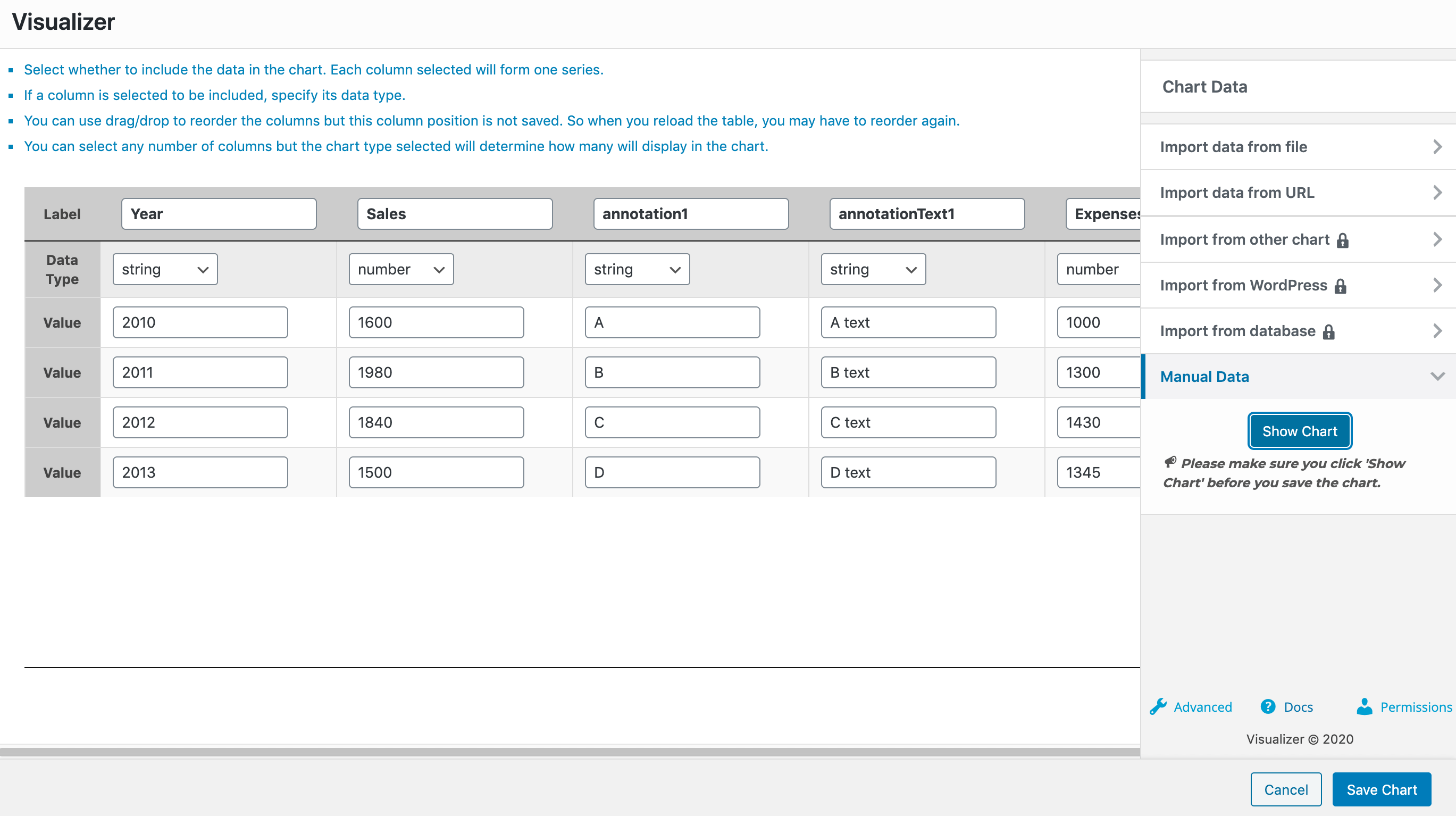
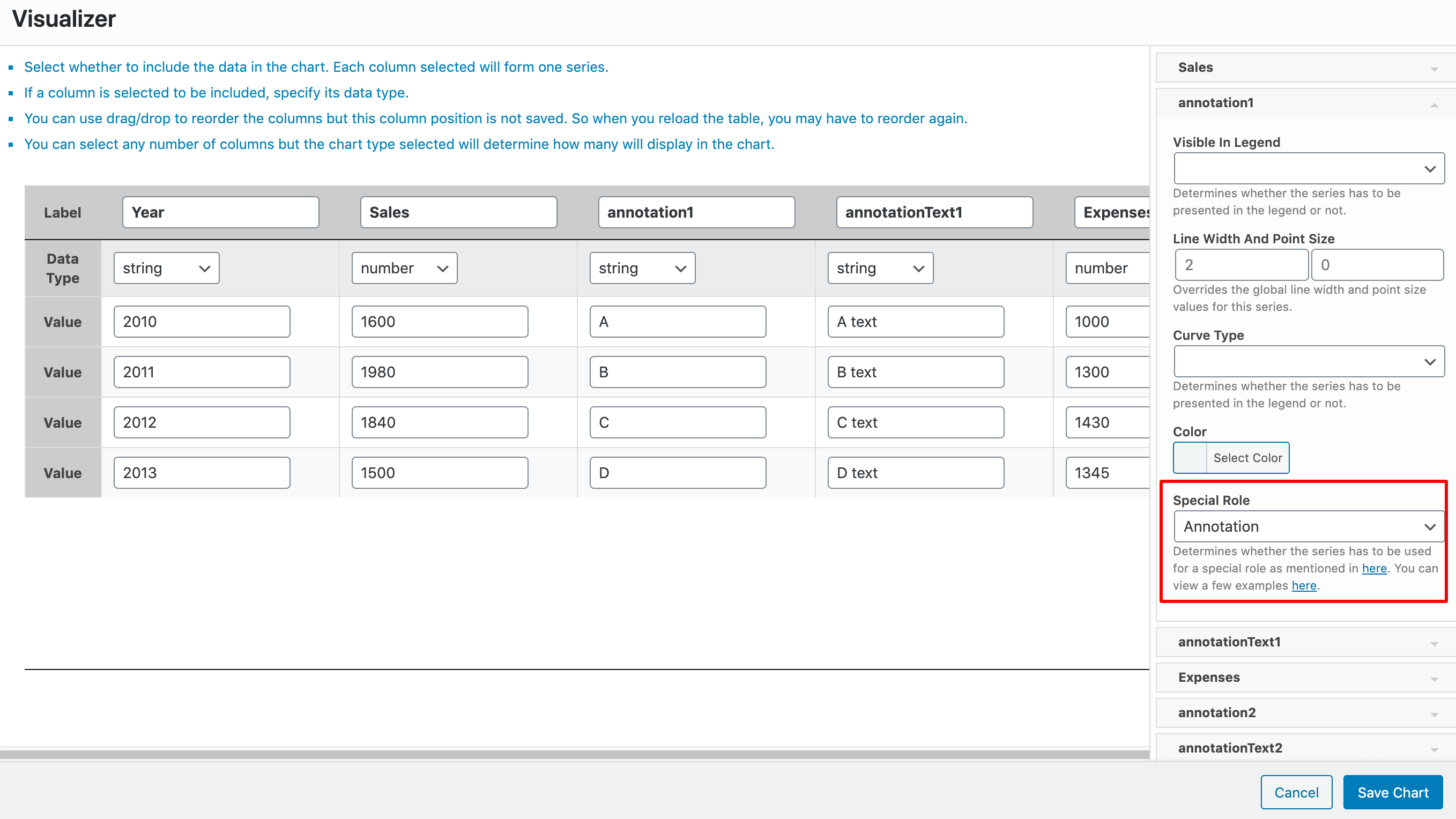
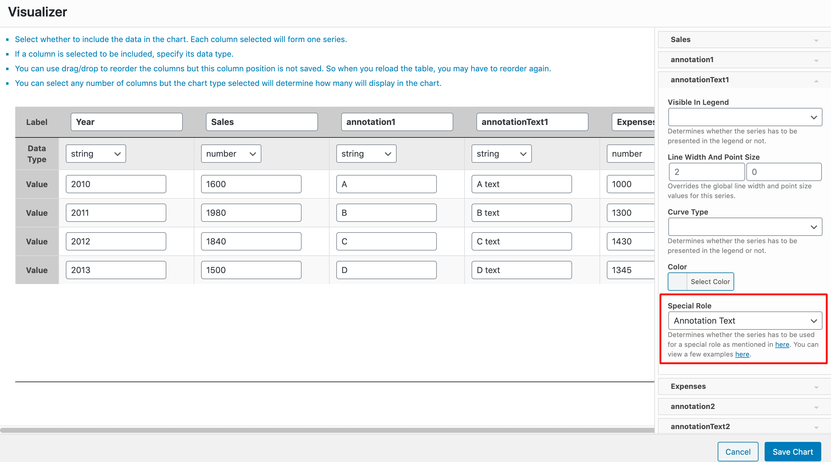
For this example, we have a line chart, with the three columns Year ( of type string ), Sales ( of type number ), and Expenses ( of type number ). After each of the Sales and Expenses columns, we have two dedicated columns: Annotation ( of type string ) and annotationText ( of type string ) which are used as the annotation and annotationText columns of the chart. For that to happen, you must go to the Settings tab > Series Settings > Select each of the annotation and annotationText columns and for them choose the Annotation Special Role/Annotation Text Role.
3. Certainty
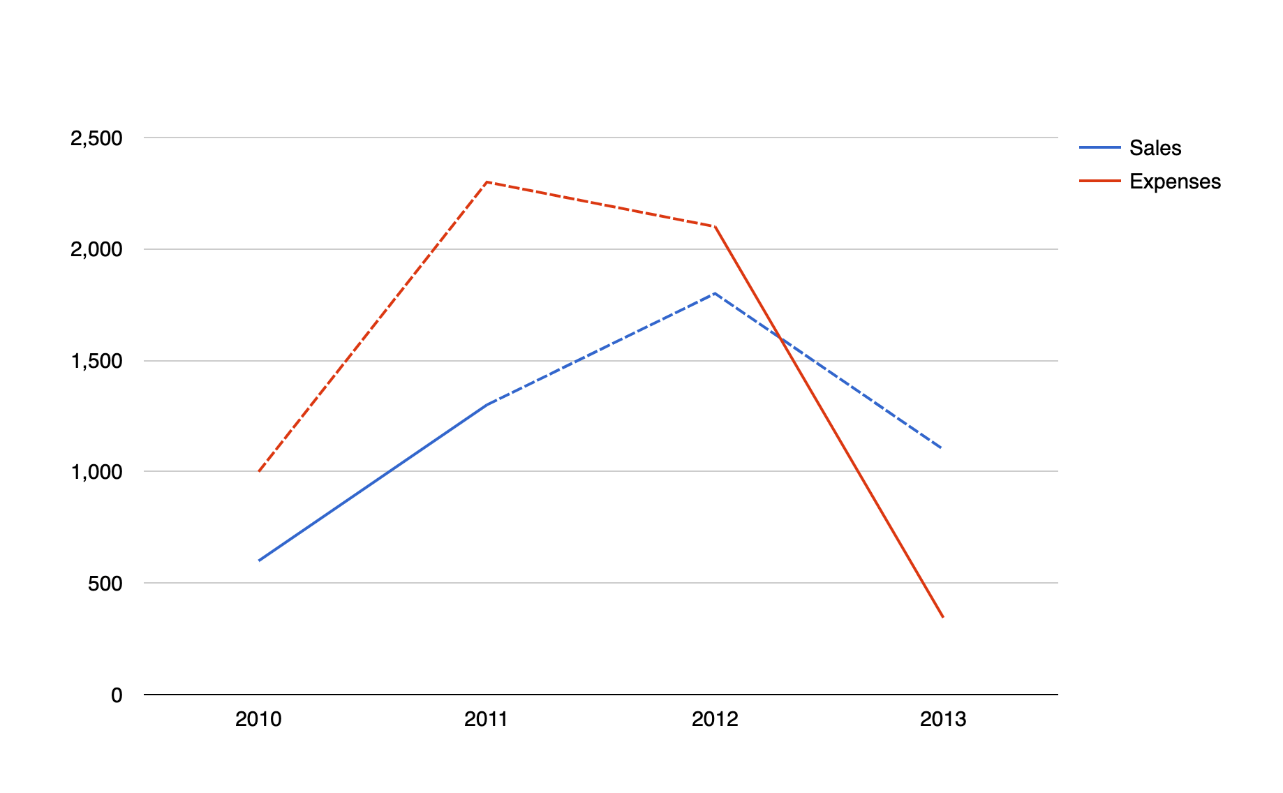
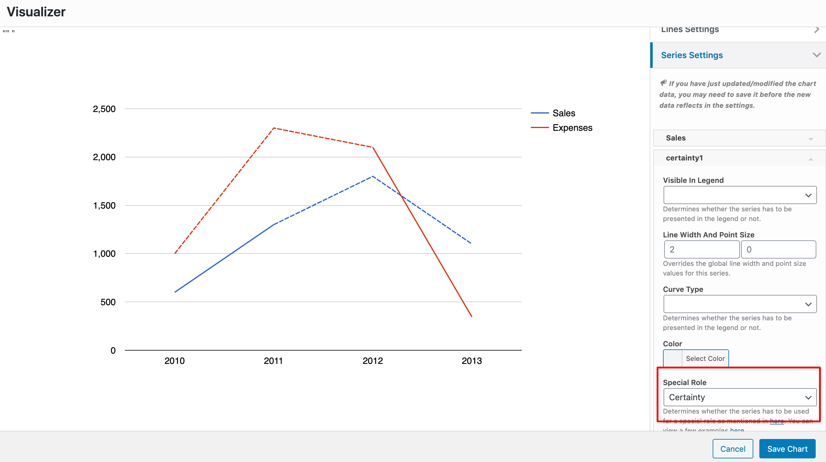
Certainty indicates whether a data point on the chart is certain or not. How this is displayed depends on the chart type. For example, it might be indicated by dashed lines or a striped fill.
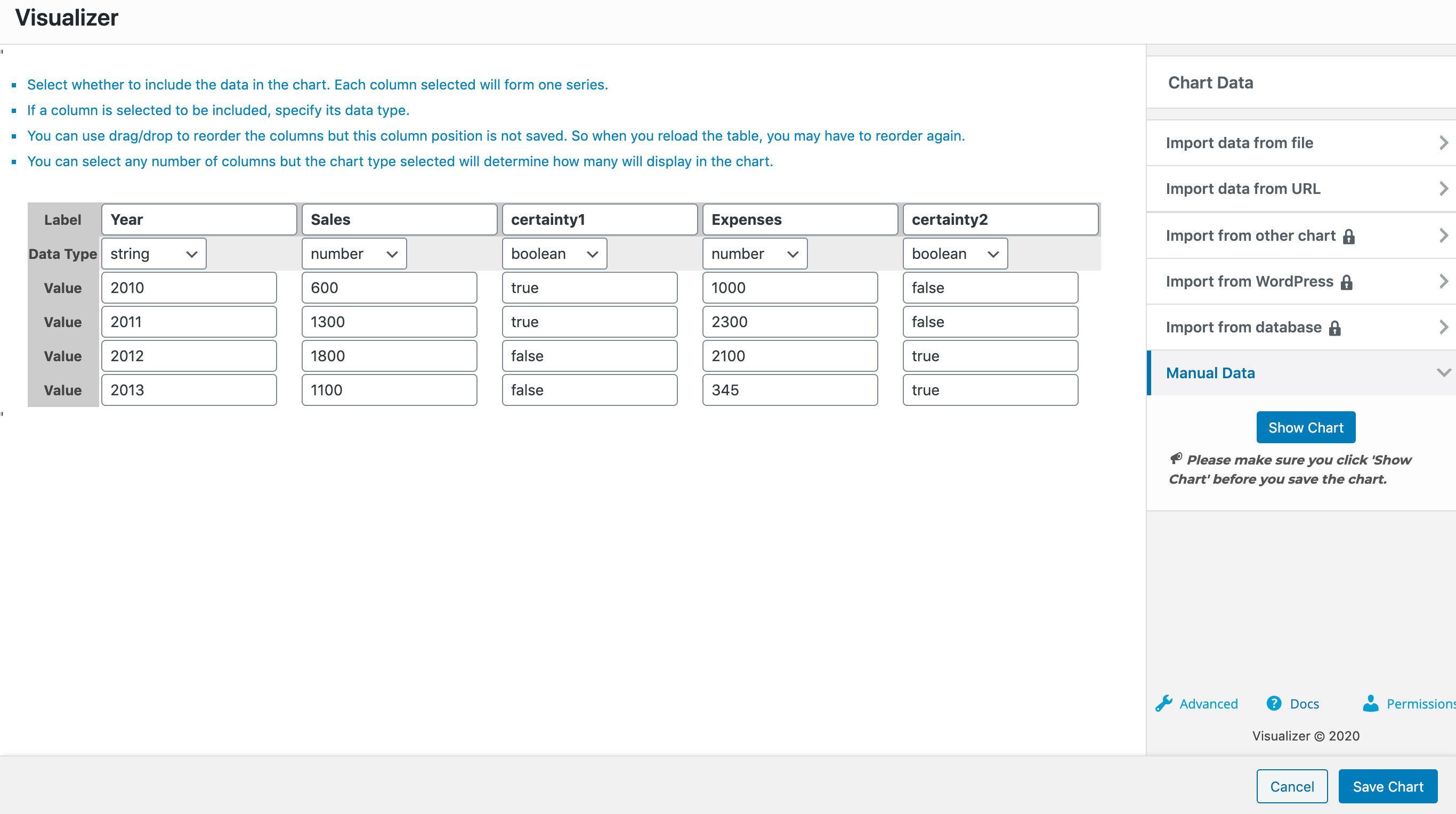
For this example, we have a line chart, with three columns Year ( of type string ), Sales ( of type number ), and Expenses ( of type number ). For each of the Sales and Expenses columns, we have a dedicated column certainty ( of type boolean ) which is used as the certainty column of the chart. For that to happen, you must go to the Settings tab > Series Settings > Select each of the certainty columns and for them choose the Certainty Special Role.
4. Emphasis
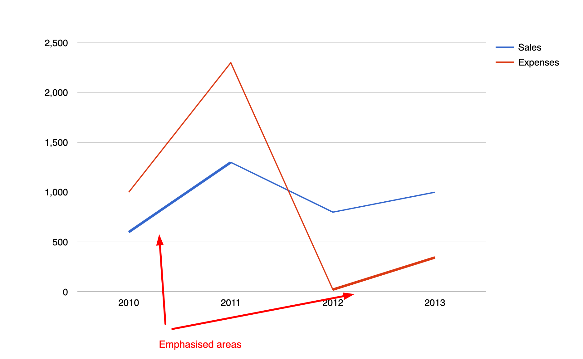
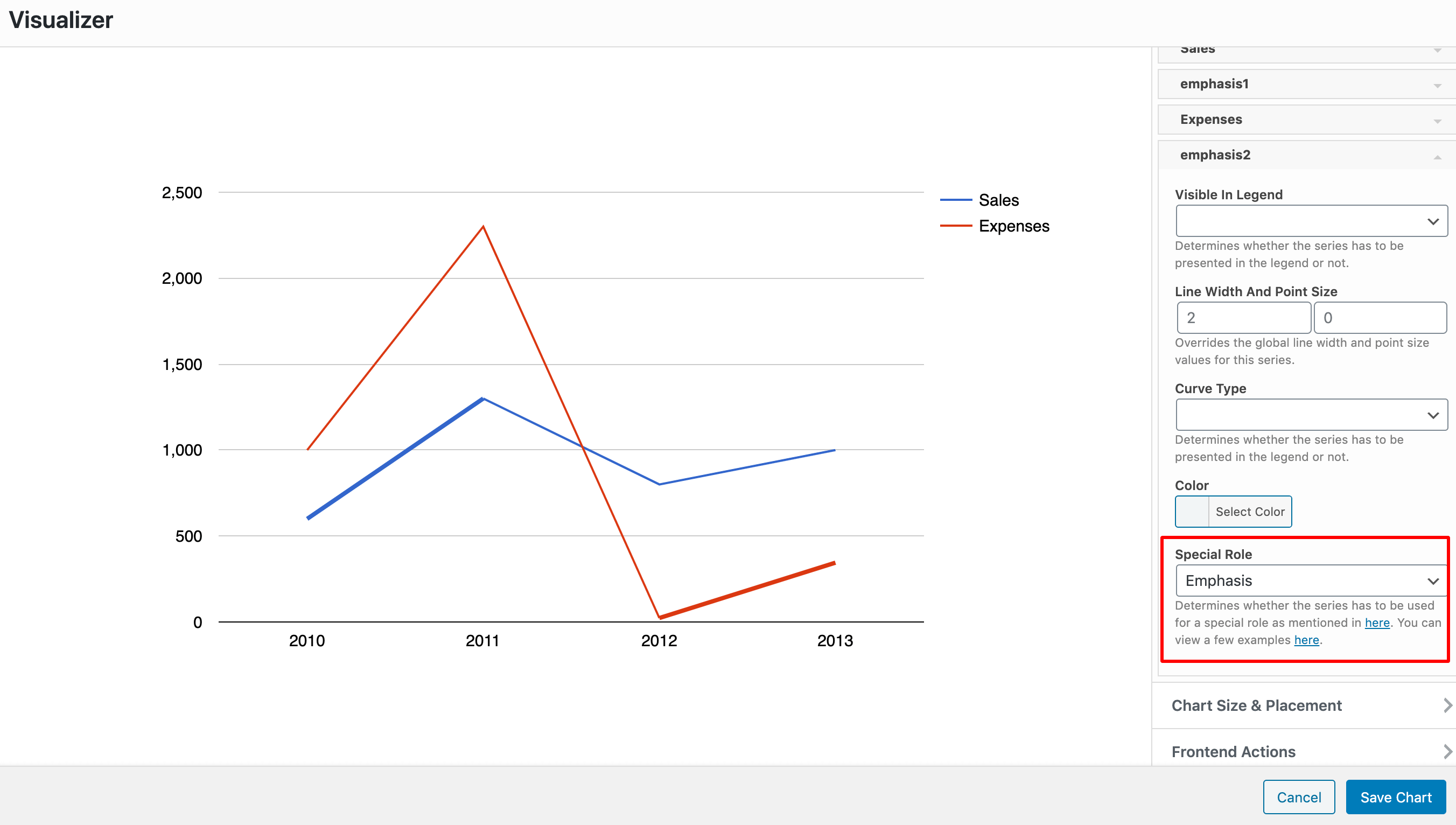
Emphasizes specified chart data points. Displayed as a thick line and/or large point.
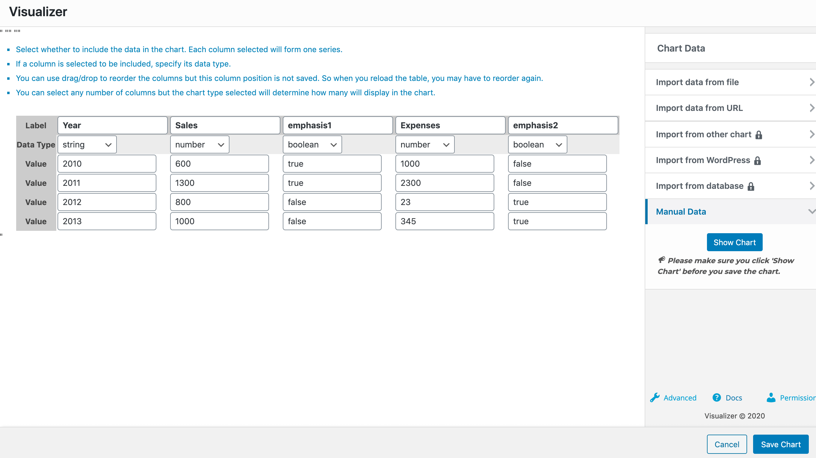
For this example, we have a line chart, with the three columns Year ( of type string ), Sales ( of type number ), and Expenses ( of type number ). For each of the Sales and Expenses columns, we have a dedicated column emphasis ( of type boolean ) which is used as the emphasis column of the chart. For that to happen, you must go to the Settings tab > Series Settings > Select each of the emphasis columns and for them choose the Emphasis Special Role.
5. Scope
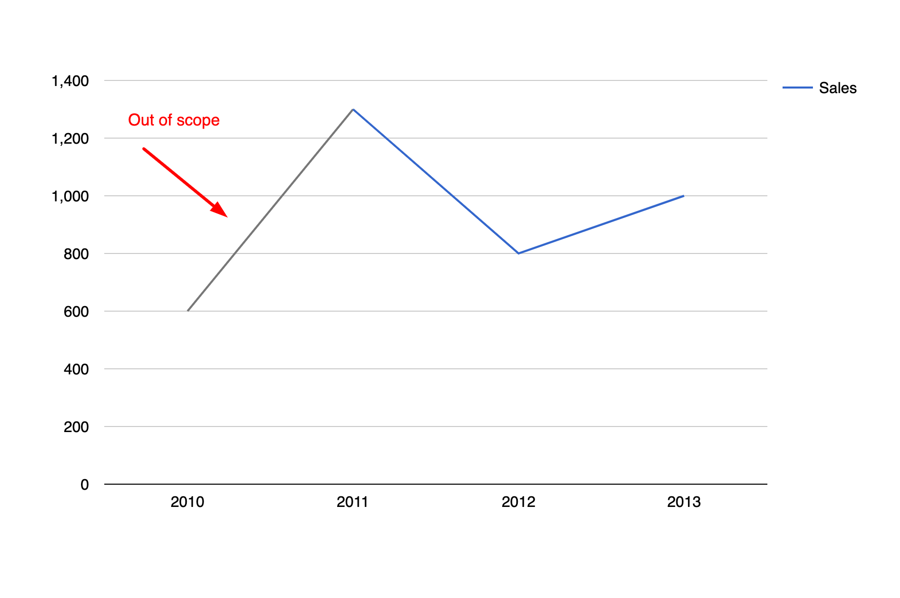
Using the scope role, we can indicate whether a point on the chart is in or out of scope. If a point is out of scope, it is visually de-emphasized.
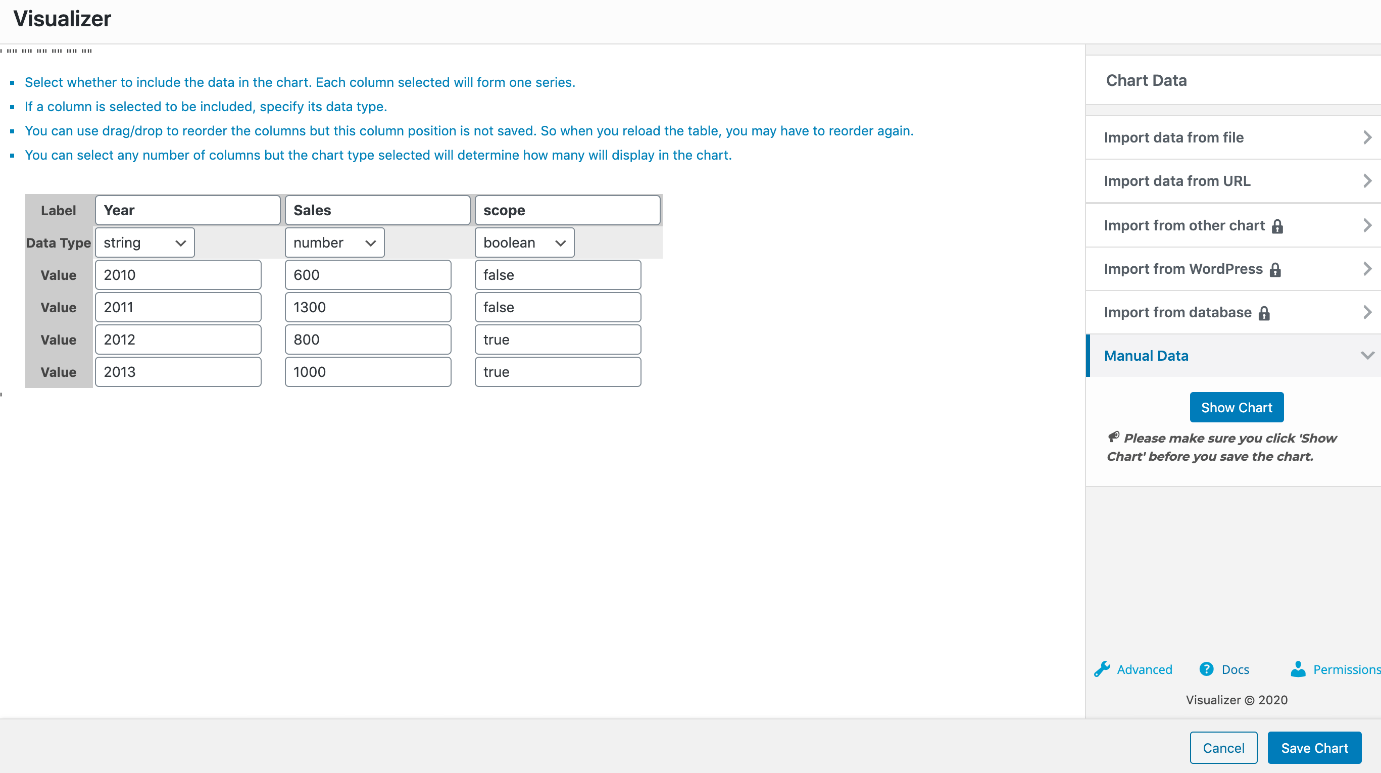
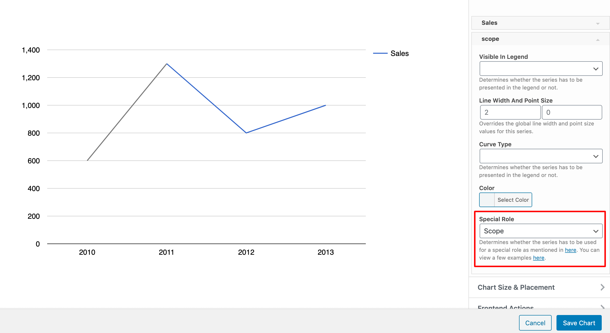
For this example, we have a line chart, with two columns Year ( of type string ) and Sales ( of type number ), and a third column Scope ( of type boolean ) which is used as the scope column of the chart. For that to happen, you must go to the Settings tab > Series Settings > Select the Scope column and for that choose the Scope Special Role.
6. Style
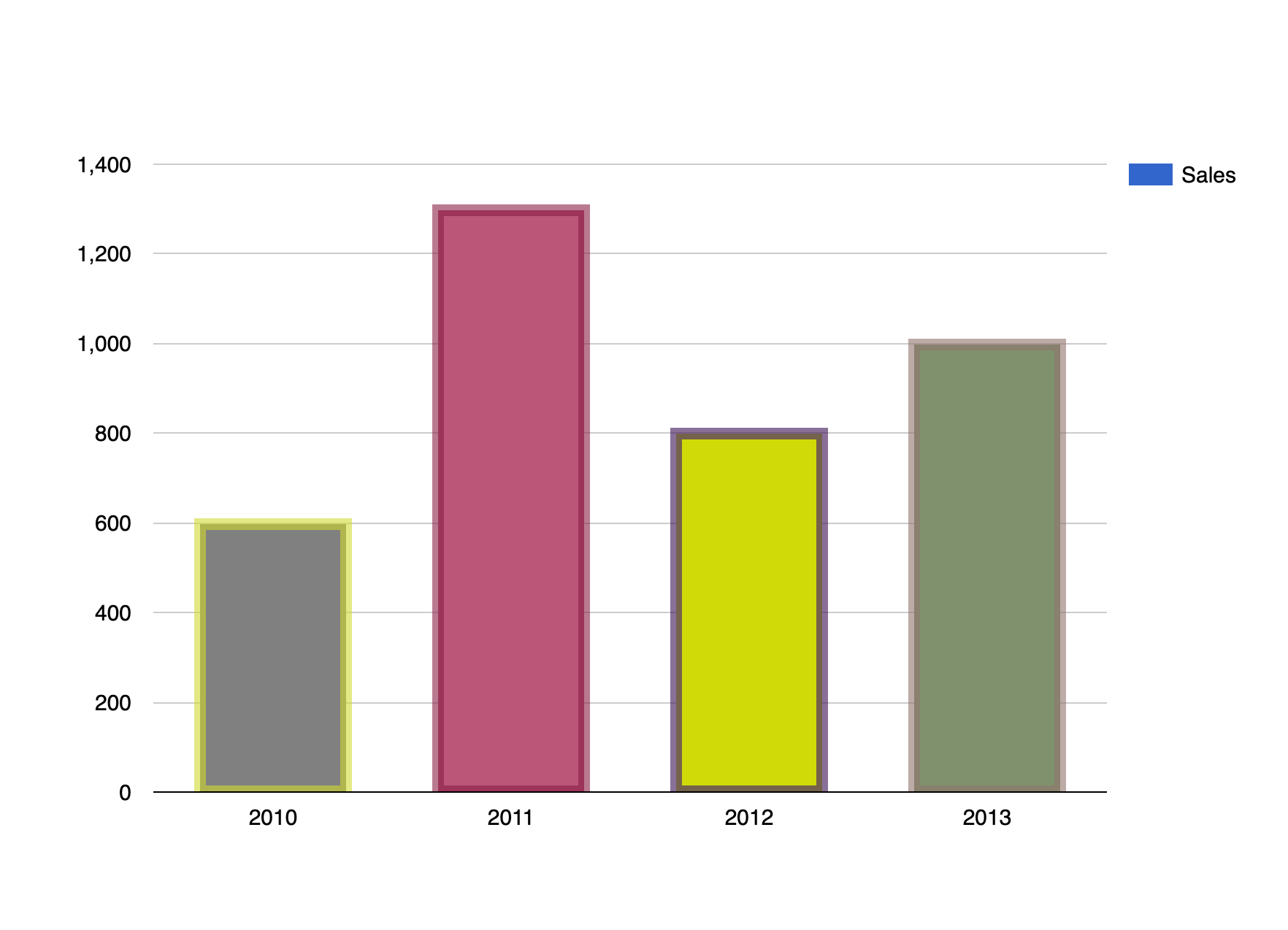
Using the style role, we can style certain properties of the chart, like color, opacity, stroke-width, stroke-color, stroke-opacity, fill-color and fill-opacity.
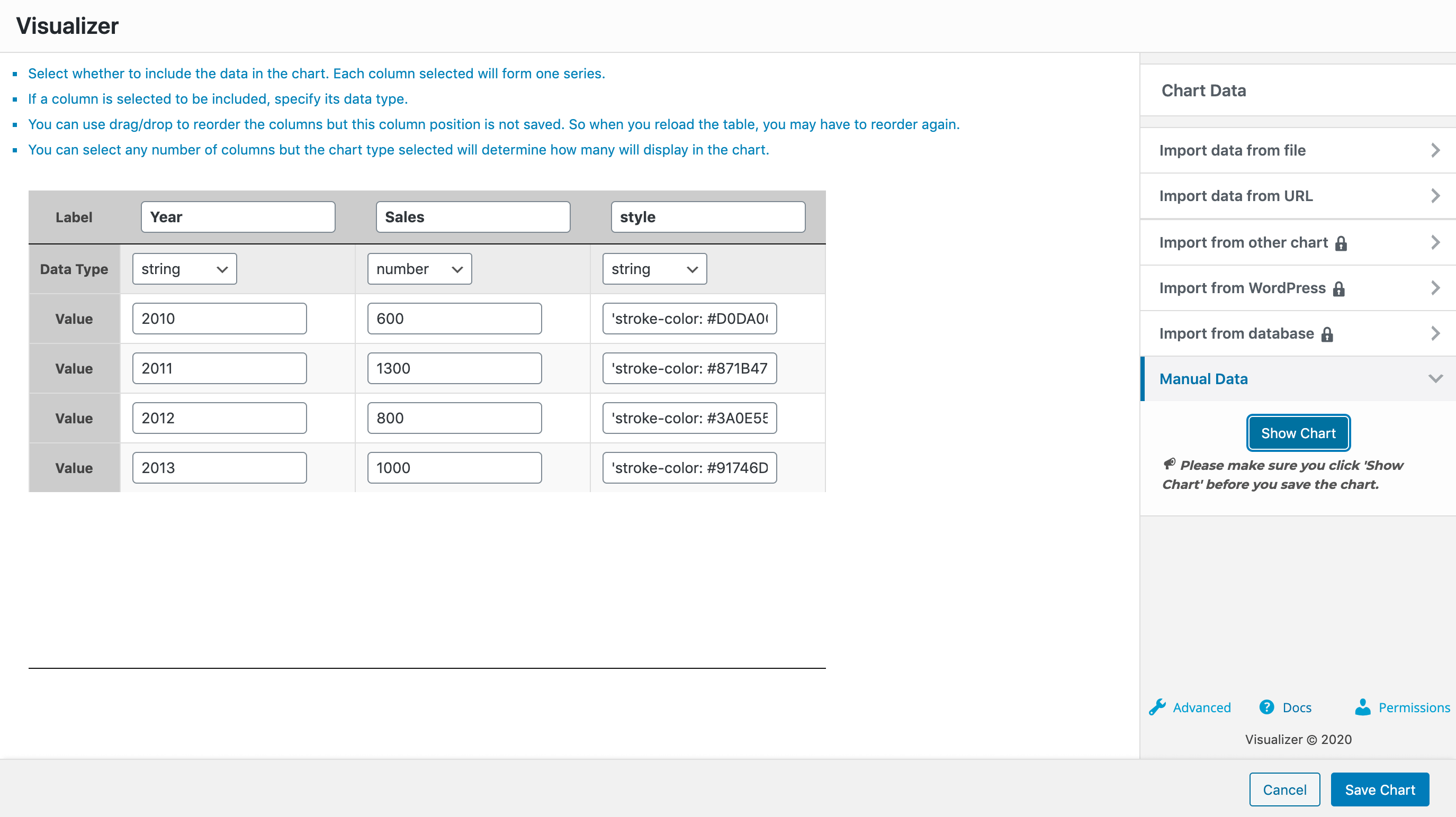
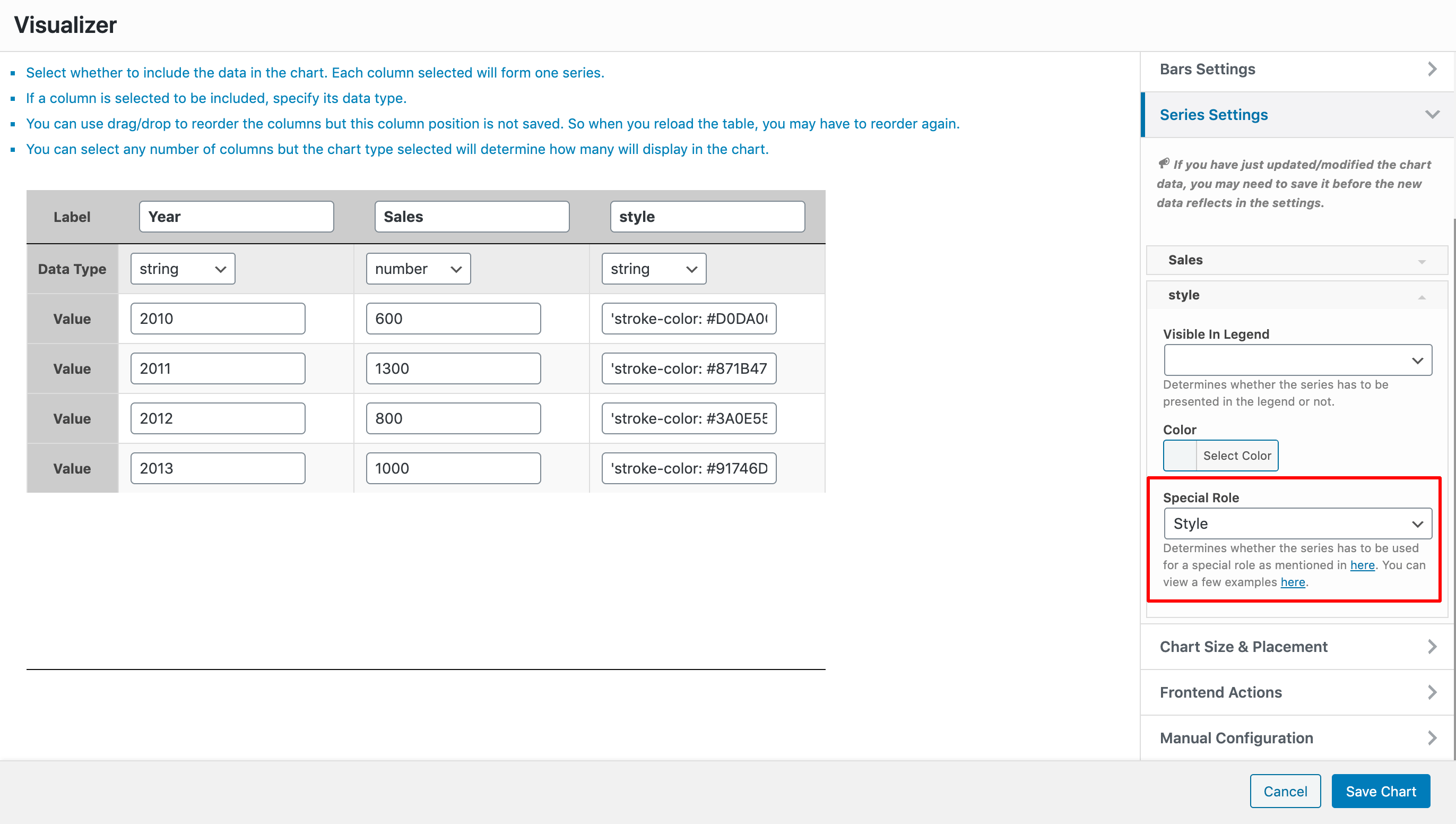
For this example, we have a column chart, with two columns Year ( of type string ) and Sales ( of type number ), and a third column Style ( of type string ) which is used as the style column of the chart. For that to happen, you must go to the Settings tab > Series Settings > Select the Style column and for that choose the Style Special Role.
Note: for the style column make sure to use double quotes, for example:
"stroke-color: #871B47; stroke-opacity: 0.6; stroke-width: 8; fill-color: blue; fill-opacity: 0.2".
7. Tooltip
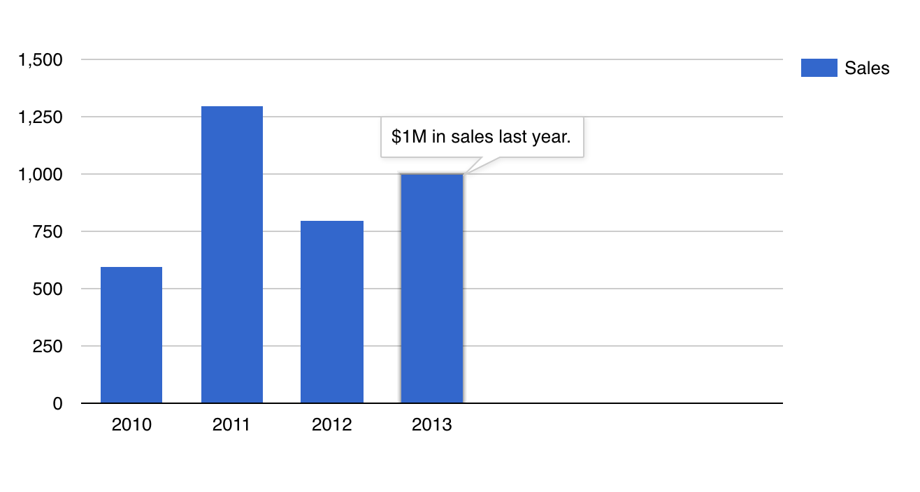
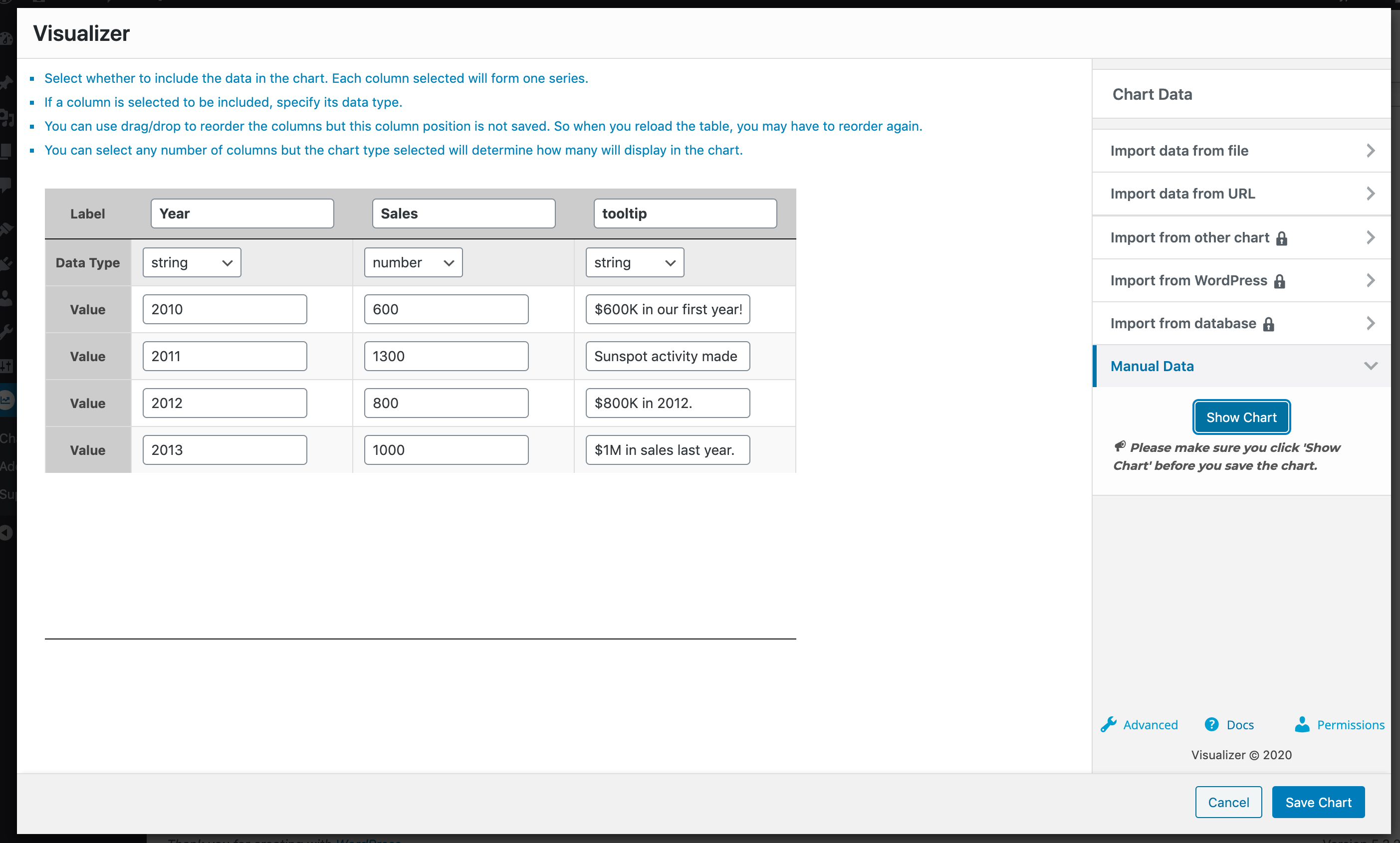
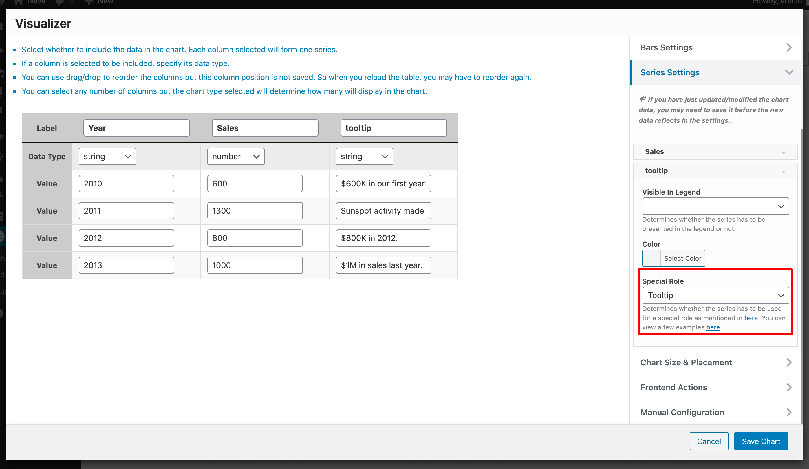
Using the tooltip role, we can add custom content to the tooltips by adding a new column to the chart and marking it with the tooltip role.
For this example, we have a column chart, with two columns Year ( of type string ) and Sales ( of type number ), and a third column Tooltip ( of type string ) which is used as the tooltip of the chart. For that to happen, you must go to the Settings tab > Series Settings > Select the Tooltip column and for that choose the Tooltip Special Role.
8. Interval
Using the interval role, you can display a range around the data points of a series, such as a minimum and maximum or a confidence interval. Add one or more columns of type number next to your data column, then go to the Settings tab > Series Settings, select each interval column, and choose the Interval role.