What is the Difference Between Neve and Neve PRO?
Which product version is right for me, free or PRO?
1. Starter Sites Library
Neve and Neve Pro come with an ever-growing starter sites library, which enables you to import a ready-made website in no time. With just a few clicks you can begin customizing your site using any of the most popular page builders out there.
New Starter Sites are added to the library each month, so stay tuned.
| Starter Sites | Neve | Neve Pro (Personal) | Neve Pro (Bussiness) | Neve Pro (Agency) |
|---|---|---|---|---|
| Free | Yes | Yes | Yes | Yes |
| Premium | - | - | Yes | Yes |
| Import the page template only | for free demos | for free demos | for any starter site | for any starter site |
| Save a page as template in your own library | - | - | - | Yes |
| Load a template saved in your own library | - | - | - | Yes |
| Import page templates created in Gutenberg (not the ones from starter sites, independently templates) | Yes | Yes | Yes | Yes |
2. Header
Neve brings in a versatile builder for the header and footer areas of your site. With just a few clicks you can create your perfect header and footer. While Neve has all the main components needed for creating a basic header, Neve Pro brings in extra components that can be used to create more advanced sticky, transparent headers.
| Features | Neve | Neve Pro |
|---|---|---|
| Header custom background image or color Choose the desired text and background color for each header row and component. An image can also be used as the header background, instead of a solid color. | Yes | Yes |
| Header Presets Try a few header layouts within a few clicks, by choosing from the ready-made presets. | Yes | Yes |
| Sticky header Each of the header builder's three rows can be set up as Sticky and/or Show only on scroll. | - | Yes |
| Transparent header The transparent header area is applying just on the homepage if a static front page is selected. | - | Yes |
| Color Palette Switch(Dark/Light theme) - Header Component This component allows the site visitor to change the color palette on his end. It can also be set to automatically adjust the color scheme based on the visitor's browser time. | Yes | Yes |
| Divider This component is a vertical line that can be used to separate the different header components. | - | Up to two |
| Social Icons component Allows for social links in the header, without the need for any plugin. | - | Yes |
| Header Custom Layout Allows a custom layout to be shown in the Header area. | - | Yes |
| Contact component Allows for an unlimited number of fields, type of Text, Email, or Phone. | - | Yes |
| Breadcrumbs component It can be added in the header, only when one of these plugins is installed and configured to display breadcrumbs: Yoast SEO, Rank Math SEO, Breadcrumb NavXT, or SEOPress. | - | Yes |
| Wish List component It is a special component that can be used only if the Wish List mechanism is enabled in the WooCommerce Booster module. | - | Yes |
| Button component Add buttons to the header builder without writing any HTML code, and inherit the global settings for the buttons alongside the theme. | Just one | Up to three |
| HTML component Add the desired HTML code, similar to the HTML widget available in WordPress. | Just one | Up to three |
| Search Form component Display an inline search form in the header, without taking the user to a different page for searching. | Just one | Two |
| Primary Menu component Show a menu that also allows drop-downs and change its color as you wish, on Desktop and eventually in a different way on Mobile devices. | Just one | Three |
| Logo & Site Identity component Display either the site name and a description, or an image, or both of them. | Just one | Two |
| Search and Cart icons The search icon will open a form above the whole page content while the cart icon can behave differently, by redirecting the user to the cart page or displaying the mini cart in the header, or the off-canvas cart as a sidebar. | Yes | Yes |
3. Block Editor
One of the main reasons why Neve is so easy to use is that it brings in blocks that make building a website a lovely activity. While Neve has all the main components needed for creating a basic page, Neve Pro brings in extra blocks that can be used to create a more interactive website.
| Features | Neve | Neve Pro(Business or Agency) |
|---|---|---|
| Business Hours As expected from the name, the block is very useful when it comes to creating a schedule for a business. | - | Yes |
| Popup The popup is a notice that appears suddenly on the screen, over another window or display. | Yes | Yes |
| Review Comparison Table It is a special component that can be used only if the Comparison Table module is enabled in the WooCommerce Booster module. | - | Yes |
| WooCommerce Product Comparison This block helps the customers to have a better overview of the desired product, by comparing it with other products that he selects. | - | Yes |
| Add to Cart Button The add to cart button represents the button that stays somewhere around the product, to ensure the sale process. | - | Yes |
| Conditional Loading Feature The conditional loading is a feature that applies to all blocks within the Otter Library and is represented by the Visibility Condition, in the Settings panel. | - | Yes |
| Import and sync review data from Woo products feature This feature is related to the Product Review Block. It displays the review of a manually added product, but this process can be automated by using the details of a WooCommerce product. | - | Yes |
📝 Note: More details about the Block Editor Booster can be found here.
📝 Note: More details about the Otter Blocks plugin can be found here.
4. Page Header
Apart from the header builder, Neve Pro allows for the customization of the Page Header area ( the area below the header, where the page title is displayed ).
The page header builder consists of two rows, Buttons, HTML areas, and a Page Header Menu component. Apart from HTML code, the HTML component allows for some magic tags: {title}, {date} and {author} which are replaced automatically on each page with the actual title of the page, publish date and author name.
More details about the options available in the Page Header area can be found in this guide.
5. Page Footer
Neve Pro allows the layout customization to be shown in the Footer area.
The Footer builder area has 2 rows (Footer Top and Footer Bottom), easily accessible. It allows you to arrange components or to bring some new layout or style settings.
| Features | Neve | Neve Pro |
|---|---|---|
| Footer Custom Layout This footer component allows a custom layout to be shown in the Footer area. | - | Yes |
| Widgets Footer Component There are four widget areas, each with General and Layout options. | 4 widgets | 4 widgets |
| Copyright Footer Component This component allows you to add the desired text, but it also allows you to get dynamic information, like the current year or current page title. | - | Yes |
| Social Icons Component This component allows you to add social media buttons (Facebook, Twitter, Youtube, Instagram) to the site footer. | - | Yes |
| Payment Icons Component This component allows you to add payment methods (Visa, Mastercard, PayPal) to the site footer. | - | Yes |
| Footer Menu This component provides options like: General, Layout, Style | Yes | Yes |
| Divider This component is a vertical line that can be used to separate the different footer components. | - | Up to two |
6. Blog Page
Three layouts available for the Blog page
The posts within the blog page can be displayed as a list, grid, or covers.
| List | Neve | Neve Pro |
|---|---|---|
| List Spacing | - | Yes |
| Image Position | - | Yes |
| Content Padding | - | Yes |
| Image Width | - | Yes |
| Image Style | - | Yes |
| Disable Title | Yes | Yes |
| Alternating Layout | Yes | Yes |
| Add Separator between posts | - | Yes |
| Enable Card Style | - | Yes |
| Covers | Neve | Neve Pro |
| Columns - control the number of columns | Yes | Yes |
| Grid Spacing | - | Yes |
| Card Min Height | - | Yes |
| Border Radius | - | Yes |
| Overlay Color | - | Yes |
| Text Color | Yes | Yes |
| Content Padding | - | Yes |
| Image Style | - | Yes |
| Disable Title | Yes | Yes |
| Enable Masonry | Yes | Yes |
| Show Content Only on Hover | - | Yes |
| Enable Card Style | - | Yes |
| Grid | Neve | Neve Pro |
| Columns | Yes | Yes |
| Grid Spacing | - | Yes |
| Border Radius | - | Yes |
| Content Padding | - | Yes |
| Image Style | - | Yes |
| Disable Title | Yes | Yes |
| Enable Masonry | Yes | Yes |
| Add Separator between posts | - | Yes |
| Enable Card Style | - | Yes |
Apart from the specific options of each layout, four more panels are used to boost your blog's appearance.
| Featured Post | Neve | Neve Pro |
|---|---|---|
| Featured Post type | Yes | Yes |
| Image Position | - | Yes |
| Image Alignment | - | Yes |
| Content Alignment | - | Yes |
| Background Color | - | Yes |
| Content Padding | - | Yes |
| Post height | - | Yes |
| Ordering and Content | Neve | Neve Pro |
| Order Posts by | - | Yes |
| Post Pagination | Yes | Yes |
| Post Content Order | Yes | Yes |
| Content Alignment | - | Yes |
| Excerpt Lenght | Yes | Yes |
| Thumbnail Shadow | Yes | Yes |
| Post Meta | Neve | Neve Pro |
| Meta Order and Reorder - the Hide on mobile option is available in free and pro, but the Format is available only on pro. 📝Note: The pro version includes the Estimated Reading Time meta and customizable Format. | Yes | Yes |
| Meta Add Item | - | Yes |
| Separator | Yes | Yes |
| Show Author Avatar | Yes | Yes |
| Use last updated date instead of the published one | Yes | Yes |
| Read More | Neve | Neve Pro |
| Customizable Read More option - with three available styles. | - | Yes |
7. Single Post Page
| Features | Neve | Neve Pro |
|---|---|---|
| Show/Hide/Reorder items within the page The elements within the single post layout can be reordered or hidden. | Yes | Yes |
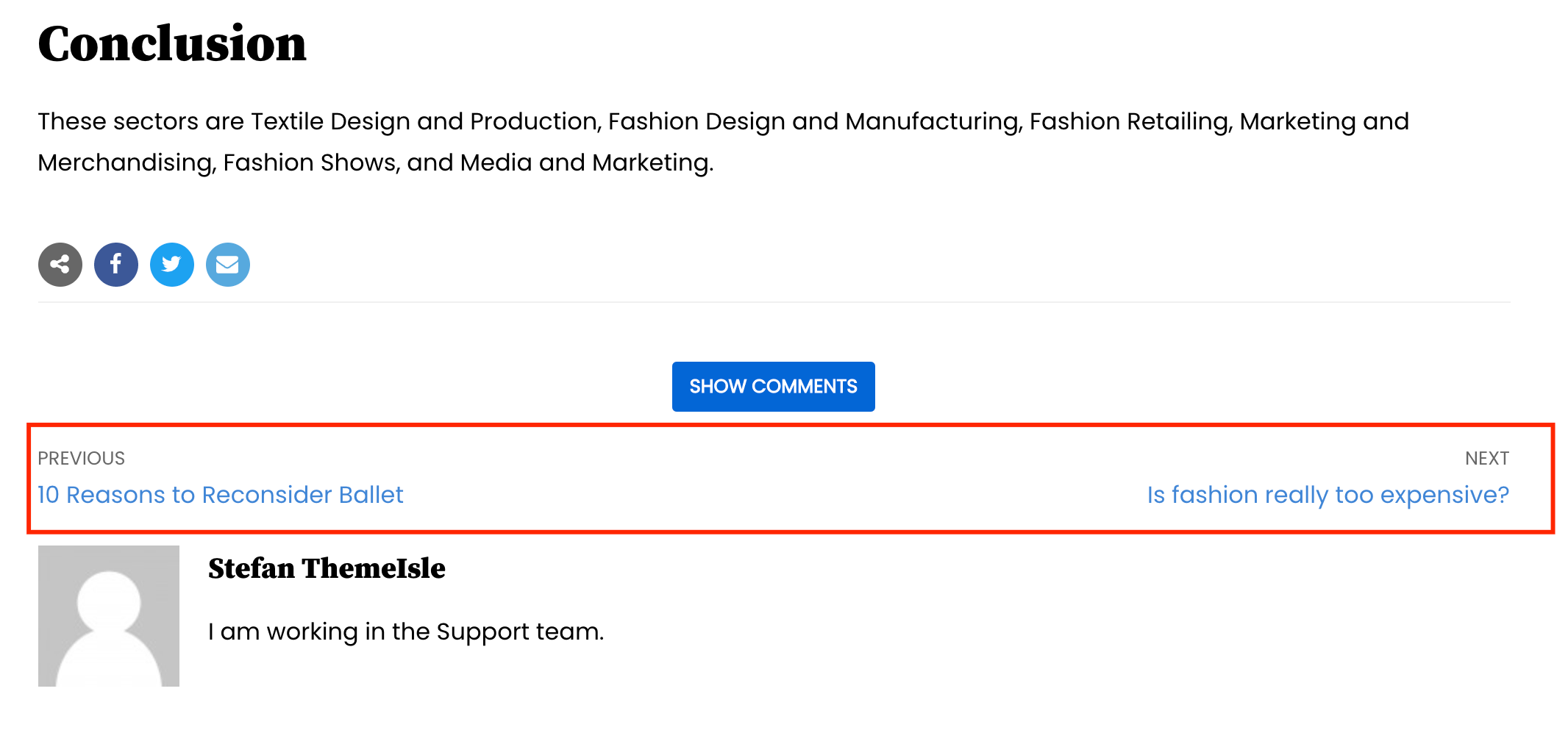 Posts navigation Posts navigationDisplay the title of the next and previous posts with a link to them, based on the blog page order. | Yes | Yes |
 Header Layout Header LayoutChange the header to a full-width one with the featured image as background hero image and the title above it. | Yes | Yes |
| Sharing Icons Easily share the current post on email or social media by using the default sharing icons. | - | Yes |
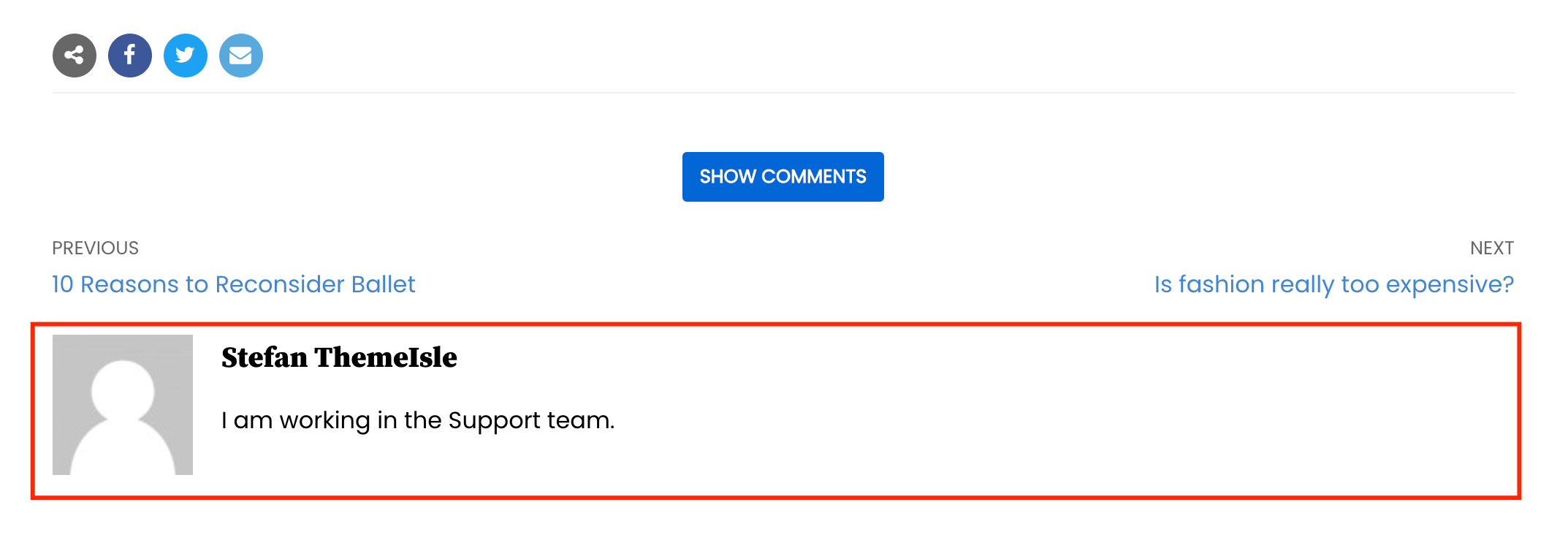 Author Biography Author BiographyPulls out the post's author name, description, and Gravatar image from the user settings. | - | Yes |
| Related Posts With options for the section title, the number of related posts, length of the post content, and filtering option ( you can choose to select related posts based on related categories or related tags ) | - | Yes |
| Custom display for the Comments section Ability to have a show/hide mechanism for the comments section | - | Yes |
8. Custom Layouts
Custom Layouts is one of Neve Pro Addon's modules, which allows you to easily create headers, footers, and other custom sections in the default editor or any page builder. You can read more about it here.
| Features | Neve | Neve Pro |
|---|---|---|
| Create a custom header Replace the theme header with a custom one that can be edited with the WordPress editor or Elementor. | - | Yes |
| Create a custom footer Replace the theme footer with a custom that can be edited with the WordPress editor or Elementor. | - | Yes |
| Create a custom 404 Page Create your own template for the 404 page. Follow this doc for more details. | - | Yes |
| Create custom PWA's Offline and Internal Server Error pages Follow this doc for more details. | - | Yes |
9. Elementor Widgets
Neve and Neve Pro are fully compatible with Elementor, but Neve Pro brings in extra widgets that can be used in Elementor.
| Features | Neve | Neve Pro |
|---|---|---|
| Flip Card widget A card with two sides (Front Side and Back Side) between which the user can flip when hovering over. | - | Yes |
| Review Box widget Display a review box with the product title and featured image, followed by the grades and a list of pro and con fields. | - | Yes |
| Share Buttons widget Add sharing colored buttons that can also have text next to the social platform logo, they look more like normal buttons with text rather than just small rounded icons. | - | Yes |
| Typed Headline widget Allows for a dynamic heading as in the screenshot below. | - | Yes |
| Team Member widget Use a template for sharing the team behind your business in a format like profile picture, name, occupation, short description, and social profiles. | - | Yes |
| Progress Circle widget Display loading circle icons to share the progress, status, or comparisons, by customizing the percentage, the color, and the thickness of the bar. | - | Yes |
| Banner widget Easily create a banner with a background image, text, and/or title above the image. | - | Yes |
| Content Switcher widget Show 3 pricing plans with toggle above them, that can keep the section layout and only changing information. | - | Yes |
| Custom Field widget Bring in post meta or ACF fields in Elementor | - | Yes |
| Particles for Elementor sections Display interactive atoms and place them in every Elementor section with awesome effects | - | Yes |
| Animations for Elementor widgets Create amazing animations and shape your elements on different scales | - | Yes |
| Content Protection for Elementor widgets Restrict any Elementor content from certain people based on time, user rules, password, logged in/not logged in user, and dates of the week | - | Yes |
10. WooCommerce
| Features | Neve | Neve Pro (Business & Angecy) |
|---|---|---|
| Shop page | ||
| Shop page pagination The pagination can be designed as a numeric ( 1, 2, 3 .. ) or infinite scroll ( loading a new batch of products on each scroll ). | - | Yes |
| Disable product filtering on the Shop page This filter changes the order of the products based on price, popularity, latest, or average rating. | - | Yes |
| Add a Layout toggle on the Shop page A toggle on the Shop page, which will display the products either in a grid view or a list view. | - | Yes |
| Options for positioning the Add to Cart button In Neve Pro, you can easily add the Add to Cart button below the product card, over the product thumbnail when hovering on the product, or hide it. | - | Yes |
| Quick view button Opens a pop-up window with details about the product. | - | Yes |
| Wish list mechanism Without any external plugin. | - | Yes |
| Grid view or list view on the Shop page Display a switcher so each user can choose the desired layout. | - | Yes |
| Option to force the same image height for products on the Shop page This option is really handy for sites with lots of products. If some product images are larger than others, this option will force them all to have the same size for a nice-looking layout. | - | Yes |
| Hover effect for products images on the Shop page Choose between None, Zoom (make the image bigger), or Swipe ( on hover, show the first image from the gallery, if there is an image ) | - | Yes |
| Enable/disable and reorder elements in the product box on the Shop page The elements are: title, reviews, price, category, and the short description | - | Yes |
| Align product boxes on the Shop page Left/right-aligned, centered, or justified. | - | Yes |
| Enable Advanced reviews on the Shop page Apart from the total review score displayed in the form of stars, display the total review score <number> and how many reviews are recorded for a particular product | - | Yes |
| Customizable Sale tag Choose its position ( inside the product box, or just on the edge ), alignment ( left/right ), border radius, color, and text ( which would replace the default Sale! text ). | - | Yes |
| Sale percentage Automatically calculate and display the percentage of sales for each product on the Shop page. | - | Yes |
| Single Product Page | ||
| Exclusive Products section From a selected category | Yes | Yes |
| Featured Video for Products Similar to adding a featured image, you can select a video that will show up on the single product page. | - | Yes |
| Enable/disable and reorder elements on the product page The elements are: title, price, short description, Add to cart button, meta, and reviews | - | Yes |
| Two layouts for the images gallery With the images on the left side of the main image, or at the bottom of the main image | - | Yes |
| Transform the images gallery into a slider Display the rest of the product images except for the featured image as a slider. | - | Yes |
| Enable or disable Related and Upsells Products Show some products related to the current one in a grid or carousel format. | - | Yes |
| Enable or disable product images zoom effect It zooms in the product featured image when hovering over it. | - | Yes |
| Cart Page | ||
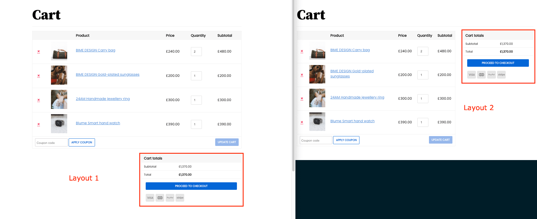 Two different layouts for the Cart Page Two different layouts for the Cart PageWith the Cart totals box on the right side or at the bottom of the main content. | - | Yes |
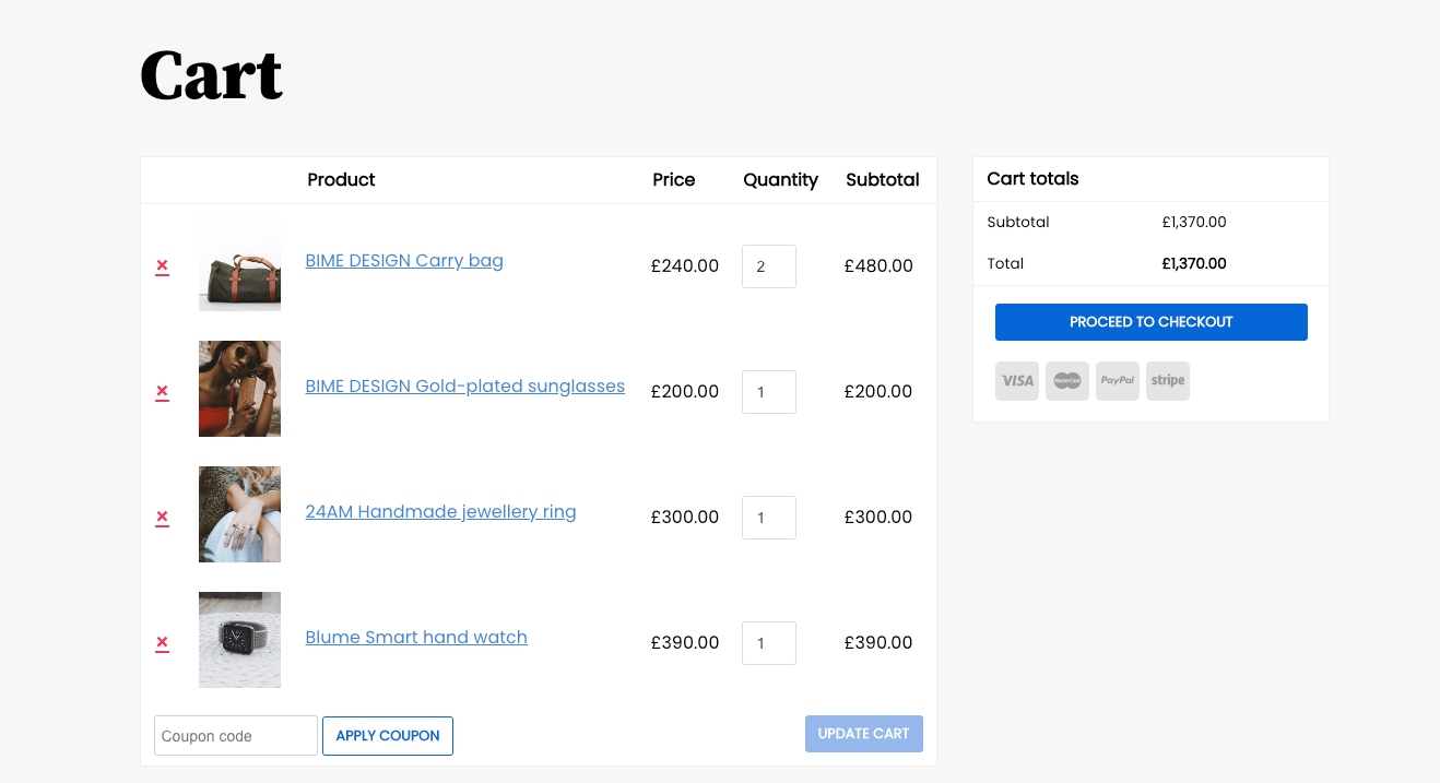 Two different background colors for the Cart Page Two different background colors for the Cart Page | - | Yes |
| Checkout Page | ||
| Three layouts available Choose between a standard, vertical, or stepped layout. | - | Yes |
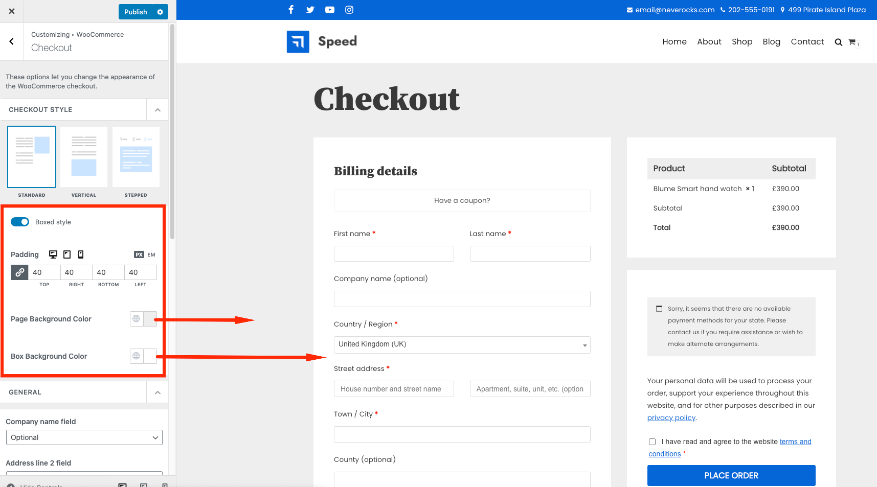 Style options Style optionsSet a page background color, tables' background color, and tables' padding. | - | Yes |
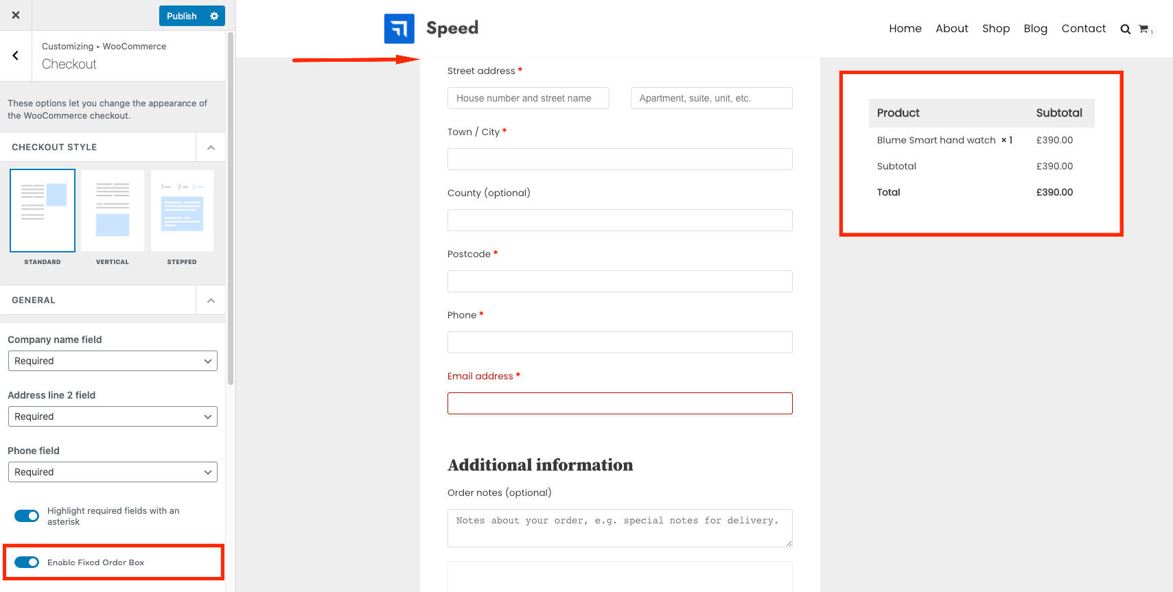 Enable Fixed Order Box Enable Fixed Order BoxIt works only for the Standard layout and it makes the cart totals box sticky. | - | Yes |
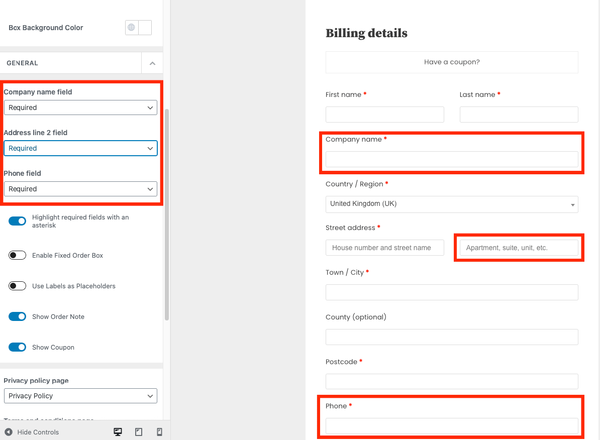 Option to enable/disable different page elements on the Checkout Page Option to enable/disable different page elements on the Checkout PageCustomize some of the fields by making them optional, required, or disabled. | - | Yes |
 Ability to use Labels as Placeholders Ability to use Labels as Placeholders | - | Yes |
| Integrations | ||
| Multi-Announcements Bars Create cart notices that can be shown based on particular action like a specific product being added to the cart. | - | Yes |
| Variation swatches Design the variations according to their type instead of showing just a drop-down choice. It can be a color, an image, or an icon. | - | Yes |
| Comparison Table Enable the comparing products option and show the comparison table on the dedicated page. | - | Yes |
11. White Label
Neve Pro gives you the opportunity to present Neve and Neve Pro as your own. You can, in fact, hide the actual names of the theme and the plugin (and all their custom details, like description, screenshot, license, and so on), and use your brand name instead.
| Features | Neve | Neve Pro |
|---|---|---|
| Rename the theme name and details to your own. | - | Yes |
| Rename the plugin name and details to your own. | - | Yes |
| Hide the license field and all notices. | - | Yes |
| Hide the Starter Sites Library. | - | Yes |
More details about the White Label options are available in this guide.
12. Performance module
The performance module provides some optimization options to enhance the performance of your site.
More details about the Performance Module options are available in this guide.
13. LifterLMS
Neve and Neve Pro are compatible with the popular plugin for online courses LifterLMS. Both are also compatible with LearnDash.
| Features | Neve | Neve Pro |
|---|---|---|
| Basic compatibility with LifterLMS | Yes | Yes |
| Customizable Catalog page Customize the number of courses per row, pagination type (numeric or infinite scroll), and layout (grid or list) on the Catalog page | - | Yes |
| Customizable Memberships page Customize the number of memberships per row, pagination type (numeric or infinite scroll), and layout (grid or list) on the Memberships page | - | Yes |
| Customize the main color used by LifterLMS | - | Yes |
14. Typekit (Adobe) Fonts
Neve Pro's module allows for an easy way of enabling new awesome Adobe (previous Typekit) Fonts in Neve's Typography options.
| Features | Neve | Neve Pro |
|---|---|---|
| Use Typekit (Adobe) Fonts in Neve's Typography options | - | Yes |
15. Scroll to Top
Neve comes with a small but handy module for adding a scroll to top button at the bottom of the page.
| Features | Neve | Neve Pro |
|---|---|---|
| Add a Scroll to Top button | Yes | Yes |
| Customize the color, size, border-radius, and position for the Scroll to Top | Yes | Yes |
16. Custom Sidebars
The Custom Sidebars module is a pro-only feature that allows you to create your own sidebars that suit your needs for any page. It can be displayed for a specific part of the website, using conditions.
More details about the Custom Sidebars Module options are available in this guide.
17. Content Restrictions
The Content Restriction module allows you to restrict several content types across your website based on users, user roles, or passwords.
More details about the Content Restrictions Module options are available in this guide.
18. Support
Besides our infinite love and respect, Neve Pro users get access to regular support and updates. Make sure you check out our pricing for more details on that.
