The Primary Header Menu Component - Neve Header / Footer Builder
For more details check out the full Neve documentation and Neve PRO documentation.
📝Note: This component is part of both Neve and Neve PRO.
The Primary Menu component is the easiest to use menu component, with many customizations available.
🧰 Using the Component
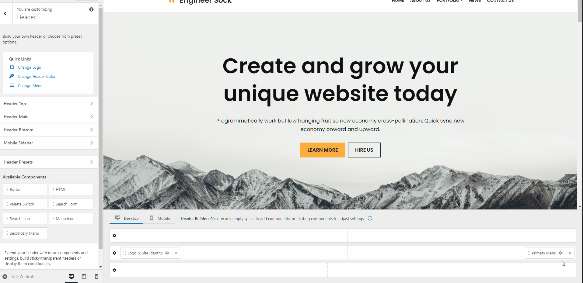
1. Start by adding the component into the rows, by clicking on the ➕ button and selecting the component.
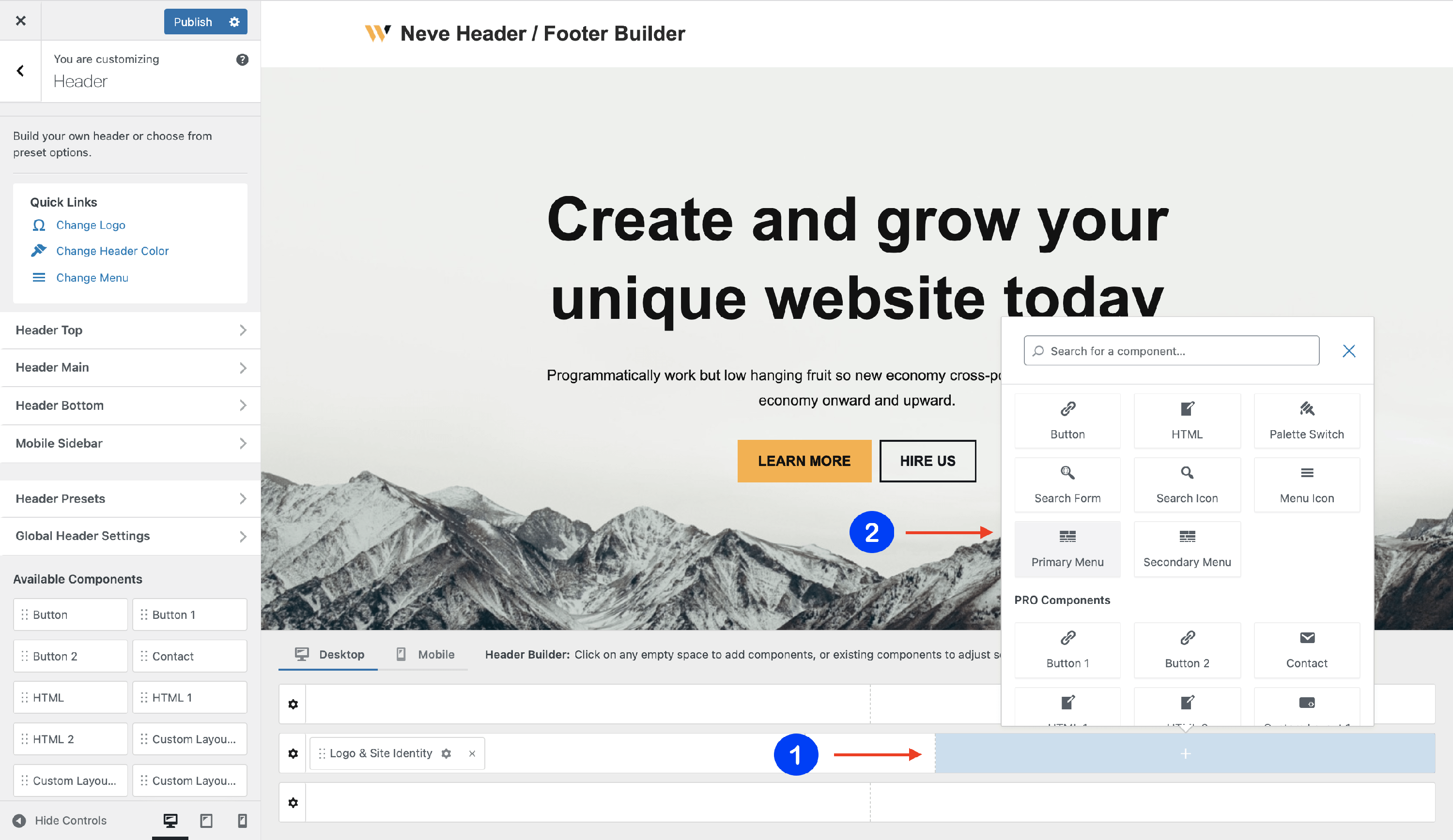
2. Open the component's settings to customize it by clicking on the ⚙️icon.
📝 Note: When using Neve PRO, there are three instances available for this component: Primary Menu, Primary Menu 1, and Primary Menu 2.
🔮Customizing the Component
There are three panels with customizing options for this component, which allow you to create the desired header / footer:
⚙️General Panel
When you click on the ⚙️ icon, the General tab will appear on the left side.
- create your Primary Menu - you will be directed to the Menus location in Customizer, where you can create / edit a new menu and assign it as Primary Menu.
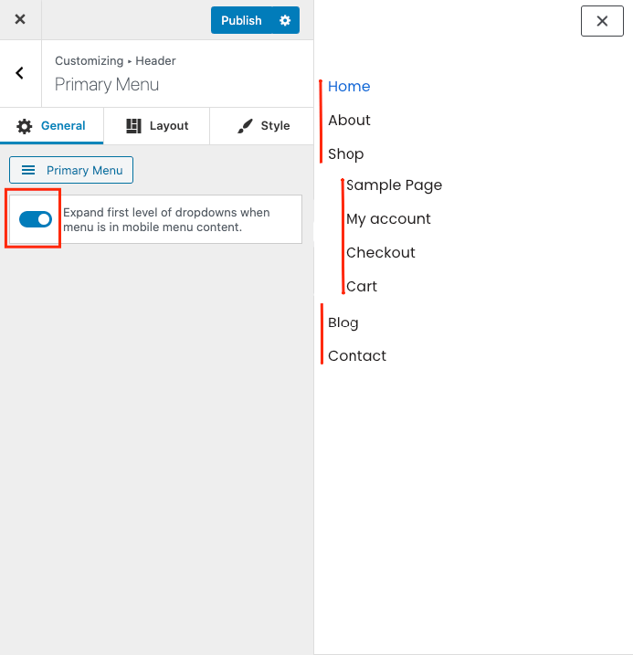
- expand the first level of the dropdowns when the menu is in the mobile menu content - enable / disable.
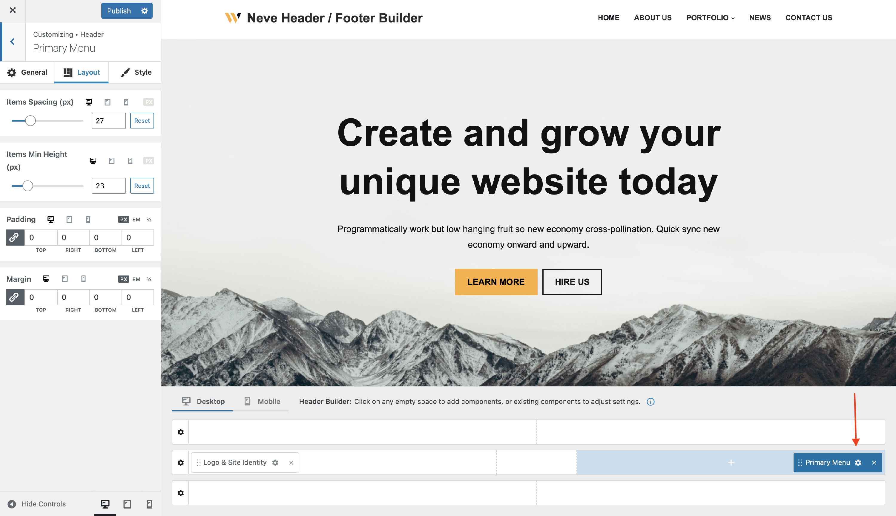
📐Layout Panel
The layout options allow the following adjustments:
- Items Spacing and Item Height - adjust the space between menu items and the top / bottom space, with responsive controls.
- Padding and Margin - available in PX, EM, and %, with a link button that helps with establishing the same dimension for all the directions ( Desktop | Tablet | Mobile ).
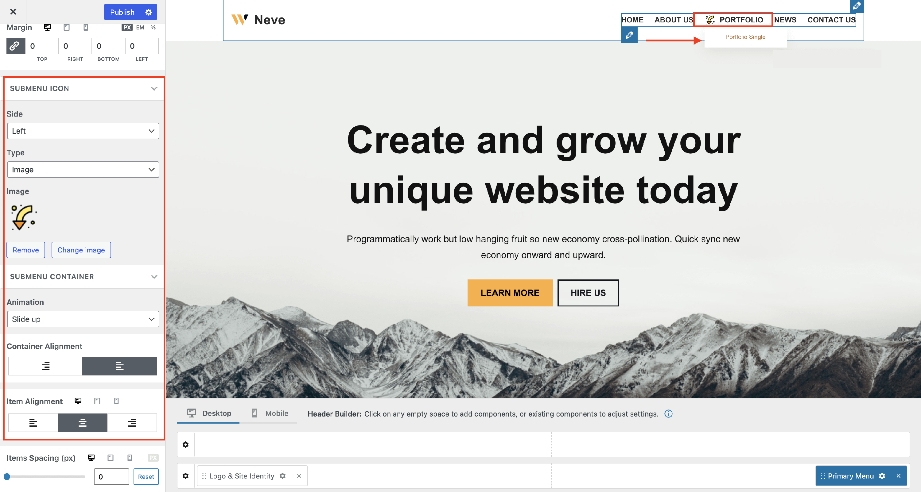
- Submenu Icon - you can change the side where it appears, select a different icon/caret or even insert an image. Here you can find more images in this direction.
- Submenu Container - select a different animation for the moment when the submenu opens, adjust container and item alignment, as well as items spacing, using the responsiveness controls.
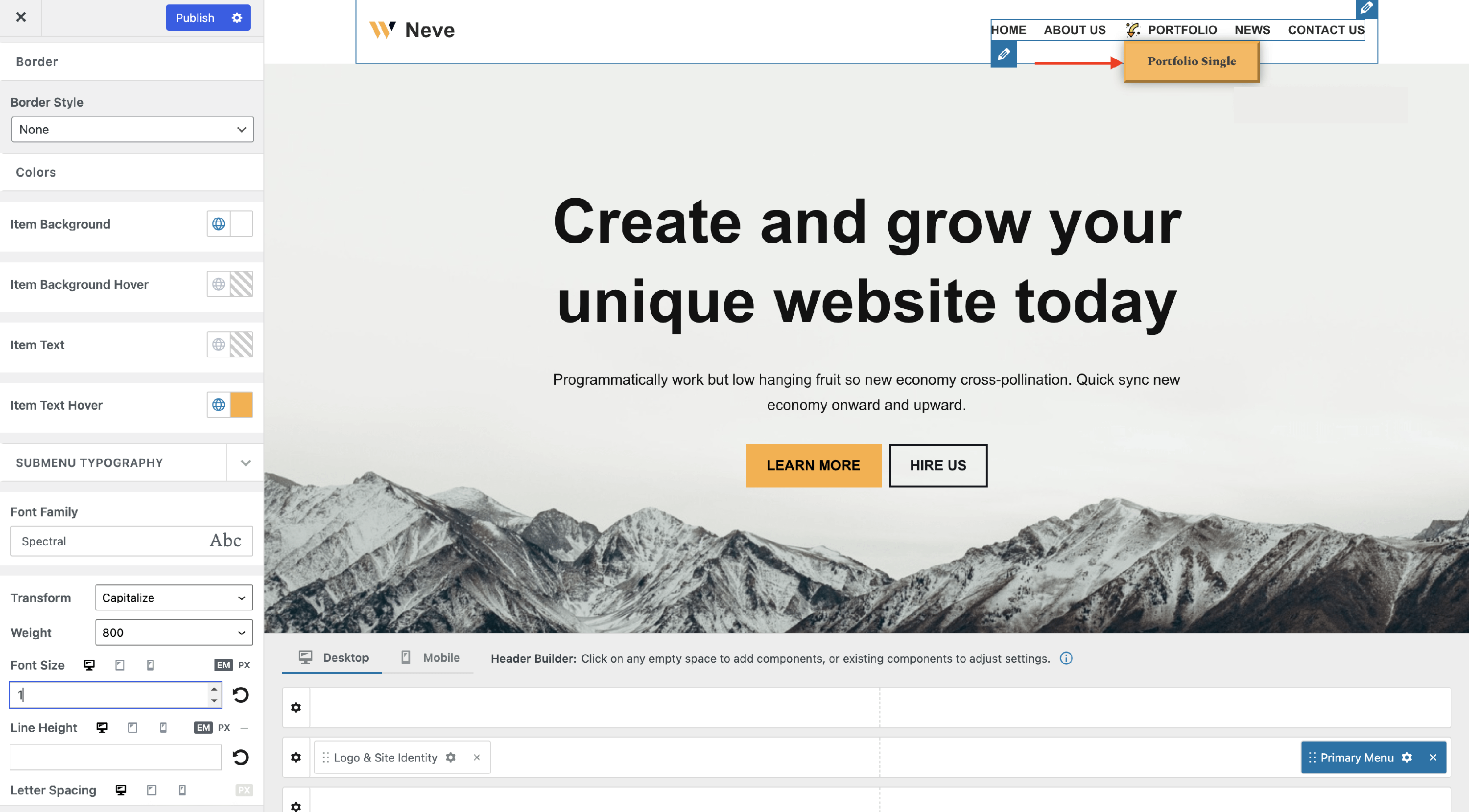
🖌 Style Panel
The Style panel contains more areas of use regarding colors or appearance, typography, and submenu style.
Custom colors for the Primary Menu items
Hover Skin Mode - four skin modes are available for the primary menu. These are styles that apply while hovering over the menu items.
Color - create a homogenous look of the menu by selecting colors for items, active item, or item hover mode. You can choose one of the global colors ( theme's default colors ) by clicking on the 🌐 button.
📝 Note: This is an article about Global Color in Neve.
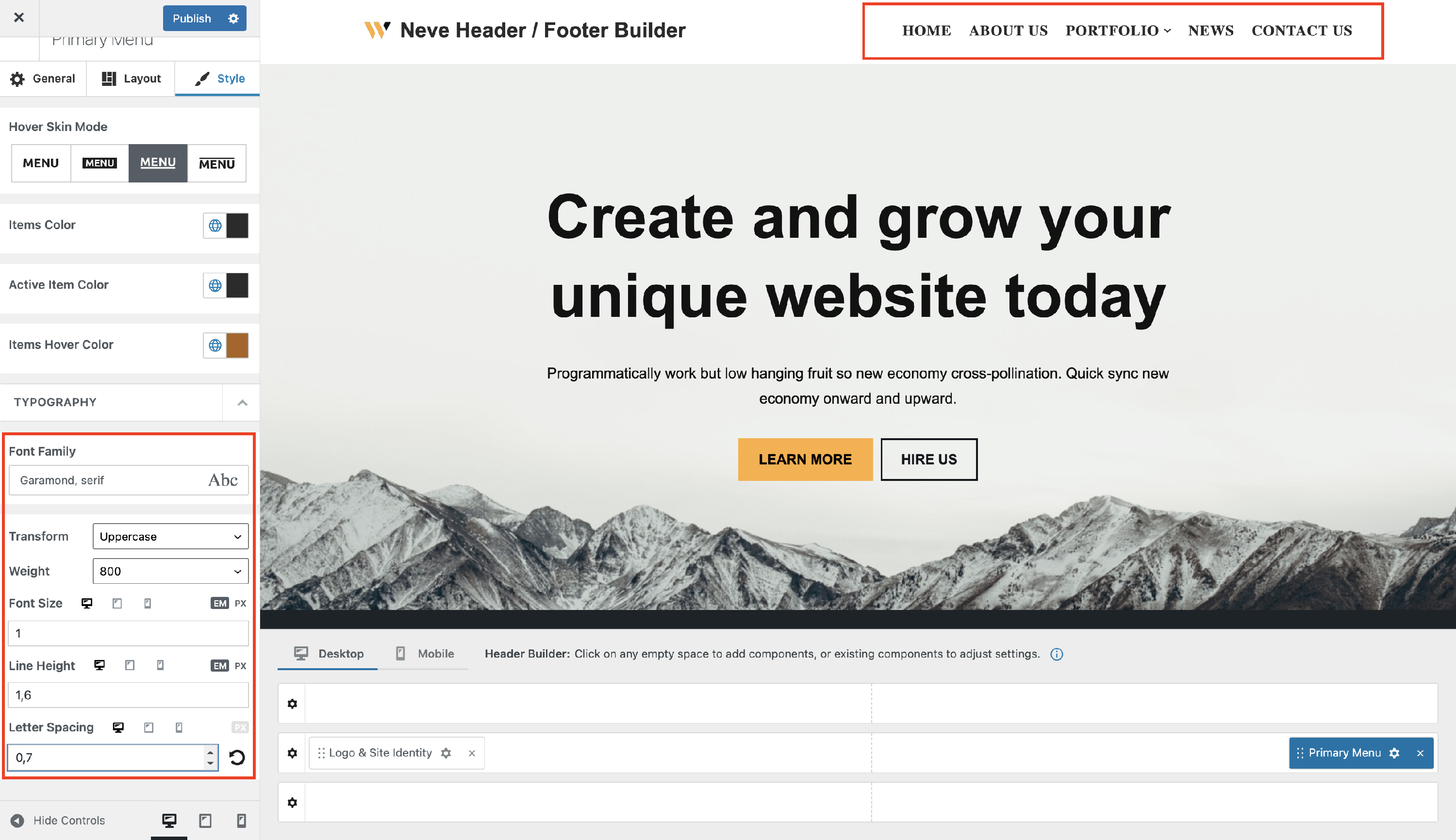
Custom typography for the Primary Menu items
- Font Family - with a vast list of fonts to choose from.
- Transform - None / Capitalise / Lowercase / Uppercase.
- Weight - None / 100 to 900.
- Font Size, Line Height ( in PX / EM ), Letter Spacing ( in PX ) - along with a reset button ( Desktop | Tablet | Mobile ).
Submenu appearance settings
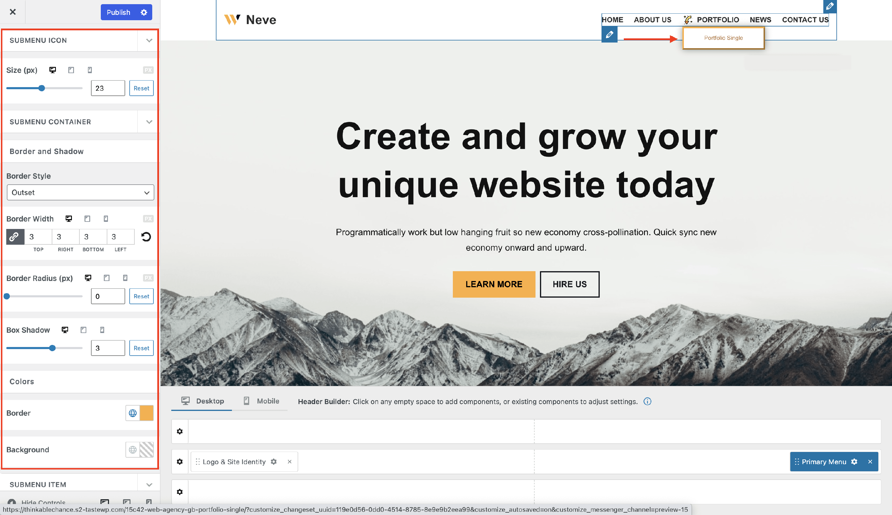
- Submenu Icon - adjust the size of the previously set icon. This might be very important if you have inserted an image.
- Submenu Container - highlight the submenu using borders and shadows.
- Submenu Item - pick a different hover skin mode for the submenu items, add a new border, and modify the color of the background and item text on normal and hover mode.
- Submenu Typography - create a different appearance for the submenu, using other typography settings.