Progress Circle Widget
📝 Note: The Progress Circle widget is part of Neve PRO's Elementor Booster module.
The Progress Circle widget works like a progress tracker, in an animated way.
Adding the widget
1. Once the Elementor Editor has been opened, click on the ➕ button to add a new section on the page.
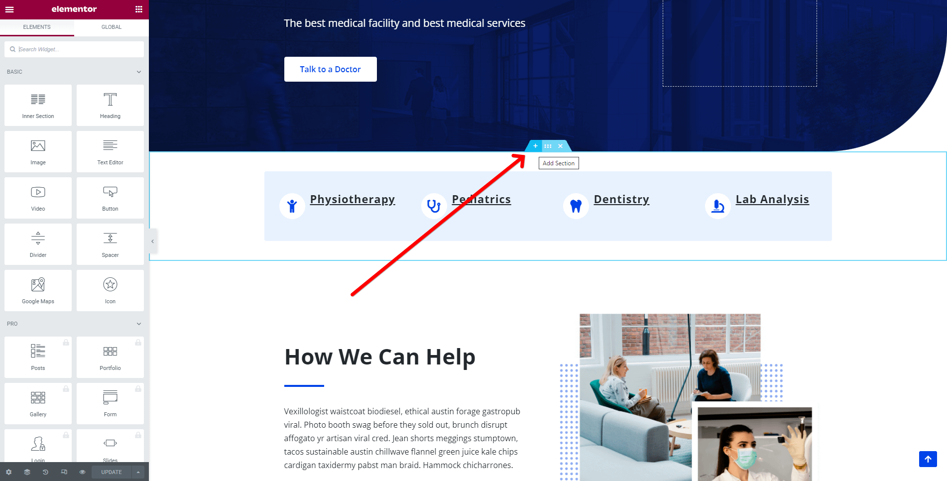
2. Add the Progress Circle widget from the Elementor Library by clicking on the ➕ button and navigating to the Neve PRO Addon Widgets.
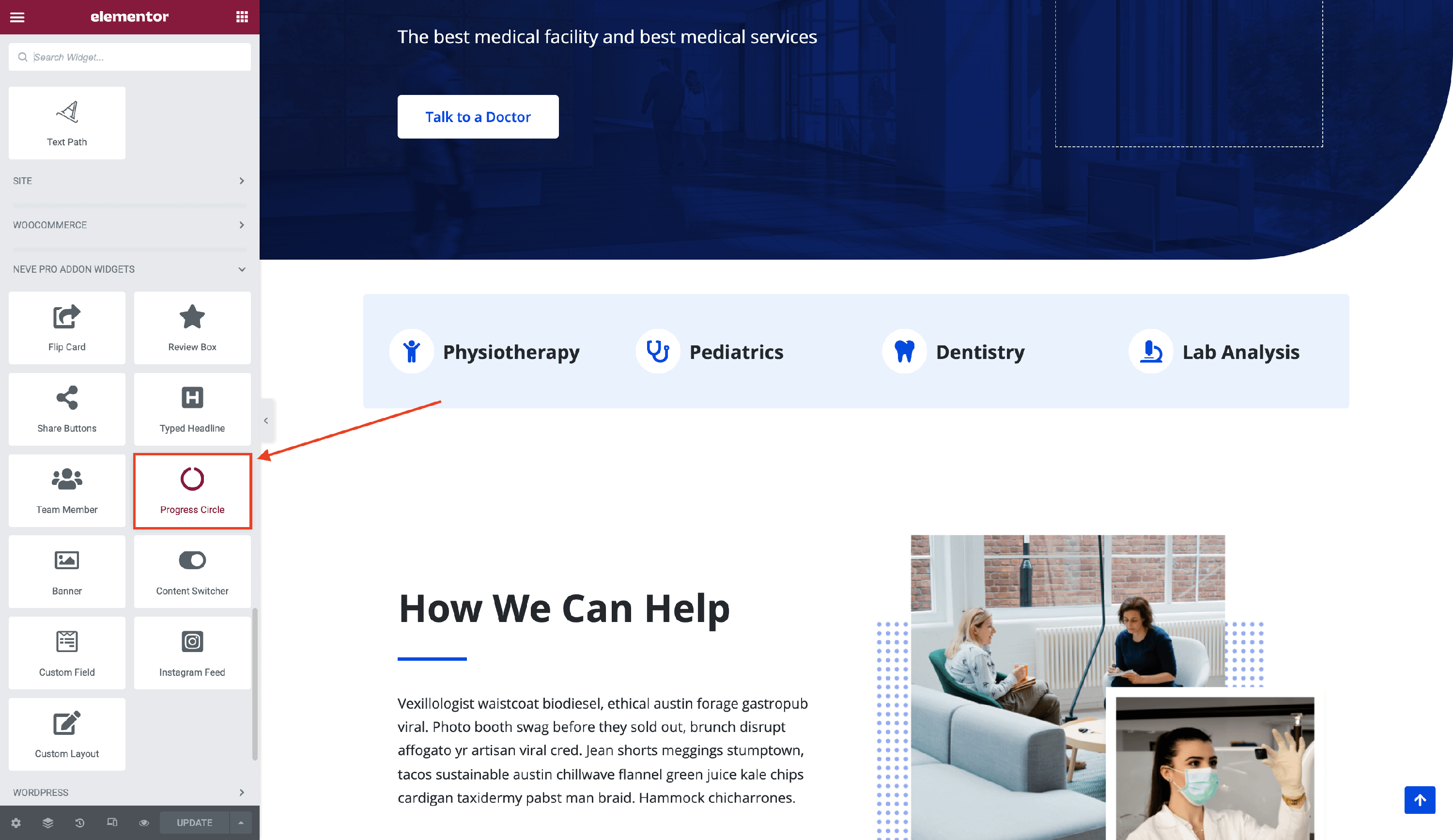
3. Drag and drop the Progress Circle widget into the selected area.
Customizing the widget
The Progress Circle component is easily customizable and its options cover two areas:
⚙️Circle Progress
- Percent - set the percentage of the circle that you want to be displayed.
- Speed(s) - decide how fast you want the progress to be completed.
- Steps - establish the recurrence of the progress.
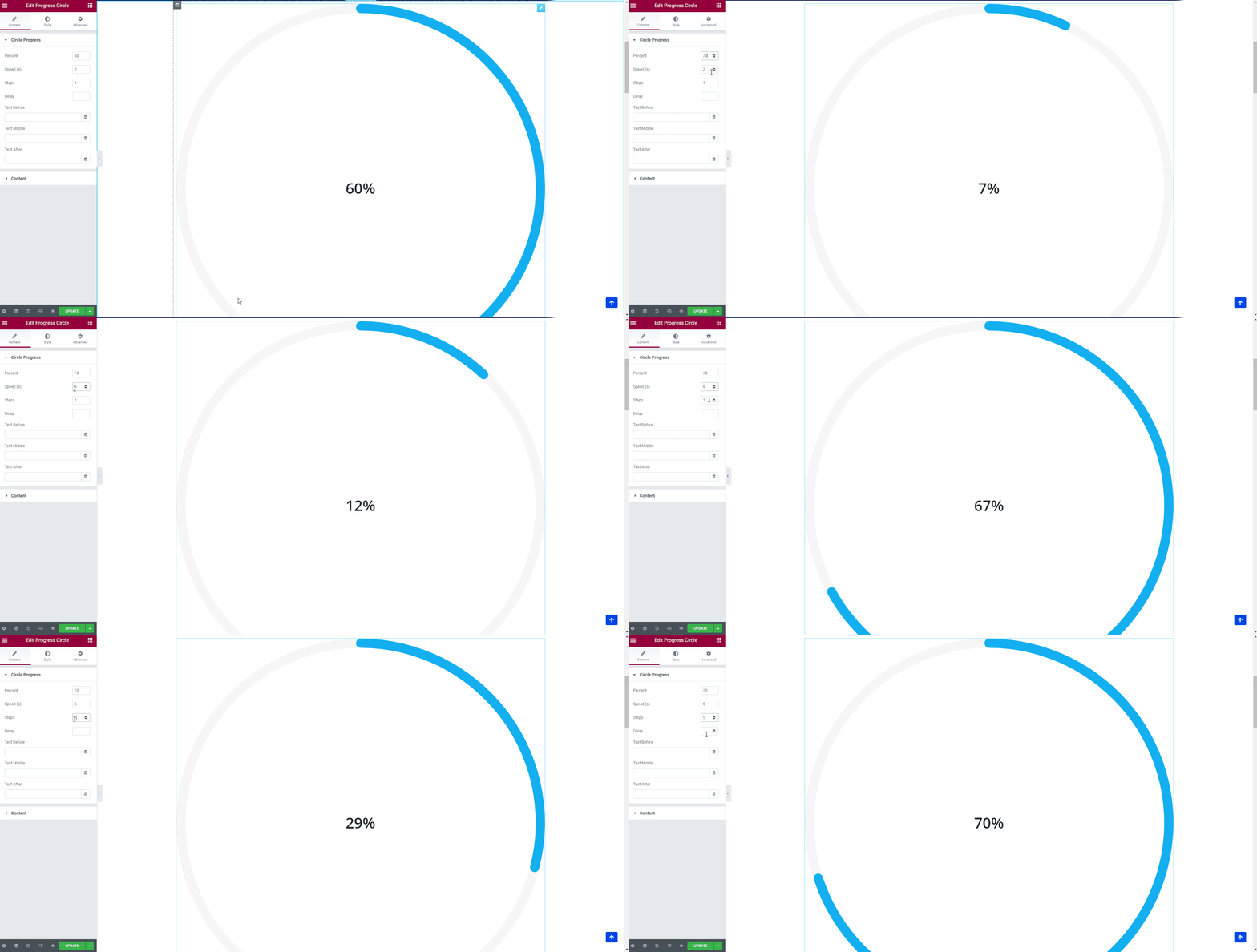
- Delay
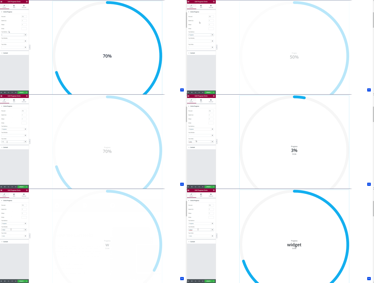
- Text Before / After- add some custom content before and after the percentage number.
- Text Middle - this option would replace the percentage number with custom content.
🖌️ You can also style its appearance by navigating into the Style tab and exploring the options, such as: Bar Size, Color of the Circle on the Inside and on the Outside, padding and margins, typography options for the text and number.
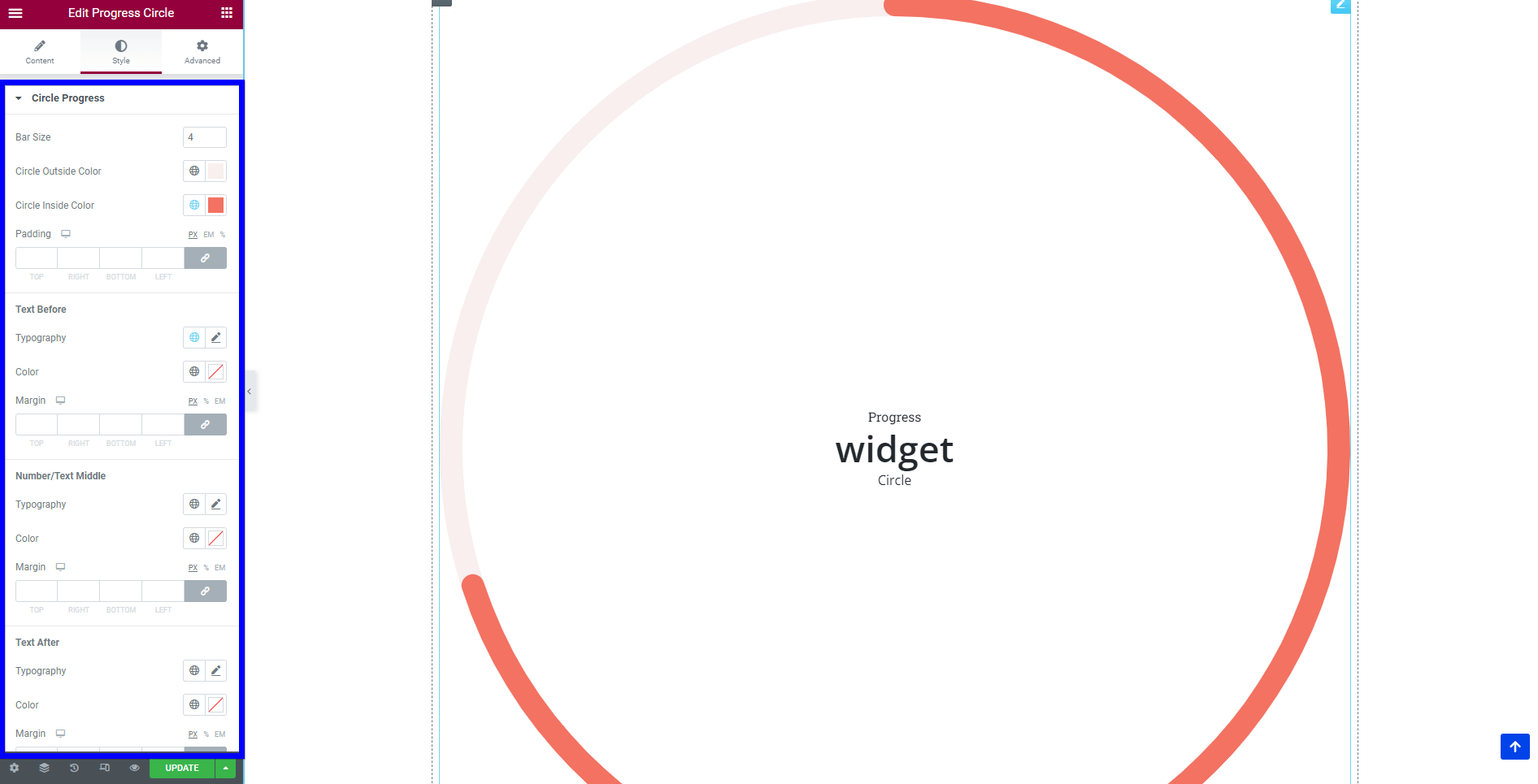
📑Content
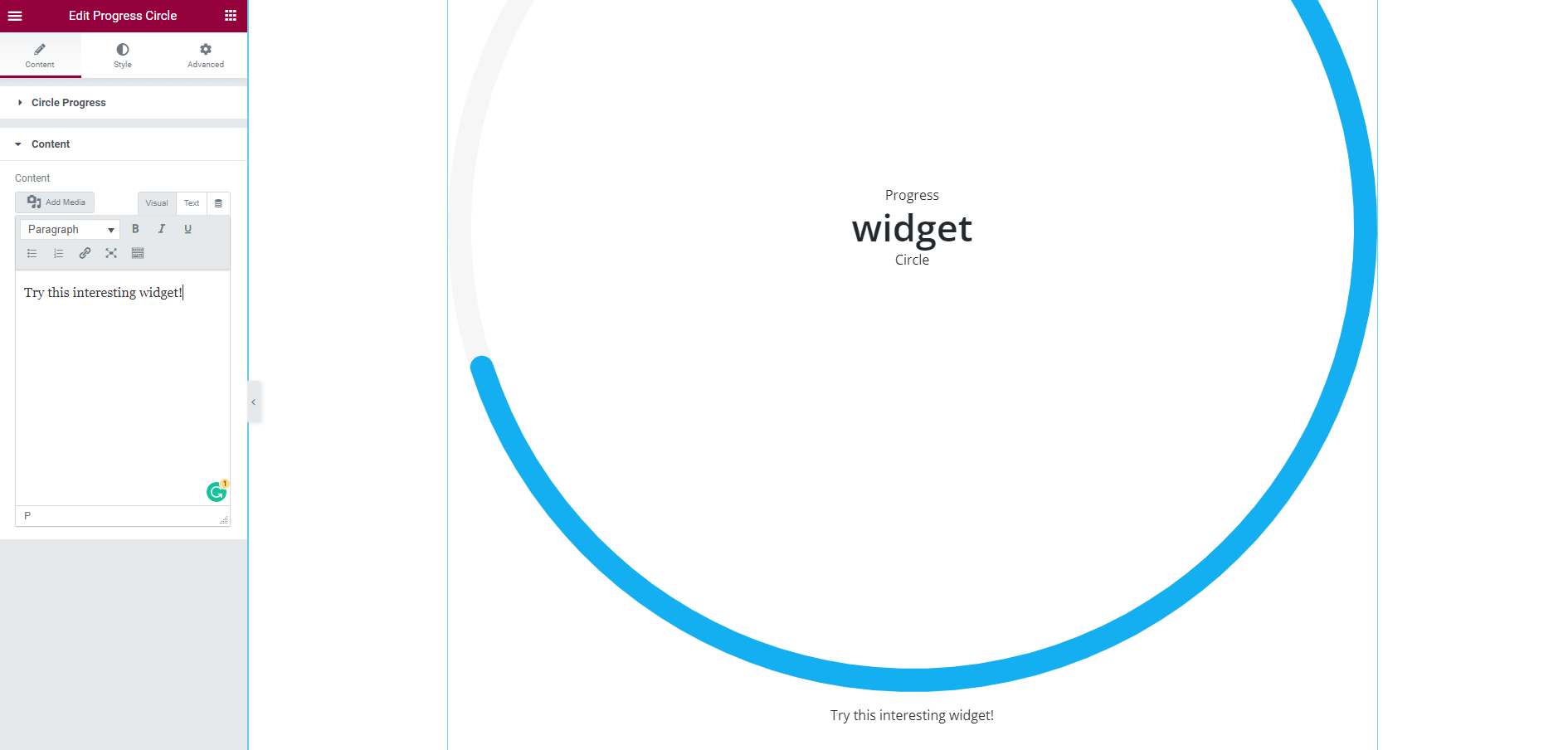
There is also an option for Additional Content that will appear after the circle. Here you can customize the content and add media.
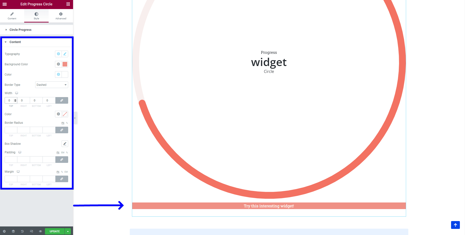
🖌️ You can style its appearance by navigating into the Style tab and exploring the options, such as: typography, background color, border type and color, width, padding, and margins.
📌 Now, that the widget is almost ready, you can go on to the Advanced tab, if you want to add motion effects, advanced effects, content protection, background or make the page responsive.
After finishing all the editing, click on Publish to see your work live.
📝Note: If you want the circle to have a certain size, navigate into the Advanced tab > Positioning > Width and change the default setting.

