The Products Comparison Module - Sparks
📝 Note: The Product Comparison module is part of the Sparks plugin, which you can get from here.
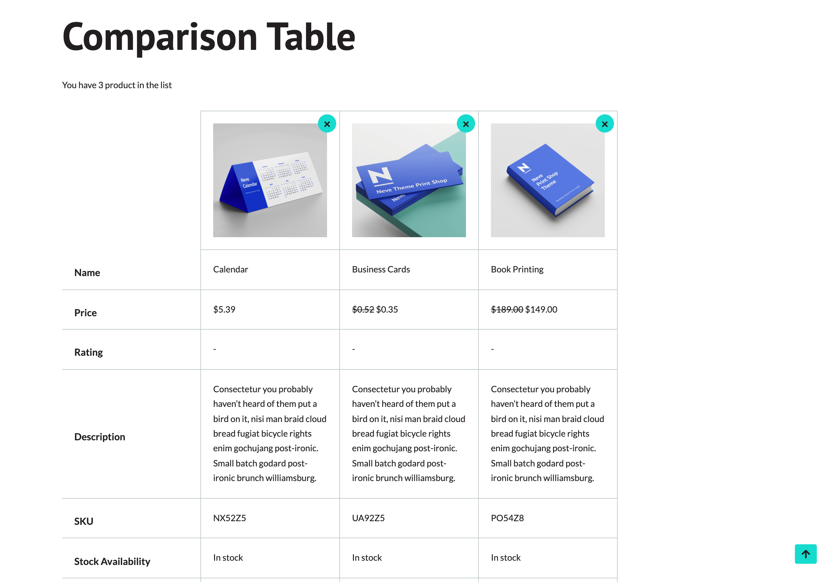
The Product Comparison is an indispensable feature of an online shop nowadays that helps the user to have a better overview of the desired products by having them displayed along with their specifications one next to the other.
🖲 Activating the Module
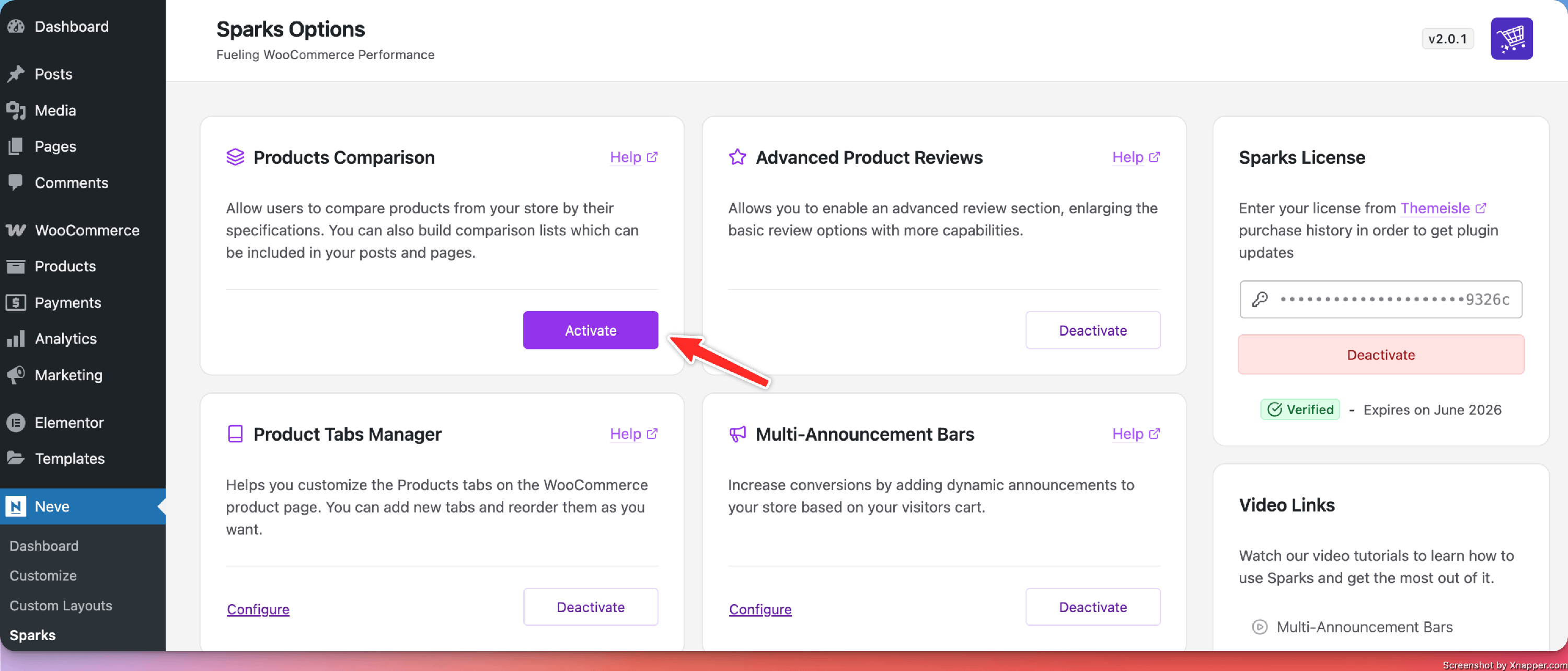
1. Install the Sparks plugin, using these instructions.
2. Navigate to Settings > Sparks and activate the module.
NOTE: If you are using Neve, navigate to Neve > Sparks to access Sparks's options.
🧰 Using the Product Comparison
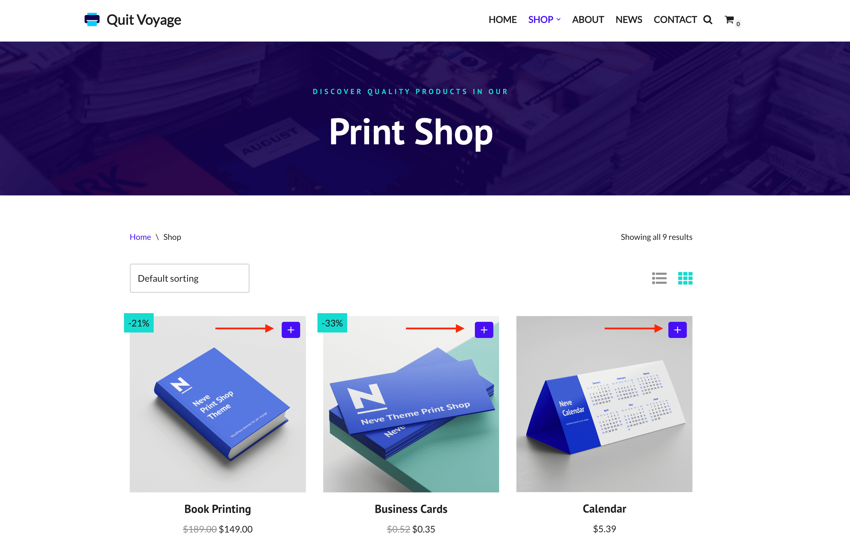
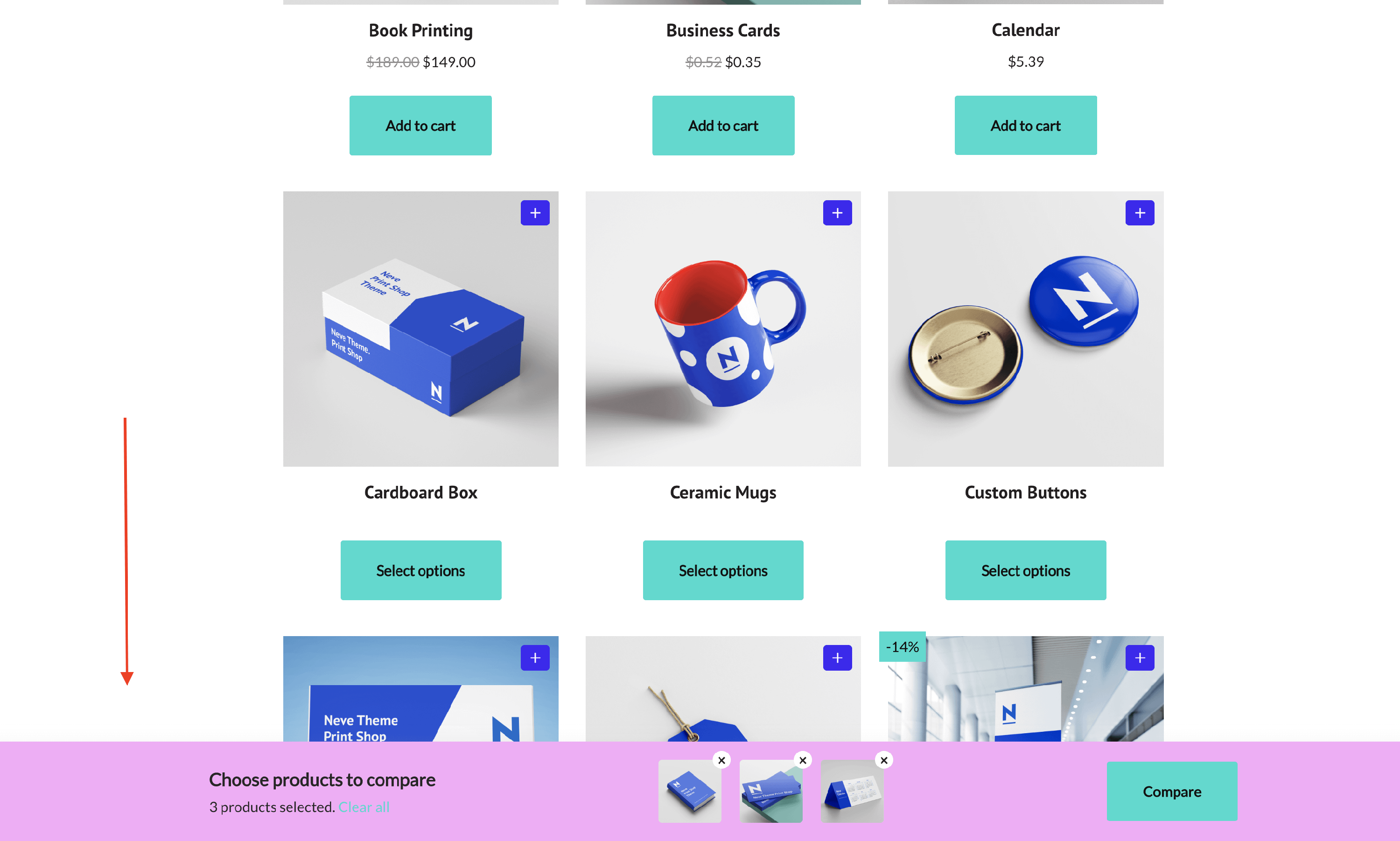
In order to see it on your website, you have to click on the ➕ button:
Then, all the added products will appear at the bottom of the screen and, to access the comparison table, you will have to click on Compare:
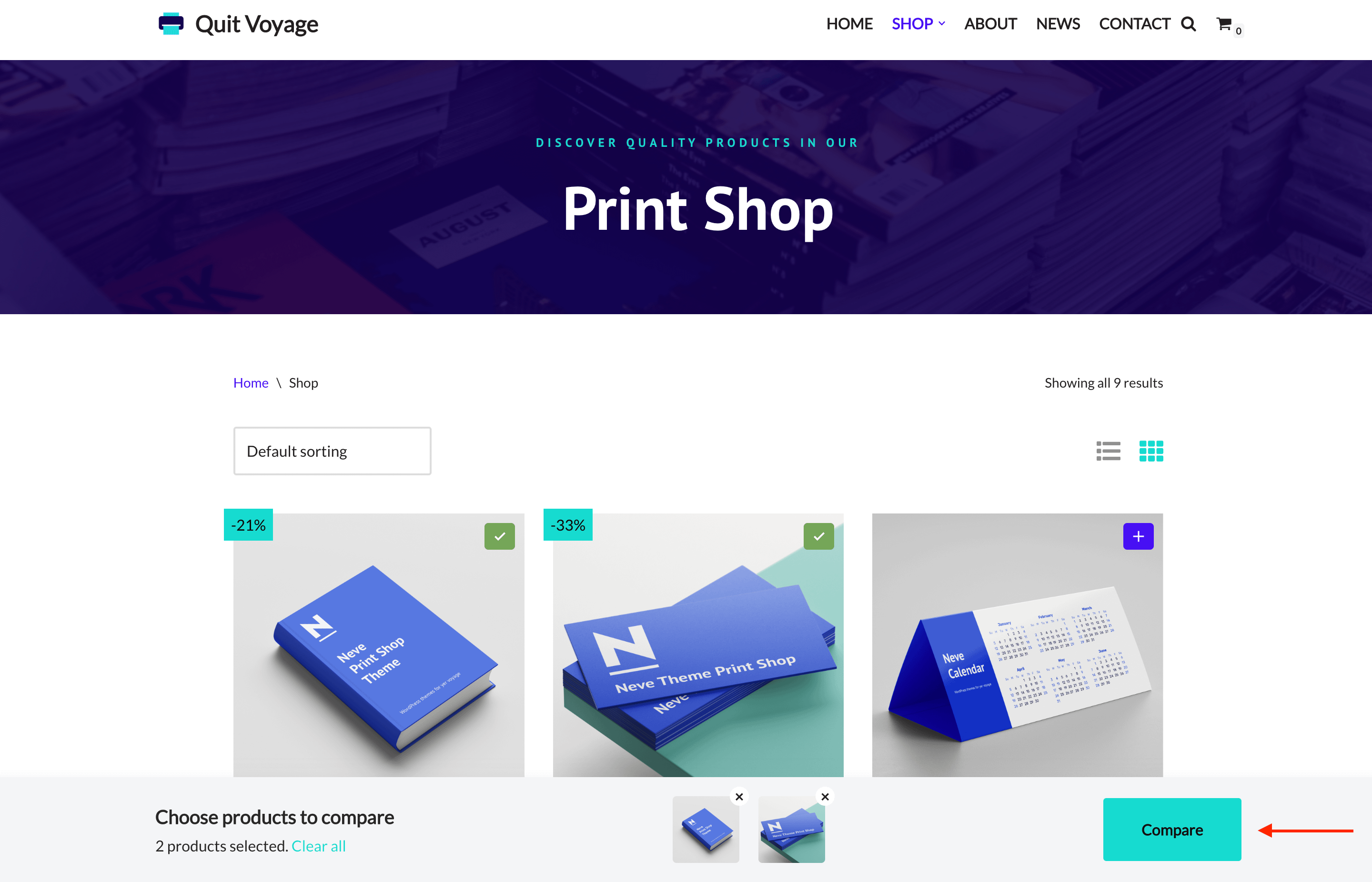
📝 Note: You can set a maximum of products to be compared. After you complete the limit, a notification will appear when you hover over the plus button again.
🖌 Configuring the Product Comparison
Once you have activated the module, click on the Configure button to start using it.
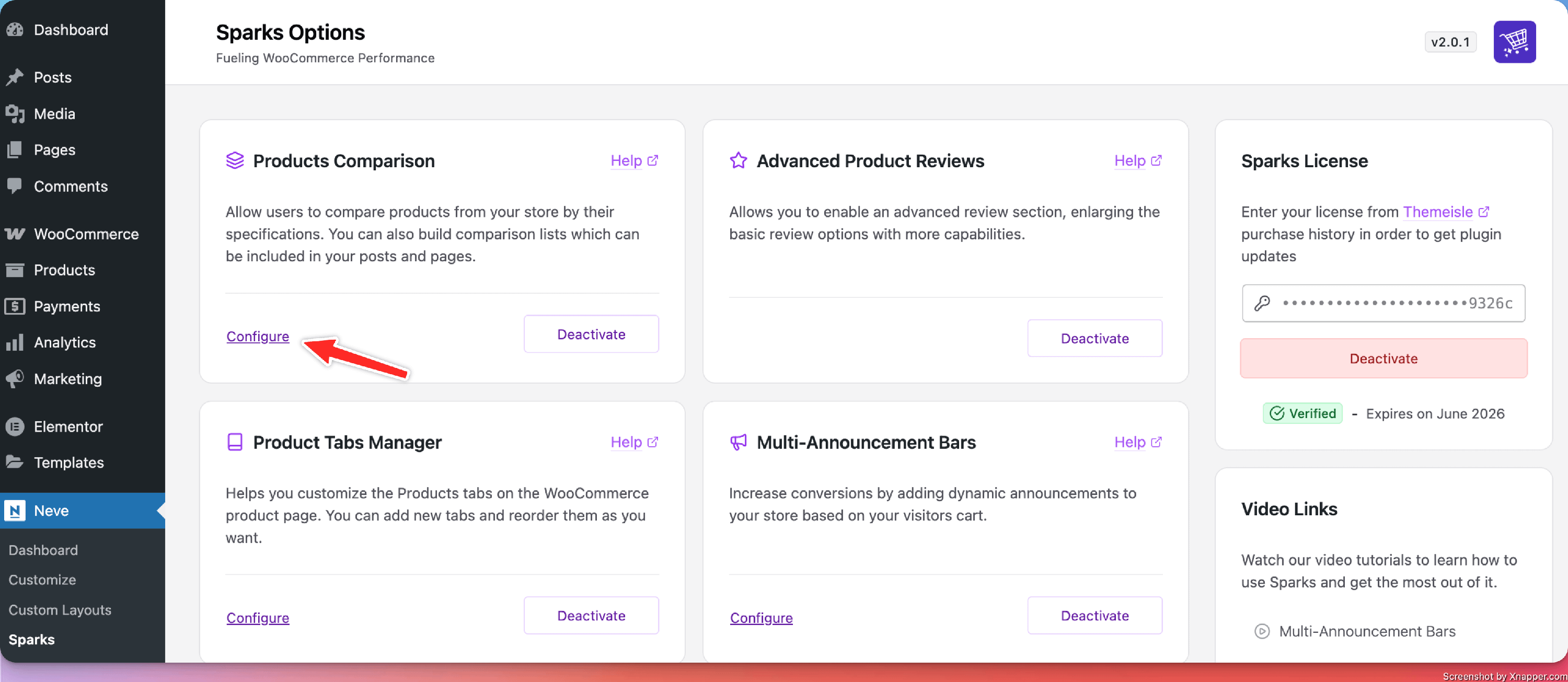
There you will find all available options:
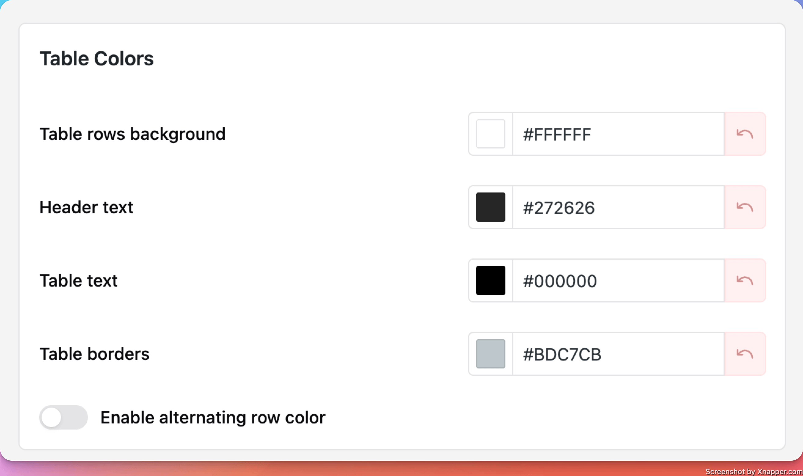
Table Colors
The Table Colors card provides options for color changing of the following elements:
- Table rows background
- Table header text
- Table text
- Table borders
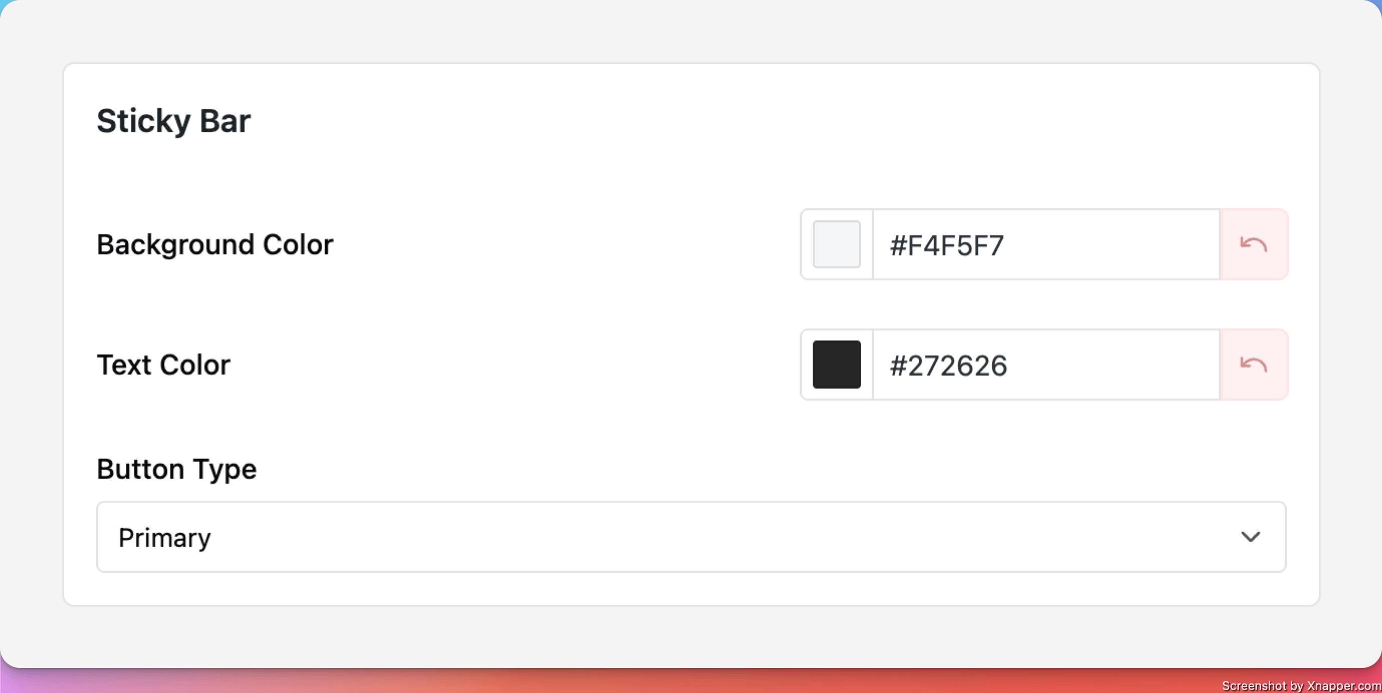
Sticky bar
The sticky bar where the comparison table can be opened is displayed at the bottom of the page if at least one product was added to the comparison.
These options allow customization:
- Bar background color - boost the table's appearance by using the Gradient option that can be accessed from the BG color.
- Text color
- the style of the compare products button - Primary / Secondary.
General Settings
In this section, you will find the following options:
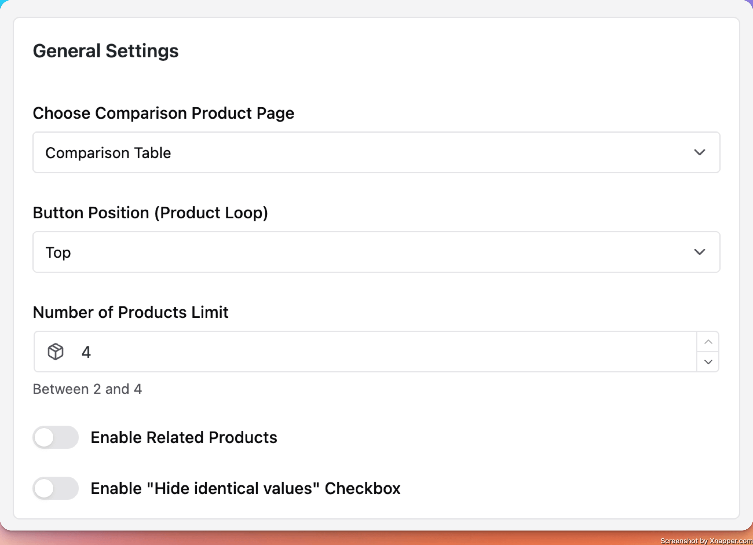
- Choose Comparison Product Page - the page where the comparison table will be shown.
IMPORTANT NOTE: The page selected here, needs to have the [sparks_comparison_table] shortcode added in the content, in order for the comparison to work.
- Number of Products Limit - the maximum number of products that can be compared at the same time can be chosen here as well ( maximum 4 ) - ( 1 )
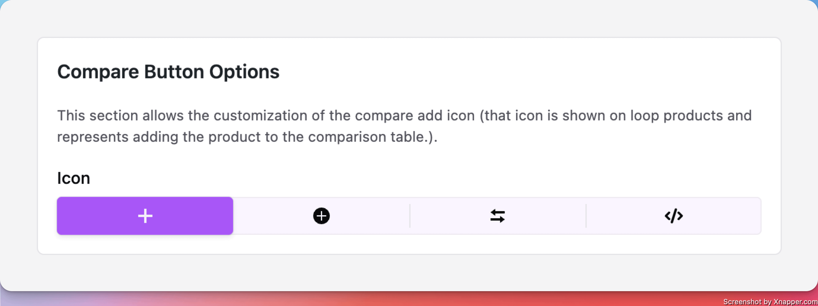
- Button Position (Product Loop) - the position of the add to comparison button that is displayed on the product thumbnail on archive pages or sections as Related Products.
- Return to shop button - A button is automatically added to the comparison table page when no products are selected, allowing users to quickly return to shopping.
Enable Related products
By enabling this option, products related to those within the comparison table will be listed below.
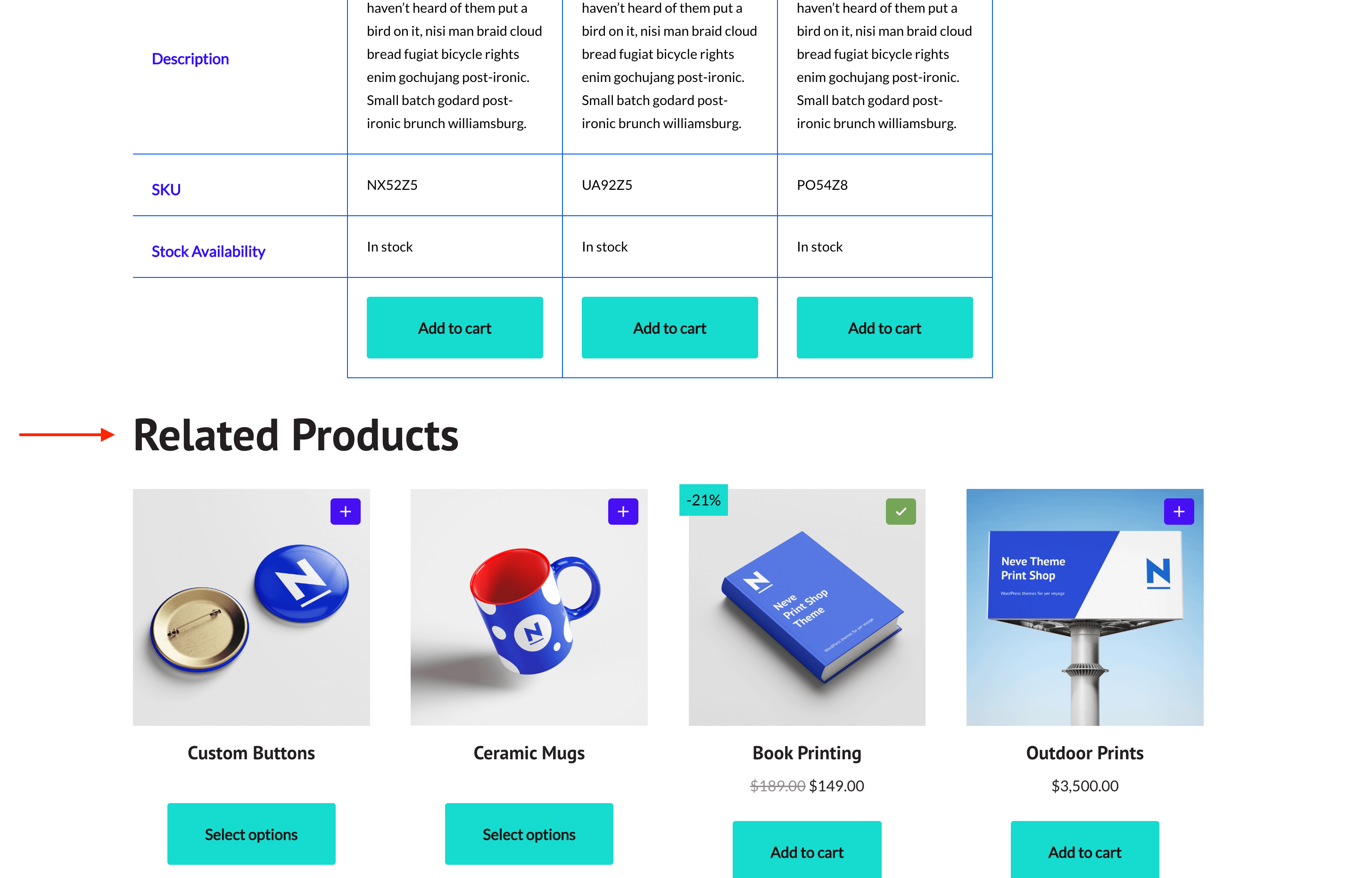
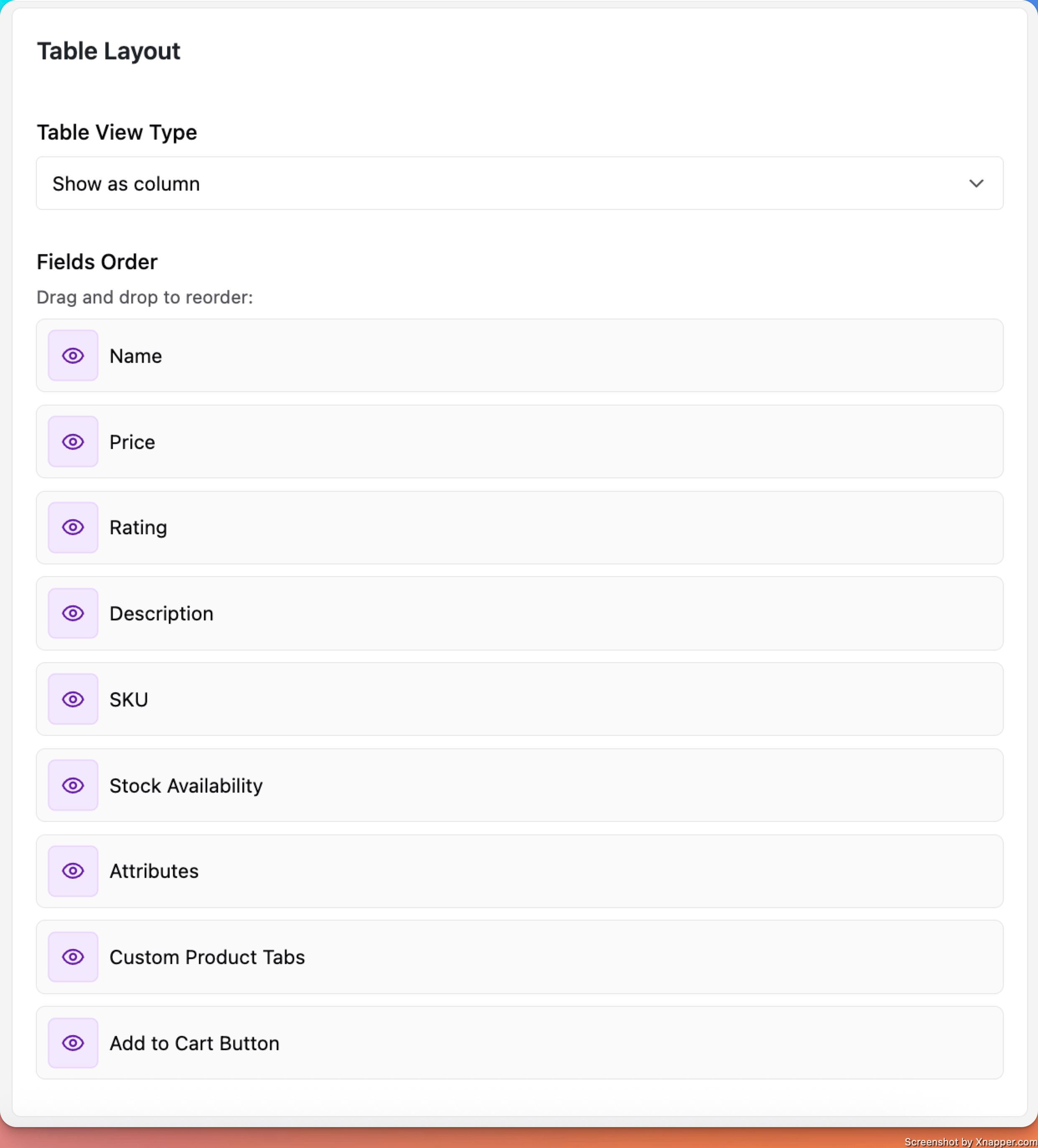
Table Layout
This panel allows the table rows to be sorted as desired, with a drag-and-drop movement.
You can also modify the visibility of some elements if you click on the 👁 icon.
The layout can be changed from columns to rows, and horizontal scroll will be enabled by default.
Additionally, you can enable the Hide identical values option to simplify the table by removing rows where all compared products share the same value for a specific attribute.
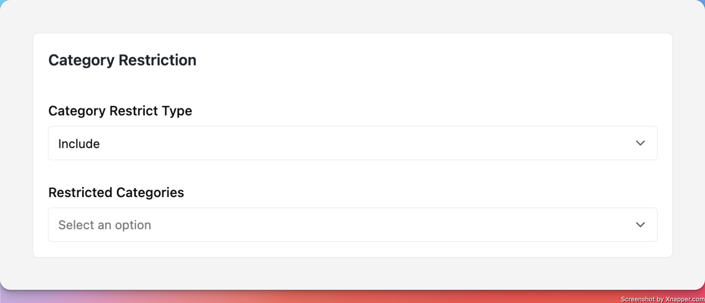
Category restriction
The category restriction allows setting a rule to either:
- Exclude categories - which means that products within these categories can't be compared.
- Include categories - which means that only products within these categories can be added to the comparison table.
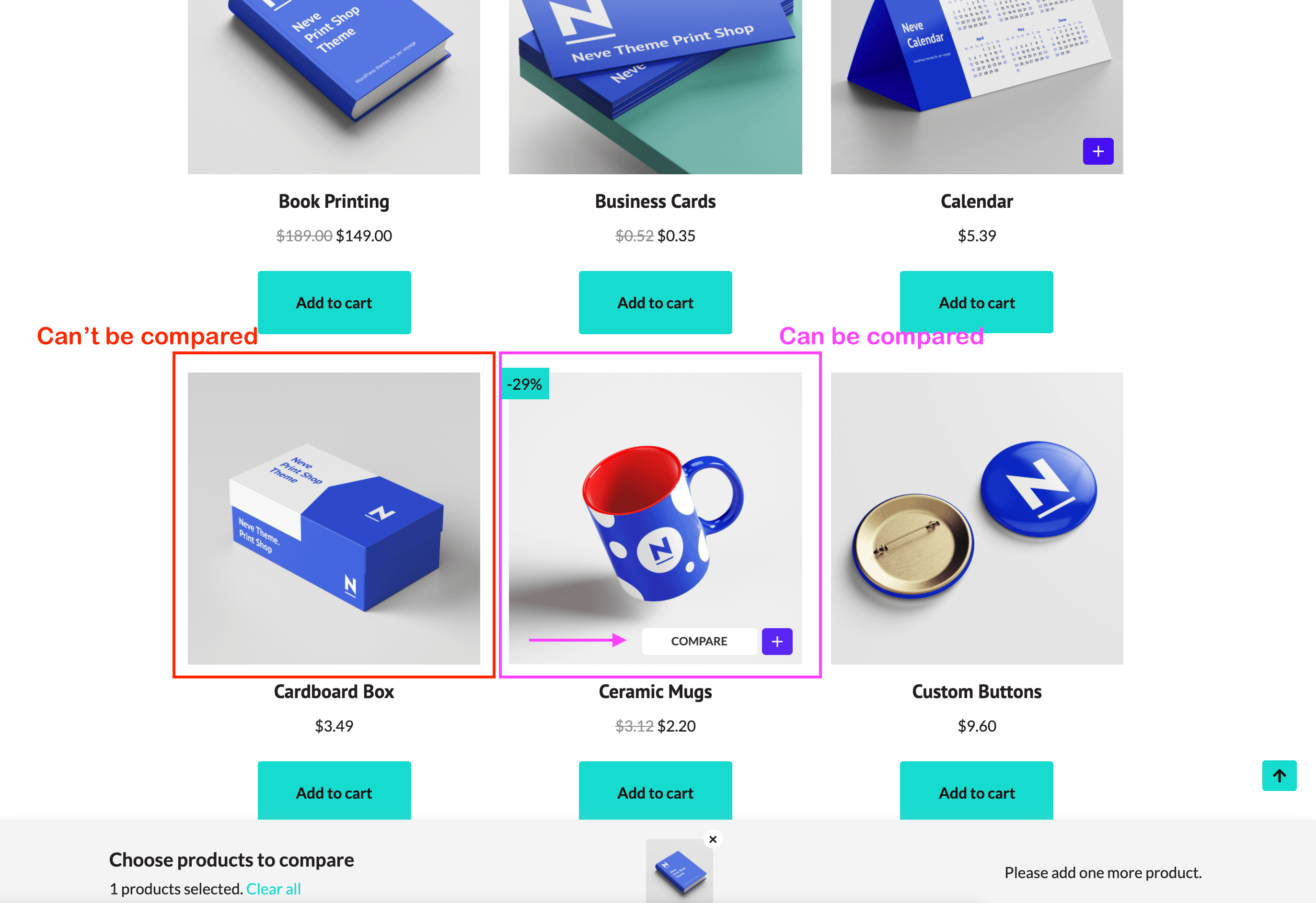
📝 Note: A product that can't be added to the comparison table due to such rules won't display the ➕ icon on the front end - an example below.
