Neve Page Header (PRO)
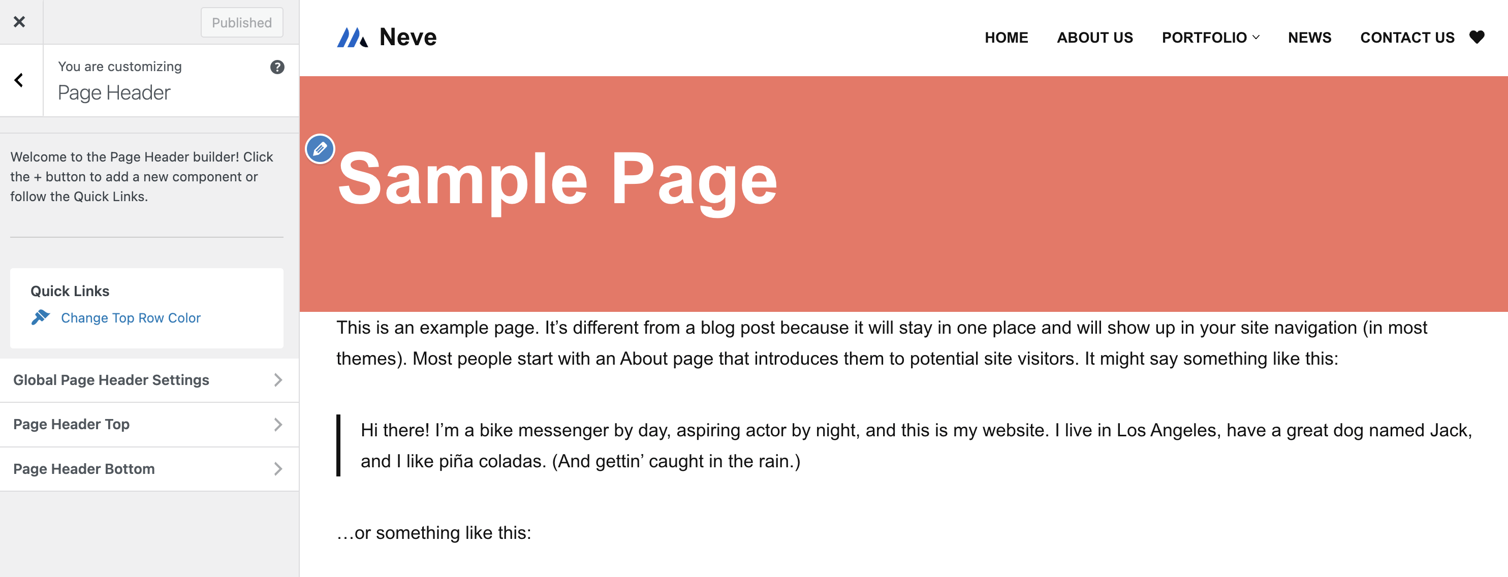
The Page Header is the area below the header / navbar where the page title over a hero image is usually shown.
📝 Note: This section is a premium feature of the theme. If you are interested in getting all the features of the Header Booster module, you can get Neve Pro on this page.
Jump to:
Using the Page Header |
Page Header Layout |
Page Header Rows |
Managing the Components |
Components Library |
Useful Resources |
🗄Using the Page Header
- 1
- Navigate to Appearance > Neve Options > Neve PRO.
- 2
- Under the Header Booster Module, click on the Extra Features accordion and enable the Page Header feature.
- 3
- Navigate to Appearance > Customize > Page Header.
📝 Note: Please note that by default, this section will be visible on all pages, below the navbar, after adding some components on those rows.
For displaying it only on certain pages, use the options available in the Global Page Header Settings:
- Show on Archives - from this panel you can enable page header for posts or / and pages.
- Show on Singles - from this panel you can enable page header for posts or / and pages.
There is an interesting option that allows you to create a custom page header, by clicking on the blue link, which will open the editor. It qualifies you to build individual subheaders per post type and post type contexts ( i.e archive/single ).
📝 Note: This custom page header works similar to the custom layout module, for which you can find dedicated docs here.
🔎 Page Header Layout
The Page Header consists of two areas:
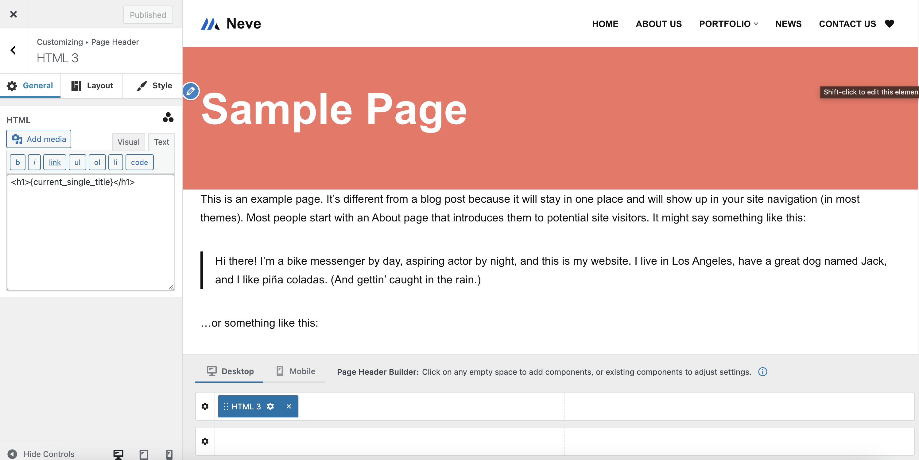
- Page Header Live View Area - where you can see the live preview of how the page header will look on the site.
- Page Header Builder Area - where you can add, reorder and remove components.
📑 Page Header Rows
The Page Header builder area has two rows ( Page Header Top, and Page Header Bottom ) in which you can easily select and arrange the available components you can find while hovering over each division of the rows.
Rows Structure
|
Rows Opening |
Rows Customizations |
Rows Structure
Each page header row has by default two columns, with equal space where the components are added.
Rows Opening
Each of the three rows ( page header Top, page header Main, and page header Bottom ) of the page header builder can be styled individually, which can be done in two ways:
- by clicking on the ⚙️icon, which appears at the beginning of the row once you hover over it.
- by clicking on any panel of the menu, on the left side (page header Top | page header Main | page header Bottom).
Rows Customizations
Each row has some options / settings available, divided into two tabs:
📐Layout Tab
- Layout - can be Full Width - Contained | Full Width | Contained - below are screenshots with each of them.
- Full Width - Contained - the row content is wrapped by the page container and the background color stretch the full width.
- Full Width - content and background color stretch the full width.
- Contained - both the content and background color are wrapped by the page container.
🖌Style Tab
In the style tab are many options available:
- Row height - in pixels, with a reset button at the end of the row.
- Desktop | Tablet | Mobile.
- Border Width - in pixels, with a reset button at the end of the row.
- Desktop | Tablet | Mobile.
- Border Color - with the possibility to choose from Neve's Global Colors.
- Text and Background Colors
- with the possibility to choose from Neve's Global Colors.
- Adding an image as the background - can be a static image or the featured image of the current page.
- When using a background image, it is also possible to set an overlay(color and transparency).
📝 Note: What is noticeable here is that the background image of a row can be set to use the featured image of the page. In this case, the image you set here will be used just as a fallback for the pages without a featured image.
🧰Managing the Components
The components can be found under the Global Page Header Settings.
Add components |
Remove components |
Customize components |
Add components
While hovering over each division of the rows, click on the ➕ sign and a list of components will appear.
Each component has specific options you can customize once that component is clicked on.
Components can be added to the rows in two ways:
- drag&drop them from the left sidebar
- directly from the page header rows
Remove components
In order to remove a component, there are two steps that need to be done:
Step 1: hover over the component you want to remove.
Step 2: click on the ❌ icon on the right corner of the component.
Customize components
To open the customizing options for a newly added component, you have to follow two steps:
Step 1: Select the component that you want to customize.
Step 2: Click on the ⚙️ icon when the component is already enabled in one of the rows.
📚Components Library
Neve has an impressive components library that comes with specific settings. This section contains the list with all the available components and their dedicated doc:
- Button - 3 instances
- HTML - 3 instances
- Secondary Menu
- Custom Layout - 3 instances
- Widget Area - 3 instances
- Divider - 2 instances
📝 Note: The settings of each component are common, no matter the location: Header / Footer.
🗂Useful Resources
The most powerful feature here is the magic tags available in the editor.
These tags are something like, display the page title here but get the title of each page. As the whole page header will be displayed sitewide, those magic tags are very helpful in showing information specific to each page, like the title, or the description.
Below is a screenshot of how to set these magic tags to build a hero section where the page title and date are displayed.
This is an example of a product category page that also has a description.
For adding the background image and increasing the section height, the row settings come in handy.