Neve Single Post Options

๐Ÿ“Note: Neve PRO offers a set of options for the Single Post layout, which applies by default on all the existing and newly-created posts. Some of them are also integrated into the individual post options and can overwrite the global ones.


Global options

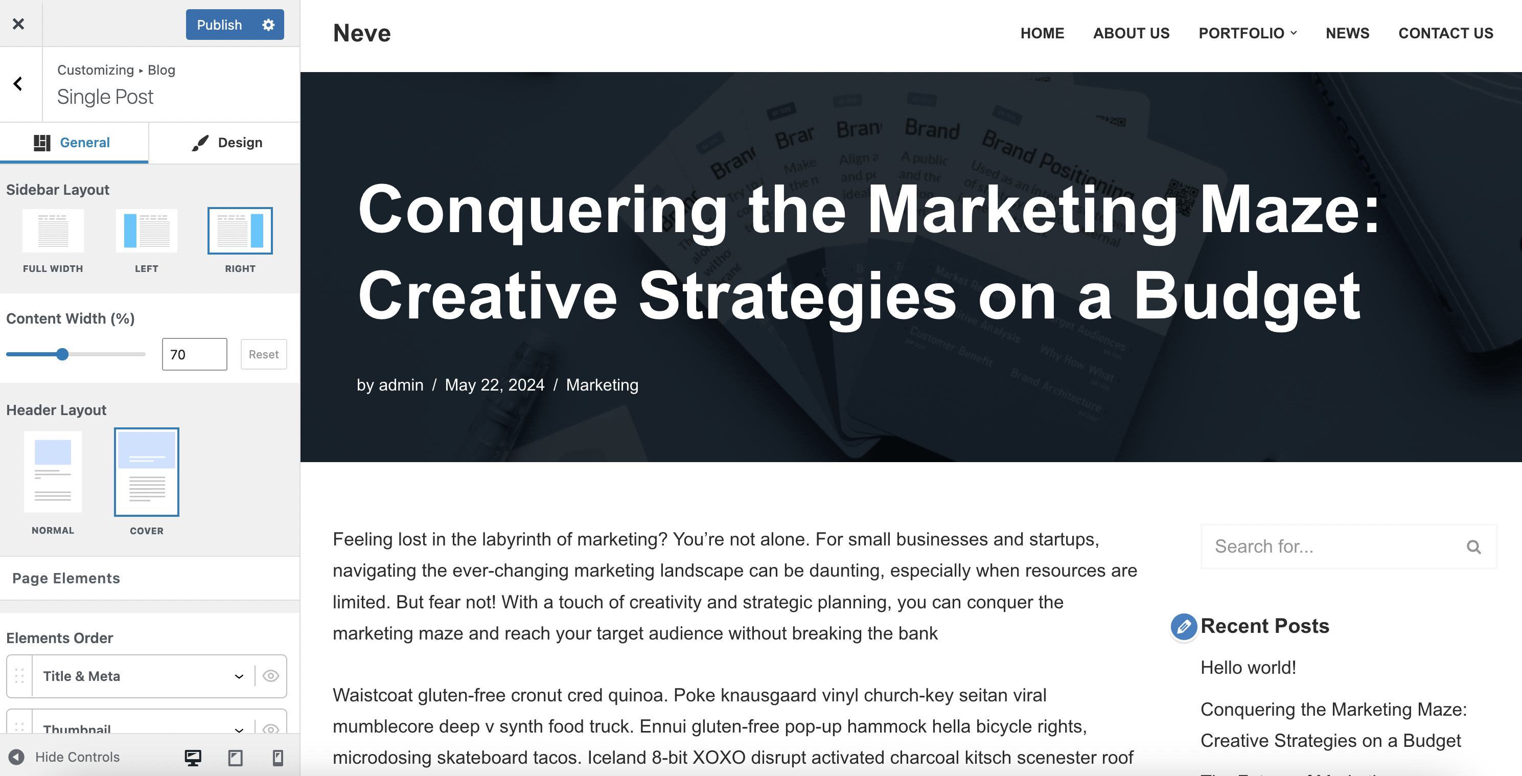
To access the global options, navigate to  Neve > Customize > Layout > Single Post.

While making visible the elements (from Elements Order), more of the following options will appear:

Header Layout

The options available for the header layout are:

  • Normal - it's the layout that can be observed from the screenshot above. 
    • Title Alignment - with three options: left / center / right (Desktop | Tablet | Mobile).
  • Cover - is the layout that will transform the main photo of the post into a cover photo, as you can see below.

Once you choose this layout, there will be many customizations available:

  • Cover height - available in PX, VH, EM, or REM. It can be set differently for any of the devices (Desktop | Tablet | Mobile).
  • Cover padding - available in PX, EM, or REM. It can be set differently for any of the devices (Desktop | Tablet | Mobile).

  • Title Alignment - will change the alignment of the title, with three options: left/center/right (Desktop | Tablet | Mobile).
  • Title Position - will change the position of the title, with three options: top/center/bottom (Desktop | Tablet | Mobile).
  • Display meta before title - changes the order of the meta and title by reversing them. 

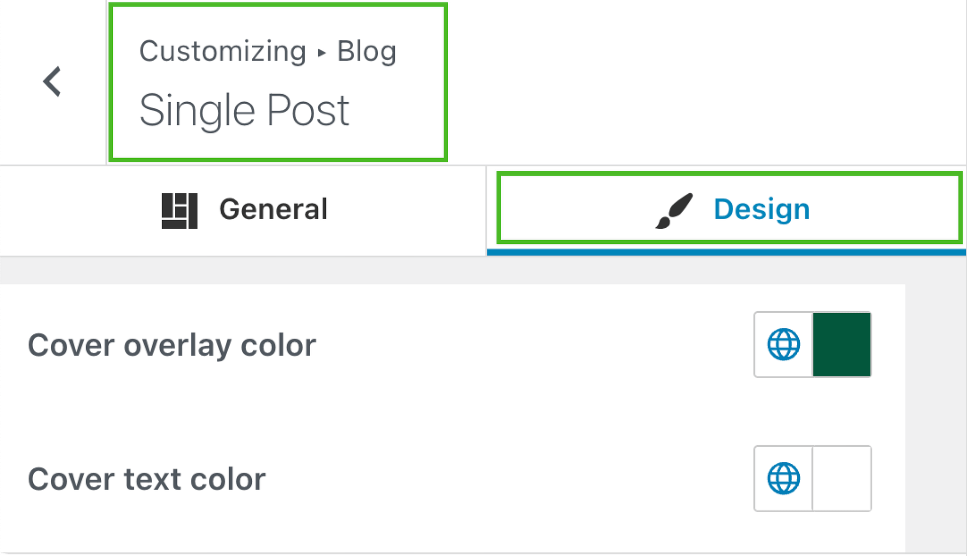
  • Overlay/ Text color - modifies the color of the overlay / title&meta. You can choose one of the global colors (the theme's default colors) by clicking on the ๐ŸŒ button.
    • ๐Ÿ“Note: You can boost your website's appearance by using the Gradient option that can be accessed while editing the overlay color.
  • Overlay opacity - allows the user to set a percentage of the overlay's opacity, along with a reset button.
  • Hide featured image - will erase the photo of the article (the cover photo), replacing it with a default color (grey).

  • Blend mode - gives the possibility to edit the cover's appearance and has plenty of options: Multiply / Screen / Overlay / Darken / Lighten / Color Dodge / Saturation / Color / Difference / Exclusion / Hue / Luminosity.
  • Cover container - has two options: Contained / Full Width. 
  • Boxed Layout - adds a box under the title and meta. Once you enable this option, you can adjust the section padding and the background color, including a gradient option.


Page Elements

The options available for the page elements are:

  • Elements Order - changes the order of the elements from the article with a drag-and-drop movement. 
  • Visibility - you can turn on / off the visibility of the elements by clicking the ๐Ÿ‘๏ธ button.
  • Spacing between elements - changes the dimension of the blank space between the elements ( tags, content, biography, etc.), available in PX, EM, or REM (Desktop | Tablet | Mobile). 

The elements presented here may vary, depending on the layout used:

Cover

Normal

๐Ÿ“ Note: The thumbnail element refers to the featured image of the single post. 


Post Meta

The options available for the post meta are:

  • Meta Order - allows you to change the order of the title and details, with a drag-and-drop movement. For this, you have to click on the Reorder button.    
  • Visibility - you can turn on / off the visibility of the meta by clicking the ๐Ÿ‘๏ธ button.
  • Separator - gives you the possibility to add the desired separator (a character that separates the author, date, category, and estimated reading time). 
  • Show Author Avatar - aligns the avatar next to the author's name.
    • Avatar Size - helps to set the perfect dimension for the avatar, in PX, EM, or REM, along with a reset button (Desktop | Tablet | Mobile). 
    • Use the last updated date instead of the published one - allows the user to provide the last update's date.

Each  meta item has the option to Hide it on mobile so that the meta will not be visible from mobile devices. This will become available once you click the ๐Ÿ”ฝ icon:

๐Ÿ“ Note: You can check how it looks, by clicking on the mobile control, at the bottom of the Customizer options.

The PRO version of Neve offers extra options, like changing the Format of the meta item and adding a new one, with the following customizations:

  • Type - pick the desired item type from the dropdown. This one depends on the installed plugins because it offers integration with ACF , Meta Box, Toolset. Once you have installed and created custom fields using these plugins, their names will be added in the Type dropdown.

๐Ÿ“ Note: Using Neve Pro, you can also display custom taxonomies. Here is a useful guide for this.

  • Field - insert the name of the new item. 
    • If you have installed the ACF plugin, this field will become a dropdown list with the names of the ACF fields - check this doc for further details about creating a custom field.

    ๐Ÿ“ Note: It works the same for any of the three plugins that have this integration.

    • You have the possibility to use Raw meta here by adding the meta key of a certain field. This is the name of the previously created custom field.

    • Format - this field offers you the possibility of customizing the text that appears. The default format is {meta}, which represents a magic tag. You can add text before and after this default format to create the desired aspect.
    • e.g. To display the author's name, you use the {meta} format ( default ) and will display ( for example ) "by John". But you can change this text into "Written by John", by adding "Written by {meta}" in the Format field.
  • Fallback - establish a standard value of the item so that if there is no value added yet, it will inherit this one.

๐Ÿ“ Note: These customizations are available only if you add a new item, which implies having the PRO version of Neve.


Comments

The options available for the comments are:

  • Comments Section Style - has two options: 
    • Show/ Hide mechanism - a blue button with "Show comments" will appear.
    • Always show - provides a box with the "Leave a Reply" title where the users can add their thoughts.
  • Comments Section - has two options:
    • Section title - sets the front-end title of the section. You have the possibility to let it empty, which generates a default behavior ( eg. "1 thought on โ€œA look inside our barโ€ ").
    • Boxed layout - if it's enabled it will generate a box around the section and will also unlock some options:
      • Section padding - similar to the ones presented before.
      • Background / text color - similar to the ones presented before.
  • Submit Form Section - has four options:
    • Section title - the title that appears above the comment white box. If you choose to leave it empty, it will generate a default text ( eg. "Leave a Reply" ).
    • Button style - customizes the button's appearance and has two options: primary ( blue button with white text) and secondary ( white button with a blue border and blue text).
    • Button text - changes the text that appears on the button (by default: "Post Comment").
    • Boxed layout - adds a box in the background of the section. If it enables it will generate the following options:
      • Section padding - similar to the ones presented before.
      • Background / text color - similar to the ones presented before.

๐Ÿ“ Note: You may find useful this article about how to prevent users from leaving more than one review.


Author Box

The options available here are:

  • Show author image - once enabled, it will generate the avatar of the author, with the following options:
    • Image Size - modifies the size of the photo, in PX (Desktop | Tablet | Mobile). 
    • Image position - changes the position of the photo and has three options: left / center / right.
    • Border Radius - rounds the margins according to the desired level.
  • Show archive link - adds a link that points to the other author's posts.
  • Content alignment - arranges the content of the author's biography according to the options: left / center / right.
  • Boxed layout - adds a box around the content and image. Once you enable it, there will appear a few options:
    • Section padding - similar to the ones presented before.
    • Background / text color - similar to the ones presented before.

Related Posts

This section shows posts within the same category or tags with the post currently viewed. The following options are available for this section:

  • Title - the title that appears above the section. If you leave the field empty, there is no default text.
  • Related Posts By - shows the posts related by category or tags.
  • Columns - sets the number of columns in which the posts will be displayed - responsive
  • Number of Related Posts - sets the number of posts that will be displayed.
  • Content alignment - change the alignment of the whole content that describes the related post - responsive
  • Excerpt Length - trims the content of the summary. If you want to undo the changes, there is a reset dedicated arrow (โŸฒ) at the end of the row.
  • Boxed layout - adds a box around the related posts. Will create additional settings for section padding, background color, text color, and section width.
  • Related posts card - change the visibility of the available elements ( Featured Image, Post title, Post meta, Post excerpt ), reorder them, or adjust the margin-bottom in PX.
  • Related Posts Meta Order - change the visibility of the available meta ( Author, Category, Date, Comments, Estimated reading time), reorder them, or decide whether you want them to be hidden on mobile or not.


Sharing Icons

Those icons help with sharing the current post on social media, and you can choose which social networks to appear on the page.

The options available for the sharing icons are:

  • Icon style - changes the appearance of the icons and has two options: round ( as in the screenshot above, adds a circle background) / plain ( shows only the social icons).
  • Use custom icon color - allows the user to modify the color of the icons. You can choose one of the global colors ( theme's default colors ), by clicking on the ๐ŸŒ button.
  • Icon Size - adjust the size of the social icons for each device.
  • Padding - adjust the icons' padding for each device.
  • Add text label - allows you to add a custom text with a corresponding HTML tag and adjust its position (above/below/before/after).
  • Icons alignment - control the alignment on the post (left/center/right).
  • Space between - adjust the space between the icons for each device.

  • Icons individual customizations - there are options available for each individual icon:
    • Visibility - you can turn on / off the visibility of the icon, by clicking the ๐Ÿ‘๏ธ button. 
    • Title - you can change the title that appears when you hover with the mouse over the icon.
    • Social Network - once you click on the ๐Ÿ”ฝ button, there will appear a list from which you can choose.
    • Icon and Background color - adjust the color of the icon and its background.
    • Show on Desktop - can be enabled or disabled.
    • Show on Mobile - can be enabled or disabled.
    • Remove - it will remove the social icon.

There are two more settings available here: 

  • Reorder - once you click this one, two arrows will appear for each social network. After finishing, you can click "Done".
  • Add item - once you click this one, another field will appear, with the previously mentioned settings.

Post Navigation

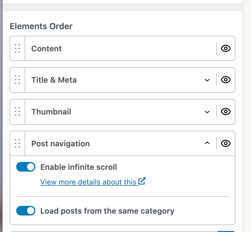
Infinite scroll can be enabled on the single post layout and will display the content of all posts available on the blog page after the content of the current post. This way, all posts within the website can be explored without clicking on the navigation links.

Important! To be able to see the Infinite scroll option you need to first open the Page Elements tab and enable Post Navigation. After that, a new Post Navigation tab will appear ( with the option to enable or disable Infinite Scroll).

Check the following GIF to see how the feature works.

๐Ÿ“ Note: The posts displayed through the infinite scroll are presented in the descending order of the time they were created.


Page Settings

Inside the Page Settings accordion, you can control the  content vertical spacing, which can be inherited from Layout > Container or even customized (responsive). It allows you to control the content's top and bottom margins.


Individual Options

๐Ÿ“  Note: The Customizer option sets the default sidebar position for various types of pages and by editing a particular page with the individual option, the Customizer value might be overwritten.

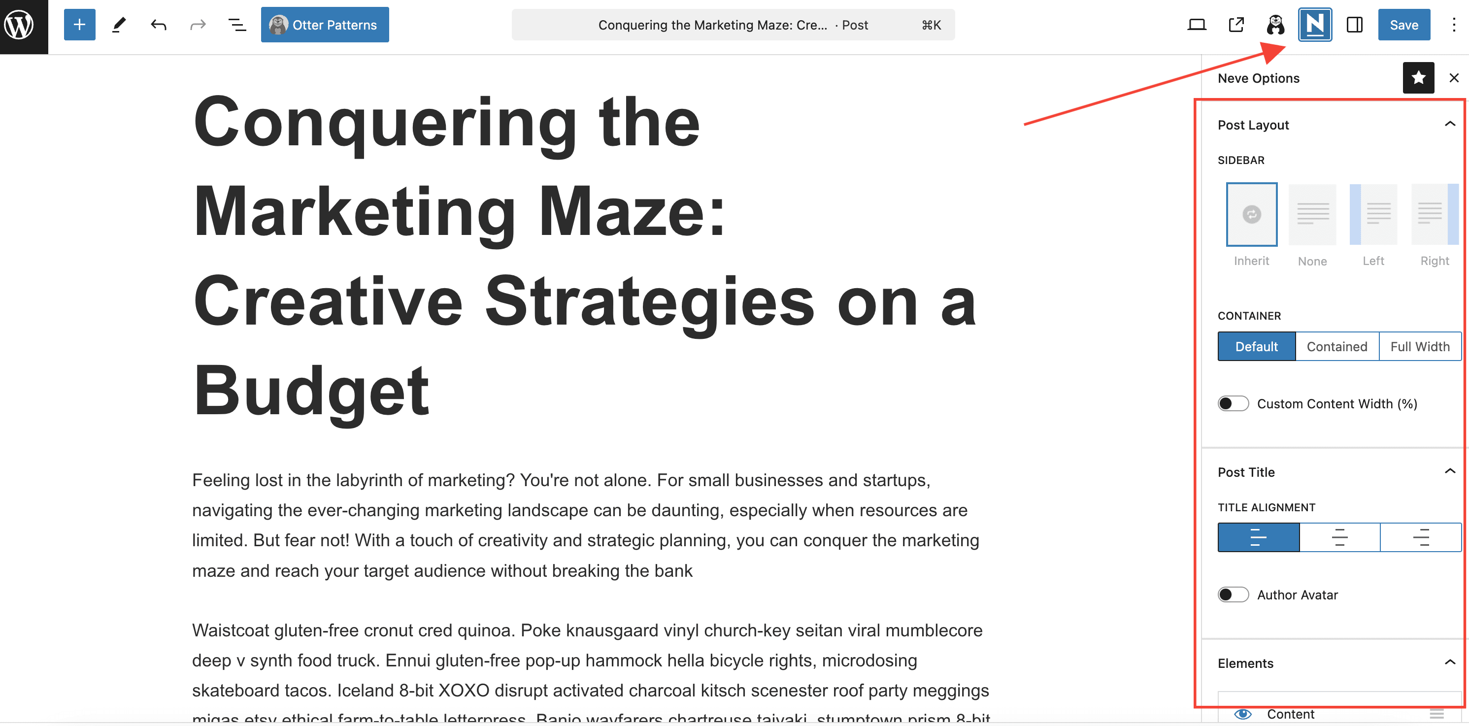
In order to access the individual options, you have to go to Dashboard > Posts > choose one post > Edit > click on the Neve icon.

While editing each post, the following options, more specific than the ones within the Customizer, are available within the  right sidebar. The areas are:

  • Post Layout
    • Sidebar - sets the position of the sidebar, coming with four options: Inherit (from the Customizer) / None / Left / Right.
    • Container - modifies the space occupied by the content, taking into consideration a predefined frame, coming with three options: Default / Contained / Full Width.
    • Custom Content Width - when enabled, it will generate a field to set the percentage. It changes the width of the content, according to the defined dimension.

๐Ÿ“ Note: The post template influences the presence of the sidebar. Make sure you use the default templates for pages where you want the sidebar to appear.

  • Post Title
    • Title alignment - changes the alignment of the title from the front-end.
    • Author Avatar - adds the avatar of the author near the meta.
    • Reading Time -  adds the estimated reading time of the author near the meta.
  • Elements
    • Order - similar to the Elements Order from the Customizer, it shows/hides/reorders options for the same elements listed in the Customizer. The individual options have a higher priority - Content, Tags, Comments, Post Navigation, Author Biography, Related Posts, Sharing Icons.
    • Disable Header - once enabled, hide the header rows.
    • Disable Footer - once enabled, hide the footer rows.

In the end, there is a Reset all options to default option by clicking the  โŸฒ button, which means to inherit all those settings from the Customizer.

๐Ÿ“ Note: Please note that those options don't have a live preview. To check the results, you need to update the page and preview it.


๐ŸŽฅ Video - Neve Single Post Options

Did this answer your question? Thanks for the feedback There was a problem submitting your feedback. Please try again later.

Still need help? Contact Us Contact Us