Banner Widget
📝 Note: The Banner widget is part of Neve PRO's Elementor Booster module.
The Banner works like a section that can bear an image, description that can catch the attention of the users.
In this article
Adding the widget
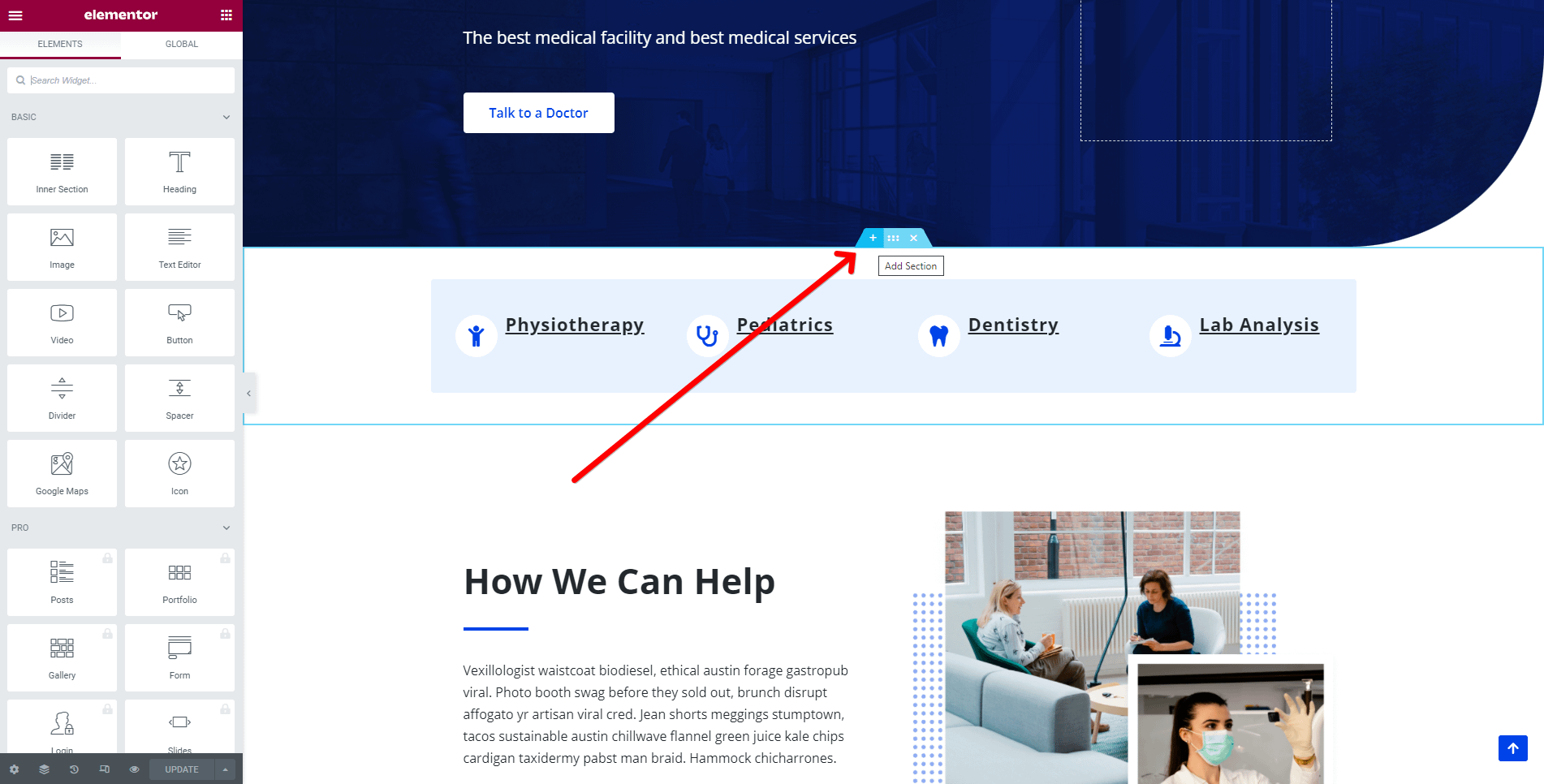
1. Once the Elementor Editor has been opened, click on the ➕ button to add a new section on the page.
2. Add the Banner widget from the Elementor Library by clicking on the ➕ button and navigating to the Neve PRO Addon Widgets.
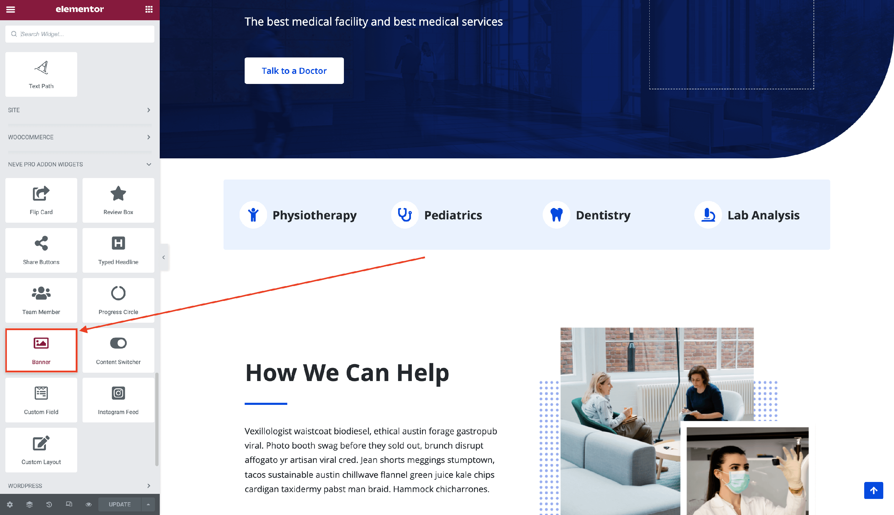
3. Drag and drop the Banner widget into the selected area.
Customizing the widget
The Banner component is easily customizable and its options cover three areas:
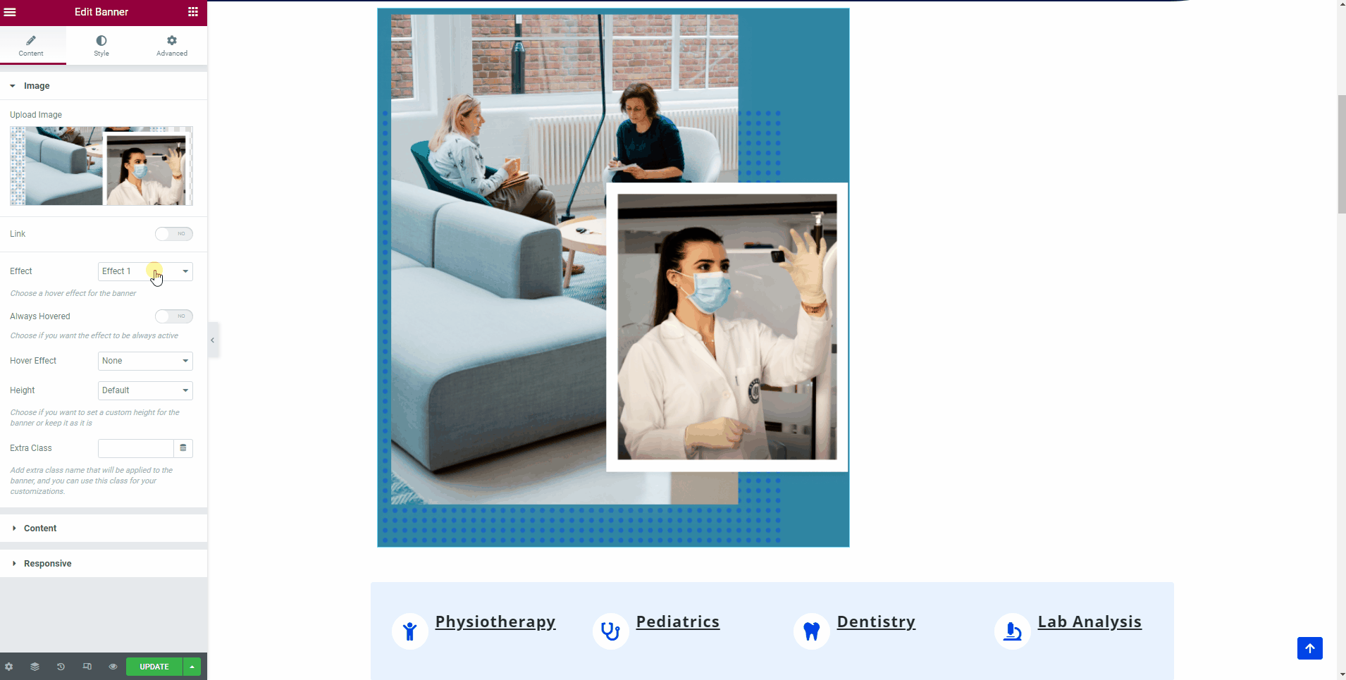
Image
- Upload image - choose the image that you want to be displayed on the banner.
- Link - you can link the image to a custom URL or to an existing page, modify its title, choose to open it in a new tab, or convert it to a nofollow option.
- Effect - something very interesting for the banner widget is that you can choose a hover effect for it, from six available types.
- You can also decide if the hover effect should be always applied, which will make the hover effect appear at all times, no matter if the banner is hovered or not, and how it should behave ( zoom in / out, blur, sepia ).
- Height - set a custom height for the banner.
- Extra Class - add an extra class name for the banner.
🖌️ You can also style its appearance by navigating into the Style tab and exploring the options, such as Background Color, opacity, CSS and Hover Filters, Border, or Blend Mode.
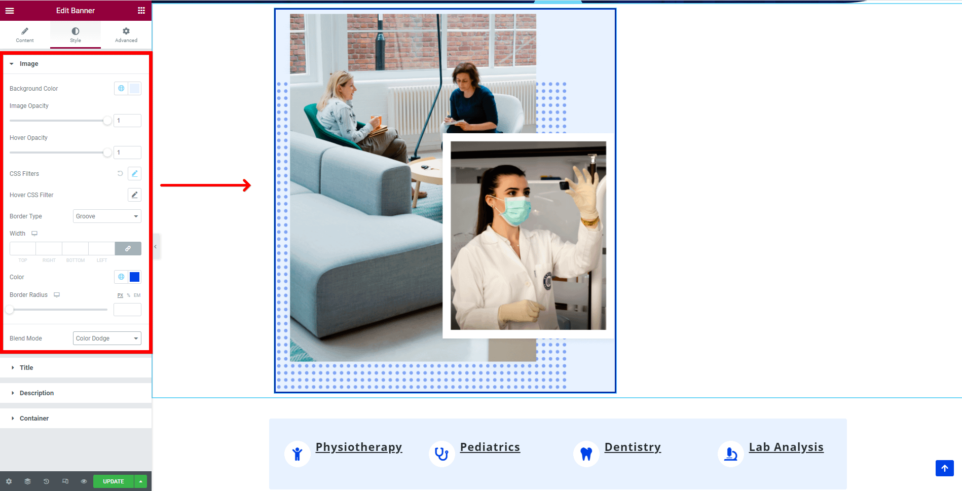
📝 Note: Some CSS filters might prevent hover effects from applying on the banner.
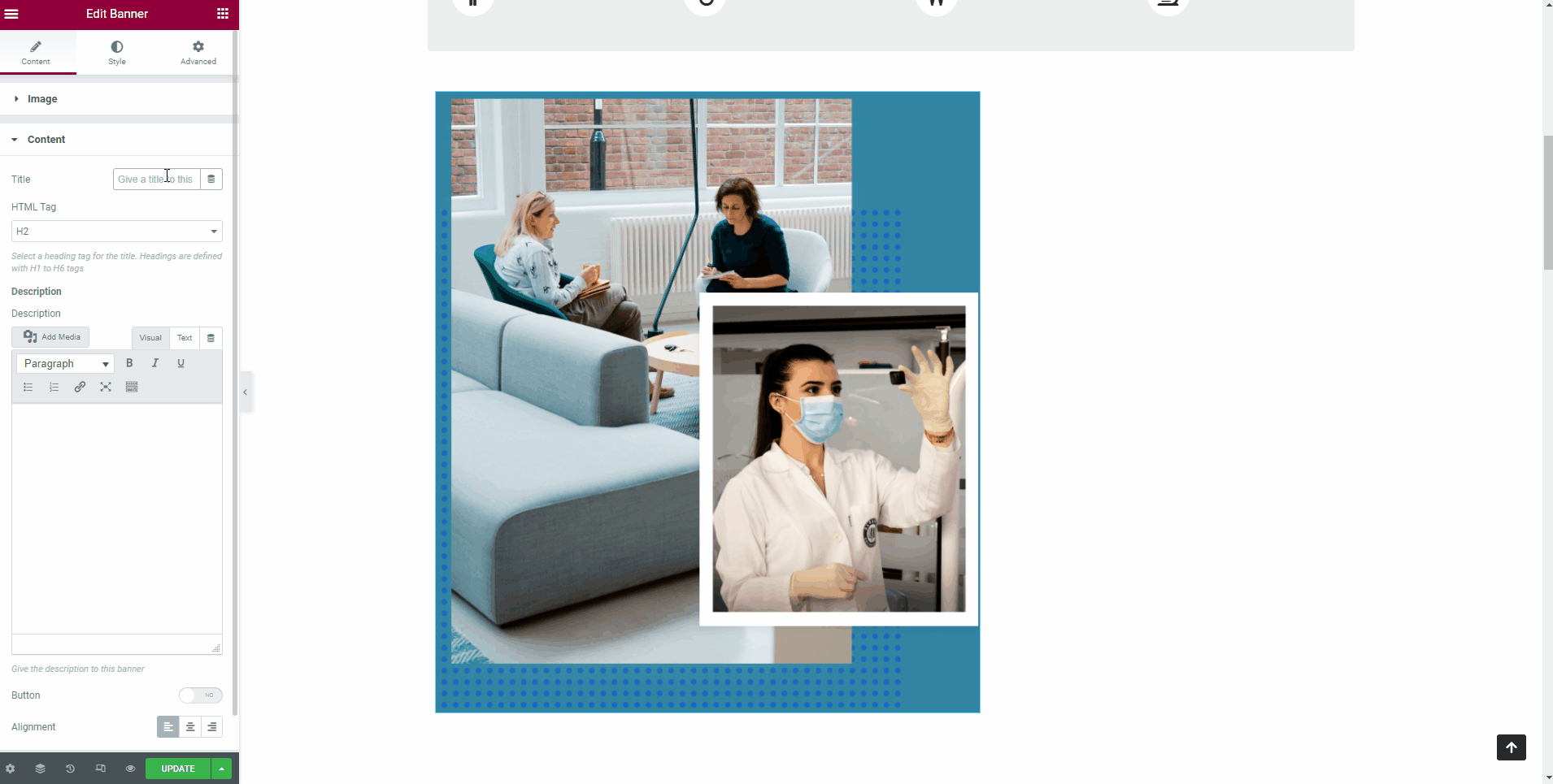
Content
- Title - the title's appearance inserted here depends on the Effect established earlier, into the Image section. It appears on hover over the banner.
- You can pick an HTML Tag, to increase the title's size.
- Description - insert a description of the banner here, using the text settings provided. Its appearance also depends on the Effect selected earlier. It appears on hover over the banner.
- Button - enable a button linked to a certain page and customize its text.
- Alignment - select one of the three orientations ( left / center / right ) for the title and description.
🖌️ You can style content's appearance by navigating into the Style tab and exploring the options, available not only for the title, but for the description too, such as text color, background color, typography, and shadow.
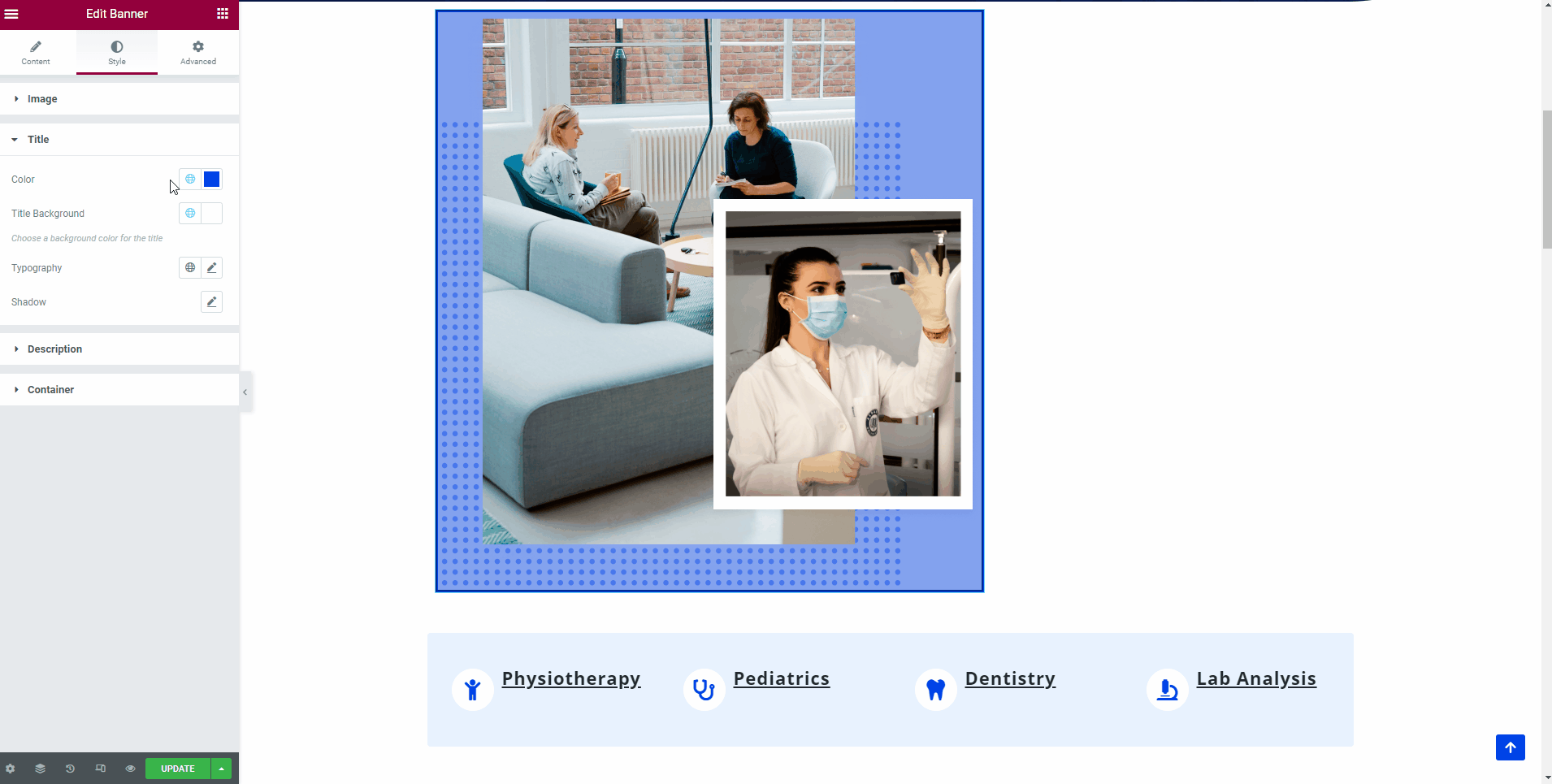
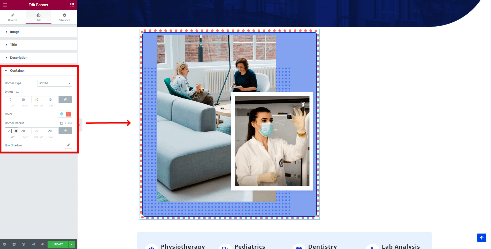
Something interesting is that in the Style tab you can also find options for the container, which is different from the border of the banner.
📌 Now, that the widget is almost ready, you can go on to the Advanced tab, if you want to add motion effects, advanced effects, content protection, background or make the page responsive.
After finishing all the editing, click on Update to see your work live.