Custom Field Widget
📝 Note: The Custom Field widget is part of Neve PRO's Elementor Booster module.
The Custom Field is useful when it comes to importing content, by working similarly to the magic tags.
In this article
Adding the widget
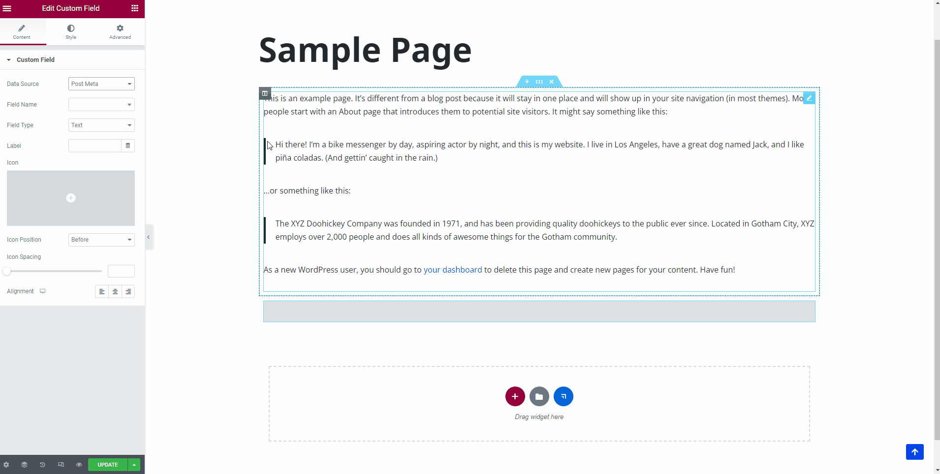
1. Once the Elementor Editor has been opened, click on the ➕ button to add a new section on the page.
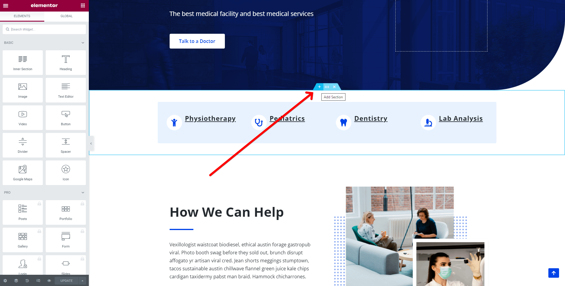
2. Add the Custom Field widget from the Elementor Library by clicking on the ➕ button and navigating to the Neve PRO Addon Widgets.

3. Drag and drop the Custom Field widget into the selected area.
Customizing the widget
The Custom Field component is easily customizable and its options cover one area:
Custom Field
One of the most important features of the custom field widget is that you can decide what Data Source will be used. There are two options available:
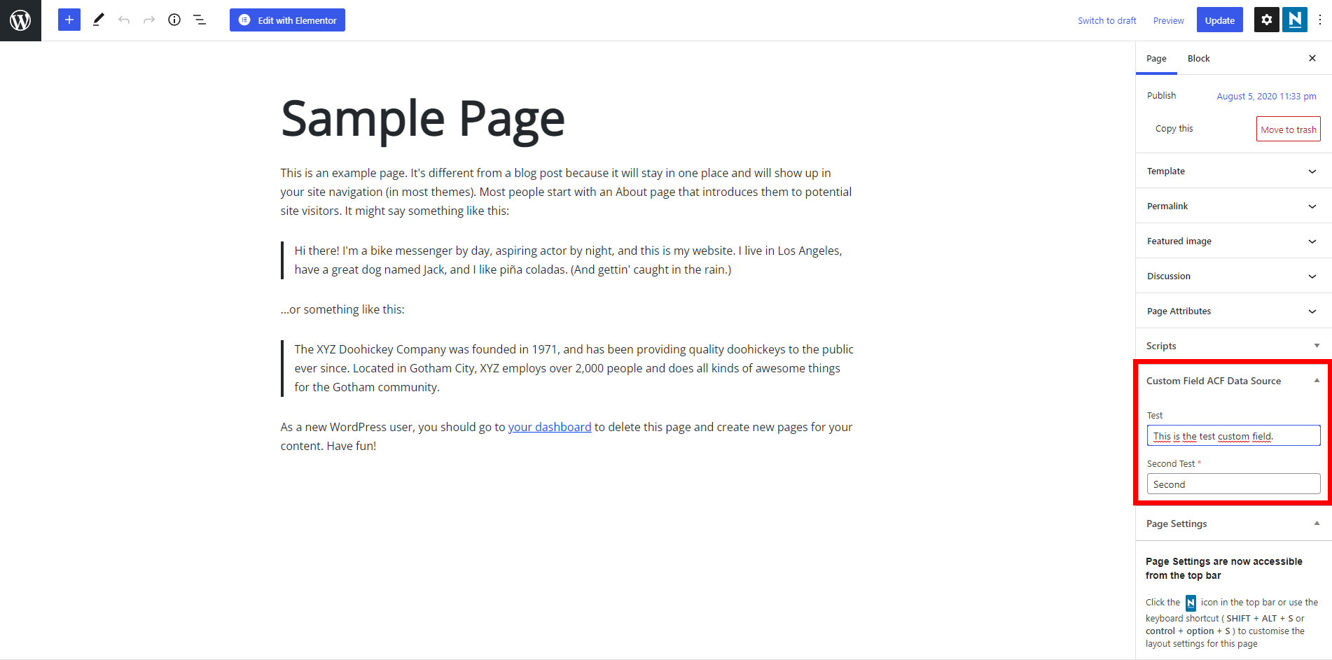
Post Meta
In order to access the data from the meta, follow these steps:
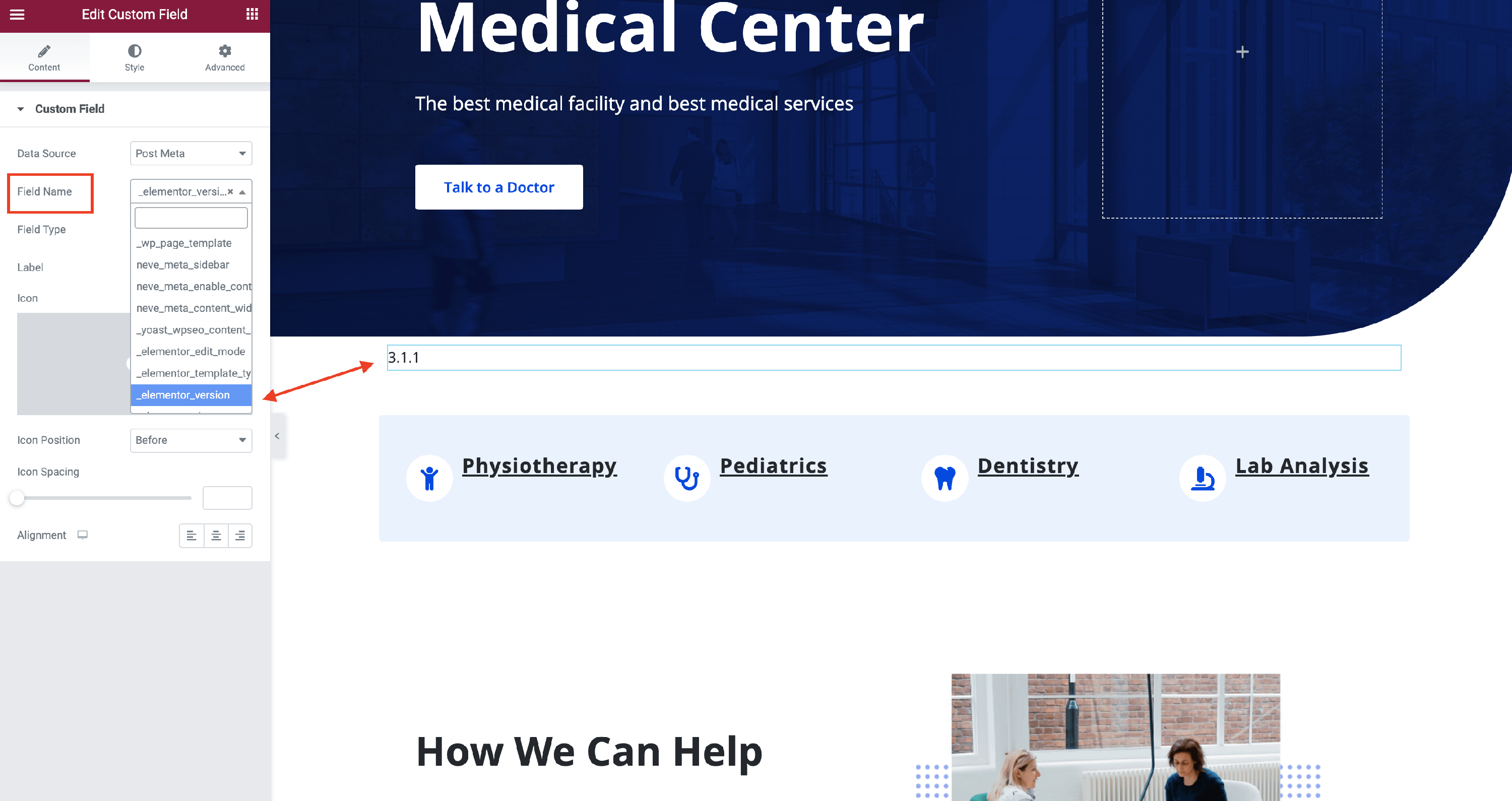
- Step 1: Select the Post Meta option for the Data Source.
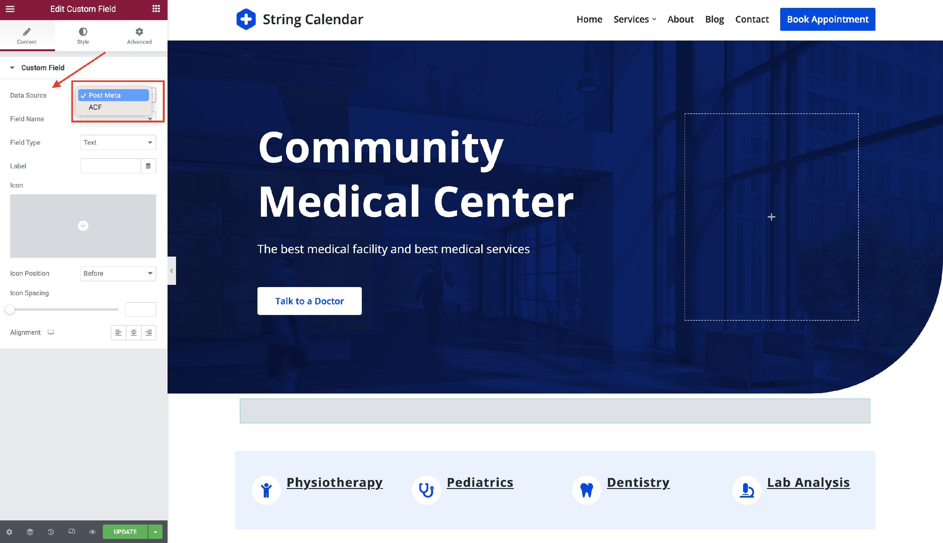
- Step 2: Into the Field Name you will find a long list with the meta available for your website. Pick one of them.
ACF Plugin
Follow these steps in order to access this source:
- Step 1: Install the ACF plugin, using these instructions.
- Step 2: After activating the plugin, a new menu will appear in the Dashboard, called Custom Fields. Navigate to this menu.
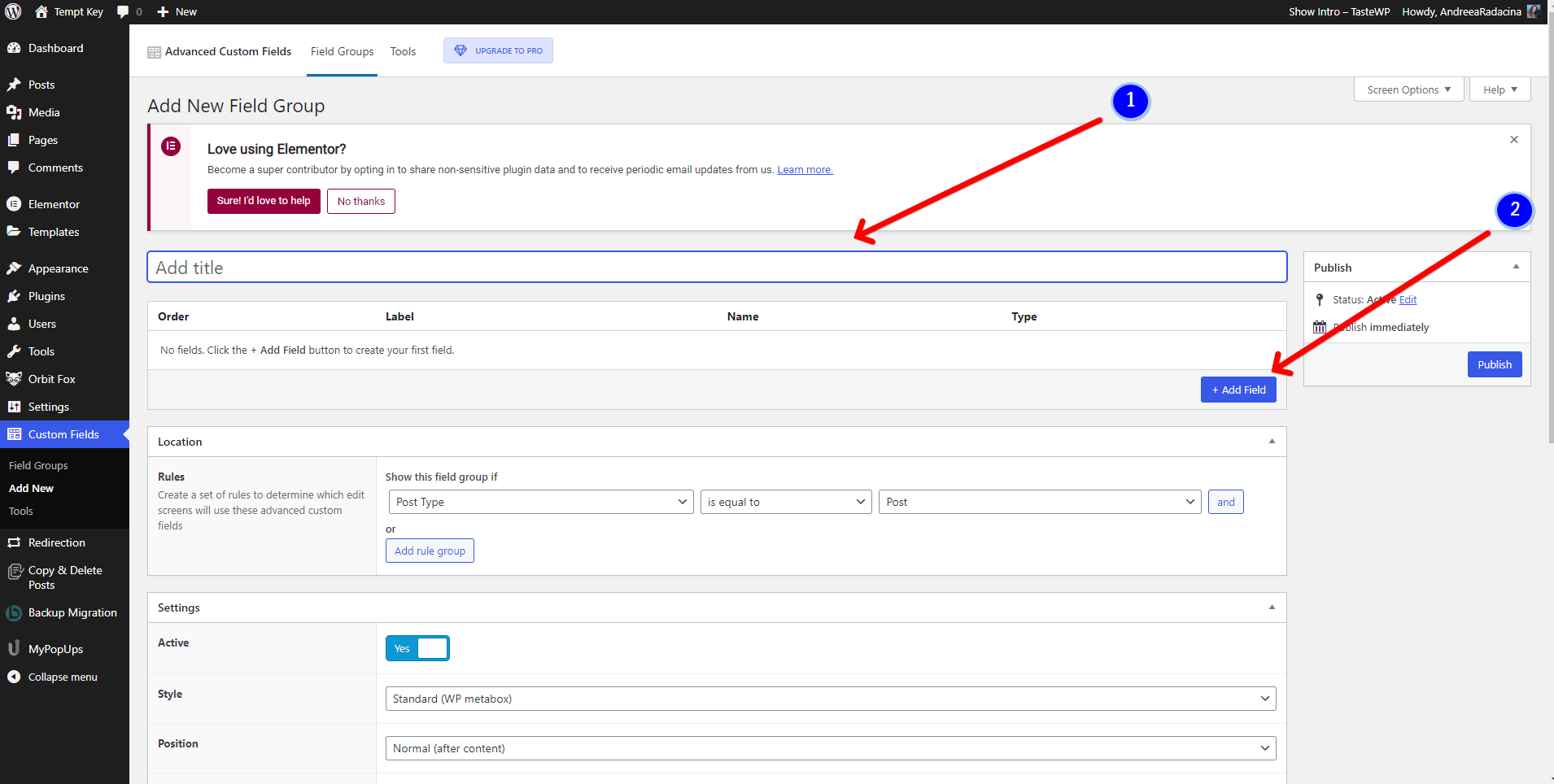
- Step 3: Create a new field group with the fields you want to use, by clicking on the Add New button.
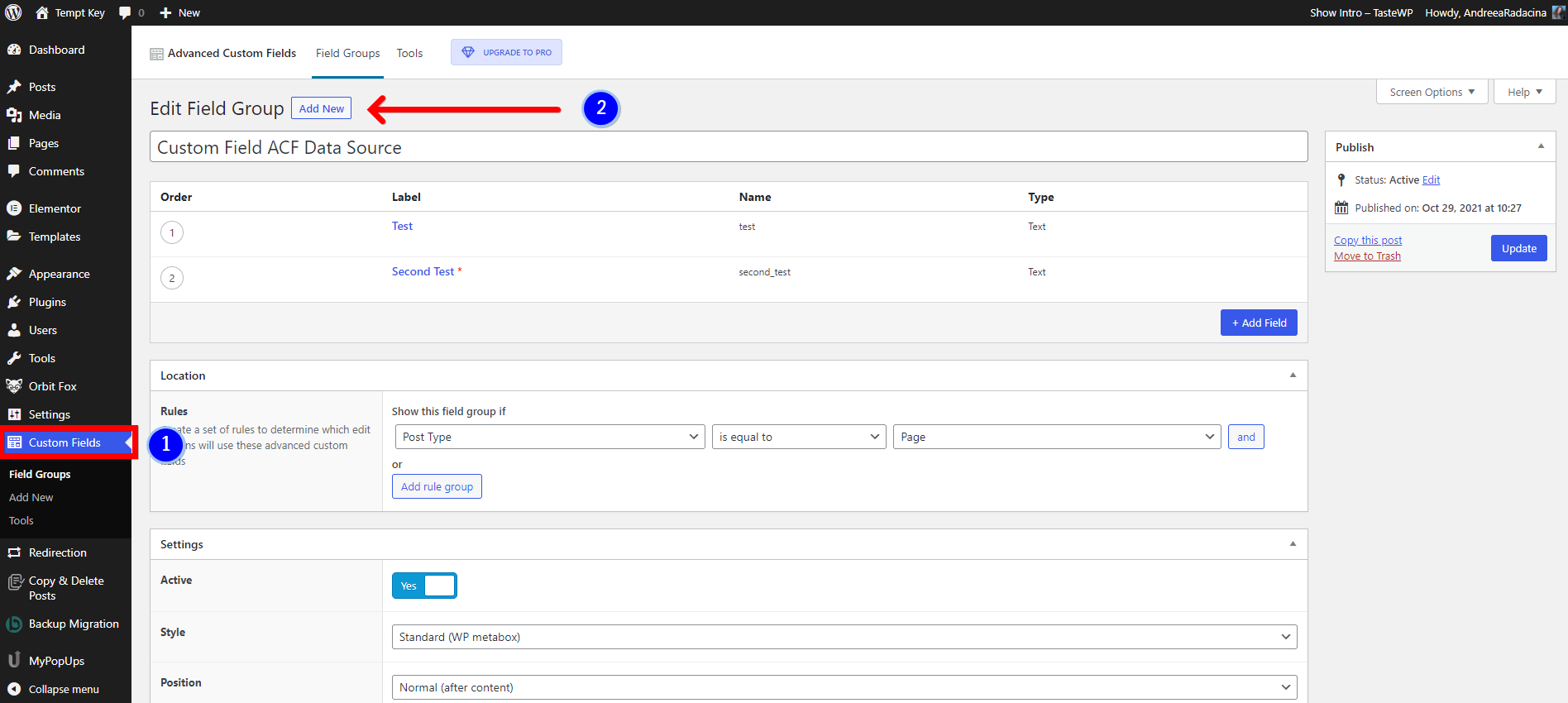
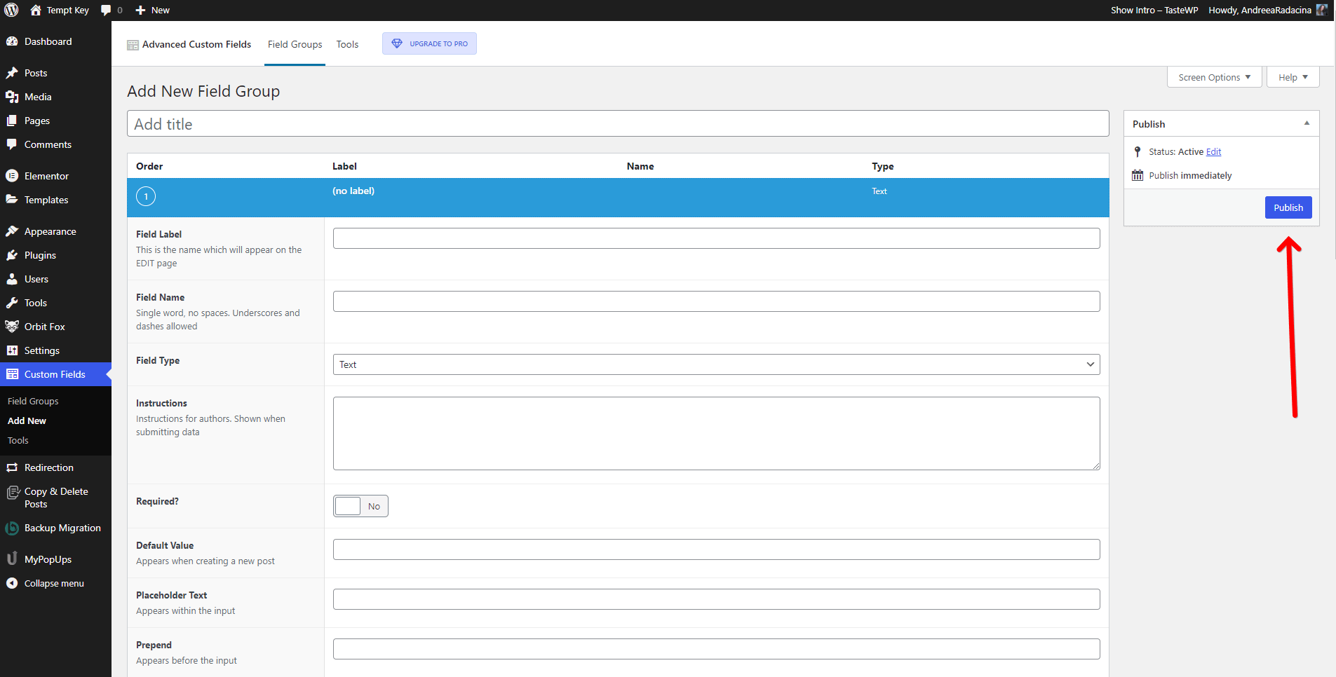
- Step 4: Insert a title for the group of fields and click on the Add Field button.
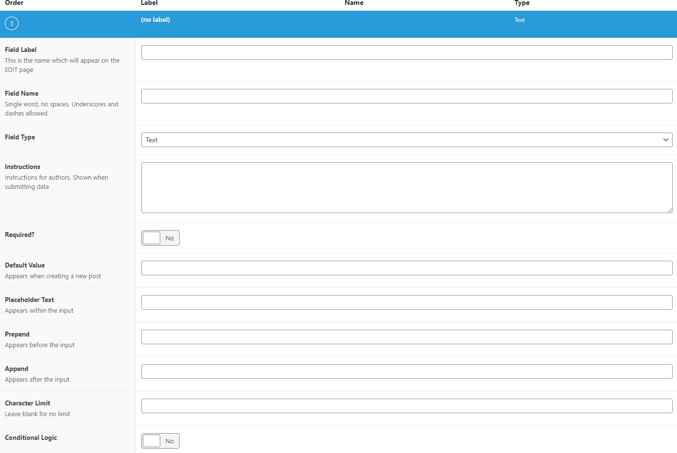
- Step 5: Complete the details of the field.
- Step 6: Make sure you insert the locations so that this Data Source will be displayed only on those pages.
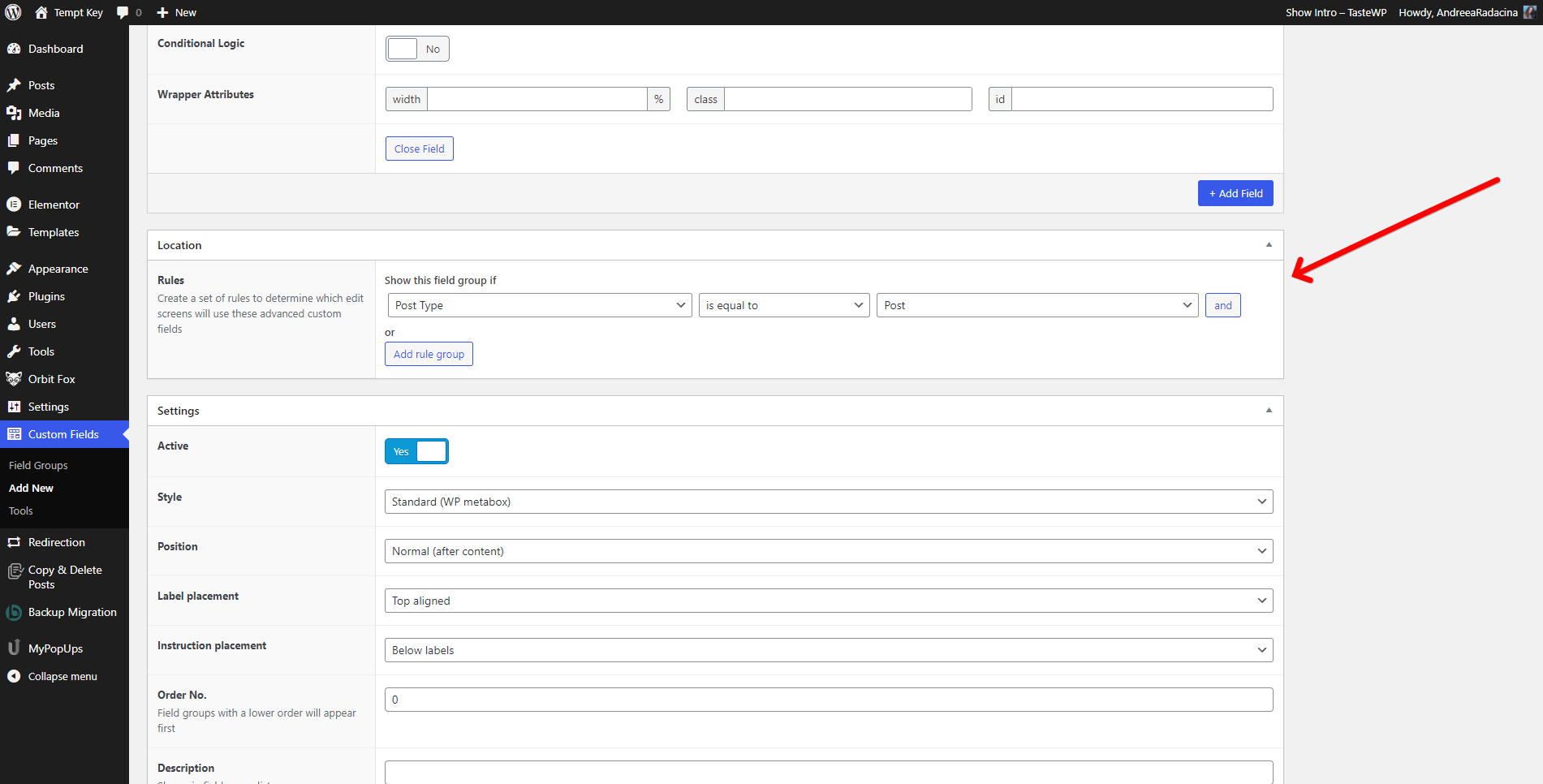
- Step 7: Click on the Publish button from the right side of the page, to access the changes live.
- Step 8: Navigate to the page of your choice and fill in the custom fields and save the page.
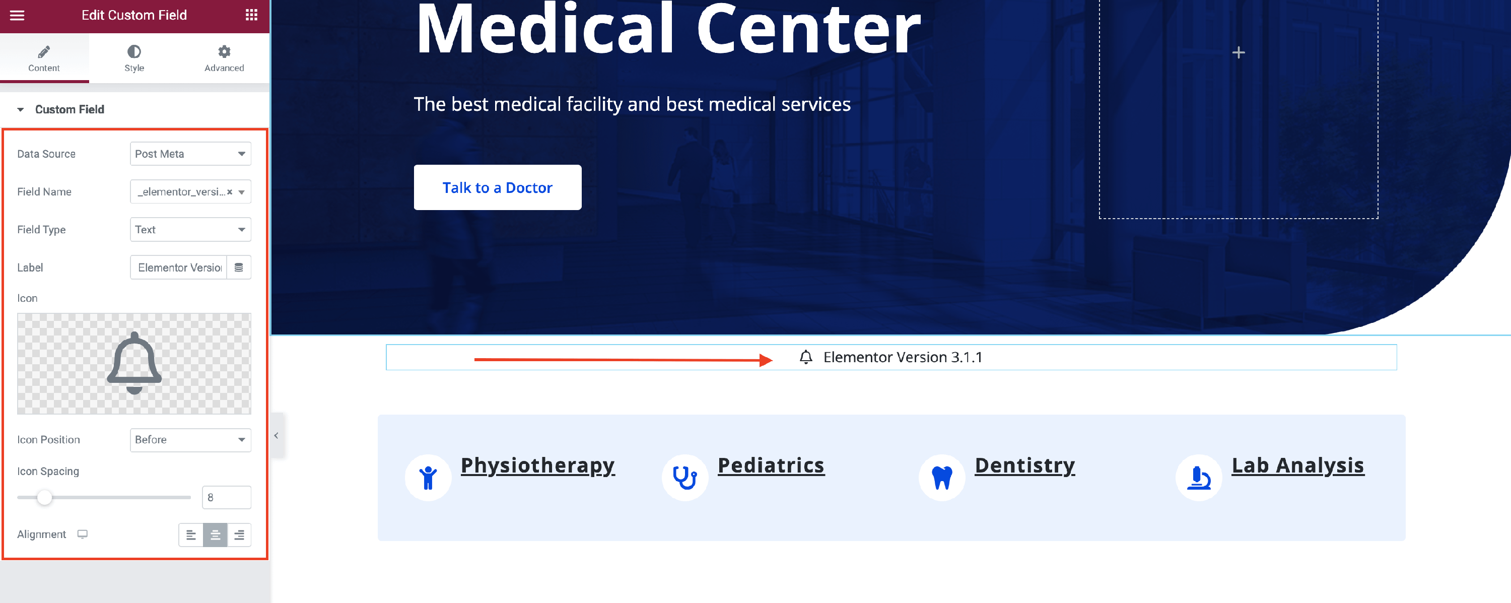
💡Result - when you will open the Elementor Editor and insert the Custom Field widget, with the ACF as Data Source, this will be the result:
Other settings are available for the Data Sources:
- Field Name - you can select the desired field created earlier and this will dynamically display its value on the page.
- Field Type - this can be either Text or Link. Based on this, the custom field will be displayed as text or as a link.
- Label - this will display a default text into the field.
- Icon - select one from the Icon Library or Upload a SVG. It will be displayed along with the Label and Field Name.
- Icon Position - decide where you want the Icon to be positioned, before or after the rest of the text.
- Icon Spacing - adjust the space between the Icon and the rest of the text.
- Alignment - establish the position of the custom field ( left | center | right ).
🖌️ You can also style the Field's, Label's, and Icon's appearance by navigating into the Style tab and exploring the options, such as typography, color, and icon size.

📌 Now, that the widget is almost ready, you can go on to the Advanced tab, if you want to add motion effects, advanced effects, content protection, background or make the page responsive.
After finishing all the editing, click on Publish to see your work live.