Neve Blog/Archive Options
Neve's Blog/Archive options let you control the layout, sidebar, and post card display for your blog listing and archive pages, accessible under Appearance > Customize > Blog > Blog/Archive.
For more details check out the full Neve documentation and Neve PRO documentation.
📝Note: These options are part of both Neve and Neve PRO. More advanced options can be found in Neve PRO.
The Blog page
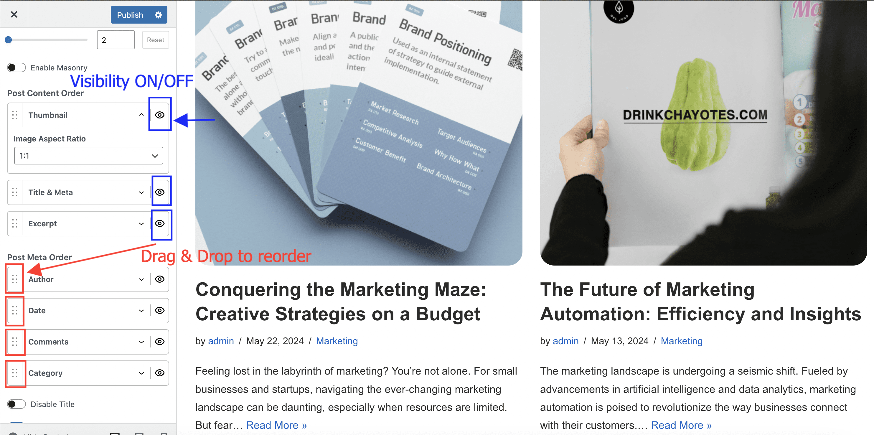
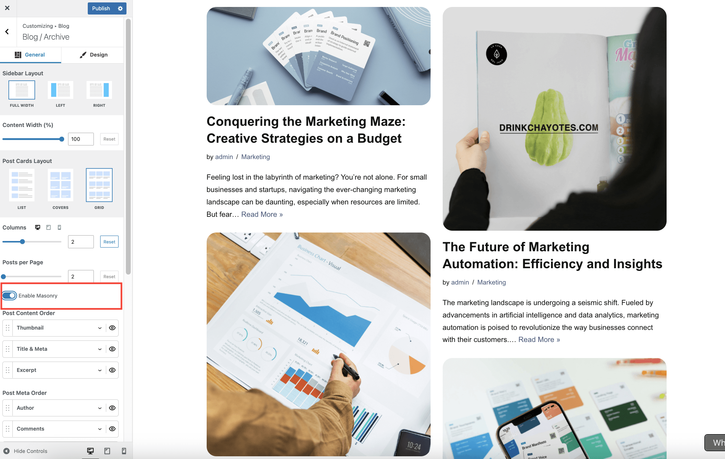
Navigate to Appearance > Customize > Blog > Blog/Archive to access the options:
- Sidebar Layout and Content Width are two related options. When choosing a Left or Right sidebar layout, make sure to add widgets in the Sidebar, by going to Appearance > Customize > Widgets, and select a corresponding Content Width which would allow for the sidebar to show. ( e.g. 70%)
- Post Cards Layout is the main setting of the Blog page. Depending on the selected option ( List, Covers, or Grid ), additional dedicated options are available.
- The Post Content Order and Post Meta Order options allow you to choose a specific layout of each post displayed on the Blog page. Drag & drop elements to reorder them, or click on the little eye icon to show/hide them. To review the featured image settings for archive cards, expand Post Content Order and open Thumbnail.
- The Disable Title option is used to hide the main title of the Blog page.
- Enable masonry - When masonry is enabled, items are arranged to minimize vertical gaps between them. Unlike the default grid with fixed row heights, masonry grids adjust the positioning of items dynamically based on their content height.
Why editor content does not appear on the assigned Posts page
If you assign a page under Settings > Reading > Posts page, WordPress uses that page as the blog archive and shows the post loop there. Because of that WordPress behavior, the content you add in the page editor does not appear on the front end.
This is not caused by Neve. Neve only styles the blog archive that WordPress outputs for the assigned Posts page.
Add custom content above a posts list
If you want to show an introduction, buttons, or other custom blocks above a list of posts, use a regular page instead of the assigned WordPress Posts page.
- Create or edit a standard page that is not assigned under Settings > Reading > Posts page.
- Add the introduction or any other blocks you want to display above the posts list.
- Insert an Otter Posts block from the Otter Blocks plugin, or another posts-list block, where you want the articles to appear.
- Publish the page and add it to your navigation menu if needed.
This gives you a page with custom content at the top and a posts list underneath, without the editor-content limitation of the built-in Posts page.
Adjust featured image size on the blog archive
To control how featured images appear on blog and archive cards, go to Appearance > Customize > Blog > Blog/Archive, expand Post Content Order, and open Thumbnail.
- In both Neve and Neve Pro, this is where you manage the archive thumbnail element itself inside the post card layout.
- In Neve Pro, the Blog Booster Documentation covers the extra Image Position and Image Width controls available in Thumbnail.
- If you need to change the actual generated thumbnail dimensions in WordPress, follow How to change image size in Neve and regenerate the thumbnails afterward.
When using Optimole
Optimole optimizes images based on the size requested by the page layout. If you reduce the displayed archive thumbnail width in Neve Pro, Optimole can serve a smaller optimized featured image for those blog cards.
This affects the image size requested on the archive page, but it does not replace WordPress thumbnail generation. If you need different thumbnail dimensions at the source, use the separate image-size guide linked above and regenerate thumbnails after the change.