WooCommerce Booster Module Documentation
The WooCommerce Booster is a Neve PRO add-on (Business and Agency plans) that extends WooCommerce with advanced customization options for the Shop, Product, Cart, and Checkout pages.
For more details check out the full Neve documentation and Neve PRO documentation.
Important: The WooCommerce Booster is part of just two Neve PRO plans: Business and Agency.
In this article
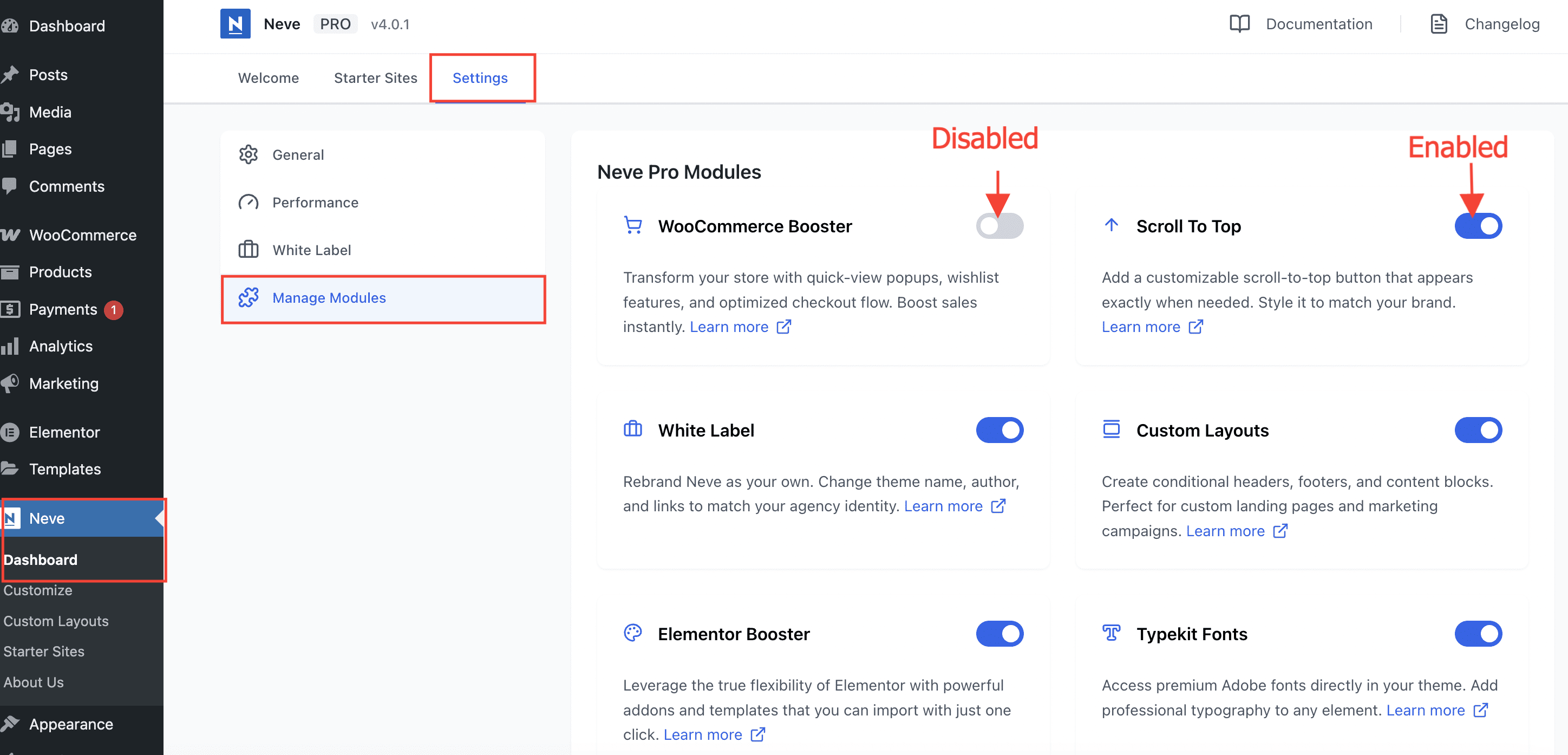
Enable or disable modules
Part of Neve PRO options consists of modules which can be enabled/disabled if used or not.
To enable/disable modules, navigate to Neve > Dashboard > Settings > Manage Modules.
Use the module
The WooCommerce Booster is an add-on for the WooCommerce plugin, which brings in lots of customizations options for the Shop, Product, Cart and Checkout pages.
Note: The WooCommerce Booster requires Sparks to be installed and activated. Read here or bellow about all the options coming from Sparks:
| Multi-Announcement Bars | Variation swatches |
| Comparison table | Advanced Reviews |
| Tabs Manager for Products | Custom Thank You Page |
| Quick View | Product Wishlist |
Customize the Shop page
Navigate to Appearance > Customize > WooCommerce > Product Catalog to access the options:
- Products per row (maximum 6) and Products per page are two related options, setting the number of products that will display on the Shop page.
- Pagination - Choose between Number (display page numbers for navigation) and Infinite Scroll (continuously load products as users scroll down the page).
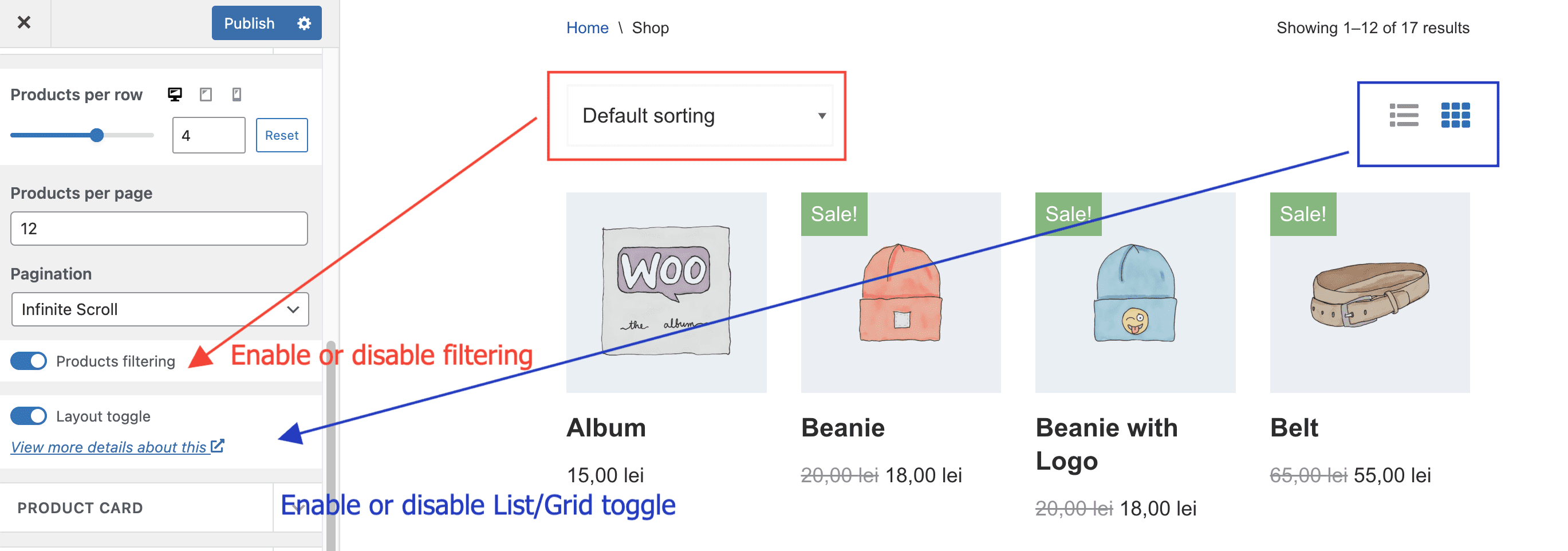
- In the Product card panel, there is an option to display products either as Grids or Lists, and an option to adjust the Add to Cart button ( either not show it at all, at the bottom, or on top of the product, on hover ).
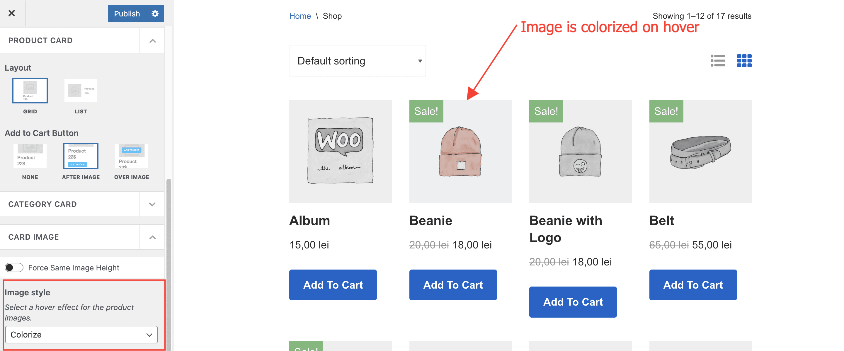
- In the Card image panel, there are two options that can be used to customize the product image: Force Same Image Height ( which makes all images the same height, no matter their initial size ) and Image style ( which allows for various hover effects like Zoom, Blur, Colorize etc ).
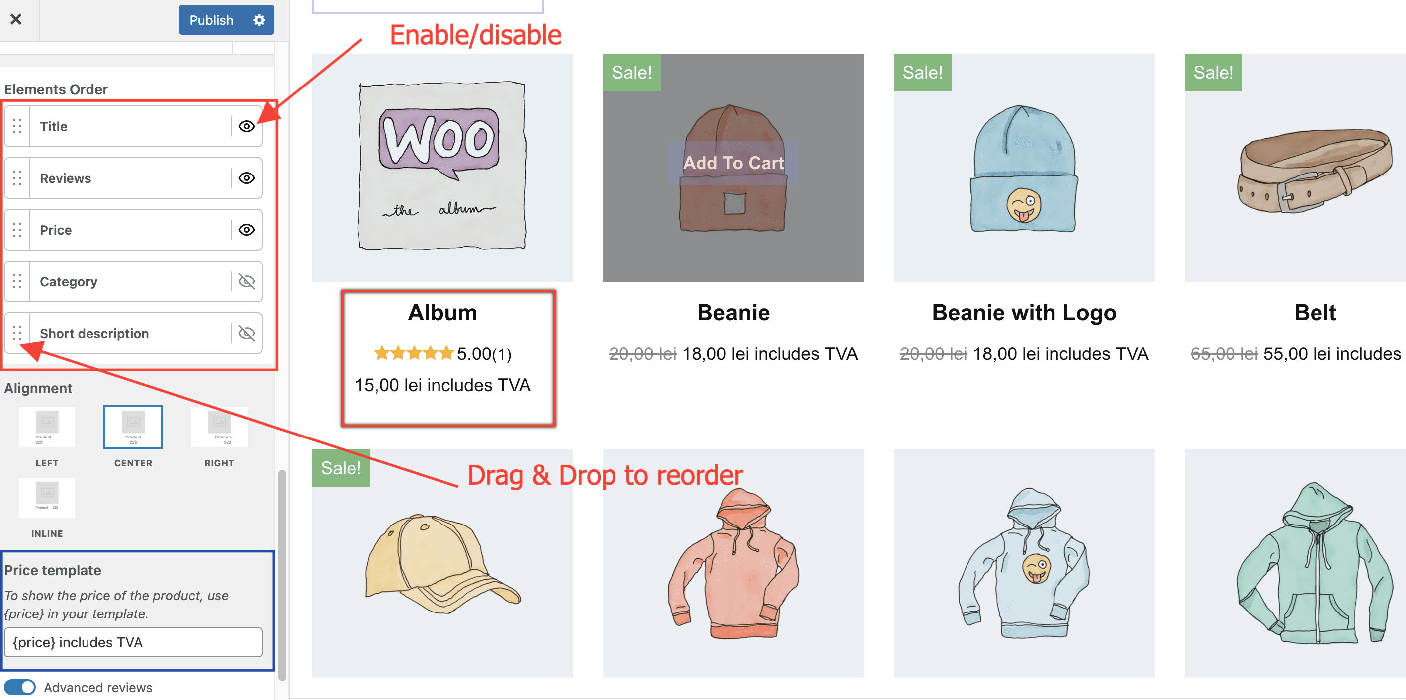
- In the Card Content panel, the main option is Elements Order, from where you can reorder and enable/disable the elements ( Product title, Reviews, Price, Product Category and the Short description ) to obtain the layout of your choice.
- Price template - Allows you to add prefixes ( For e.g. only, buy at ) or suffixes ( For e.g. included tax, VAT included) for the price.
- Advanced reviews - Besides the default Product stars rating, by enabling this option, you also get the rating number and the total number of reviews, as in the image below.
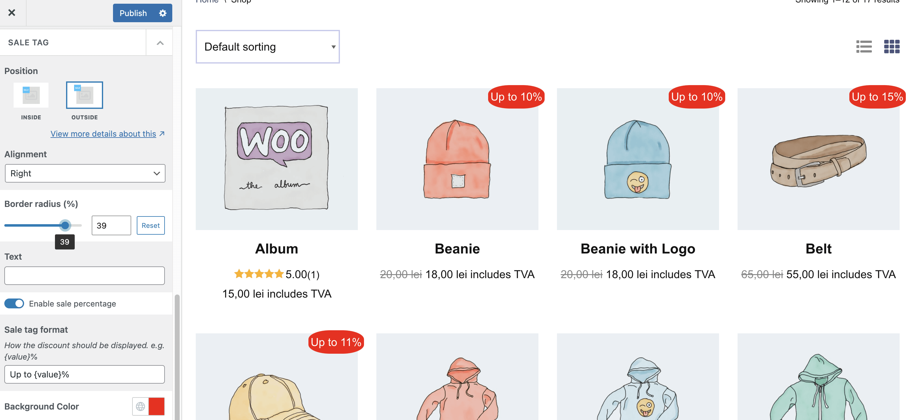
- The Sale tag for products that have a discounted price, can be customized from Appearance > Customize > WooCommerce > Product Catalog > Sale Tag.
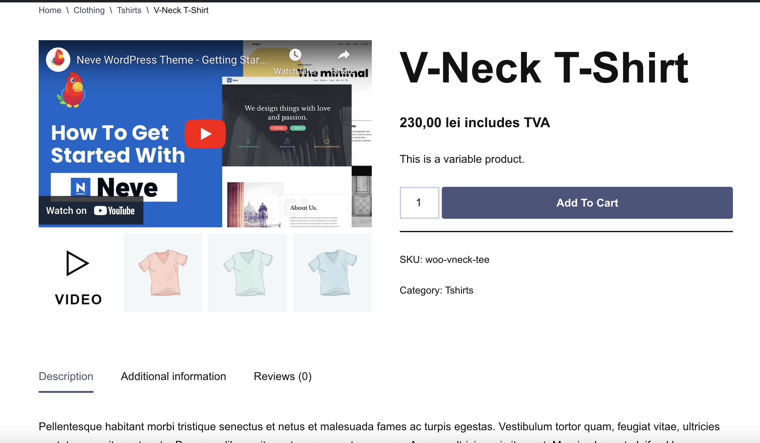
Customize the Product page
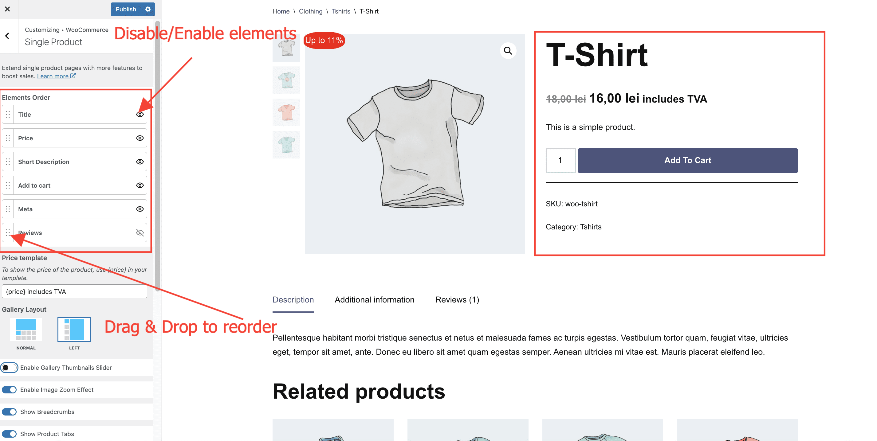
Navigate to Appearance > Customize > WooCommerce > Single Product to access the options:
- The main option is Elements Order, from where you can reorder and enable/disable the elements ( Product title, Reviews, Price, Meta, Add to Cart button, and the Short description ) to obtain the layout of your choice.
- For products that have a gallery of images, the Gallery Layout option can be used to change the default layout of the product ( where the gallery images are at the bottom of the main image ), to one where the images are in the left side of the main image.
- Show Product Tabs - Enable or disable the tabs coming from WooCommerce ( Description, Additional information and Reviews )
- Enable Seamless Add to Cart - When this option is enabled, the product is added to the cart without refreshing the page.
- Show Upsell Products - Enable or disable upsells for the current product.
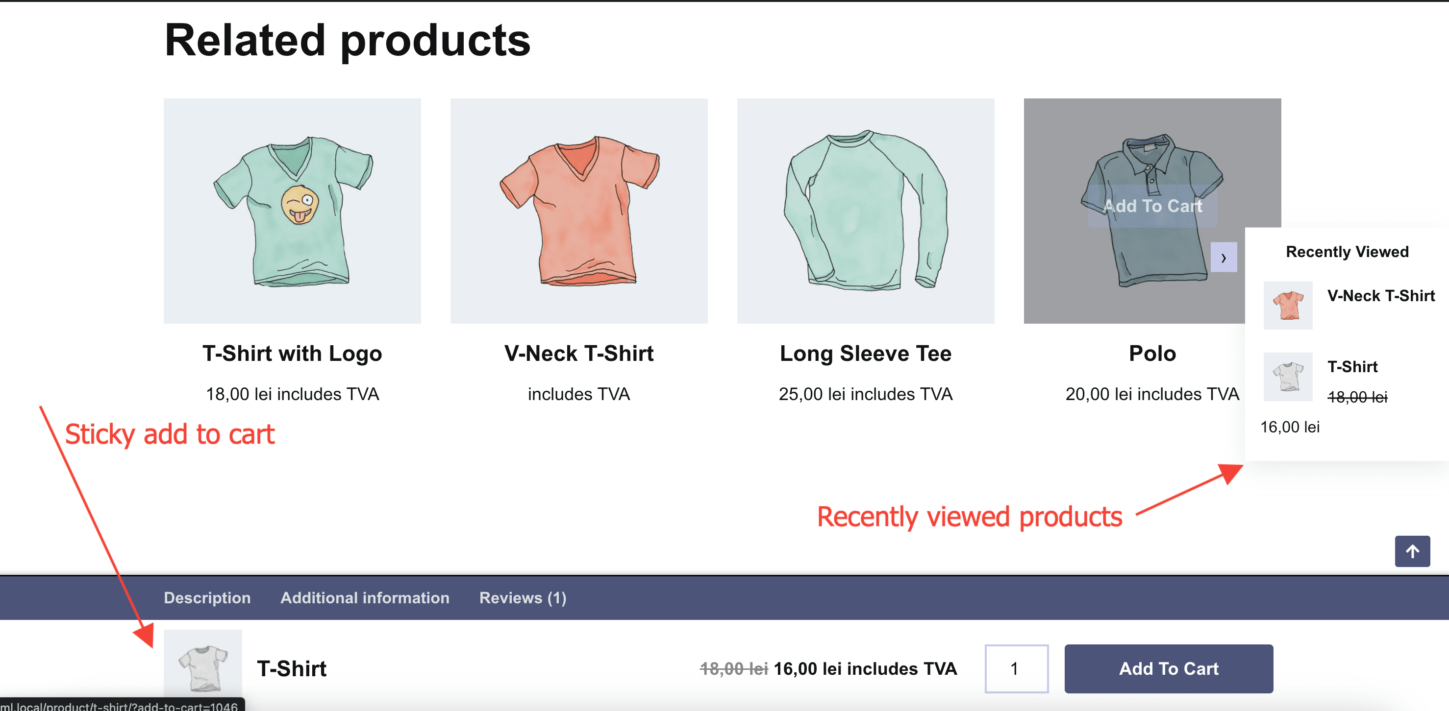
- The Recently Viewed Products and Sticky Add to Cart can be seen in the image below.
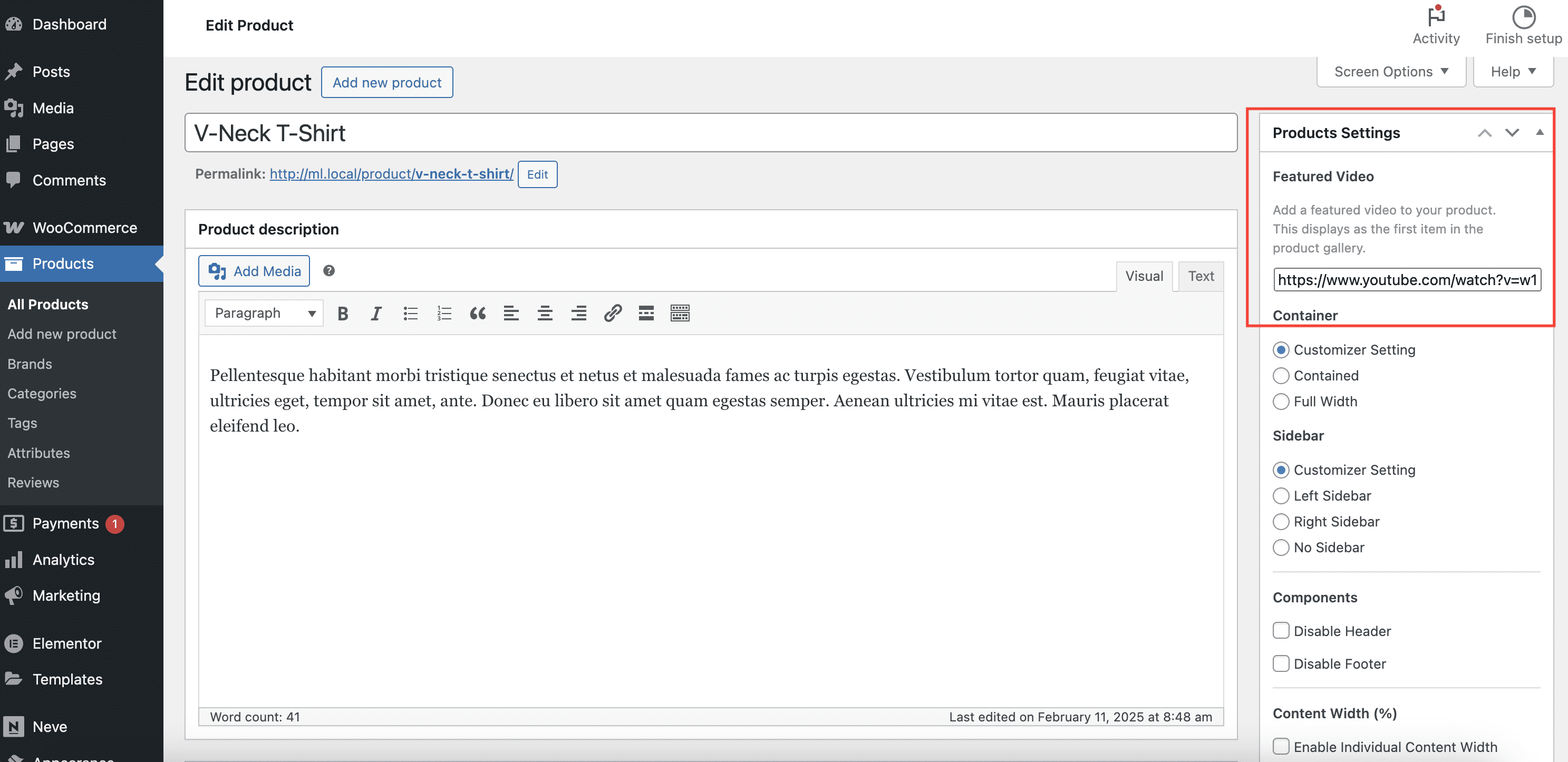
Featured Video for Products
Another awesome feature of the WooCommerce Booster is the ability to add a featured video for each product. Similar to adding a featured image, you can select a video that will show up on the single product page.
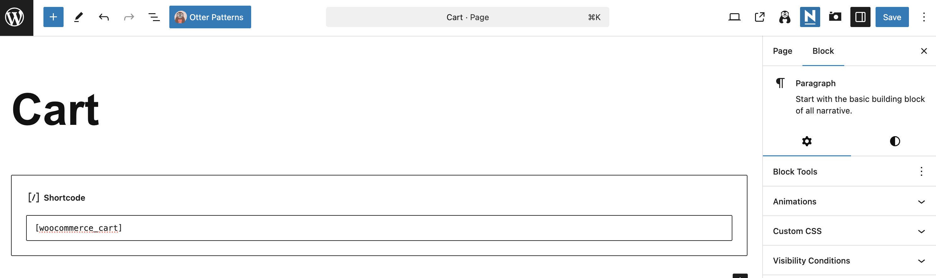
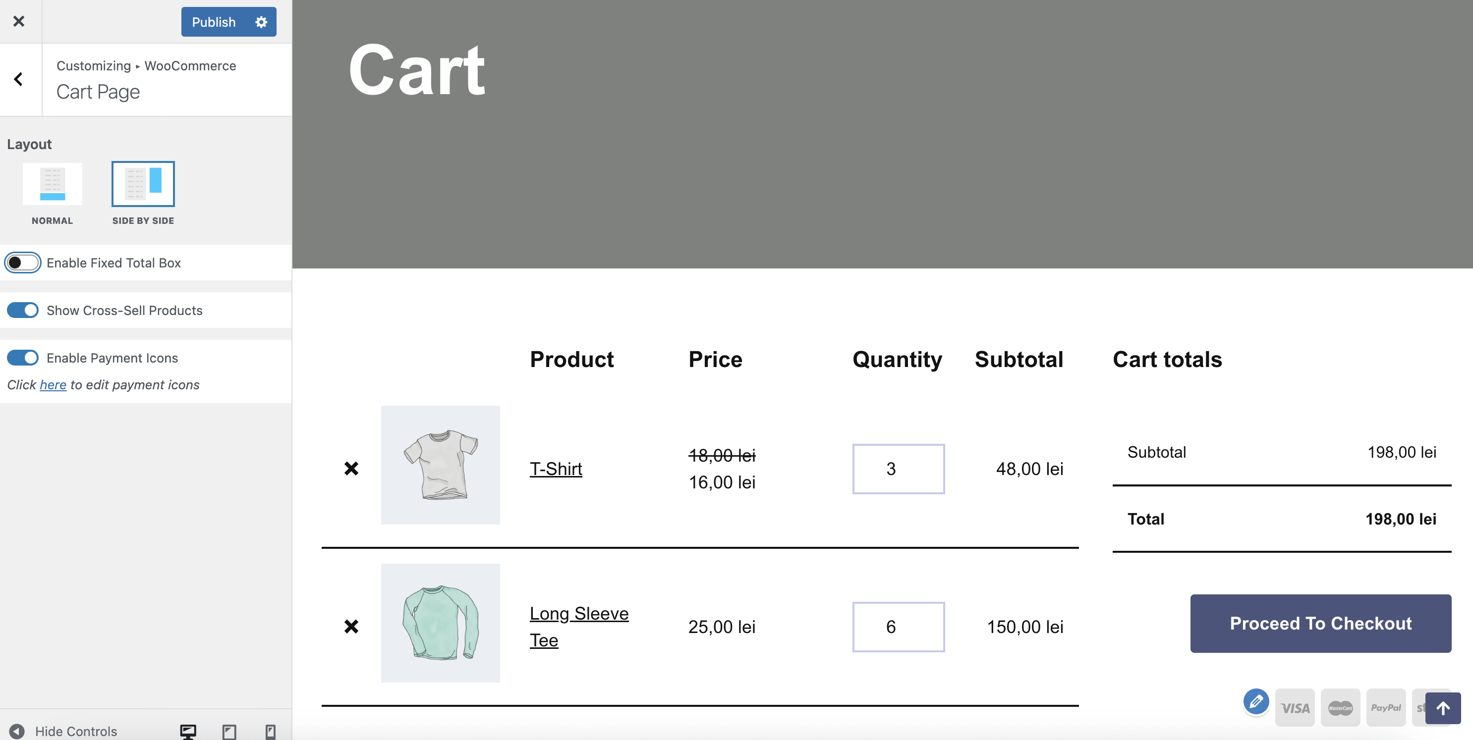
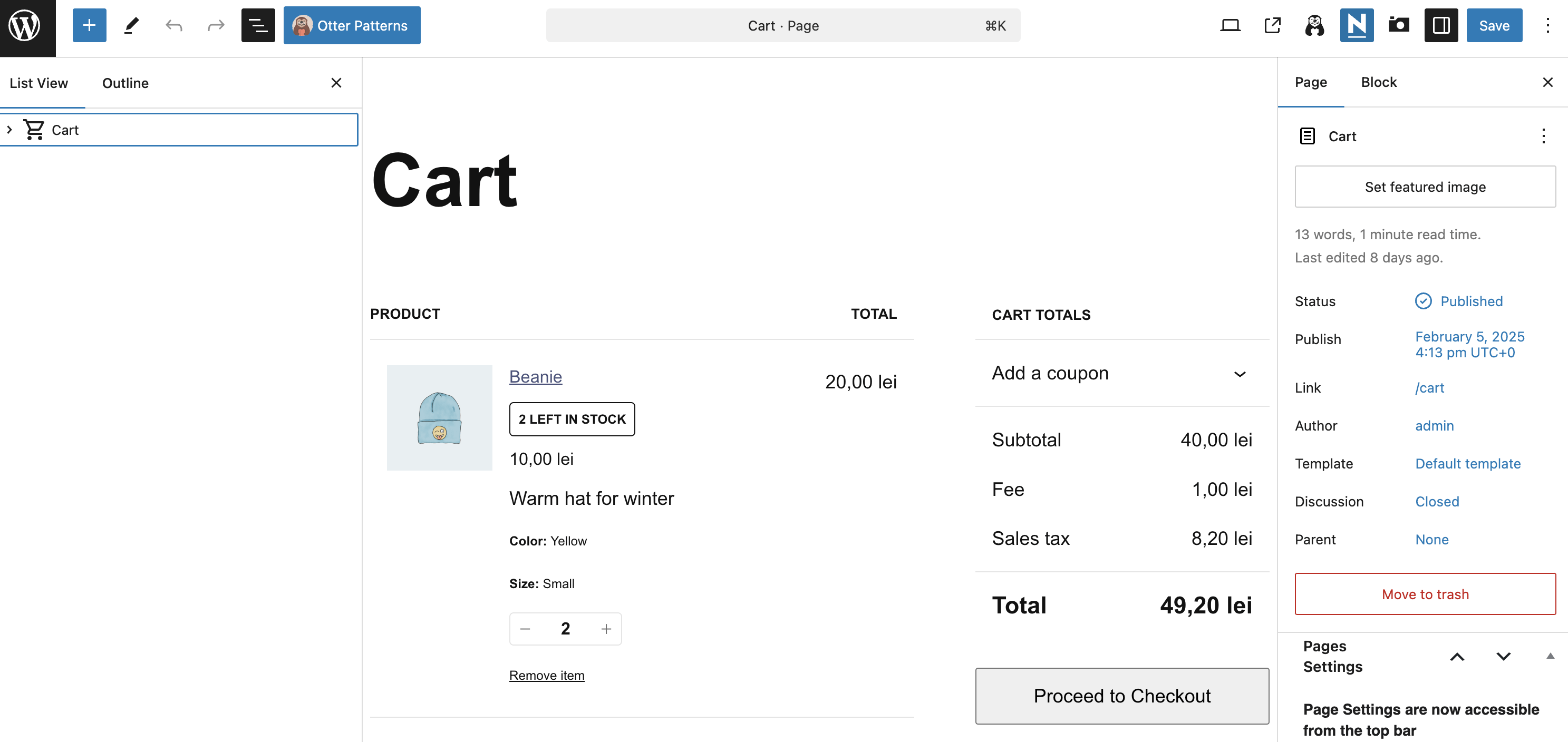
Customize the Cart page
The Cart page can be built using two methods:
1. Using the [woocommerce_cart] shortcode - In this case, the Cart page can be customized by navigating to Appearance > Customize > WooCommerce > Cart Page.
2. Using the Cart block - In this case, to customize the Cart page, you need to edit the page, and update the block's options in the editor. In this case, the options from Appearance > Customize > WooCommerce > Cart Page are not usable.
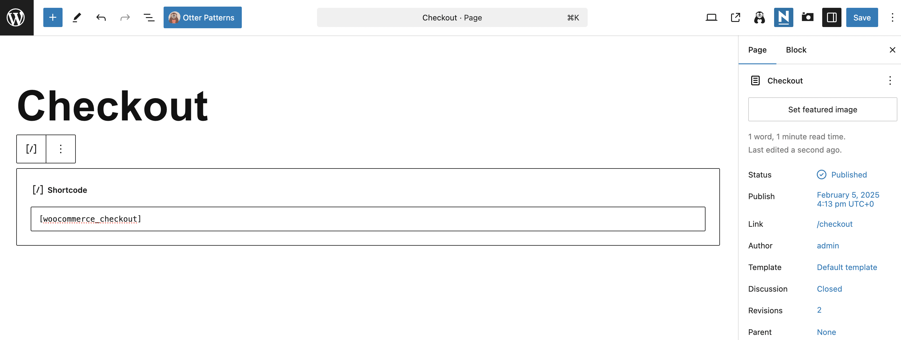
Customize the Checkout page
The Checkout page can be built using two methods:
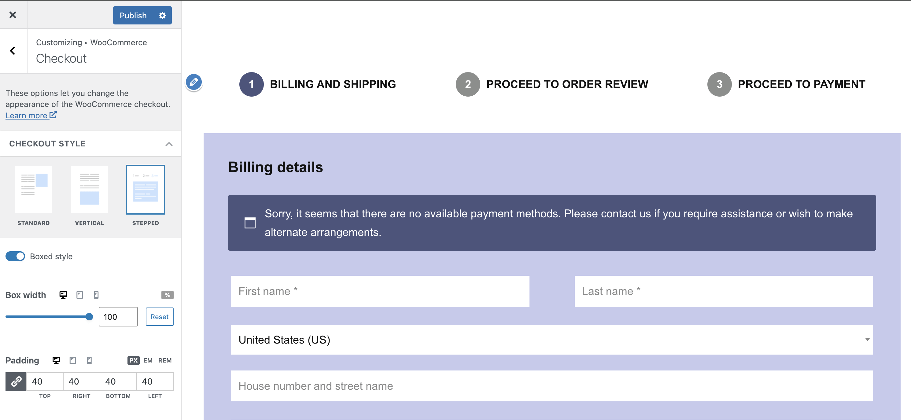
1. Using the [woocommerce_checkout] shortcode - In this case, the Checkout page can be customized by navigating to Appearance > Customize > WooCommerce > Checkout.
- Checkout Style is the main setting of the Checkout page. Depending on the selected option ( Standard, Vertical or Stepped ), additional dedicated options are available.
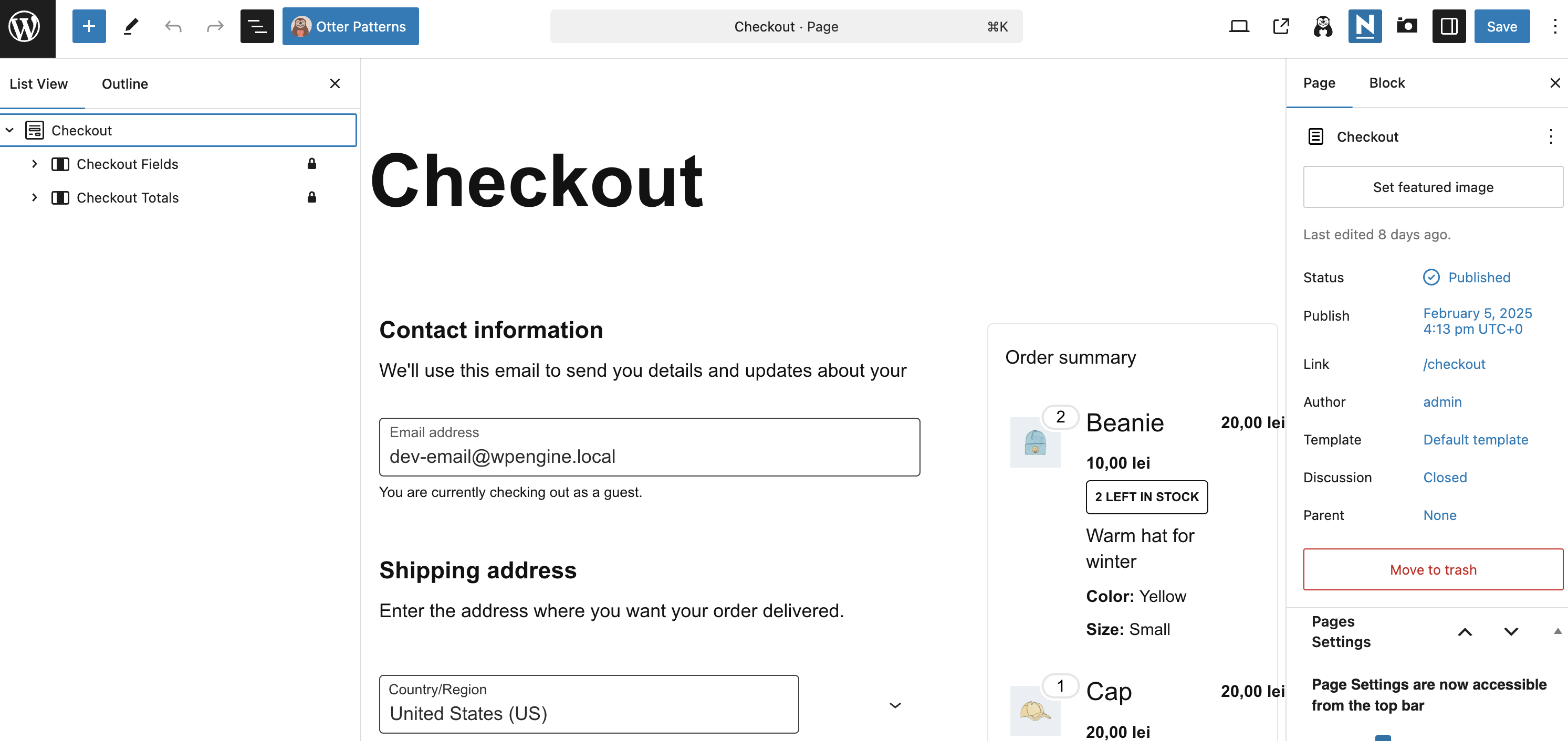
2. Using the Checkout block - In this case, to customize the Checkout page, you need to edit the page, and update the block's options in the editor. In this case, the options from Appearance > Customize > WooCommerce > Checkout are not usable.
Compatibility note: Add to Cart widgets on checkout pages
⚠️ Warning: The WooCommerce Checkout page is the order-completion step. Add to Cart buttons/widgets, product-loop elements, and Elementor dynamic product widgets are not intended for this page and might appear in the editor but not on the frontend.
This applies whether your checkout uses the [woocommerce_checkout] shortcode, the Checkout block, or a custom Elementor layout. Each method can behave differently, but Neve does not override WooCommerce or Elementor checkout context restrictions.
Recommended placement for Add to Cart widgets
Use Add to Cart widgets in supported contexts where a valid product context exists, such as:
- Single Product templates
- Product page layouts
- Shop/product archive layouts
Keep the checkout page focused on the checkout form (shortcode or Checkout block) and supported checkout customizations.
Troubleshooting: widget appears in Elementor but not on the frontend
If a widget is visible in Elementor but missing on the live checkout page:
- Confirm the page is assigned as the WooCommerce Checkout page in your WooCommerce settings.
- Check whether the page uses the
[woocommerce_checkout]shortcode, Checkout block, or an Elementor template. - Remove Add to Cart/product widgets from the checkout page and place them in a Single Product or product listing context instead.