Content Switcher Widget
📝 Note: The Content Switcher widget is part of Neve PRO's Elementor Booster module.
The Content Switcher is ideal for the pricing tables because this will display the details of each of the selected options when the switcher is enabled.
In this article
Adding the widget
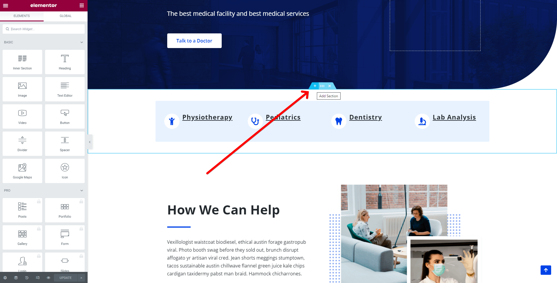
1. Once the Elementor Editor has been opened, click on the ➕ button to add a new section on the page.
2. Add the Content Switcher widget from the Elementor Library by clicking on the ➕ button and navigating to the Neve PRO Addon Widgets.
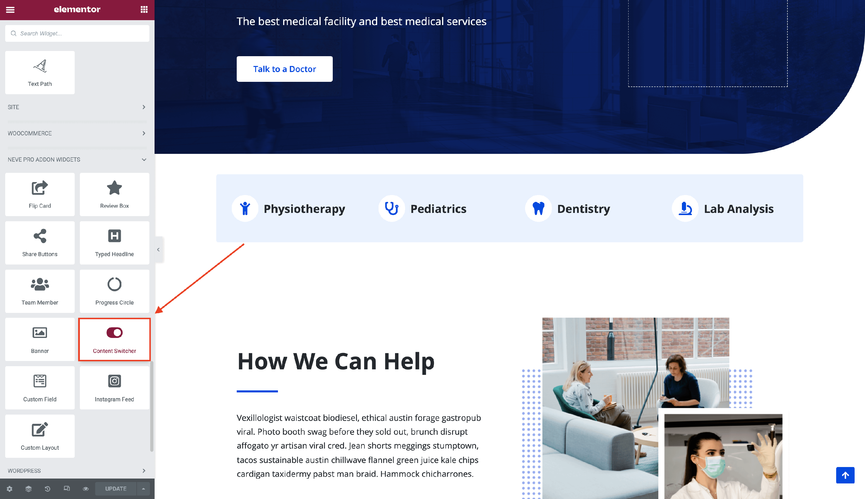
3. Drag and drop the Content Switcher widget into the selected area.
Customizing the widget
The Content Switcher component is easily customizable and its options cover three areas:
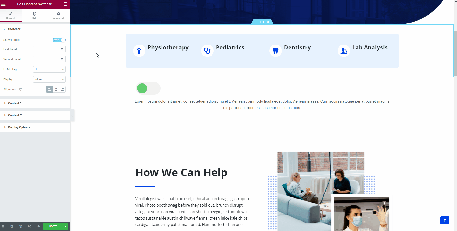
Switcher
- Show Labels - enable the labels of content 1 and content 2.
- If enabled, insert the name of the first and second label, decide the HTML Tag of them ( from H1 to H6 ).
- Display - choose to display the labels in an inline mode or a block one (one by the other ).
- Alignment - select from the three available options ( left / center / right ).
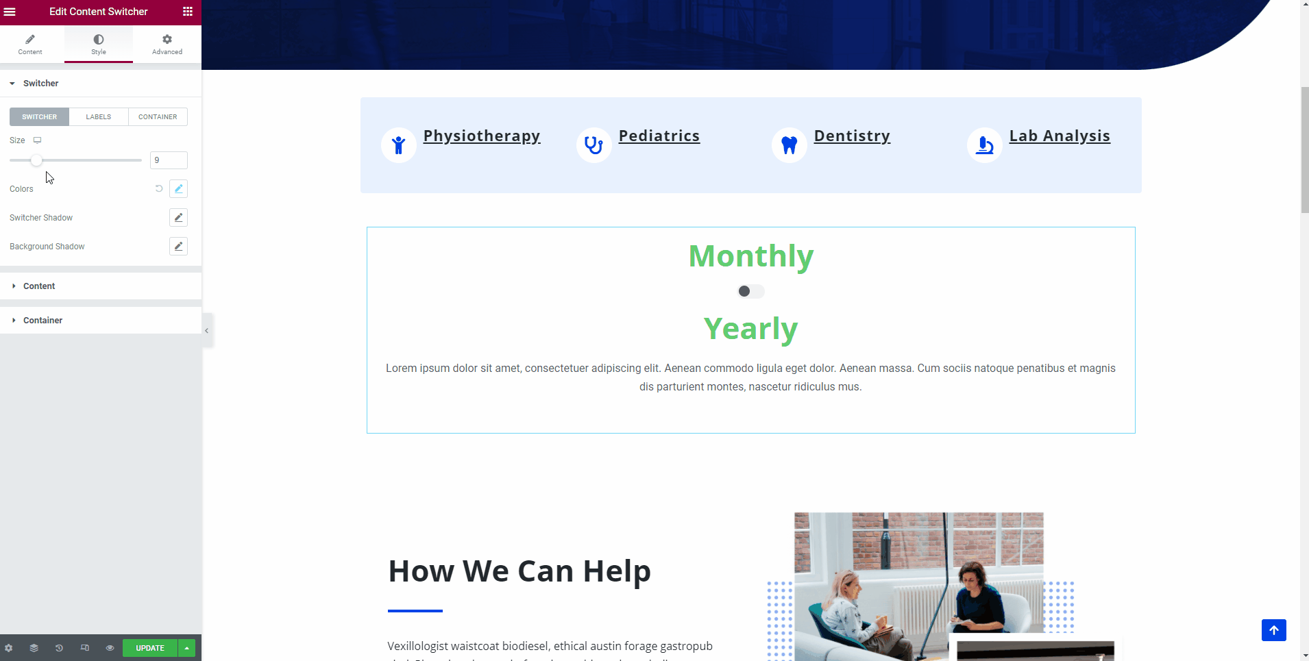
🖌️ You can also style the switcher's appearance by navigating into the Style tab and exploring the options, such as Size, Colors, Switcher Shadow, Background Shadow. Here are other two tabs that allow you to customize the Labels and Container appearance as well, with options like text color, typography, borders, and many others.
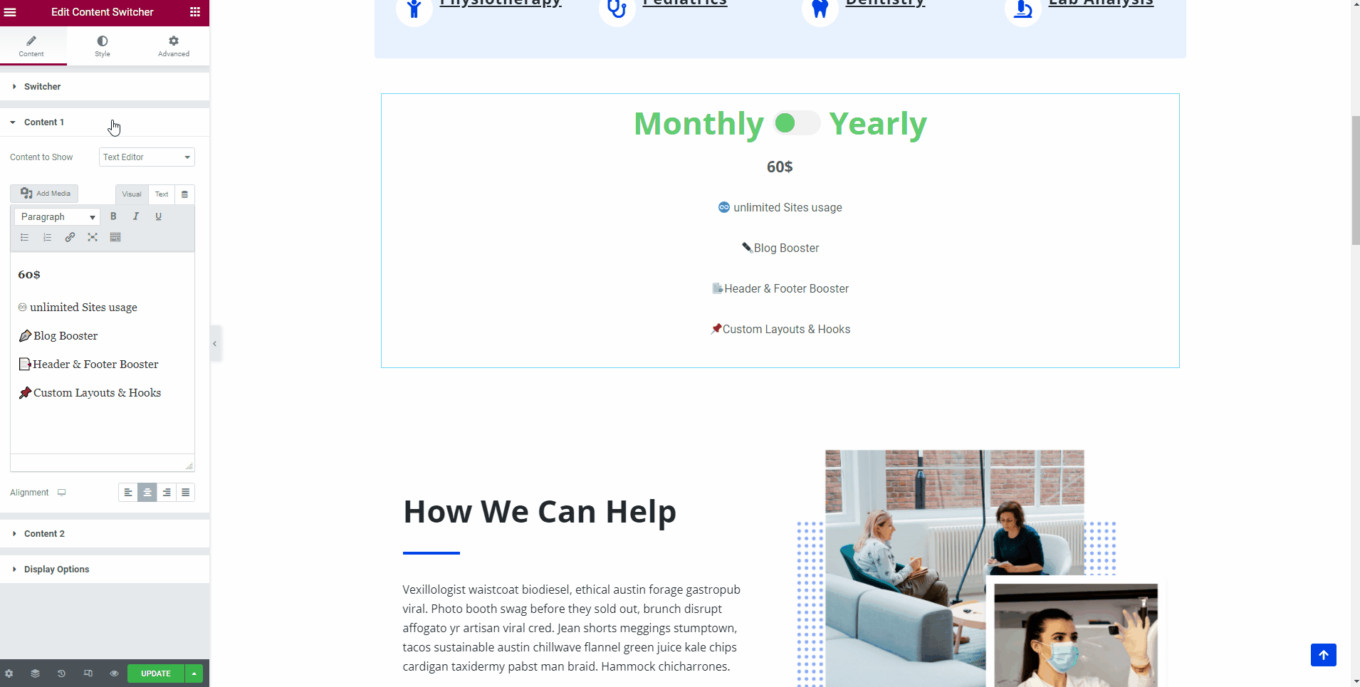
Content ( 1 and 2 )
- Content to show - you can choose from the Text Editor and Elementor Template.
- Description - insert a description of the first or second component here, using the text settings provided.
- Alignment - select one of the three orientations ( left / center / right / justify ).
📝 Note: If you choose to use an Elementor Template, be aware that changing its content from the Content Switcher widget will not work properly. To edit the template, make sure you navigate to your Dashboard > Templates > Saved Templates.
🖌️ You can style content's appearance by navigating into the Style tab and exploring the options, available for both components, such as height, text color, background color, typography, and shadow, border, margin, and padding.
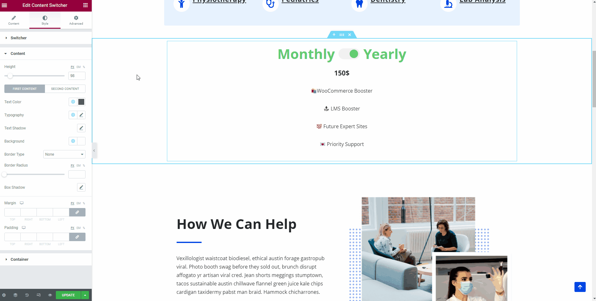
Something interesting is that in the Style tab you can also find options for the container, which is different from the border of the banner.
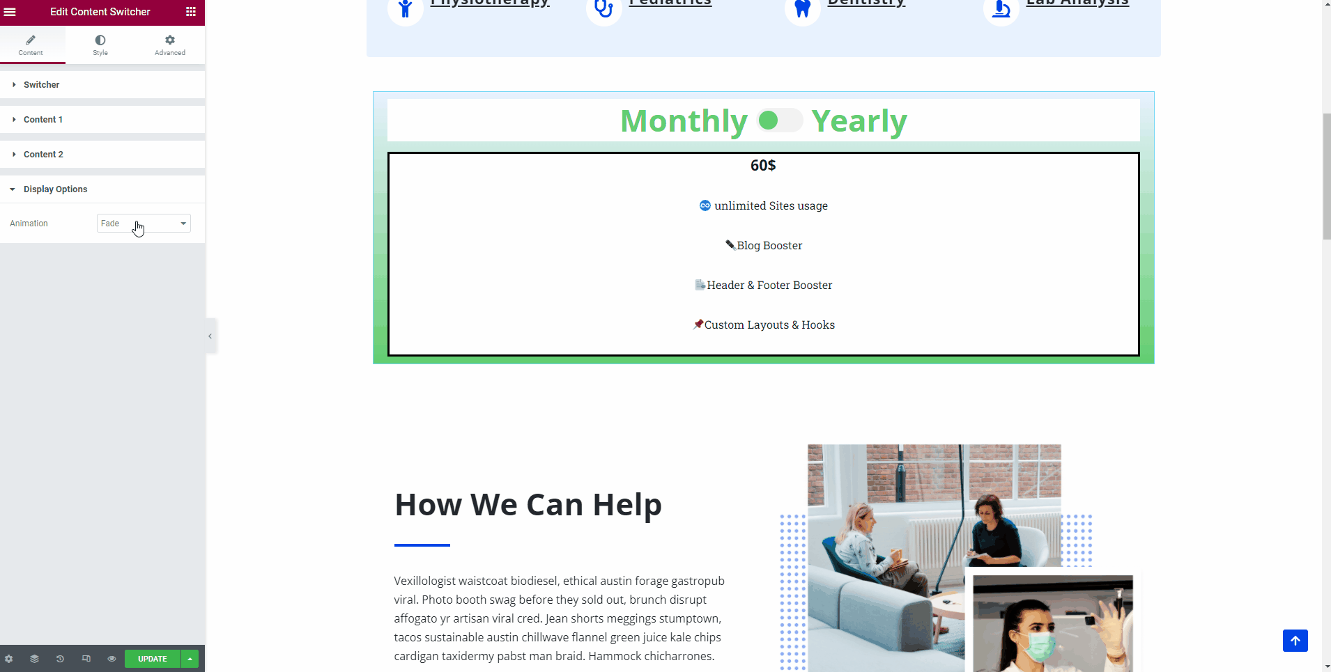
Display Options
- Animation - from this panel you can control the way the content switches between the options.
- You can choose from two options - fade and slide.
📌 Now, that the widget is almost ready, you can go on to the Advanced tab, if you want to add motion effects, advanced effects, content protection, background or make the page responsive.
After finishing all the editing, click on Publish to see your work live.