Flip Card Widget
📝 Note: The Flip Card widget is part of Neve PRO's Elementor Booster module.
The Flip Card widget consists of a card with two sides (Front Side and Back Side) between which the user can flip when hovering over. It is very useful especially for announcements or important things, due to the fact that it can easily catch the attention of the user.
In this article
Adding the widget
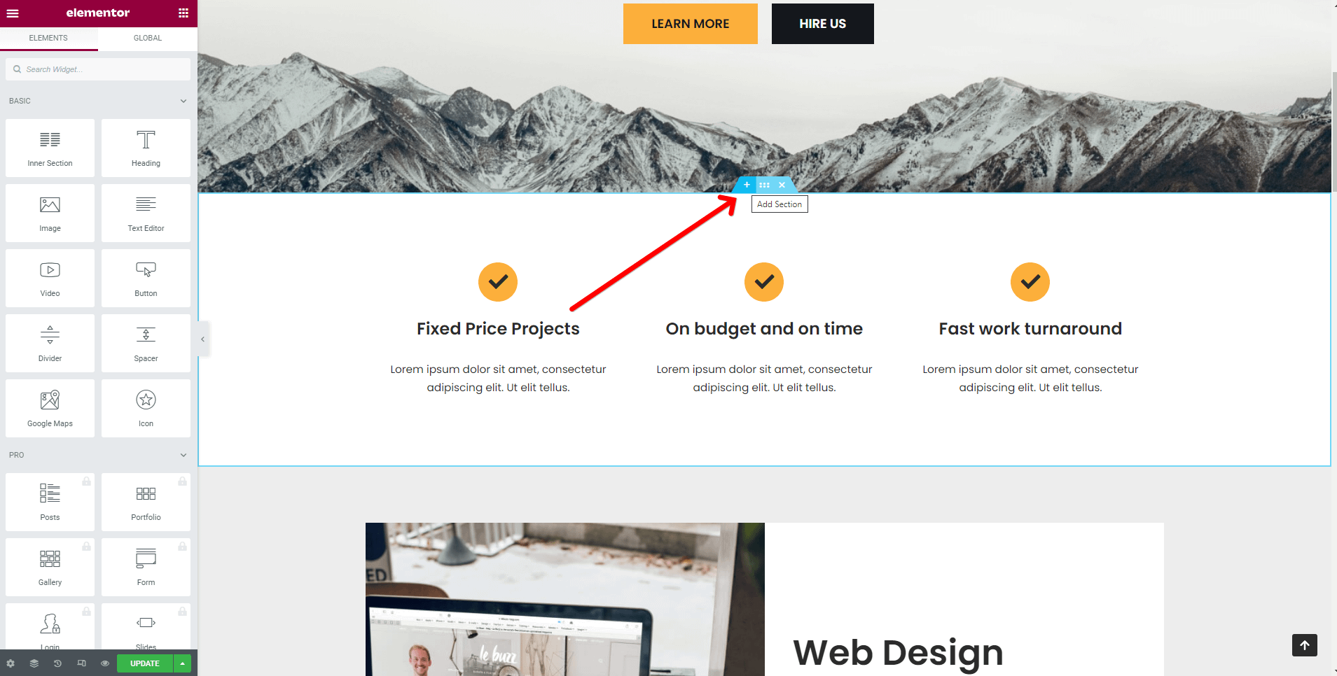
1. Once the Elementor Editor has been opened, click on the ➕ button to add a new section on the page.
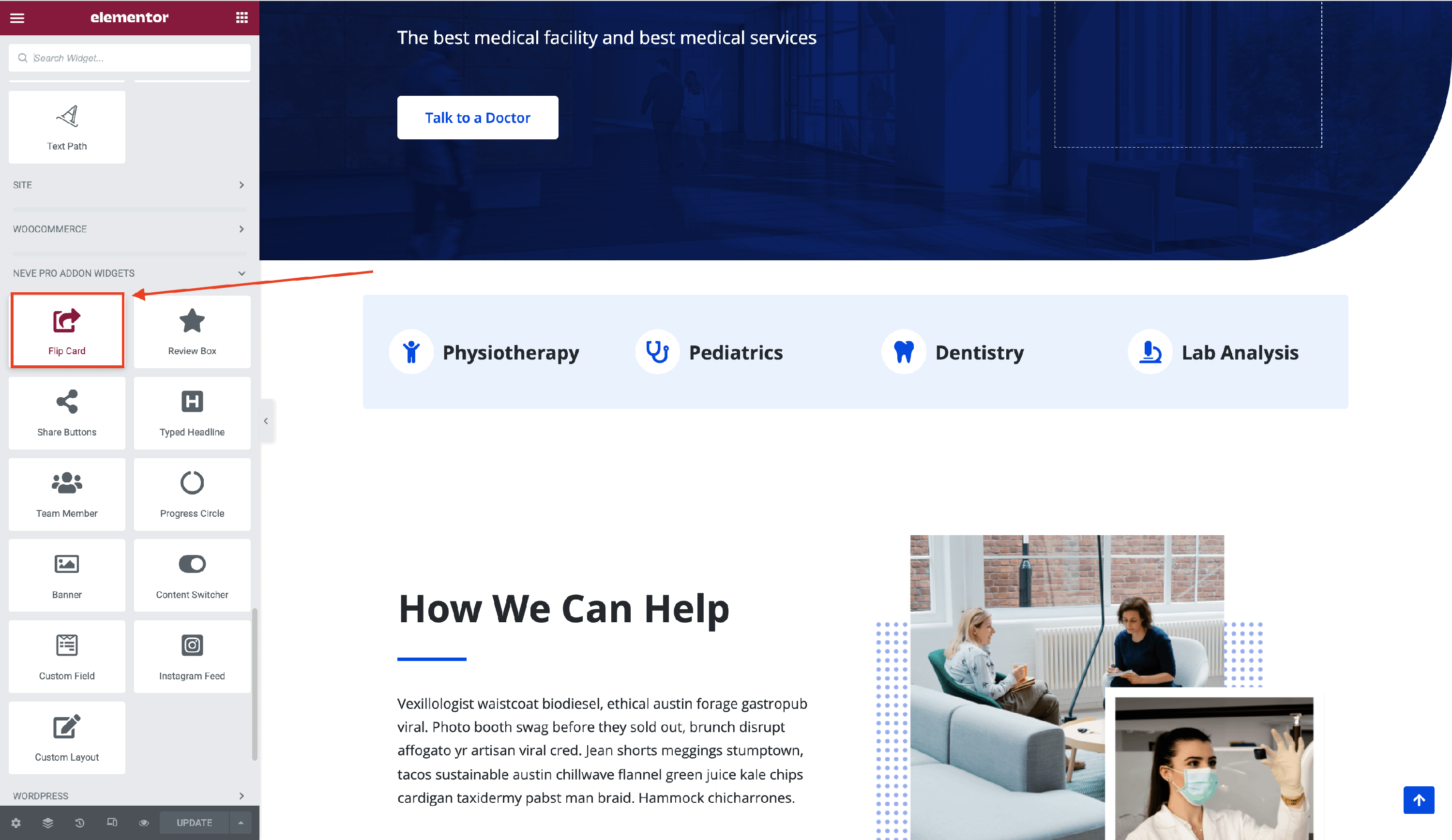
2. Add the Flip Card widget from the Elementor Library by clicking on the ➕ button and navigate to the Neve PRO Addon Widgets.
Customizing the widget
The Flip Card component is easily customizable and its options cover three areas:
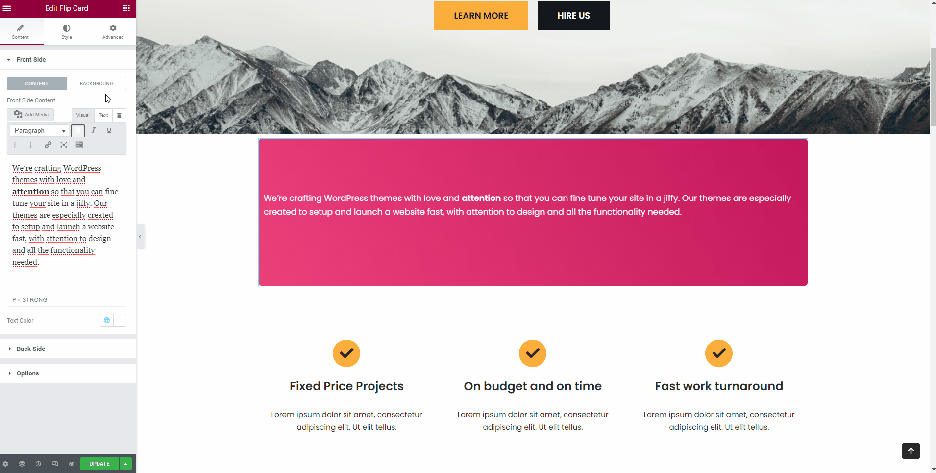
Front Side
This is the side that initially appears on the page. Here are the customizable options:
- Content
Front Side Content - add your own content for the front side of the widget, using the tools provided there.
Add Media - insert audio, video, or gallery to the Flip Card.
Text Color - personalize the text by adding a text color.
You have the possibility to choose from Neve's Global Colors, by clicking on the 🌐 button.

- Background
Background Type - there are two types of background available: classic / gradient.
The classic one includes choosing from color or adding an image.
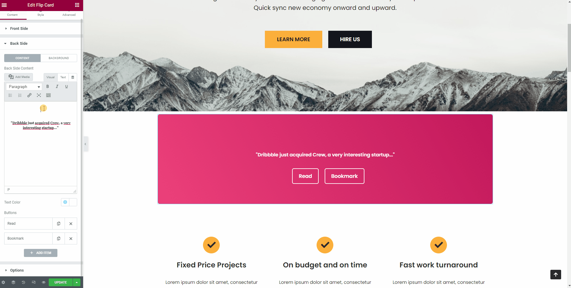
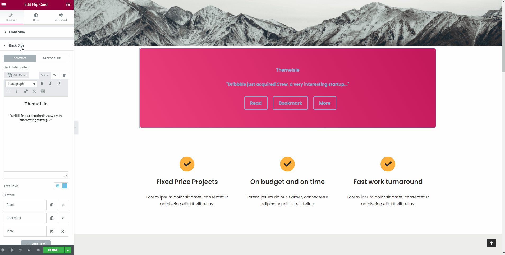
Back Side
- Content
- Front Side Content - add your own content for the front side of the widget, using the tools provided there.
- Add Media - insert audio, video, or gallery to the Flip Card.
- Text Color - personalize the text by adding a text color.
- You have the possibility to choose from Neve's Global Colors, by clicking on the 🌐 button.
- Buttons - add or remove buttons for the backside.
- Background
Background Type - there are two types of background available: classic / gradient.
The classic one includes choosing from color or adding an image.
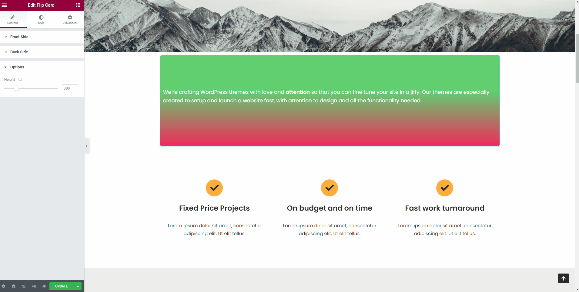
Options
- Height - use the slider to adjust the height of the flip card.
- Vary the dimensions according to each device: Desktop | Table | Mobile.
Styling the widget
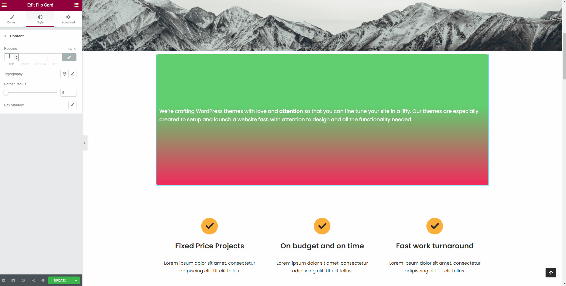
After building the widget content, you can go ahead and customize it. Click on the Style tab to explore the options:
- Padding - available in PX and percents, with a 🔗 button that helps with establishing the same dimension for all the fields ( Desktop | Tablet | Mobile ).
- Typography - this setting offers a vast list of fonts to choose from. You can also select one of the Global Fonts, by clicking on the 🌐 icon.
- Border Radius - rounds the corners of the flip card. Use the slider to adjust the level.
- Box Shadow - adds a shadow around the section block. Select a color and customize the shadow.
📌 Now, that the widget is almost ready, you can go on to the Advanced tab, if you want to add motion effects, advanced effects, content protection, background or make the page responsive.
After finishing all the editing, click on Publish to see your work live.