Scroll To Top Module Documentation
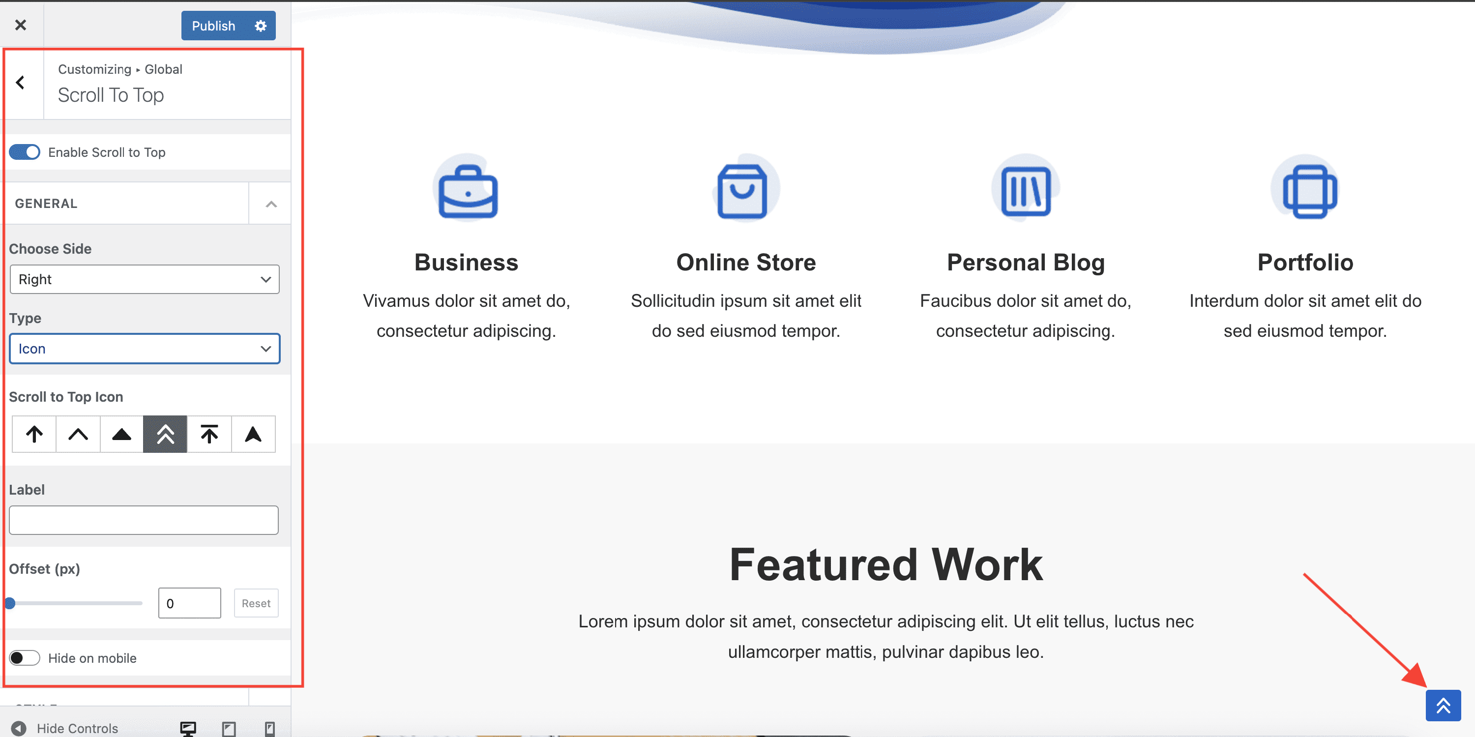
The Scroll To Top module adds a configurable button that lets visitors jump back to the top of the page. You can control when it appears and how it looks from Appearance > Customize > Global > Scroll To Top.
For more details check out the full Neve documentation and Neve PRO documentation.
Use the module
Navigate to Appearance > Customize > Global > Scroll To Top to access the options.
- Enable - shows or hides the scroll to top button. It is enabled by default.
- Choose Side - places the button on the left or right side of the screen (right by default).
- Type - sets the button content to either an icon or a custom image.
- Icon - selects the arrow icon style when Type is set to Icon.
- Image - uploads a custom image when Type is set to Image.
- Label - adds an optional text label displayed alongside the icon.
- Offset (px) - is the number of pixels scrolled after which the Scroll to Top button will appear. You can undo the changes through the Reset button.
- Hide on mobile - hides the scroll to top button on mobile devices.
The Style options let you fine-tune the button's appearance:
- Padding - internal padding around the button, responsive in PX, EM, and REM units.
- Icon Size - responsive icon size in PX, EM, and REM.
- Border Radius - corner rounding in PX.
- Color and Hover Color - the icon or text color.
- Background Color and Background Hover Color - the button background, which also supports gradients.