The Social Icons Component - Neve Header / Footer Builder (PRO)
📝Note: This component is part of the Neve Header / Footer Builder.
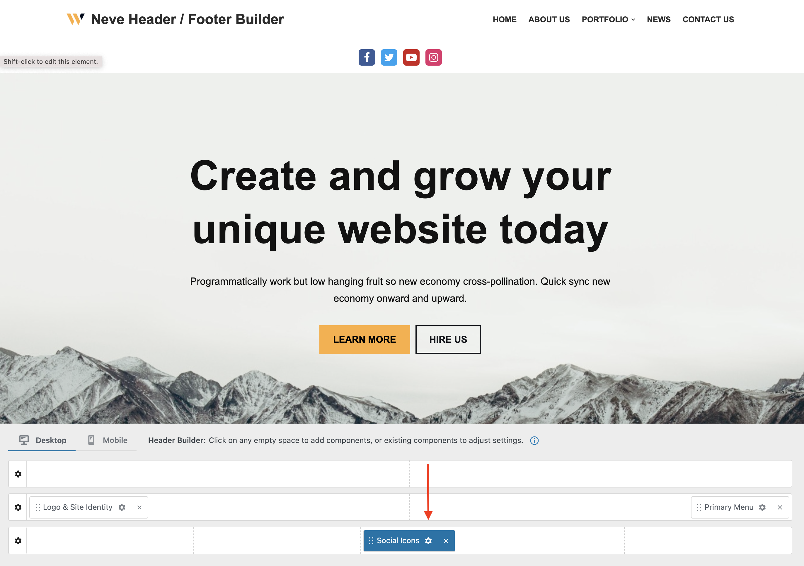
If you wish to add your social media buttons (Facebook, Twitter, and many others) to your website, you can do so through the Social Icons component of the header/footer builder. No coding skills are required.
🧰 Using the Component
- 1
- Start by adding the component into the rows, by clicking on the ➕ button and selecting the component.

🔮 Customizing the Component
There are three panels with customizing options for this component, which allow you to create the desired header/footer:
| General
|
Layout
|
Style |
⚙️ General Panel
The general tab allows you to configure the desired icons: add a title (label), a corresponding icon, and a link to the desired social page. Apart from these, you can customize their appearance by selecting an icon color and a background color.
The other available settings allow you to remove the icon and change its visibility by clicking on the 👁️ icon.
📝 Note: In order to see the social icons in the header/footer builder, you have to insert the link to the desired social app.
Other options available in the General tab:
- reorder the elements, add a new item
- open in a new tab - when clicking on a certain icon
📝Note: Between the available social icons, you will find Facebook, Instagram, Twitter, LinkedIn, YouTube, Mastodon, Snapchat, WhatsApp, TikTok, Reddit, etc.
📐Layout Panel
In the Layout tab, you also have access to advanced positioning options like Padding and Margin, available in PX, EM, REM, and %, with a link button that helps with establishing the same dimension for all the directions ( Desktop | Tablet | Mobile ).
🖌️ Style Panel
The style tab includes the options that help you to create a suitable appearance for your social icons:
- Icon Size - sets the size of the social icon for each device using the responsive controls.
- it has a reset button, to undo the changes
- Icon Spacing - the space between the icons.
- it has a reset button, to undo the changes
- Border Radius - rounds the corners of the icon (in PX).
- Icon Padding - available in PX, EM, and %, with a link button that helps establish the same dimension for all the directions.


