
How to Style the Header Search Block in FSE Themes
You can add a Search block to your header and customize its appearance on all devices or use CSS for a mobile-only change. This guide applies to Neve FSE, Raft, Fork, Jaxon, Riverbank, Church FSE, LMSCourse FSE, and Non-Profit FSE.
In this article
Add Search to the header
These themes do not include a Search block in the header by default. To add one:
- In your WordPress dashboard, open Appearance > Editor.
- Open the header template part used by your site and select where you want the search form to appear.
- Use the block inserter to add a Search block.
- Save your changes. The edited header will update wherever that template part is used.
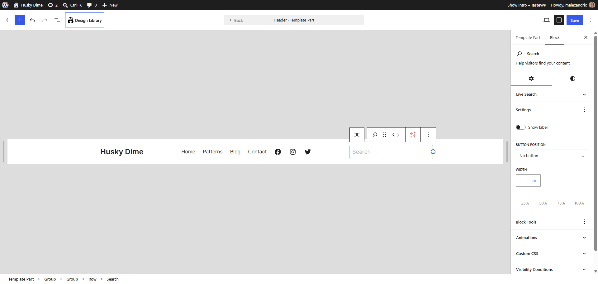
Customize the Search block
Select the Search block in the editor. Its controls let you change the label, choose the button position, use a button icon, and adjust the width. In the block's style controls, you can adjust colors, border, corner radius, and typography where available. These settings apply across screen sizes; the Search block does not have separate mobile controls.
Your theme also supplies default styles. For example, Neve FSE gives the search button an accent color. To adjust Search styles across your site, open Styles > Blocks > Search in the Site Editor and save your changes. An individual block's styling can differ from these site-wide defaults.
Change the button on mobile only
To apply a different style at a smaller screen width, add a CSS class to the Search block and use a media query, a CSS rule that applies only at a specified screen size:
- Select the header's Search block and add
header-mobile-searchas an additional CSS class in its advanced settings. - Follow the guide to add custom CSS to your FSE theme and add this example:
@media (max-width: 600px) {
  .wp-block-search.header-mobile-search .wp-block-search__button {
    padding: 8px 12px;
  }
}
This example changes the button's padding at widths of 600 pixels or less without changing other Search blocks. Adjust the values to suit your header. The button must be enabled for the rule to have a visible effect.
Put Search in the mobile menu
As an alternative to styling a separate header search, you can place the Search block inside the header's Navigation block. When the navigation uses a mobile menu overlay, the search appears in that overlay rather than remaining outside the menu.
- Open the header template part and select its Navigation block.
- Use the inserter inside the navigation to add a Search block, then save.
- Check that the navigation is configured to show its mobile menu.
Check the result
Visit your site at desktop and mobile widths. Confirm that the header search looks as expected, enter a search term, and submit it. If you placed Search in the navigation, open the mobile menu and check that the search form appears and works there. If a change is not visible, check that you edited the header used by the page, saved your changes, and added the CSS class to the intended Search block.