Shop - Related Blocks
📝 Note: These blocks are part of the Otter Blocks plugin, which you can get from here.
📝 Note: The blocks' appearance can be improved using the Otter features, such as Transform to Sticky, Visibility conditions, Dynamic Values or Images, as well as Counting / Typing / Loading animations, and 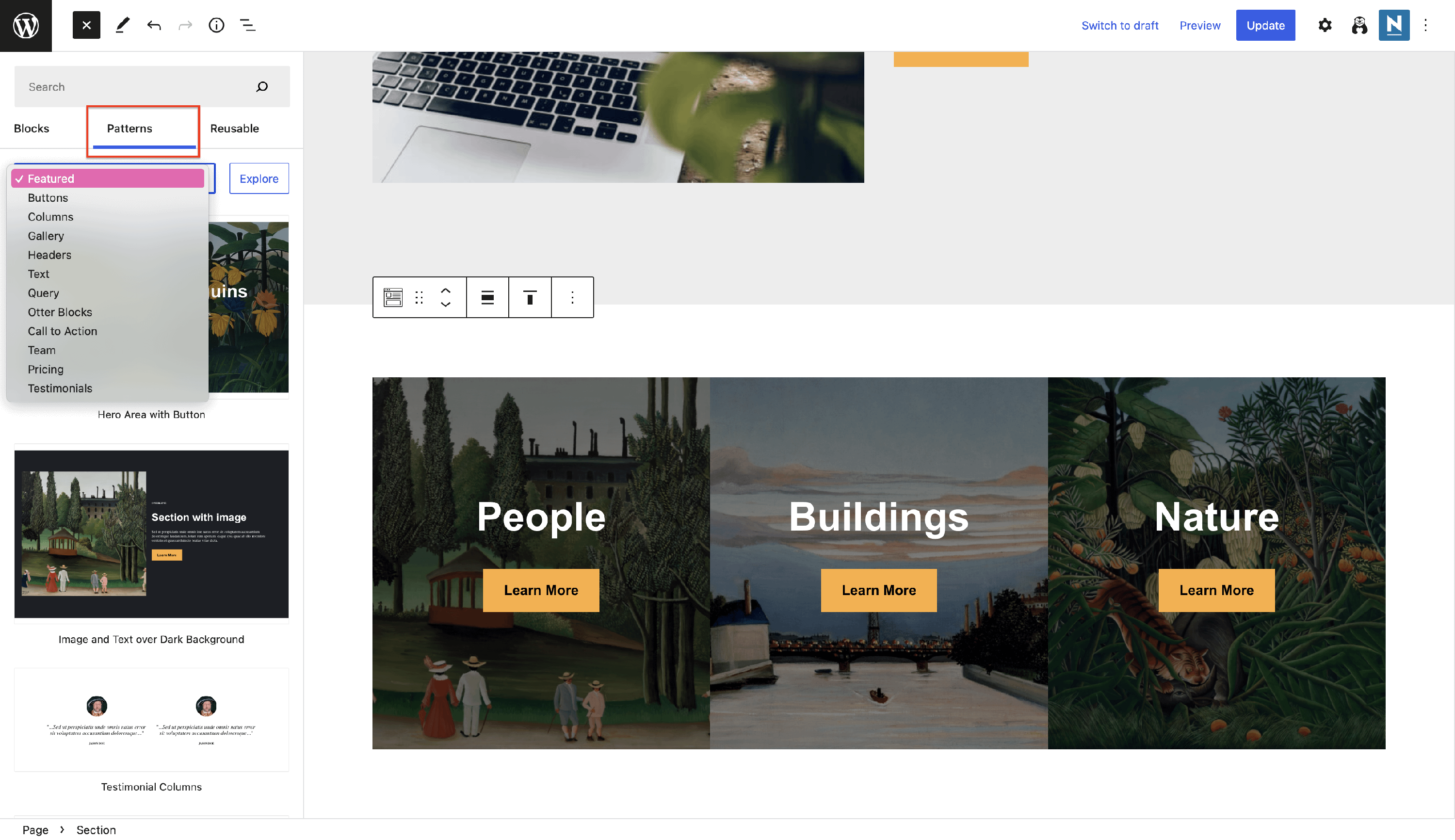 Patterns.
Build your desired shop page using the Otter dedicated blocks:
🔎 Review Comparison Table
📝 Note: This table works only with the reviews added with the Product Review block, not with the ones added from the website.
In order to use the Review Comparison Table, follow these steps:
- Step 1: Navigate to the desired page and add the Product Review component from the blocks library.
- Step 2: Publish the page, otherwise it will not work.
- Step 3: Repeat the steps above for how many reviews you want to compare.
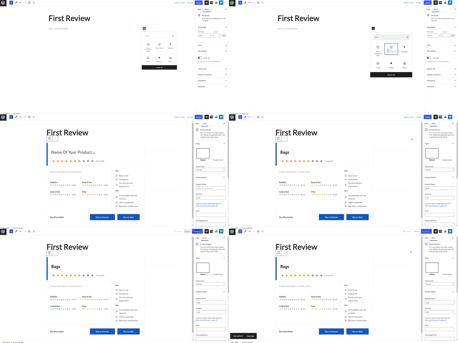
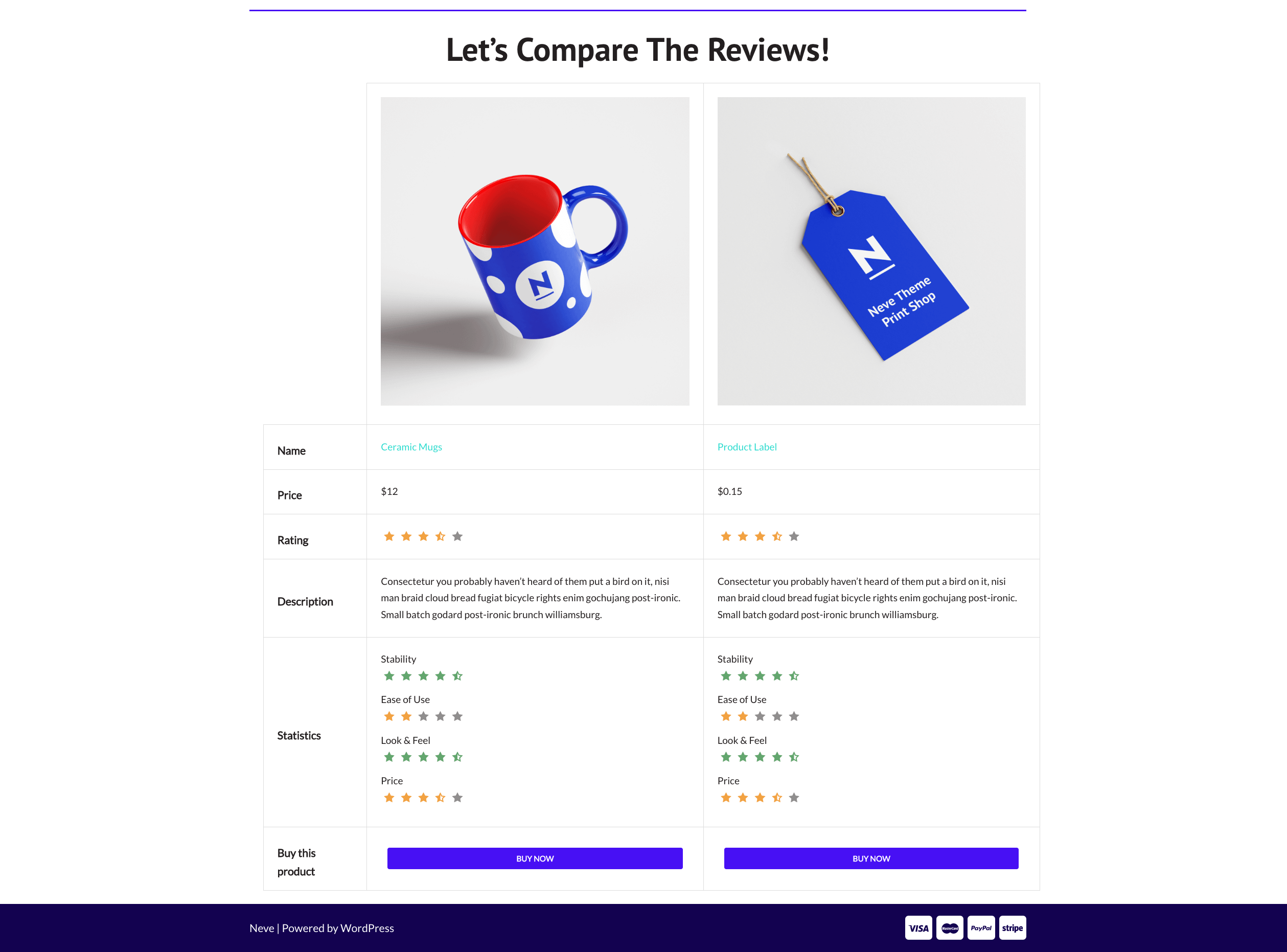
The next step is to add the Review Comparison Table block. When the block appears, pick the reviews that you want to compare. You can customize the color of the buttons and button text.
📋 Product Review
Transform your posts into ingenious reviews with ratings and generate edges with a fulfilling product review block. The most powerful feature of this block is the Sync with WooCommerce possibility, which allows you to import information from existing products.
Styles - some options are available to change the general appearance of the block.
Product Details - here, you have to insert the product's information; if you create the review for a new product or choose to Sync with WooCommerce ( another option listed down in the sidebar ) and they will be automatically imported.
Product Features - these can be customized even if you choose to sync with WooCommerce, and for each one of them, you can insert a title and a rating.
Increase your review's credibility by adding a list of Pros and Cons.
Cons - add the weak points of the product.
Links - insert the links of the selling platforms, adding them a label and a sponsored notice.
Color customizations are also available.
📝 Note: If you choose to design your own product review, you can use a dynamic image as a Product image.
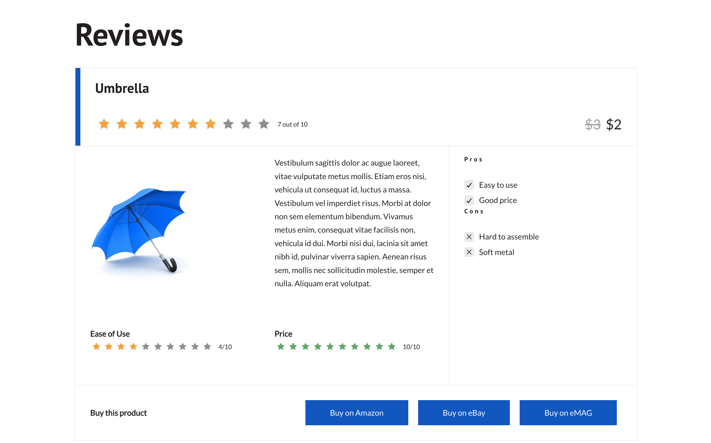
You can use a 1-5 scale instead of 1-10 by enabling this option in 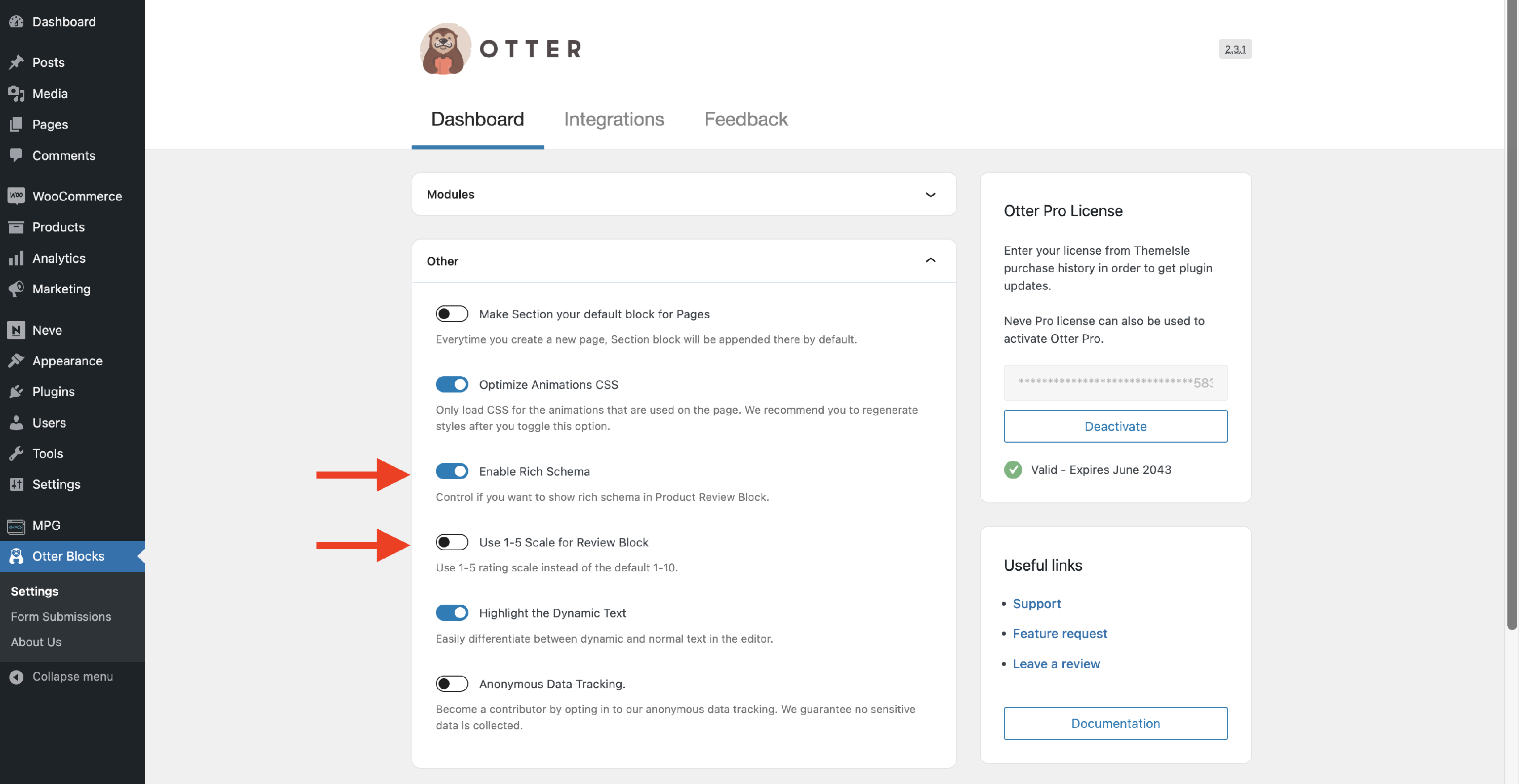 Dashboard > Otter > Settings > Other . Also, from there, you can enable the rich schema.
📝Note: If you want to have different colored starts based on the rating, check this doc to learn how.
🛒 Add to cart button
By default, the A****dd to Cart button represents the button that stays under the product on the Shop Page to ensure the sale process.
Using the add to cart button from Otter Blocks, you can achieve this behavior anywhere on the website, not necessarily on the Shop Page, which means that you can place the Add to Cart button even on the Homepage, and it will redirect to the product's page.
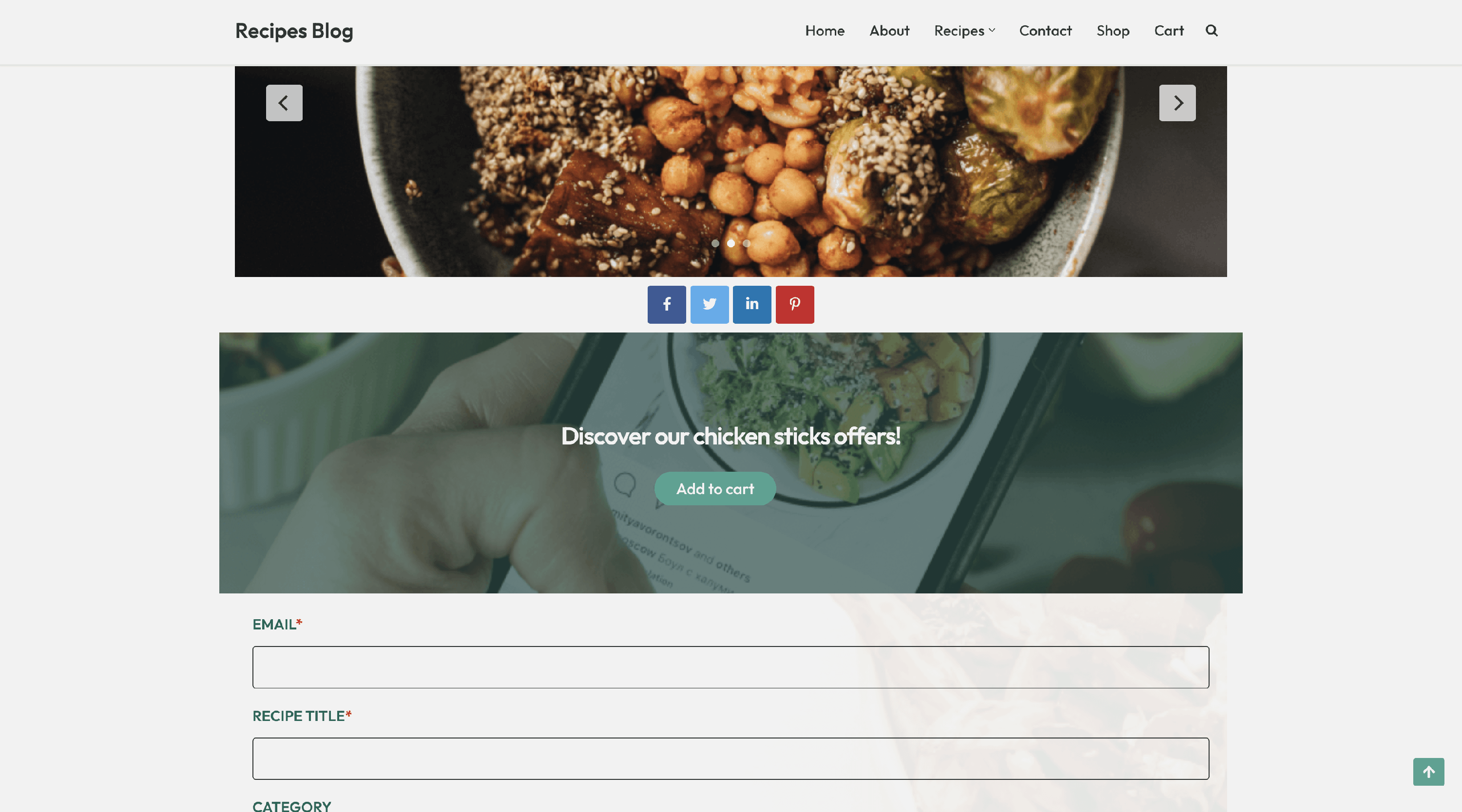
To use this, pick a product from the block's dropdown, where the page will be redirected once the button is clicked.
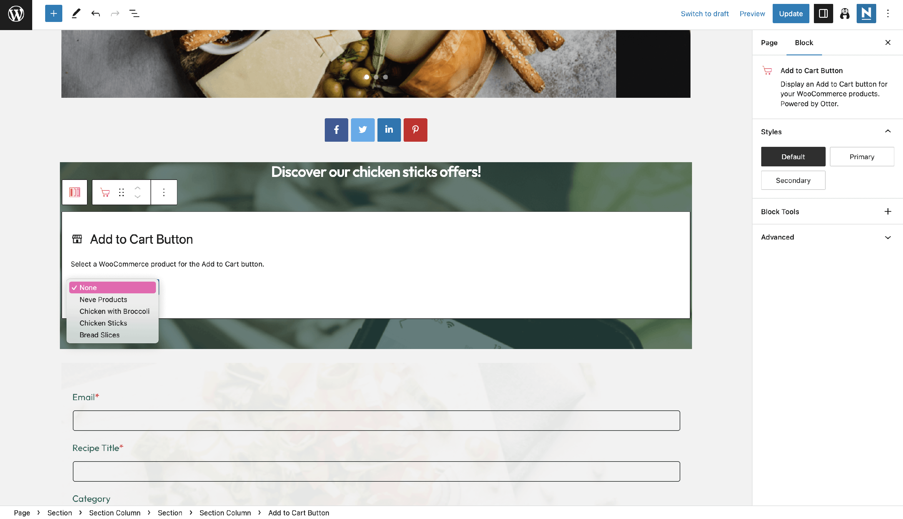
Apart from the usual block settings, you can customize the button's appearance using the Styles accordion. From here, you can make the button have the theme's primary or secondary buttons.
🛍 WooCommerce Comparison Table
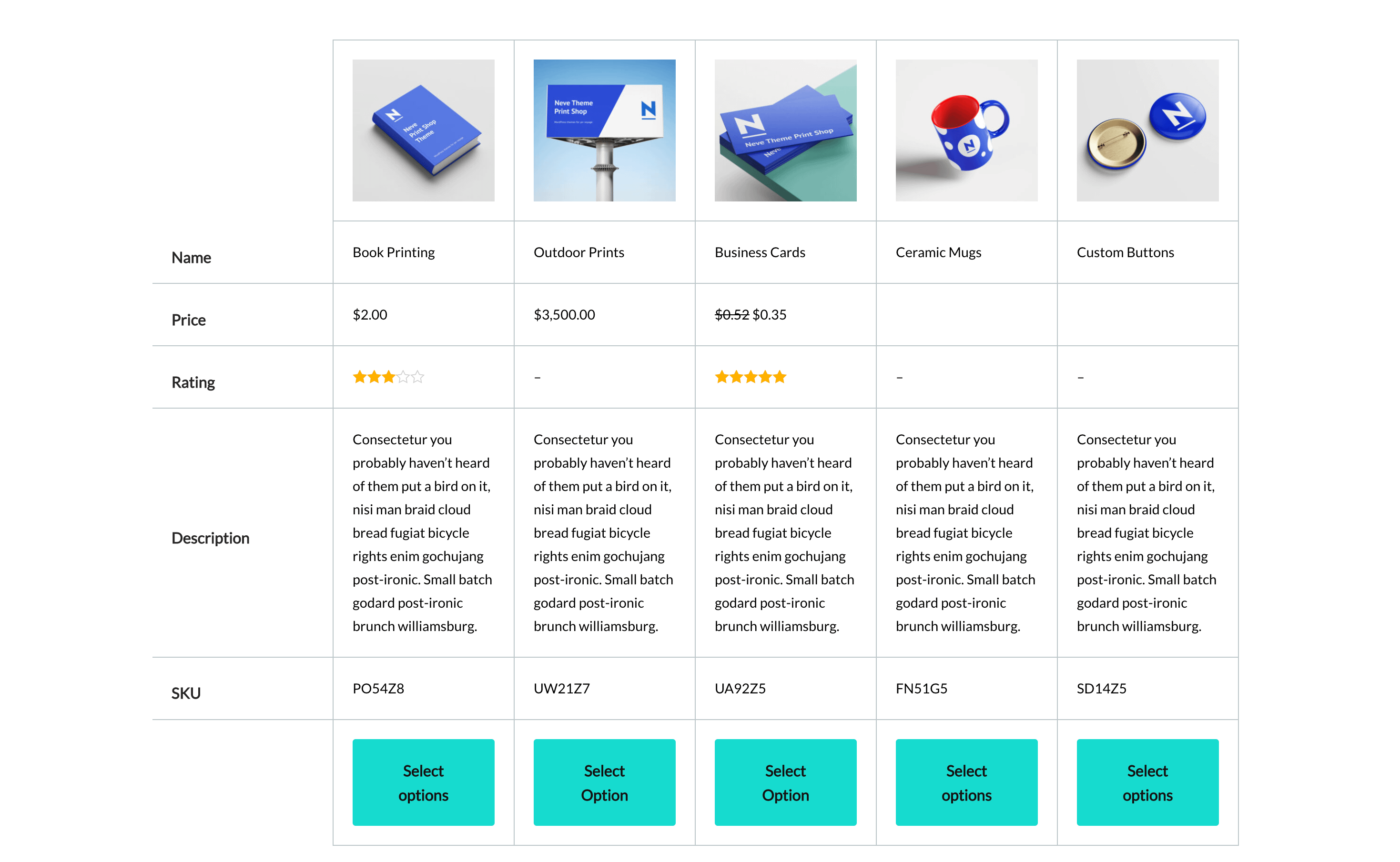
You can use this block to outline the differences between more products, helping the client choose the best product he needs.
Just add the block, select the products you want to compare from the list and if you need to edit them, click on the pencil icon.
- Settings - from this area, you can select the view type ( row or column ) and enable alternating row color.
- Fields - change the visibility of the fields or reorder them.
- Color - choose the best color combination that suits your theme.
📝 Note: Unlock more features using the PRO version of the plugin.
