Hestia Documentation
Hestia is a modern WordPress theme for professionals. It fits creative or small businesses (restaurants, wedding planners, sport/medical shops), corporate businesses, online agencies and firms, portfolios, e-commerce (WooCommerce), and freelancers, with a multipurpose one-page design, widget area footer, and a clean look.
- 📲 responsive
- 👁️ retina-ready
- 📊 SEO friendly
- 🖌️ carefully designed
📝 Note: Exciting news! We do offer a demo for Hestia PRO, allowing you to explore its features firsthand before making a decision. Take your time to test it out and see if it fits your needs perfectly here.
In this article
Compatibilities
Hestia is fully compatible with the most popular page builders on the market, Elementor, Brizy, Beaver Builder, and others. For adding more functionality to the website, like social icons, contact forms, the shop pages, check the recommended plugins within the options page presented in the next chapter.
Download and Install Hestia
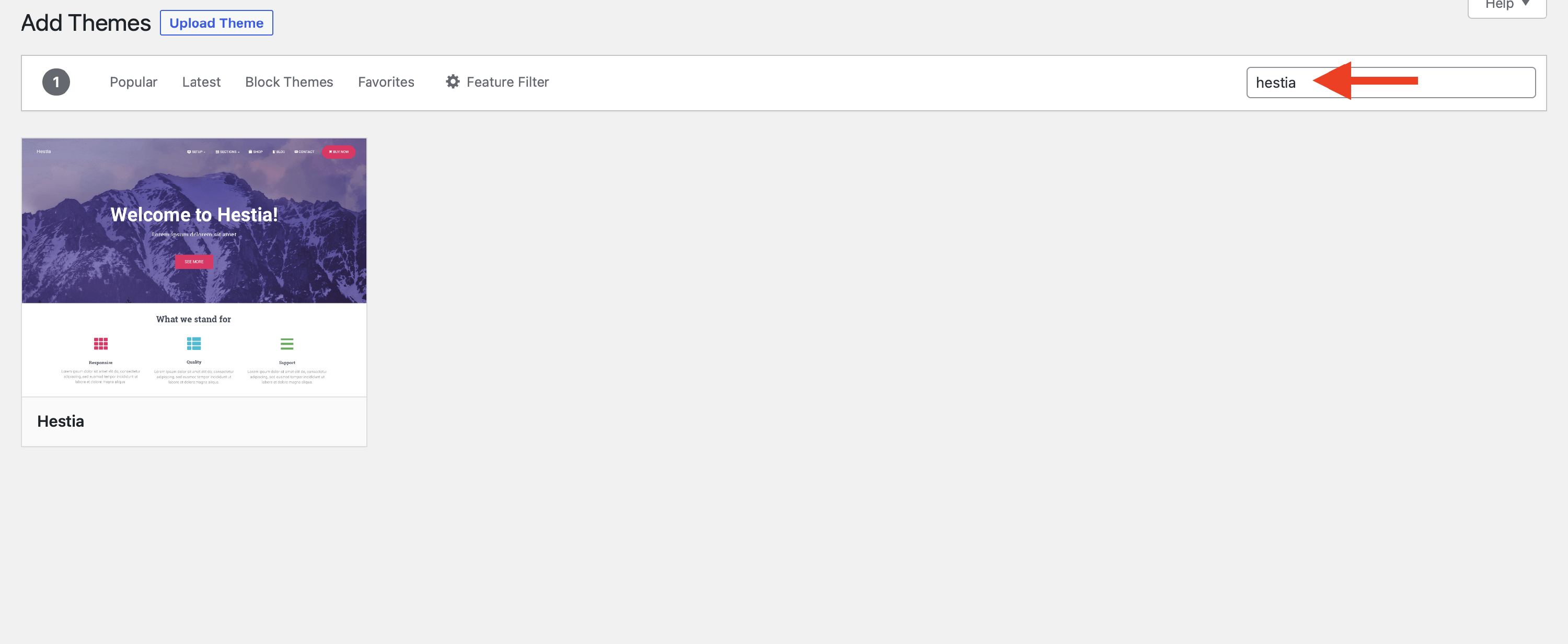
1. Navigate to Dashboard > Appearance > Themes.
2. Click on Add New and search for Hestia.
3. Once it appears, click on Install and then Activate.
📝 Note: The instructions for installing Hestia Pro can be found here.
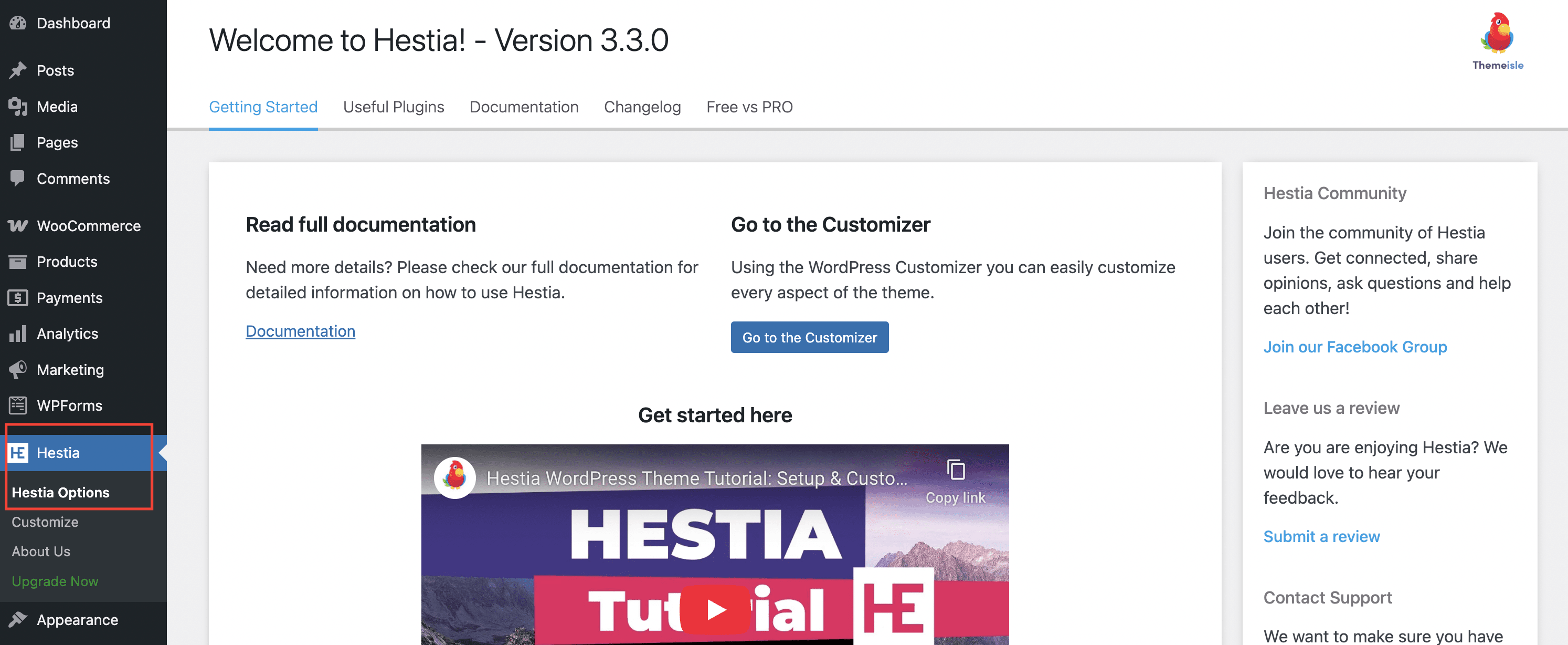
Hestia Options
Here you will find information that will help you get started with Hestia, such as recommended actions, useful plugins that will enhance your experience, support information, a changelog with the latest updates, and a free vs pro table.
1. Navigate to Dashboard > Hestia.
2. Click on Hestia Options and start exploring the page.
Customizer Options
Hestia's main features are its stylish, unique material design, and the ability to customize everything from just one place, which is the Customizer.
📝Note: More features such as shop options are available in Hestia Pro, which you can get from here.
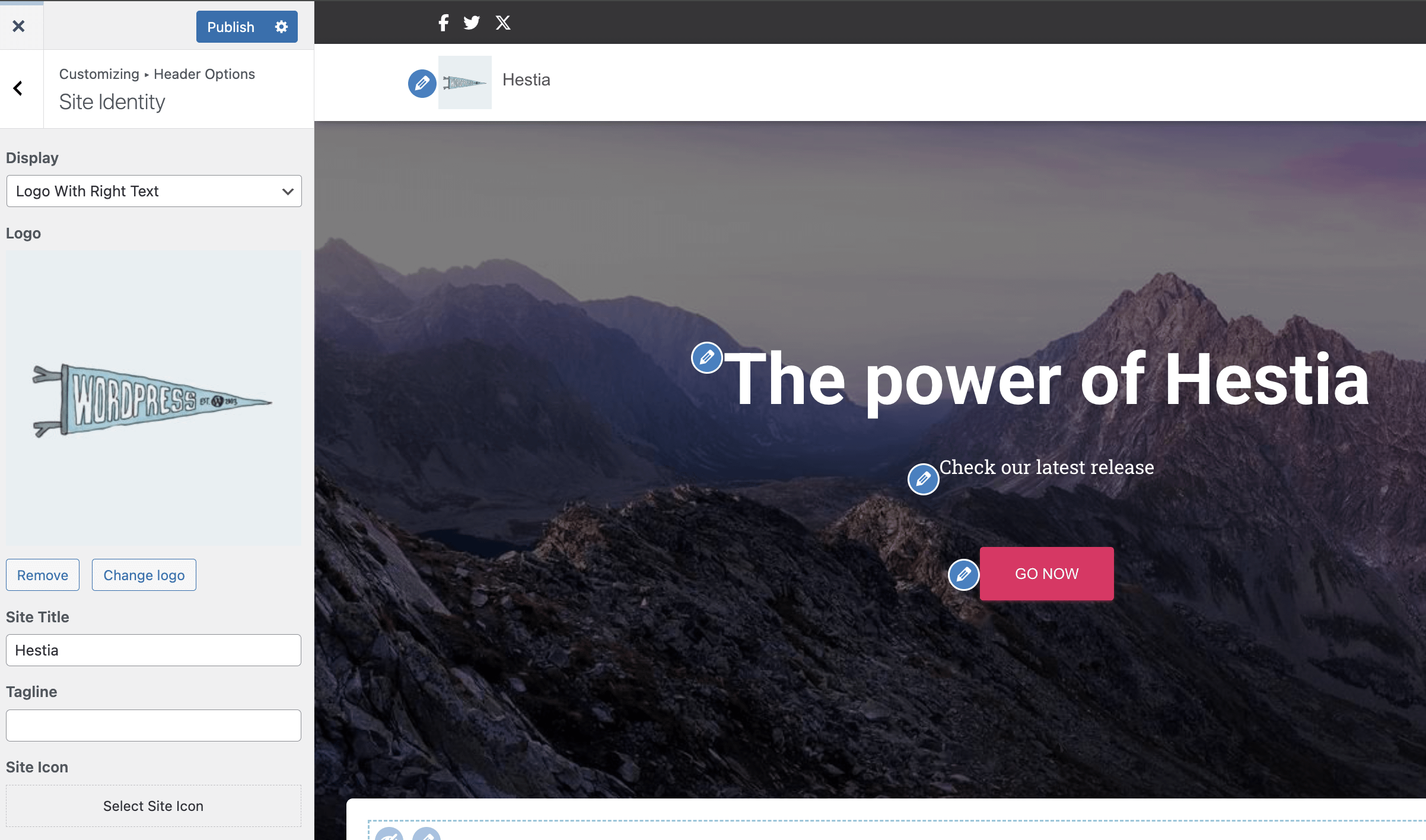
Site Identity
To access the Site Identity options, navigate to Appearance > Customize > Header Options > Site Identity.
Hestia comes with a navigation menu with two different variations: a transparent state (on the front page, before scrolling) and a solid background style (on the front page, after scrolling, and on internal pages). This is why, in some cases, the Logo image you are using may not be very suited for both menu variations.
For those cases, you can use different logos for the Logo and Transparent Header Logo options.
- Display - only logo/ logo with right text/ logo with left text/ logo with bottom text.
- Logo - suggested image dimensions: 150 by 100 pixels.
- Site Title - insert the name of the website or leave it empty. If you need to change the font size of the title, check this doc.
- Tagline - a short phrase, or sentence, used to convey the essence of the site. In Hestia, the tagline is also used as a title for the latest posts page (if in Reading > Settings, you have selected the "Your latest posts" option).
- Site Icon - also called a favicon, it appears in the browser tab.
📝 Note: For changing the site title and hamburger menu color on mobile, please refer to this doc.
Appearance Settings
General Settings
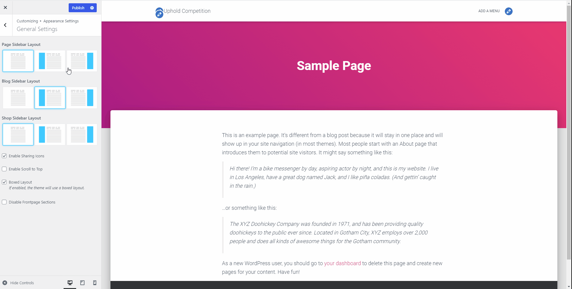 Page Sidebar Layout - this option controls the sidebar position on internal pages (default template pages and WooCommerce Shop Page).
Blog Sidebar Layout - this option controls the sidebar position on blog-related pages ( Blog, Archive, and Single Posts ).
Shop Sidebar Layout - this option controls the sidebar position on the shop page and products' archives.
Enable Scroll to Top - allows the user to navigate back to the top of the page easily.
Boxed layout - it's enabled by default and creates a boxed layout for all containers within the site. For full-width type containers, just deselect this option.
Disable Frontpage Sections - check this option to completely disable the front page template, so you can easily add your content.
📝 Note: Hestia Pro allows you to customize the sidebar and container width.
Typography
- Font Family - define Headings Font Family, Body Font Family, Font Subsets.
- Font Size - for Posts & Pages (Headings, Content), and or Frontpage Sections - (Big Title Section, Section Title/Subtitle, Content)
📝 Note: Hestia Pro supports generic options. Find out more about Hestia Pro Typography from this doc.
Colors
Change the Background color throughout the whole site, and Accent Color - controls the buttons and other small accent elements like the categories in the Shop Section and many more.
📝 Note: More color options are available in Hestia Pro which you can get from here.
Background Image
When you choose a background image, the background color will be replaced by it. You can customize the background image with the following options:
- Preset - Fill Screen/Fit to Screen/Repeat/Custom.
- Image Position - select the arrow that corresponds to the desired direction.
- Image Size - appears only if the preset is set to Custom. The available options are: Original/Fit to Screen/Fill Screen.
- Repeat Background Image
- Scroll with Page - the image will move as you scroll the page.
- Header Background - You will be redirected to the header's options, where settings like post/page layout, product layout, current header, header gradient, and enabling Header Image Sitewide will appear.
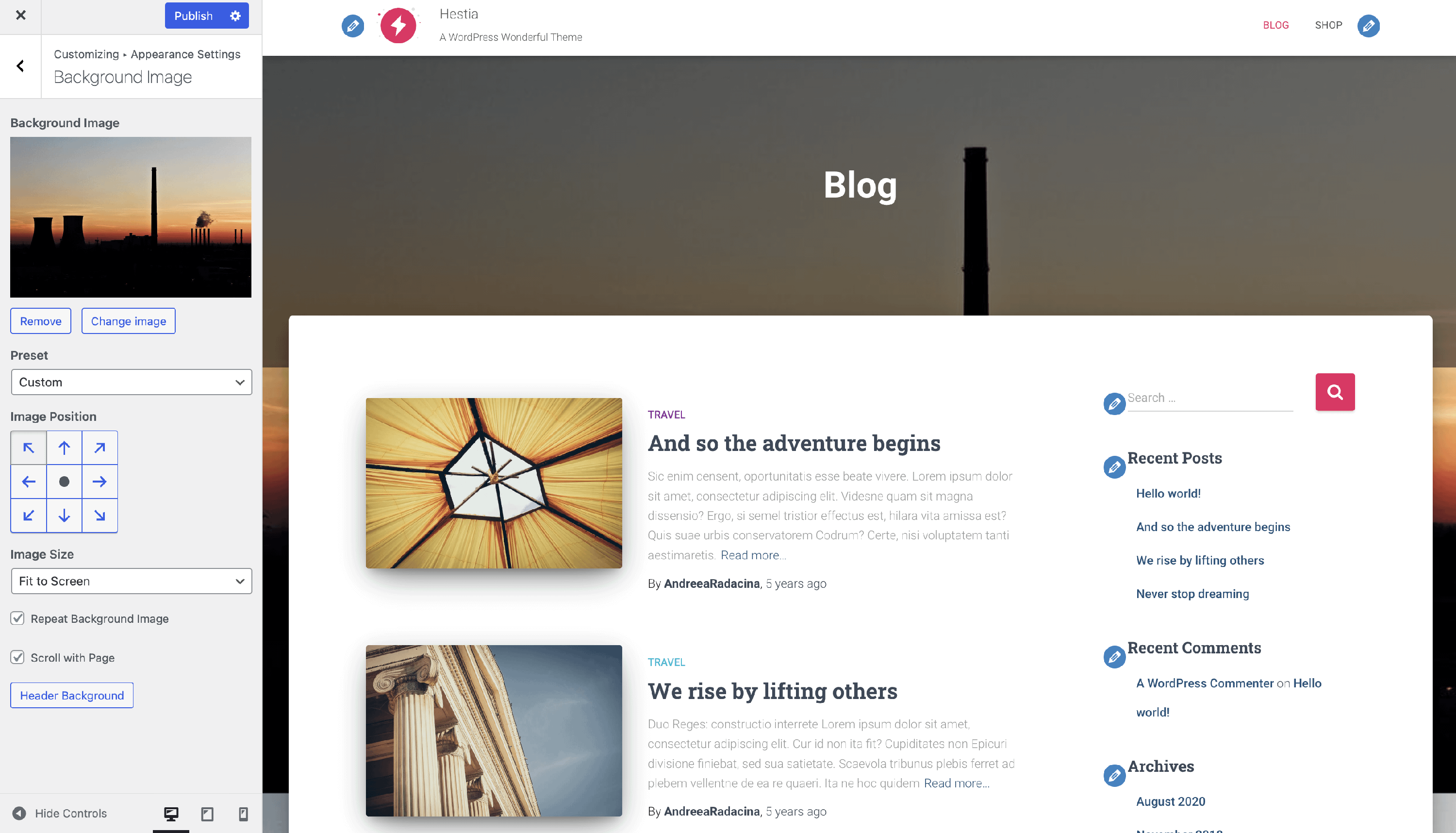
📝 Note: The options may differ according to the preset. Keep the size less than 1MB so that the website loads faster.
Button
This panel allows you to customize button appearance across the website. You can adjust its padding and border-radius. If you need to learn how to customize the text color, check this dedicated doc.
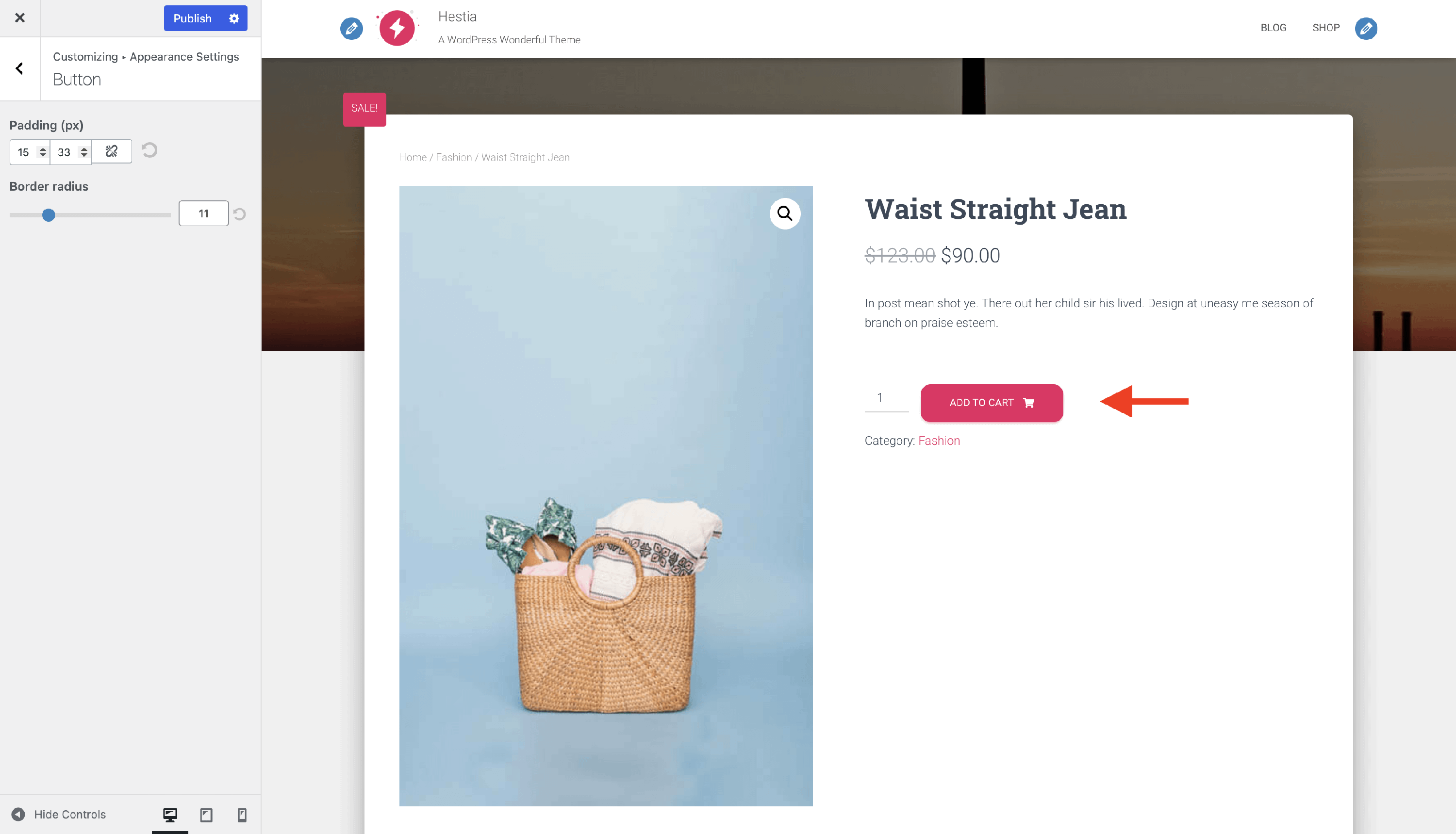
📝 Note: Hestia Pro offers hover effects for the buttons, and it can be a shadow or distinct color.
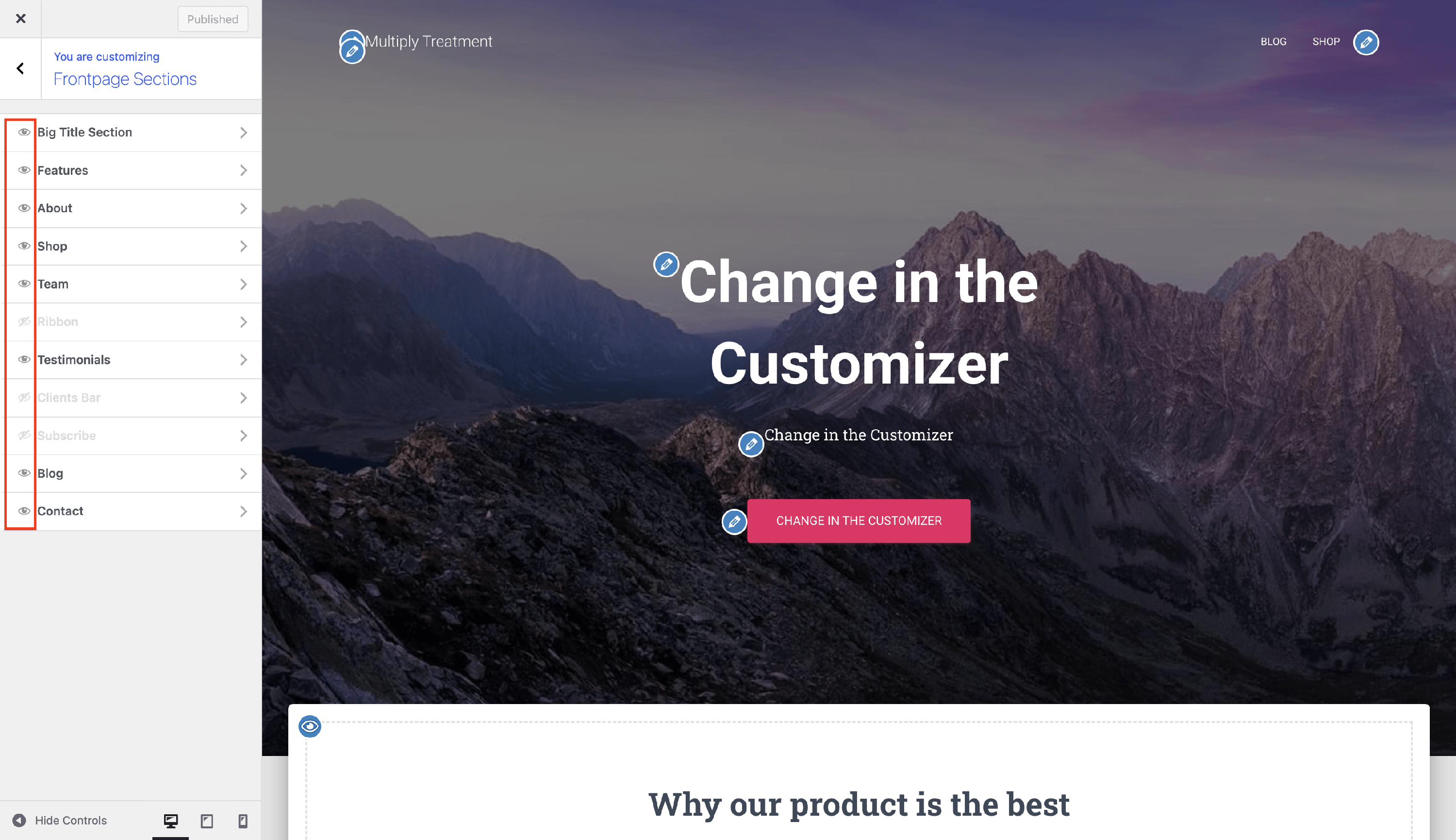
Frontpage Sections
Here are listed the sections that appear on the homepage, as long as the homepage is set as a static page. When it displays posts, the front page sections will no longer be displayed.
Visibility - you can turn on / off the visibility of the elements, by clicking the 👁️ button. This can also be done while accessing a certain section, by clicking on the Disable section button. The PRO version allows you also to reorder the frontpage sections.
📝 Note: Furthermore, you can add custom frontpage sections to your website, by following the instructions presented in this doc.
📝 Note: Please note that some of the following sections do not work without Orbit Fox. To make sure that all of the sections are available, enable the Hestia Enhancements module.
📝 Note: More frontpage sections and settings are available in Hestia Pro which you can get from here.
Header Options
Here are the options for customizing the header area. There are three subpanels:
Very Top Bar
The Very Top Bar is the highest-positioned section on the site, just above the navigation area. You can disable the section, configure the Very Top Bar menu and insert widgets.
📝 Note: Hestia Pro allows you to set a distinct layout for the very top bar. Also, it has a second panel called Appearance Settings, which allows you to adjust the background, text, link, and link on hover colors.
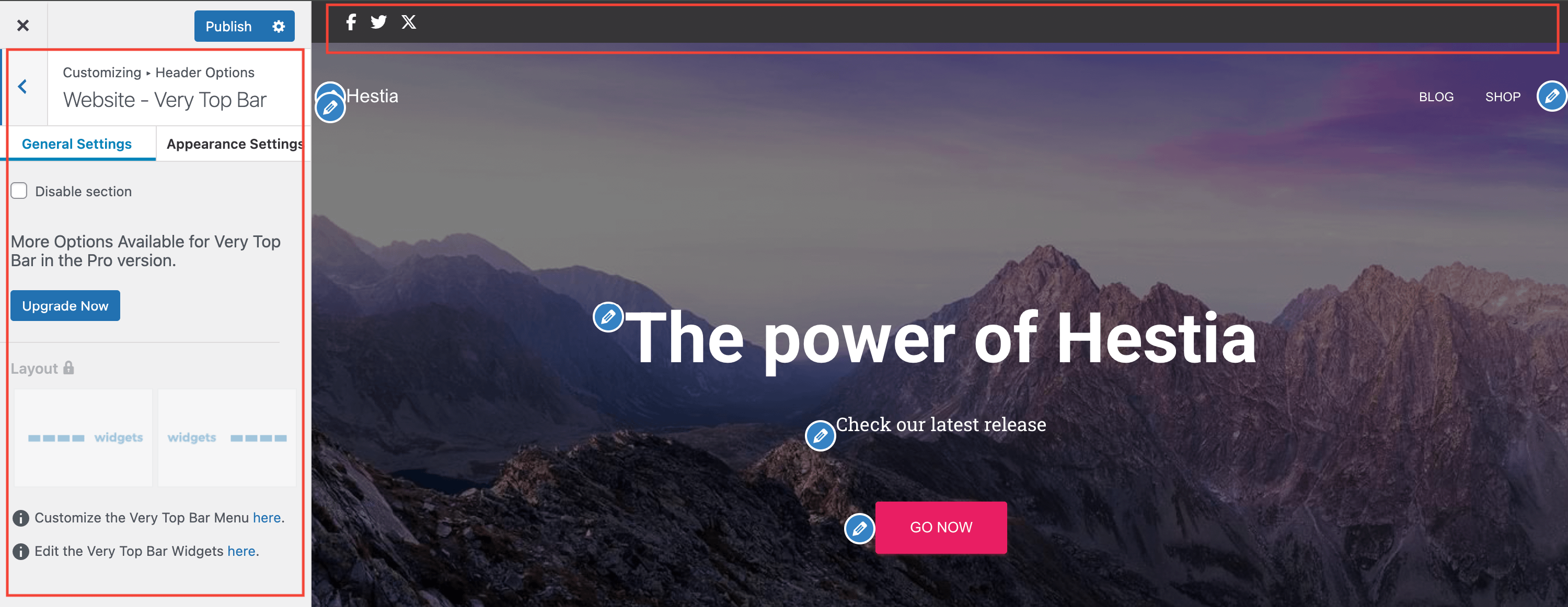
📝 Note: Read more about configuring the Very Top Bar and examples here.
Website - Header
The Website - Header area is formed by the Logo or Site Title, the Primary Menu, and the Navigation widget area. From this place, you can make the navbar transparent, enable the search, which will generate a search icon in the menu, change the layout, and add widgets. To match the transparent-header look from demos, navigate to Appearance > Customize > Header Options > Website - Header and enable Transparent Navbar.
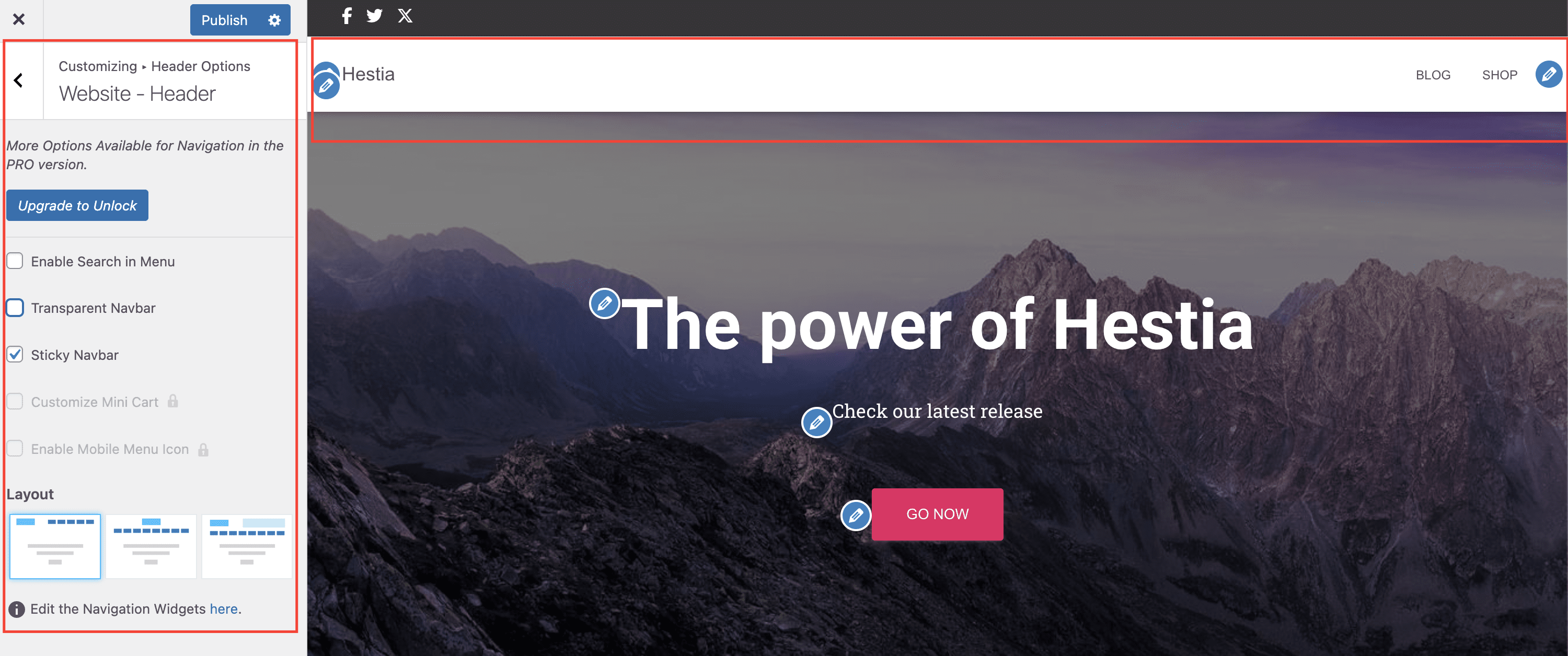
📝 Note: In the PRO version you can enable the full-screen menu, or enable the menu Mini Cart and customize its icon (if you have WooCommerce installed).
📝Note: If you want to make the navigation static, check this doc.
📝 Note: If you want a transparent navbar on inner pages as well, follow How to make Hestia navbar transparent for other pages.
Posts & Pages - Header
Inside the header settings, you can access layouts for posts/pages and products. Another option is to add a header image, to enable it sitewide or use a header background if no image is set. When you enable the header sitewide, the image that you use as a header will be displayed for posts/pages (regardless of the featured image) and on products.
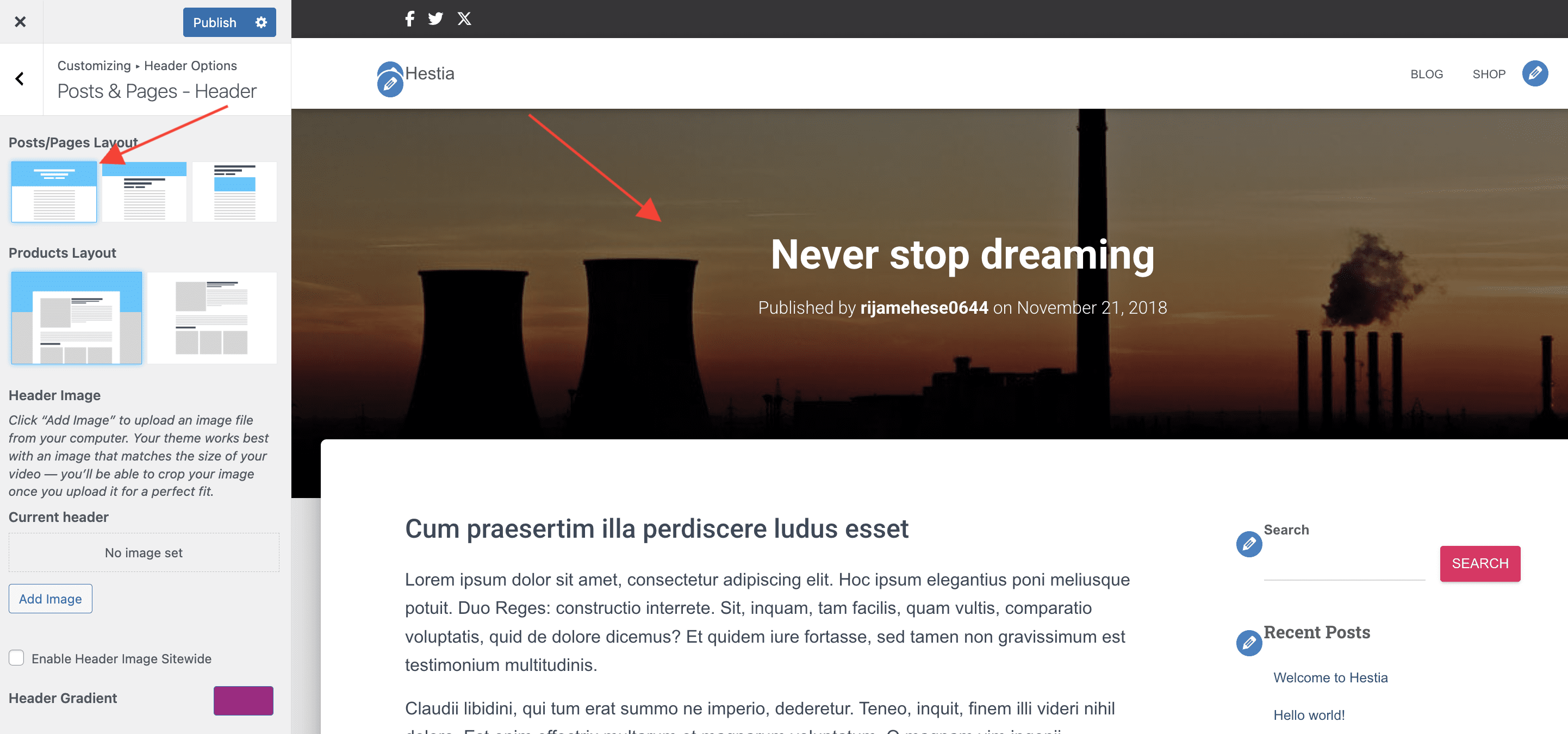
📝Note: Check this doc that presents Hestia posts/page layouts.
Why header images crop on mobile
Hestia header and background images use CSS background-size: cover with center alignment by design. This keeps the header area fully filled across all screen sizes, though portions of the image may be cropped on narrow/mobile screens (typically from the left and right edges).
To minimize cropping issues:
- Keep the most important part of the image close to the center.
- Start with the dimensions from Hestia Recommended Image Sizes.
- Use the available Image Position controls to keep the focal area visible when possible.
Device-specific header images
Hestia Pro does not currently include separate header image uploads for desktop and mobile.
If you need better cross-device results, use a mobile-safe image composition (keep key text or subjects near the center with extra space around them), adjust image position where available, or use advanced customization (such as custom CSS) for device-specific behavior.
Footer Options
This panel displays information about the branding label, which can be customized with the pro version.
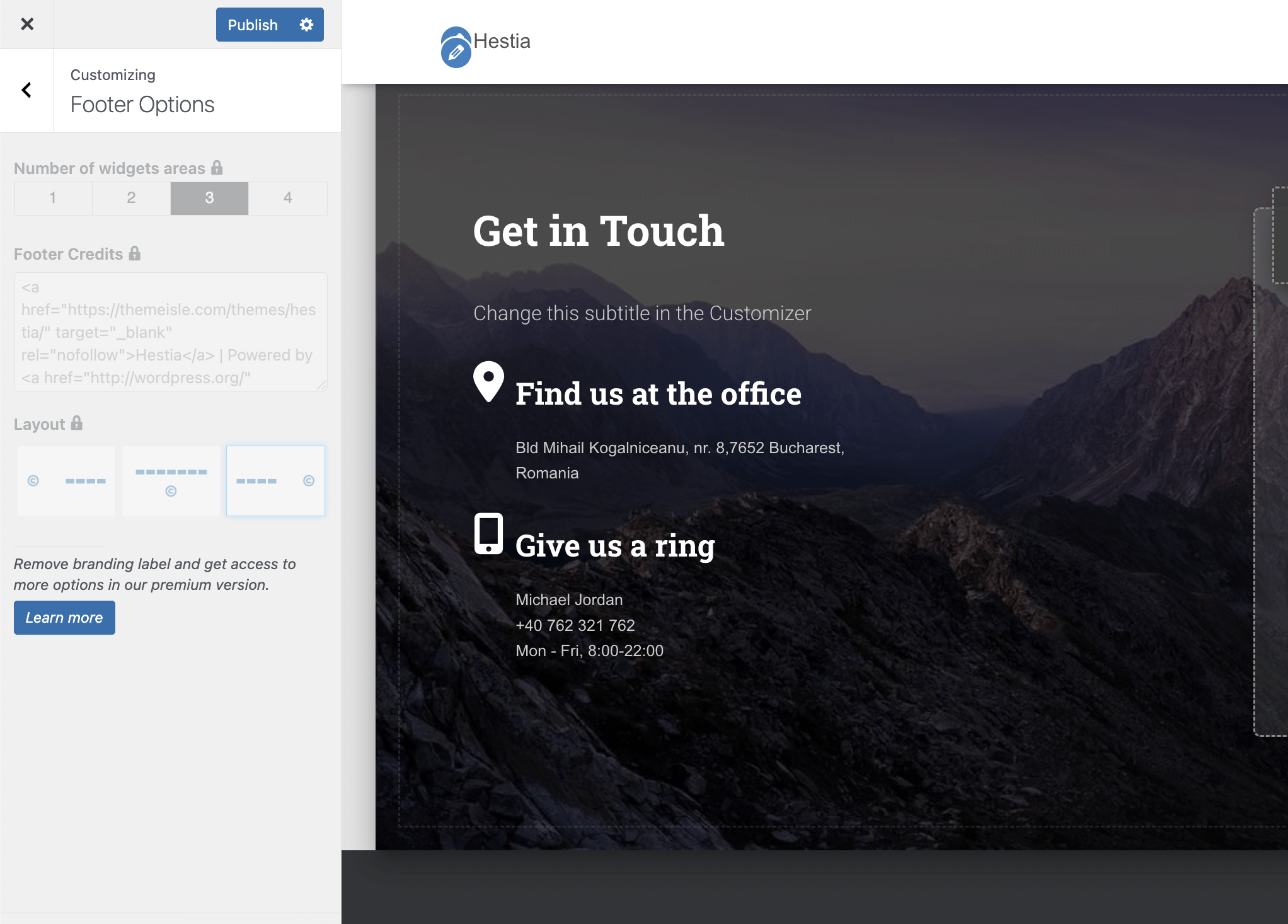
📝 Note: Check this doc to see all pro footer customizations, including number of widgets area, layout, and color.
Blog Settings
Before customizing the blog page: set the Posts page
Hestia blog layout options work correctly only when WordPress has a dedicated Posts page.
- Navigate to Dashboard > Settings > Reading.
- Select A static page.
- Set a page as Homepage and a different empty page as Posts page.
The page assigned as Posts page should usually stay empty in the editor, because WordPress and Hestia generate the posts listing there.
⚠️ Warning: If blog controls seem missing, the blog page shows unexpected page content, or the selected blog layout is not applied, recheck the Settings > Reading assignment first. For a full walkthrough, see Hestia Frontpage Sections Disappearing.
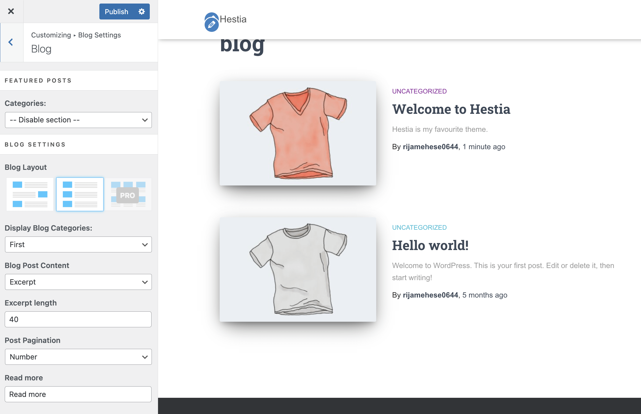
Featured Posts - will display on top of the normal blog page the most recent three posts from the category you choose. You are able to choose from what categories the posts should be displayed.
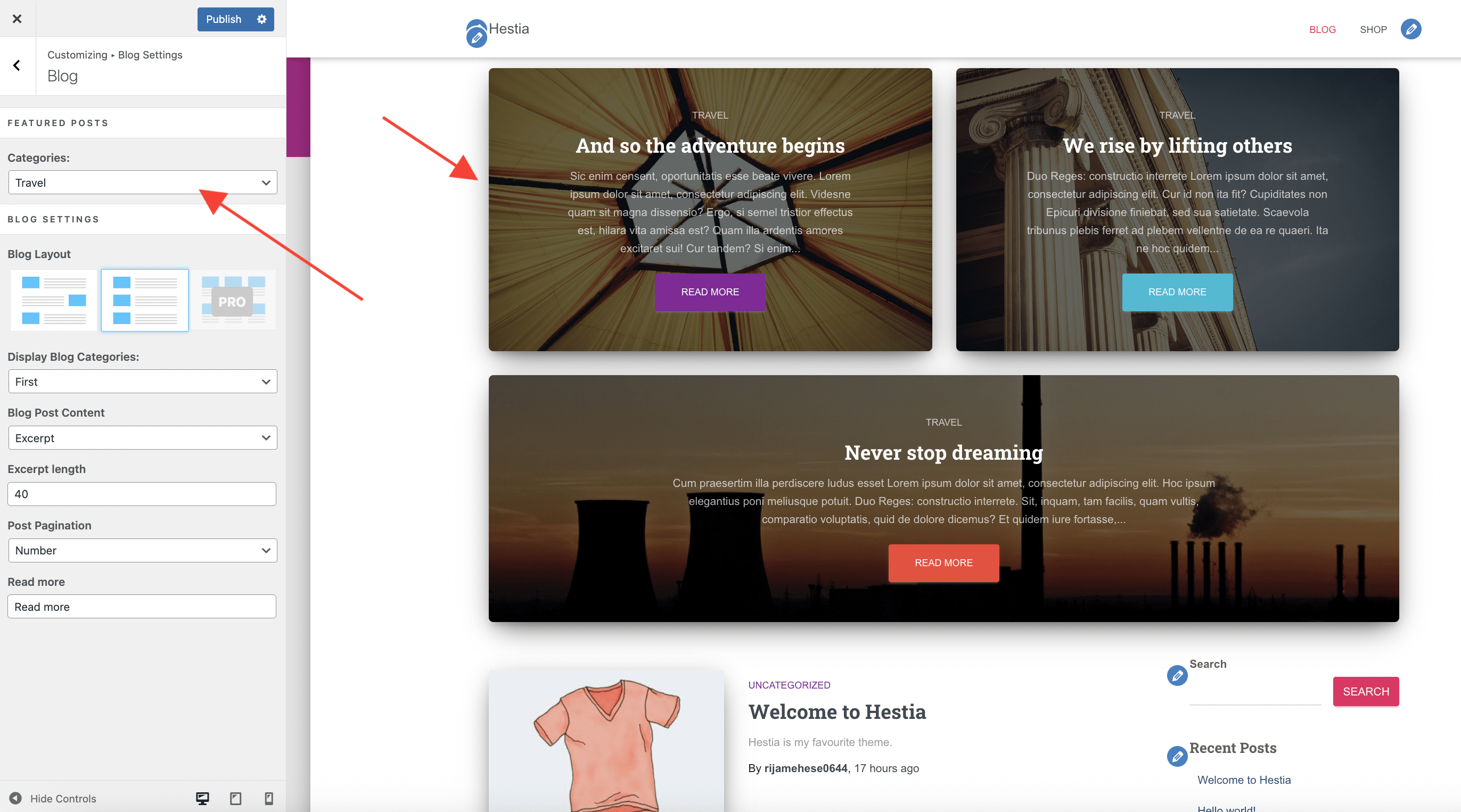
Blog Settings
- Blog Layout - Post List / Post List with alternative positioned images.
- Display Blog Categories - control the number of categories displayed for each post, which can be all, none, or first.
- Blog Post Content - use either the content or post excerpt to be displayed on the archive. If you choose the Excerpt option, you will have to set the Excerpt Length.
- Post Pagination - choose the pagination type: Number/Infinite Scroll.
- Read more - change the default Read more text
Single post pages
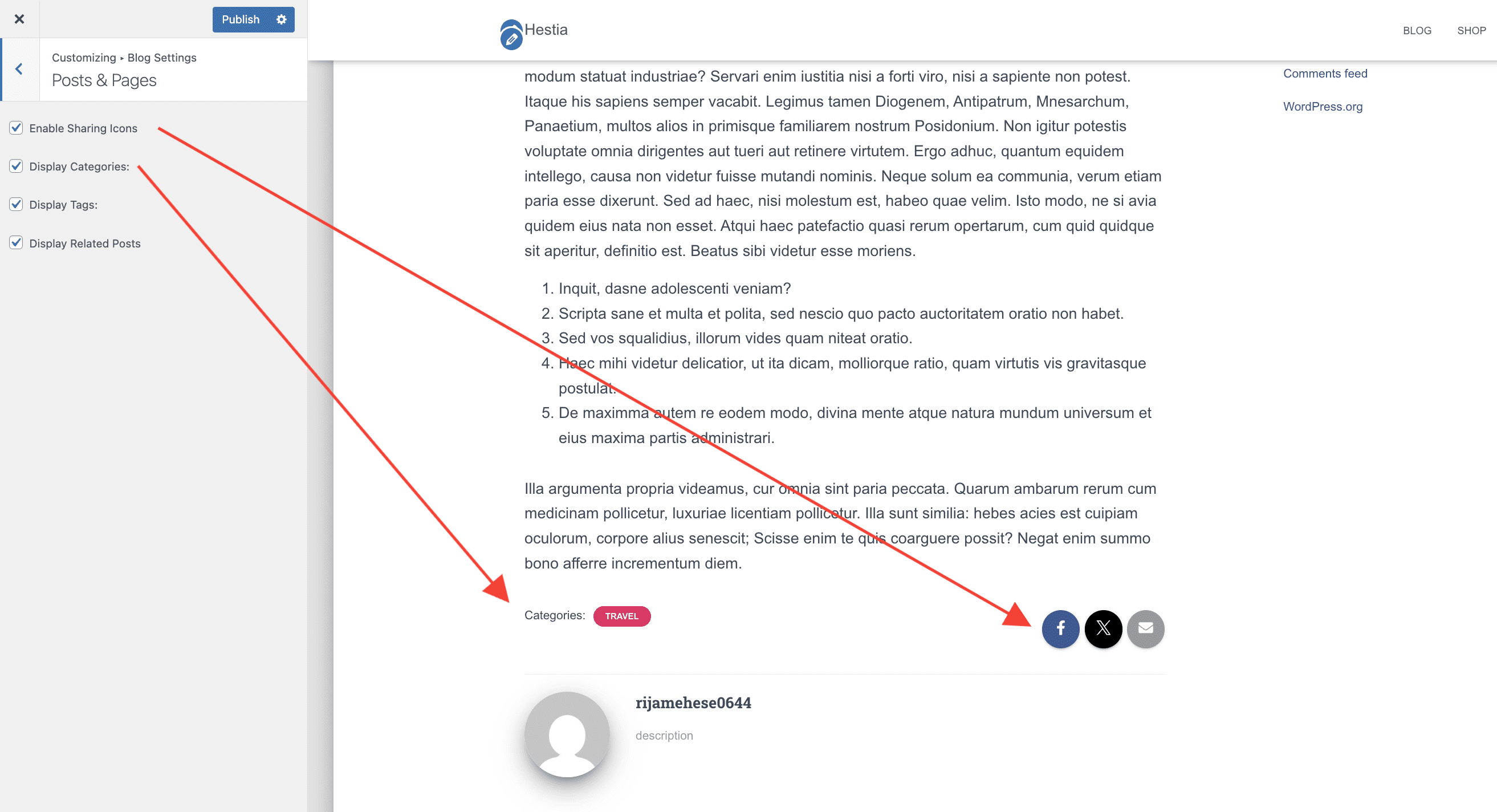
By navigating to Appearance > Customize > Blog Settings > Posts & Pages you have access to options that can be used to customize the single post pages:
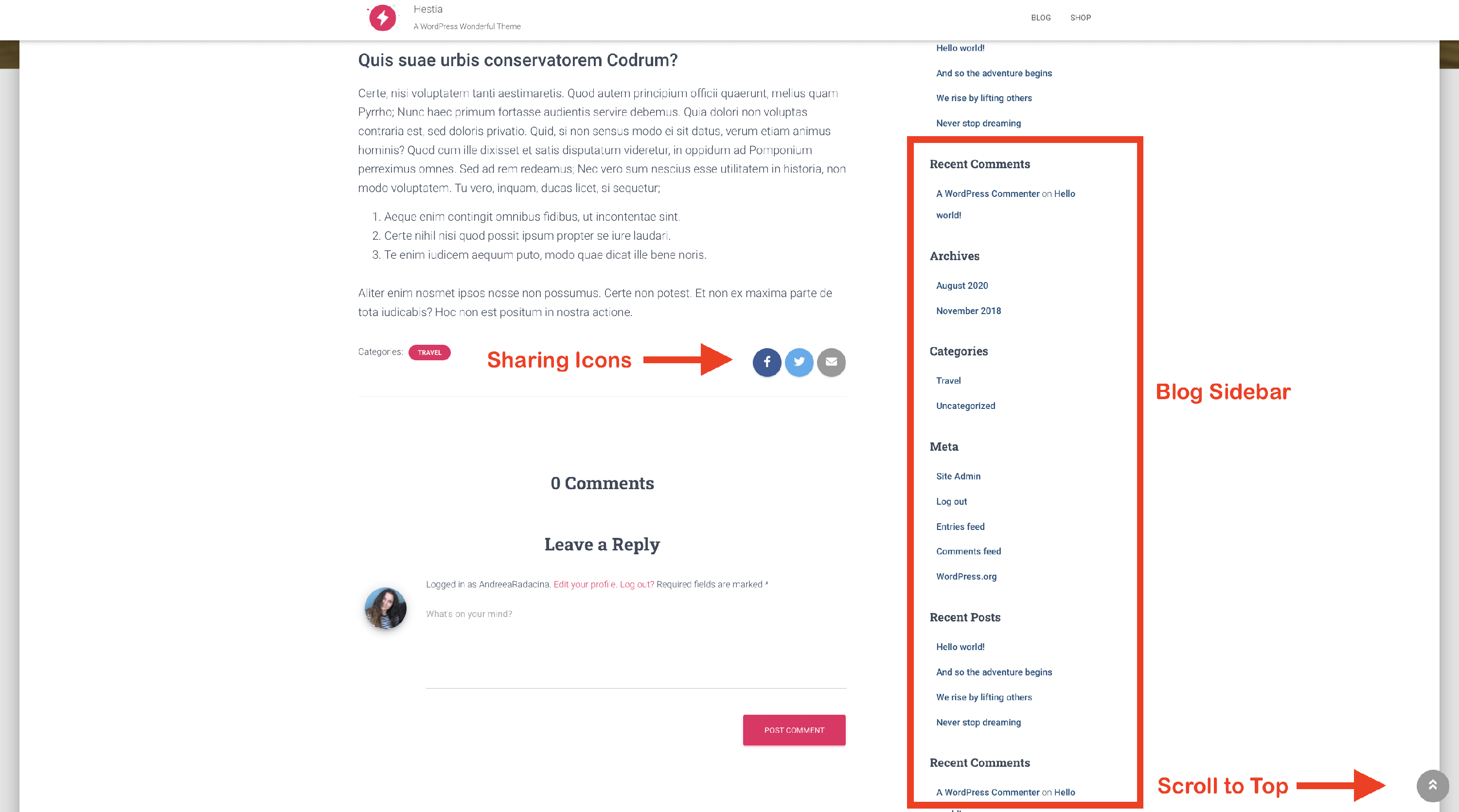
- Enable Sharing Icons - show or hide Sharing Icons
- Display Categories - show or hide the categories attached to the post
- Display Tags - show or hide the tags attached to the post
- Display Related Posts - show or hide the Related Posts section at the bottom of the post page
📝 Note: More options, such as grid layout, author section, and subscribe section are available in Hestia Pro, which you can get from here.
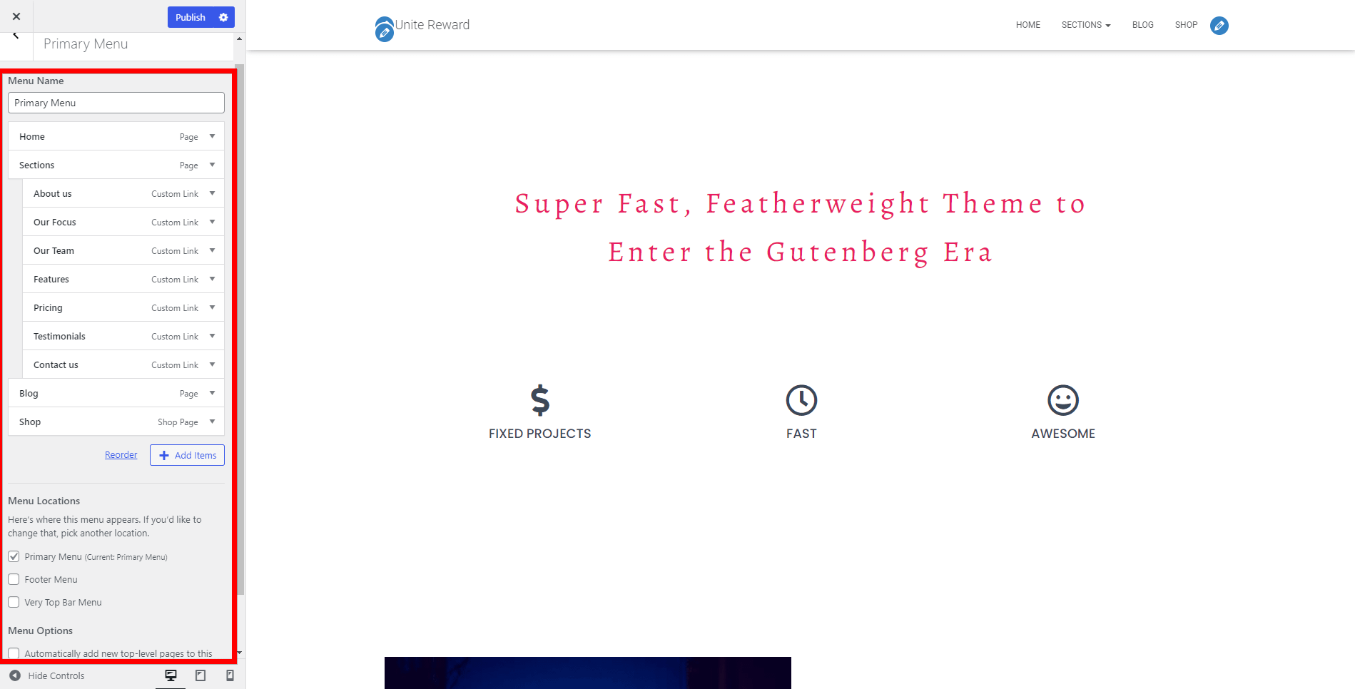
Menus
In this panel, you have the possibility to configure your current menu, create a new one or set the menu locations. Hestia supports three menus: Primary Menu, Footer Menu, and the Very Top Bar Menu.
Useful links:
- How to enable Hestia mobile menu on larger screens
- How to link the menu to sections in Hestia
- How to change the Hestia menu background on mobile
- Hestia Basic Mega Menu Setup
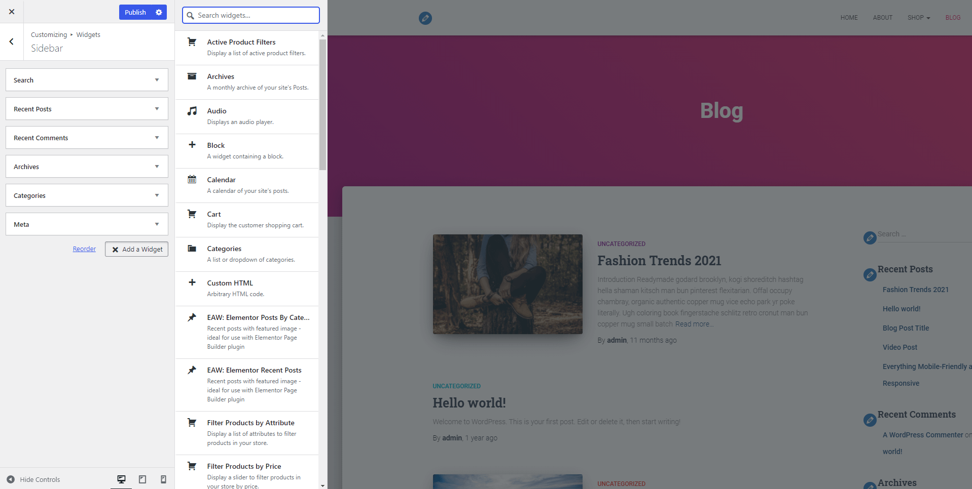
Widgets
Hestia supports multiple widget areas. As the name suggests, the Footer One, Footer Two, and Footer Three widget areas are situated in the footer of the site and can be filled with the widgets of your choice. Apart from these, you can add widgets in the following locations: Sidebar, Subscribe, WooCommerce Sidebar, Very Top Bar, Navigation, and Big Title Section.
For each area, you can add a new widget or reorder the widgets.
Header / Footer Scripts
This panel allows the user to write code to customize the header and footer of the website.
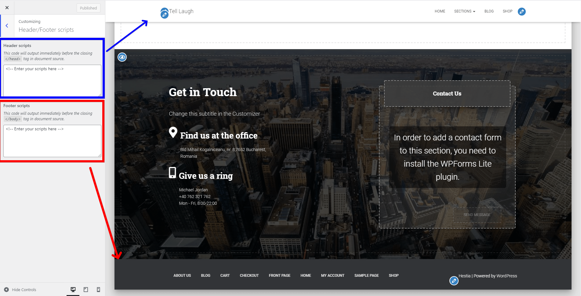
📝 Note: This option is available only with the Orbit Fox plugin installed.
Translate Hestia
Translating Hestia can be done by using any of the following plugins:
Single Language:
- TranslatePress - a dedicated article on how to use this plugin with Hestia is available on this page.
- Polylang - a dedicated article on how to use this plugin with Hestia is available on this page.
📝Note: We also have translations available for plenty of popular languages here. You can simply download and use the translated .po and .mo files.
Multiple Languages:
📝 Note: For a fully multilingual website with Hestia, you need the premium version which you can get from here.
Hestia Patterns
Hestia introduces templates that enable you to effortlessly replicate and implement sections both on the homepage and throughout the entire website. This streamlines the utilization of the original Hestia design with minimal difficulty.
📝 Note: Read more about Hestia Patterns here.