Hestia Pro Documentation
Hestia is a modern WordPress theme for professionals. It fits creative businesses, small businesses (restaurants, wedding planners, sport/medical shops), startups, corporate businesses, online agencies and firms, portfolios, e-commerce (WooCommerce), and freelancers.
*Hestia uses Material Kit created by Creative Tim for its design.
📩 Install and Configure Hestia PRO
To download and install Hestia, make sure you follow the steps below:
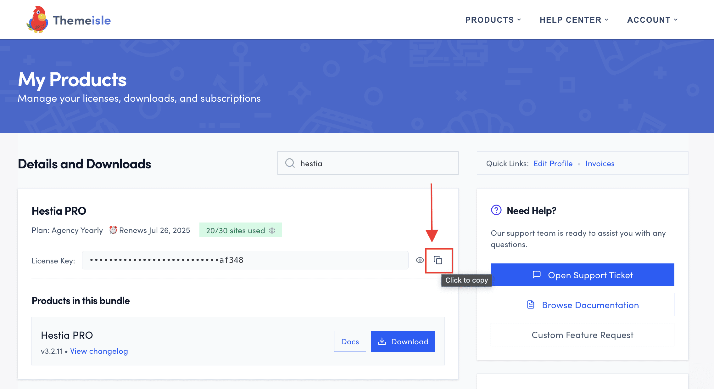
1. After purchasing a plan on this page, download your theme from the Purchase History.
2. Install the theme following these instructions, using the license key, from the ThemeIsle account.
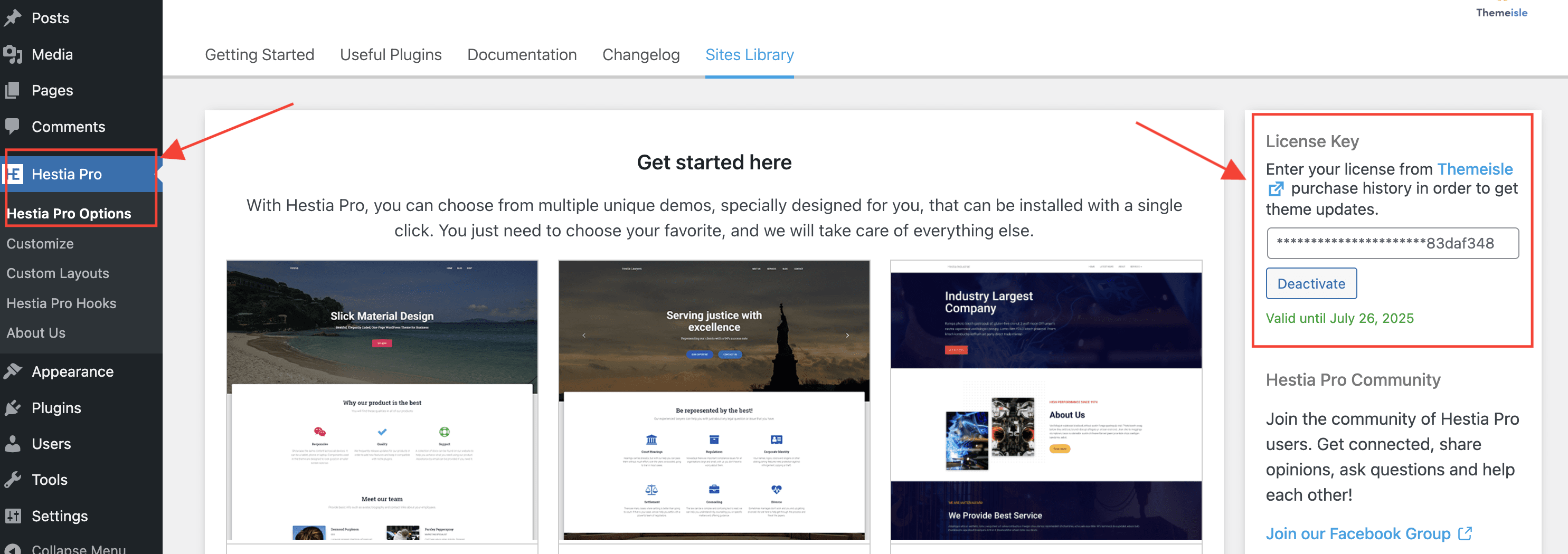
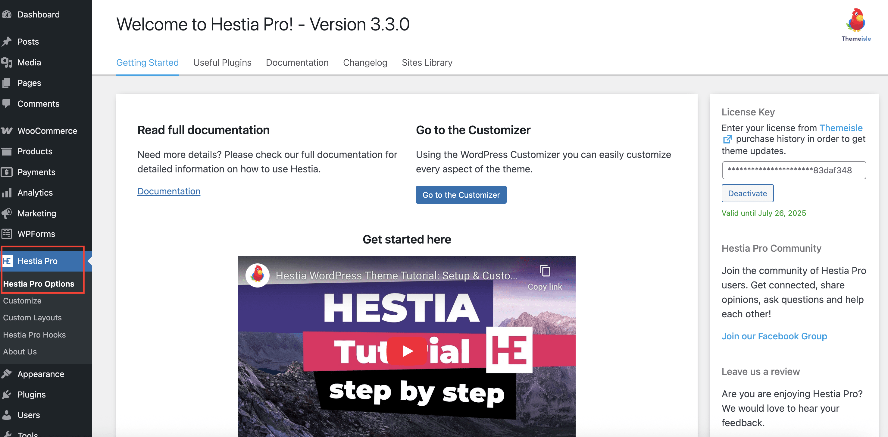
3. Navigate to Dashboard > Hestia Pro > Hestia Pro Options and activate the license key.
⚙️ Hestia PRO Options
Here you will find all the necessary information about Hestia PRO. From the documentation, useful Plugins, the Support, Changelog, to Sites Library, this is the place to go.
1. Navigate to Dashboard > Hestia PRO.
2. Click on Hestia PRO Options and start exploring the page.
Starter Sites Library
The great advantage of Hestia Pro is that it comes with Demo Content, available for import. Those are templates similar to the front-page sections of the theme, however, they are built with a page builder plugin like Elementor.
📍 Dashboard > Hestia PRO > Hestia Pro Options > Sites Library:
Each demo was designed for a dedicated website, and they are separated, according to the plans:
- Hestia Original Demo (All plans)
- Lawyers Demo (Business & Agency)
- Industrial Demo (Business & Agency)
- Business Demo (Business & Agency)
- Fitness Demo (Business & Agency)
You can get Hestia Pro on this page.
🖌 Customizer Options
Hestia's main features are its stylish, unique material design, and the ability to customize everything from just one place, which is the Customizer.
- Navigate to Dashboard > Appearance > Customizer and start customizing Hestia:
| Site Identity | Appearance Settings | Frontpage Sections | Header Options | Shop Settings | Footer Options | White Label |
| Blog Settings | Menus | Widgets | Homepage Settings | Additional CSS | WooCommerce | Header / Footer Scripts |
A
Site Identity
Hestia comes with a navigation menu with two different variations: a transparent state ( on the front page, before scrolling ) and a solid background style ( on the front page, after scrolling, and on internal pages). This is why, in some cases, the Logo image you are using may not be very suited for both menus variations.
For those cases, you can use different logos for the Logo and Transparent Header Logo options.
- Display - only logo/ logo with right text/ logo with left text/ logo with bottom text.
- Logo - suggested image dimensions: 150 by 100 pixels.
- Transparent Header Logo - displays only when the header is transparent
- Site Title - the main title of the site.
- Tagline - a short phrase, or sentence, used to convey the essence of the site. In Hestia, the tagline is also used as a title for the latest posts page (if in Reading > Settings, you have selected the "Your latest posts" option).
- Site Icon - also called a favicon, it appears in the browser tab.
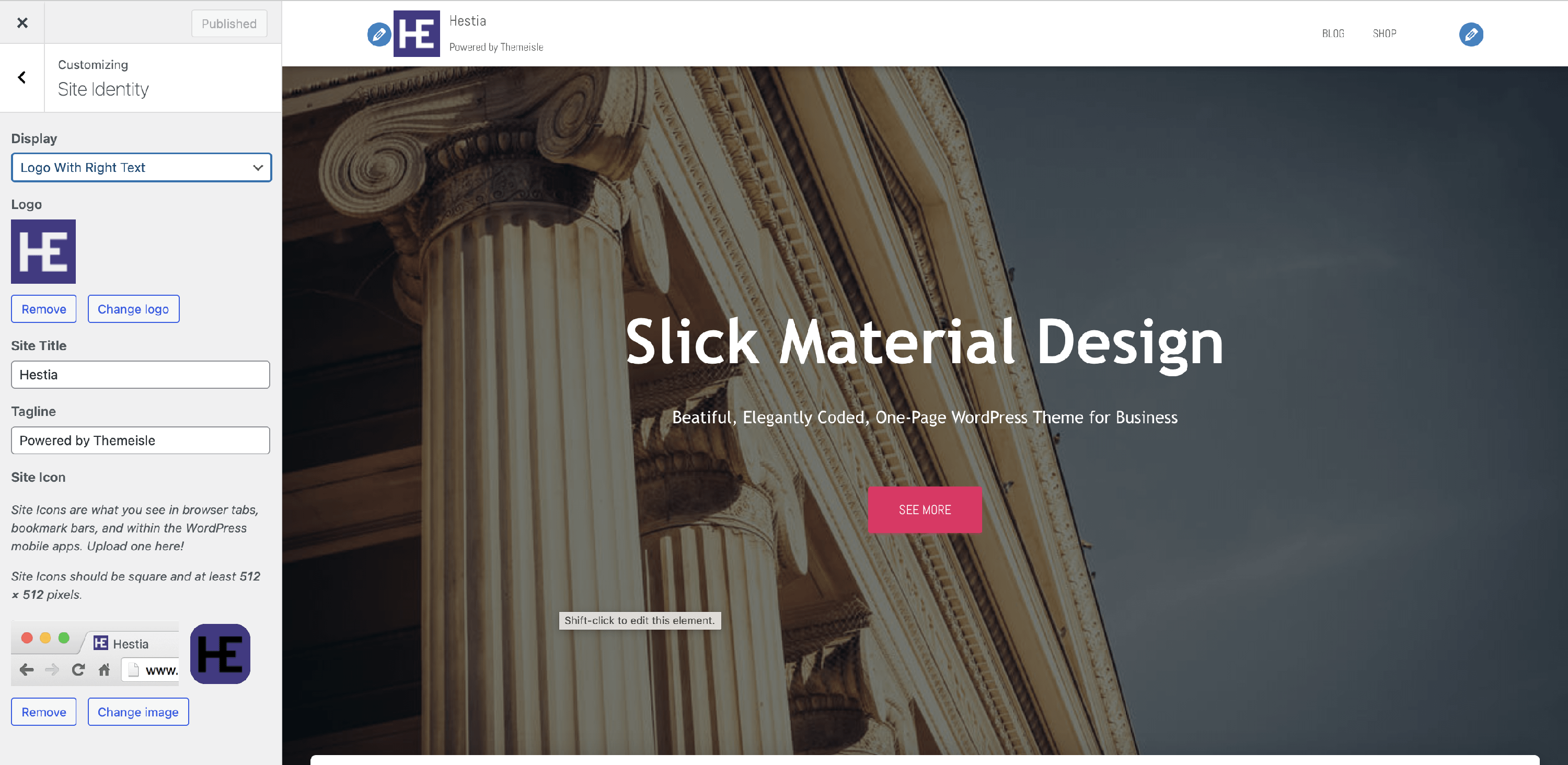
📝 Note: On the page will appear either a logo, or the site title, but not both.
B
Appearance Settings
📍 Appearance > Customize > Appearance Settings
The Appearance Settings panel is organized in five areas:
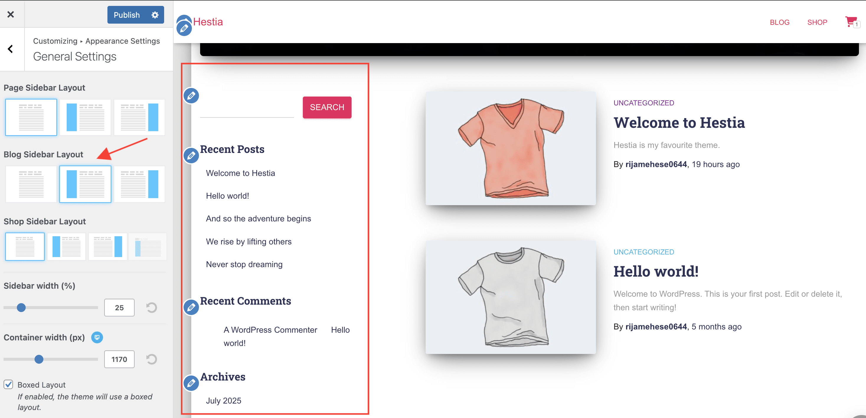
- General Settings - mostly settings regarding layout.
- Page Sidebar Layout - this option controls the sidebar position on internal pages ( Default template pages and WooCommerce Shop Page).
- full width / left / right
- Blog Sidebar Layout - this option controls the sidebar position on blog-related pages ( Blog, Archive, and Single Posts ).
- full width / left / right
- Page Sidebar Layout - this option controls the sidebar position on internal pages ( Default template pages and WooCommerce Shop Page).
- Shop Sidebar Layout - this option controls the sidebar position on products related pages ( Shop, Products Archive).
- full width / left / right / 💸 slider
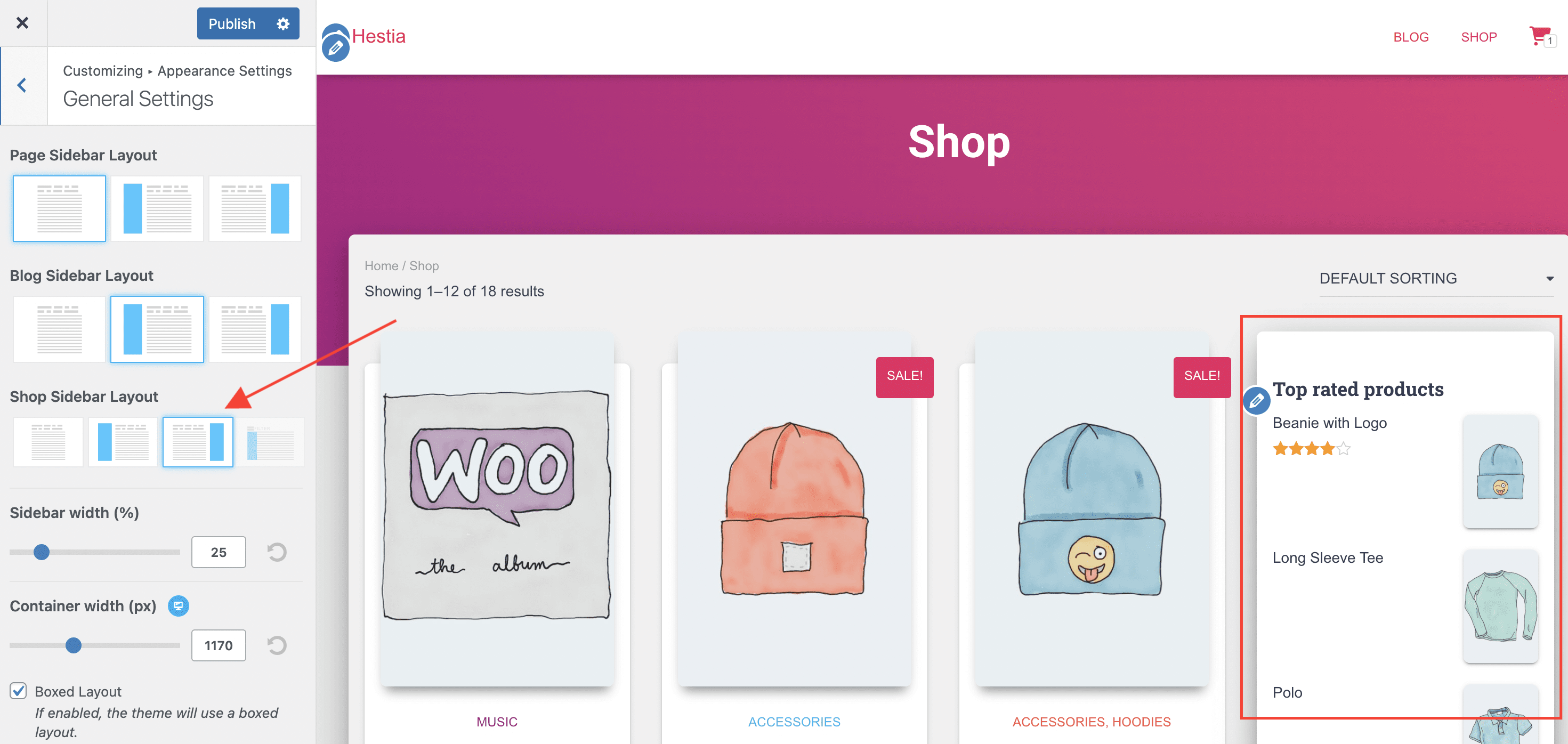
- Sidebar width - modify the dimension of the sidebar ( in percents).
- undo the changes with the ↺ (reset) arrow.
- Container width - modify the dimension of the container ( in percents), available for Desktop | Tablet | Mobile.
- undo the changes with the ↺ (reset) arrow.
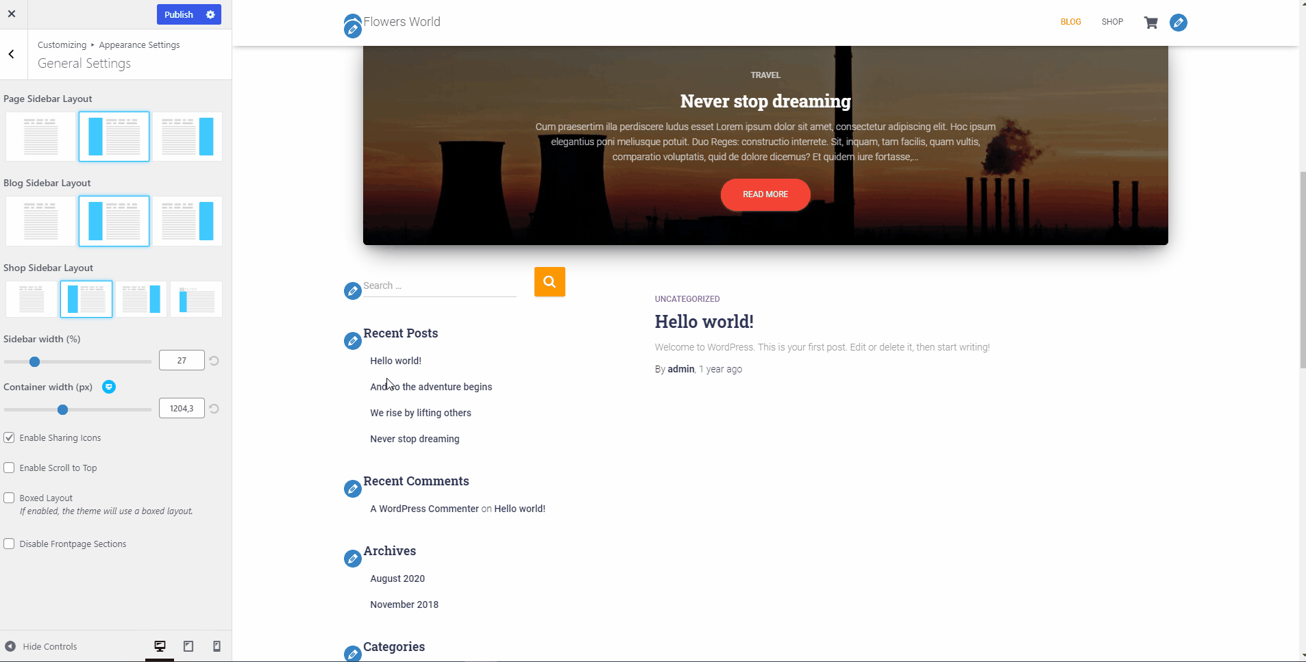
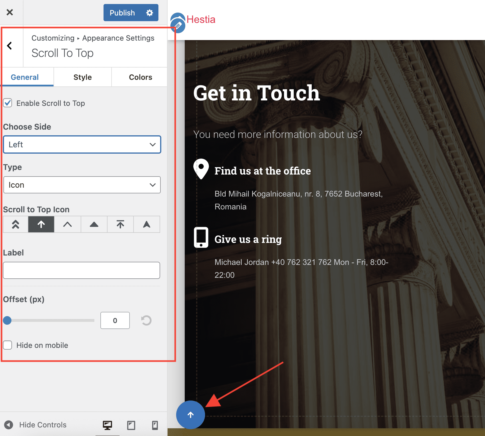
- Enable Scroll to Top - choose to enable or disable the option to add a Scroll to Top button at the bottom of each page, which allows the user to easily navigate back to the top of the page.
Boxed layout - by default, this option is selected and creates a boxed layout for all containers within the site. For full-width type containers, just deselect this option.
Disable Frontpage Sections - check this option to completely disable the front page template, so you can easily add your content.
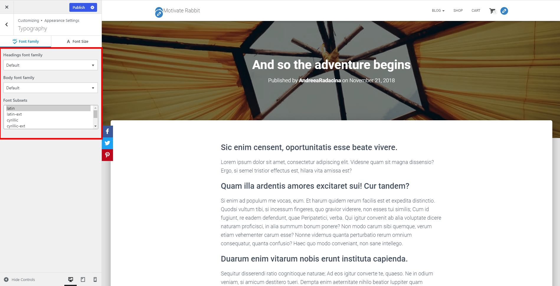
Typography - includes settings for two panels:
- Font Family
- Headings Font Family - select the font you want to use for all the headings on the site.
- Body Font Family - select the font you want to use for all texts on the site.
- Font Subsets - select only the subset of fonts you want to use. In this way, only the characters you want to use will be loaded.
- Font Family
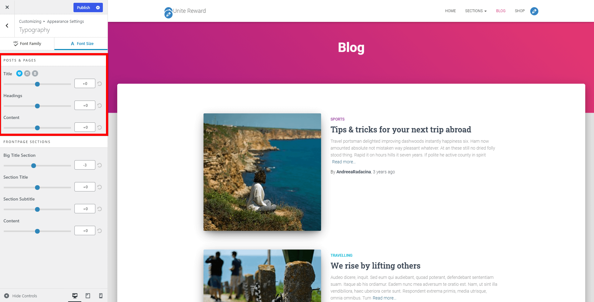
Font Size
- Posts & Pages - make the changes for each post and page, which can be set differently for Desktop | Tablet | Mobile.
- Title
- Headings
- Content
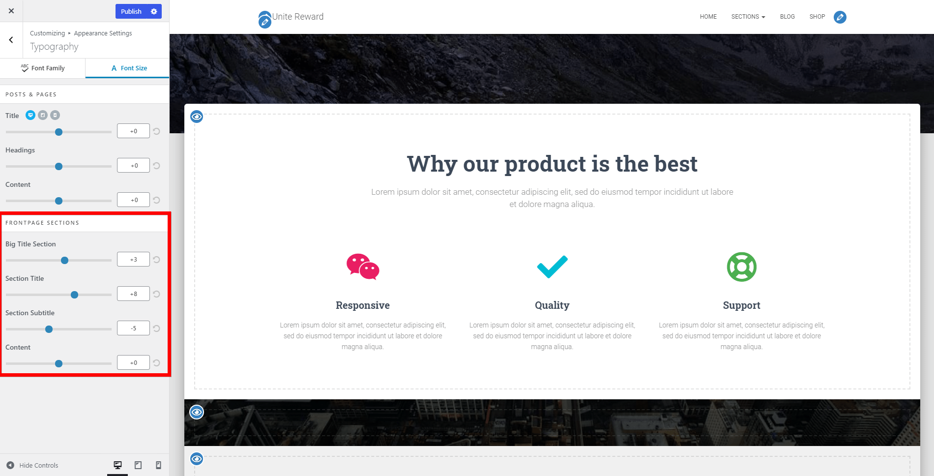
- Frontpage Sections - change the font size for the front page sections, which can be set differently for Desktop | Tablet | Mobile.
- Big Title Section
- Section Title
- Section Subtitle
- Content
- Generic Options - changes the size of the menu items, which can be set differently for Desktop | Tablet | Mobile.
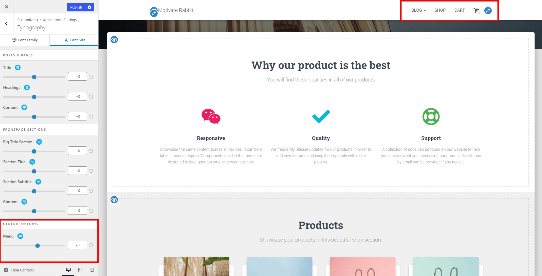
📌 The font size is defined in pixels.
📌 You can always undo the changes by clicking on the ↺ button (reset arrow).
- Posts & Pages - make the changes for each post and page, which can be set differently for Desktop | Tablet | Mobile.
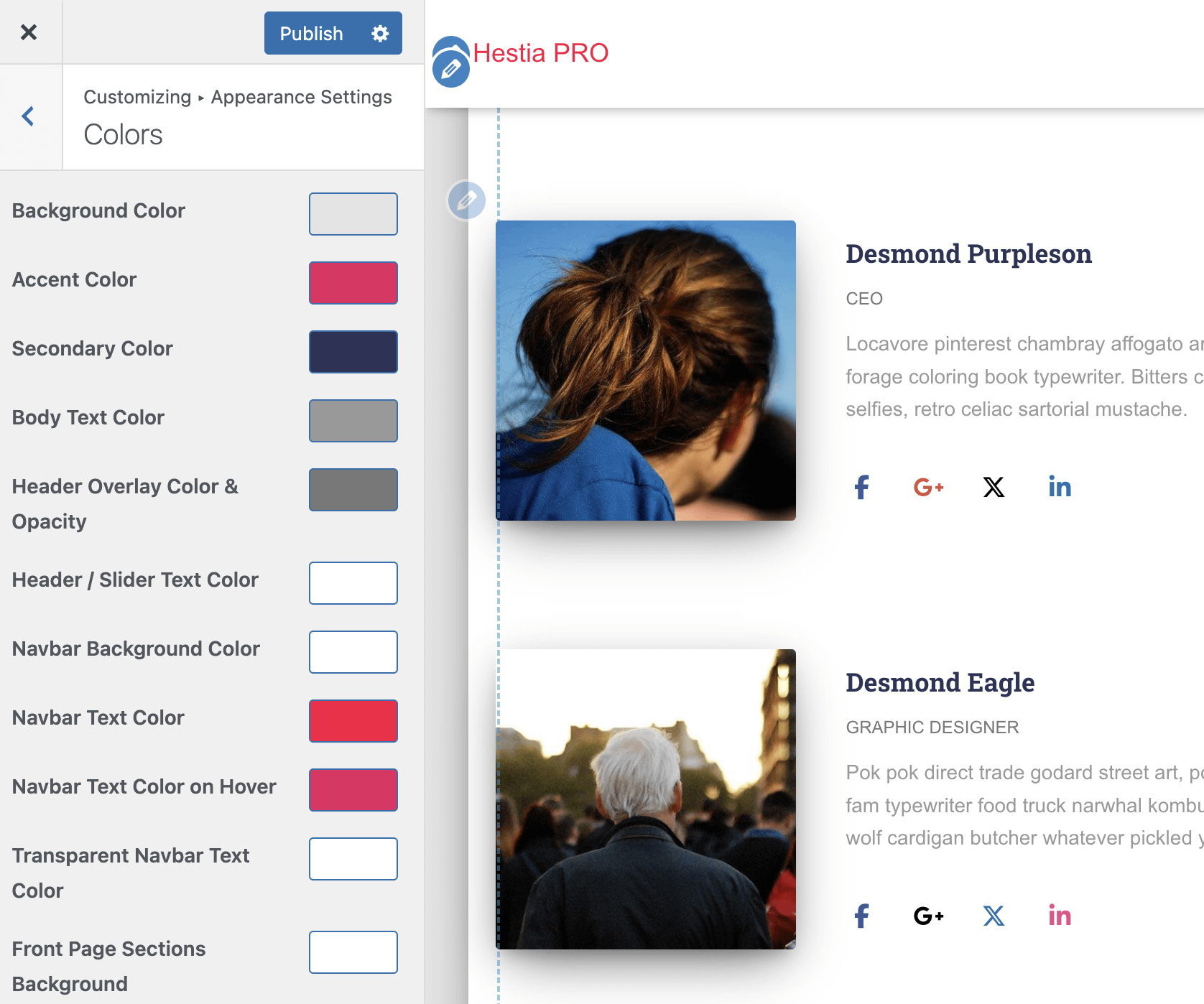
Colors
- Background Color - change the background color throughout the whole site.
- Accent Color - controls the buttons and other small accent elements like the categories in the Shop Section and many more.
- Secondary Color
- Body Text Color
- Header Overlay Color & Opacity
- Header / Slider Text Color
- Navbar Background Color
- Navbar Text Color
- Navbar Text Color on Hover
- Transparent Navbar Text Color
- Front Page Sections Background - it applies to frontpage sections that don't have a background image by design
- Front Page Section Title
- Front Page Section Subtitle
Background Image - it will only appear on the homepage if the Boxed Layout is enabled and you can customize it with the following options:
- Preset - Fill Screen / Fit to Screen / Repeat / Custom.
- Image Position - select the arrow that corresponds to the desired direction.
- Image Size - Original / Fit to Screen / Fill Screen.
- Repeat Background Image - enable / disable.
- Scroll with Page - the image will appear as you scroll the page.
- Header Background - you will be redirected to the header's options and there will appear settings like post/pages layout, products layout, current header, header gradient, enable Header Image Sitewide.
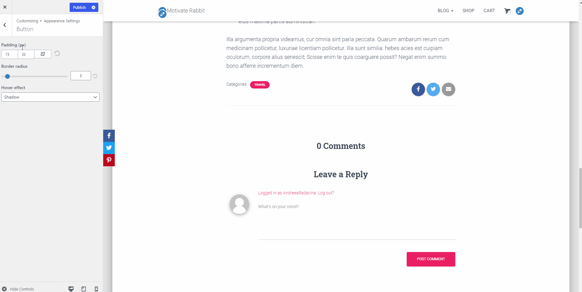
Button
- Padding - in PX, with a link button, so that the value will be applied to both directions.
- Border Radius - rounds the corners of the buttons, for the majority of the buttons on the site.
- Hover Effect - Shadow ( will create a shadow around the button ) / Color ( will change the button's color into a darker one ).
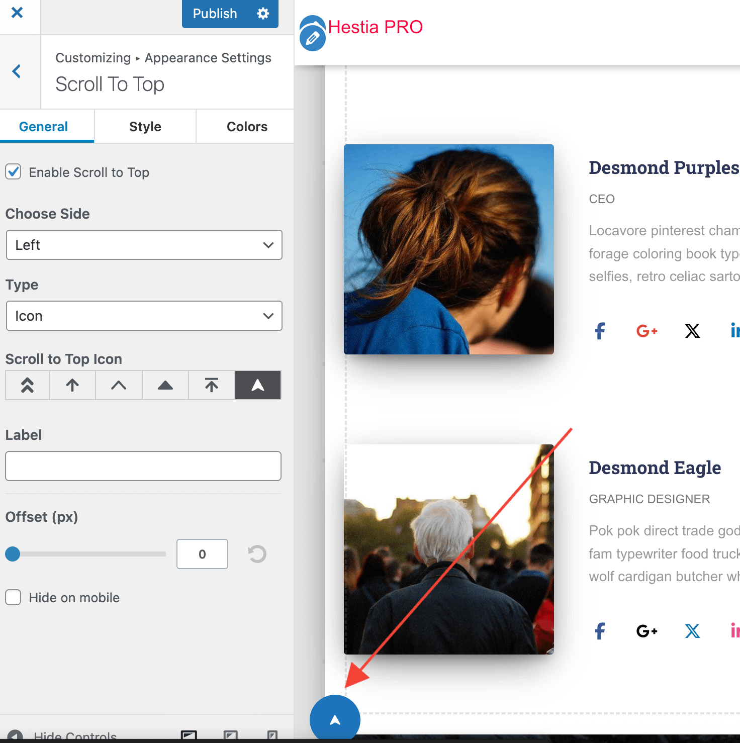
- Scroll to Top
- Customize the Scroll to Top button: choose to display it in the Left or Right side of the site, change the icon and/or image, add a text label next to it.
C
Frontpage Sections
📍 Appearance > Customize > Frontpage Sections
Here can be found the names of the sections of your website, with the following options available:
- Visibility - you can turn on / off the visibility of the elements, by clicking the 👁️ button.
- Rearrange - you can rearrange the elements, with a drag and drop movement.
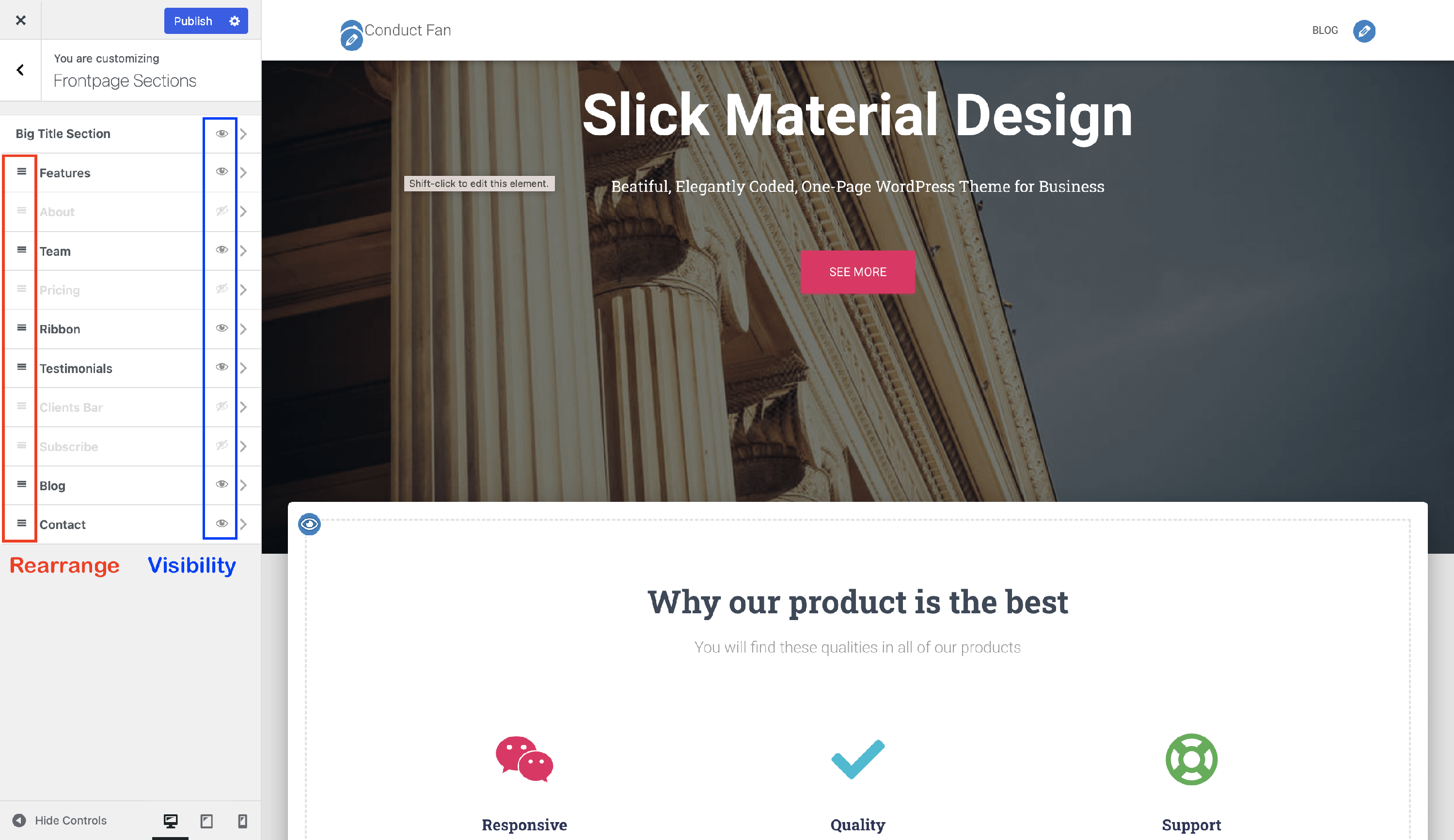
📝 Note: When using Hestia Pro for the first time, the sample content of the frontpage section will be visible only in the Customizer. You have to replace the default content to make buttons / titles visible for the visitors.
📝 Note: Furthermore, you can add custom frontpage sections to your website, by following the instructions presented in this doc.
| Big Title Section | Features Section | About Section | Shop Section | Team Section | Pricing Section |
| Testimonials Section | Subscribe Section | Blog Section | Contact Section | Ribbon Section | Clients Bar Section |
| Portfolio Section |
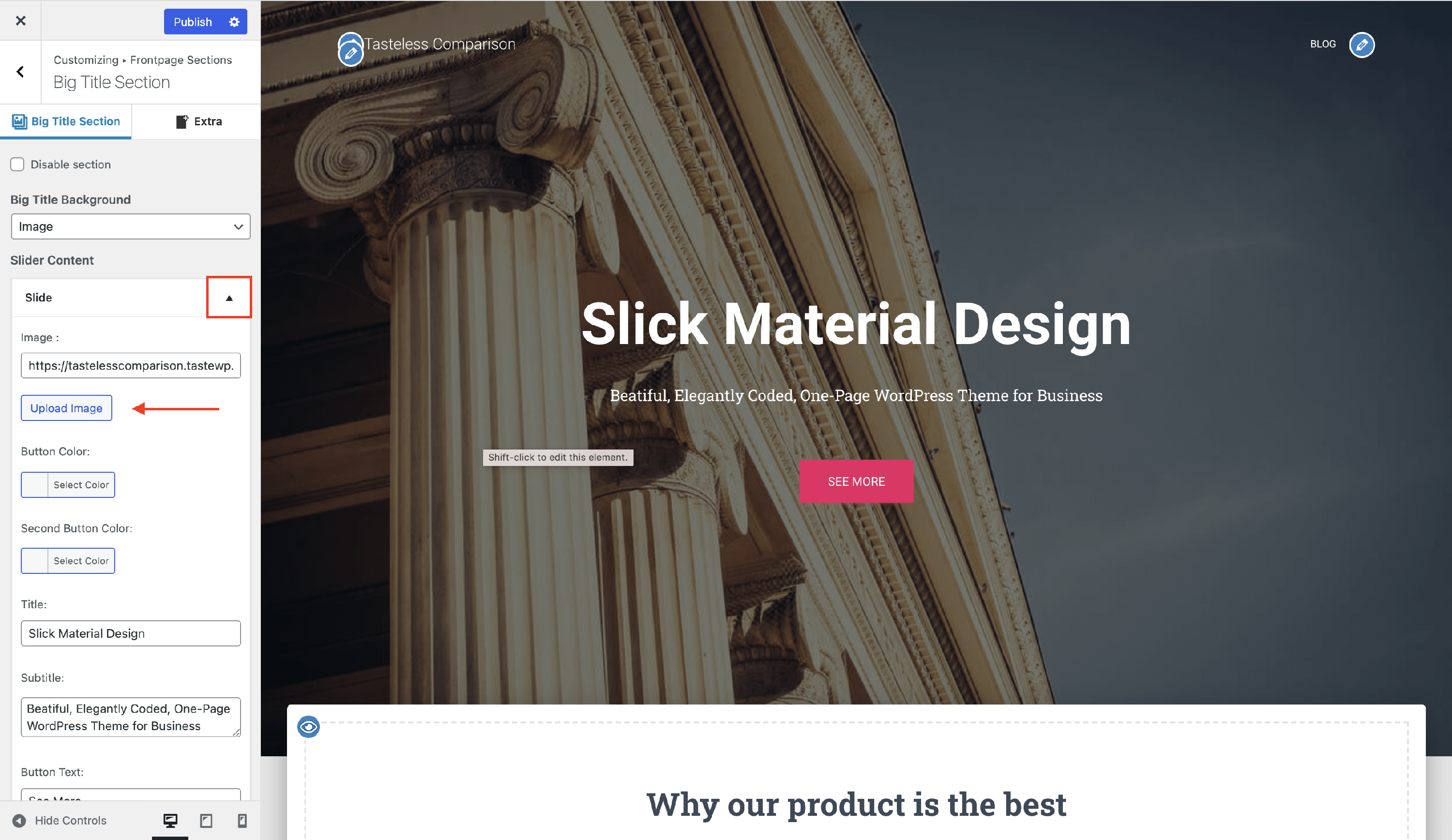
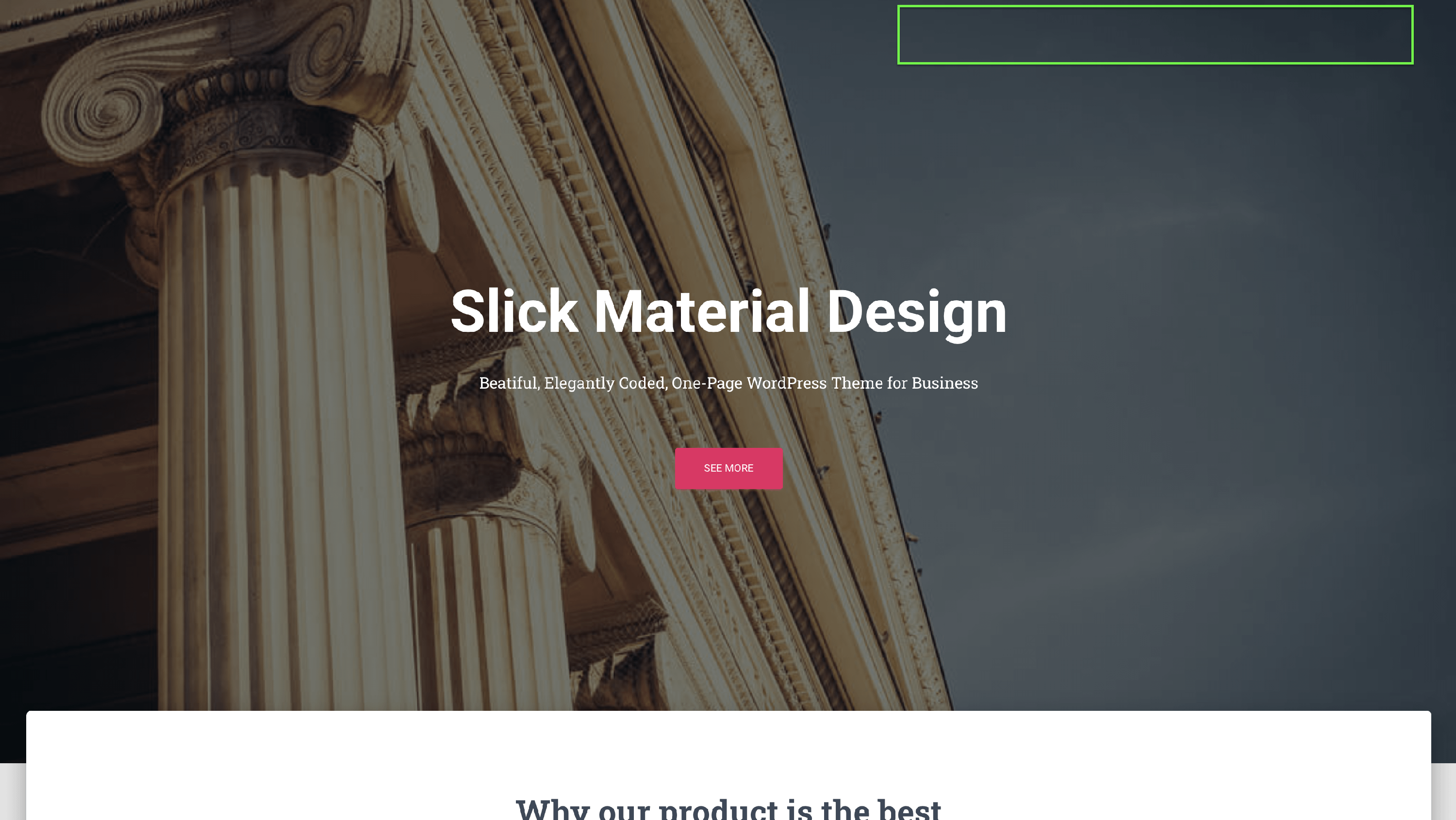
📑 Big Title Section
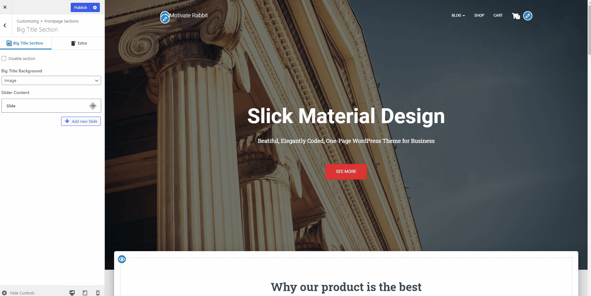
The Big Title Section is divided into two panels:
First Panel - Big Title Section
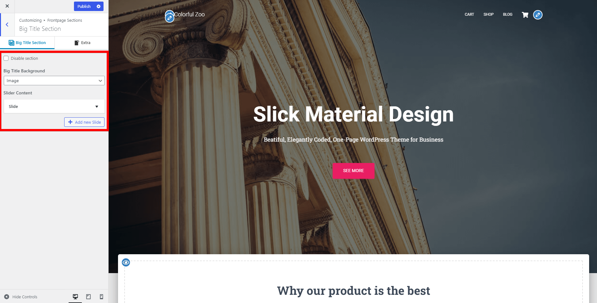
Disable Section - enable / disable.
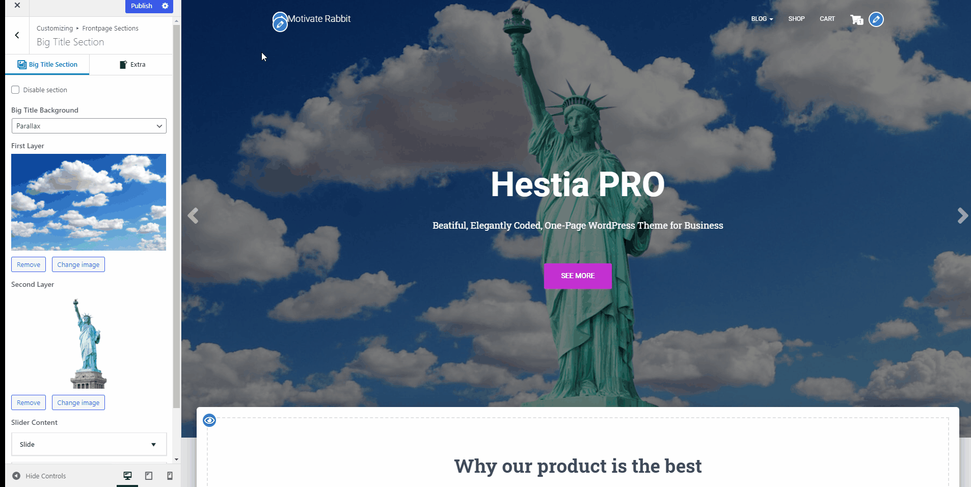
Big Title Background - with three possibilities:
a video - either upload your video or enter a YouTube URL.
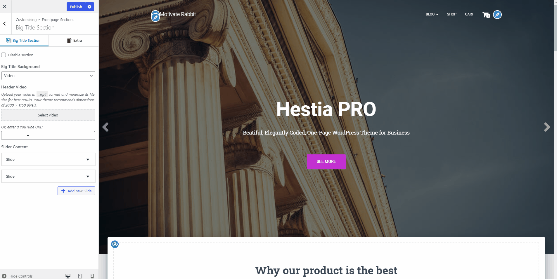
📝 Note: On smaller displays, the fallback image (Header image) will be displayed instead of the video.
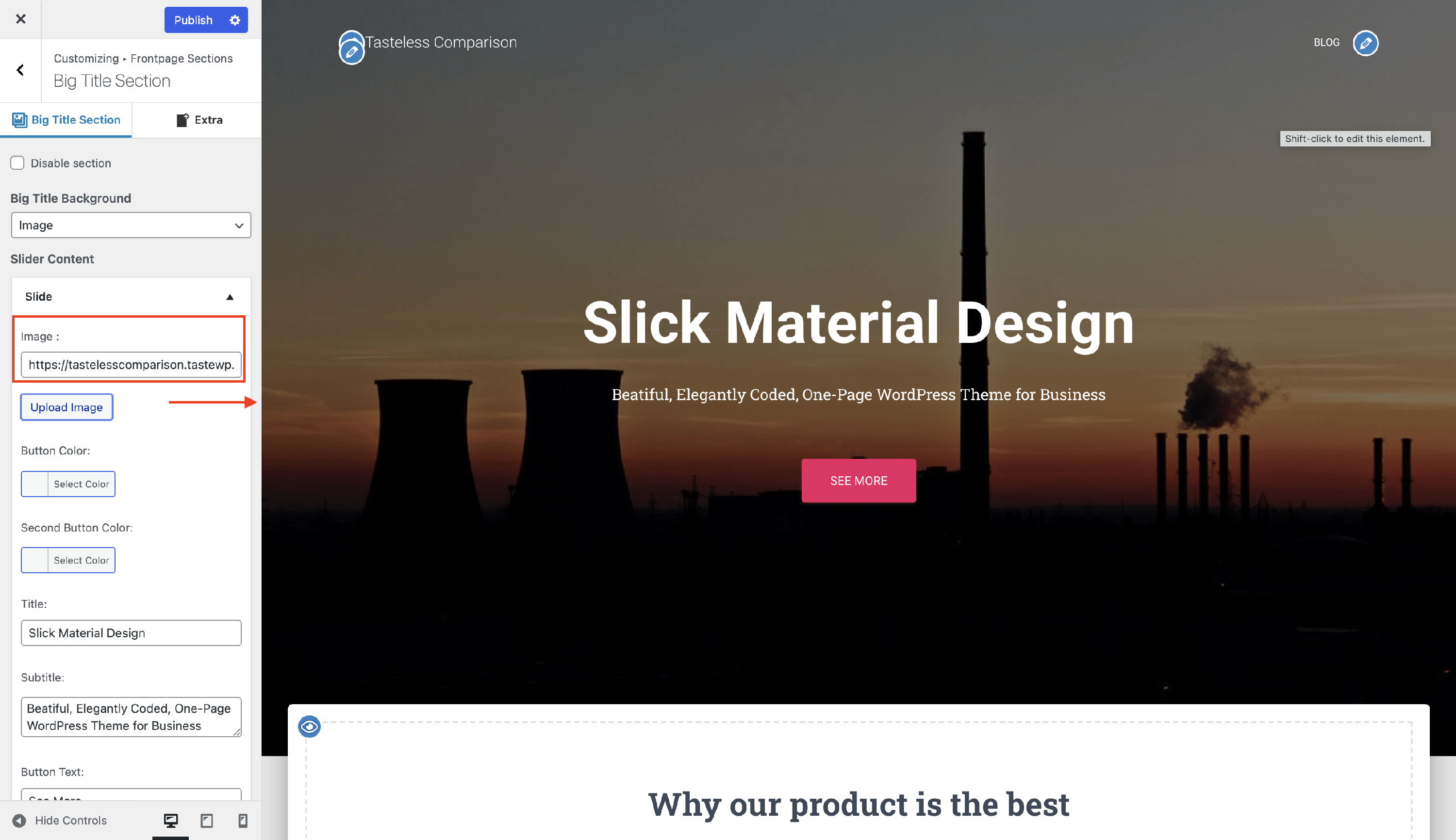
a background image for the Big Title Section - open the accordion of the Slider Content, click to Upload an Image and insert one:
the Parallax effect with two layers of images:
make sure one of the images has some transparent portions to be able to see the full parallax effect.
Slide - includes the following customizations:
Title - displays the main big title.
Subtitle - paragraph under the title.
Button and Second Button Color - add a color for the buttons.
Button text and Button Link - add a text and a link to redirect the page to the desired location.
Second Button text and Second Link - add a text and a link to redirect the page to the desired location.
The result is:

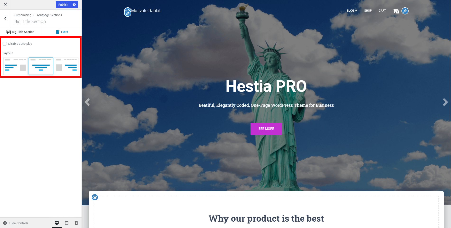
Second Panel - Extra
- Disable auto-play - the slide effect will be activated only if the arrows are pressed.
- Layout - choose from three possible layout options:
Text aligned to the left or right side or text-centered.
If left / right is selected, it enables the "Big Title Section Sidebar" options at the bottom where you can add widgets such as contact form, subscription form, etc.
Another interesting thing about this section is that here you can add widgets, for a better first impression, which can be found in Widgets > Big Title Section.
📝Note: For further information about widgets, check this chapter.
📑 Features Section
In the features section, you can showcase an unlimited number of features or services in the form of a repetitive box.
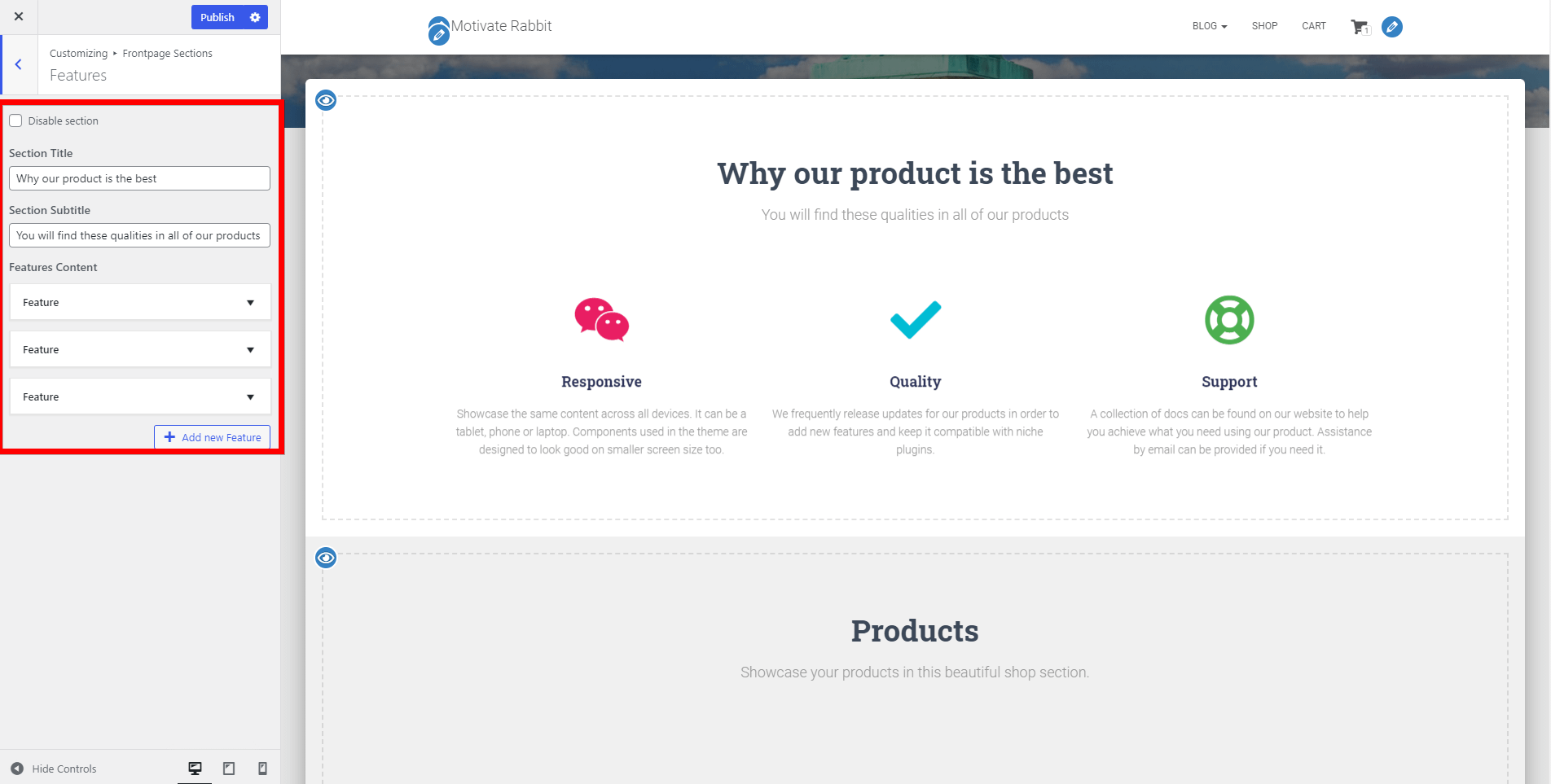
- Disable section - option to disable the section.
- Section Title - the main title of the Features Section.
- Section Subtitle - subtitle for the Features Section.
- Features Content - in this area you can add as many Feature boxes as you want. Each Feature box has the following options:
- Icon - option to select from a list of FontAwesome icons.
- Color - option to change the color of the icon.
- Title - title of the Feature box.
- Text - add content to the Feature box.
- Link - link to the Feature box.
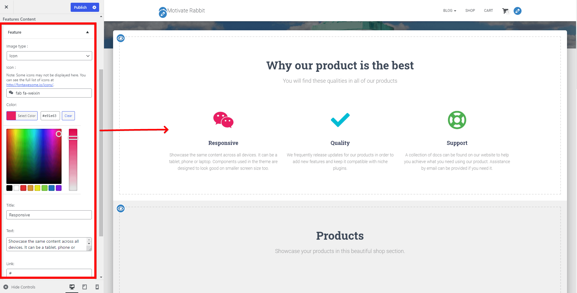
🔗 Shortcode of the section: [hestia_features].
📝 Note: Some FontAwesome icons may not be listed in the Feature box, but you can always select the one you want from the full list of icons at Font Awesome.
📑 About Section
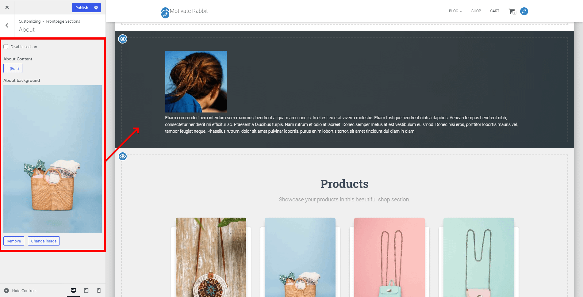
- Disable section - option to disable the section.
- About Content - main content for the About Section. The control supports text, HTML elements, and media attachments.
- if you press the Edit button, you will be redirected to the WordPress editor.
- About Background - here you can add a background image for the About Section.
- you can undo the changes by clicking on the Default button.
📝 Note: The content of the About section is synchronized with the content of the page set as Frontpage. This means that the control will also be updated if the page content is changed.
📑 Shop Section
The Shop section on the homepage was designed to showcase your best products and is divided into two panels:
First Panel - General
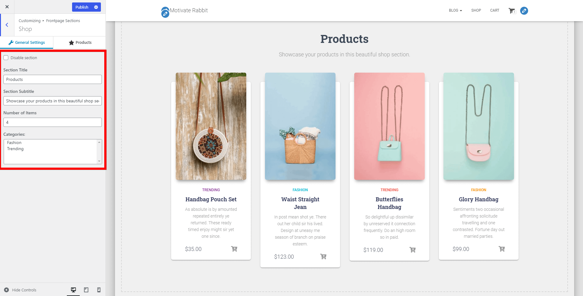
- Disable section - option to disable the section.
- Section Title - the main title of the Shop Section.
- Section Subtitle - subtitle for the Shop Section.
- Number of Items - control that allows you to change the number of products displayed in the Shop Section.
- Categories - choose what category to be displayed.
Second Panel - Products
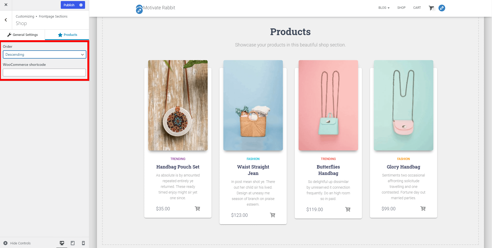
- Order - Descending / Ascending
- WooCommerce shortcode
🔗 Shortcode of the section: [hestia_shop].
📝 Note: The Shop Section requires the WooCommerce plugin to work, so make sure it's installed.
📑 Team Section
With Hestia Pro you can showcase your team members on the homepage of the site, using the Team section.
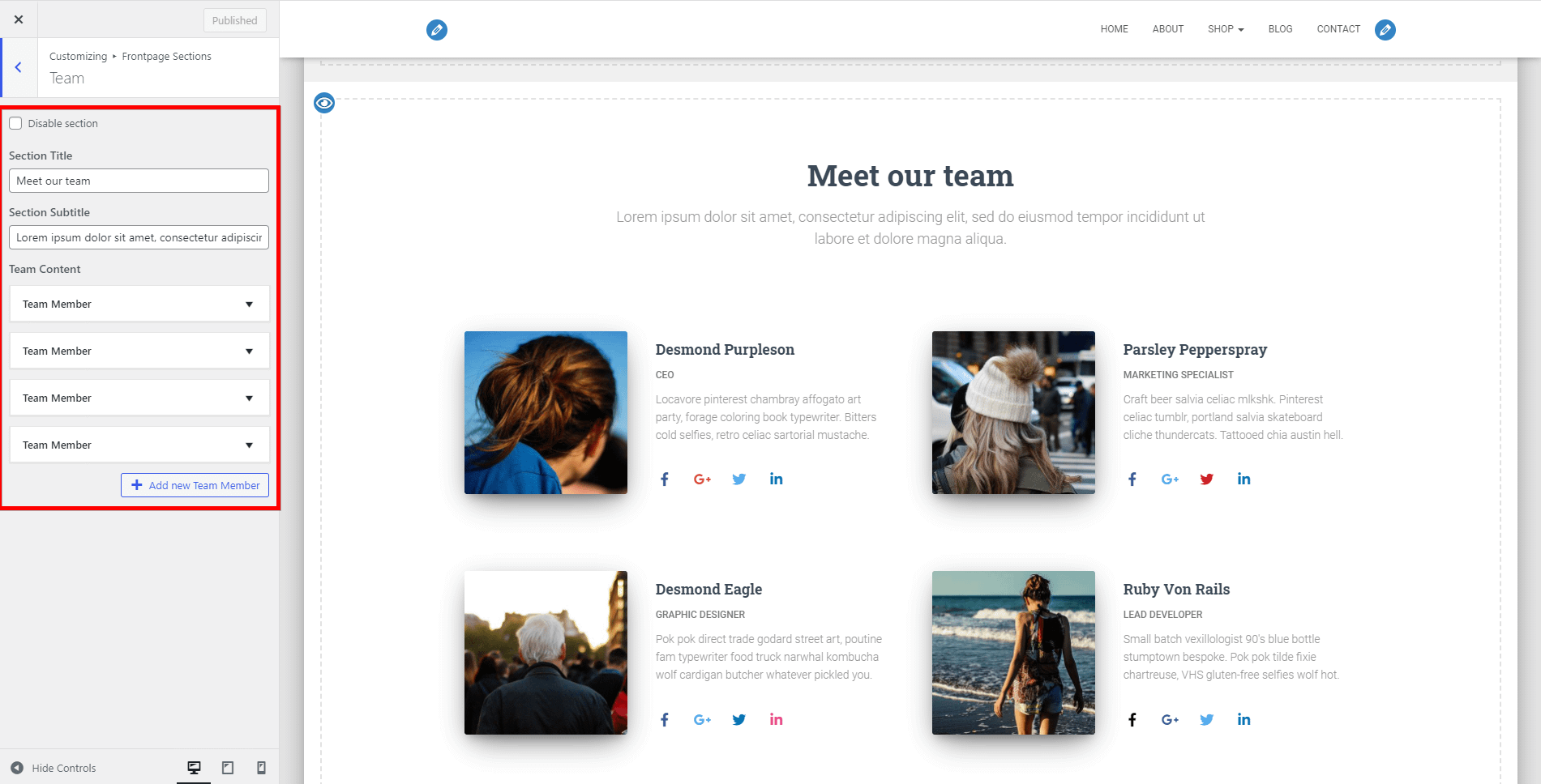
- Disable section - option to disable the section.
- Section Title - the main title of the Team Section.
- Section Subtitle - subtitle for the Team Section.
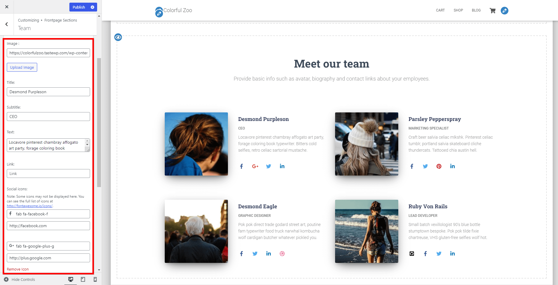
- Team Content - in this area, you can add as many Team boxes as you want. Each Team box has the following options:
- Image - image for the Team box.
- Title - the title of the Team box.
- Subtitle - the subtitle of the Team box.
- Text - main text of the Team box.
- Link - link to the Team box.
- Social icons - This is repeater control, that allows you to add as many social icons as you want to each Team box.
- For each social icon, you need to provide the icon and the link.
🔗 Shortcode of the section: [hestia_team].
📝 Note: Here is a dedicated doc about how to display Team description on mobile.
📑 Pricing Section
Hestia Pro comes with a beautiful set of pricing tables. It allows you to add unlimited options to your tables by separating them with a "\n", as seen in the images below, and is divided into three panels:
General
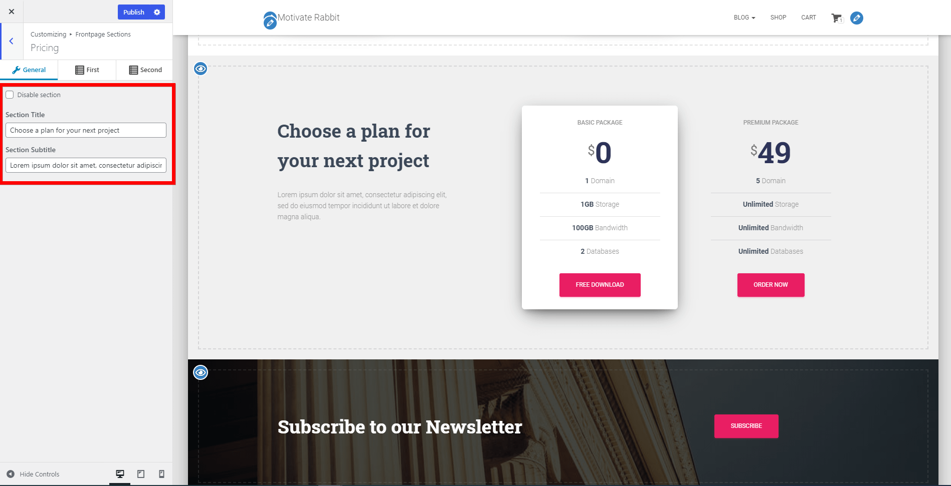
- Disable section
- Section Title
- Section Subtitle
First Panel

This panel refers to the first pricing package and contains the following options:
- Pricing Table One: Title
- Pricing Table One: Icon
- Pricing Table One: Price
- Pricing Table One: Features
- Pricing Table One: Link
- Pricing Table One: Text
Second Panel
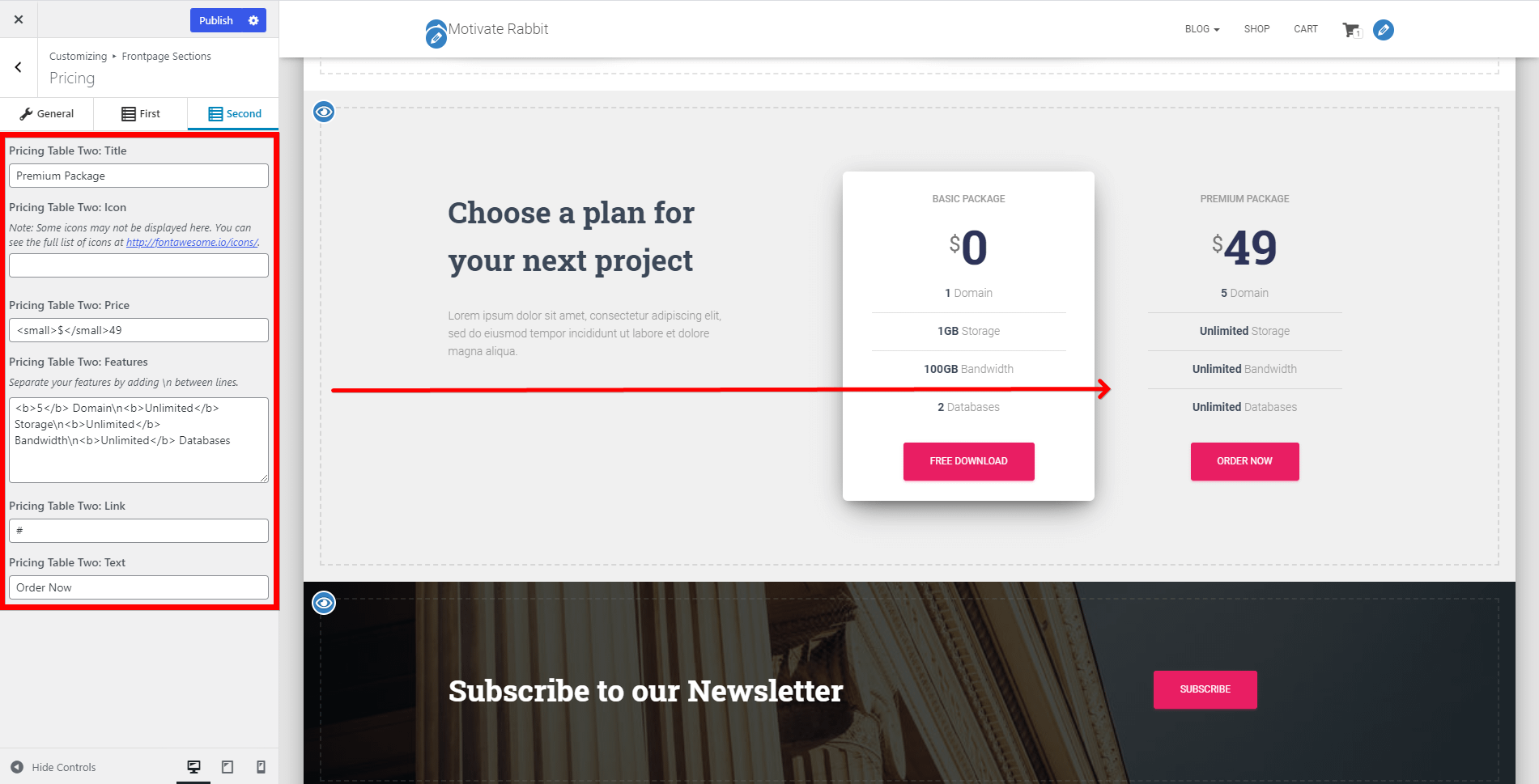
This panel refers to the second pricing package and contains the following options:
- Pricing Table One: Title
- Pricing Table One: Icon
- Pricing Table One: Price
- Pricing Table One: Features
- Pricing Table One: Link
- Pricing Table One: Text
🔗 Shortcode of the section: [hestia_pricing].
📝 Note: Here is a dedicated doc about how to make both pricing tables raised.
📑 Portfolio Section
This section is exclusive to the Hestia Pro theme, available after installing the Jetpack plugin. Steps to follow in order to create your own portfolio:
Step 1: Install the plugin using this doc.
Step 2: Activate the Jetpack plugin and navigate to Jetpack > Settings.
Step 3: Go into the Writing menu, scroll down and enable the Portfolio option.
Step 4: Click on Add a portfolio item and you will be redirected to a sample page.
Step 5: Start customizing the portfolio using the available settings.
- There is a dedicated section for the Jetpack Portfolio Settings.
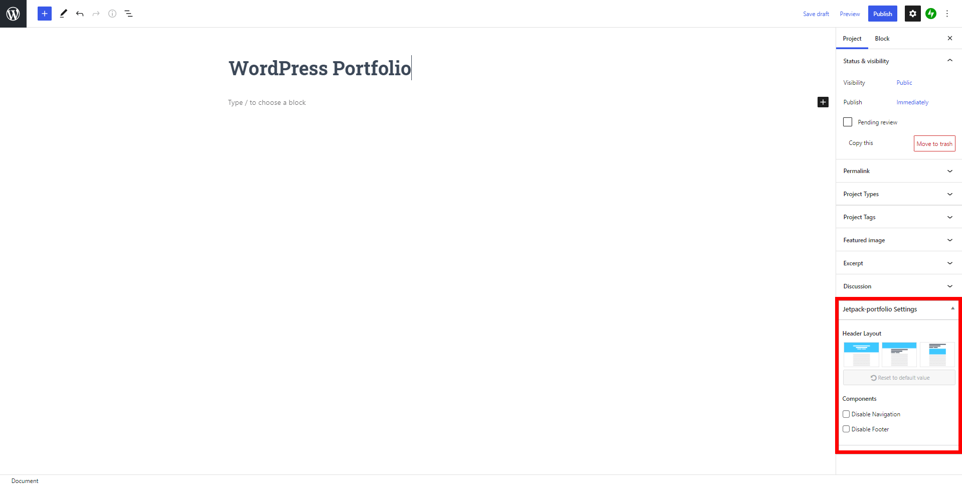
Step 6: Publish the changes and go see the website.
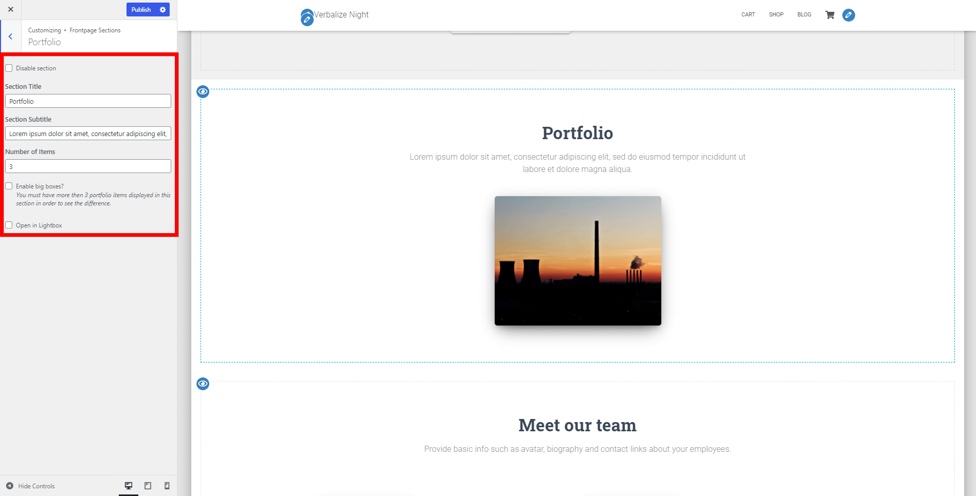
Options available here:
- Disable section - option to disable the section.
- Section Title - the main the Portfolio Section.
- Section Subtitle - paragraph under the title.
- Number of Items - type what number of items you want to be displayed.
- Enable big boxes - will enlarge the boxes, but it requires at least three items.
- Open in Lightbox - opens the image in a lightbox.
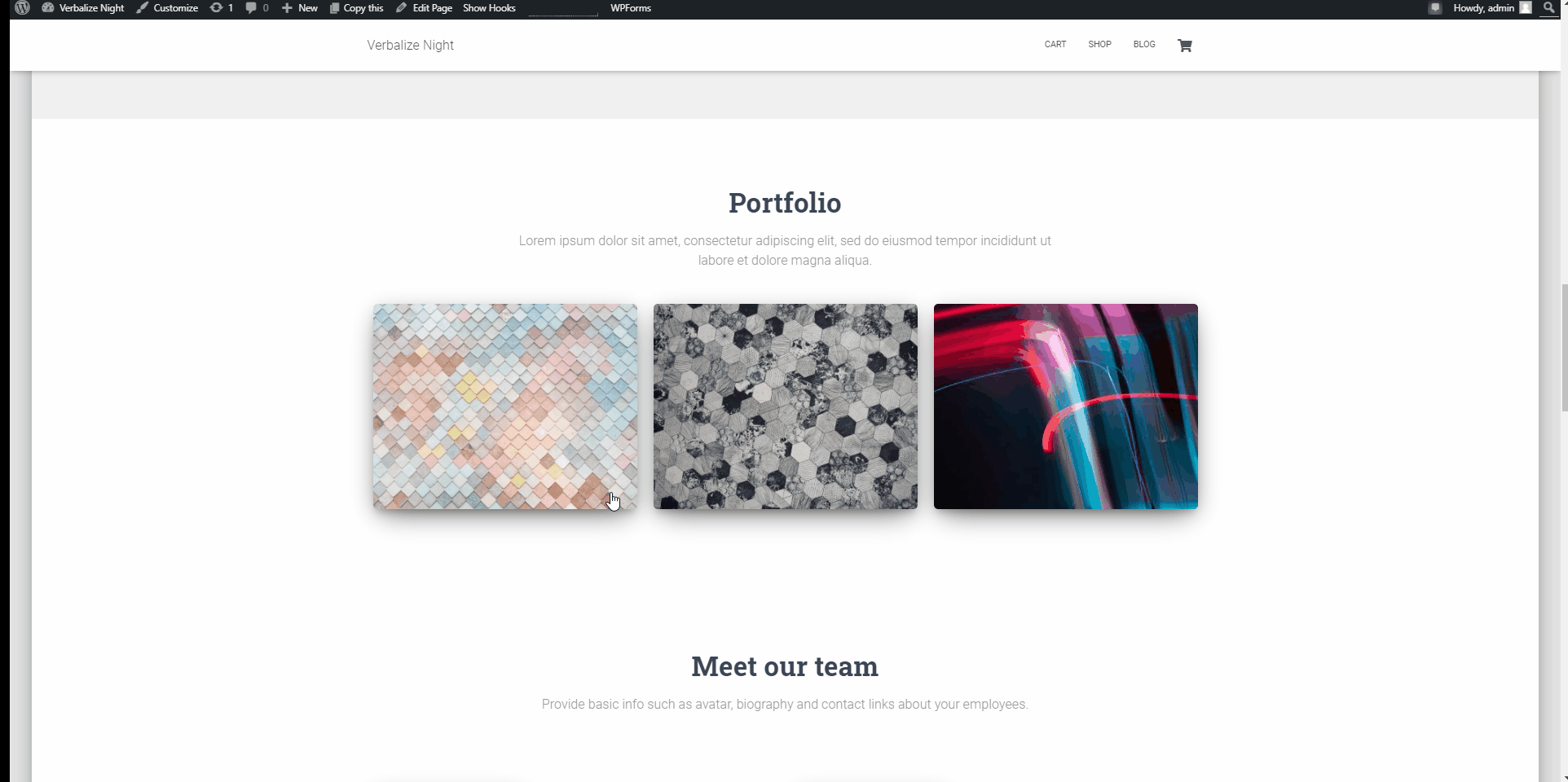
🔗 Shortcode of the section: [hestia_portfolio].
📝 Note: Here is a dedicated doc about changing the portfolio archive title in Hestia.
📑 Ribbon Section
- Disable section - option to disable the section.
- Background image - background image for the Ribbon Section.
- Text - main content text for the Ribbon Section.
- Button Text - button label for the Ribbon Section.
- Link - button link for the Ribbon Section.
🔗 Shortcode of the section: [hestia_ribbon].
📑 Testimonials Section
You can beautifully display clients' words in your Testimonials section.
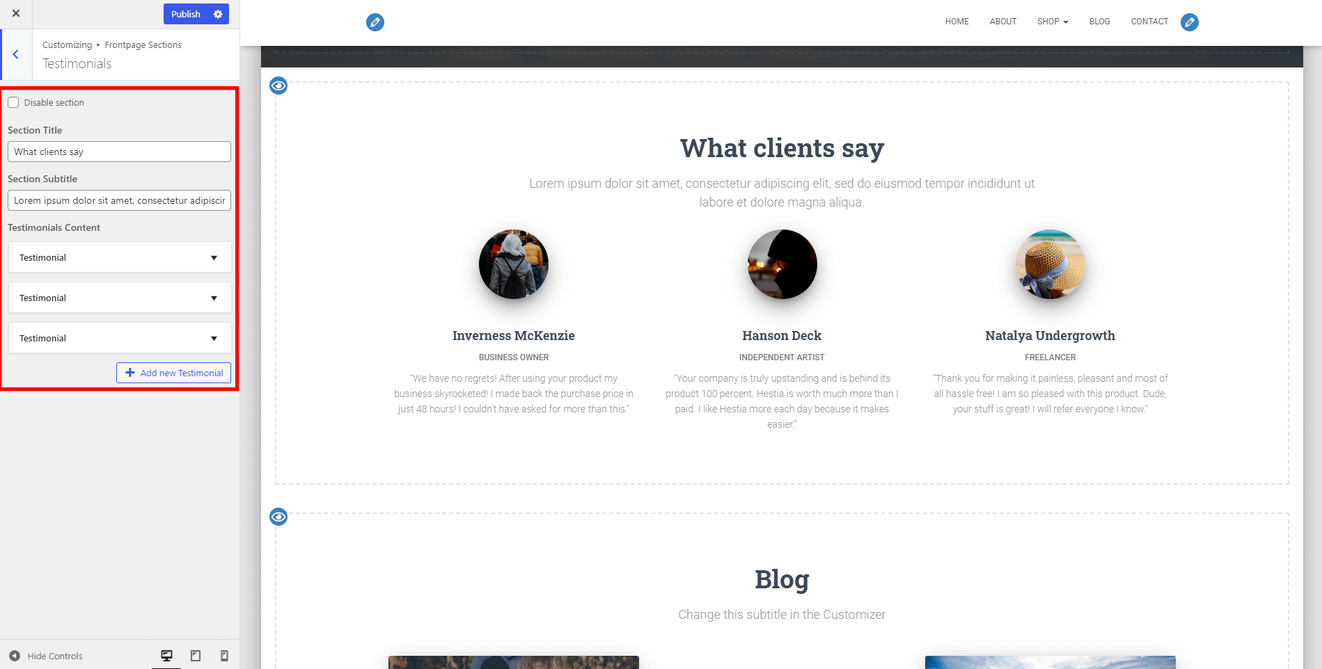
- Disable section - option to disable the section.
- Section Title - the main the Testimonials Section.
- Section Subtitle - the Testimonials Section.
- Testimonials Content - in this , you can add as many Testimonials boxes as you want. Each Testimonial box has the following options:
- Image - the Testimonial box.
- Title - the title of the Testimonial box.
- Subtitle - the subtitle of the Testimonial box.
- Text - main text of the Testimonial box.
- Link - the Testimonial box.
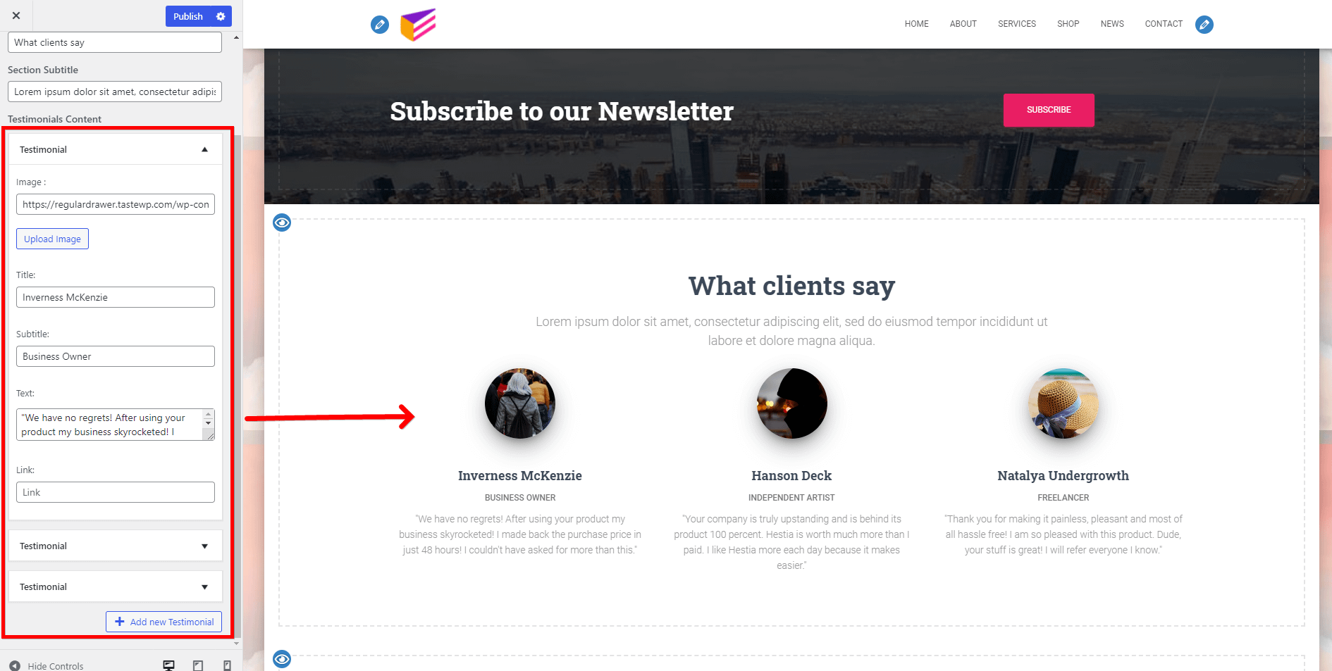
🔗 Shortcode of the section: [hestia_testimonials].
📝 Note: Here is a dedicated doc about how to change the text alignment of the Testimonials section.
📑 Clients Bar Section
- Disable section - Option to disable the section.
- Clients Bar Content - In this area, you can add as many Client boxes as you want. Each Clients box has the following options:
- Image - image for the Clients box.
- Link - link to the Clients box.
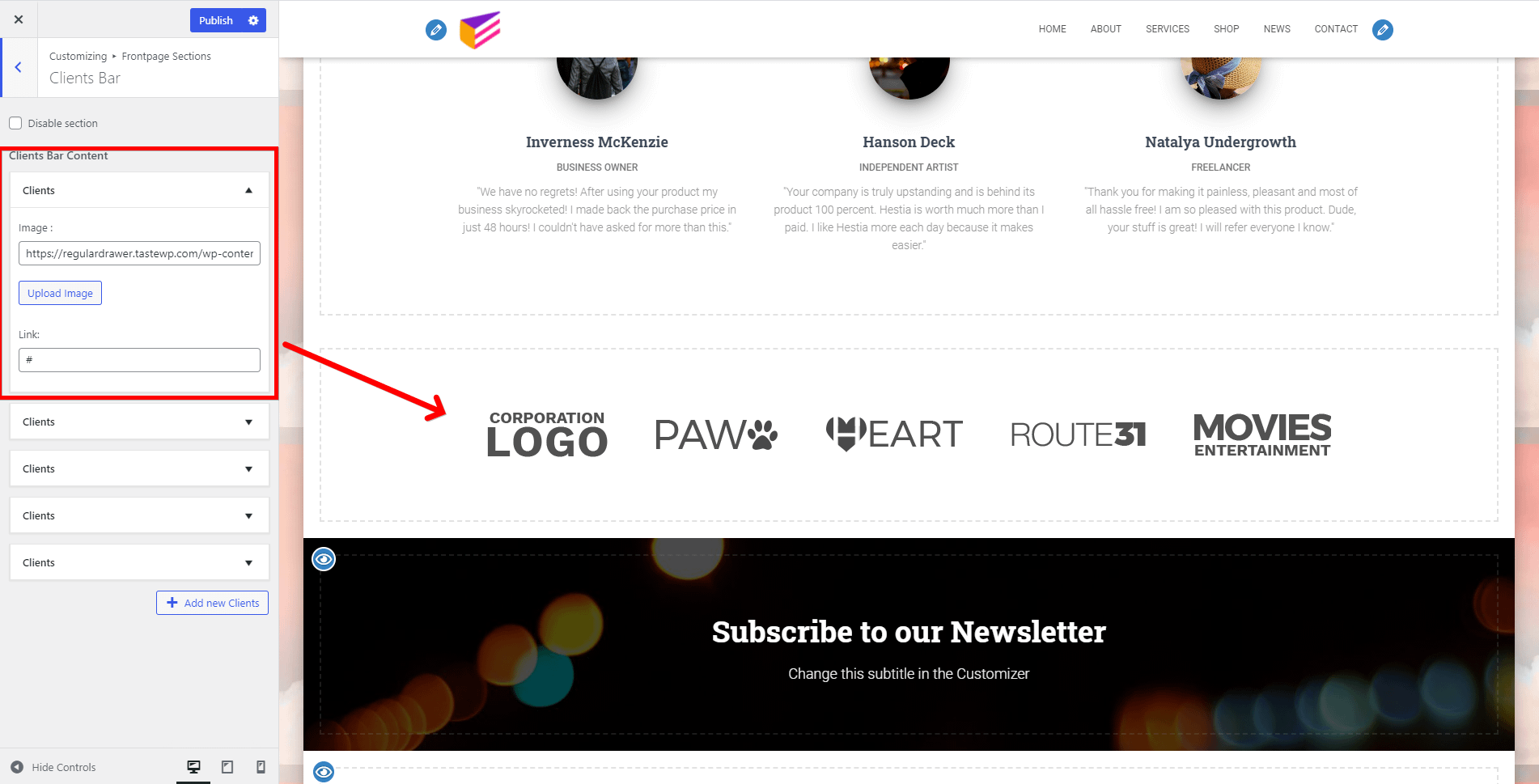
🔗 Shortcode of the section: [hestia_clients_bar].
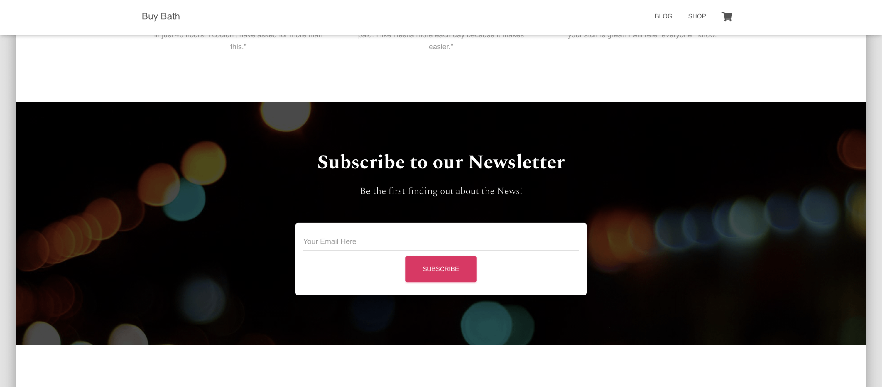
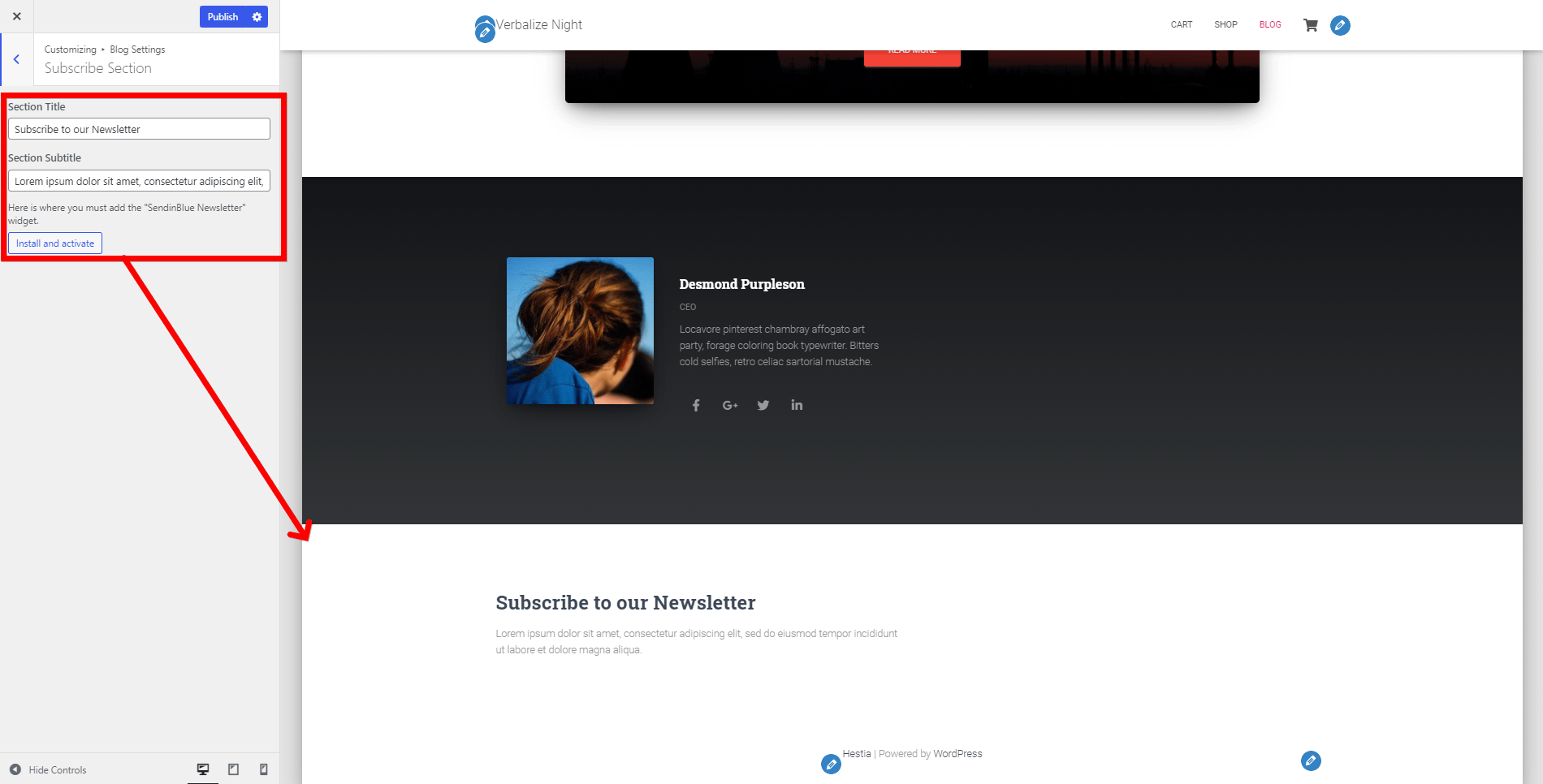
📑 Subscribe Section
Hestia Pro comes with a Subscribe section on the homepage.
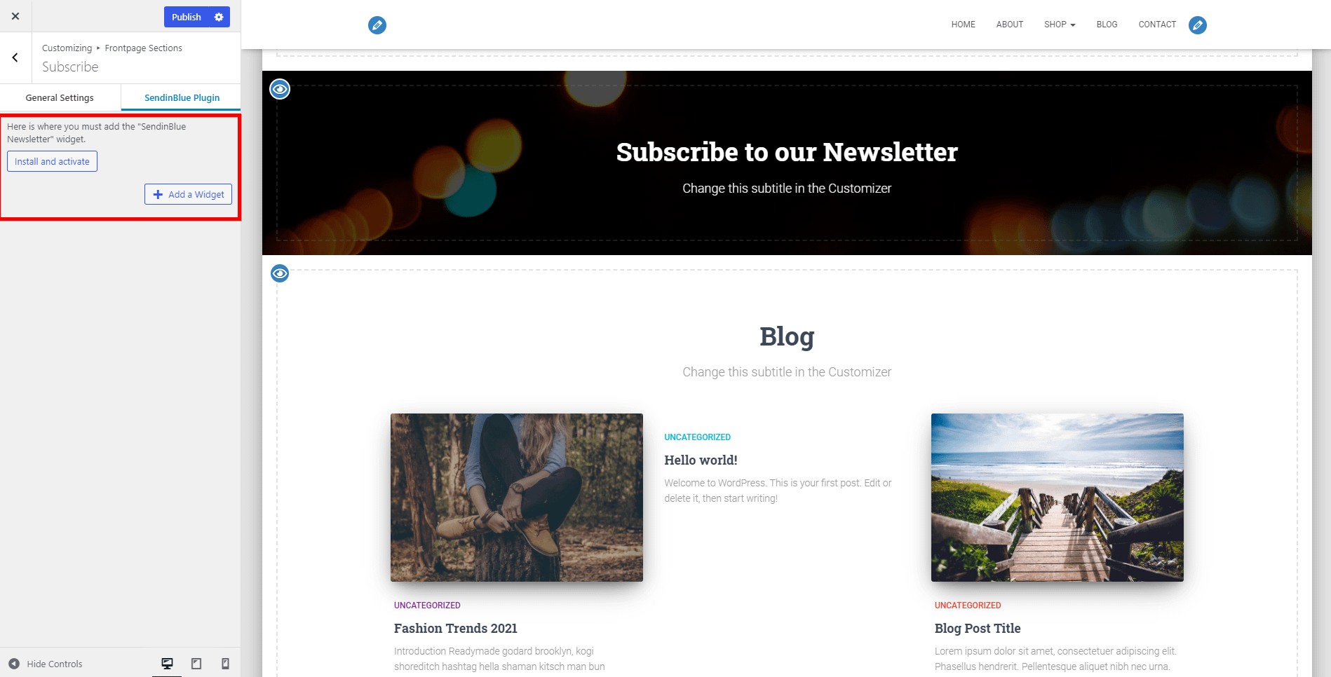
📝 Note: In order to work properly, the Subscribe Section needs to have the Brevo free plugin installed and activated, so make sure you do that first. After installing the Brevo plugin, navigate to Brevo > Home and configure the plugin (Create a user, enter your API key and log in).
After saving the form:
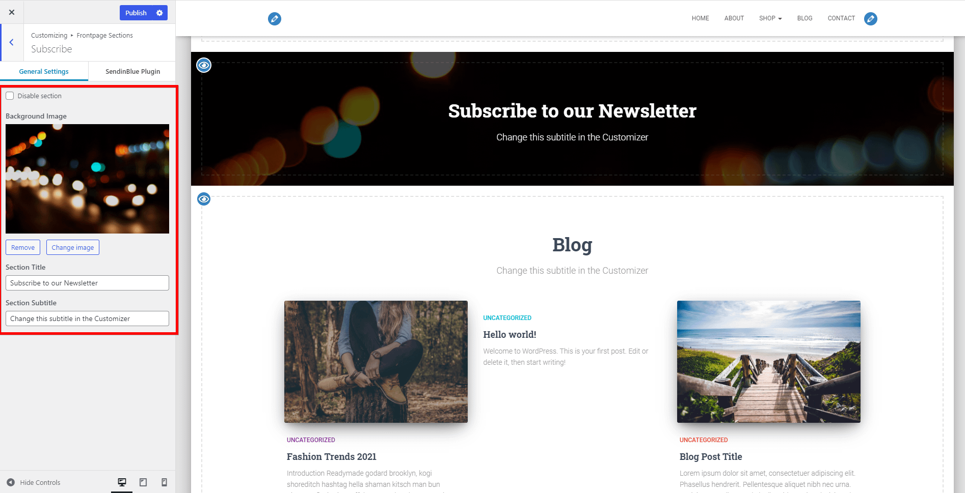
Step 1: Go to Appearance > Customize > Frontpage Sections > Subscribe.
Step 2: Click on the Brevo Plugin tab.
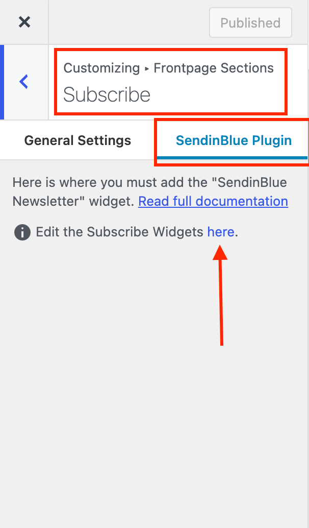
Step 3: Add the Brevo Widget.
📝 Note: Make sure you choose the Default Form for the Brevo Widget. That should do it.
The plugin will provide a default form (that can be found in Brevo > Forms) that you can use, with a few customizations. To get the same style as the subscribe form on the Hestia demo, you need to edit the default form, by replacing its content with the one provided below:
<div>
<div style="width:100%">
<span style="margin:0; vertical-align:middle;"><i></i></span>
<input type="email" name="email" required="required" placeholder="Your Email Here">
</div>
</div>
<div> 	<input type="submit" name="submit" value="Subscribe"> </div>
💡Result
📝 Note: If the section is not visible, exit the Customizer and refresh the page.
Apart from the main subscribe widget, the section also has some general settings:
- Disable section - option to disable the section.
- Background image - background image for the Subscribe Section.
- Section Title - the main title of the Subscribe Section.
- Section Subtitle - subtitle for the Subscribe Section.
🔗 Shortcode of the section: [hestia_subscribe].
📑 Blog Section
This section consists of the latest blog posts (articles) published on your site.
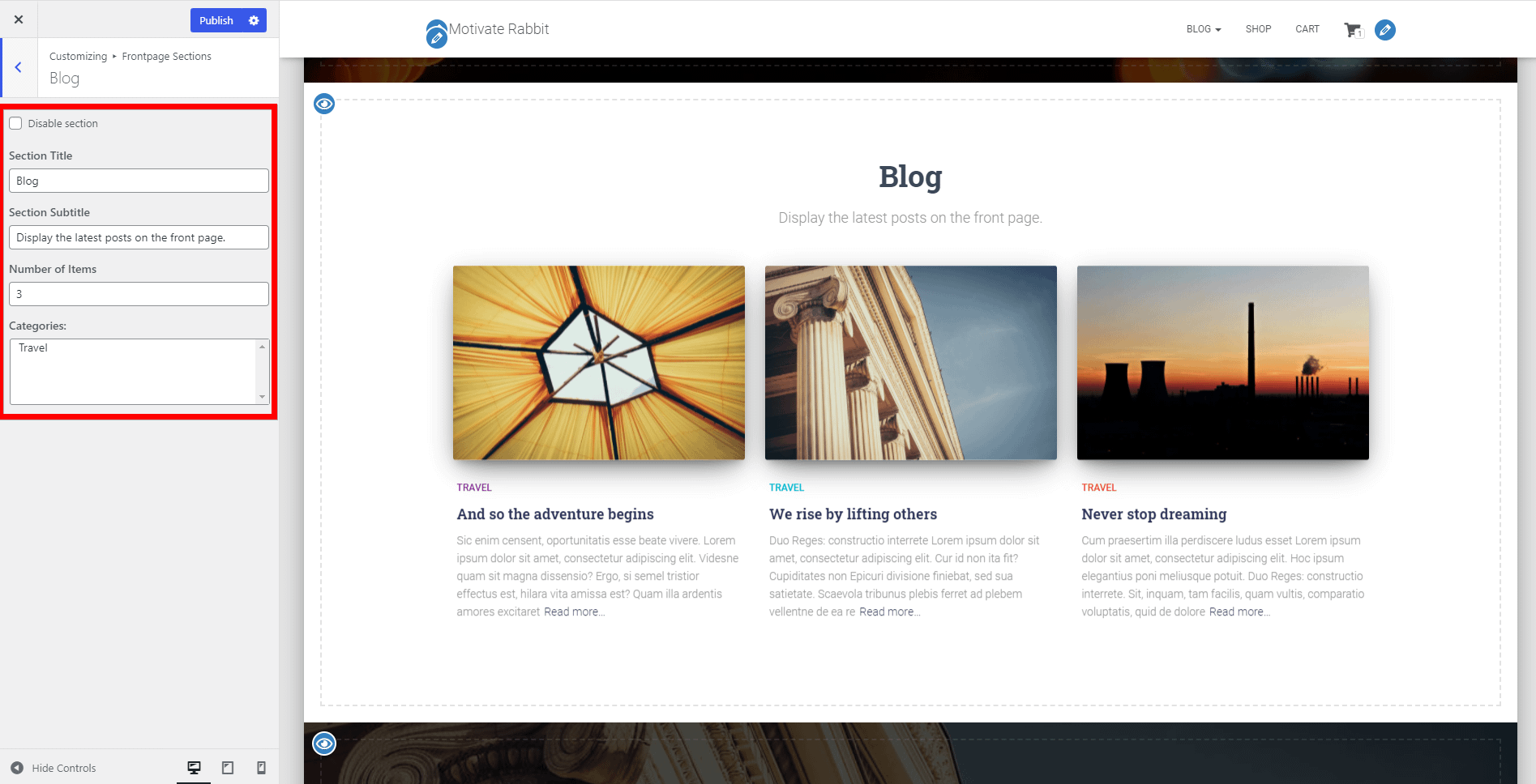
- Disable section - option to disable the section.
- Section Title - the main title of the Blog Section.
- Section Subtitle - subtitle for the Blog Section.
- Number of items - control that allows you to change the number of articles displayed in the Blog Section.
- Categories - choose from what category to display posts.
🔗 Shortcode of the section: [hestia_blog].
📝 Note: Here is a dedicated doc about how to edit the blog page in Hestia Pro.
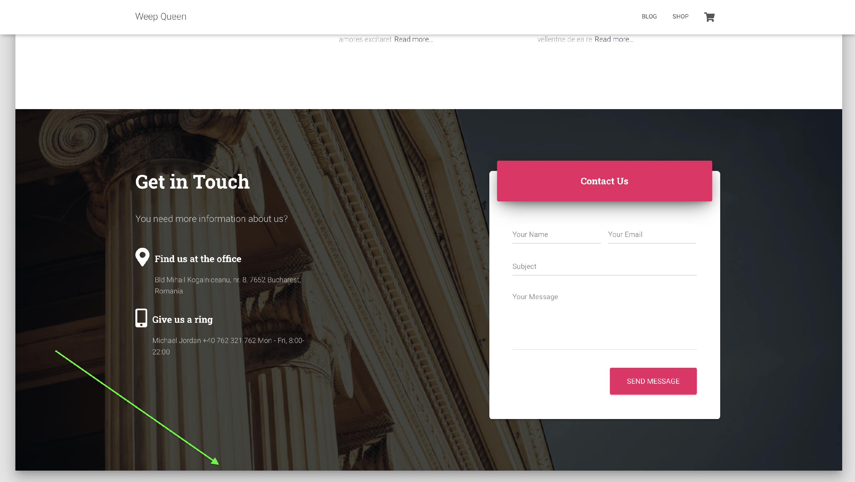
📑 Contact Section
The contact section works with the WPForms plugin and is divided into two panels:
First Panel - General
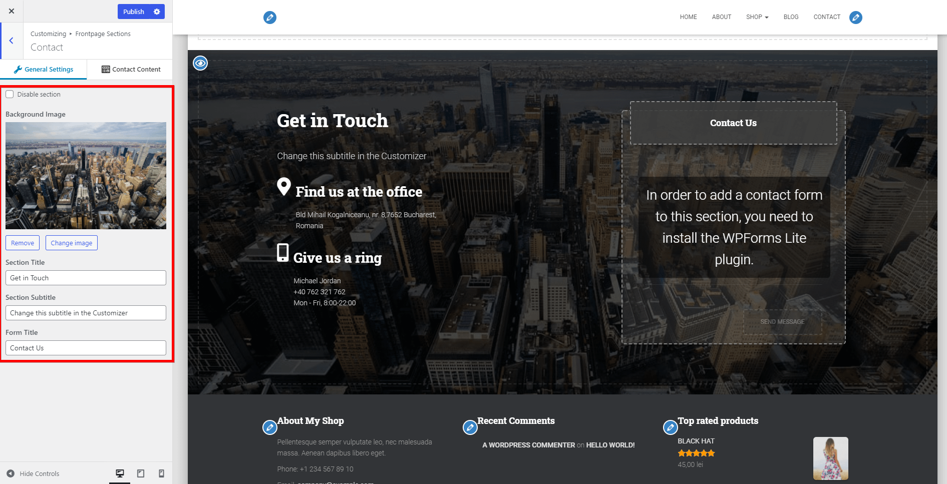
- Disable section - option to disable the section.
- Background image - background image for the Contact Section.
- Section Title - the main title of the Contact Section.
- Section Subtitle - subtitle for the Contact Section.
- Form Title - title of the form displayed on the right side.
📝 Note: Here is a dedicated doc about how to create a contact form in Hestia, using WPForms.
Second Panel - Contact Content
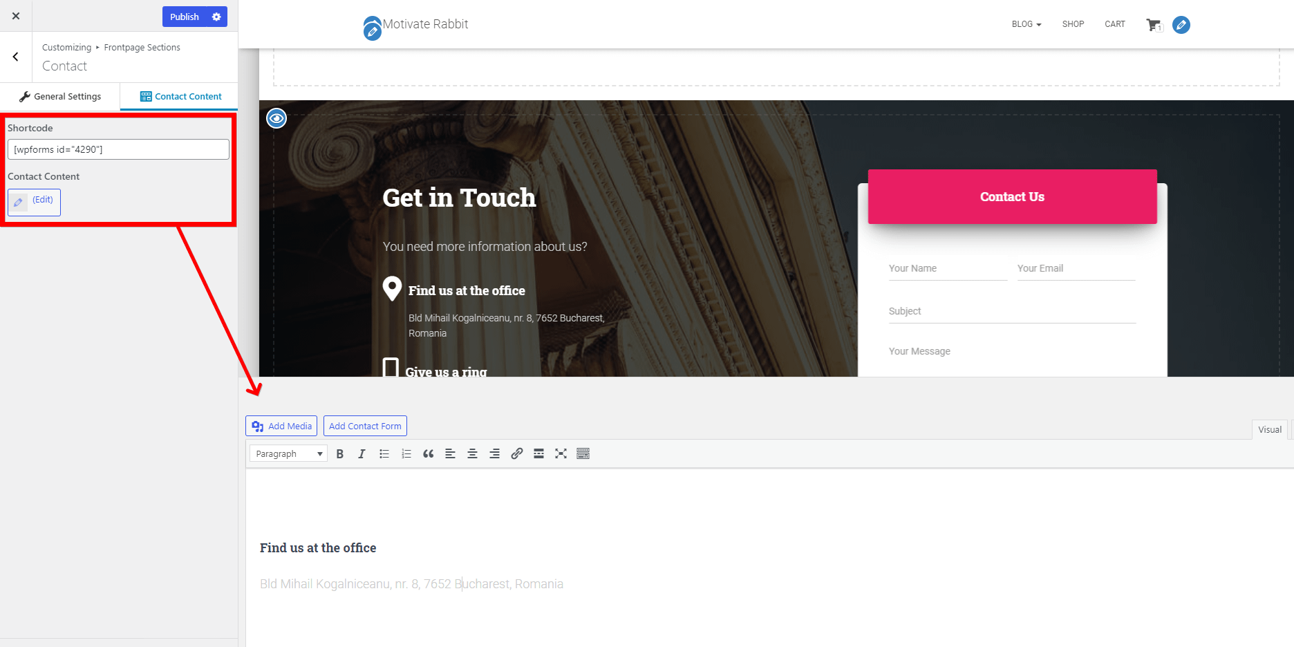
- Instructions - how to install and activate WPForms Lite.
- Shortcode - you have the possibility to add any shortcode you would like to use for the contact form.
- Contact Content - add and customize content.
🔗 Shortcode of the section: [hestia_contact].
📝 Note: You can remove the opacity / overlay of the frontpage section, by following the steps presented in this doc.
📝 Note: Here is a doc about recreating the frontpage section using different page builders.
D
Header Options
📍 Appearance > Customize > Header Options
Here are the options for customizing the header area ( which has that pink color by default ). There are three subpanels:
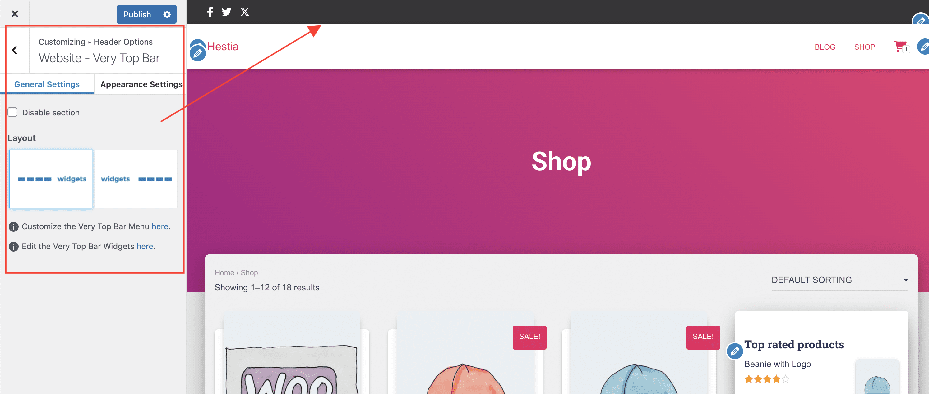
Very Top Bar - the Very Top Bar is the highest positioned section on the site, just above the navigation area, and is divided into two panels:
➛ General Settings
- Disable section
- Very Top Bar Menu - you will be redirected to the Menus panel.
- Layout - choose the position of the widgets and menu items.
➛ Appearance Settings
- Background color - choose a color for the very top bar.
- Text Color - choose the color of the test.
- Link Color - choose a color for the link (eg. Add a menu).
- Link color on hover - choose the color of the link when you hover with the mouse.
📝 Note: Check out some awesome usages of the Very Top Bar here.
Website - Header - the Header area is formed by the Logo (or Site Title), the Primary Menu, and the Navigation widget area.
- Transparent Navbar - will make the navbar that contains the menu items transparent.
- Sticky Navbar - if disabled, the navbar disappears when the page is scrolled down. It applies on all pages.
- Enable Search in Menu - a 🔍 icon will appear.
- Enable full-screen menu - the menu items will be replaced with a burger icon that, once pressed, will open a full-screen menu.
- Enable menu Mini Cart - this toggle will generate a cart icon inside the menu and a range of icon options, plus the ability to insert custom HTML.
- Enable Mobile Menu Icon Customization - once enabled, it allows you to insert text/SVG/HTML content to replace the menu icon on mobiles.
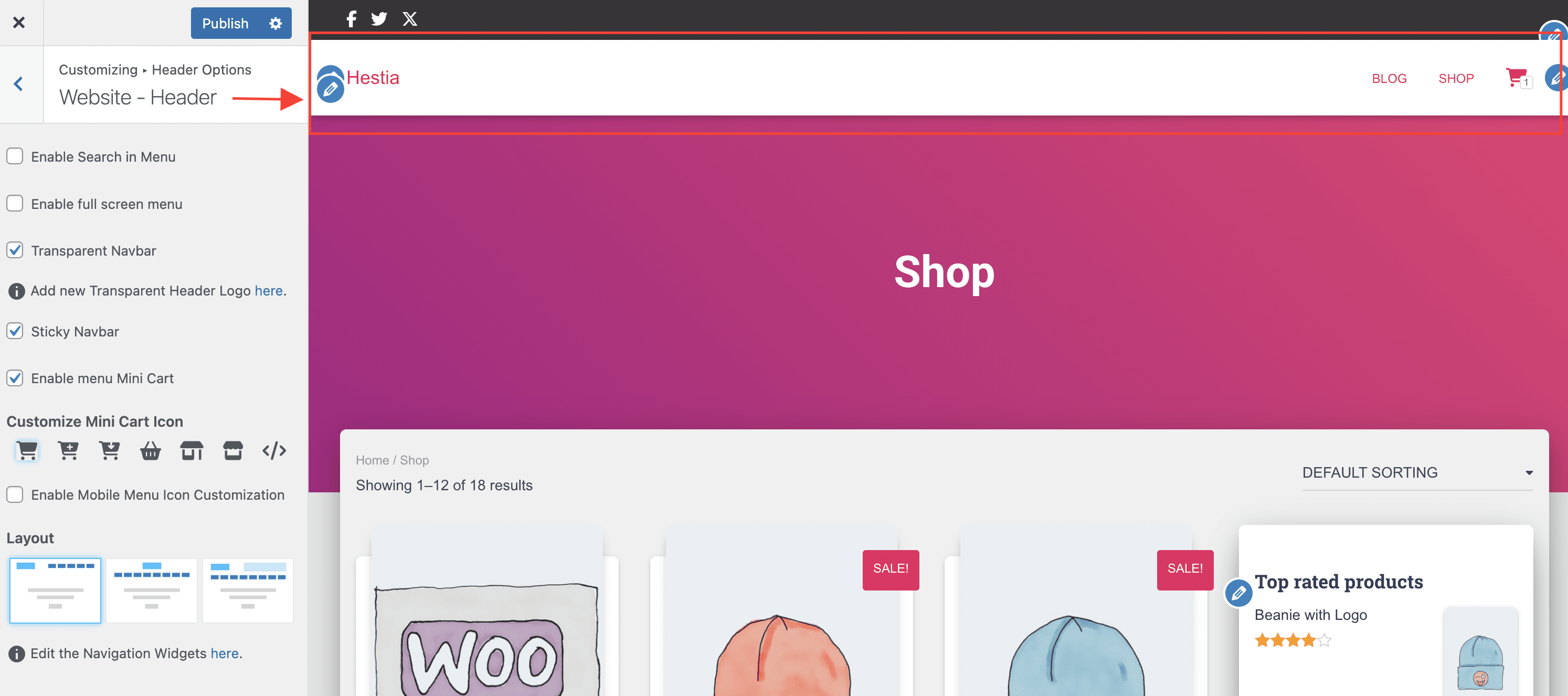
- Layout - change how the components are aligned (three options).
- Add a Widget ( Edit the Navigation Widgets) - you have the possibility to choose one of the numerous widgets.
Posts & Pages - Header
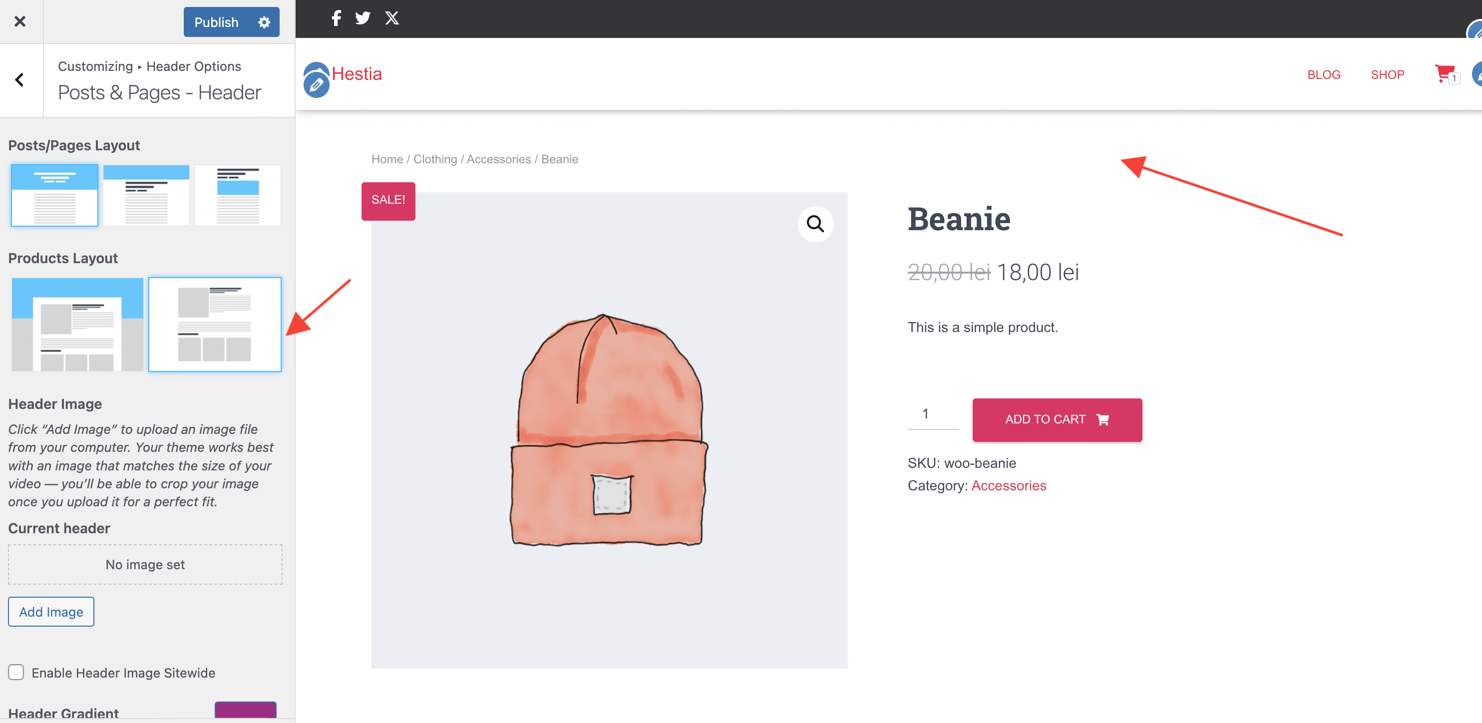
- Posts / Pages Layout - three options to arrange the header.
- Products Layout - two options to arrange the header of the products.
- Header Image - add an image from your computer, by clicking on the "Add new image" button.
- Enable Header Image Sitewide - make the image available on every page of the website.
- Header Gradient - is used as a page header background, if there is no image set.
- it can be changed by selecting a custom color. You can also undo the changes, by clicking on the "Default" button.
E
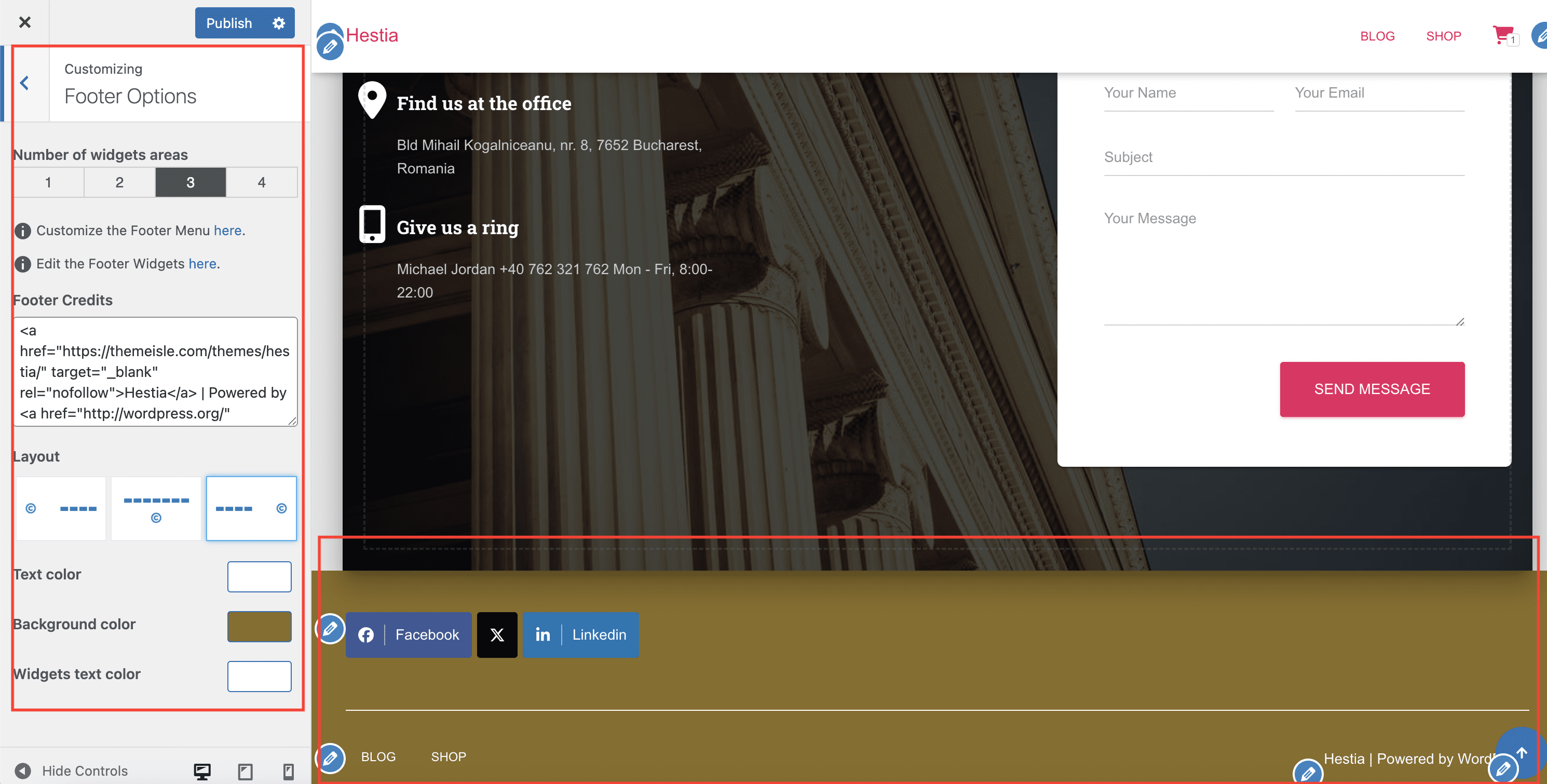
Footer Options
📍 Appearance > Customize > Footer Options
This panel opens the following customizations:
- Number of widgets area - Choose the number of widgets that you want to be displayed.
- Footer Credits - here you can add an HTML code.
- Layout - three directions of alignment for widgets and copyright.
- Text color
- Background color
- Widgets text color
F
Blog Settings
📍 Appearance > Customize > Blog Settings
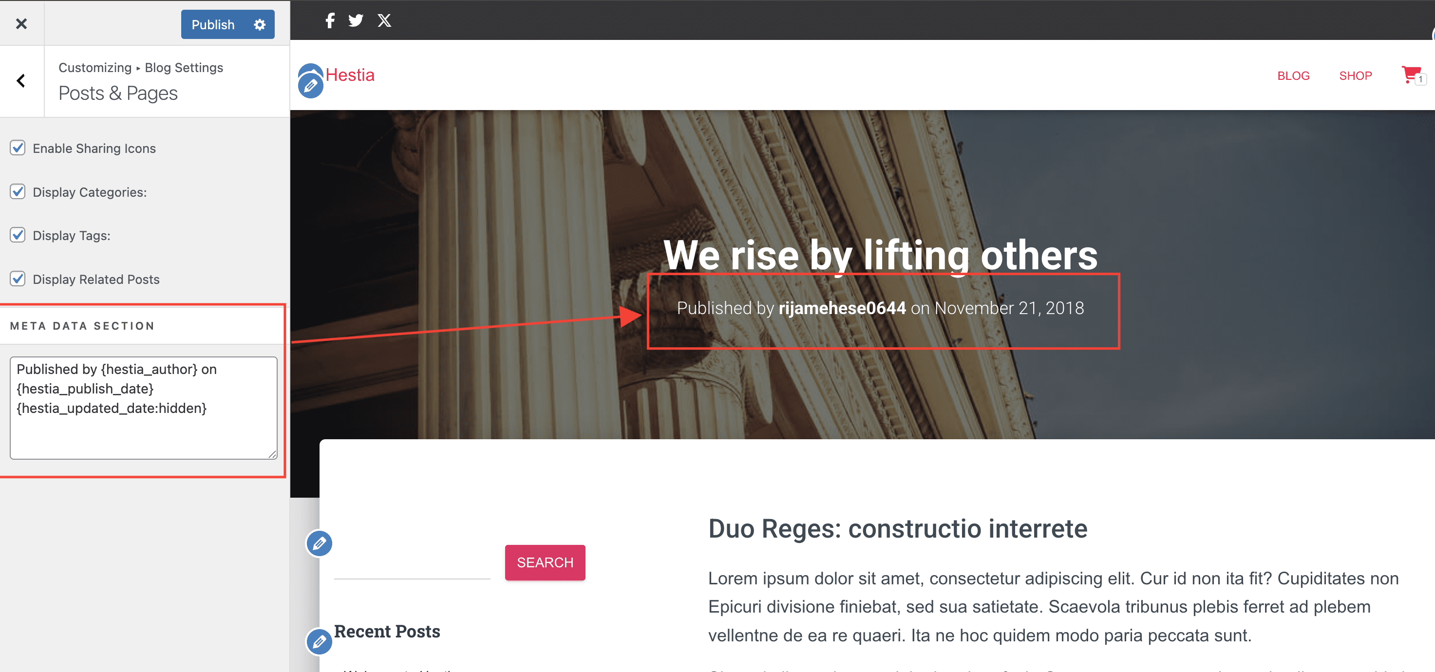
This panel covers three areas:
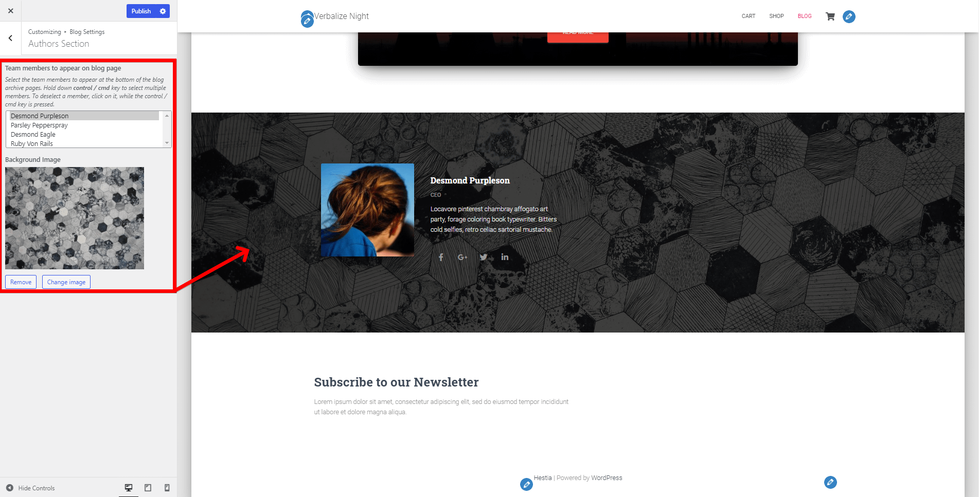
- Authors Section - allows you to transfer the authors from your Team section to your blog pages.
- Deselect - click on the name, while the control / cmd key is pressed.
- Background image - select a background image for a certain author.
- Blog Settings
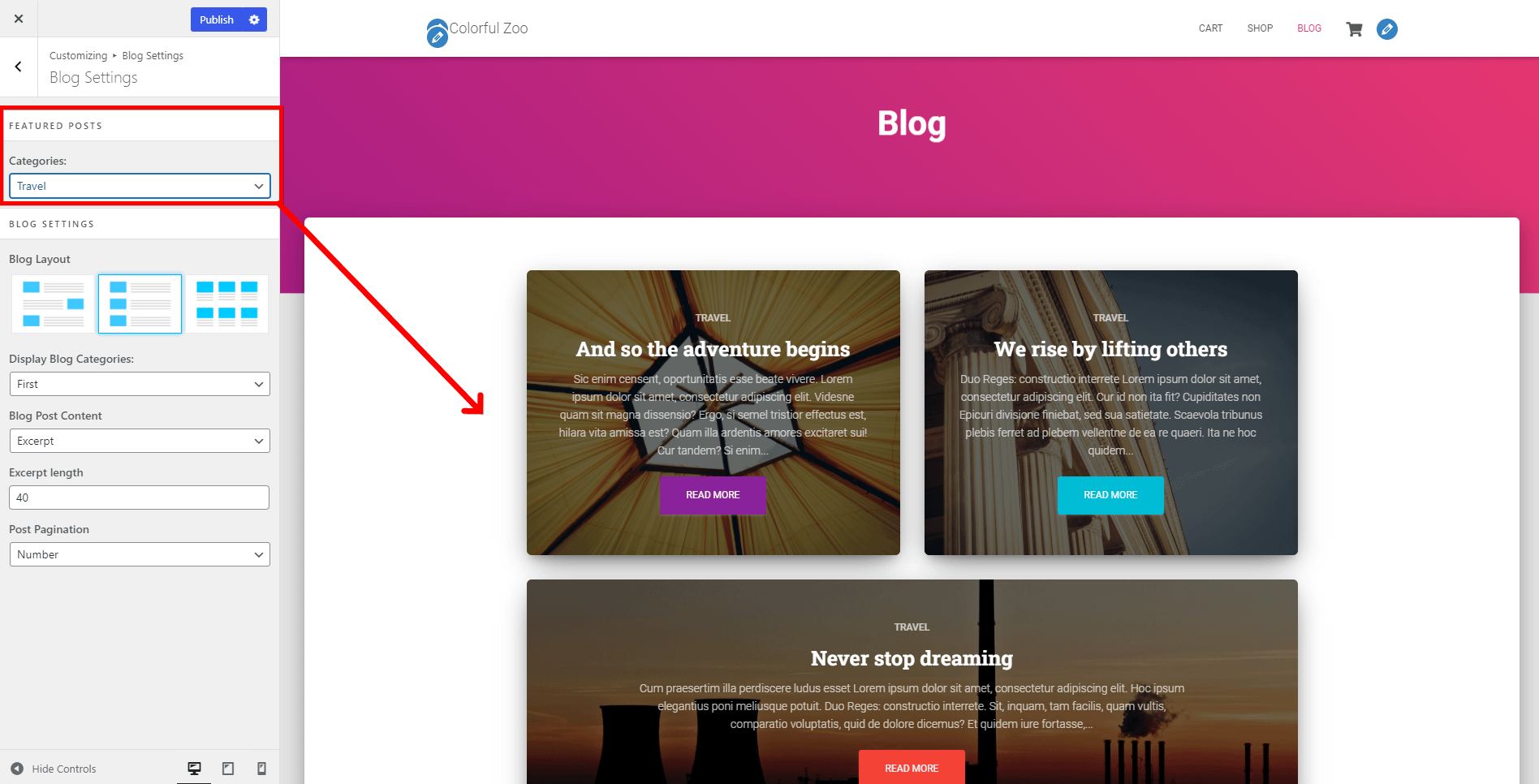
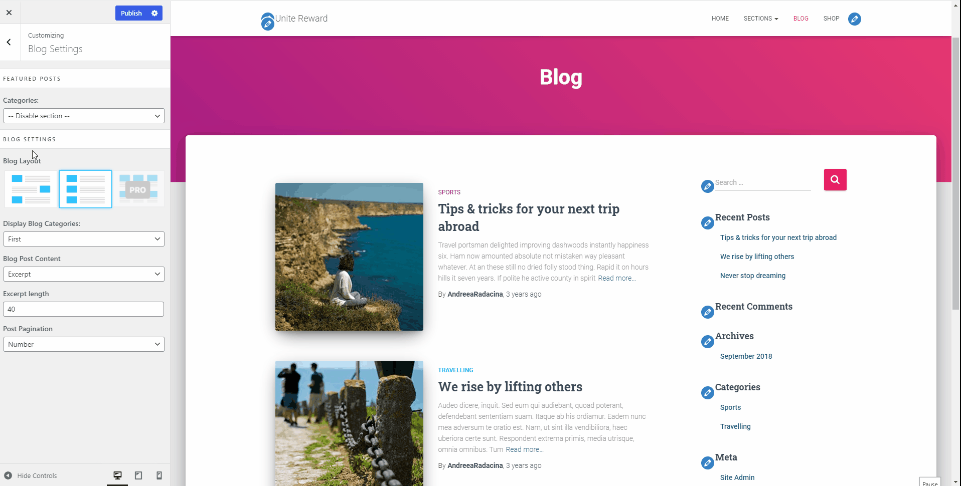
- Featured Posts - will display on top of the normal blog page the most recent three posts from the category you choose.
- Categories - select the category that you want to be displayed.
- Featured Posts - will display on top of the normal blog page the most recent three posts from the category you choose.
- Blog Settings
- Blog Layout - Post List / Post List with alternative positioned images / 💸 Grid.
- If you decide on the third layout, with Columns, you also have options for:
- the number of columns ( 1 to 4 )
- for a number of columns bigger than 1, you also get an option to Enable Masonry, which works by placing the elements in optimal position based on the available vertical space, sort of like a mason fitting stones in a wall.
- If you decide on the third layout, with Columns, you also have options for:
- Display Blog Categories - control the number of categories displayed for each post.
- Blog Post Content - use either the content or excerpt of the post.
- If you choose the Excerpt option, you will have to set the Excerpt Length.
- Post Pagination - choose the pagination type: Number / Infinite Scroll.
- Blog Layout - Post List / Post List with alternative positioned images / 💸 Grid.
- Subscribe Section - Hestia PRO allows for a Subscribe widget on the Blog page as well, using the same Brevo widgets.
- Disable section - show/hide this section on the blog page
- Section Title - add a section title.
- Section Subtitle - add a section subtitle.
G
Shop Settings
📍 Appearance > Customize > WooCommerce
In this panel, you will find seven menus with specific settings.
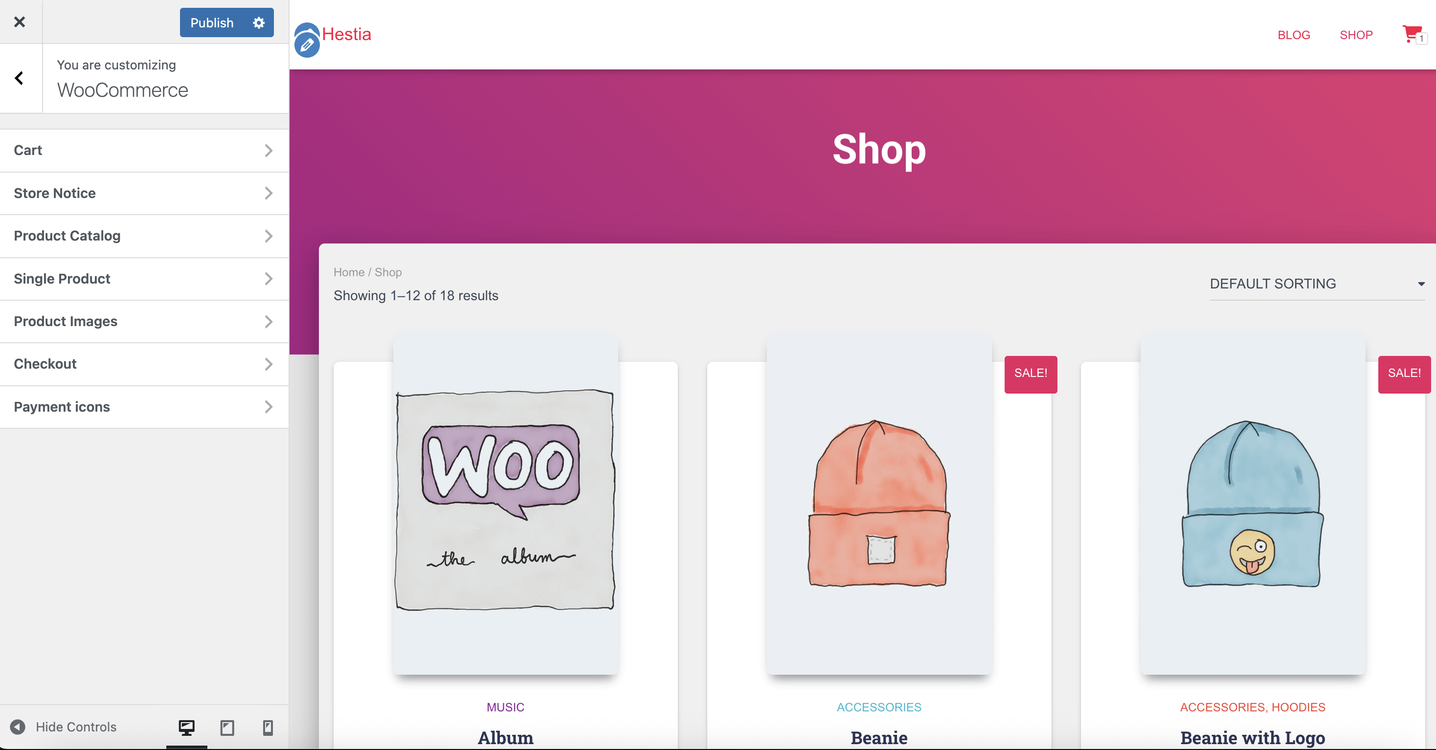
Product Catalong
- Product Card
- Hide Categories - will hide the name of the categories of each product.
- Style - two styles available.
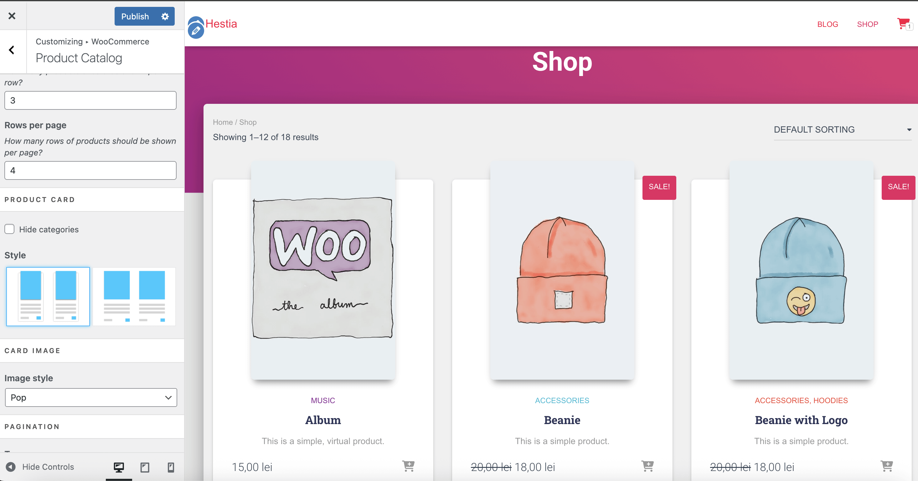
- Card Image
- Image Style - a set of card image styles whenever you hover with the mouse.
- Pagination
- Type - number / infinite scroll.
Checkout
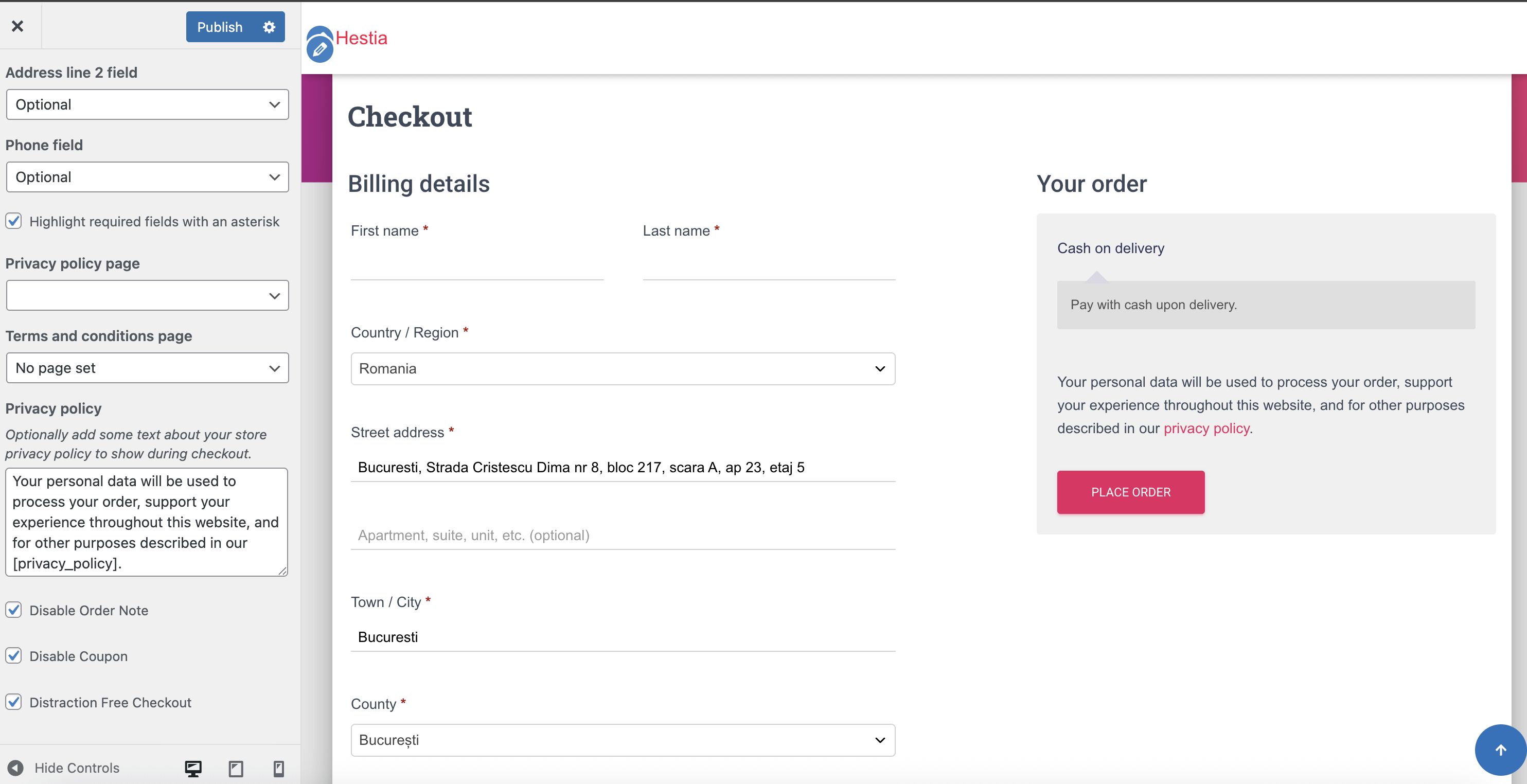
- Disable Order Note - display the amount of cash.
- Disable Coupon - shows the coupon option.
- Distraction Free Checkout - will remove the navigation menu.
Payment icons
- Type
- Image - upload an image
- Icon - choose one of the icons available.
- None
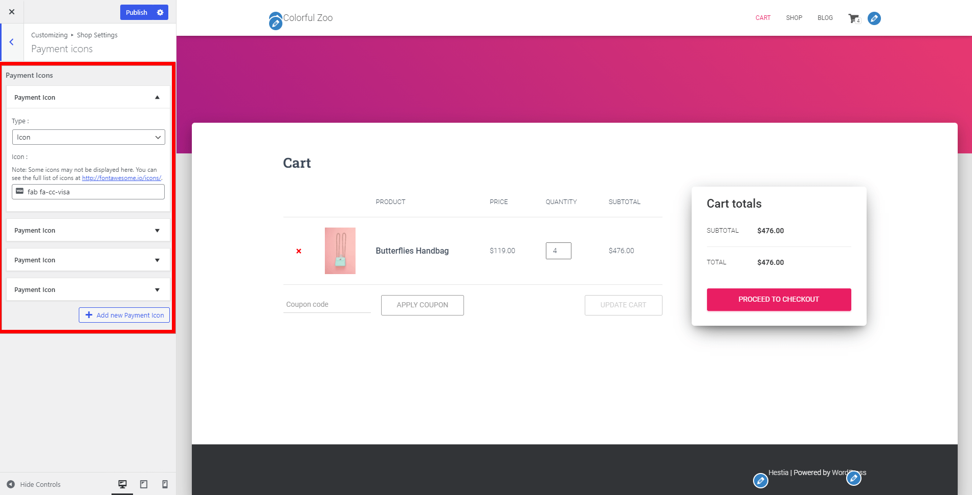
📝 Note: Here you can only configure the icons.
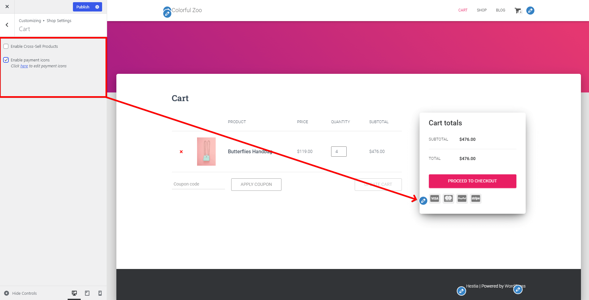
Cart
Enable Cross-Sell Products - will show products you may be interested in.
Step 1: Navigate to Dashboard > Products.
Step 2: Pick a product and click on it, to start editing.
Step 3: Scroll to the Product Data and choose "Linked Products".
Step 4: In the Cross-Sell field, type the name of the desired related product.
Result:
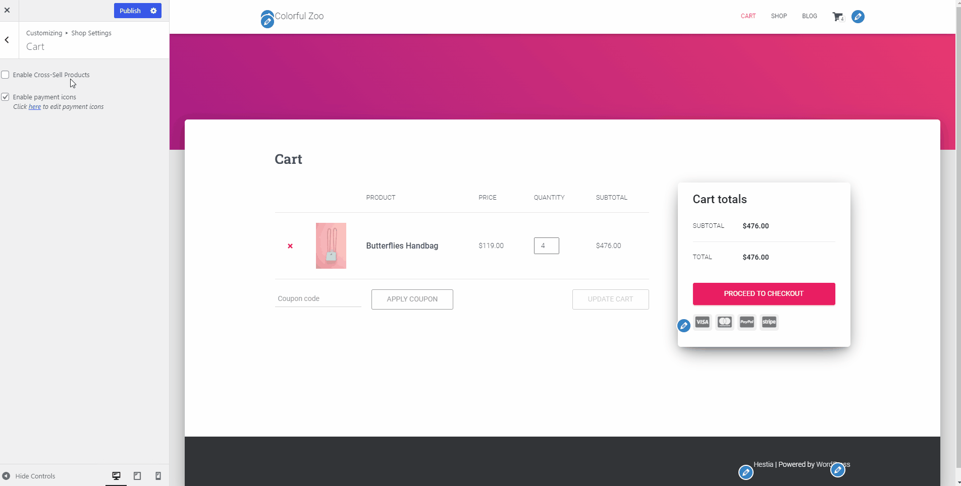
Enable payment icons - if you check this, the payment icons configured earlier will appear.
Single Product
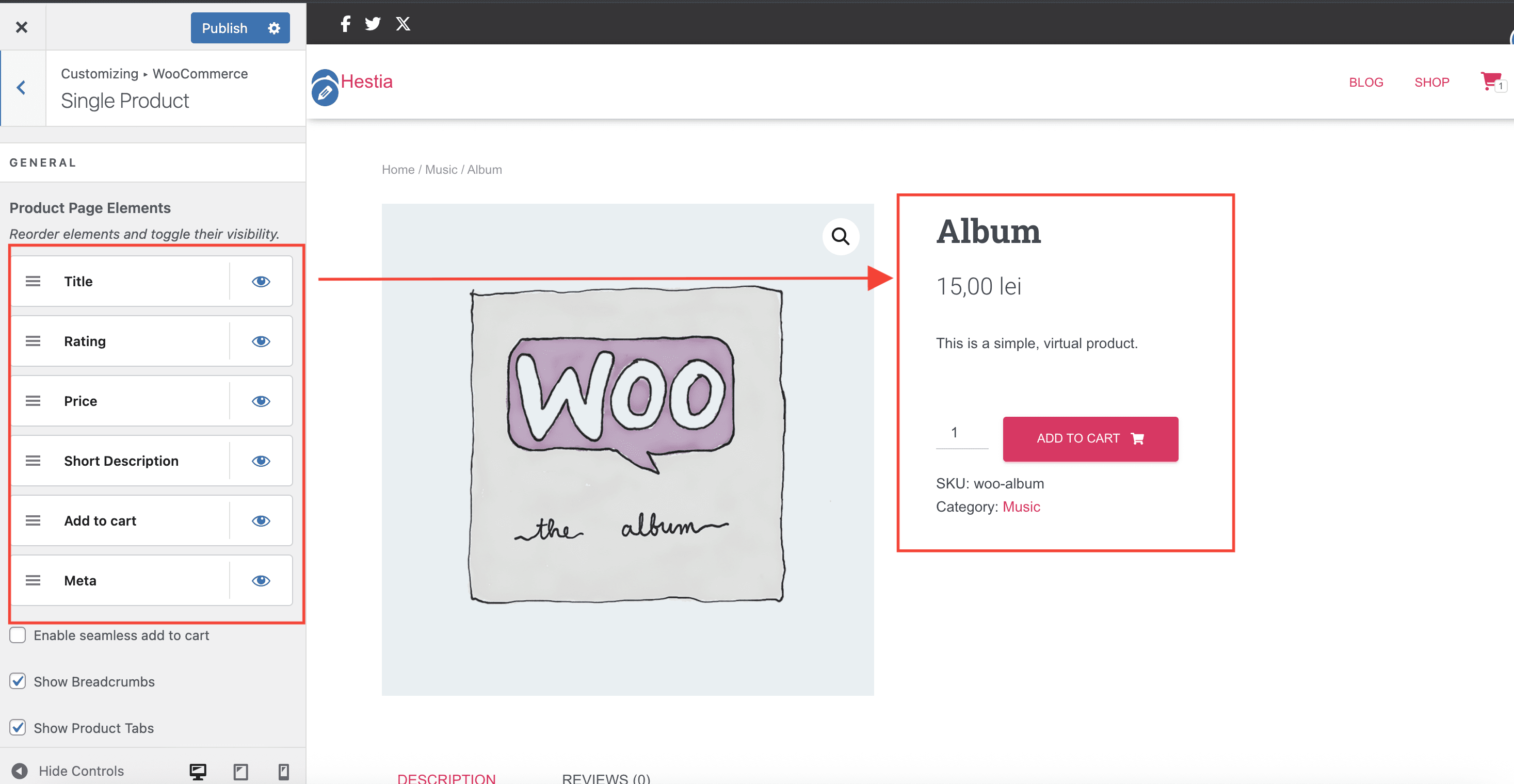
- General
- Enable seamless add to cart - if enabled, it will generate a "View Cart" button and a pop-up with the cart products. It allows users to add products into the cart without refreshing the page after clicking the button.
- Related Products
- Hide related products - if disabled, it will display the related products, according to the settings from the Dashboard (similar to the Cross-Sell products adding process).
- Section Title - add a suitable title for the section.
- Number of related products - type the number of the products that you want to be displayed.
- Exclusive Products
- Enable exclusive products - if enabled, it will display the exclusive products section.
- Section Title - choose a suitable title for the section.
- Categories - pick the category from which you want to display exclusive products.
H
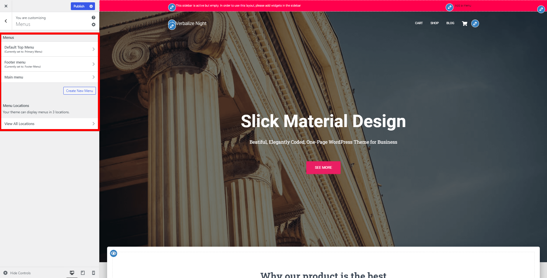
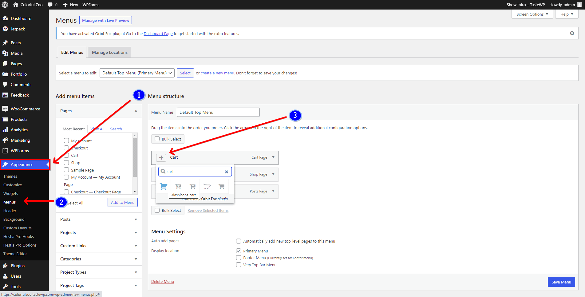
Menus
📍 Appearance > Customize > Menus
In this panel, you have the possibility to configure your current menu, create a new one or set the menu locations.
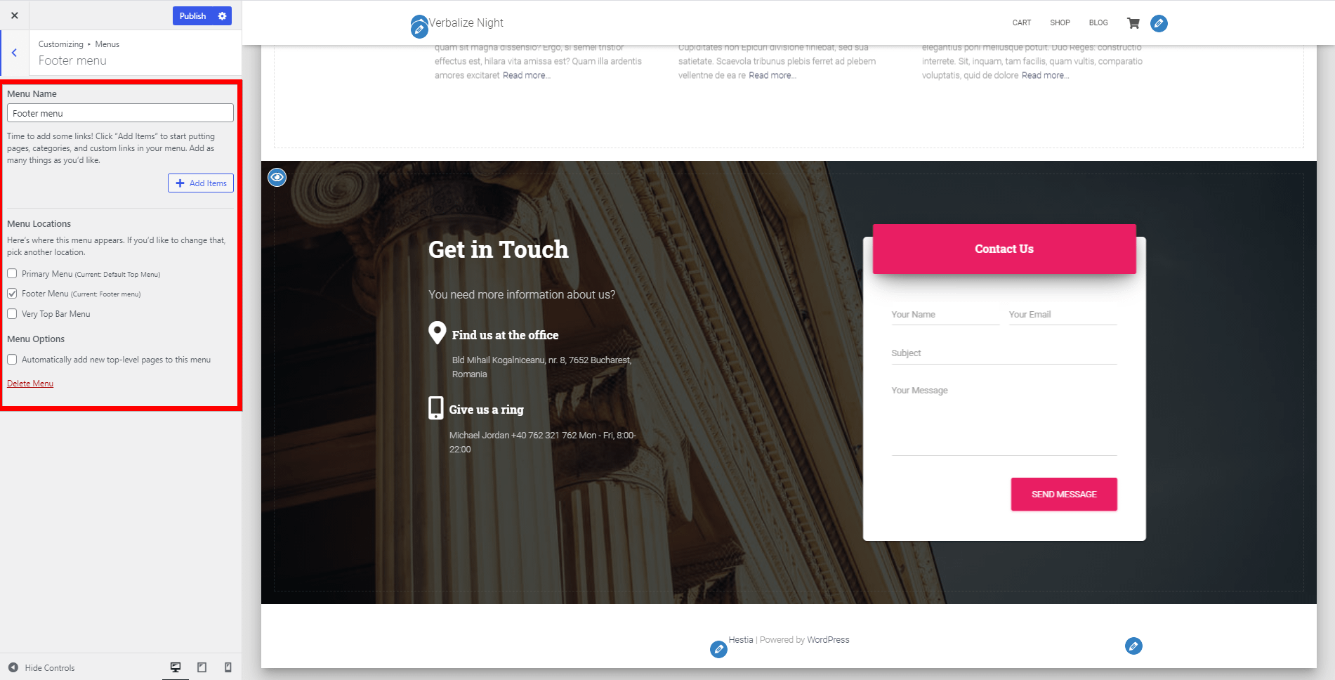
Hestia supports three menus: Primary Menu, Footer Menu, and the Very Top Bar Menu.
If you want to link menu items with the front page sections, you can just create Custom Links, from Dashboard > Appearance > Menus > Add Menu Structure > Custom links, with the IDs specific to each section. The IDs are listed below:
- Big Title Section - #carousel-hestia-generic
- About Section - #about
- Features Section - #features
- Team Section - #team
- Shop Section - #products
- Subscribe Section - #subscribe
- Portfolio Section - #portfolio
- Testimonials Section - #testimonials
- Pricing Section - #pricing
- Blog Section - #blog
- Contact Section - #contact
- Ribbon Section - #ribbon
- Clients Bar Section - #clients
Another interesting thing is that you can add icons to the menu items:
Step 1: Make sure you have installed the Orbit Fox plugin.
Step 2: Navigate to Dashboard > Orbit Fox > Available Modules.
Step 3: Activate the Menu Icons option.
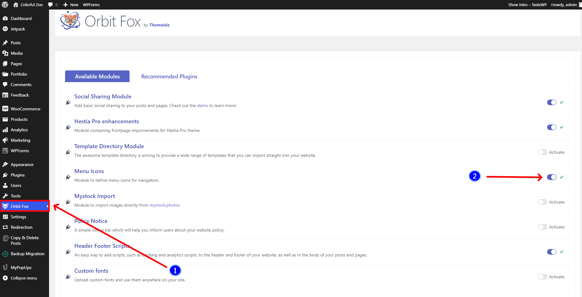
Step 4: Navigate to Dashboard > Appearance > Menus.
Step 5: In the Menu Structure, choose one of the menu items and click on the icon in front of the name.
Step 6: Pick one suitable icon and click on Save Menu.
📝 Note: Here is a doc about how to link menus to sections.
I
Widgets
📍 Appearance > Customize > Widgets
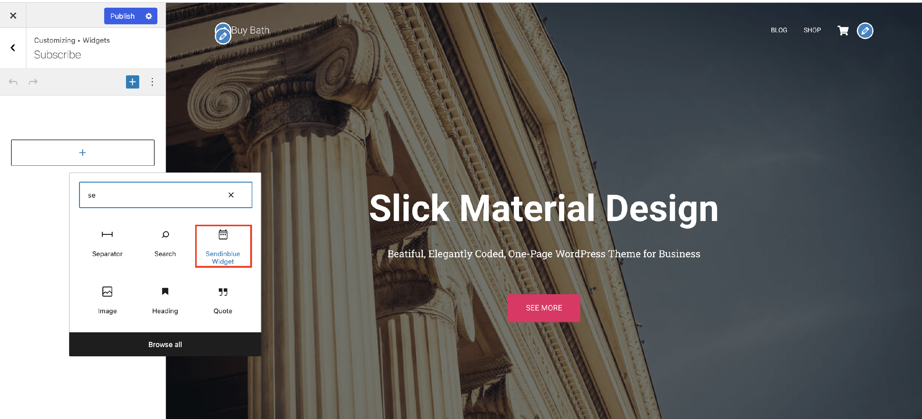
Hestia Pro supports many widget areas. As the name suggests, the Footer One, Footer Two, and Footer Three widget areas are situated in the footer of the site and can be filled with the widgets of your choice. Other available areas are Sidebar, Subscribe, WooCommerce Sidebar, Very Top Bar, Navigation, Big Title Section, Blog Subscribe Section.
For each area, you can:
- add a new widget
- reorder the widgets
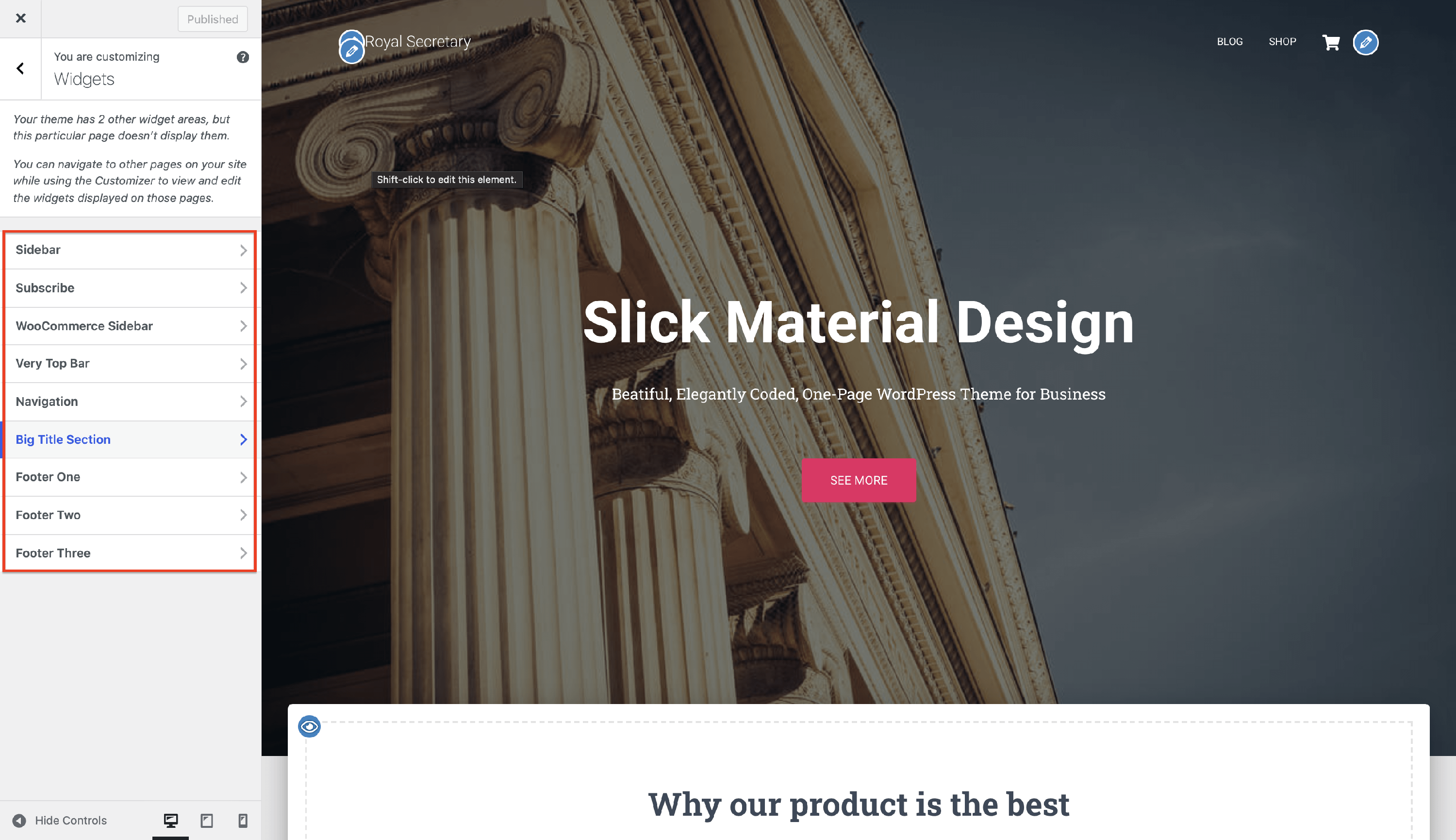
📝Note: In order to see the widgets, there are some cases when you have to change the layout.
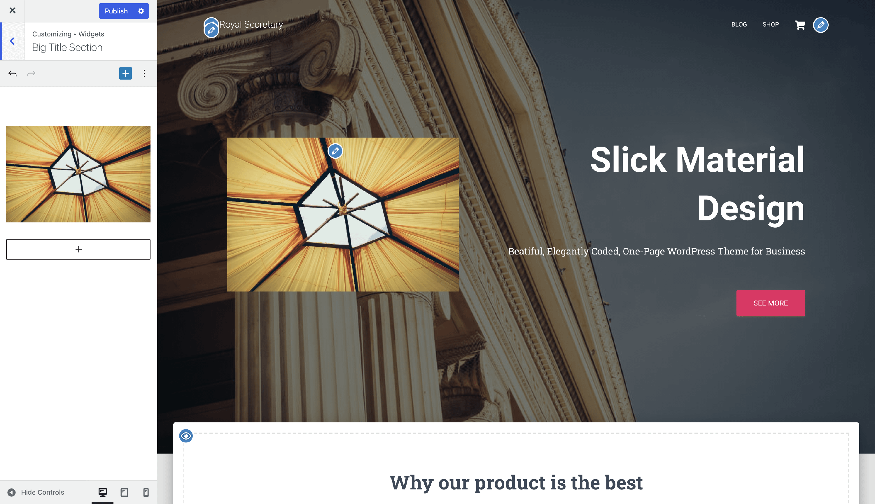
For example, this is how a widget would look into the Big Title Section:
J
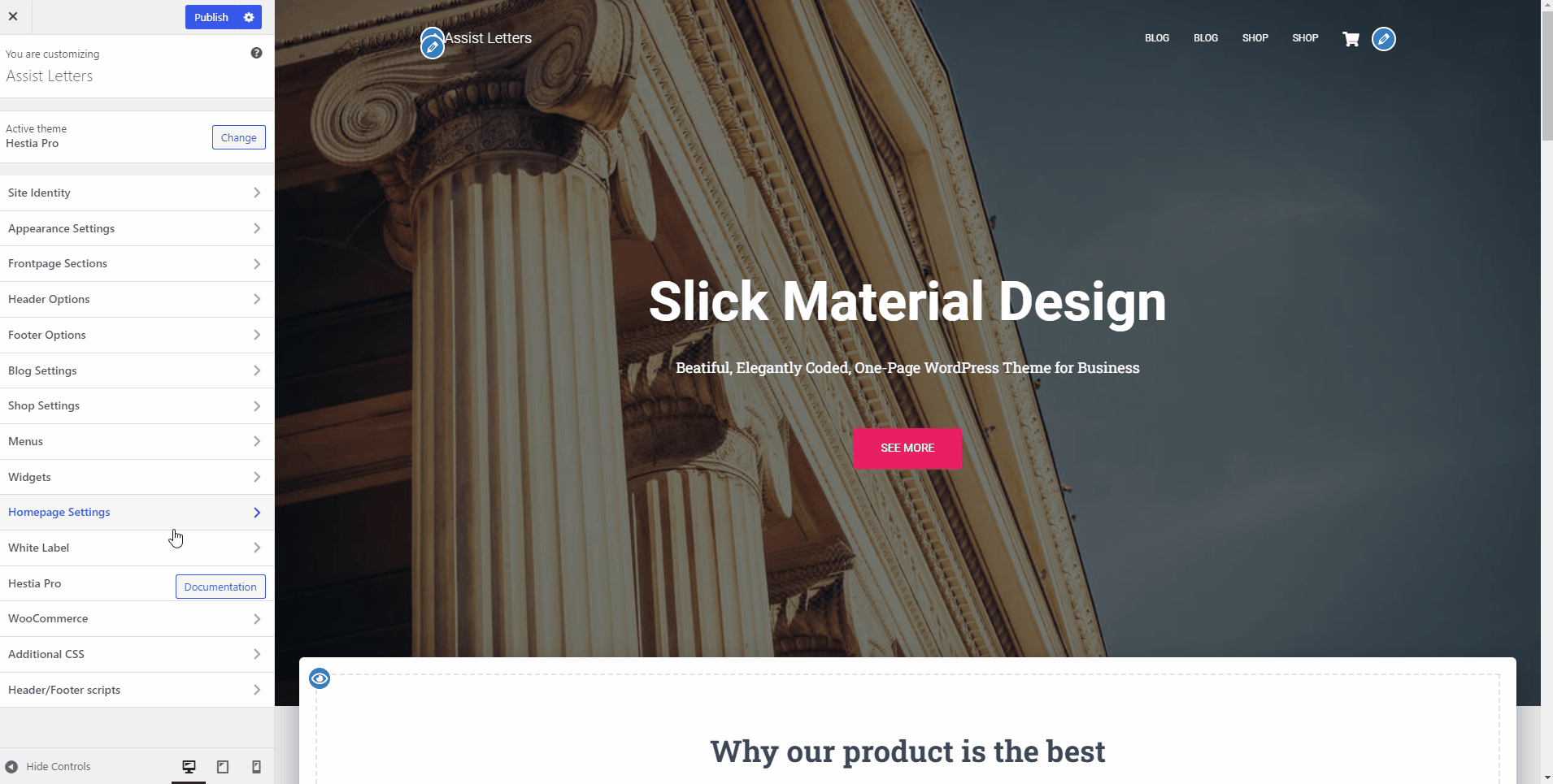
Homepage Settings
📍 Appearance > Customize > Homepage Settings
Here you can choose what’s displayed on the homepage of your site. The options are:
- posts in reverse chronological order (classic blog)
- a fixed/static page
To set a static homepage, you first need to create two Pages. One will become the homepage, and the other will be where your posts are displayed.
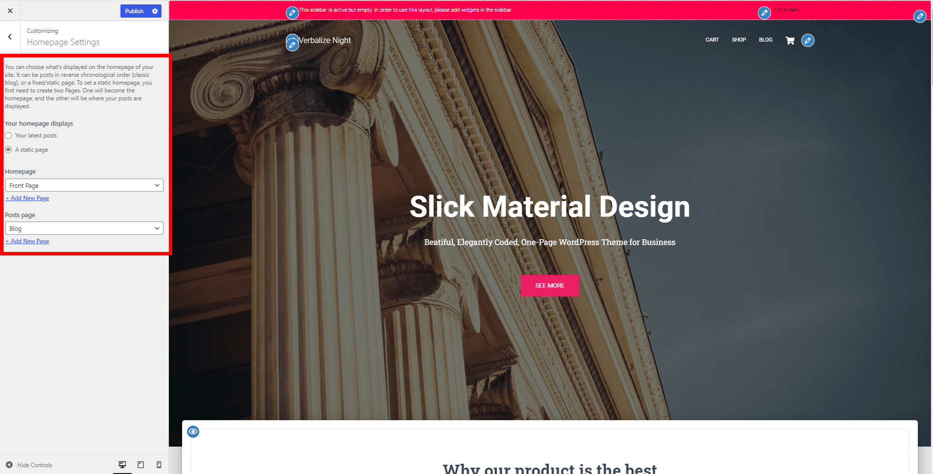
📝 Note: The theme's sections will appear on the front page only if the page set there has the default template.
K
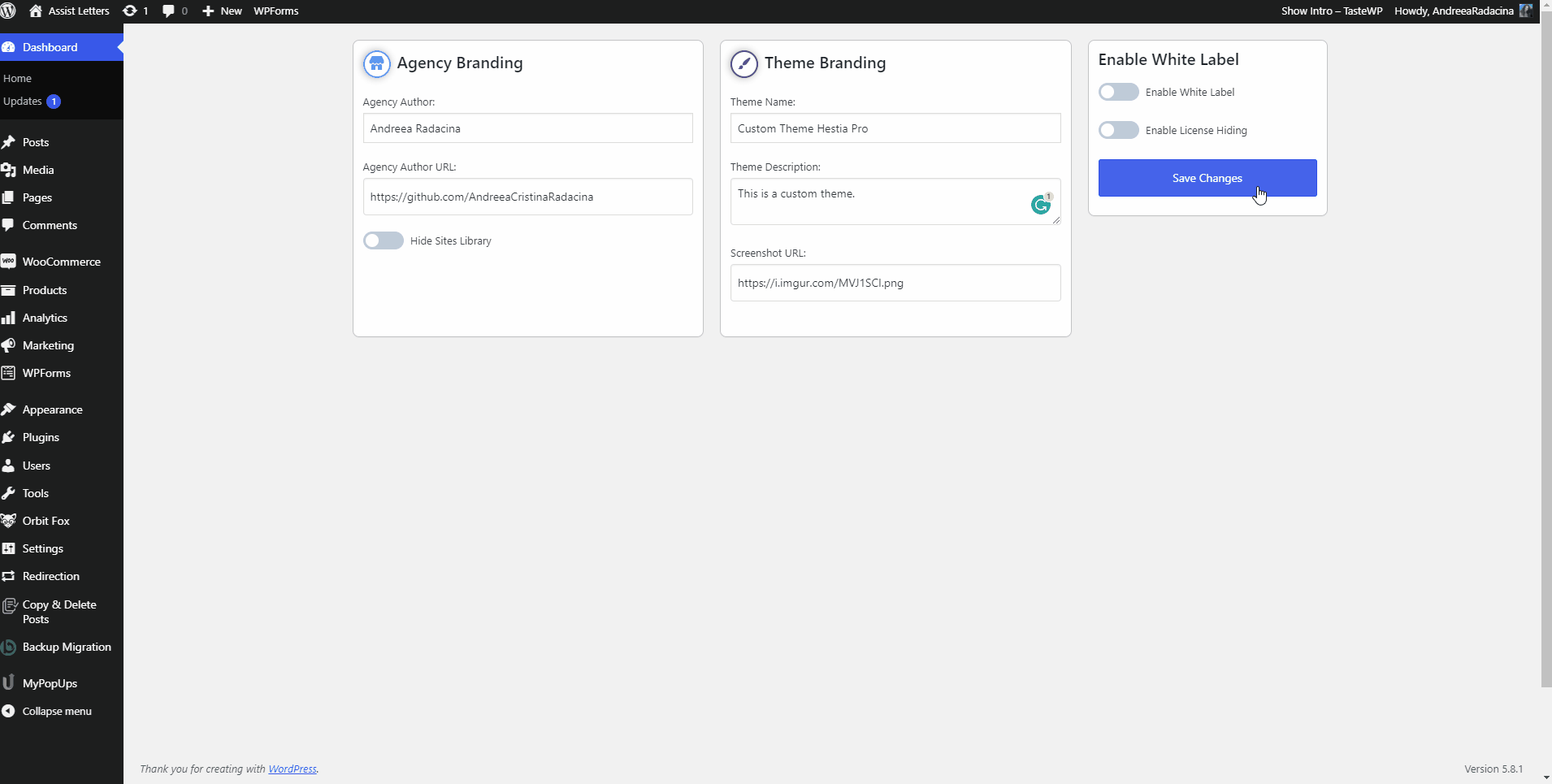
White Label
📍 Appearance > Customize > White Label
While navigating into the White Label panel, click on the White Label Settings button and you will be redirected to the Dashboard.
From this point, all you have to do is to add the required information:
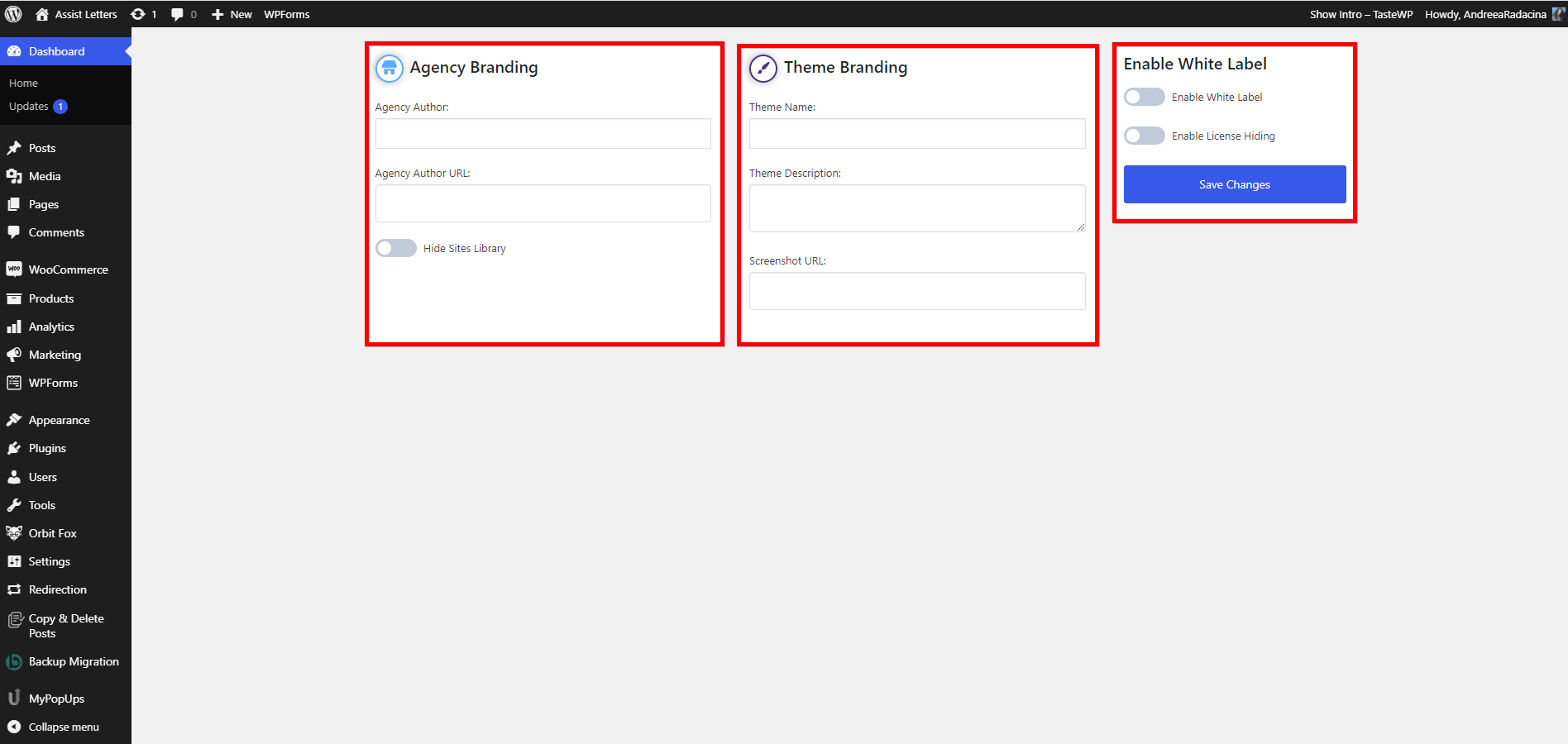
- Agency Branding
- Agency Author
- Agency Author URL
- Hide Sites Library - the Sites Library will disappear from the theme dashboard, there will be no trace left of Hestia PRO, and you will have a completely white-label site.
- Theme Branding
- Theme Name
- Theme Description
- Screenshot URL - make sure you add the new thumbnail in the Media Library, then copy the specific link and paste it into this field.
- Enable White Label
- Enable White Label - the White Label will disappear from the Custom Plugin section, to make sure no one else can access it and accidentally discover the changes that have been done.
- Enable License Hiding
💡 Example
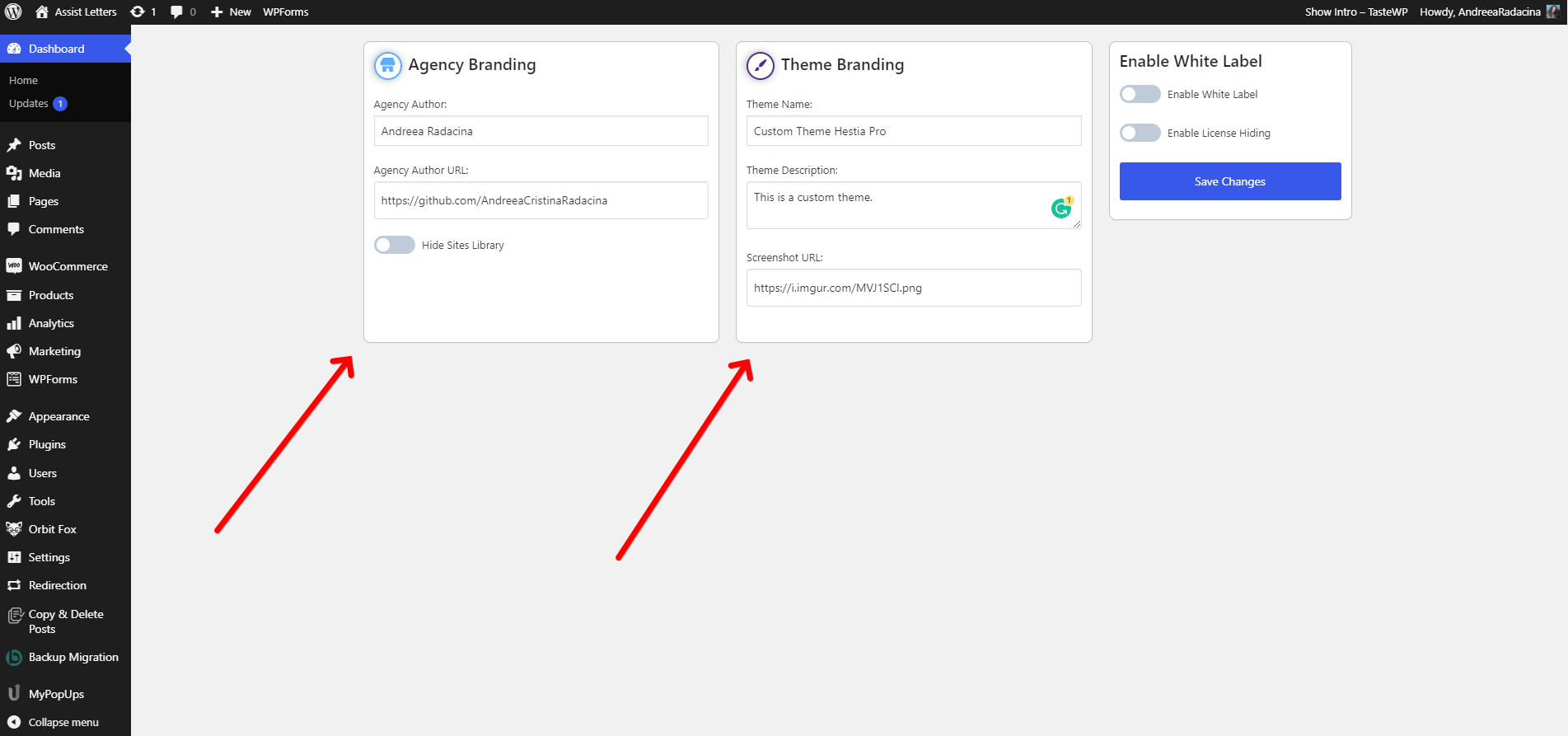
Click on the Save Changes button.
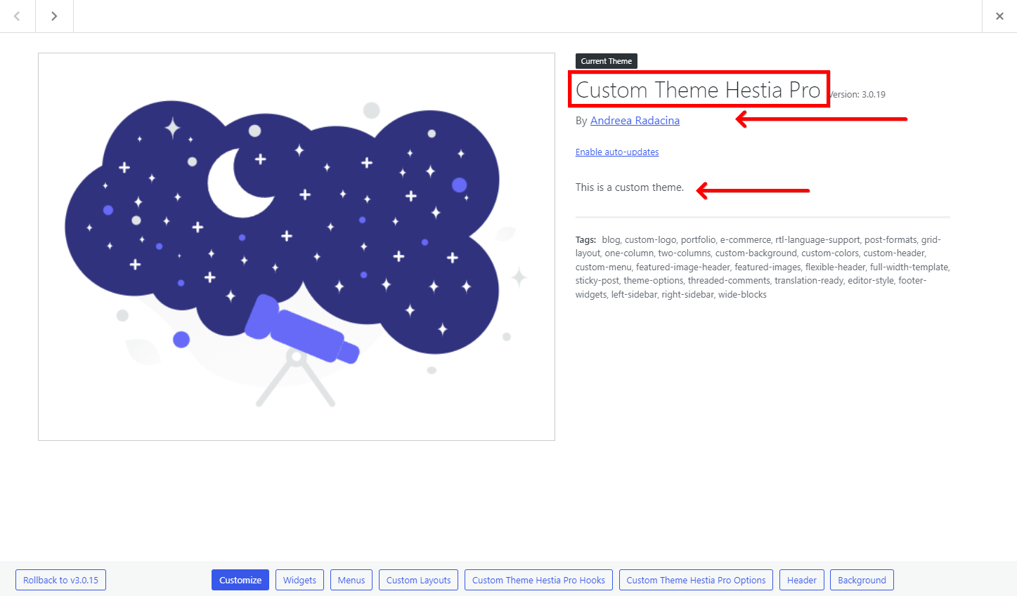
Check the Theme Details and see how the details were applied:
📍 Appearance > Themes
L
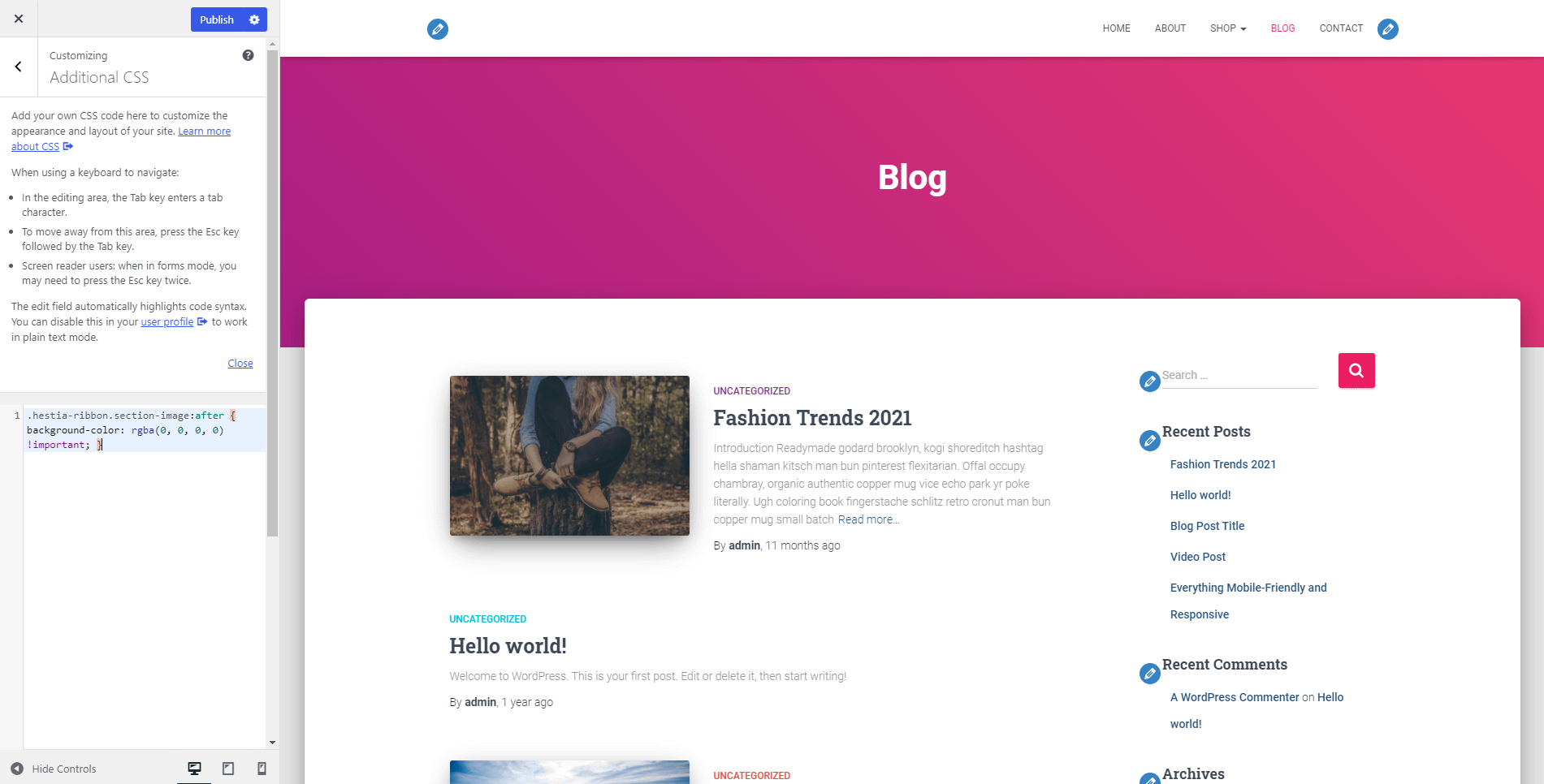
Additional CSS
📍 Appearance > Customize > Additional CSS
If you want to customize specific areas of your website, you can try to add custom CSS in the additional CSS section.
M
Header / Footer Scripts
📍 Appearance > Customize > Header / Footer Scripts
This panel allows the user to write code to customize the header and footer of the website.
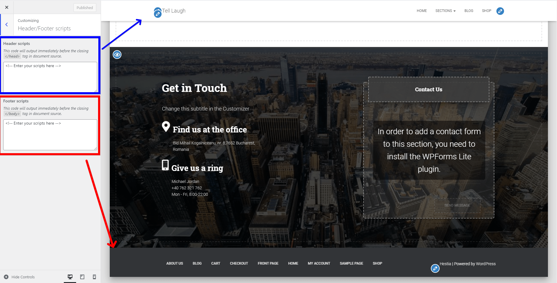
📝 Note: This option is available only with the Orbit Fox plugin installed.
⚙️Page Settings
This section refers to the individual options of the pages, that can be accessed while navigating to Dashboard > Pages and clicking on Edit page.
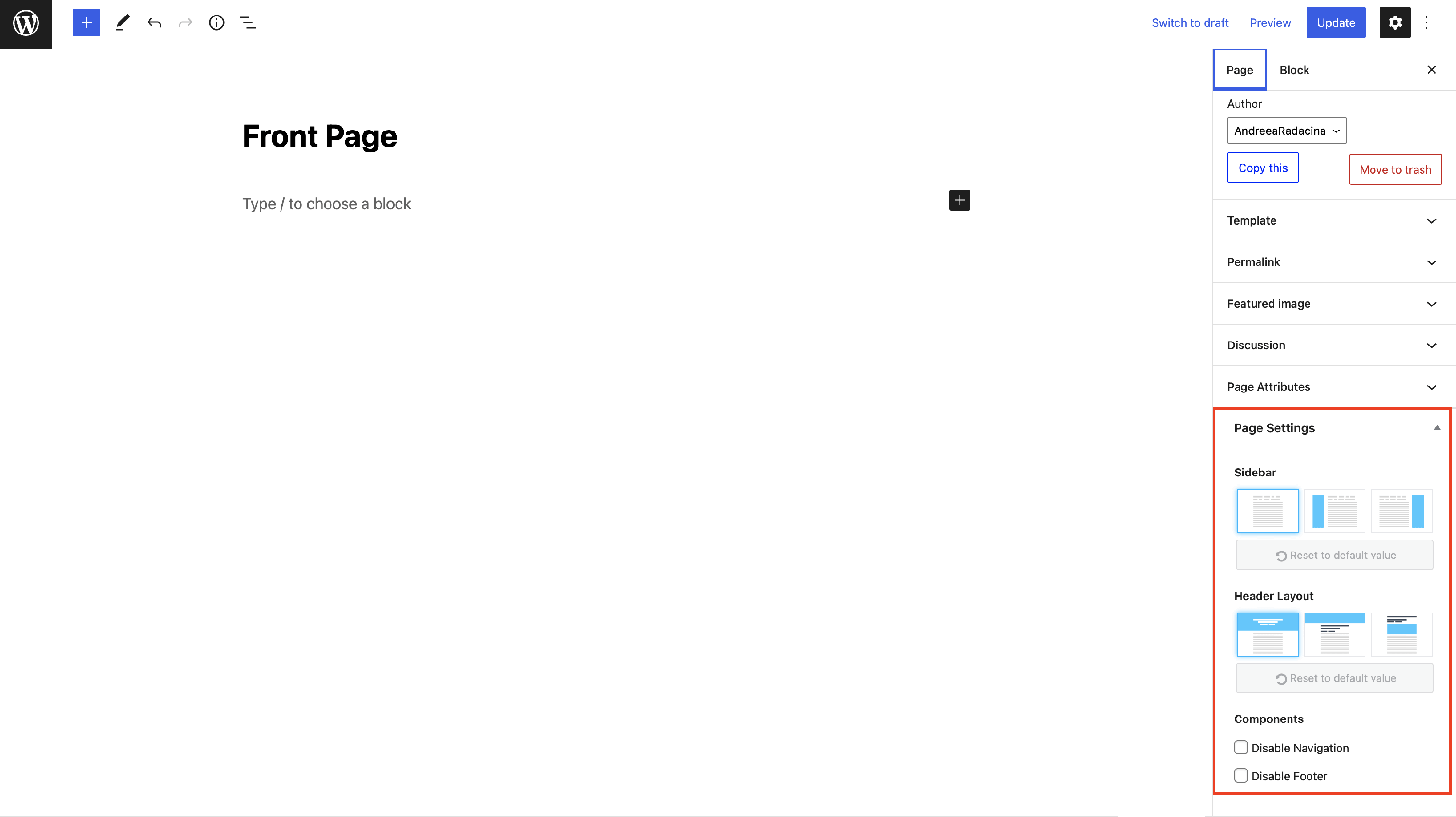
The options available here refer to the header and header layout, footer, and sidebar:
- Sidebar - pick the desired orientation of the sidebar ( none / right / left ).
📝 Note: To change the content of the sidebar, navigate to Appearance > Widgets and add / remove widgets from the sidebar area.
- Header Layout - there are three options to change the header layout of the page:
📝 Note: The header settings can be found also in the Customizer > Header Options > Header Settings.
Disable Navigation - if you check this option, the menu will disappear.
Disable Footer - if you check this option, the footer from the specific page will disappear.
📝Note: Don't forget to click on Publish / Update to see the changes.
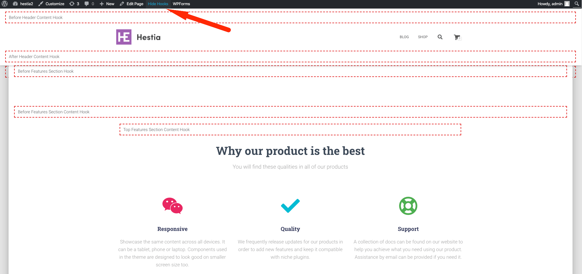
📌 Hooks in Hestia PRO
The hooks represent a very powerful feature of Hestia Pro that allows you to add elements anywhere on the page based on the hooks' locations. To have a better idea about how these are displayed, click on the Show Hooks button from the top WordPress menu.
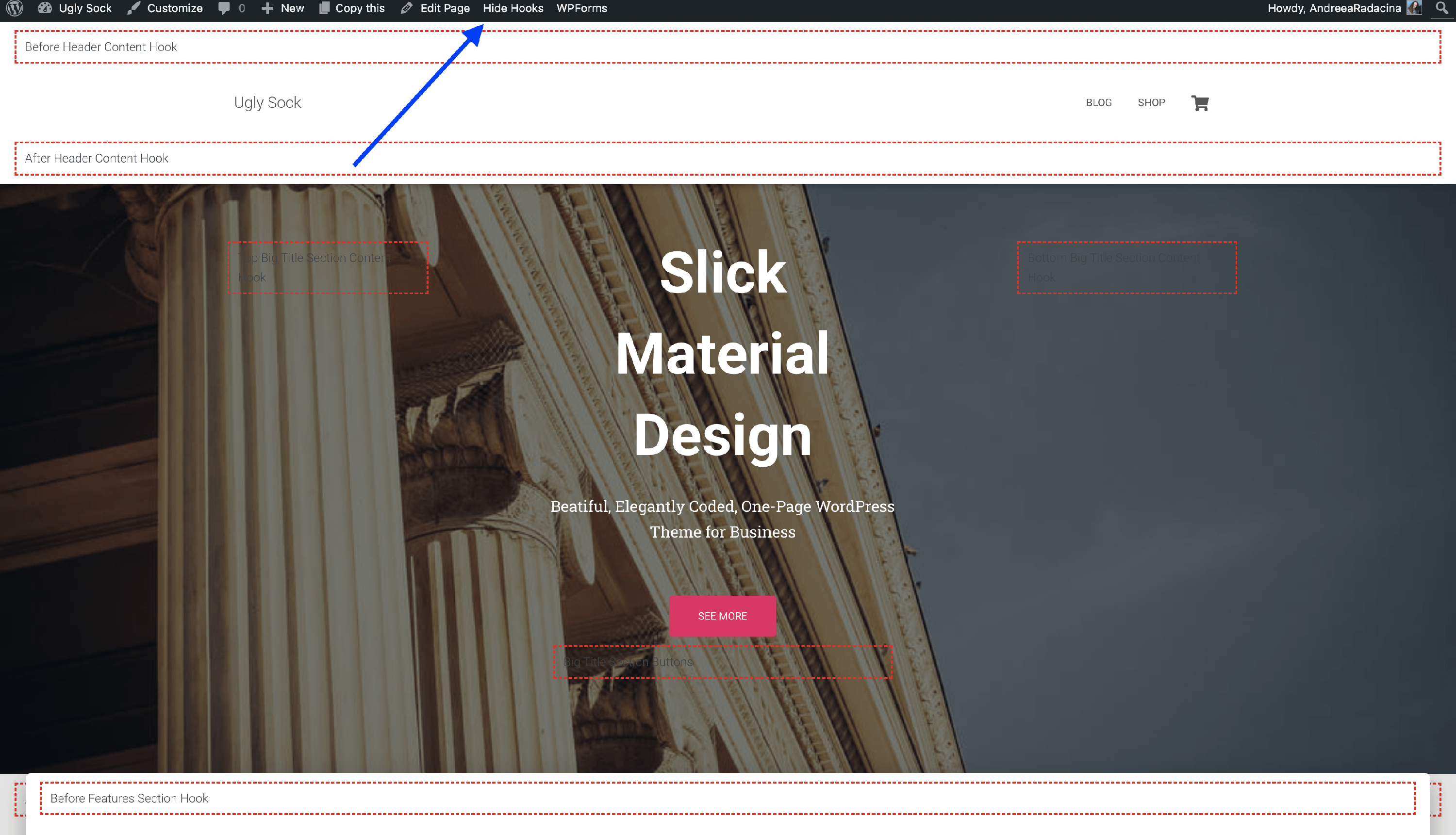
📝 Note: Here is a doc that lists all the locations.
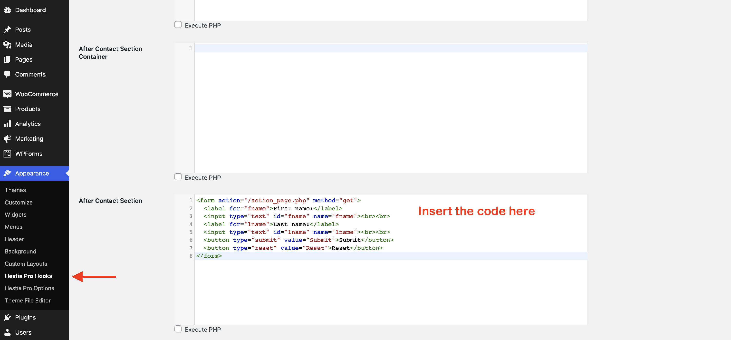
To insert code, open the Hooks Editor from Appearance > Hestia Pro Hooks, then pick a location where you want to insert elements. In the example below, we have added a contact form.
📝 Note: Check this dedicated doc about how to add custom sections based on hooks locations.
📝 Note: You can also use the custom layouts with hooks locations to increase your website's utility.
💬 Translate Hestia
Translating Hestia can be done by using any of the following plugins:
Single Language:
- TranslatePress
- a dedicated article on how to use this plugin with Hestia is available on this page.
- Polylang
- a dedicated article on how to use this plugin with Hestia is available on this page.
📝Note: We also have translations available for plenty of popular languages here. You can simply download and use the translated .po and .mo files.
Multiple Languages:
Hestia Pro is a fully multilingual theme.
You can get Hestia Pro on this page.
🧩 Hestia Patterns
The Hestia Patterns are reusable sections created in the blocks editor of WordPress. You can easily insert them into any page/post, even in custom layouts, edit and duplicate them.
| Explore Hestia Patterns | Use Hestia Patterns |
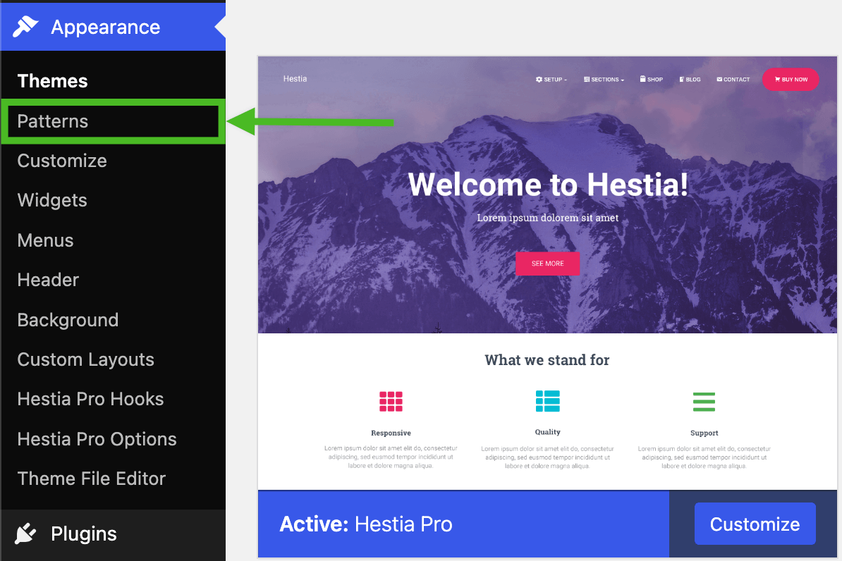
To explore the Patterns, in the Dashboard of your website, navigate to the Appearance menu and choose Patterns.
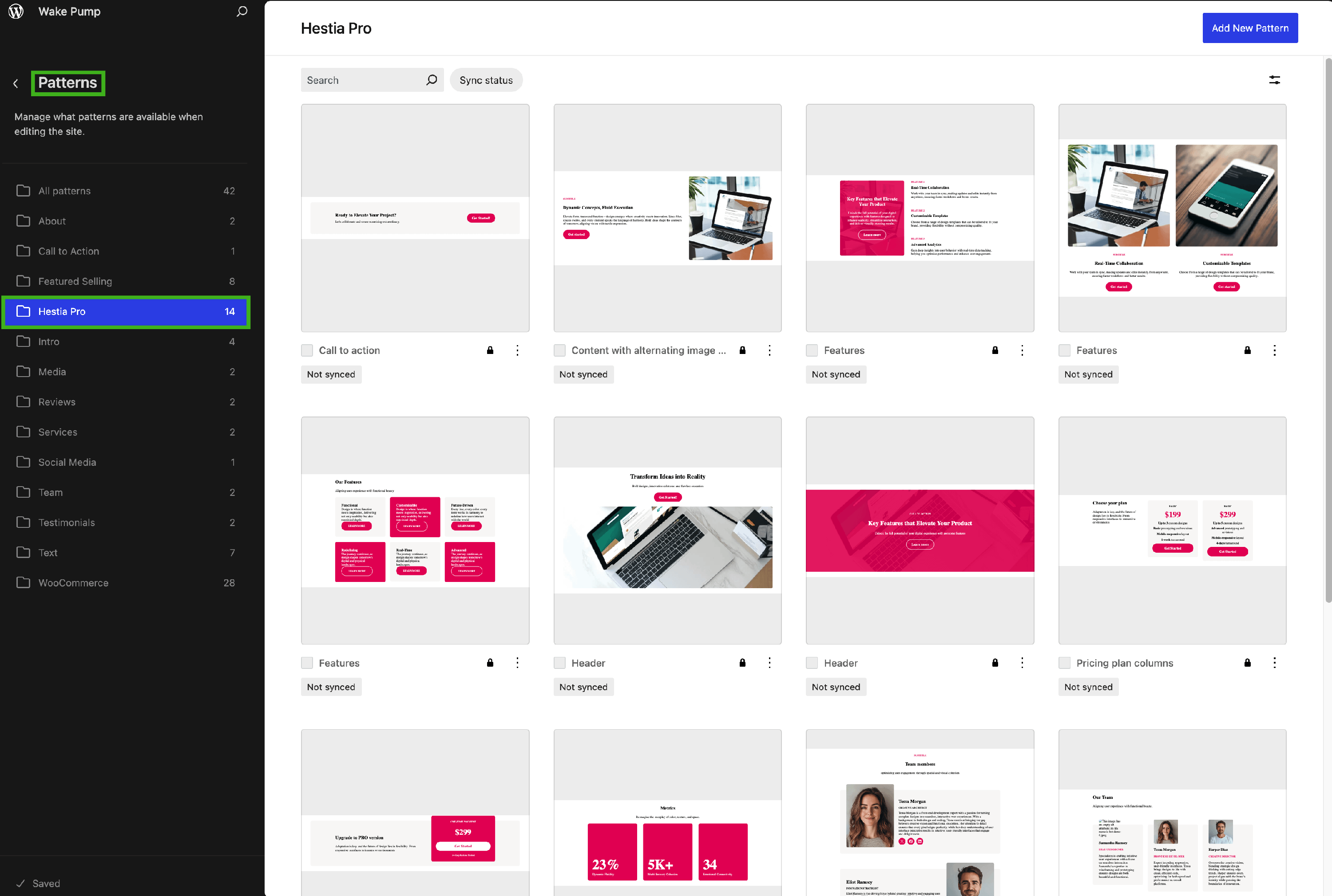
You can choose the Hestia Pro folder to explore all the available patterns.
To insert the Hestia Patterns to your content, while editing a page/post or a custom layout with the WordPress Core editor, follow the steps below:
- click on the plus icon in the top left corner of the page
- select the Patterns tab
- choose Hestia Pro
- click on the desired pattern to insert it
📐 Custom Layouts
This module allows you to create a custom section that can be placed in various places of the theme based on hooks.
Another important feature of this module is that you can make your own header/footer and replace the one from the theme.
📝 Note: Check this guide for getting started with your own layouts.
🔗Shortcodes in Hestia PRO
Using the shortcodes attached to each Frontpage Section and the Elementor plugin, you can add any desired section.
📝 Note: This approach works with any editor, in this example, we will use Elementor.
Step 1: Add the Shortcode element. This can be done easily with drag-and-drop options
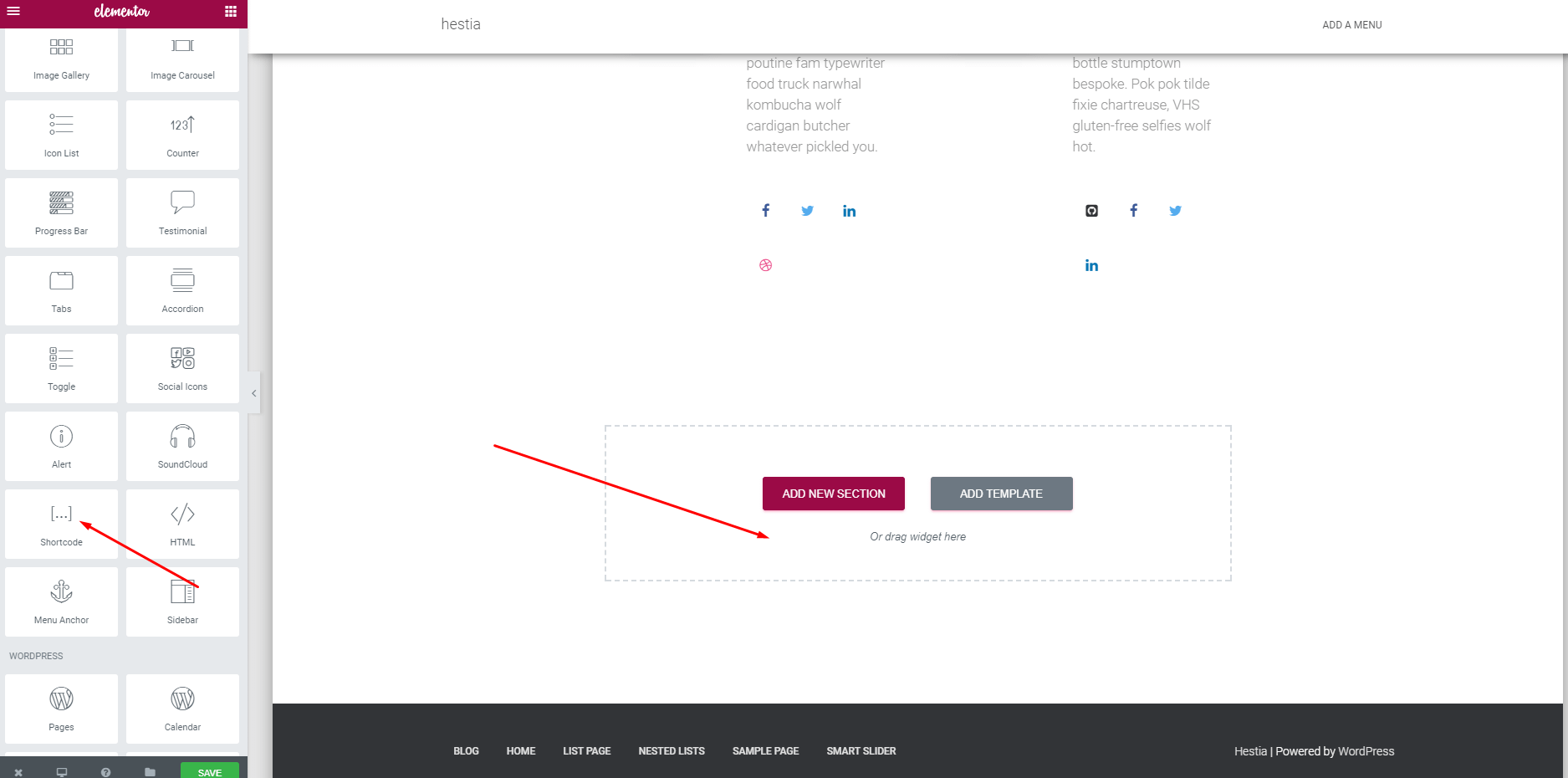
Step 2: Paste the shortcode of the desired section and this will appear in the block.
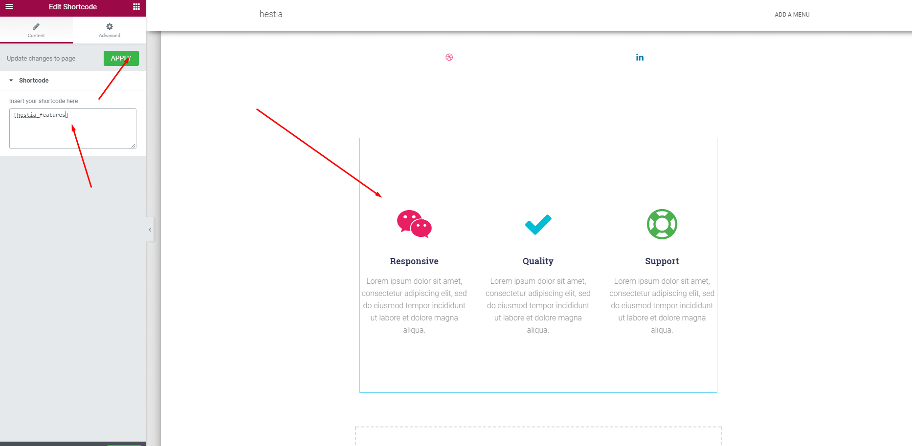
📝 Note: The theme sections are only displayed with this approach are not duplicated. On the pages where shortcodes are used, the section will have the same content as on the front page.
Get Hestia Pro on this page.