Neve Documentation
Neve is a fast, lightweight, and fully customizable WordPress theme for building virtually any kind of website. This guide walks you through everything from installing and activating Neve to customizing your header, footer, colors, typography, and WooCommerce store.
In this article
How to install and activate Neve
To get started follow the steps below:
- In your WordPress Dashboard, navigate to Appearance > Themes.
- Click on Add New and search for Neve.
- Once it appears, click on Install and then Activate. Welcome to Neve!
💡 PRO user here? Check out here how to install and activate Neve PRO.
💡 Still need help with this step? Check out here more details on how to install and activate a WordPress theme.
Import a Starter Site
Once Neve is activated, you can start building your site from scratch or by using a Starter Site.
Click on the "Explore Templates and Start Building Now!" button from the Neve notice which will automatically install and activate the Starter Sites & Templates by Neve plugin which is required in order to import any Starter Site.
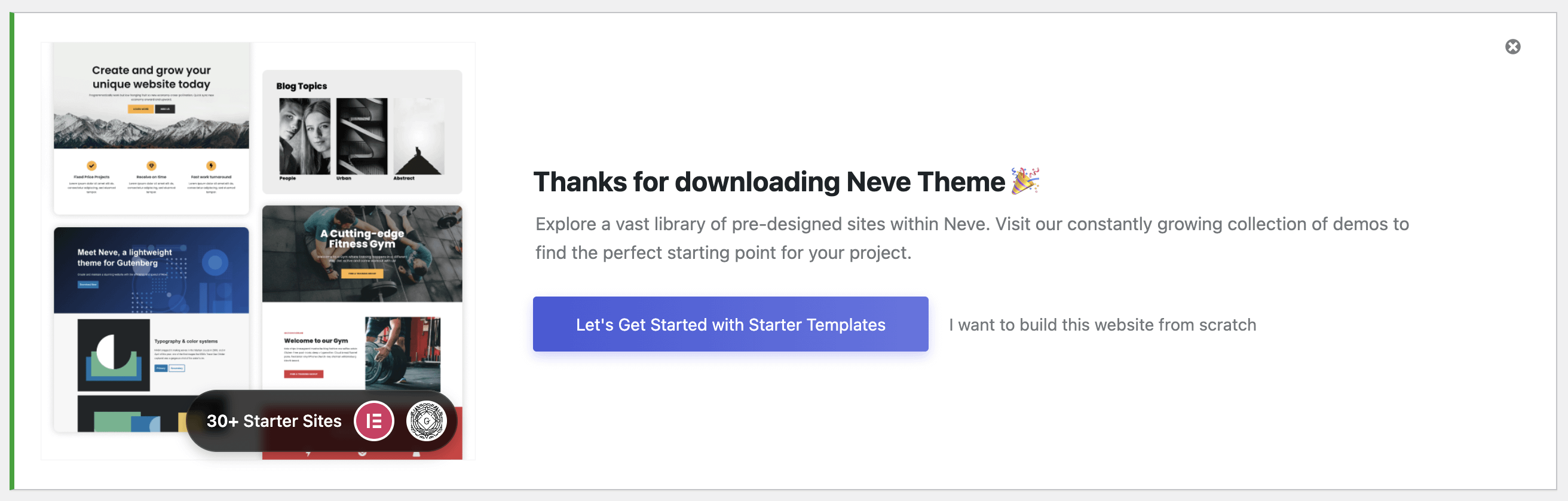
After that, you will be prompted with the oboarding.
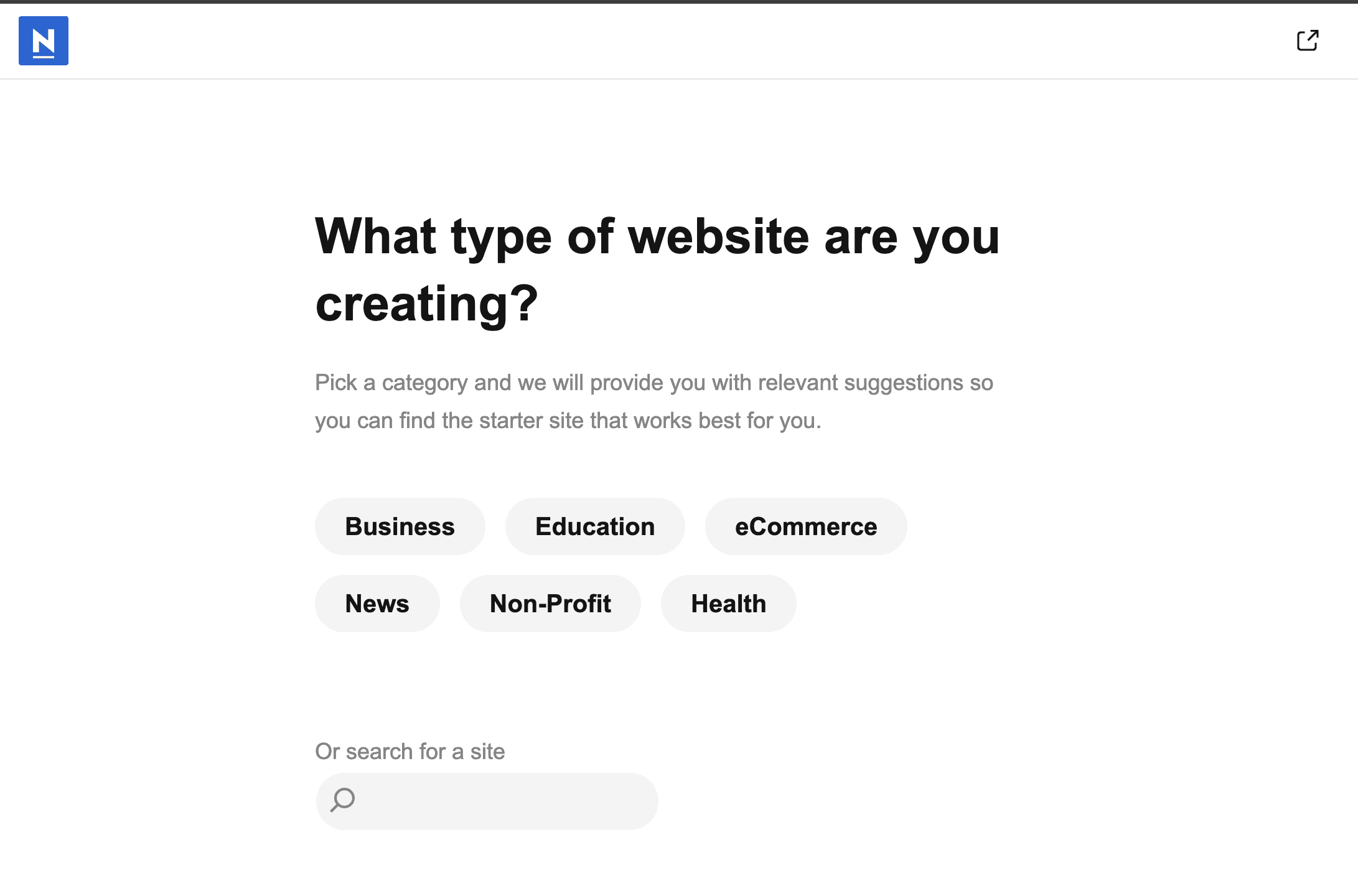
Follow all the steps to import your Starter Site.
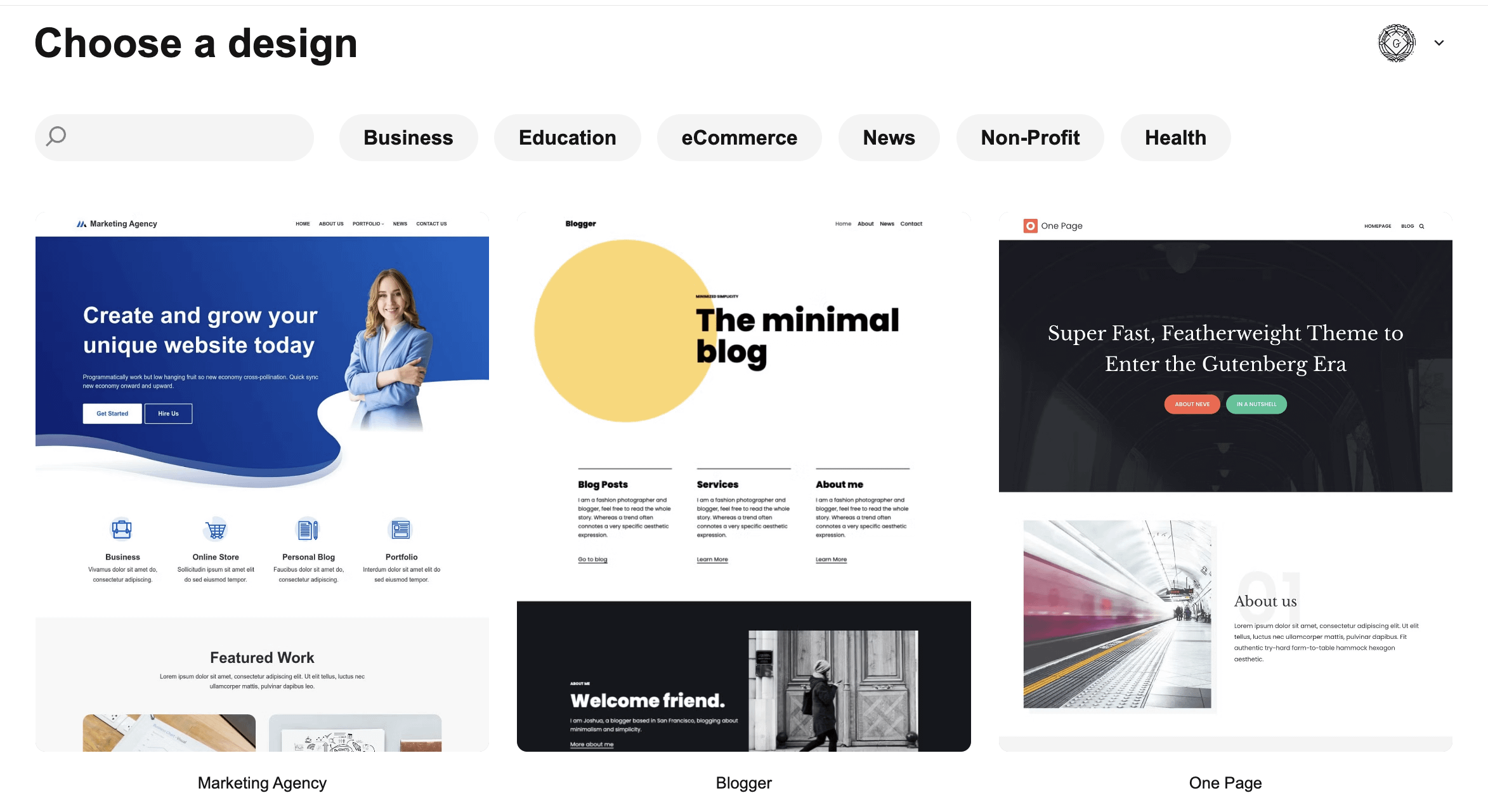
Note: The Starter Sites library can be found under Neve > Starter Sites.
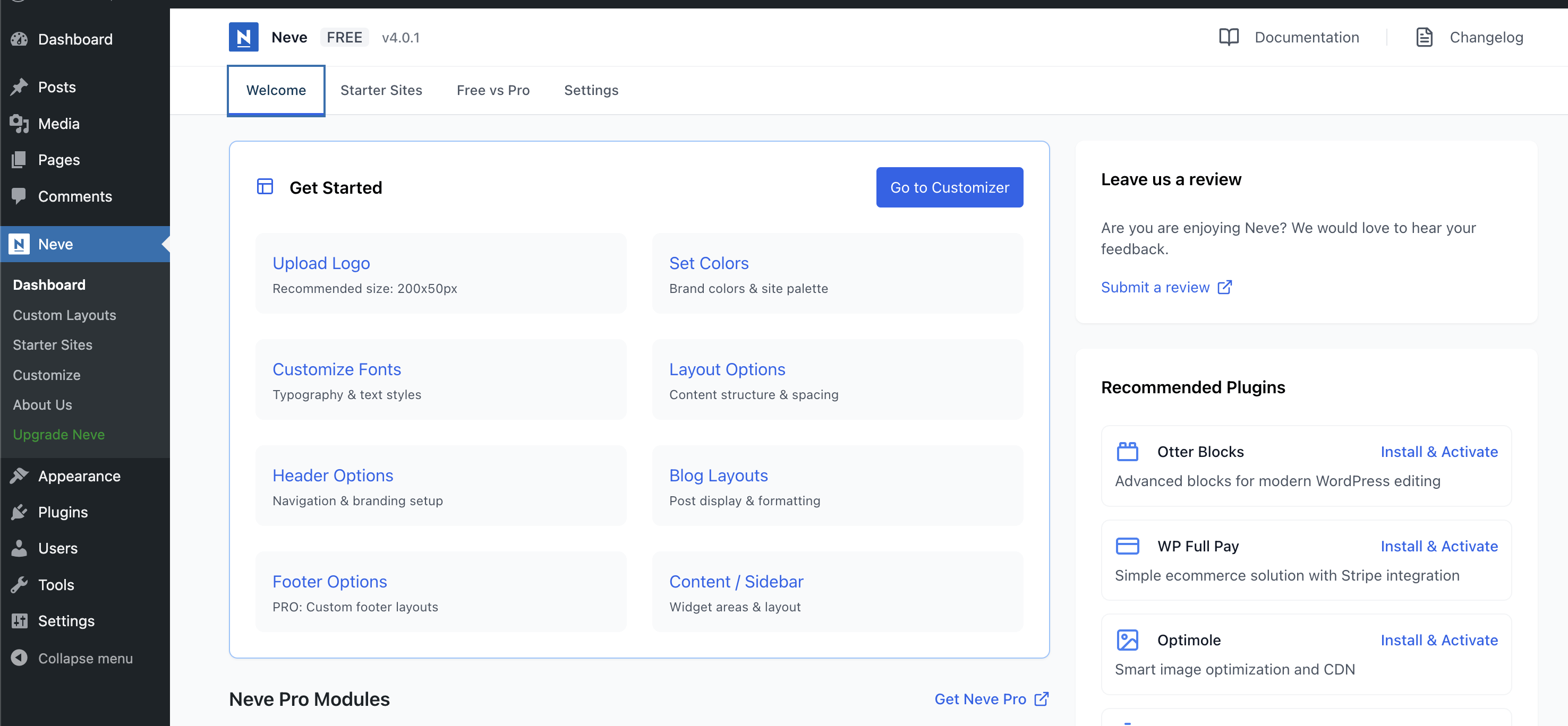
Neve Dashboard
The central hub of Neve's options is under Neve > Dashboard. There you can find the documentation, the product changelog, quick links for Customizer options and plugins recommendations.
Build your custom header & footer
Using a similar builder, you can create a custom header and a custom footer for your site.
Navigate to Appearance > Customize > Header to access the header builder and to Appearance > Customize > Footer to access the footer builder.
Both builders consists of three rows ( Top | Main | Bottom ) and a list of available components, that can be placed in any of the three rows to create your own custom header.
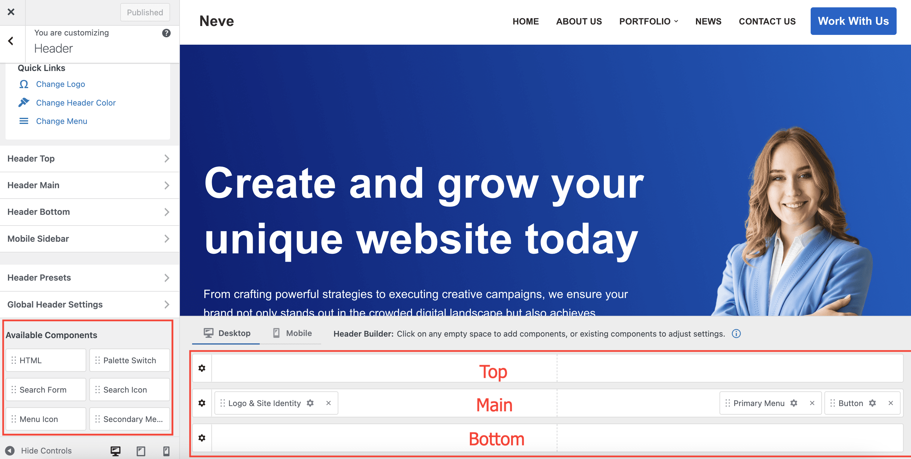
Available components for the header builder:
- Logo & Site Identity
- Primary Menu
- Secondary Menu
📝 Note: The Secondary Menu is a single-level menu. Dropdown menus can't be used with this component.
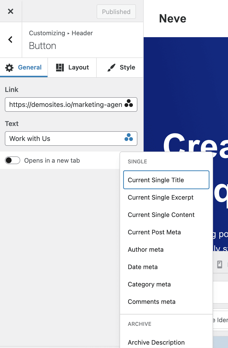
- Button
Besides normal text, the Button component allows for Dynamic Tags, which can be accessed through the three dots triangle at the end of the rows. Dynamic Tags draws content from the website, or from the current page/post, changing dynamically according to the Page or Post it’s on.
- Search Form
- Search Icon
When clicked, the search icon opens a search form field. The Open Behaviour option is in charge of controlling the way in which that form field appears for the user.
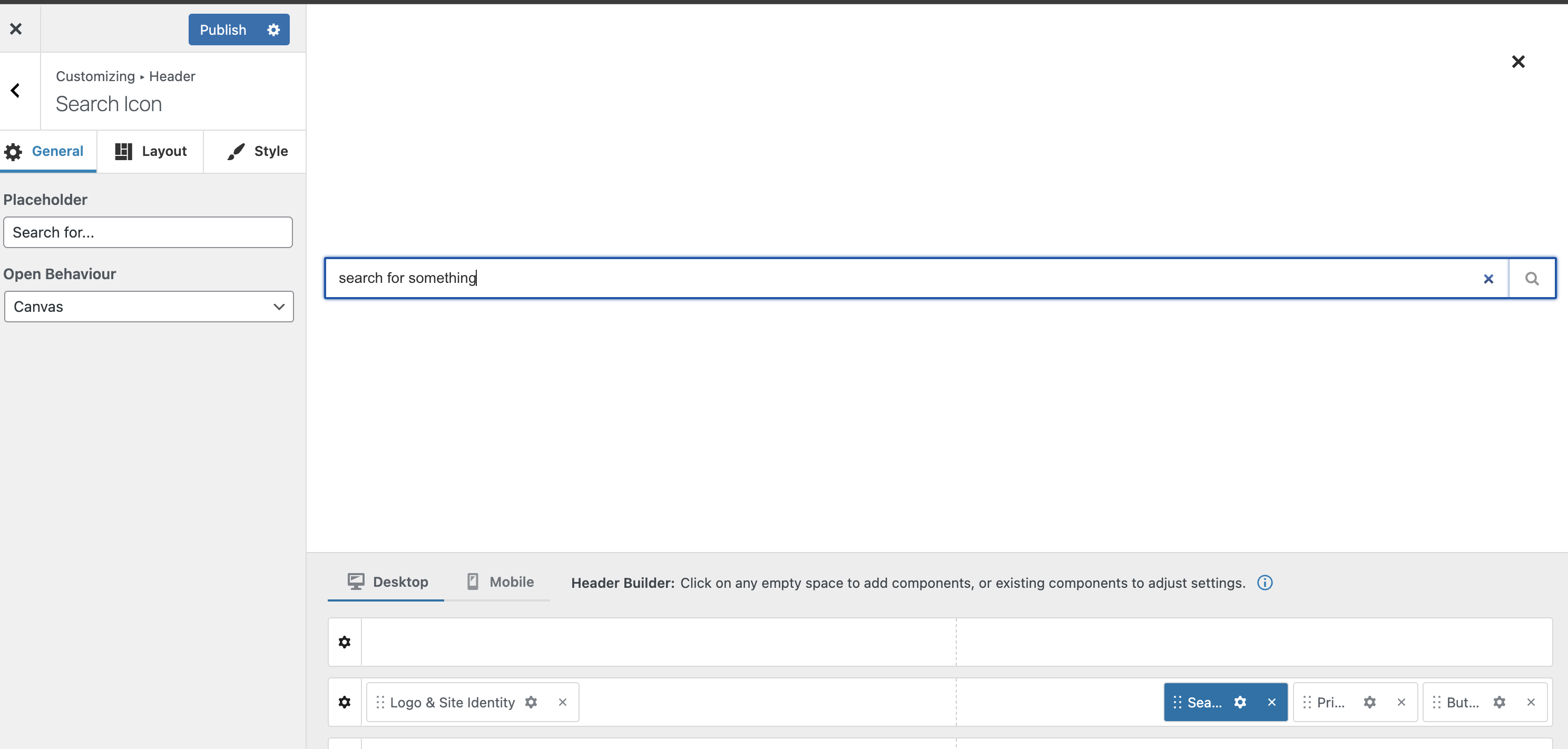
Canvas
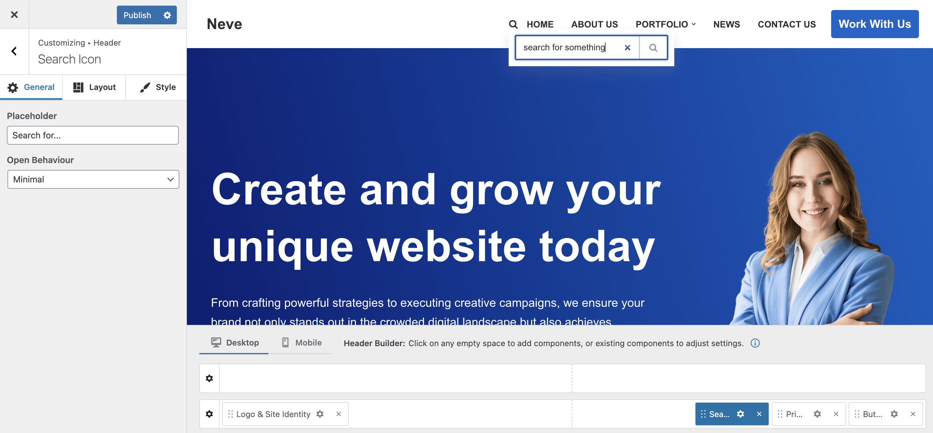
Minimal
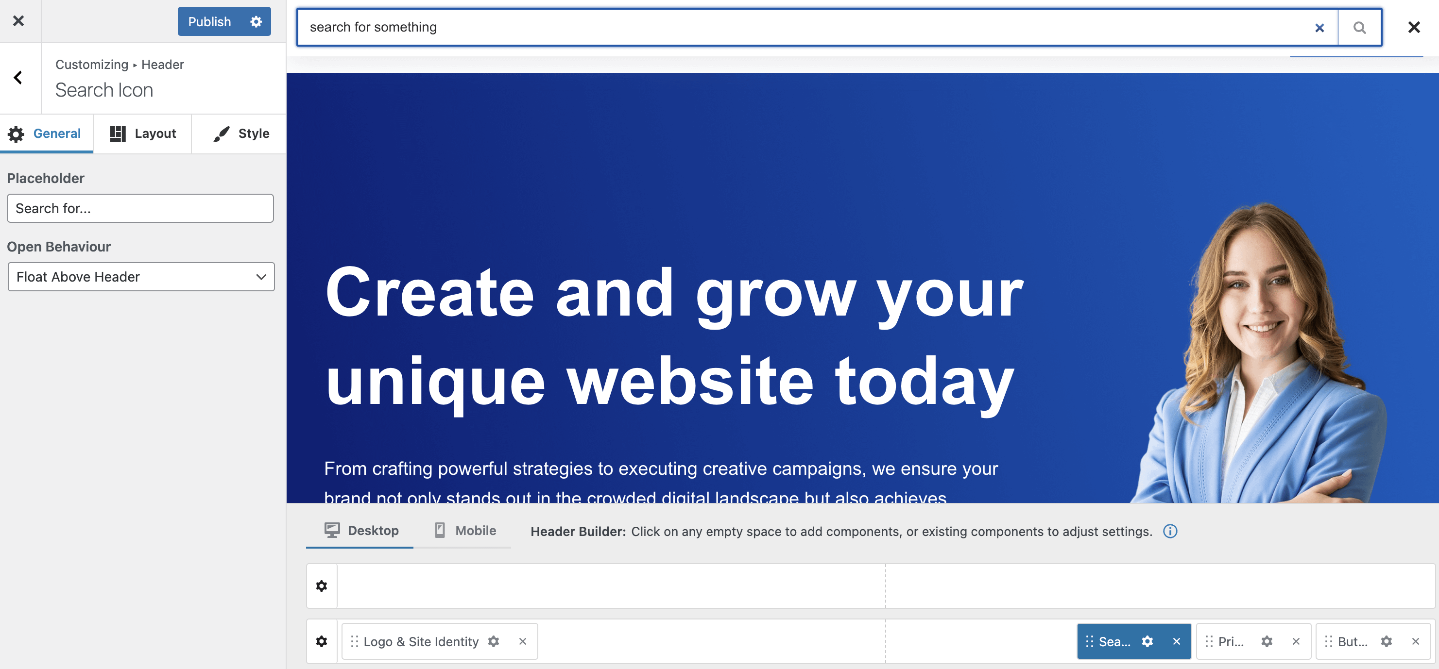
Float Above Header
- HTML
- Cart Icon ( available only if the WooCommerce plugin is installed and activated )
Changing the cart icon is possible when using the Sparks plugin or Neve Pro - Business/Agency license tiers.
- Palette Switch
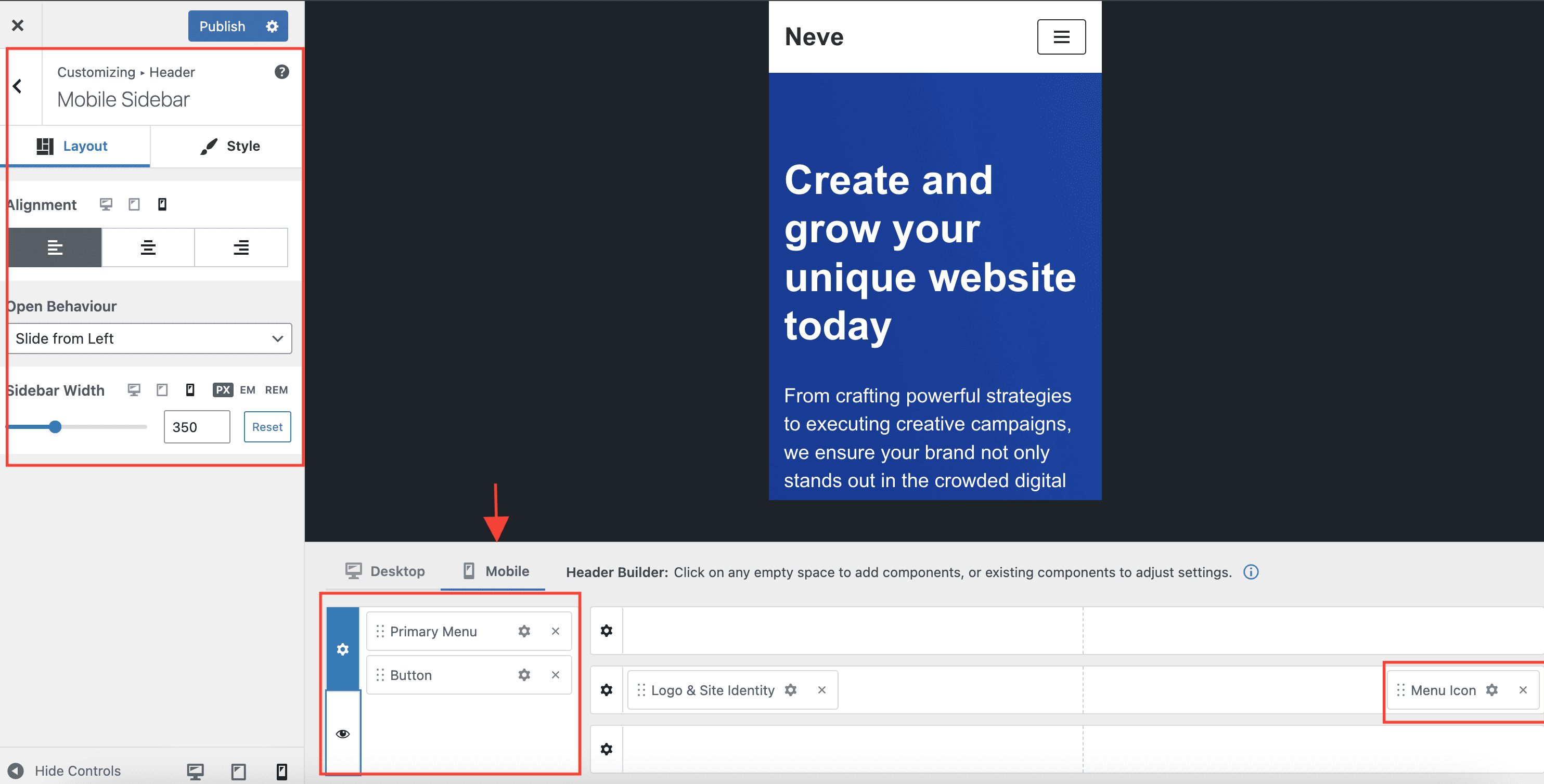
- Menu Icon
The component displays the Hamburger icon (with an optional label) which, on click, opens whatever is added in the Mobile menu content area of the builder.(It is required for the Primary Menu component to be present there)
💡 Need a different component for the header/footer? Need to use a component multiple times? Check out the list of extra components available in Neve PRO.
Available components for the footer builder:
- Footer One (this is a widget area)
- Footer Two (this is a widget area)
- Footer Three (this is a widget area)
- Footer Four (this is a widget area)
- Footer Menu
💡 Want to add your own copyright? Check out Neve PRO.
Style the custom header & footer
Each component and each of the three rows have their own settings ( for layout, colors etc ).
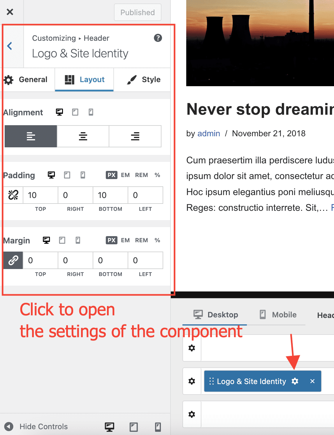
To open the settings for a specific component, just click on its little wheel that is part of the component, as shown in the picture below.
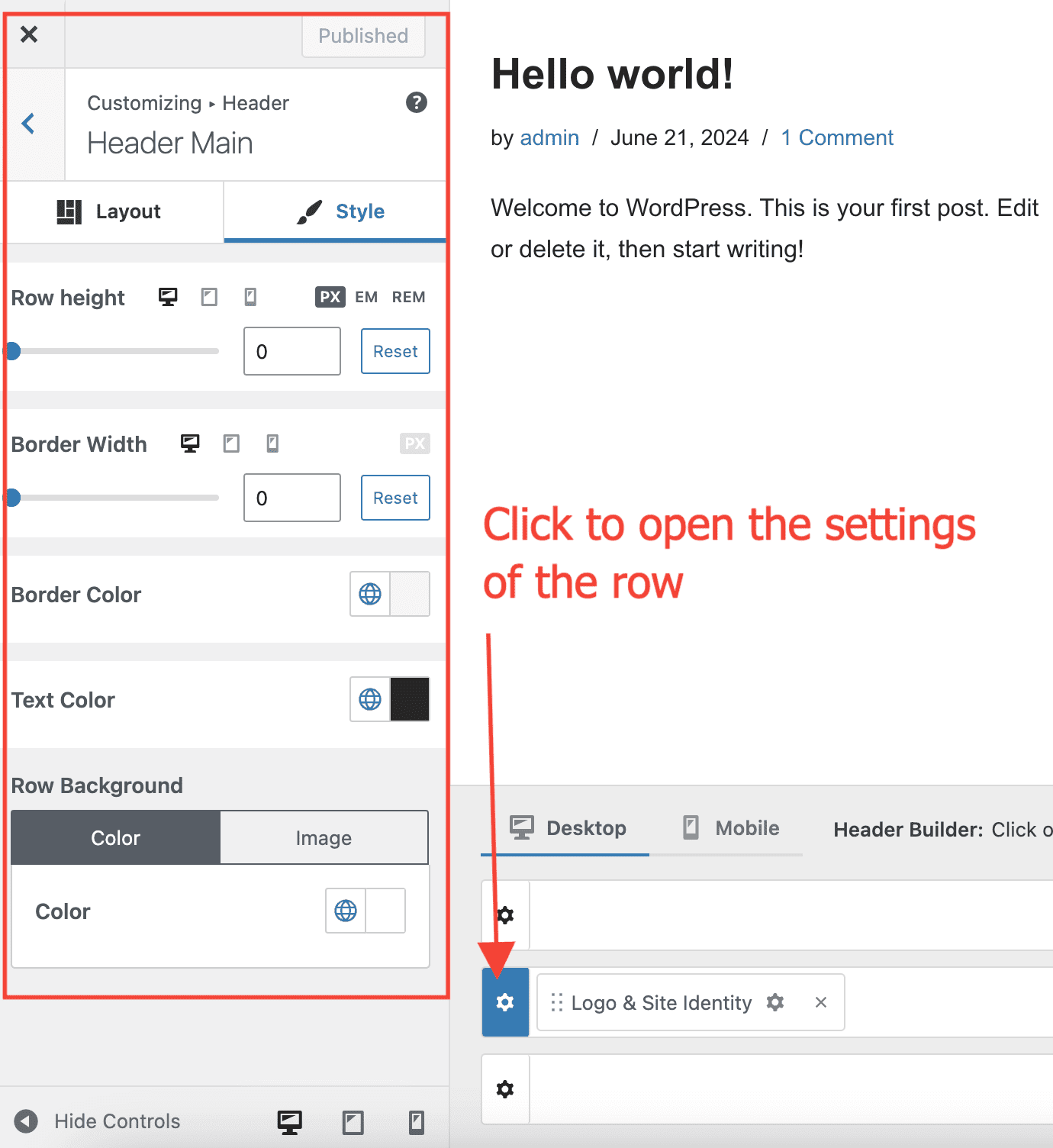
To open the settings for one of the three rows, just click on its little wheel that is situated at the start of row, as shown in the picture below.
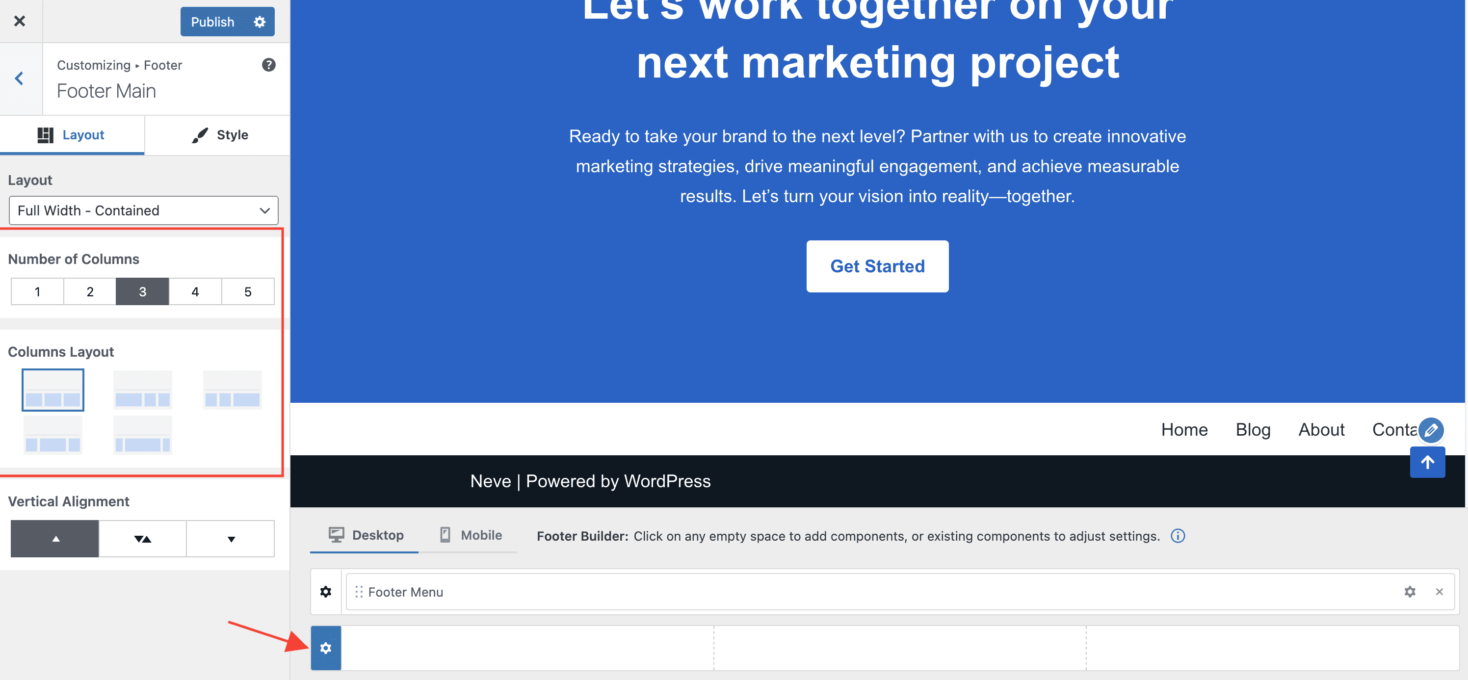
Change the number of columns and the layout of the footer
For each of the three rows of the footer, there is an option to choose a different number of columns, with a specific layout.
Choose dedicated images or background colors for each row of the header OR a single image or background color for the entire header area
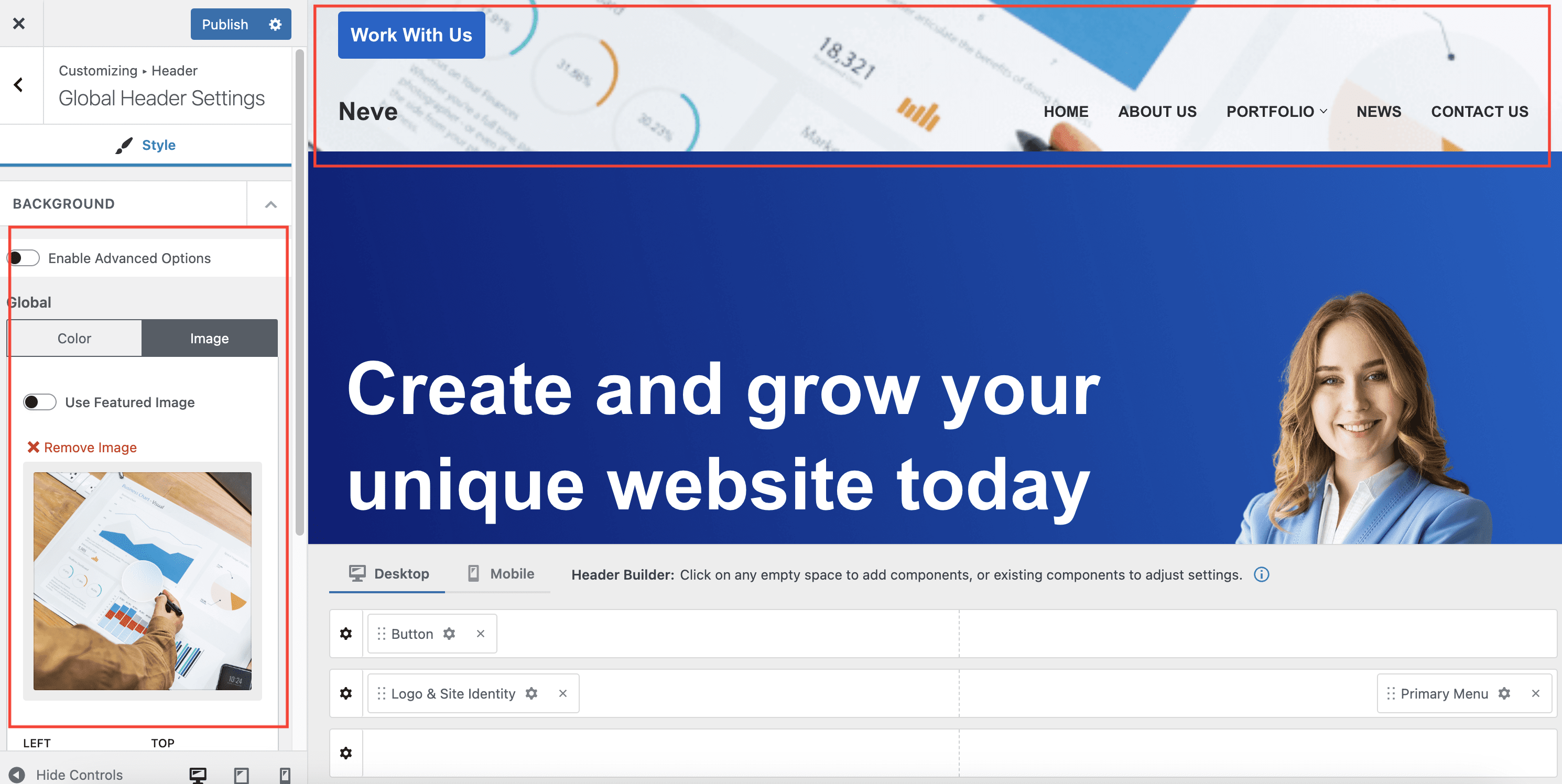
In Appearance > Customize > Header there is a Global Header Settings panel.
In that panel, if you turn on the option to Enable Advanced Options, each of the three rows of the header will have their own options for background color/image.
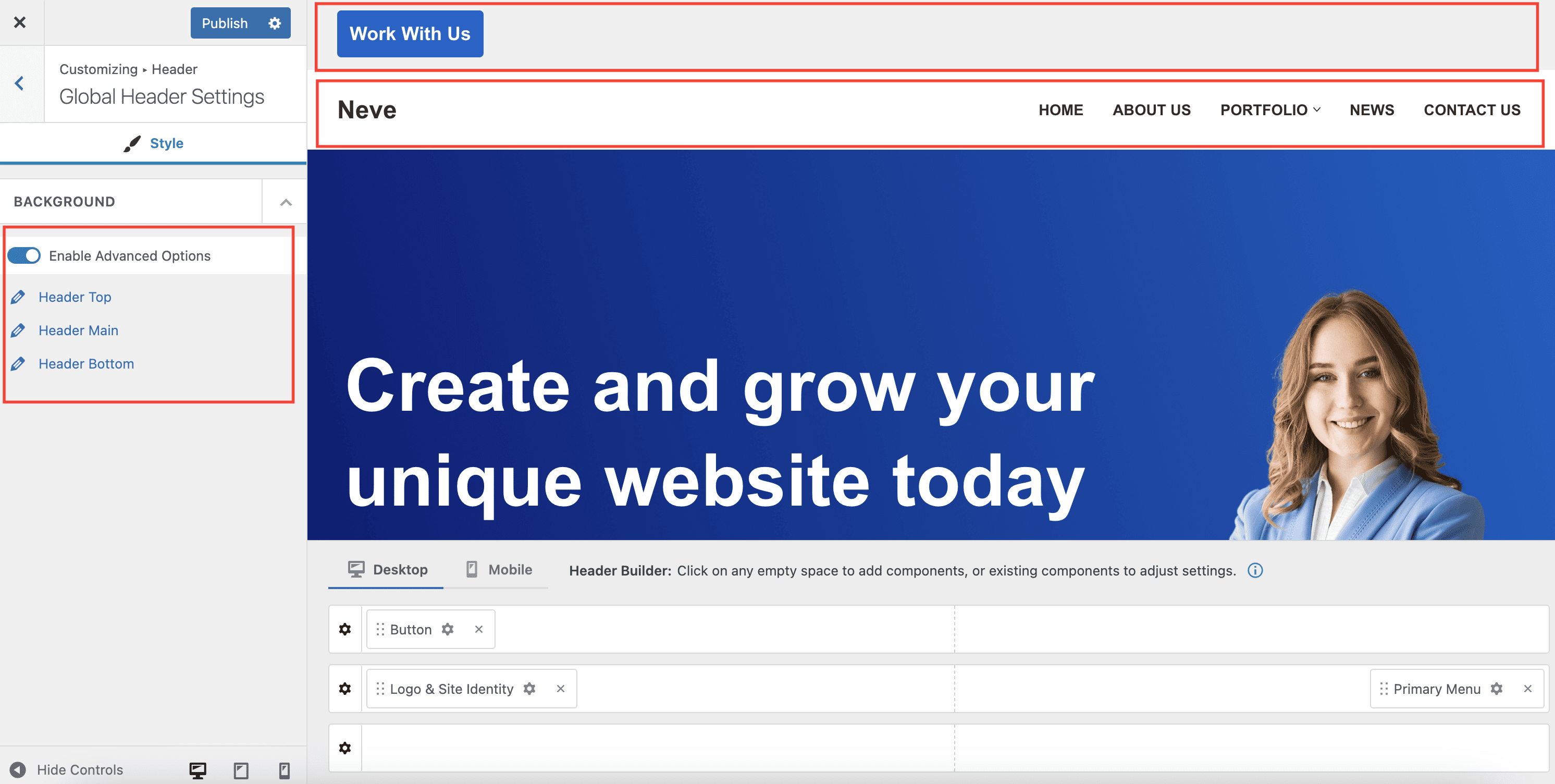
If the Enable Advanced Options option is turned off, all three rows of the header will use the global background color or image, creating a unified header.
💡 Want to make the header and/or the footer sticky? Check out Neve PRO.
Desktop VS Mobile header/footer
The header and footer builders allows for two different headers/footers on Desktop and on mobile devices ( any device with the width lower than 960px).
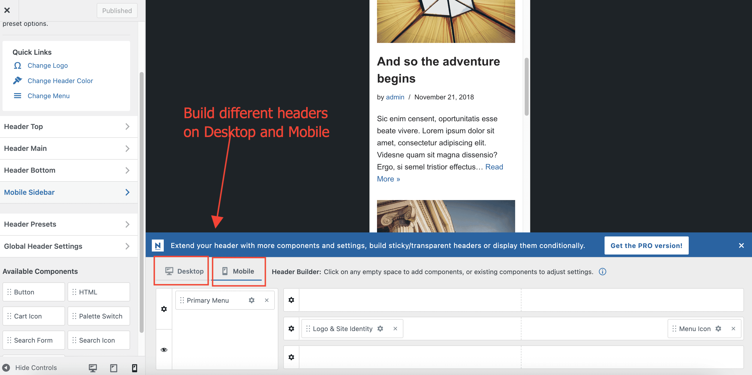
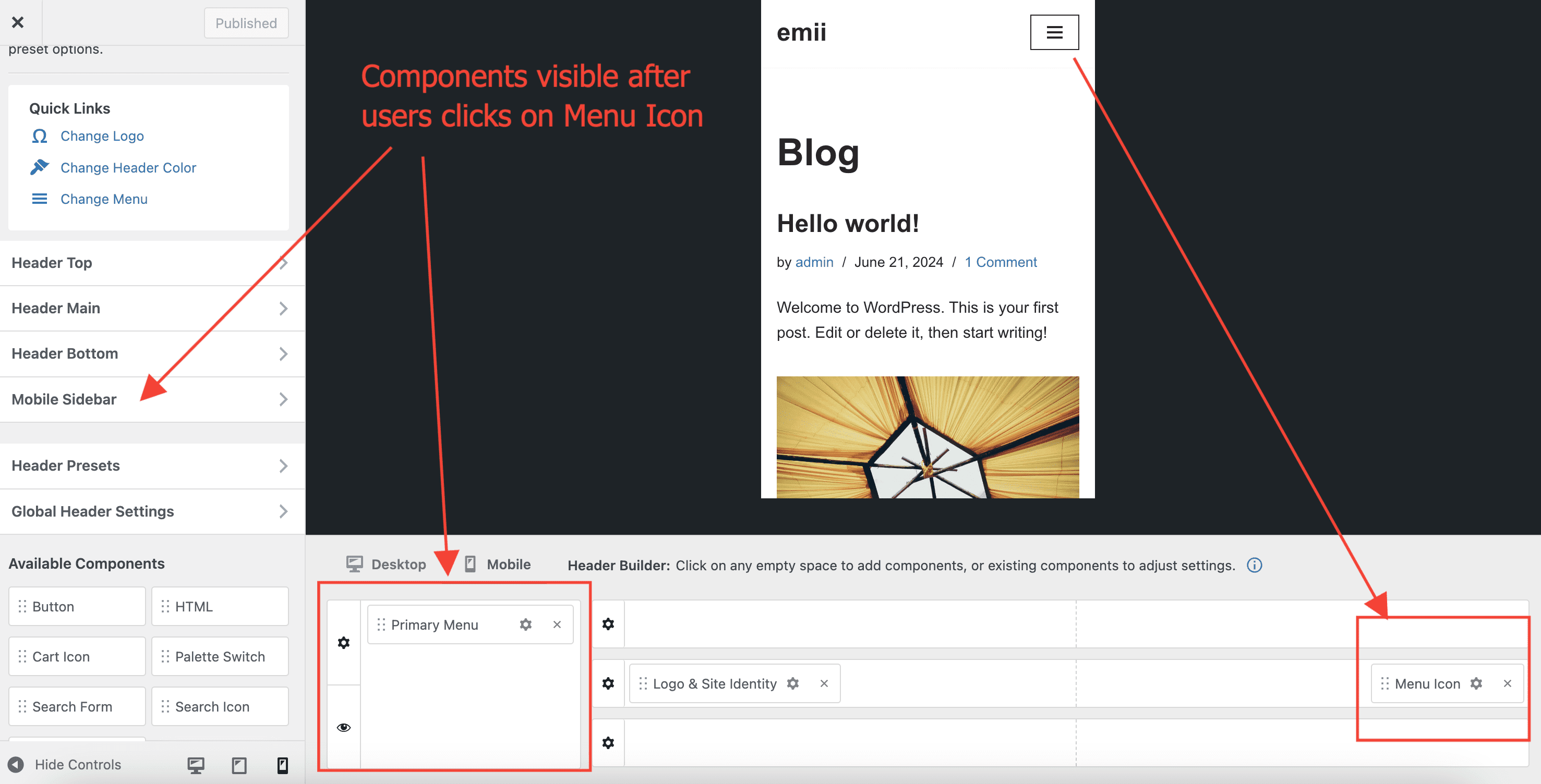
The mobile header builder has an extra area, apart from the three rows ( Top | Main | Bottom ), which is called Mobile Sidebar. This area is used in conjunction with the Menu Icon component.
Meaning, that if the Menu Icon component is part of any of the three rows, once clicked, it will show up any content available in the Mobile Sidebar area. ( Typically, users add their Primary Menu component in the Mobile Sidebar area, in order for the users to see the main menu once they click on the menu icon, on mobile ).
Mobile footer layout behavior
On smaller screens, footer rows and columns use a responsive layout and can stack vertically. This is expected behavior in Neve to keep content readable on narrow devices.
If you need a specific mobile footer arrangement (for example, keeping more items inline), use custom CSS.
Hide the footer on the mobile homepage with CSS
Neve does not include a dedicated toggle to hide the footer only on mobile and only on the homepage. For this use case, add custom CSS in Appearance > Customize > Additional CSS:
@media (max-width: 768px) {
    .home .site-footer {
        display: none;
    }
}
In this example, .home targets your homepage. If your site uses a different mobile breakpoint, adjust 768px as needed.
Related cart icon customizations
If the cart icon redirects to the Cart page instead of opening a mini-cart preview, check the Mini Cart Style setting in the Cart Icon component. This setting controls whether the cart opens as a dropdown/off-canvas preview or links directly to the cart page.
For step-by-step guidance, see:
- The Cart Icon Component - Neve Header / Footer Builder
- How to Customize the Cart Dropdown Button Text in Neve
Video - How to create a Custom Header?
💡 Want to add a scroll to the top button? Check out here how to do it with Neve PRO.
Colors & Background
Navigate to Appearance > Customize > Global > Colors & Background to change the color palette, add a new one or add a background image to the site. Read everything about this here.
Typography
Navigate to Appearance > Customize > Typography to access the options. You have two options to choose from:
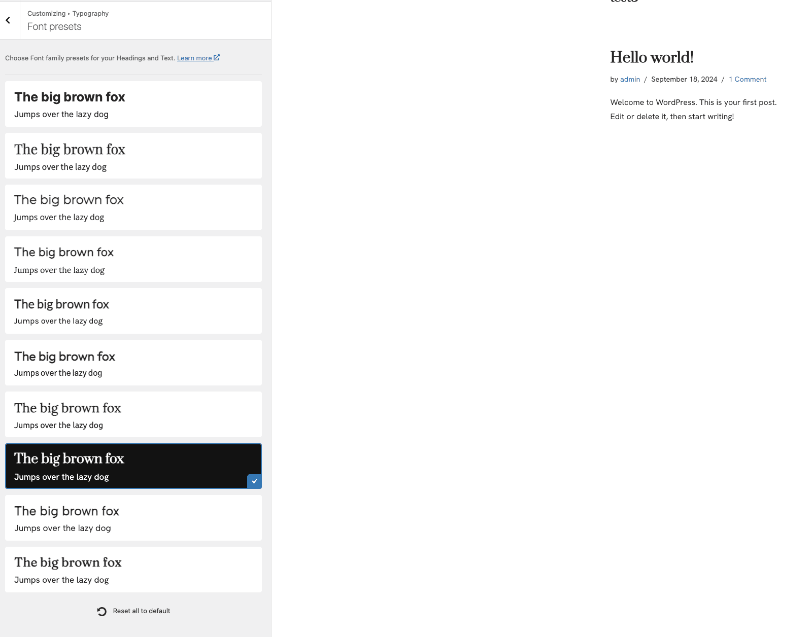
[For a beginner user] Font Presets
Use Font Presets ( a list of predefined fonts that complement each other seamlessly and look good in Neve and can be applied across the site, with just one click).
If you are not happy with the selected preset, you can click on the Reset button at the end of the list.
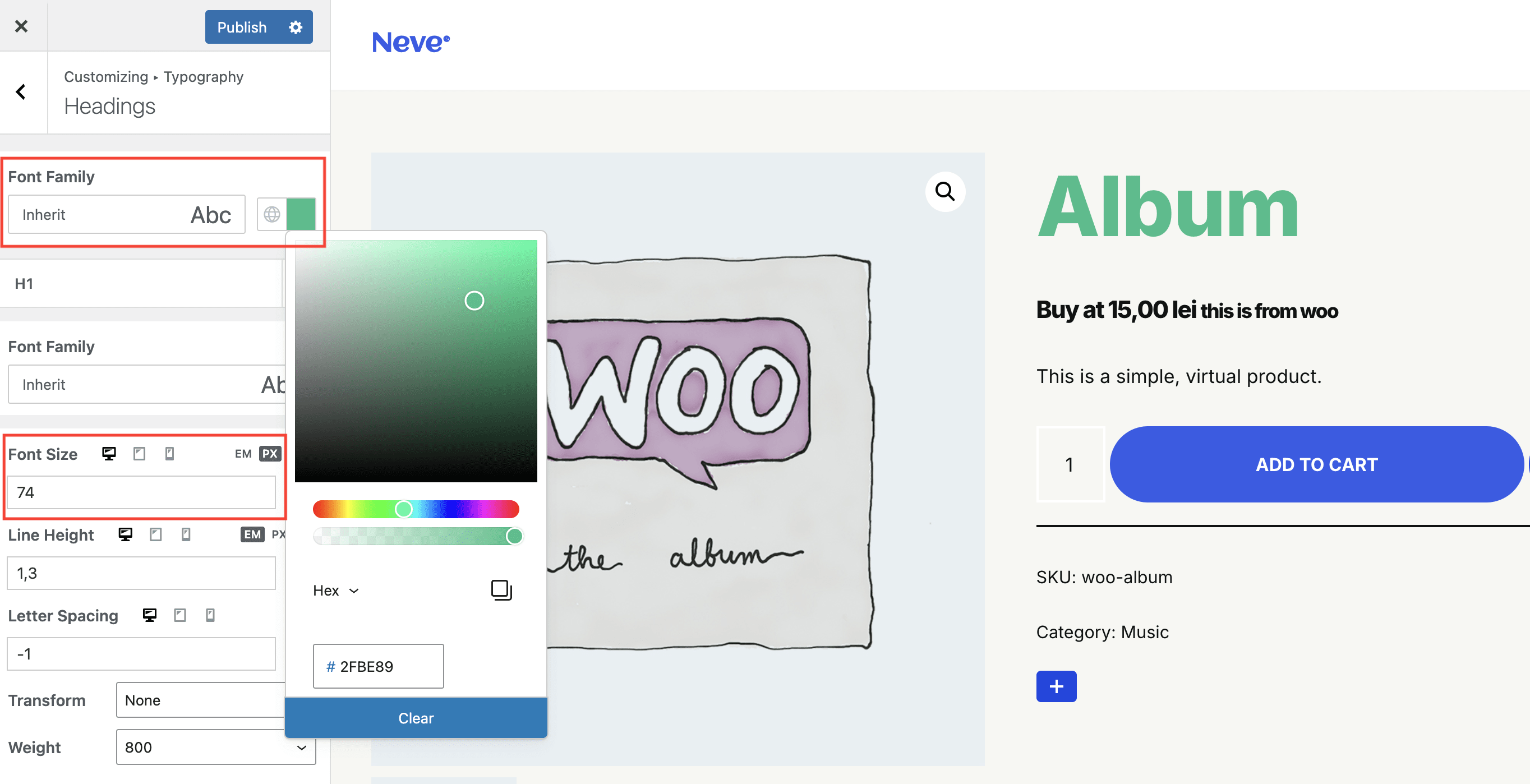
[For an advanced user]Choose your preferred options for typography
The Typography options available in Neve are spread across two panels: General, Headings and WooCommerce (if the WooCommerce plugin is installed).
The options from the Headings panel apply to all headings ( H1 - H6 ), while the options from the General panel apply to all other elements.
Apart from Typography options, the color of all headings can be changed from the same place.
For the Blog page and single posts, there are dedicated controls for typography, available in Appearance > Customize > Blog > Blog/Archive or Single post, in the Design tab.
Note: Some options, such as the Font Size for example, can have different values on mobile, tablet, and Desktop. For that, just click on the corresponding icon, and enter the value of your choice. Some options, such as the Font Size for example, can use different measurement units, like em, px, or rem. For that, just click on the corresponding icon, and enter the value of your choice.
Note: Some elements of the site, like the header, footer, and buttons have specific typography options, that surpass the ones here.
💡 Need typography options for your WooCommerce Shop or for EDD (Easy Digital Downloads)? Check out Neve PRO Business and Agency.
💡 Want to load fonts locally? Check out here how to do it.
Buttons
Navigate to Appearance > Customize > Global > Buttons to access the options (The options from the General panel apply to all other buttons, that are not primary or secondary).
Neve has two types of buttons, based on their "importance" on the page, called Primary (which have the .button-primary CSS class) and Secondary (which have the .button-secondary CSS class).
Examples of Primary buttons: Add to Cart, Post Comment, Proceed to Checkout
Examples of Secondary buttons: View Cart, Apply Coupon.
Form Fields
Navigate to Appearance > Customize > Global > Form Fields to access the options.
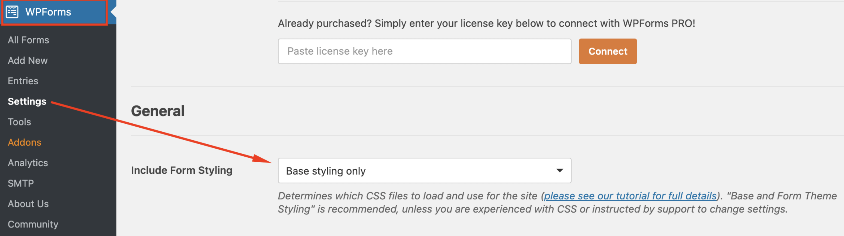
These can be used to customize the appearance of forms created with plugins like WPForms Lite, Contact Form 7, or page builders like Elementor.
Please note that some of the plugins might have their own styling options that can override the theme settings.
For example, in WPForms, the plugin style can be changed/disabled from its settings.
Breadcrumbs
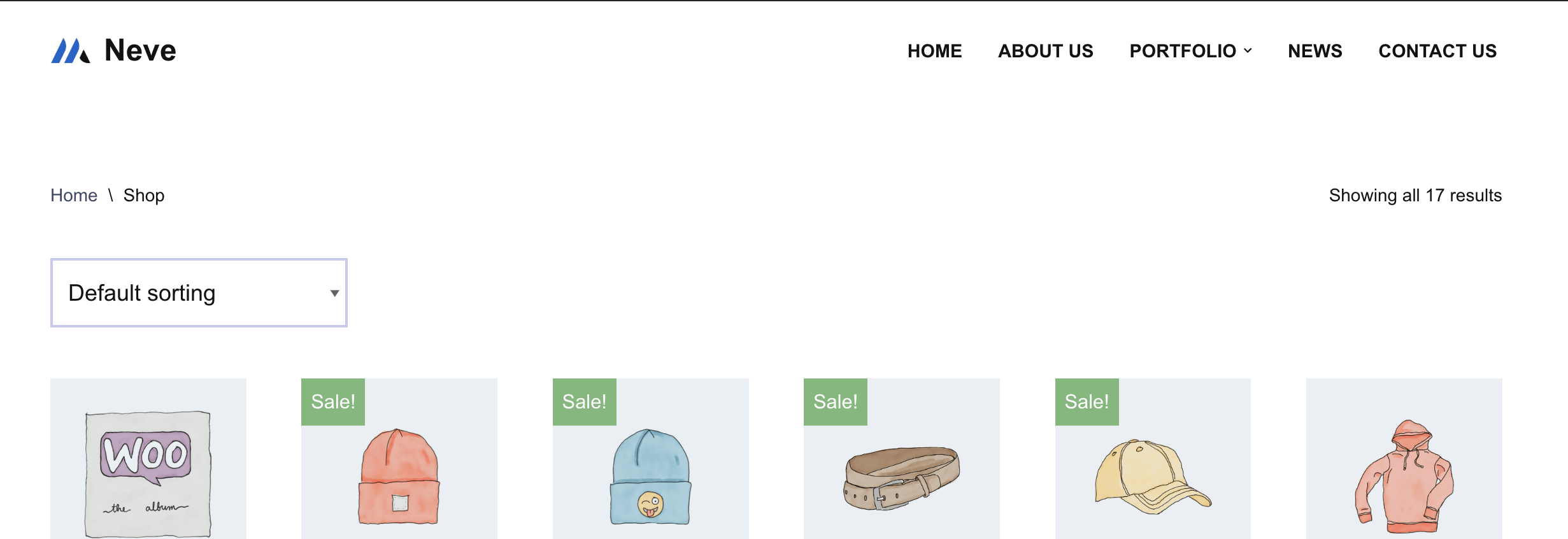
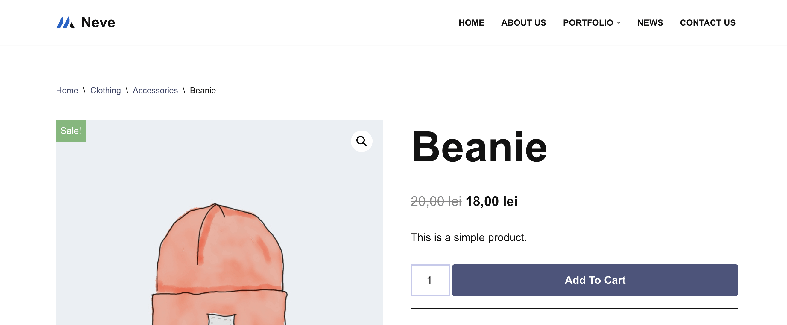
By default, Neve displays breadcrumbs just on the Shop and Product pages, as can be seen in the images below.
Neve also has integrations with Yoast SEO, Rank Math SEO, Breadcrumb NavXT, and SEOPress Pro.
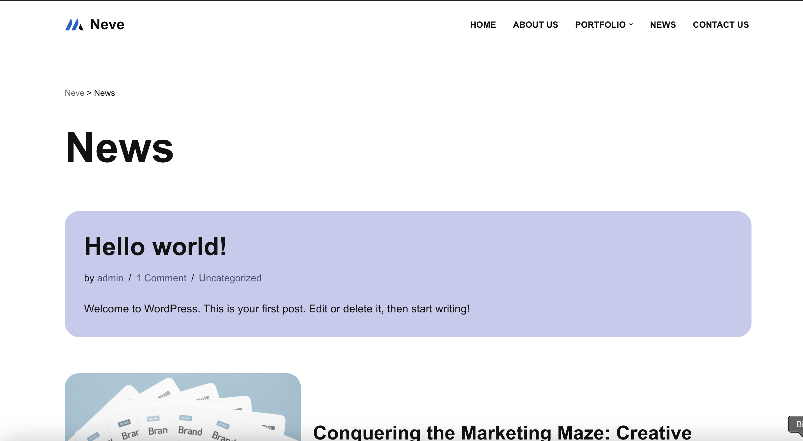
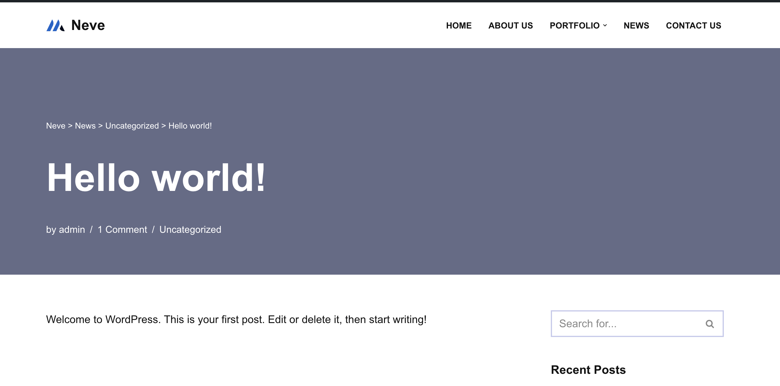
After installing and activating any of these plugins, and activate their breadcrumbs functionality, breadcrumbs will be displayed on other pages as well, like the Blog and Single post pages, as can be seen in the images below.
However, the position of the breadcrumbs can not be changed. To add the breadcrumbs in a different place of the header, make sure to check Neve PRO.
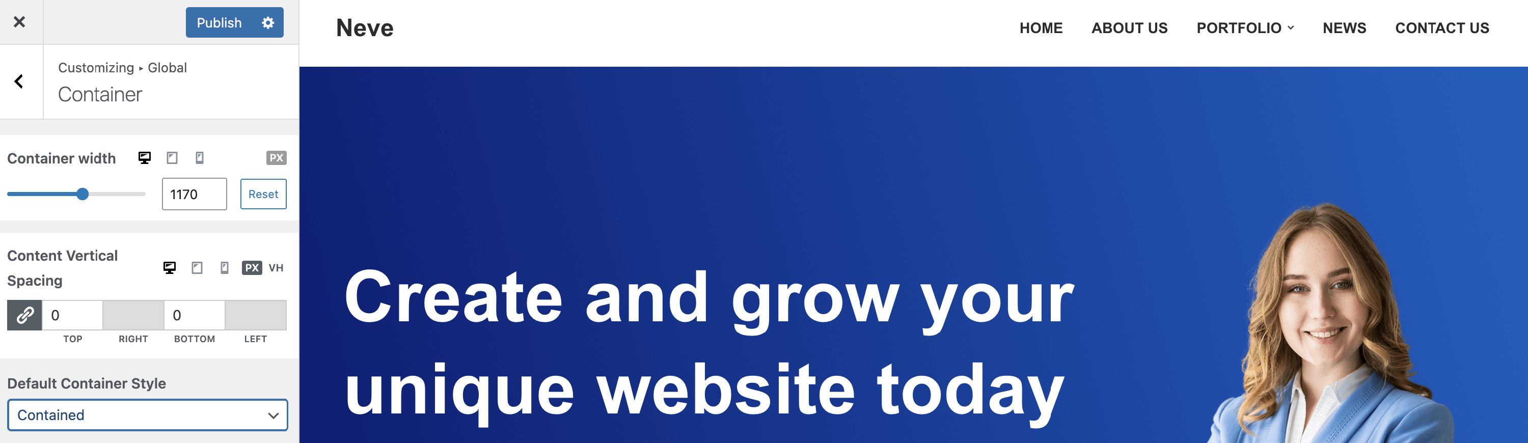
Container
Navigate to Appearance > Customize > Global > Container to access the options.
Content Width and Container Style are two related options. When choosing a Contained style, the content of the page will stay inside the corresponding Content Width, while Full Width means that the content of the page will spread the entire area.
The next two images showcase the Full Width and Contained states. Notice the layout of the content, compared to the header which is set at 1170px in this case.
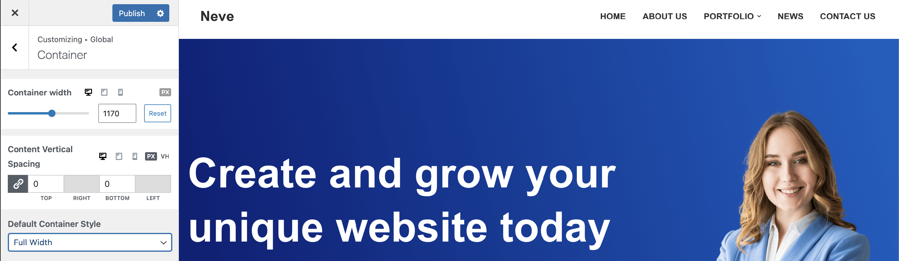
Note: The Container Style can be set differently for various types of pages. Also, the Container Width can have different sizes based on device ( Desktop, Tablet or Mobile ). For that, click on the corresponding icons and choose the desired size.
⚠️ Warning: If you use Sync with Global while editing a section or page layout width, Neve updates the global Container value too. This can make content appear narrower (or wider) across the entire site, not only on the page you were editing.
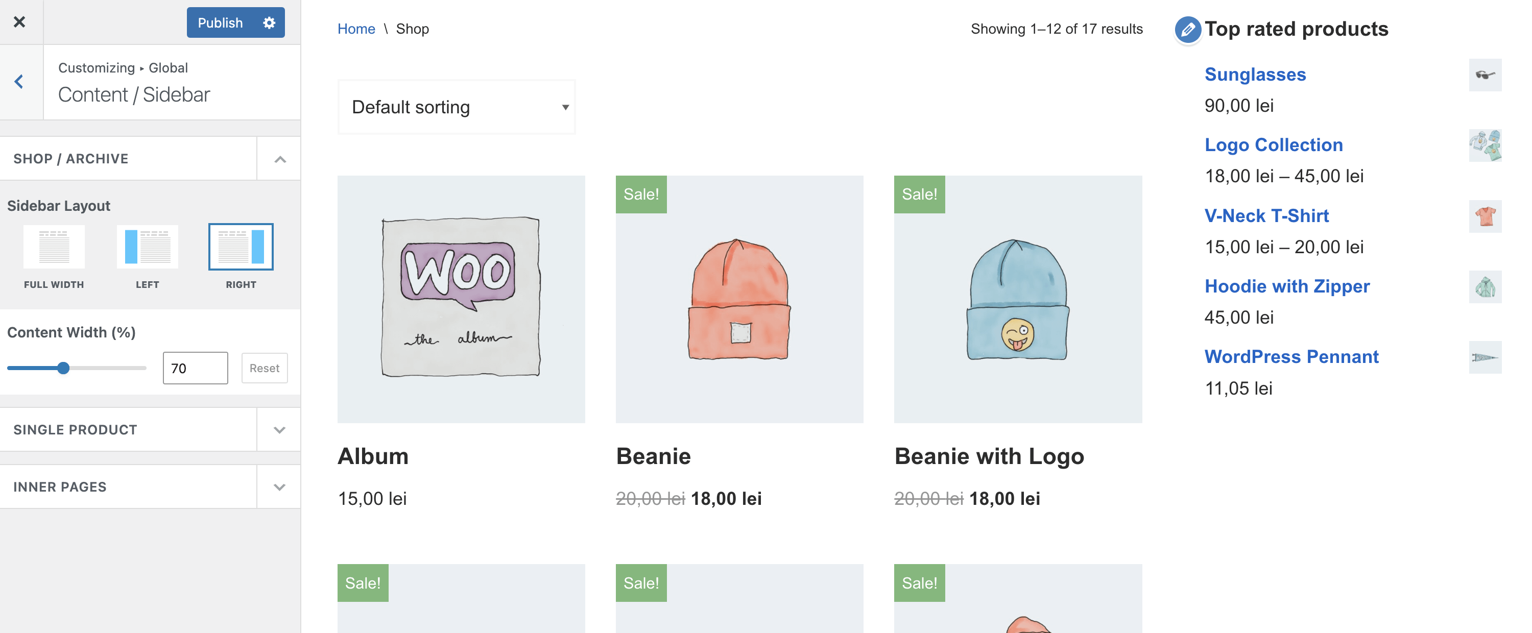
Sidebar Settings
Navigate to Appearance > Customize > Global > Content/Sidebar to access the options.
When choosing a Left or Right sidebar layout, make sure to add widgets in the corresponding Sidebar, by going to Appearance > Customize > Widgets, and select a corresponding Content Width which would allow for the sidebar to show. ( e.g. 70%)
Note: For the Blog page and single post pages, there are dedicated sidebar controls in Appearance > Customize > Blog.
Want to join Neve PRO family? Upgrade now and enjoy all the benefits.
The Blog page
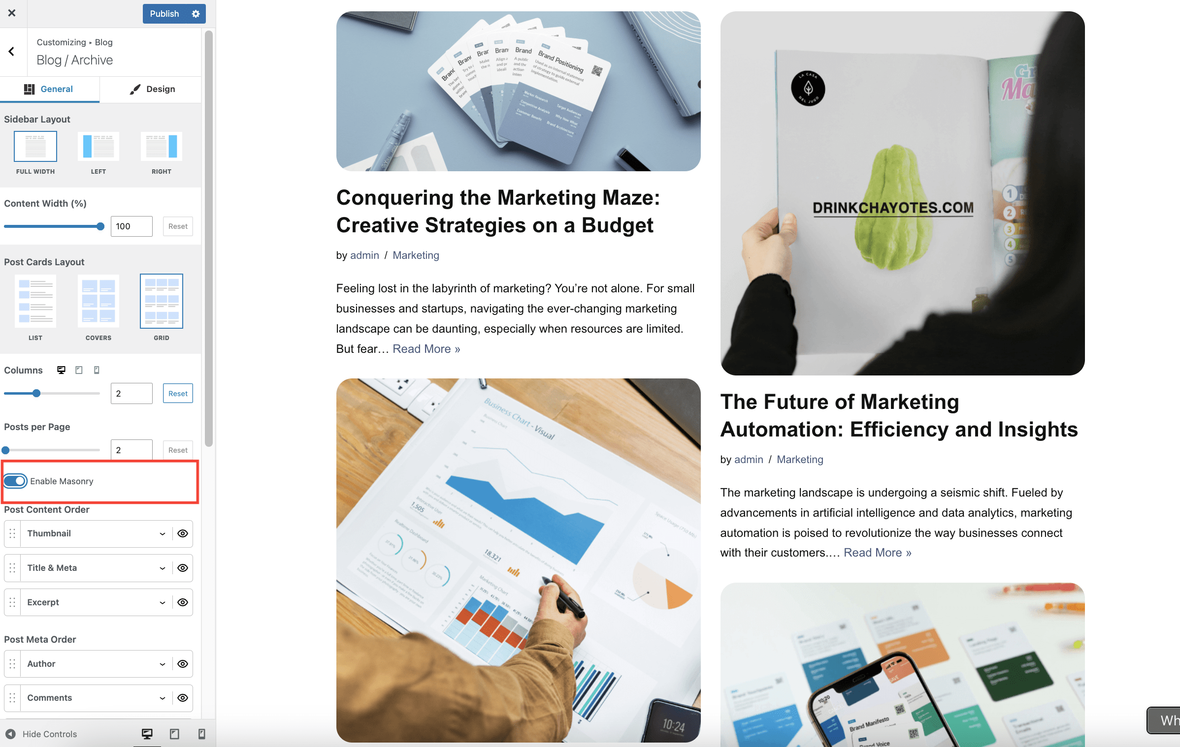
Navigate to Appearance > Customize > Blog > Blog/Archive to access the options:
- Sidebar Layout and Content Width are two related options. When choosing a Left or Right sidebar layout, make sure to add widgets in the Sidebar, by going to Appearance > Customize > Widgets, and select a corresponding Content Width which would allow for the sidebar to show. ( e.g. 70%)
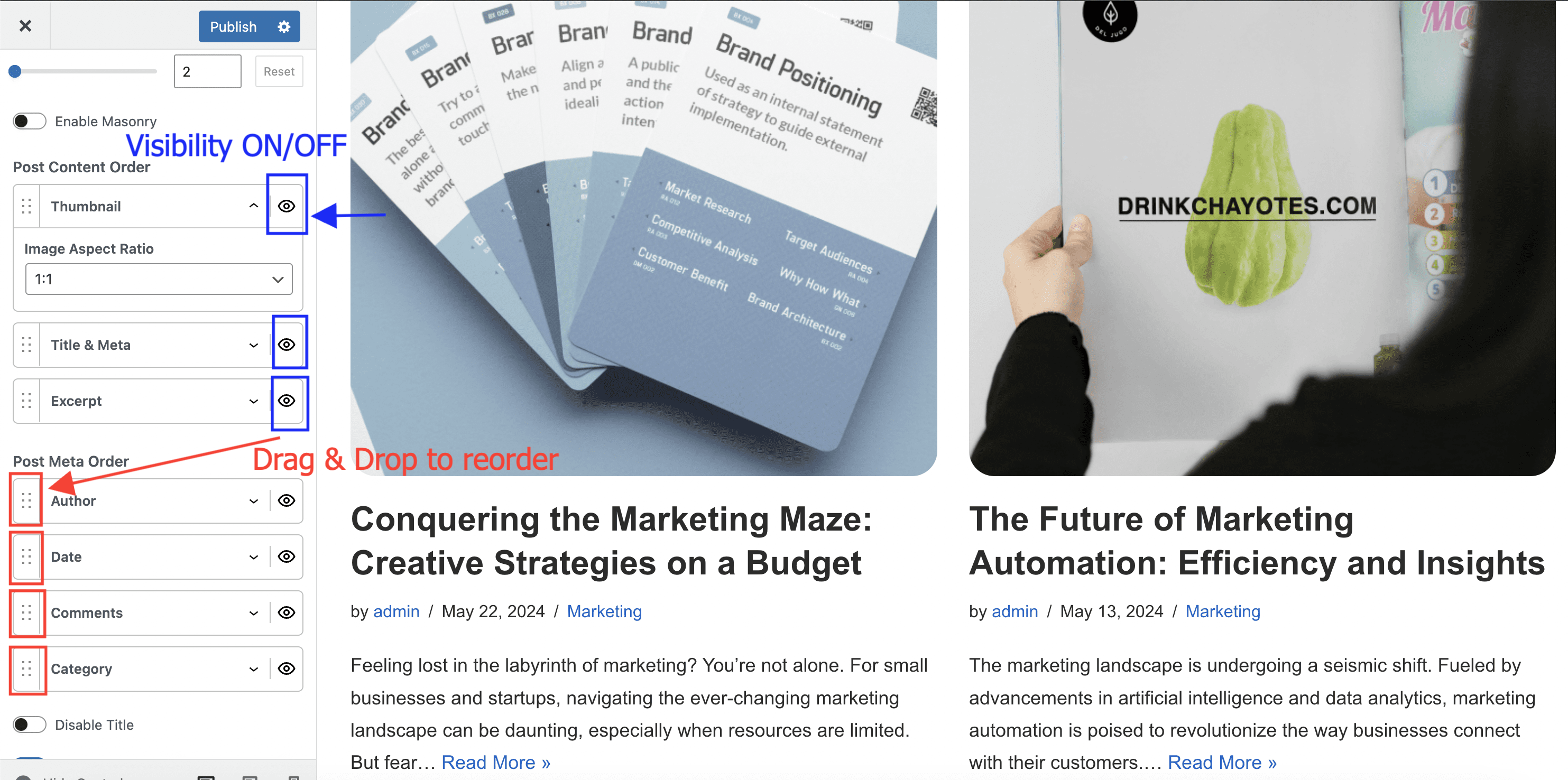
- Post Cards Layout is the main setting of the Blog page. Depending on the selected option ( List, Covers, or Grid ), additional dedicated options are available.
- The Post Content Order and Post Meta Order options allows you to choose a specific layout of each post displayed on the Blog page. Drag & drop elements to reorder them, or click on the little eye icon to show/hide them.
- The Disable Title option is used to hide the main title of the Blog page.
- Enable masonry - When masonry is enabled, items are arranged to minimize vertical gaps between them. Unlike the default grid with fixed row heights, masonry grids adjust the positioning of items dynamically based on their content height.
Single post (article)
General options (apply to all posts)
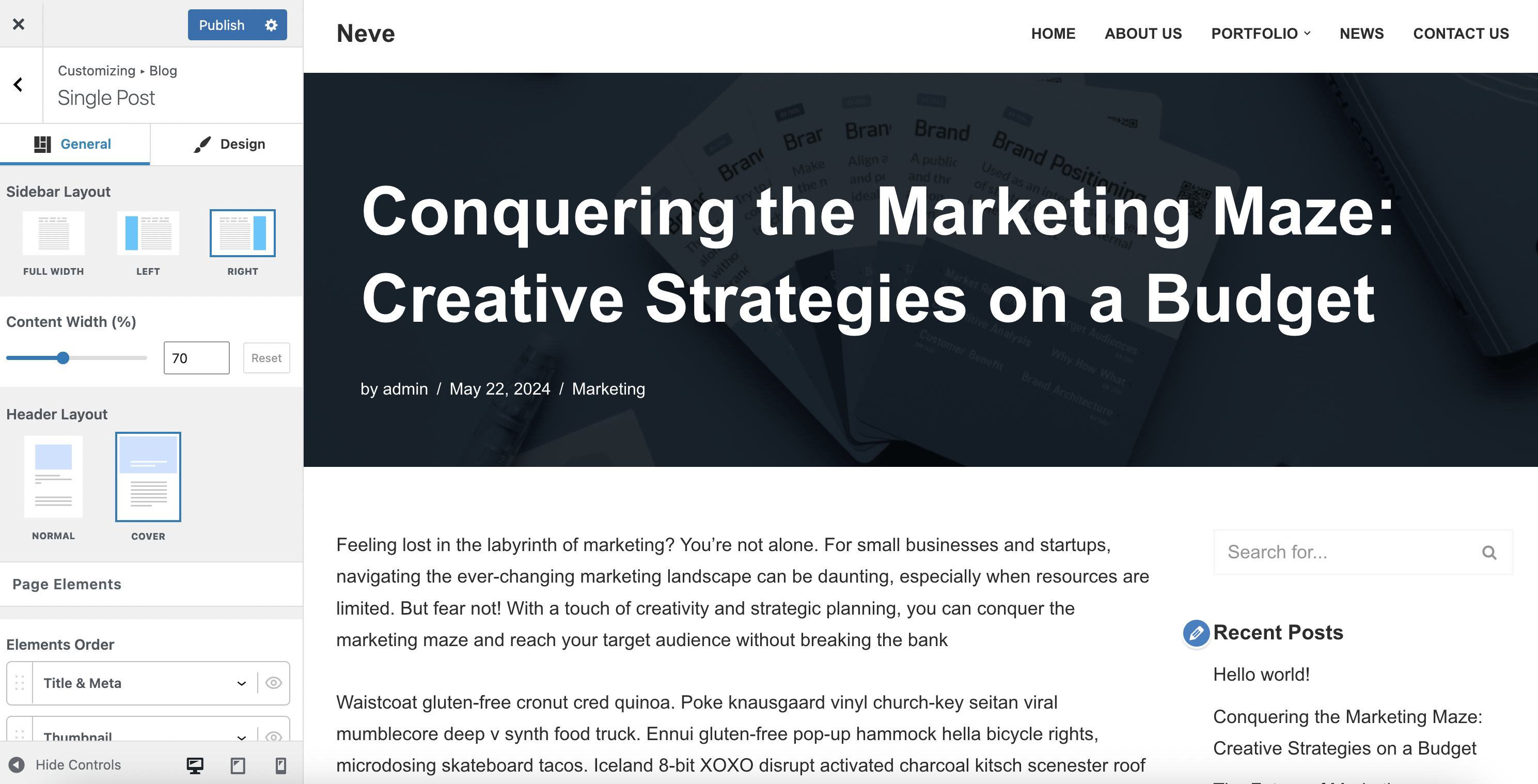
Navigate to Appearance > Customize > Blog > Single Post to access the options:
- Sidebar Layout and Content Width are two related options. When choosing a Left or Right sidebar layout, make sure to add widgets in the Sidebar, by going to Appearance > Customize > Widgets, and select a corresponding Content Width which would allow for the sidebar to show. ( e.g. 70%)
- Header Layout is the main setting of the Single post page. Depending on the selected option ( Normal or Cover ), additional dedicated options are available.
- The Elements Order and Meta Order options allows you to choose a specific layout for the elements of the single post page. Drag & drop elements to reorder them, or click on the little eye icon to show/hide them.
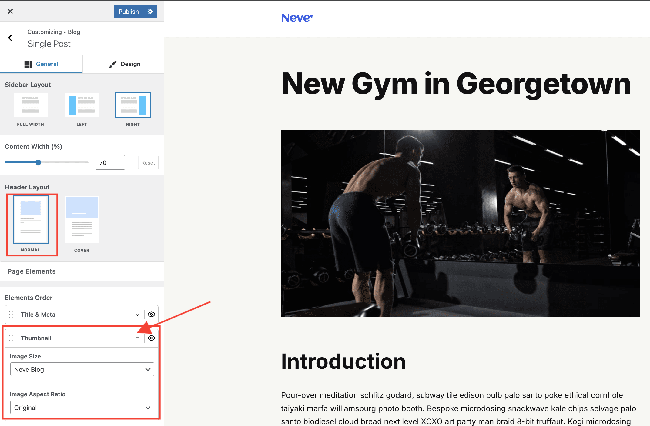
The size of the image on single posts, can be changed from Appearance > Customize > Blog > Single Post > Elements Order. Access the options under Thumbnail, where you will find the Image Size option.
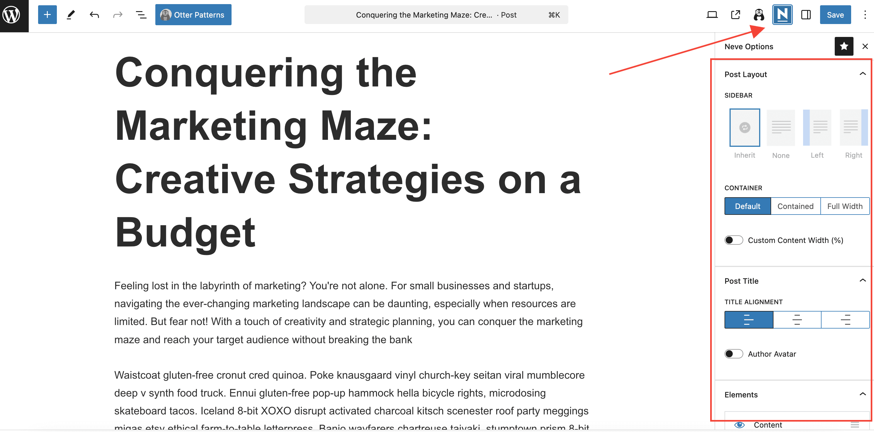
Individual options (apply to a specific post)
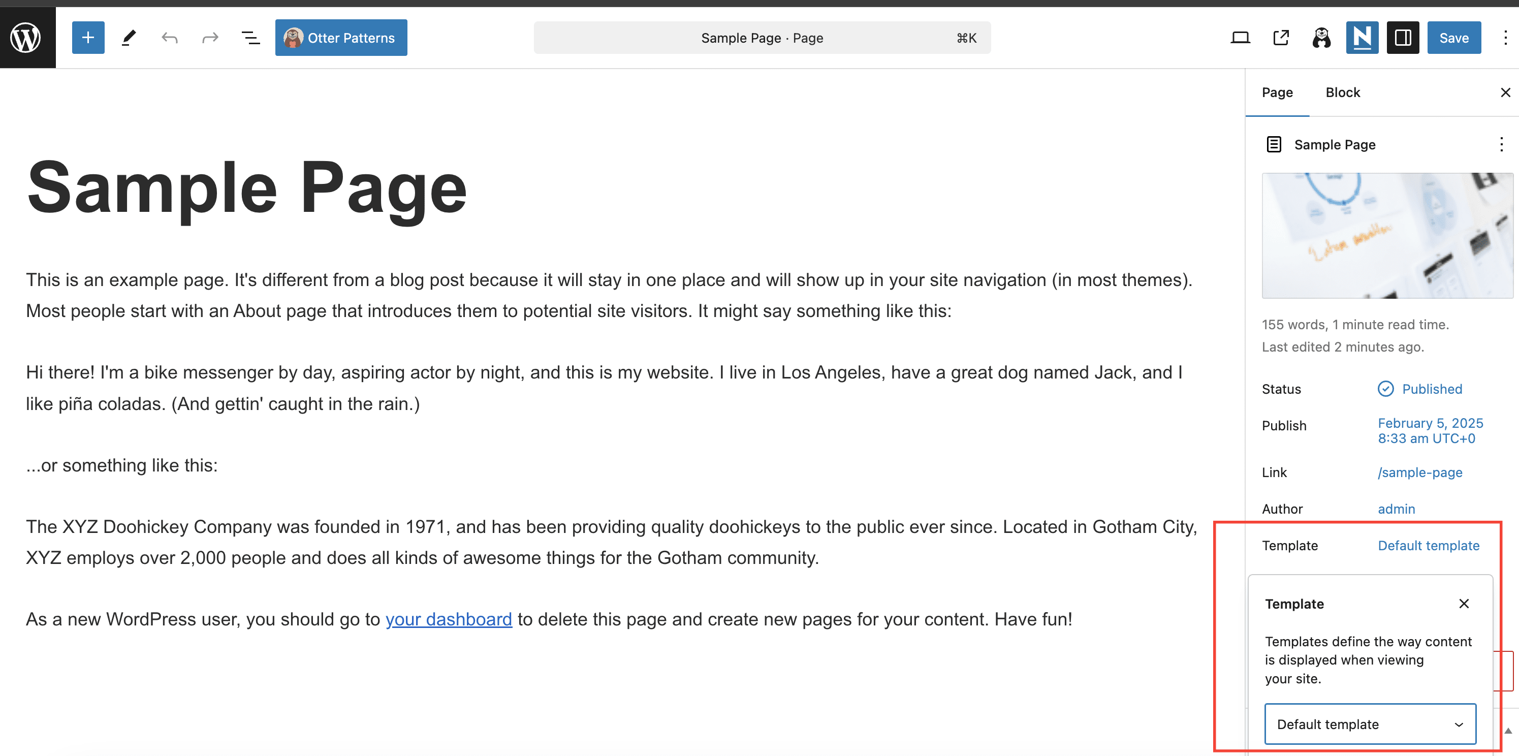
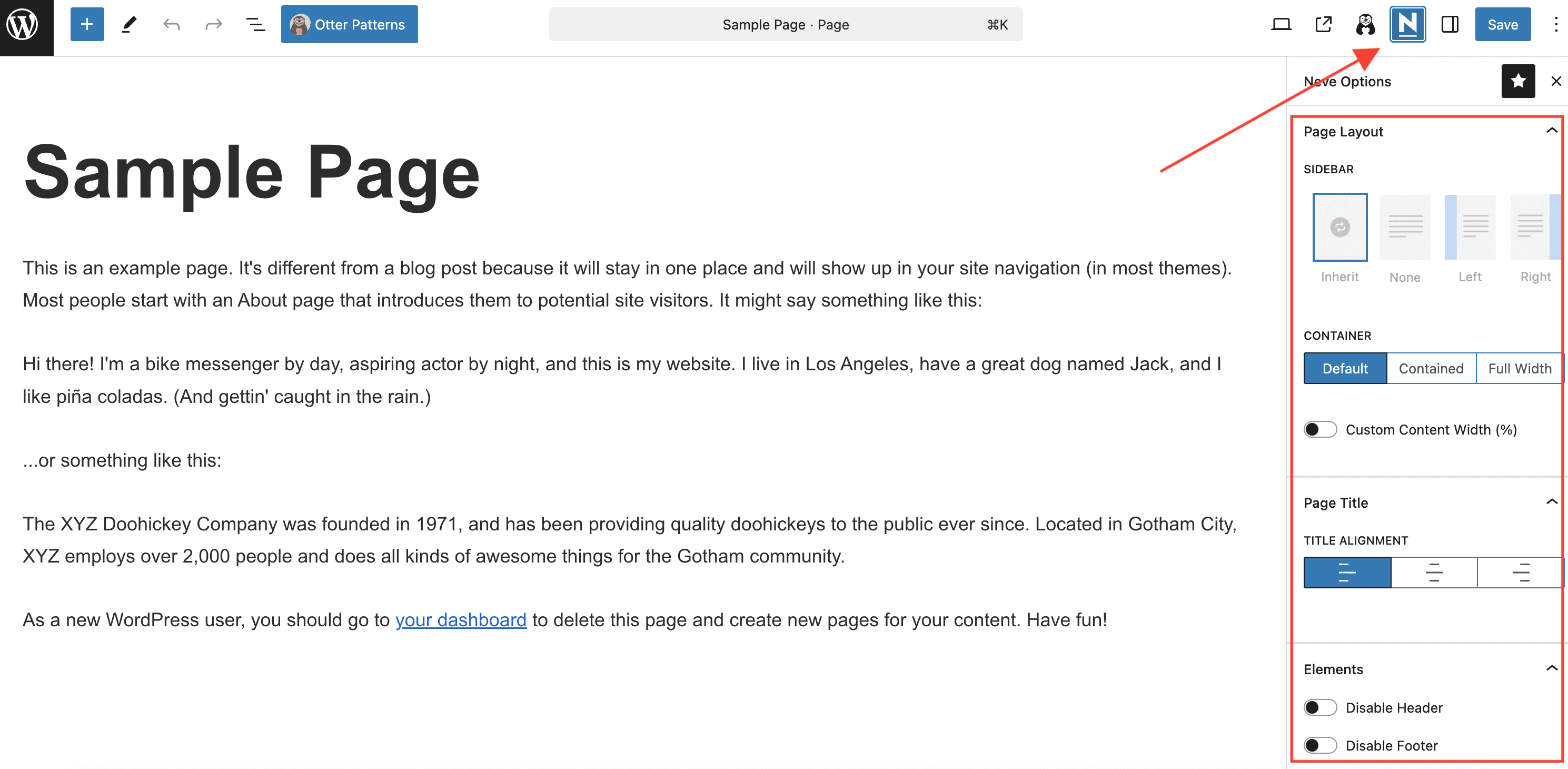
If needed, each post can have its own layout, overriding the general options set before. To obtain that, click on the Neve icon from the single post page, which will open a new panel of options.
Single page
General options (apply to all pages)
Navigate to Appearance > Customize > Global > Page to access the options which will apply on all single pages.
Note: The options apply just to pages using the Default Template. For other page templates, some/all options may not apply.
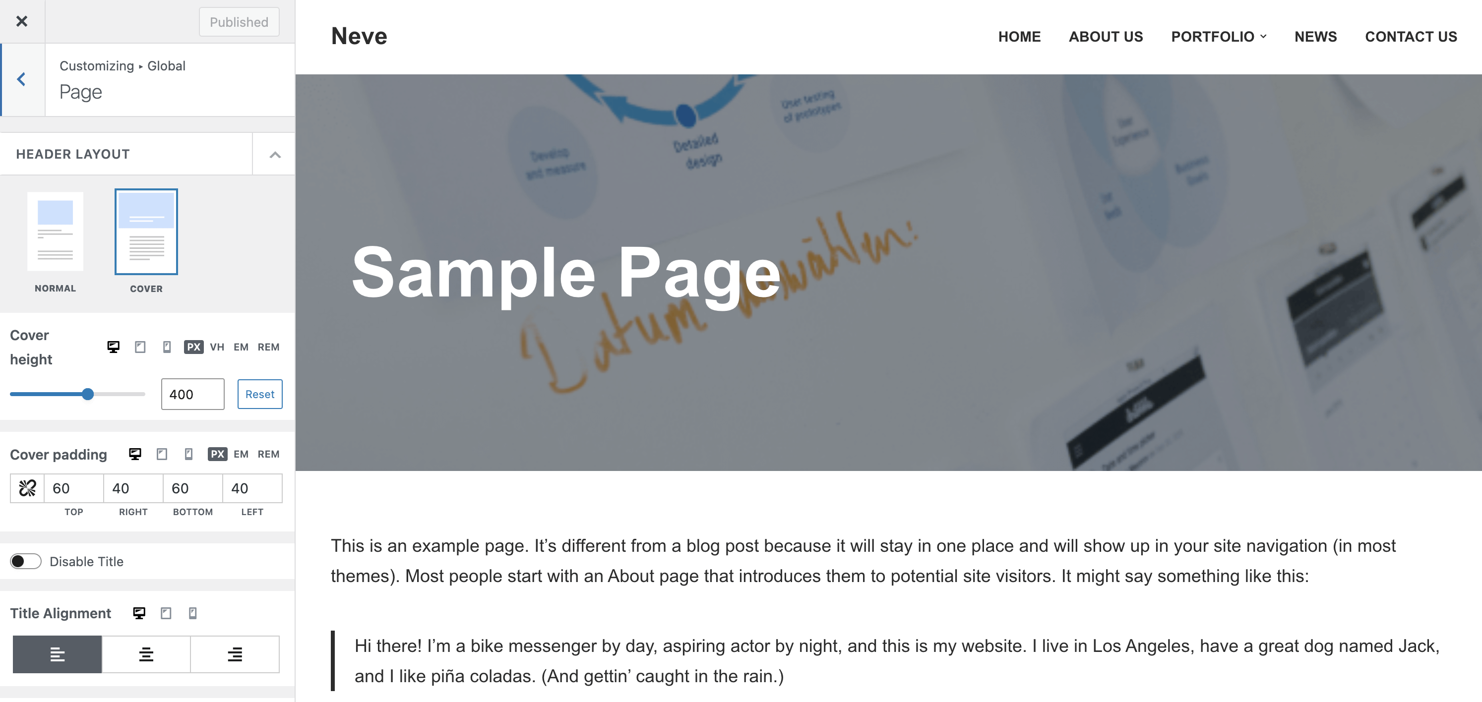
Header Layout is the main setting. Depending on the selected option (Normal or Cover), additional dedicated options are available.
Individual options (apply to a specific page)
If needed, each page can have its own layout, overriding the general options set before. To obtain that, click on the Neve icon from the single page, which will open a new panel of options.
WooCommerce
Neve is compatible with the WooCommerce plugin and can be used to create a good-looking e-commerce site. You can even try one of our dedicated starter sites for e-commerce.
Once WooCommerce is installed and activated, navigate to Appearance > Customize > WooCommerce where all Neve related options can be found.
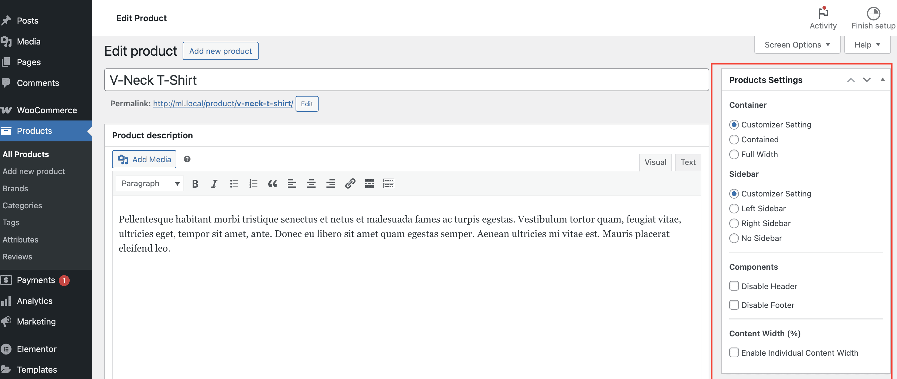
Besides the general options, each product has its own dedicated options (for sidebar, content width, enable/disable header and footer), in the product editor. If used, these options override the ones from Customize.
Need more advanced options for your E-commerce site? Take a look at all the options available in Neve PRO's WooCommerce Booster module.
Video - How to make a WordPress website for beginners?
Want to join Neve PRO family? Upgrade now and enjoy all the benefits.