Neve Header Builder
Neve comes with a versatile builder for the header area of your site. With just a few clicks you can create your perfect header.
📝 Note: If you are interested in getting all the features of the Header Booster module, just open this page.
In this article
Related docs: Multiple Headers (Pro) | Mega Menu (Pro)
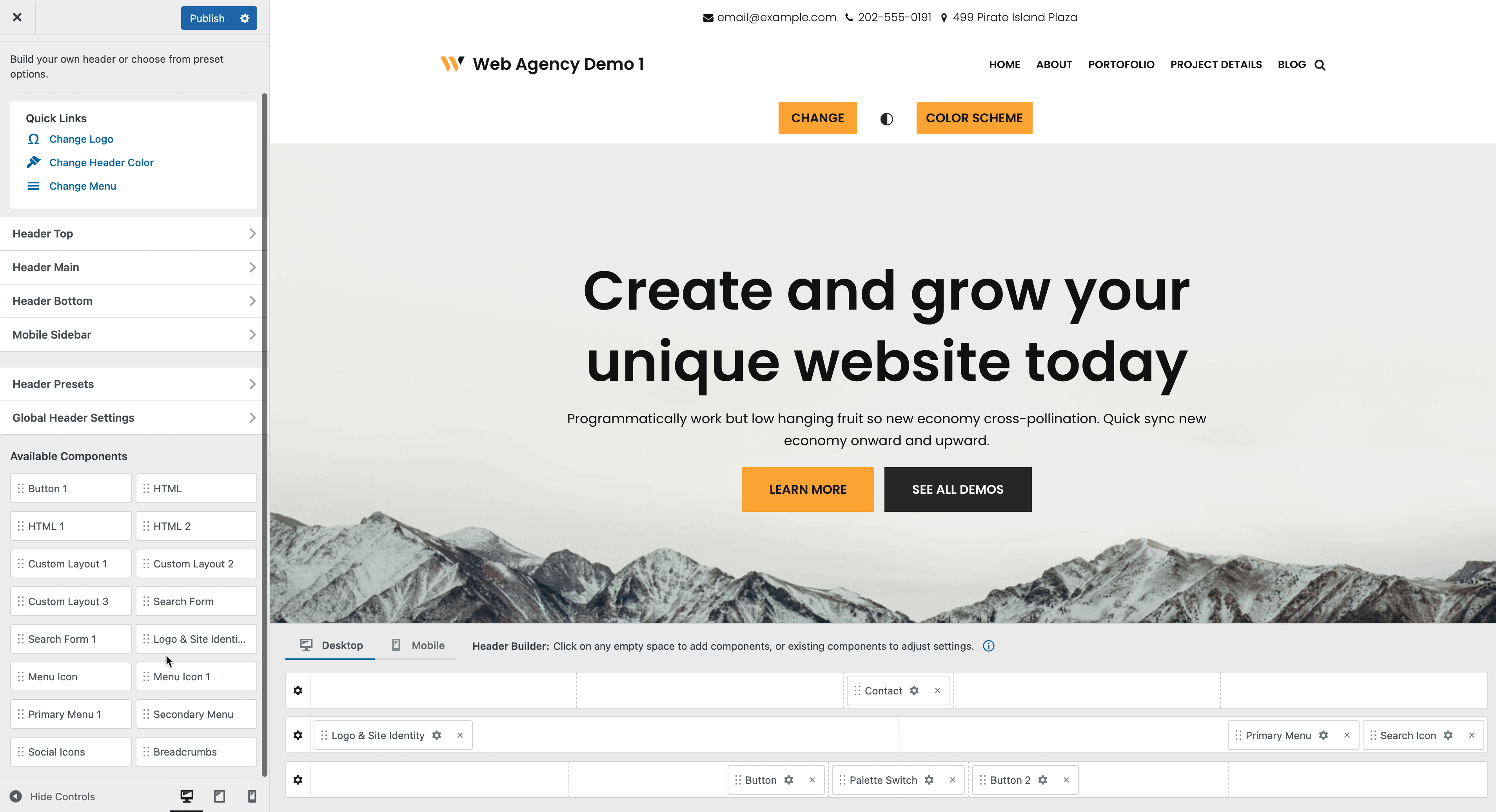
Open the Header Builder
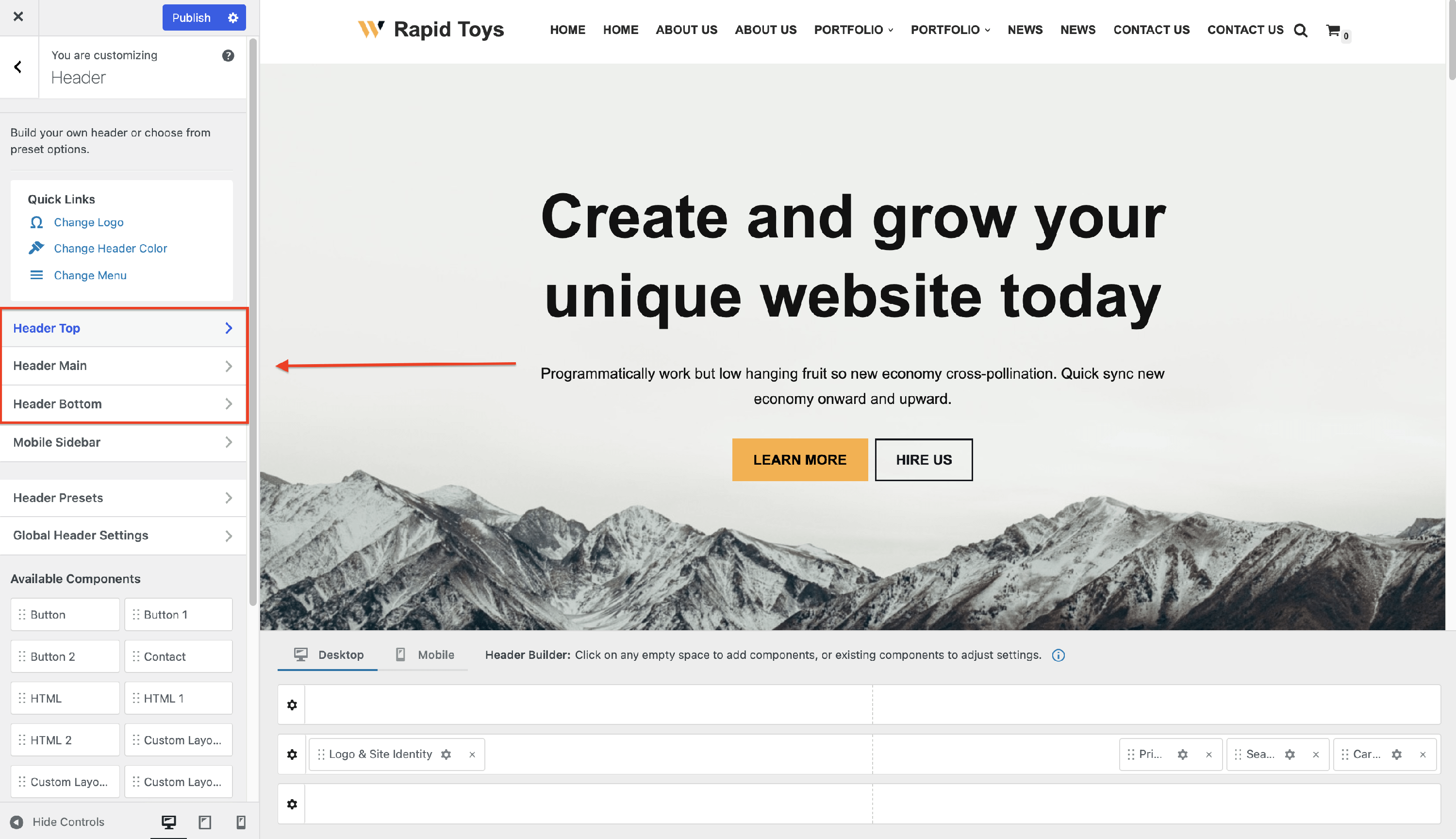
1. Navigate to Neve > Customize. 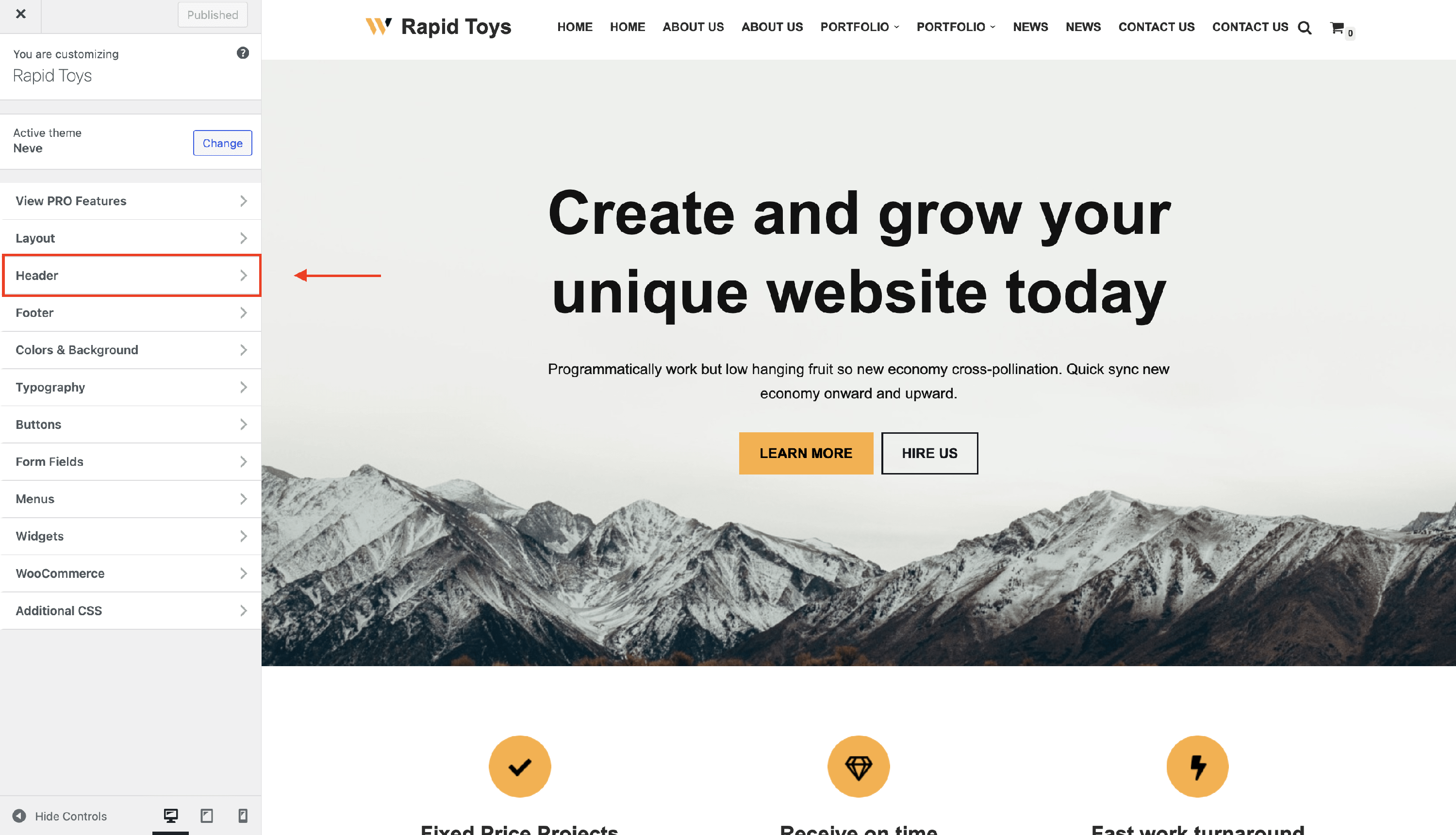
2. Click on the Header panel to open the header builder. 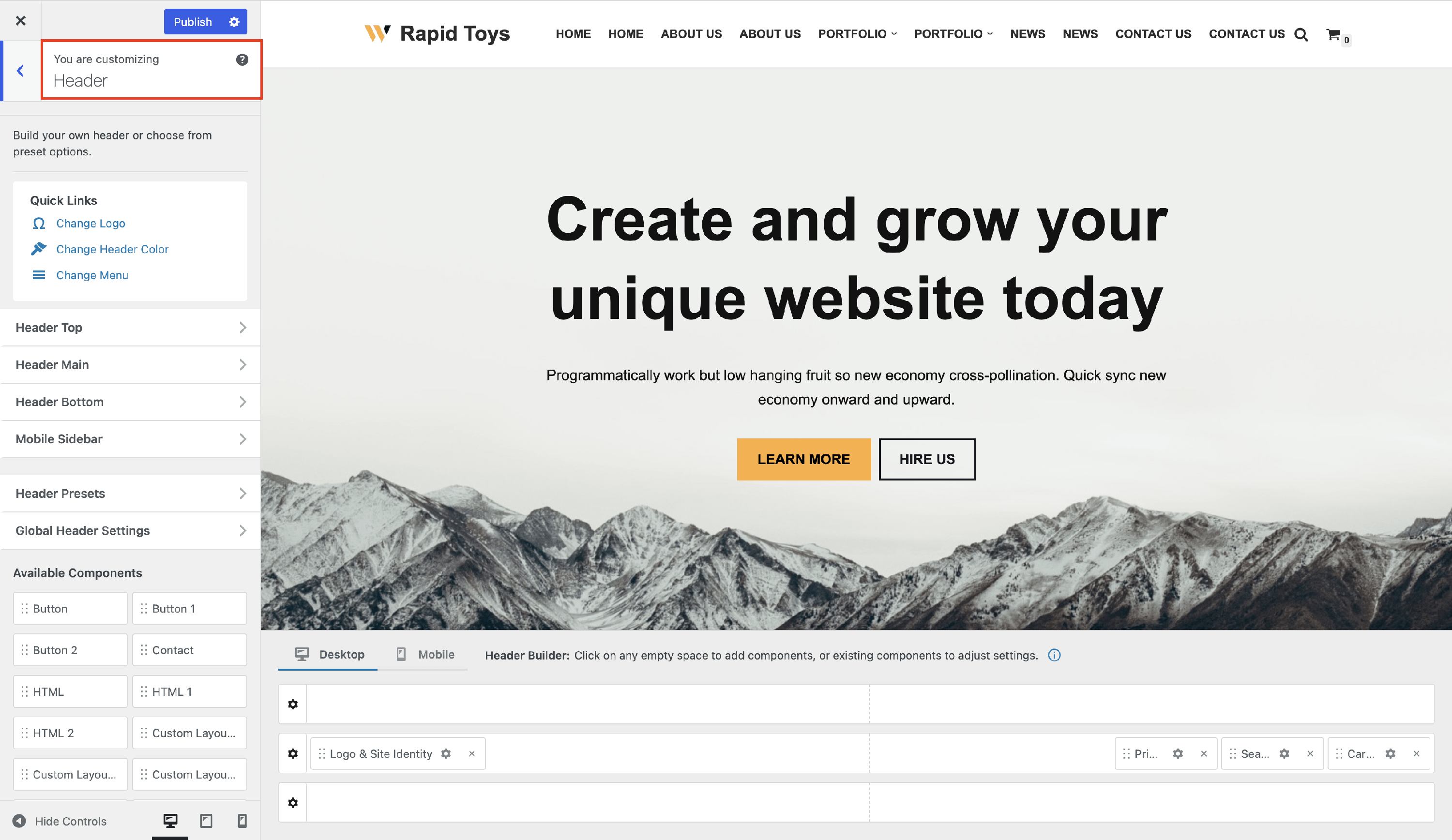
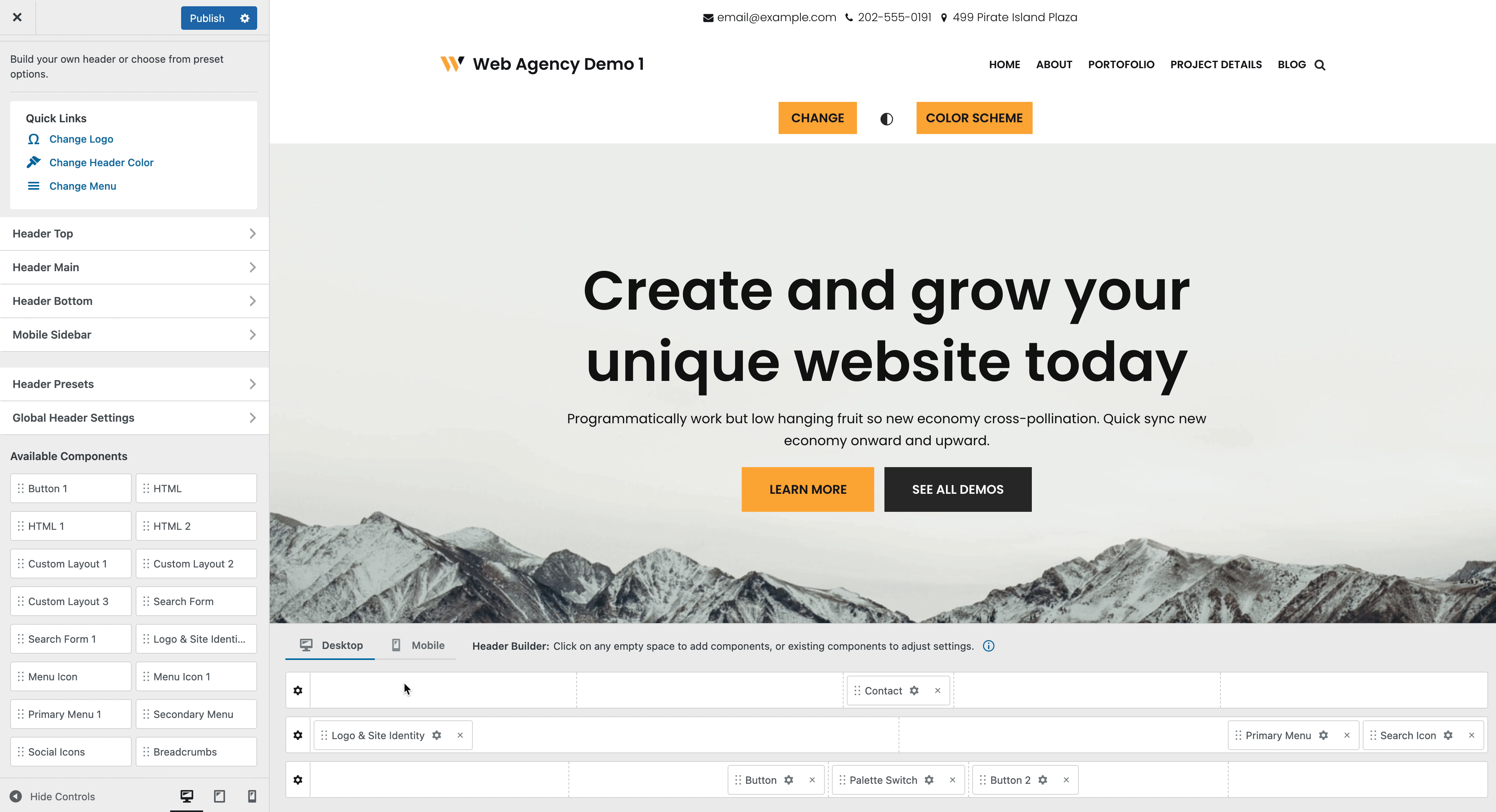
Header Builder Layout
The Header Builder consists of two areas:
- Header Live View Area - where you can see the live preview of how the header will look on the site.
- Header Builder Area - where you can add, reorder, and remove components.
Explore the Mobile Header Builder
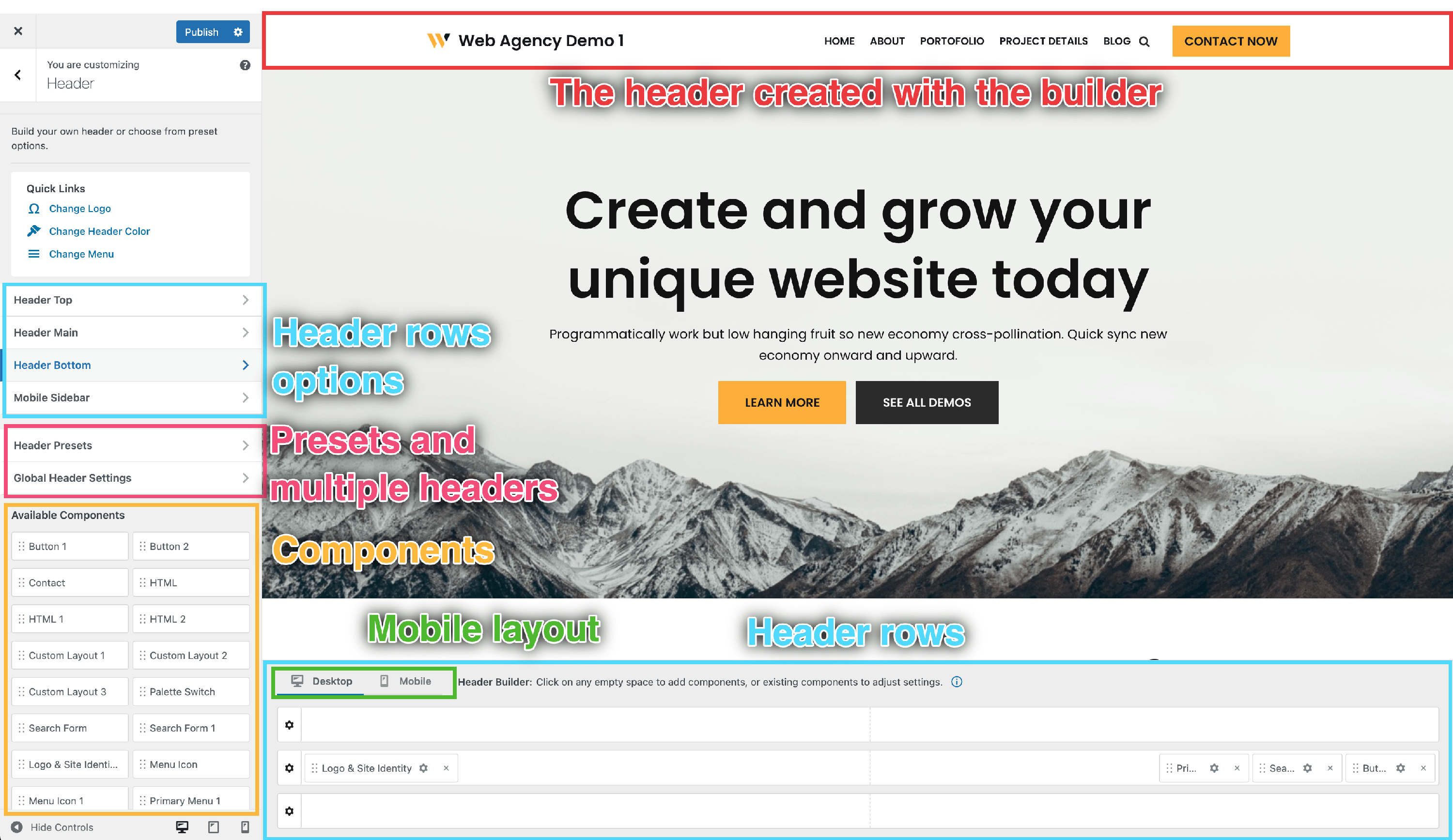
Header Builder Rows
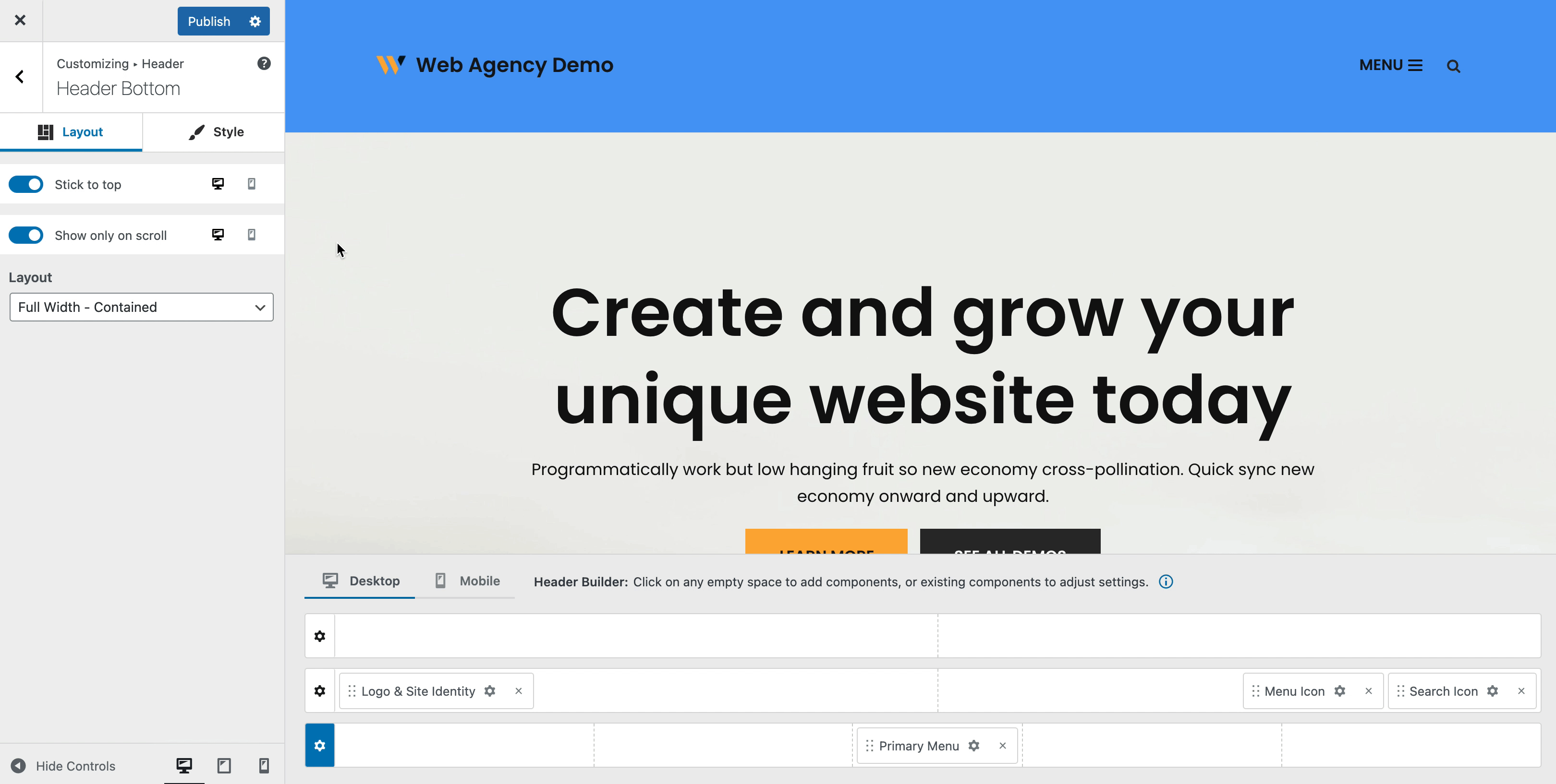
The header builder area has three rows (Header Top, Header Main, and Header Bottom ) in which you can easily select and arrange the available components while hovering over each division of the rows.
| Rows Structure | Rows Opening |
| Rows Customizations |
Rows Structure
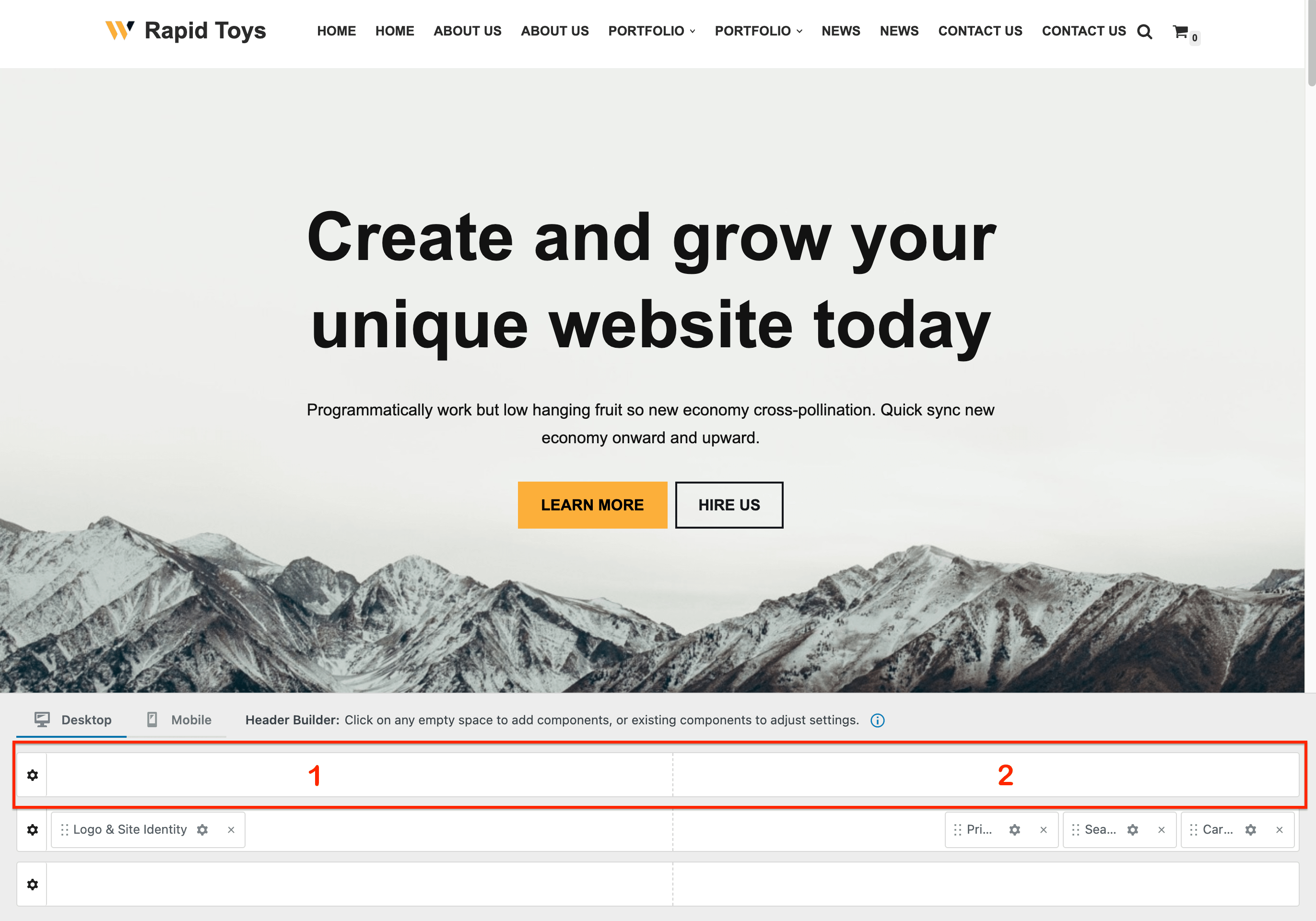
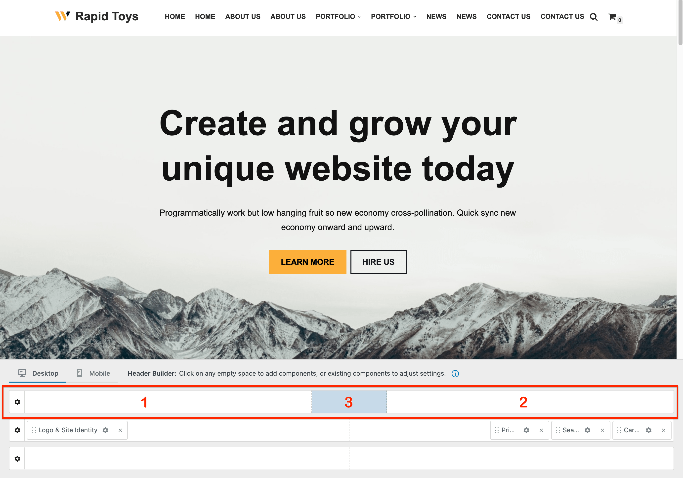
Each header row can be split into 2, 3, or 5 columns - this is done automatically based on where the first components are added. To start splitting a row into more columns, you can add a component on the left/right side which will split the row into two equal areas, like the middle one in the above screenshot.
- Two columns - the components on each side are automatically aligned based on the space they occupy:
- the left column - aligns them starting from the left top the middle.
- the right column - aligns them starting from the right to the middle.
- Three columns - in addition to the case presented above, one component can be added exactly in the middle of the row and this one will be centered.
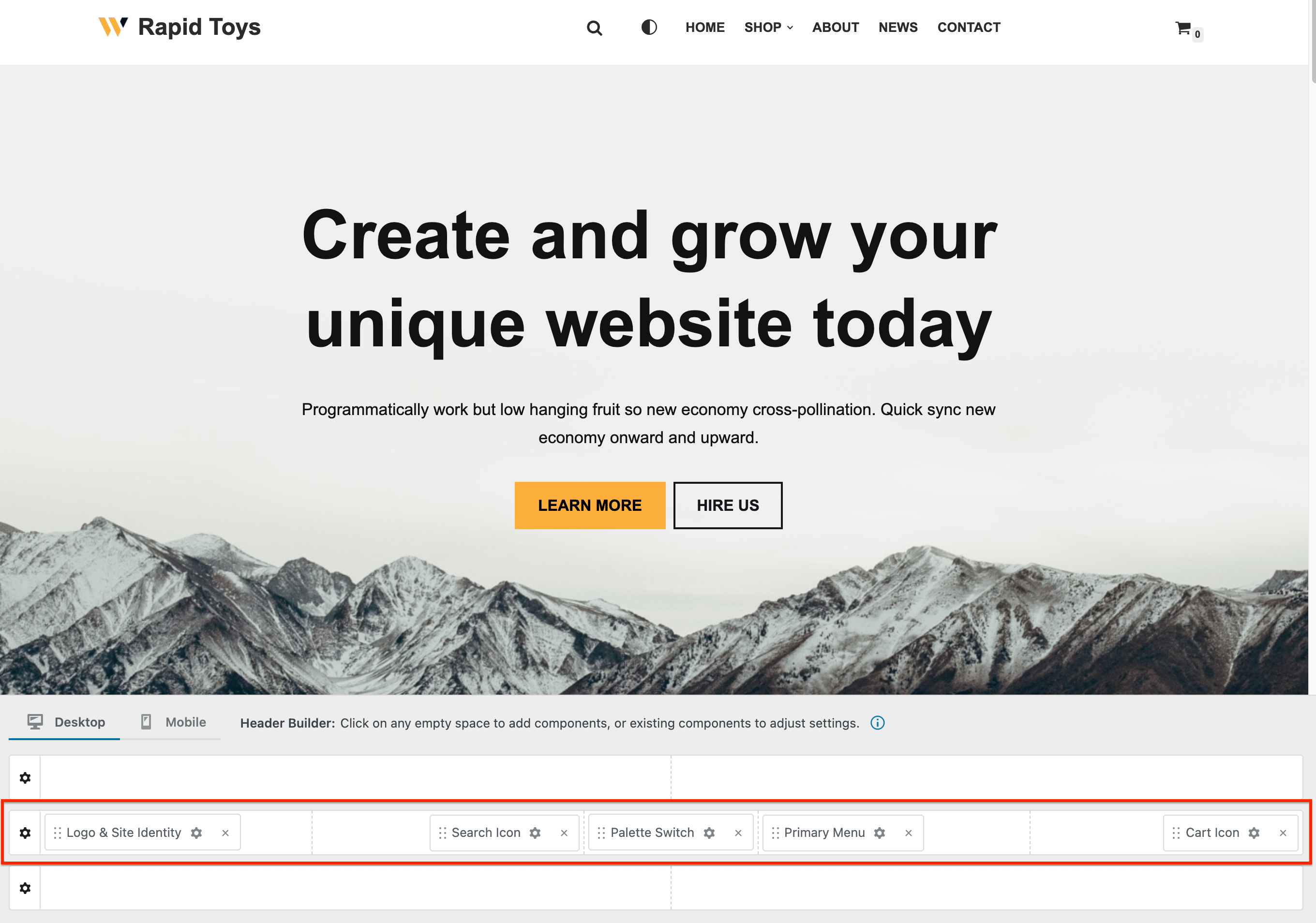
- Five columns - once a component is added to the middle, it will be possible to use two new areas, left middle and right middle. The components alignment, in this case, will be as follow:
- left area: items aligned from left to middle
- left middle area: items aligned from middle to the left
- middle: one centered item
- right middle: items are aligned from middle to right
- right: items are aligned from right to the middle
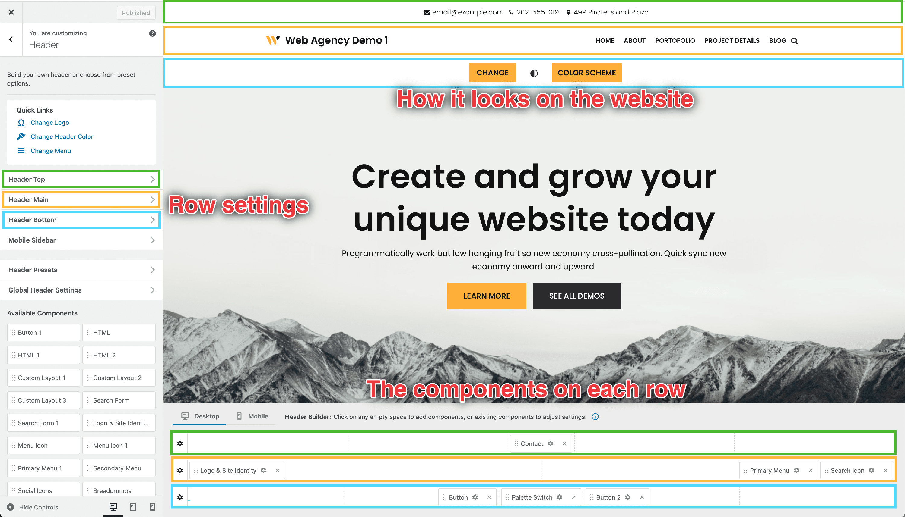
Rows Opening
Each of the three rows ( Header Top, Header Main, and Header Bottom ) of the header builder can be styled individually, which can be done in two ways:
- by clicking on the ⚙️icon, which appears at the beginning of the row once you hover over it.
- by clicking on any panel of the menu, on the left side (Header Top | Header Main | Header Bottom).
Any of the ways will generate the same thing: opening the row settings available on the left side.
Rows Customizations
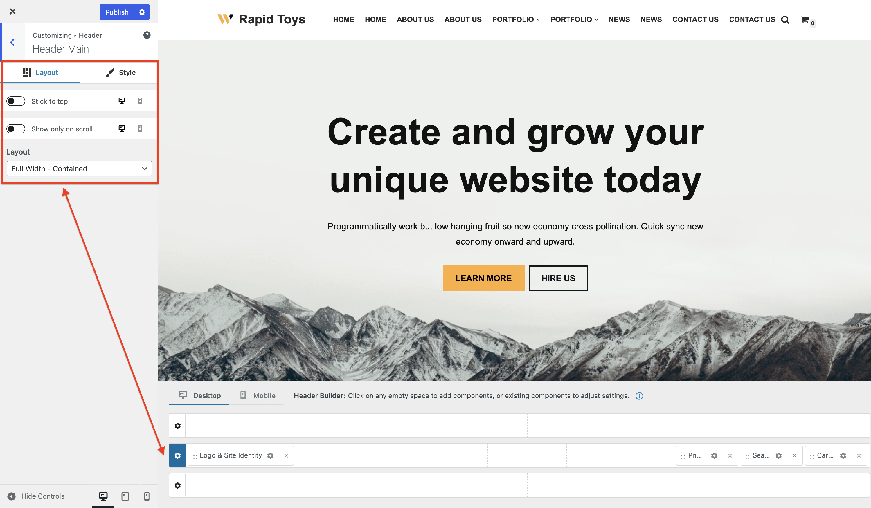
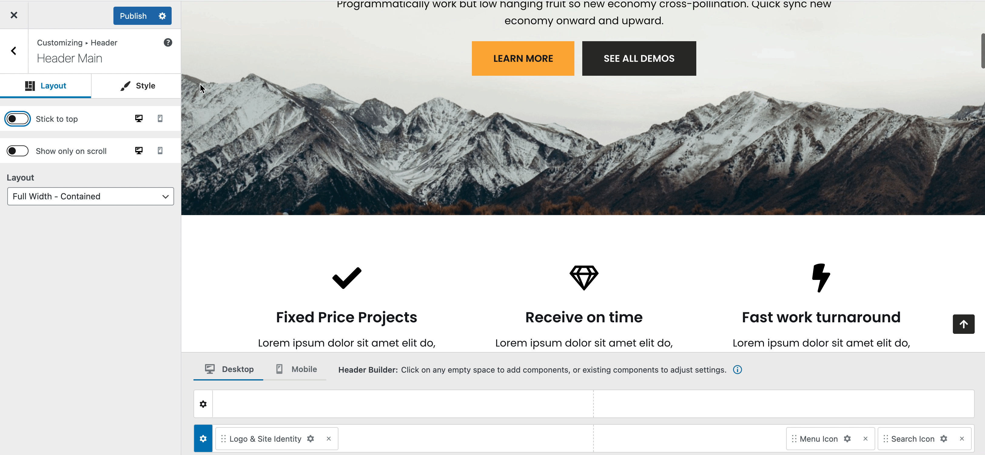
Each row has the following options / customizations available:
- Stick to top
- Show only on scroll
- Layout
- Row height
- Text Color
- Row bottom border
- Row background: Color | Image
Layout Tab
( PRO ) Stick to top
By default header rows disappear when scrolling the page down. Enable this option to make the row sticky.
( PRO ) Show only on scroll
Use it in combination with the above option enabled to shrink a header row.
📝 Note: You may find useful this article about how to shrink the sticky header on scroll.
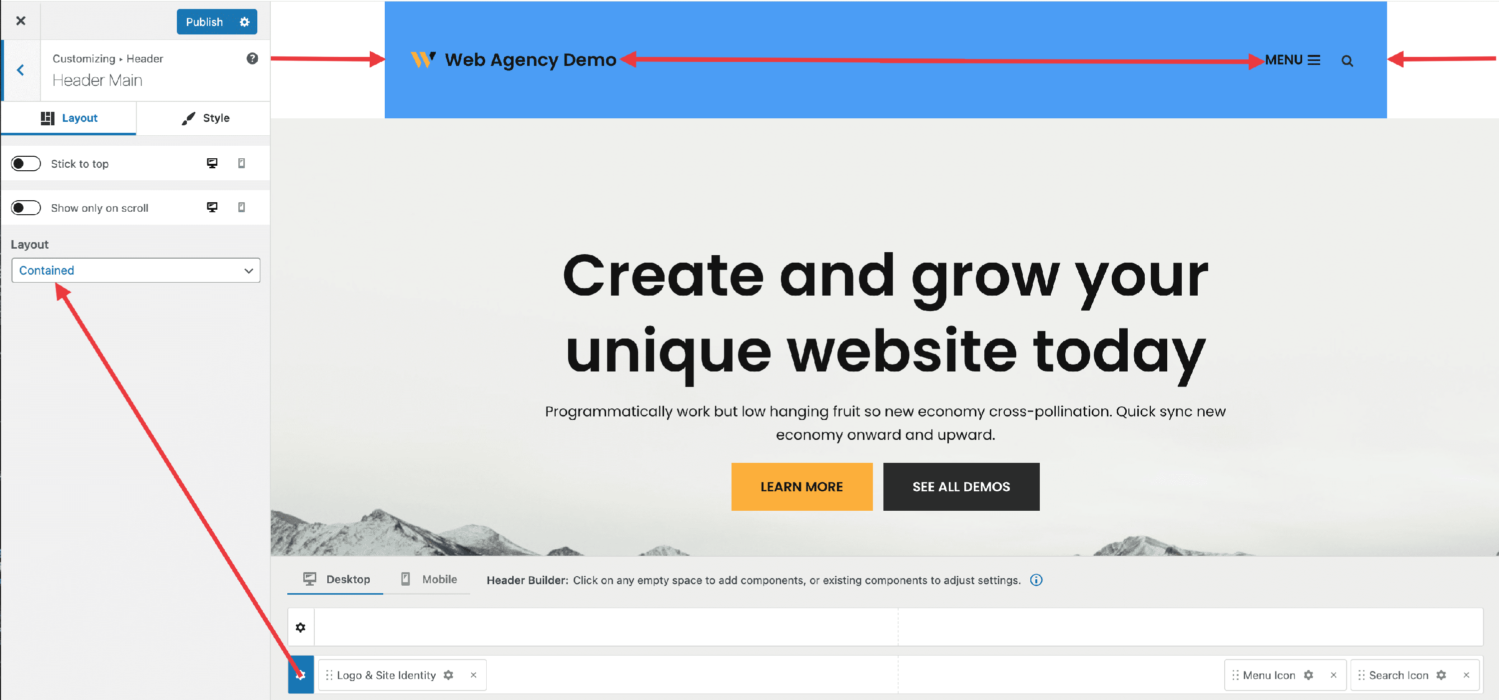
Layout
The layout has three options available:
- Full Width - Contained - the row content is wrapped by the page container and the background color stretch the full width.
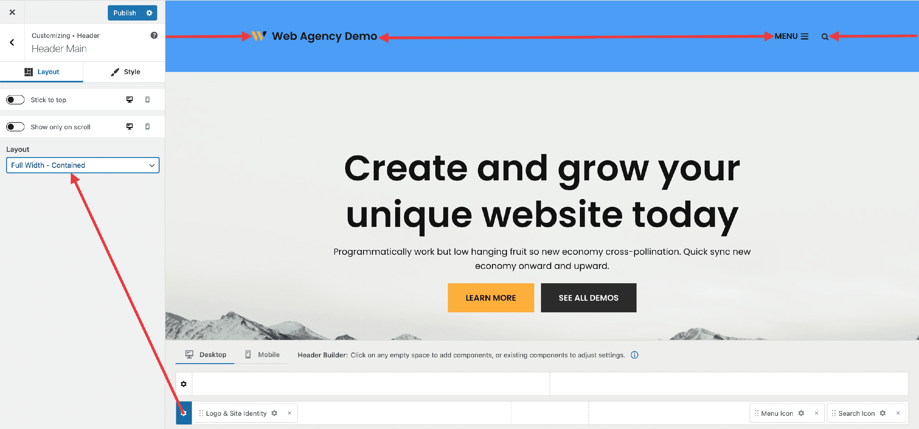
- Full Width - content and background color stretch the full width.
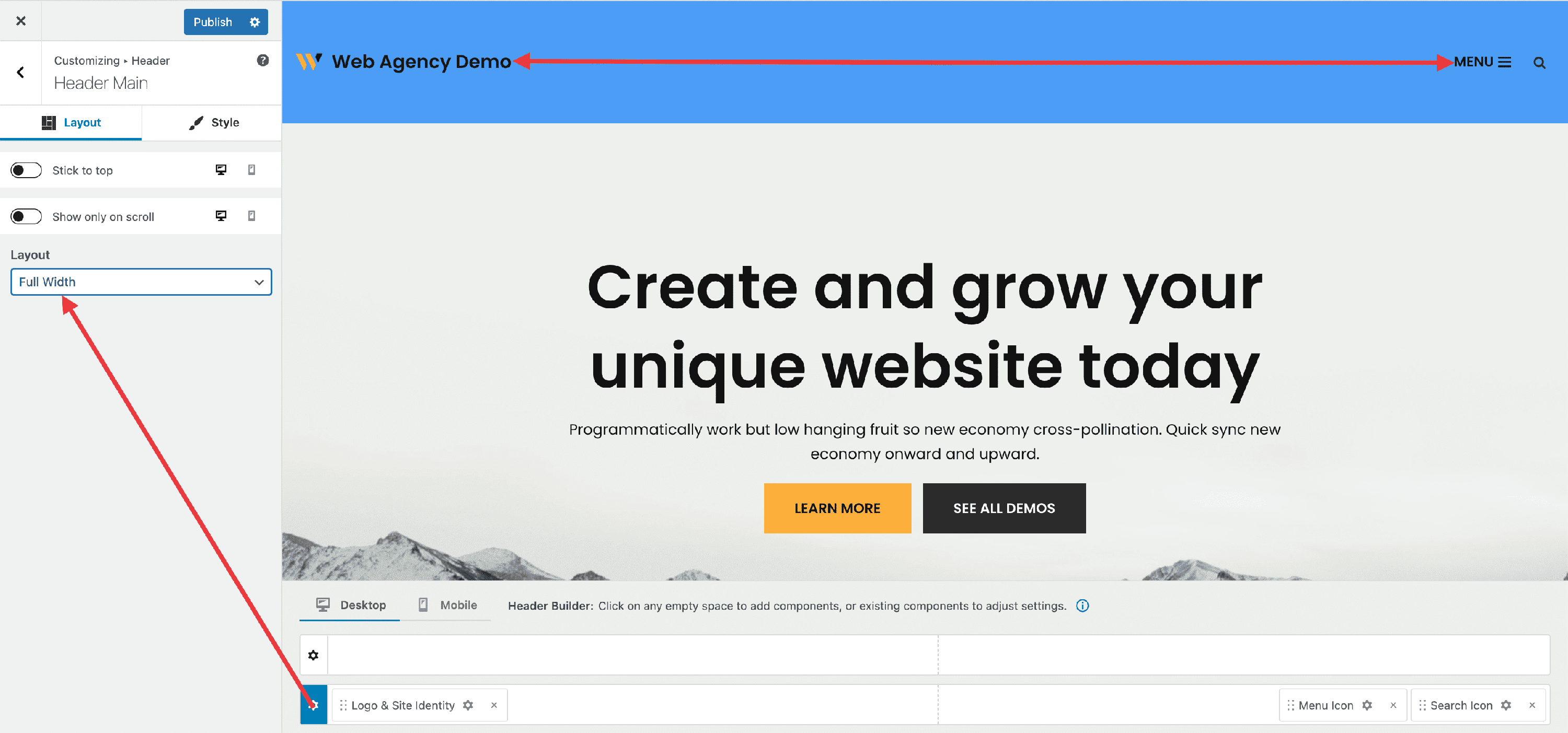
- Contained - both the content and background color are wrapped by the page container.
Style Tab
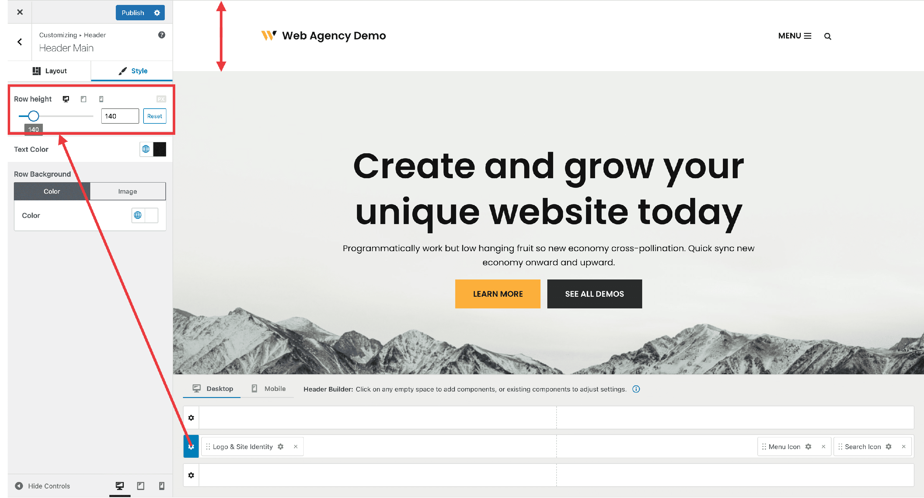
Row height
The value of the height can be inserted ( as an integer) - in PX, EM, or REM - or set using the slider.
- it has a reset button.
- it's responsive ( Desktop | Tablet | Mobile ).
Text Color
This modifies the default color of the content's text.
- it gives the user the possibility to use one of Neve's Global Colors, by clicking on 🌐.
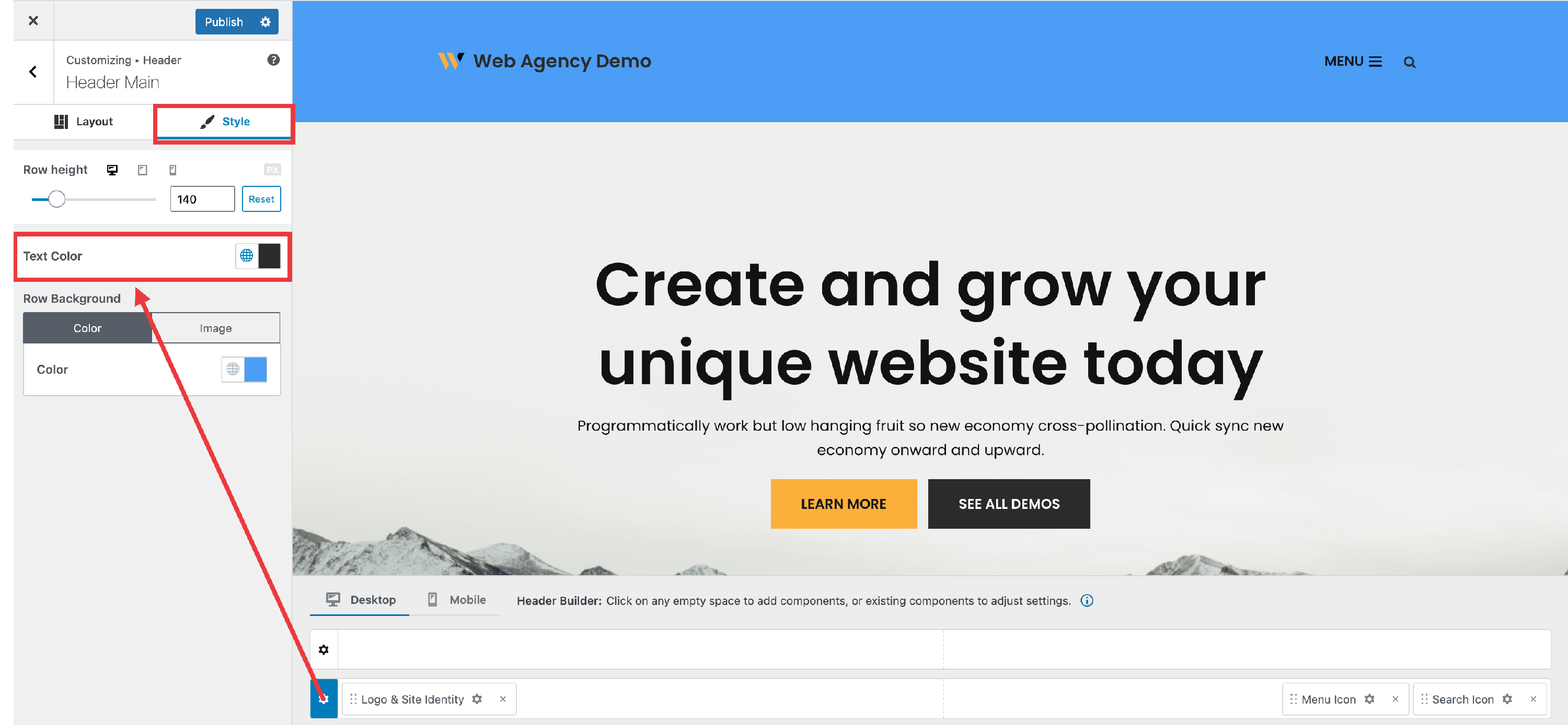
📝 Note: Here is a dedicated doc about Global Colors in Neve.
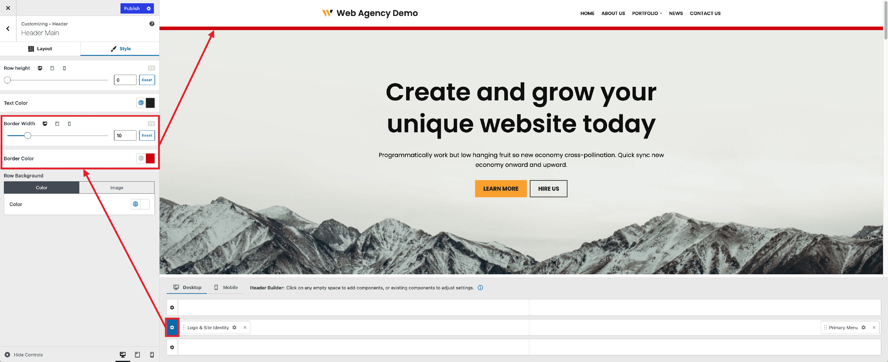
Row Bottom Border
This option allows a bottom border to be set on each header row.
Border Width
- set a width in pixels; you can set a different value for Desktop, Tablet, and Mobile.
Border Color
- choose a color of your own.
- choose from Neve's Global Colors ( 🌐).
📝 Note: Here is a dedicated doc about Global Colors in Neve.
Row Background
This area includes two options:
- Color
- choose a color of your own.
- choose from Neve's Global Colors ( 🌐).
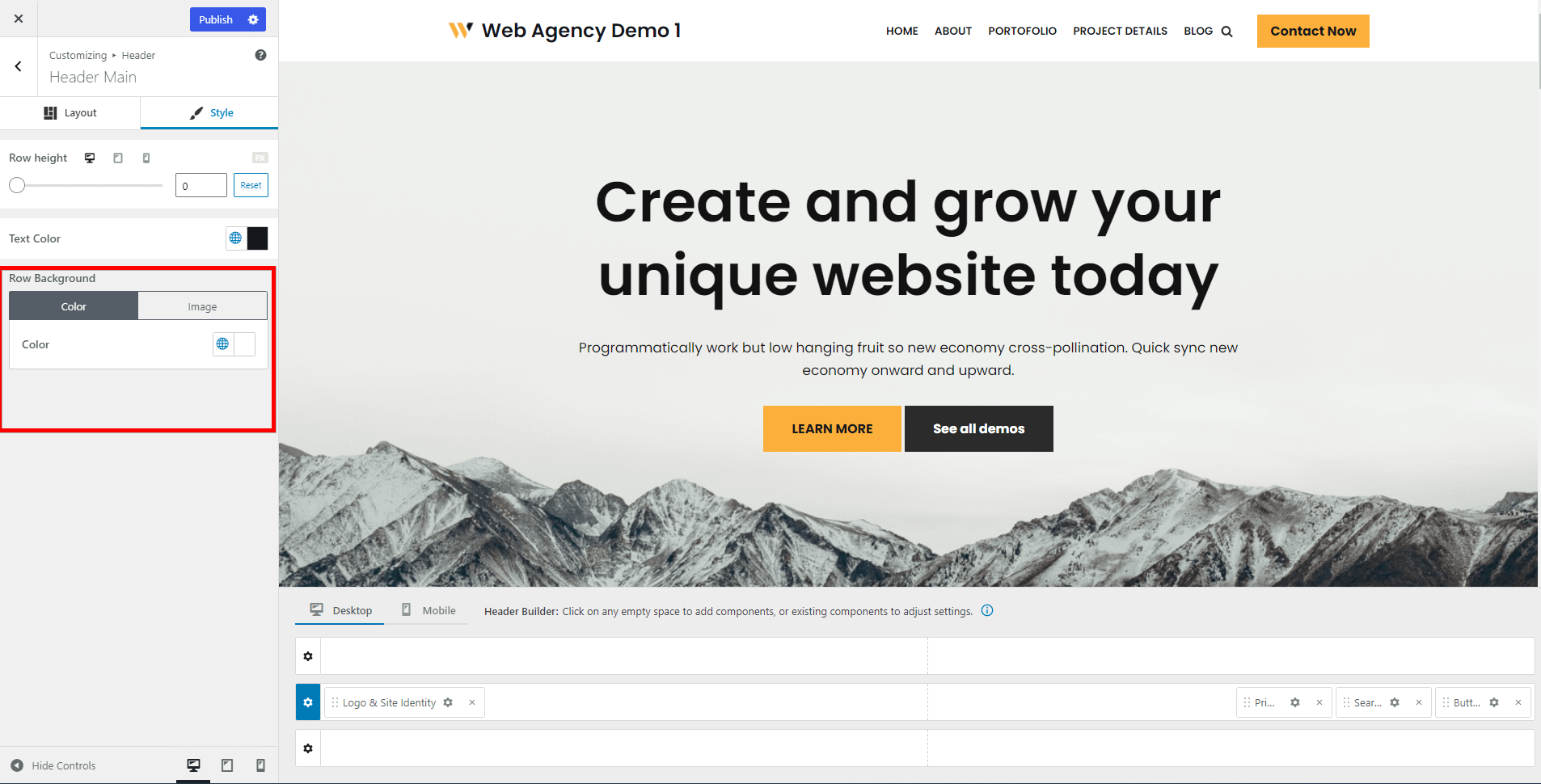
📝 Note: You can boost the header's appearance by using the Gradient option that can be accessed from the color tab.
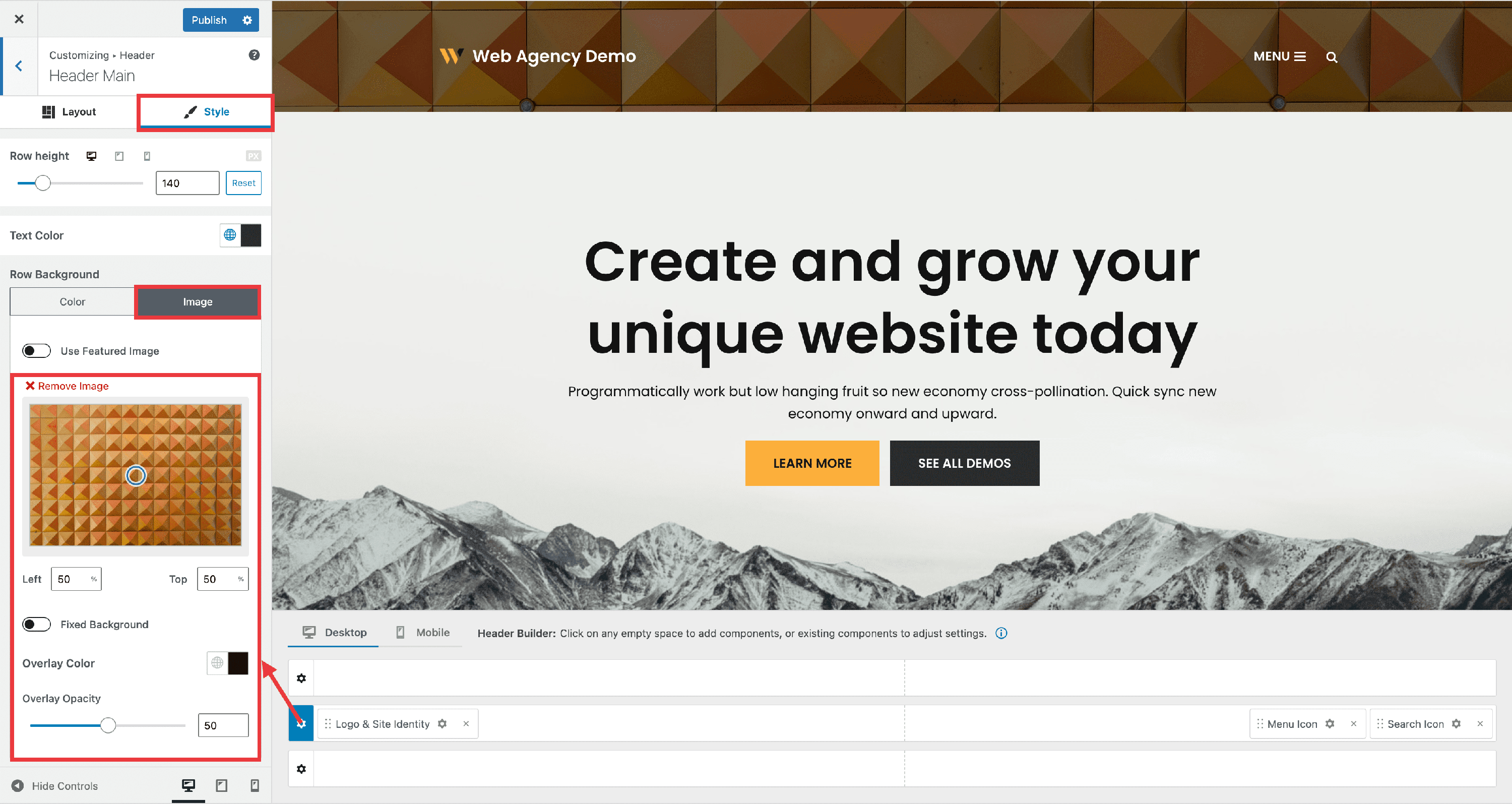
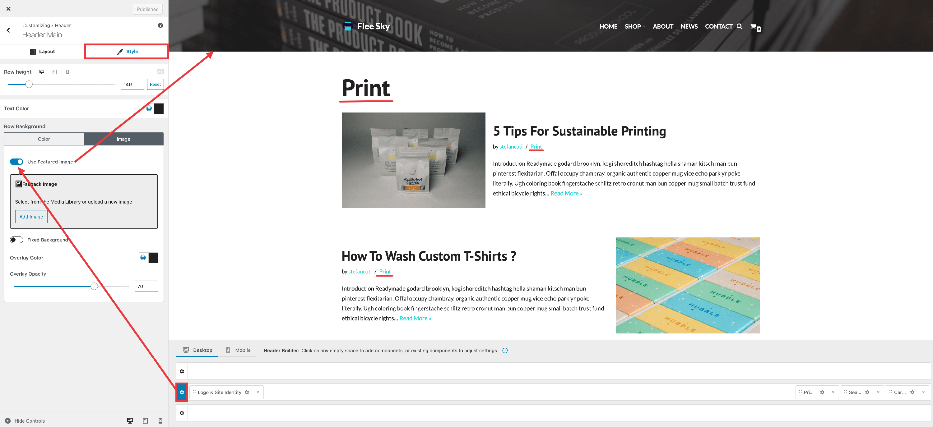
- Image
- it possible to use the featured image of the current post / page as the background by enabling the toggle available there.
- when using a static image as in the screenshot below, it's also possible to add an overlay.
Using archive featured image as the background
WordPress allows a featured image to be set on posts and pages, by default. As explained in the above chapter within this guide, Neve allows that featured image to be used as the background of a header row. This feature extends the same functionality to archive pages.
First, you need to enable the featured image field for the desired taxonomies, and this can be done from the Neve Options page within the Dashboard.
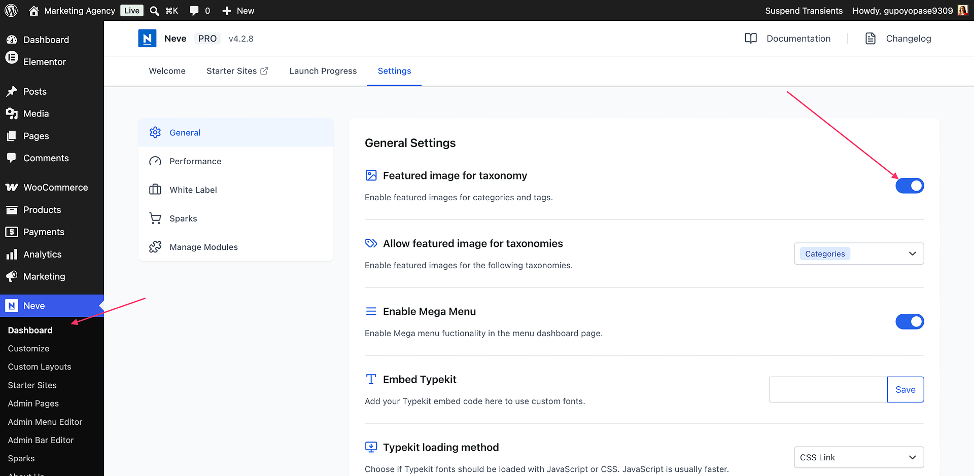
Once this is enabled, a new field will be available for adding a featured image to archives.
The featured image of each archive will be now used if the following option is enabled in the Customizer.
Managing the Components
Add components
While hovering over each division of the rows, click on the ➕ sign and a list of components will appear.
Each component has specific options you can customize once that component is clicked on.
Components can be added to the rows in two ways:
- drag&drop them from the left sidebar
- directly from the header rows
📝Note: Here is a video about using multiple instances of the same header component.
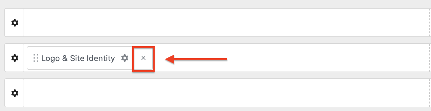
Remove components
In order to remove a component, there are two steps that need to be done:
Step 1: Hover over the component you want to remove.
Step 2:: Click on the ❌ icon on the right corner of the component.
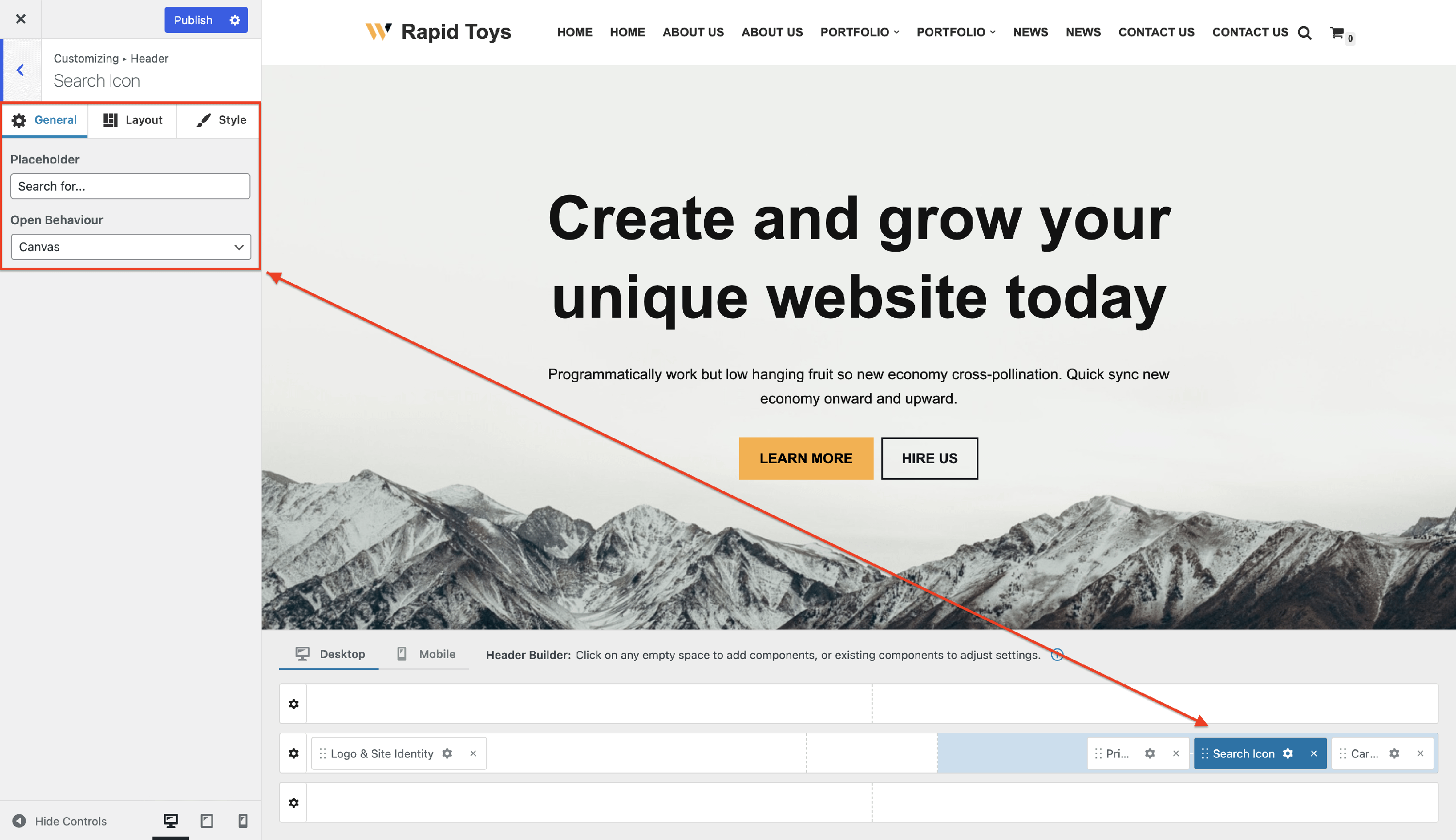
Customize components
To open the customizing options for a newly added component, you have to follow two steps:
Step 1: Select the desired component.
Step 2: Click on the ⚙️ icon when the component is already enabled in one of the rows.
Components Library
Neve has an impressive components library that comes with specific settings. This section contains the list with all the available components and their dedicated doc:
- Logo & Site Identity
- Primary Menu
- Button
- Search Icon
- Search Form
- Menu Icon
- HTML
- Secondary Menu
- Cart Icon
- Palette Switch
The PRO version of Neve brings in some extra components:
- Contact
- My Account
- Social Icons
- Breadcrumbs
- Custom Layout - 3 instances
- Wish List
- Divider - 2 instances
- Widget Area - 3 instances
- Language Switcher
- Advanced Search Form - 2 instances
- Advanced Search Icon - 2 instances
- 2 extra instances for the Button Component
- 2 extra instances for the HTML Component
- 1 extra instance for the Logo & Site Identity Component
- 1 extra instance for the Search Form Component
- 1 extra instance for the Menu Icon Component
- 2 extra instances for the Primary Menu Component
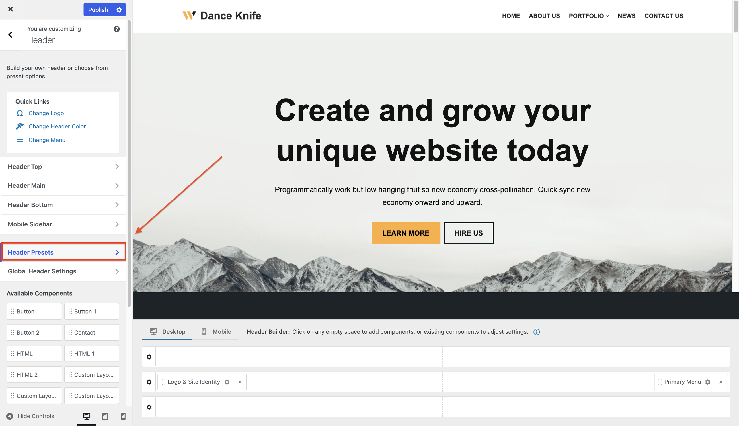
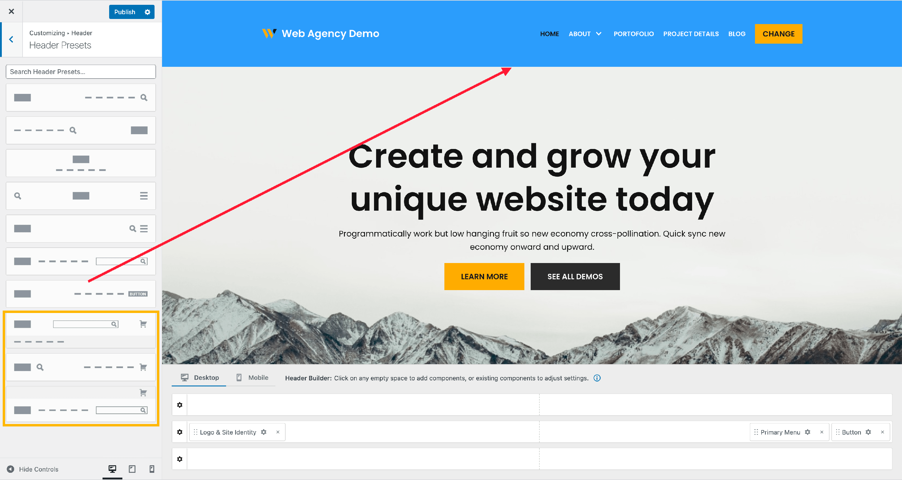
Header Presets
Header Presets can be used to instantly create a great-looking header. Just open the Header Presets panel, click on one of the presets, and the header will be created automatically using that layout.
There are seven presets available for the free version of the header builder:
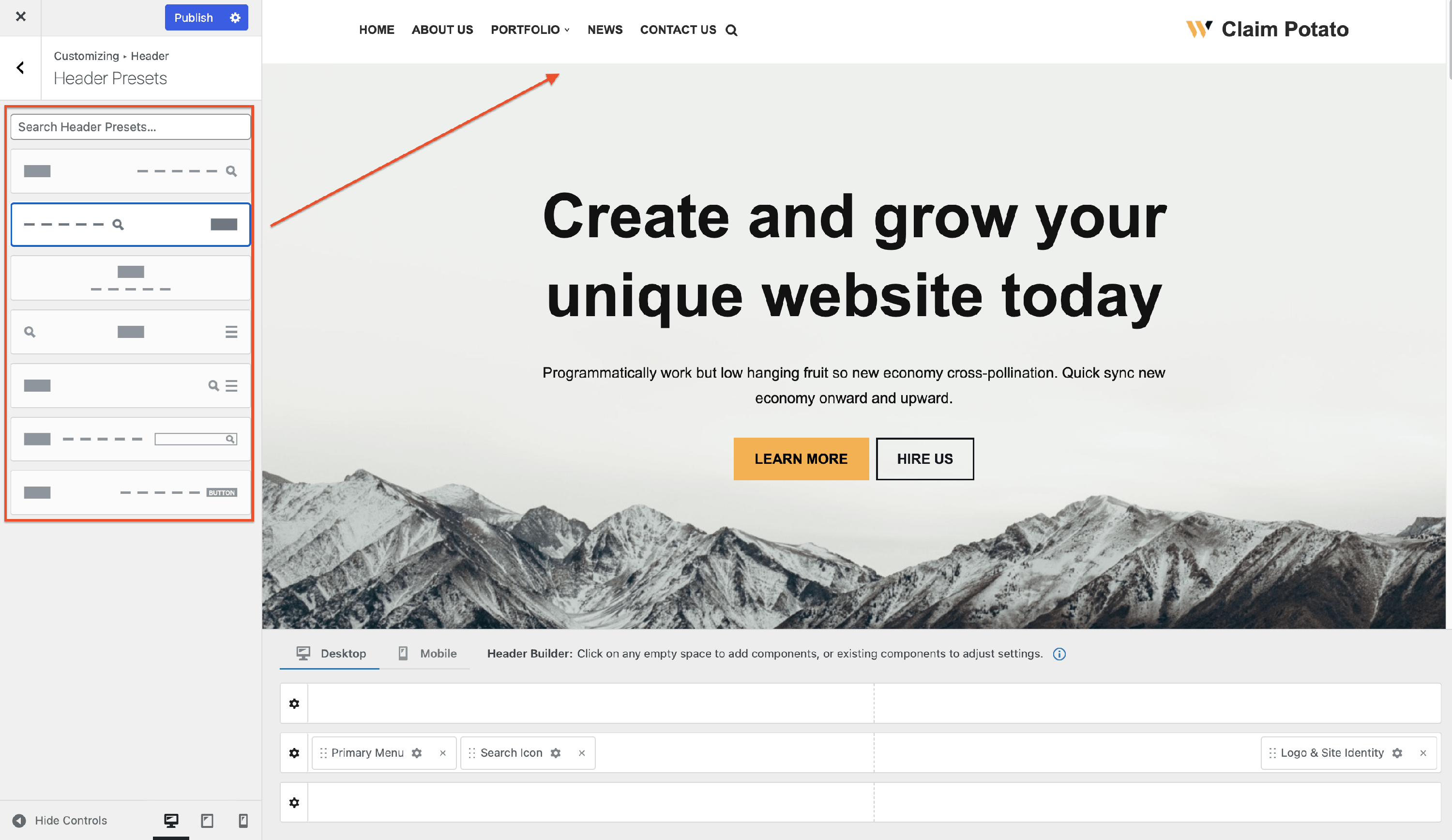
The ones highlighted with the orange rectangle are part of the WooCommerce Booster module which is available starting with the Business plan for Neve PRO.
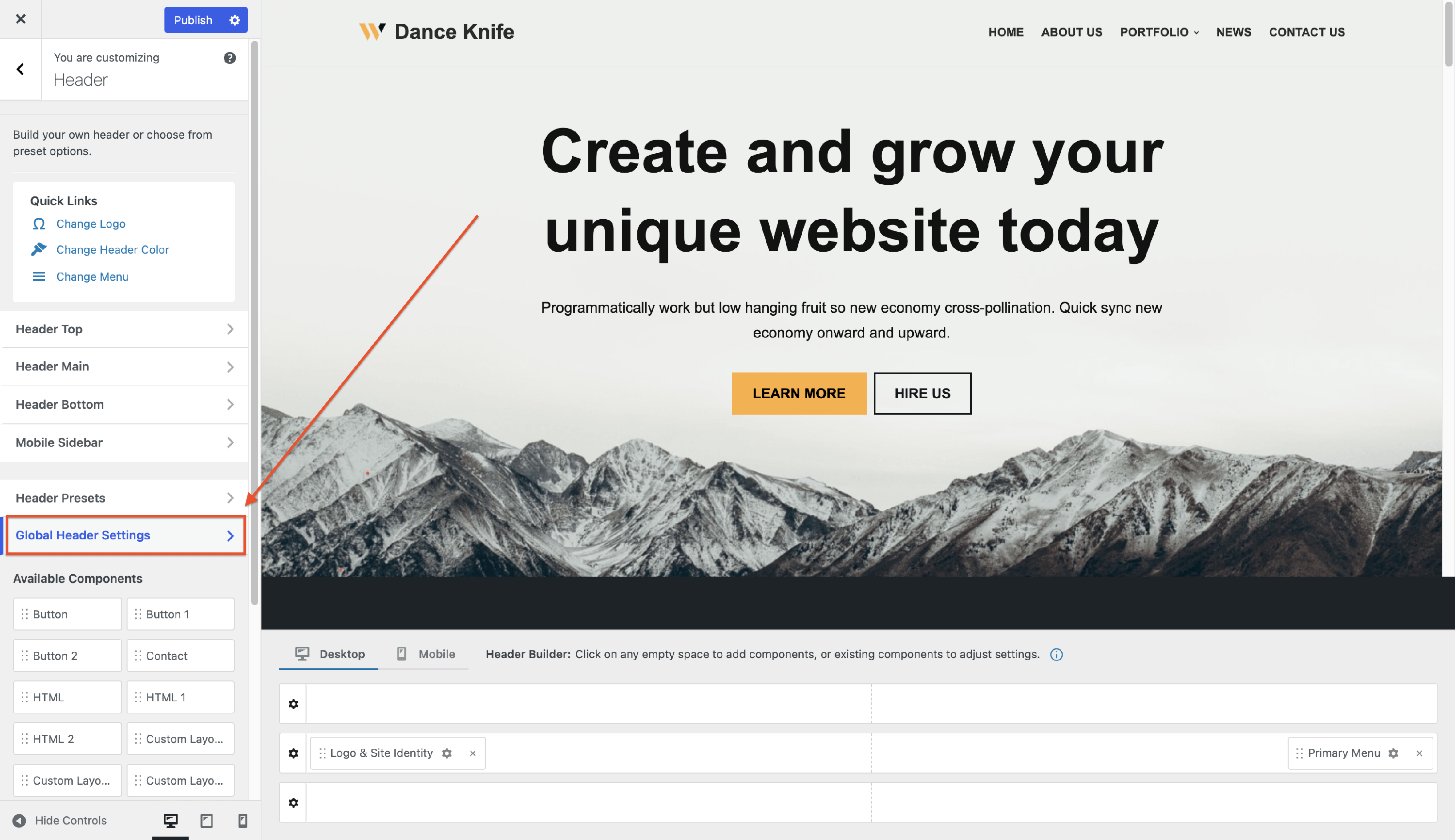
Global Header Settings
The Global Header Settings contain options that apply to the entire site, very useful for creating multiple headers.
📝Note: Here is a dedicated doc about Multiple Headers in Neve PRO.
Inside this panel you will find the following options:
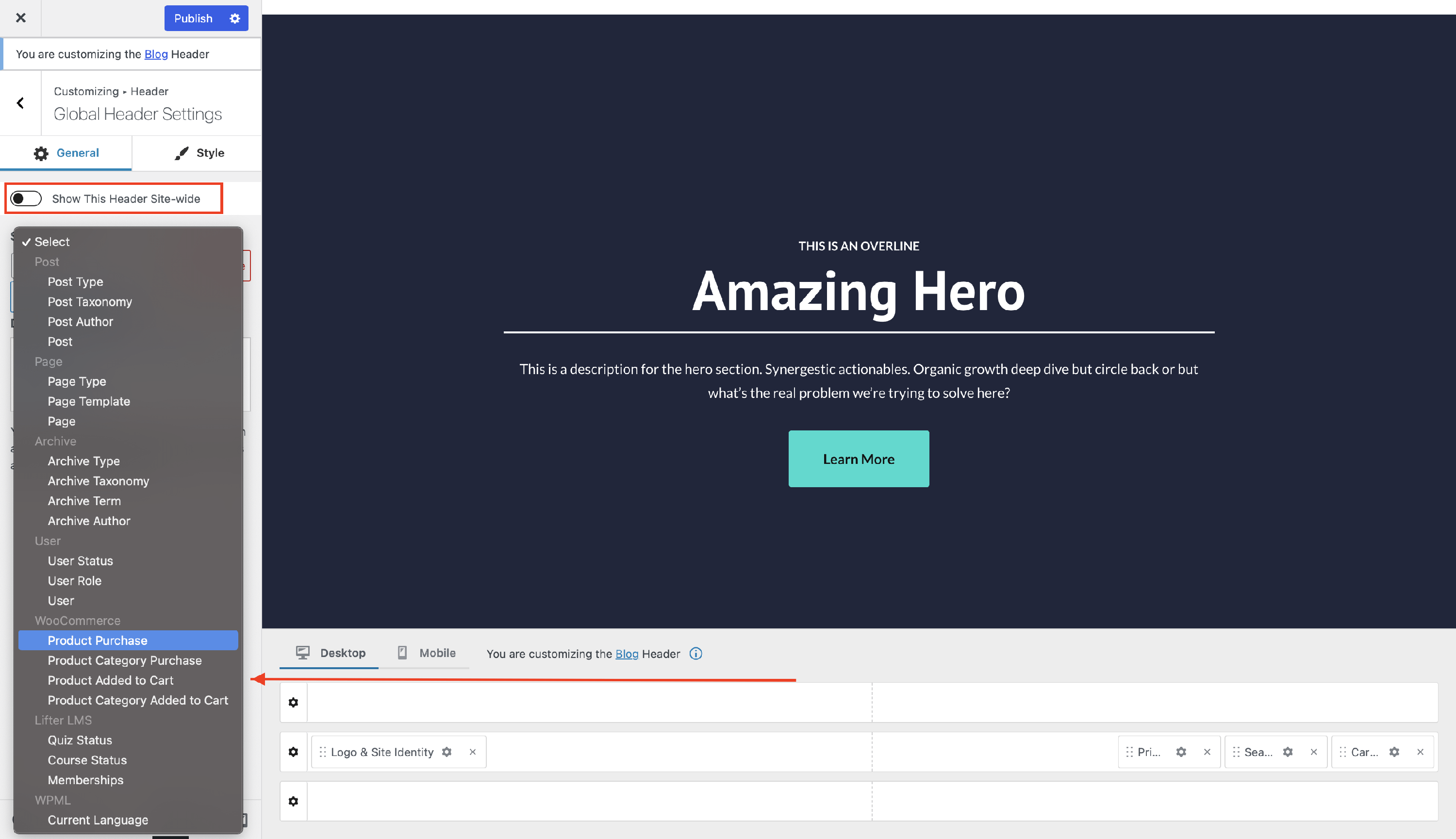
General Tab
- Show This Header Site-wide - while this option is enabled, the header created inside the header builder area will appear on all pages of the site.
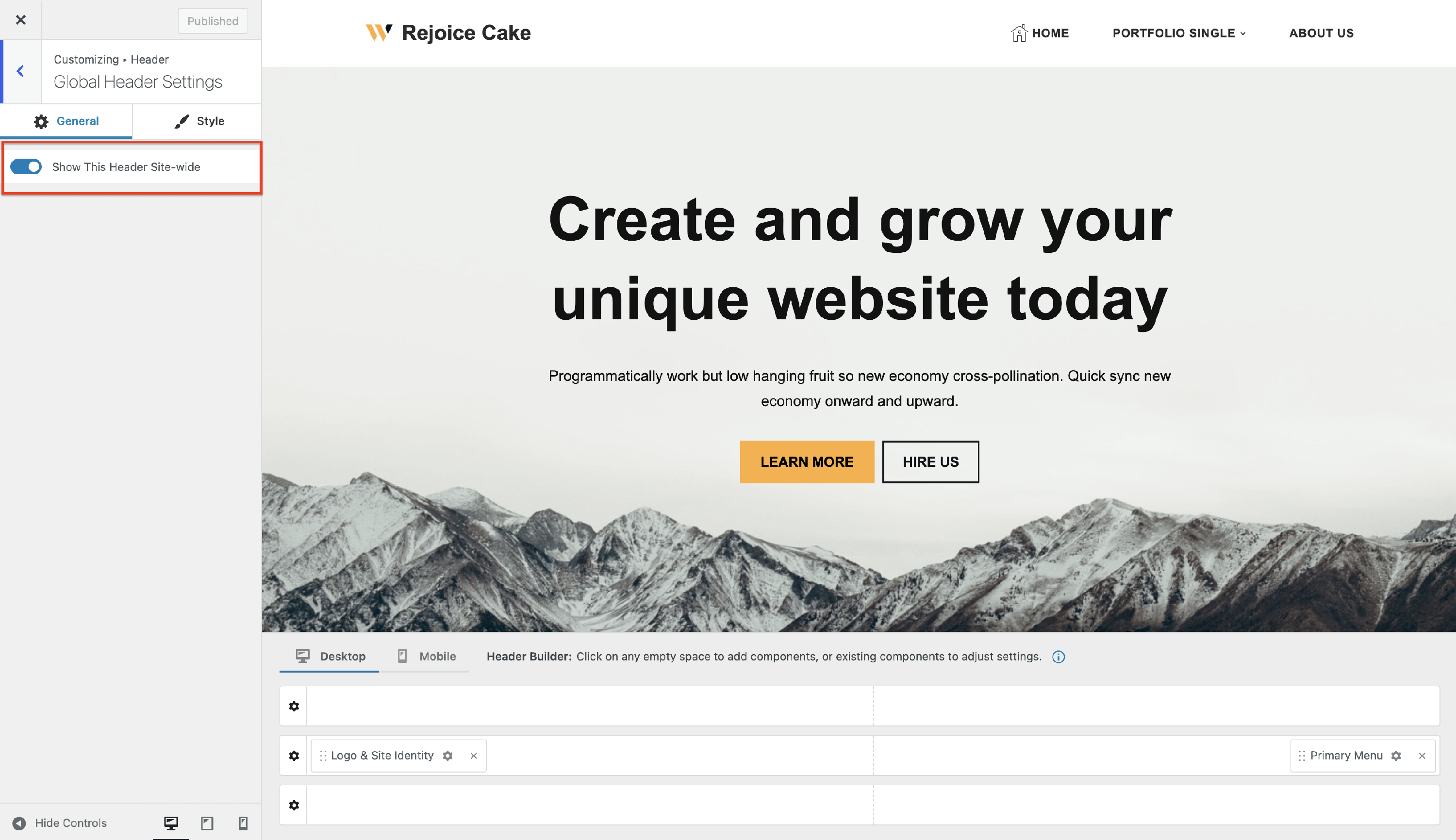
Disabling this option allows you to create particular headers that will be displayed according to the conditions that you set. After creating a new header and adding a name, you will be able to configure some displaying conditions.
These conditions can be numerous, depending on the plugins that you have installed.
📝 Note: You can find all the plugins conditions along with their explanations here.
Style Tab
- Enable Transparent Header - enabling the transparent header option will set the header background to transparent and pull the page content to the top.
- if enabled, it will generate a new option: Show Transparent Header on the Homepage Only.
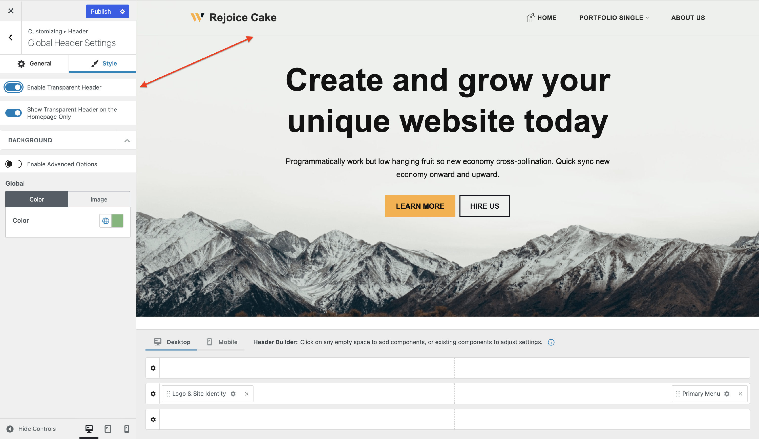
📝 Note: The transparent header will apply to the entire header area.
- Background - contains background options for the Global Header. While the Enable Advanced Options is activated, 3 shortcuts for the Header Rows background settings should appear.
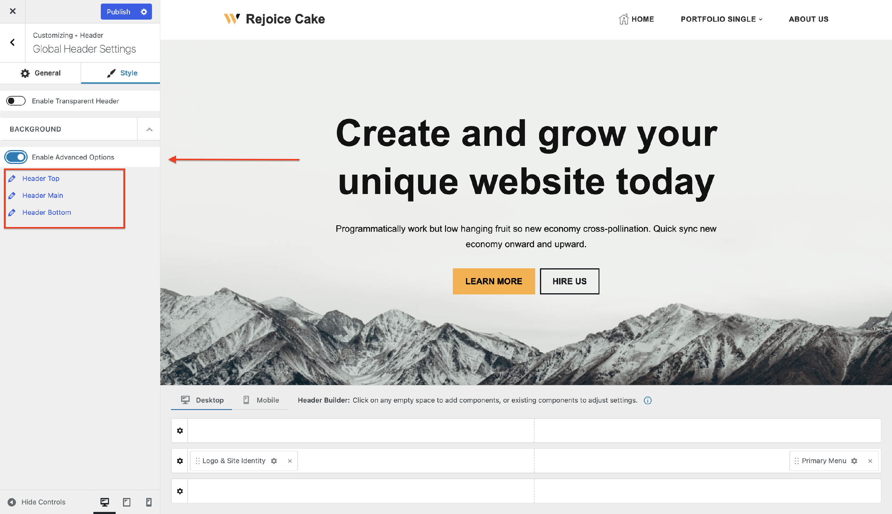
If the Enable Advanced Options is deactivated, the options for the global header will appear. You can customize the color of the whole header or even add an image.
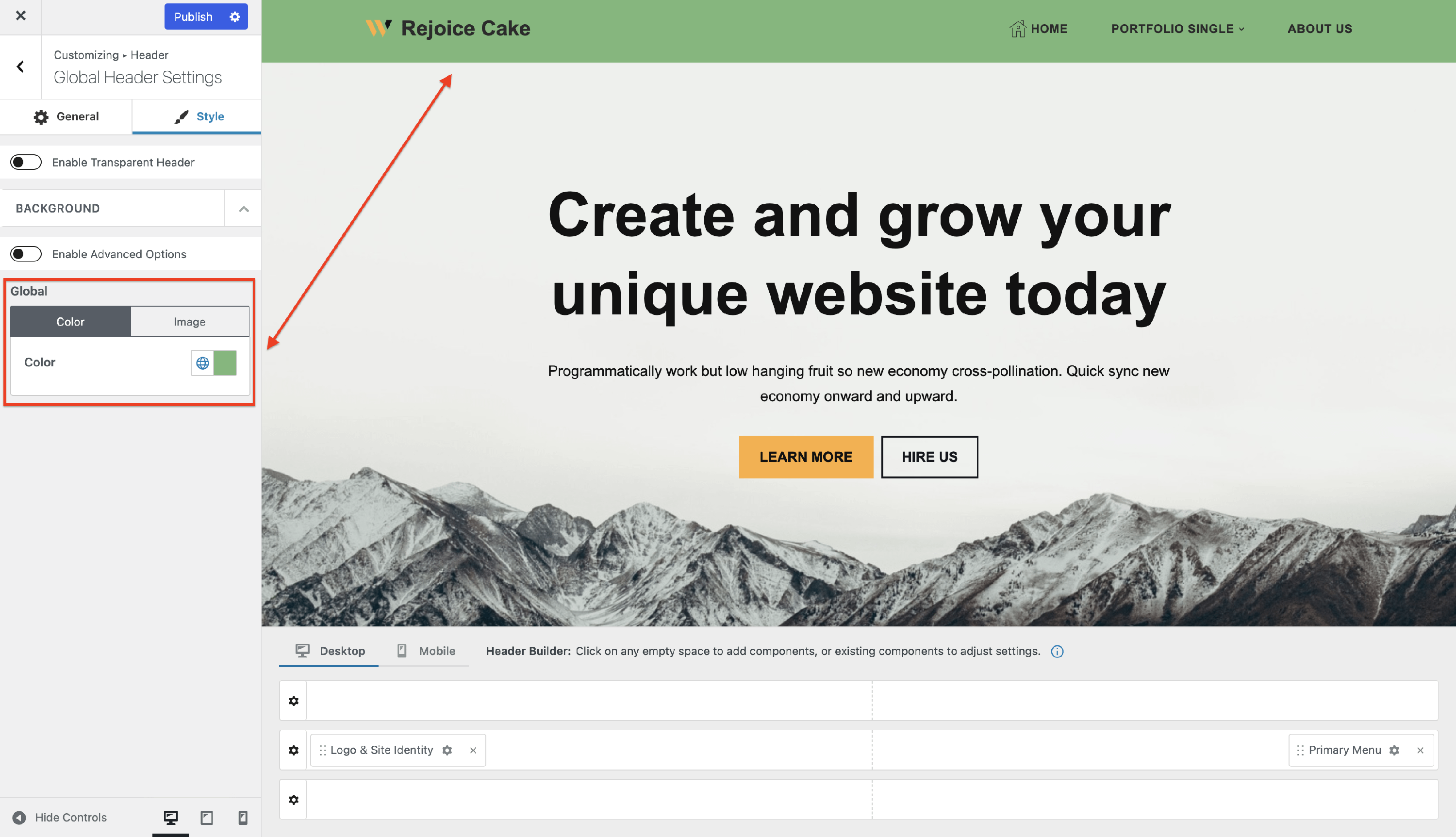
This feature is very useful when you want to have the same background for all the rows of the header.