Neve Header Builder on Mobile Devices
This is the mobile version of the Neve Header Builder, and for using all the features of the Header Booster module you can get it from here.
The header builder allows for different headers on Desktop and on Mobile devices. Just click on the Desktop | Mobile icons and you will get access to the corresponding builder.
In this article
In the mobile header builder, things are similar to the desktop builder. The only difference is the additional column called Mobile menu content.
- In Customizer - the Mobile menu content is hidden by default.
- To show the Mobile menu content when editing, click the Show label near it.
- On the frontend - the Mobile menu content shows only when you click on the Menu Icon component.
To add components to the Mobile menu content, follow the same process as before:
- click on the ➕ sign and a list of components will appear from which you can choose.
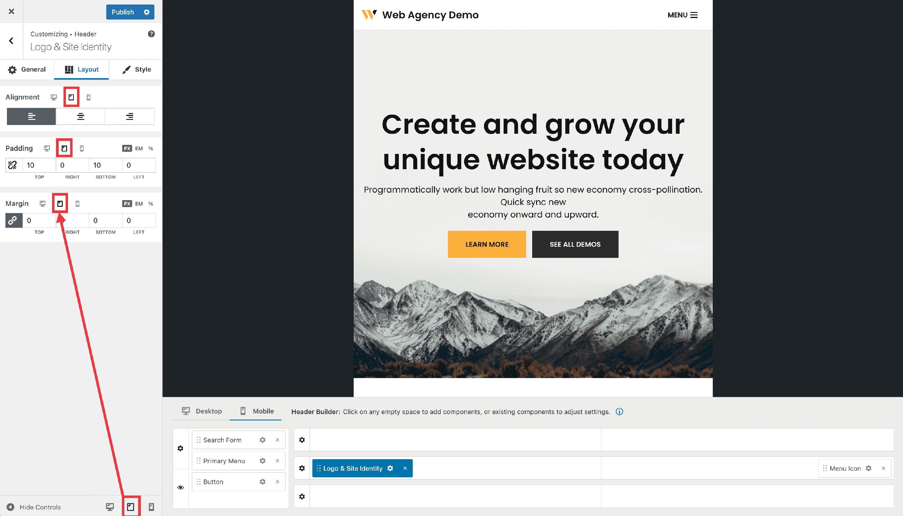
Even though the header builder only accounts for desktop and mobile, all settings have three media-queries: Desktop | Tablet | Mobile. Each setting can be set separately for tablet by switching to the respective media query in customizer from the bottom left on the sidebar.
A
Change the background color of the header or add a background image
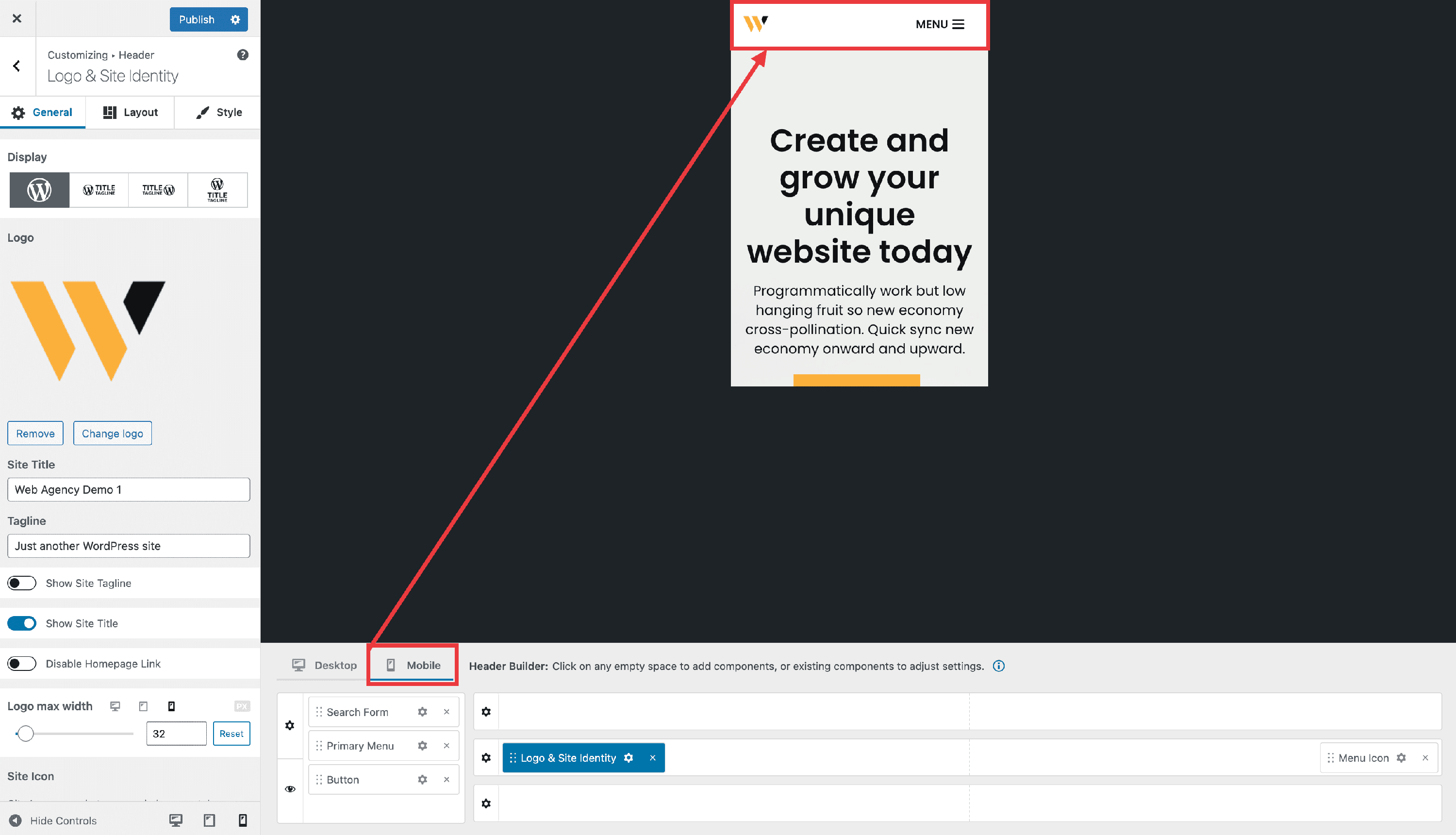
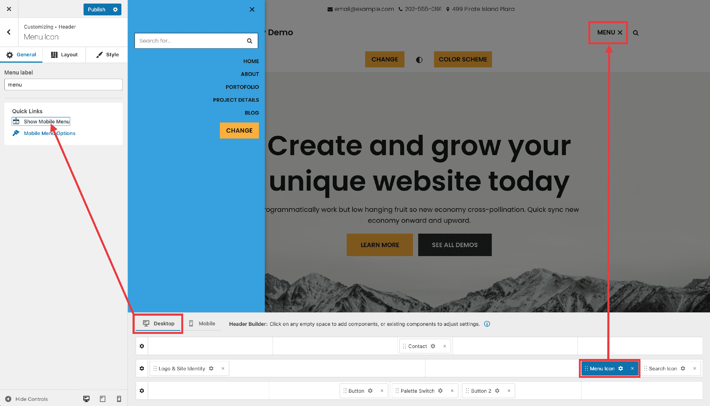
After selecting the Mobile version of the header builder, you will see the Mobile menu content which represents the area that will show up on mobile devices, after clicking on the menu icon.
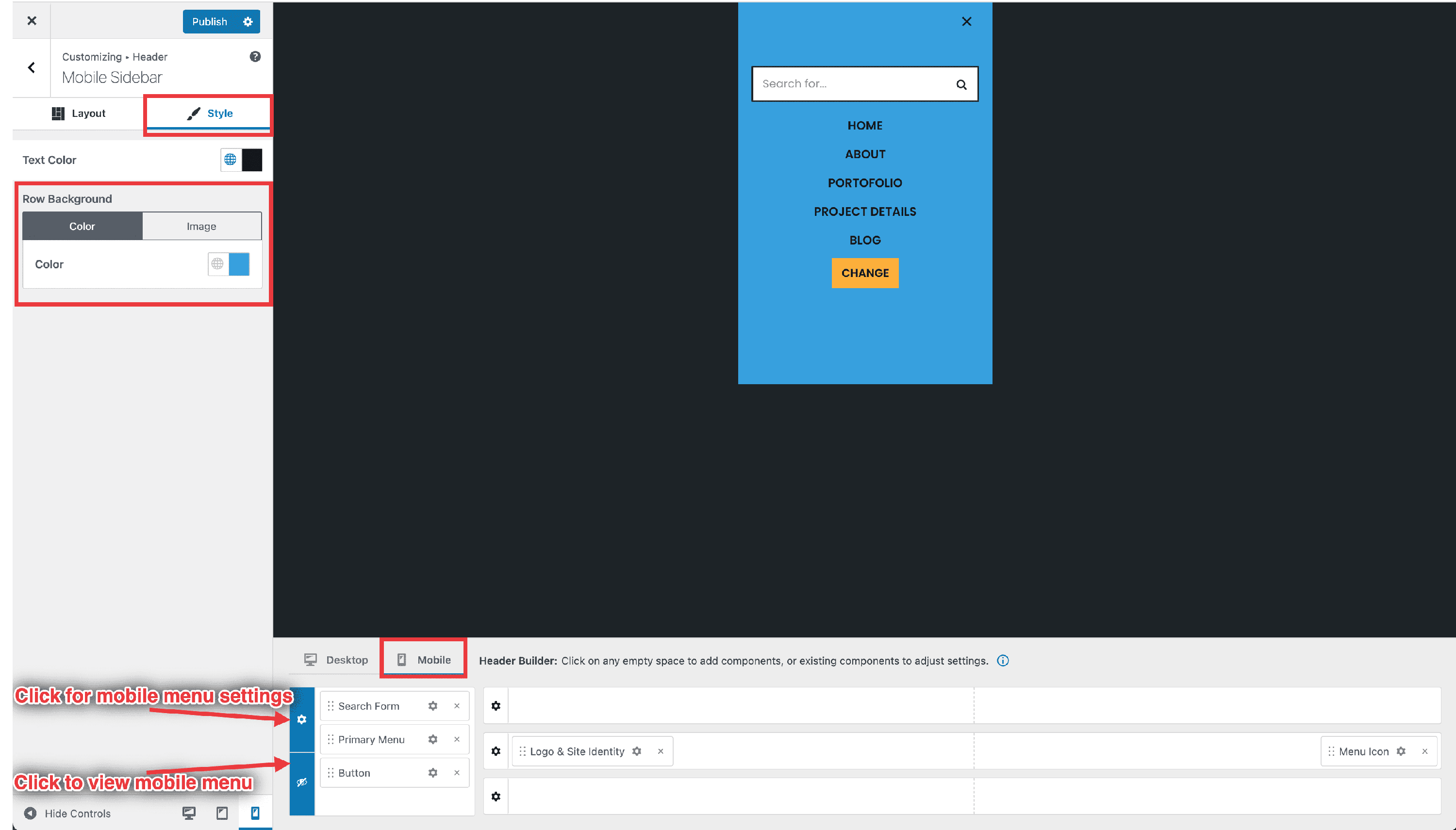
In order to change the background color of the header, these are the steps to follow:
- click on ⚙️ that appears while hovering the Mobile menu content.
- That will open options for Layout ( where you can make the mobile content open from the left side or act as a toggle ) and Style.
- There is where you can update the background of the area ( color or image ).
- That will open options for Layout ( where you can make the mobile content open from the left side or act as a toggle ) and Style.
B
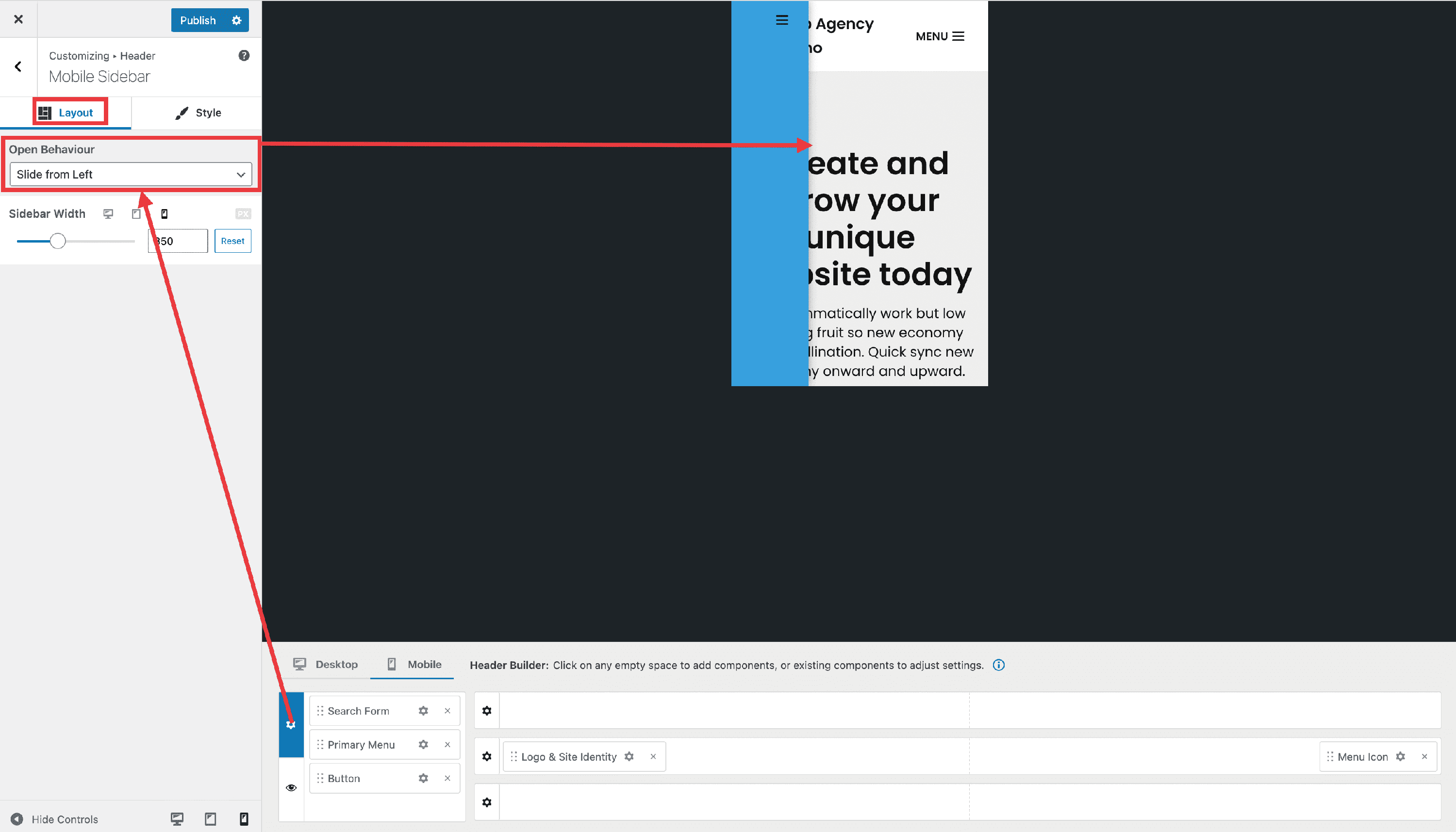
Mobile sidebar menu - opening behavior
The way the mobile sidebar menu opens/closes can be changed from the following options: Slide from Left, Slide from Right, Pull from Left, Pull from Right, Full Canvas, Slide down.
In order to use these options:
Step 1: enable the mobile header.
Step 2: click on ⚙️, near the Mobile menu content.
C
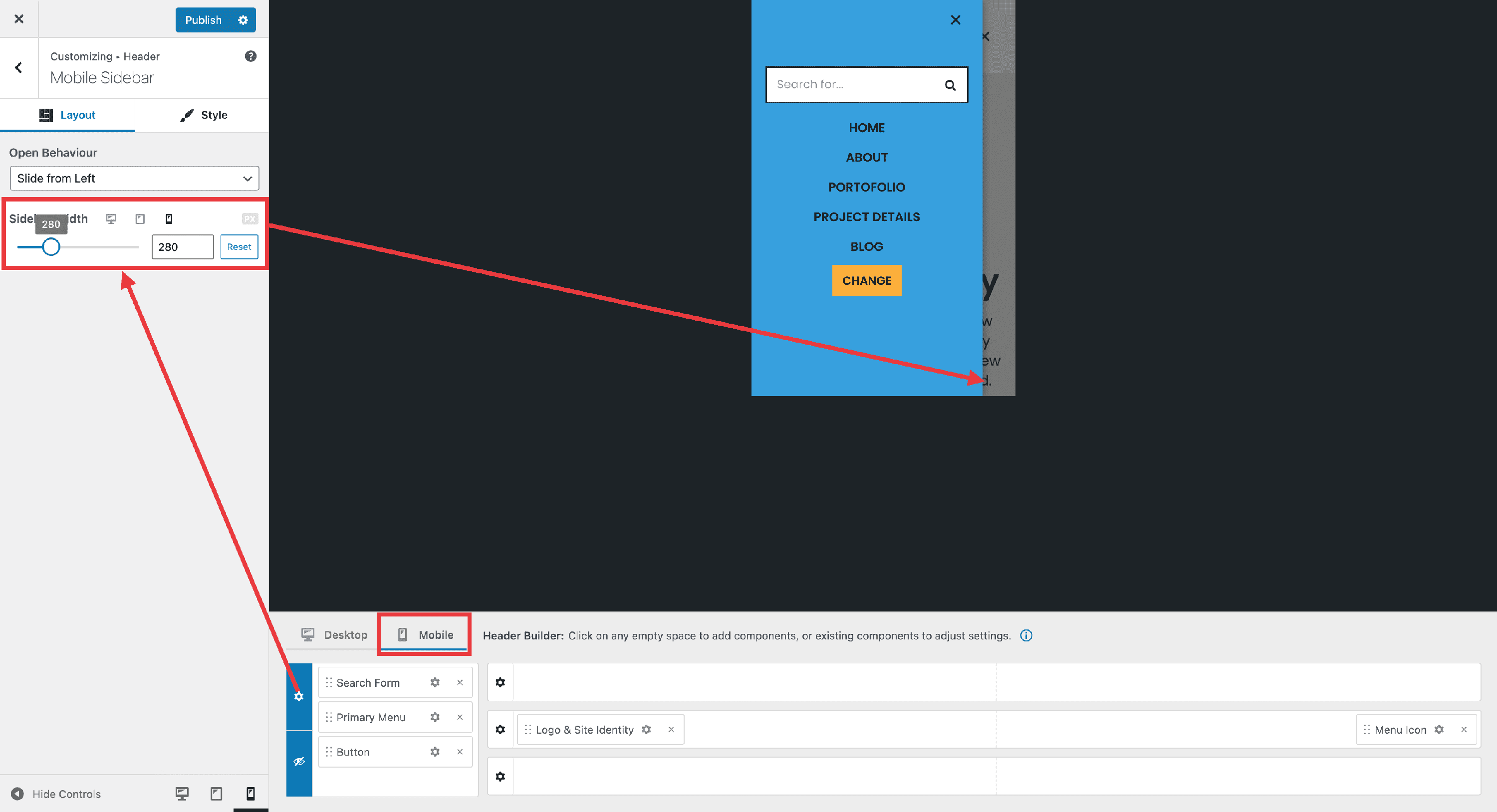
Mobile sidebar width
The mobile sidebar can also be used on Desktop, with the Menu Icon header component.
The mobile sidebar width can be changed from the Customizer options, with a different value for each device (Desktop | Tablet | Mobile).
D
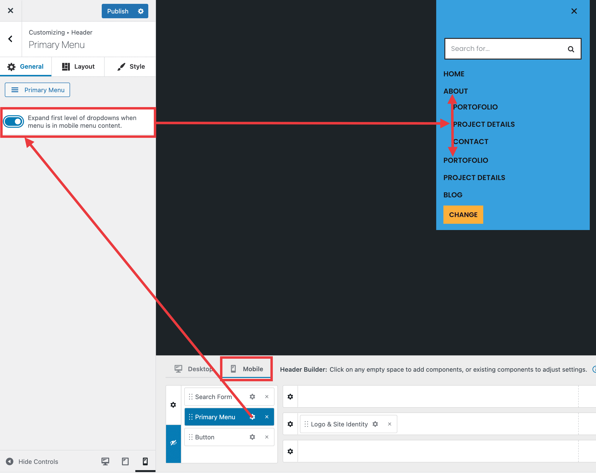
Automatically expanding drop-down menus on mobile devices
It is possible to set the menus to automatically expand the first level of the drop-downs on mobile devices.
- Customizer > Header > Primary Menu