The Advanced Search Icon Component - Neve Header / Footer Builder
For more details check out the full Neve documentation and Neve PRO documentation.
📝Note: This component is part of just Neve PRO.
🧰 Using the Component
- 1
- Start by adding the component into the rows, by clicking on the ➕ button and selecting the component.
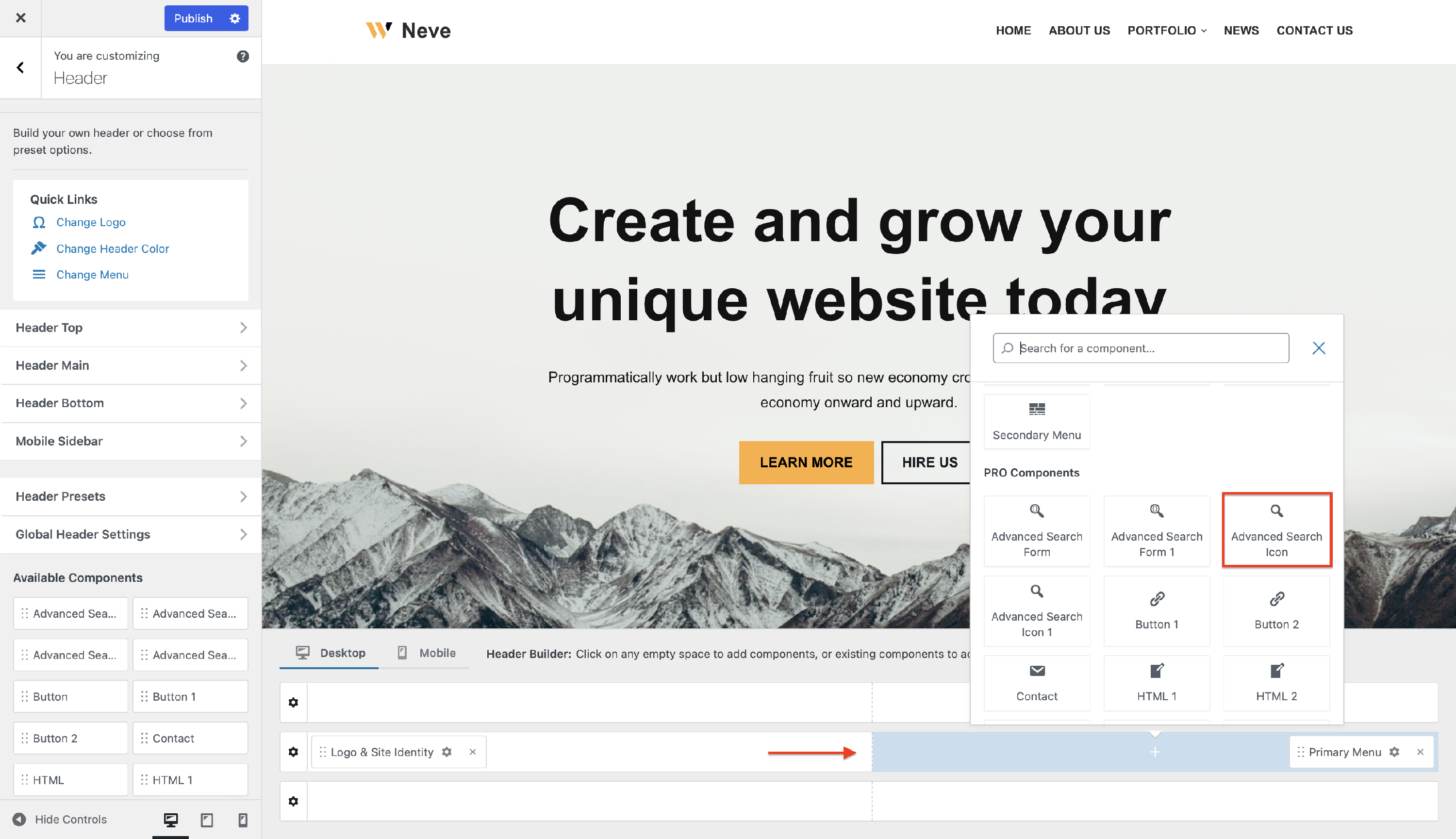
- 2
- Open the component's settings to customize it by clicking on the ⚙️ icon.

📝 Note: This component has two available instances: Advanced Search Icon and Advanced Search Icon 1.
🔮 Customizing the Component
There are three panels with customizing options for this component, which allow you to create the desired header / footer:
| General
|
Layout
|
Style
|
⚙️ General Panel
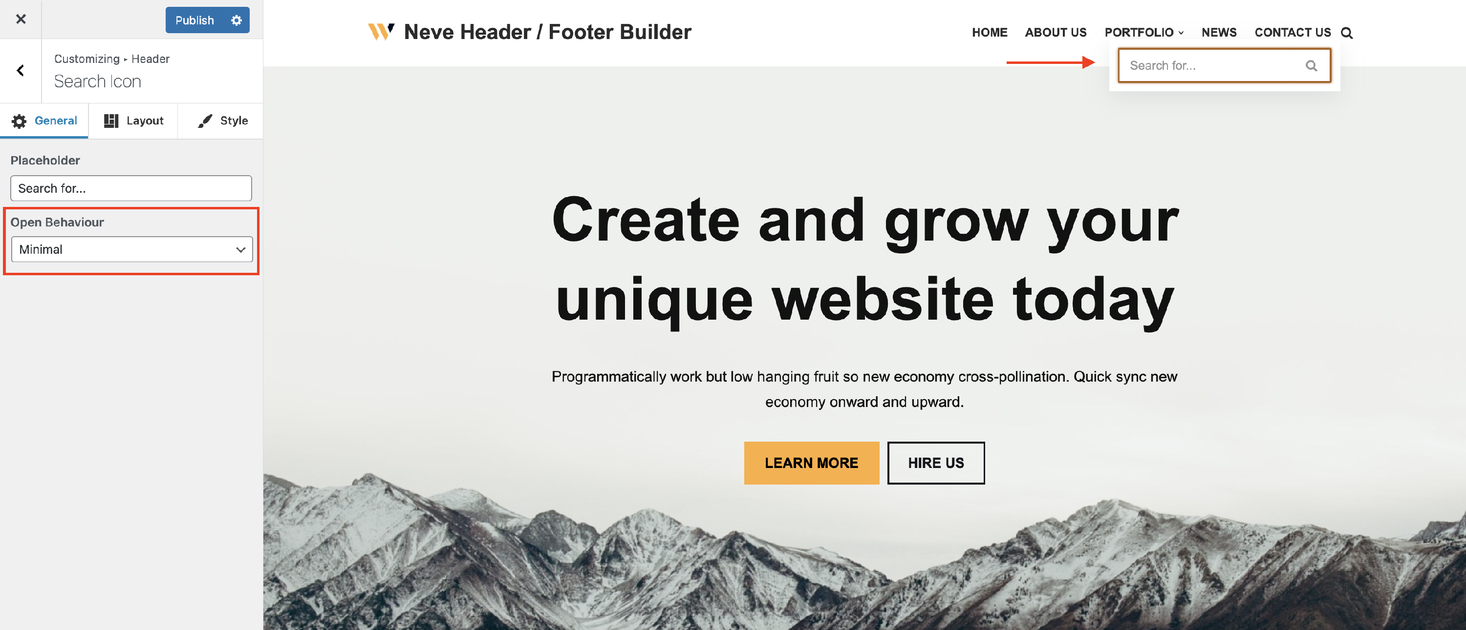
Placeholder - this option allows the user to add the desired text that will appear on the blank field of the Search Icon:
Open Behaviour - there are three options available for the open behavior of the Search Icon: Minimal, Float Above Header, Canvas.
Exclude Sticky Posts - these are the posts that appear at the top of your blog page if you have previously set them.
Search options - extend the search through your website to post title, post excerpt, post content, category / tag title or description, by enabling any of these options from the tab. You can also restrict the search area to specific post types by picking them from the list.

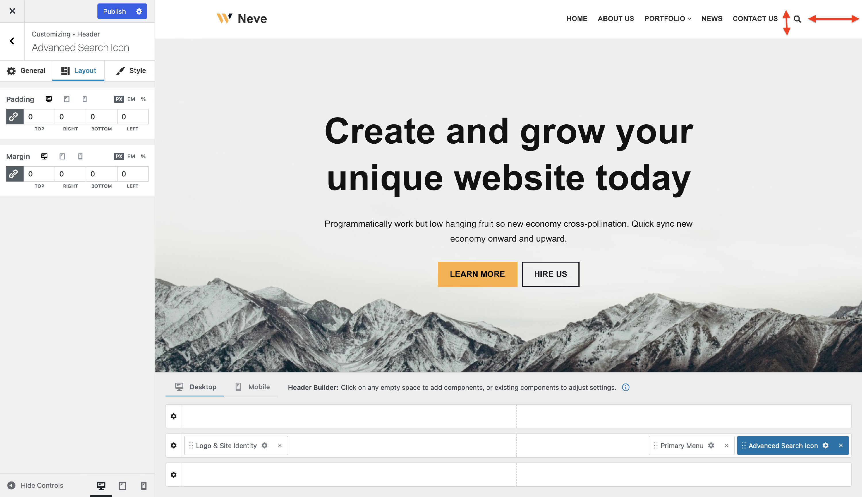
📐 Layout Panel
In the Layout tab, you also have access to advanced positioning options like Padding and Margin, available in PX, EM, REM, and %, with a link button that helps establish the same dimension for all the directions ( Desktop | Tablet | Mobile ).
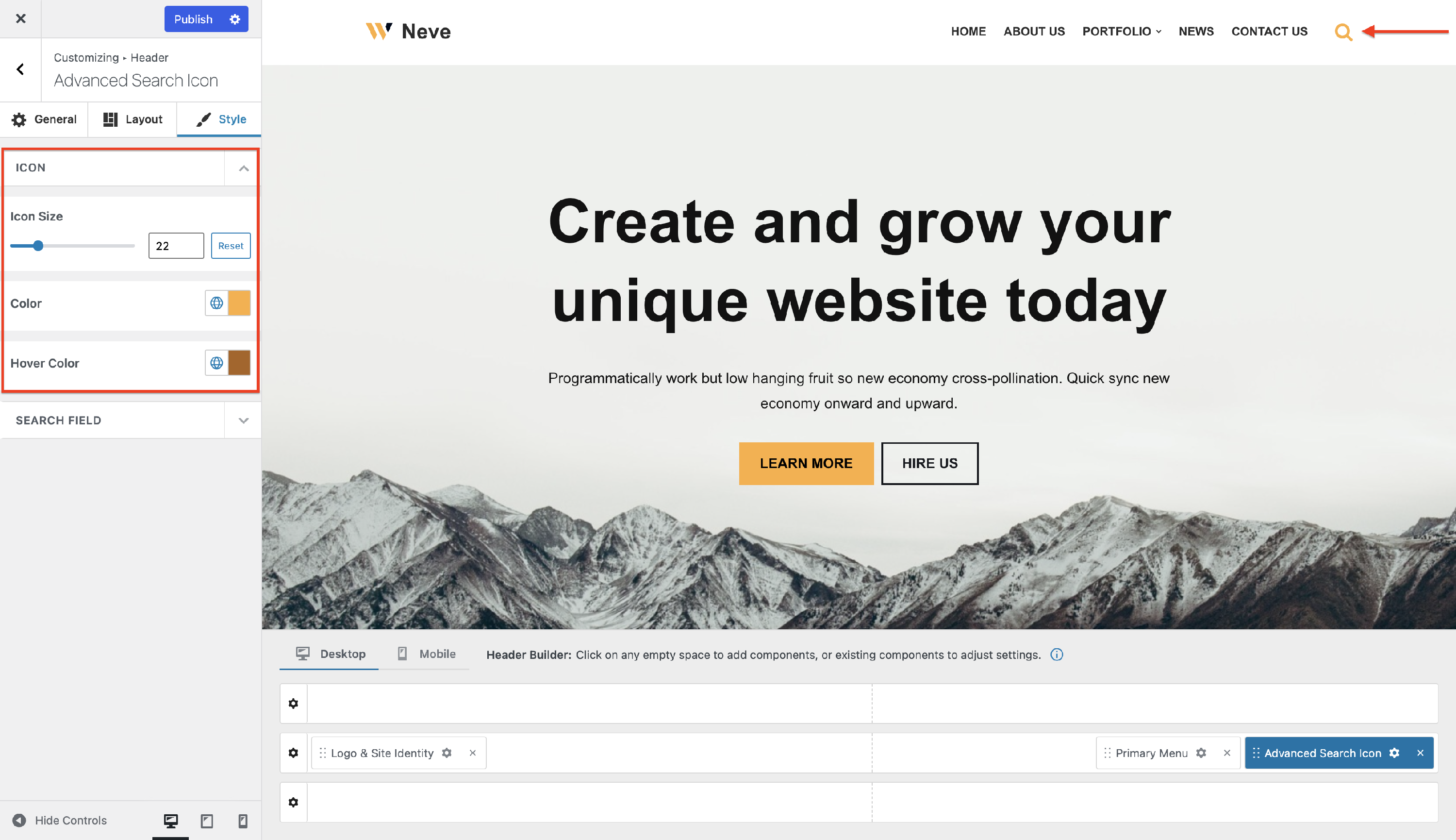
🖌 Style Panel
Icon - in this area you will find options that will be applied only to the search icon:
- Icon Size - sets the size of the 🔍, and it has a reset button, to undo the changes
- Color - sets the color of the 🔍 and you can choose one of the global colors ( theme's default colors ), by clicking on the 🌐 button.
- Hover Color - sets the color of the 🔍 when you hover with the mouse, and you can choose one of the global colors ( theme's default colors ), by clicking on the 🌐 button.
Search Field - in this area, you will find options that will be applied to the field that appears after clicking on the search icon:
- Height - sets the height of the search field (in PX), with a reset button ( Desktop | Tablet | Mobile ).
- Font Size - sets the size of the text that appears as placeholder (in PX), with a reset button ( Desktop | Tablet | Mobile ).
- Border Width - sets the width of the border (in PX), having the link option, to change the values at the same time ( Desktop | Tablet | Mobile ).
- Border Radius - rounds the corners of the field (in PX), and has the link option, to change the values at the same time.
- Background color - sets the color of the search field, and you can choose one of the global colors ( theme's default colors ), by clicking on the 🌐 button.
- 📝Note: You can boost the component's appearance by using the Gradient option that can be accessed from the background color tab.
- Text and Border - sets the color of the text inside the field and border, and you can choose one of the global colors ( theme's default colors ), by clicking on the 🌐 button.
- Icon - in this area you can change the appearance of the icon by selecting a predefined one or by adding a custom SVG code:
