Blog Booster Documentation
Blog Booster is a Neve PRO feature that enhances your blog and single post pages with additional layout options, post meta controls, and related-post functionality. It is active automatically when Neve Pro is installed and requires no separate module toggle.
For more details check out the full Neve documentation and Neve PRO documentation.
📝Note: These options are part of just Neve PRO.
Is Blog Booster Enabled?
Blog Booster is automatically active whenever the Neve Pro plugin is installed and active on your site. There is no separate activation step required -- it does not appear as a toggleable entry in Neve > Dashboard > Manage Modules.
To access all Blog Booster options, go to Appearance > Customize > Blog > Blog/Archive for blog and archive settings, or Appearance > Customize > Blog > Single Post for single post settings.
📝 Note: If you do not see these options in the Customizer, confirm that Neve Pro is installed and the license is active under Neve > Dashboard.
Blog page
Neve PRO brings new options for the Blog page. To access those navigate to Appearance > Customize > Blog > Blog/Archive:
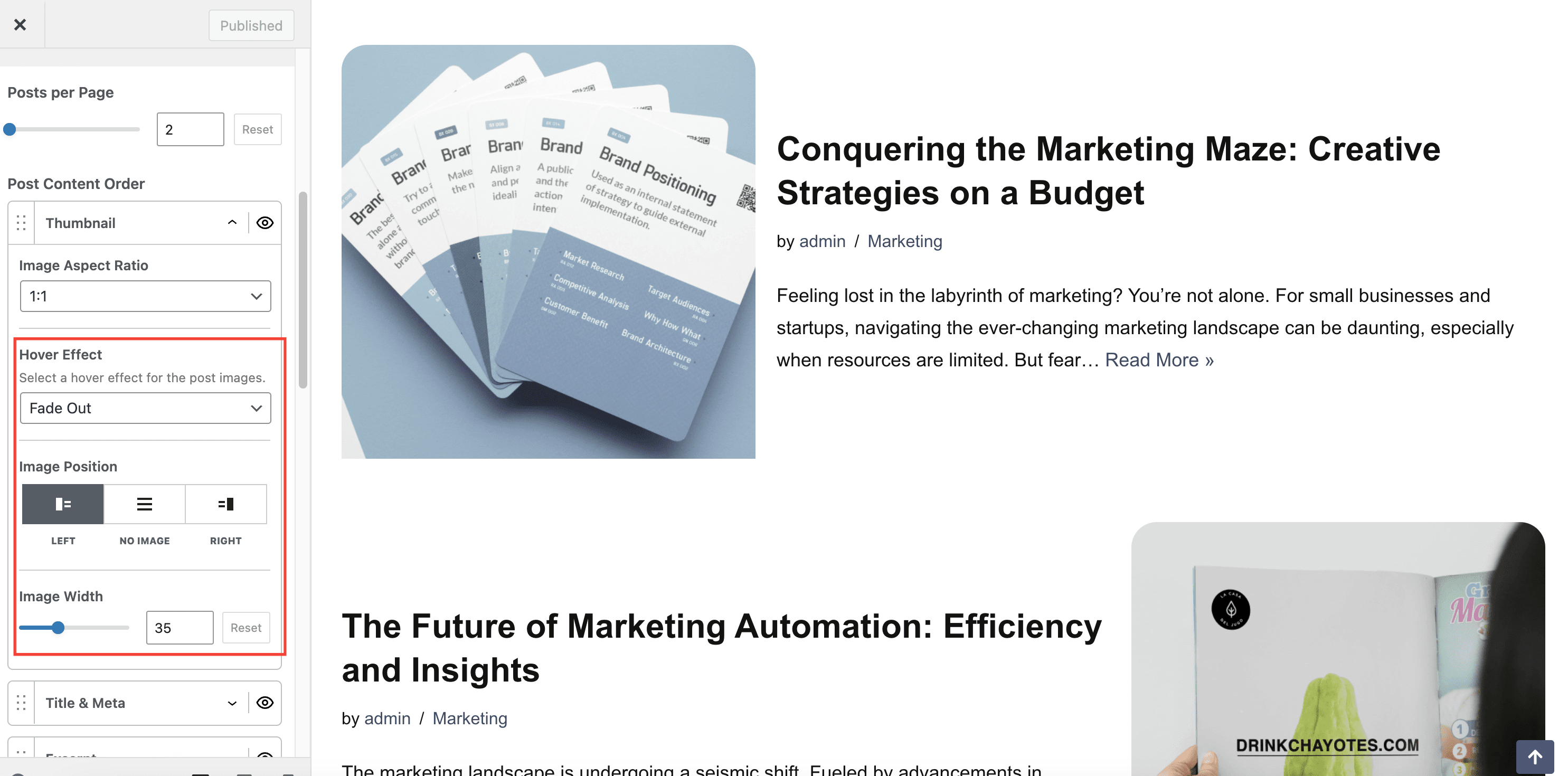
- Options to customize the featured images of each post: Hover Effect, Image Position (the position of the image, alongside the text) and Image Width. The options can be found under Thumbnail in the Post Content Order option.
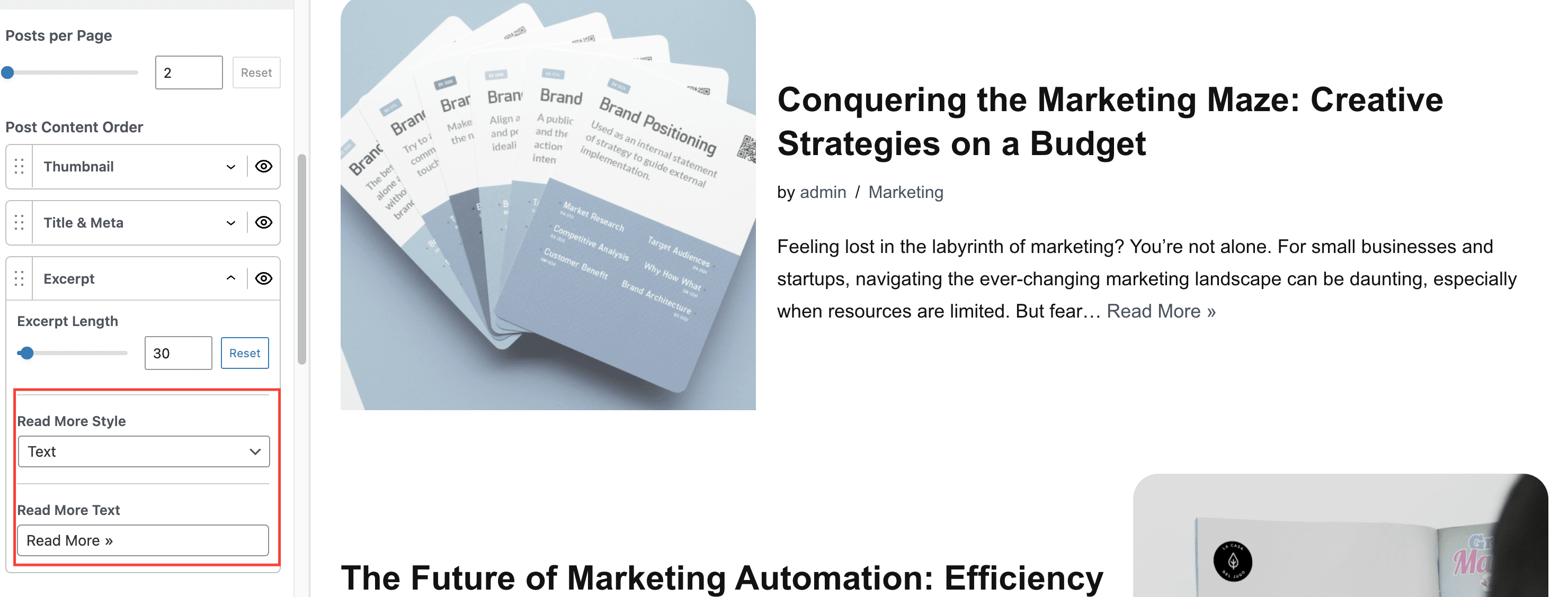
- Options to customize the Read more button style and text. The options can be found under Excerpt in the Post Content Order option.
- Add an Estimated reading time in each post meta
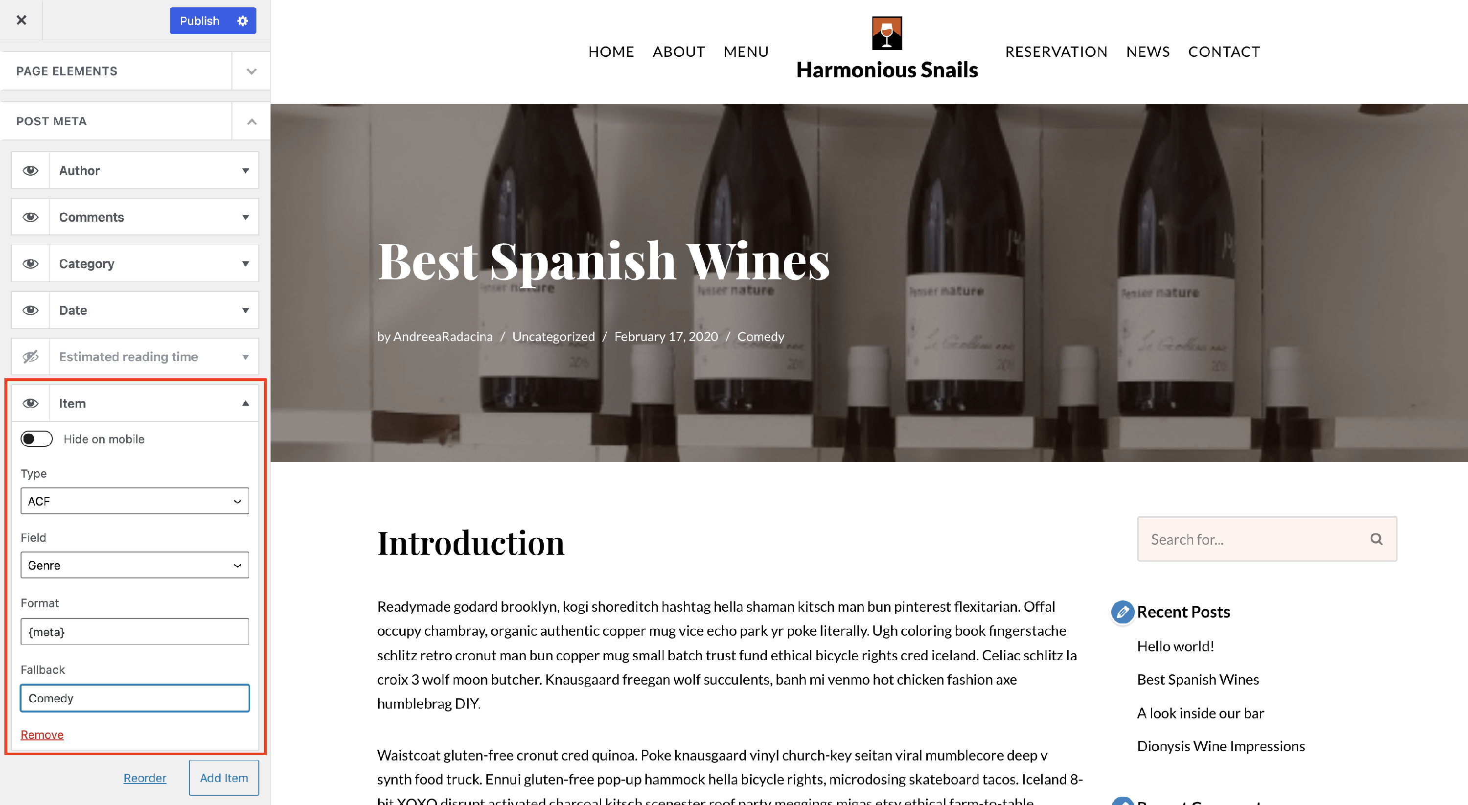
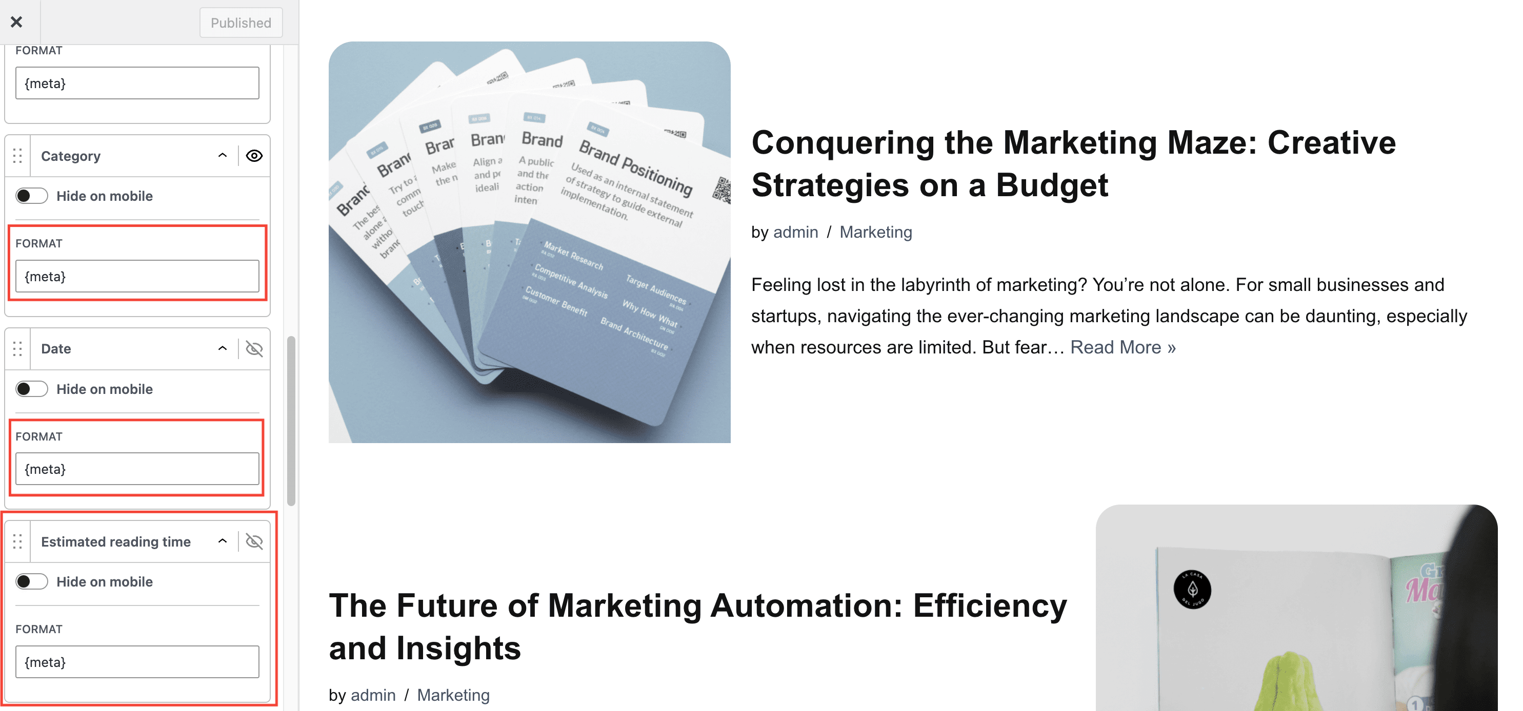
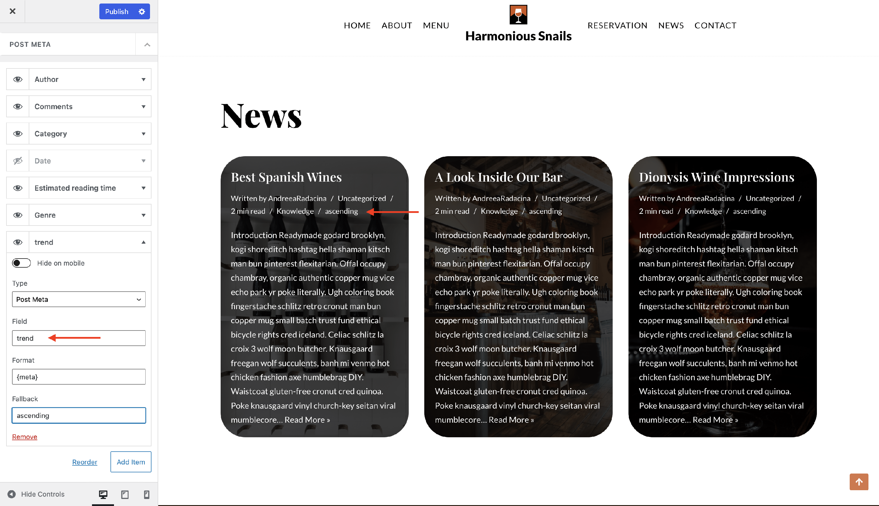
- Option to change the default format for each post meta options. The default format is {meta}, which represents a magic tag. You can add your own text before and after this default format.
- Option to add a new meta option from a Custom Field by clicking on the Add Item button.
- For Custom Fields, Neve PRO is integrated with ACF, Meta Box, Toolset, and Pods. All fields created with the plugins will be available for selection in the post meta option.
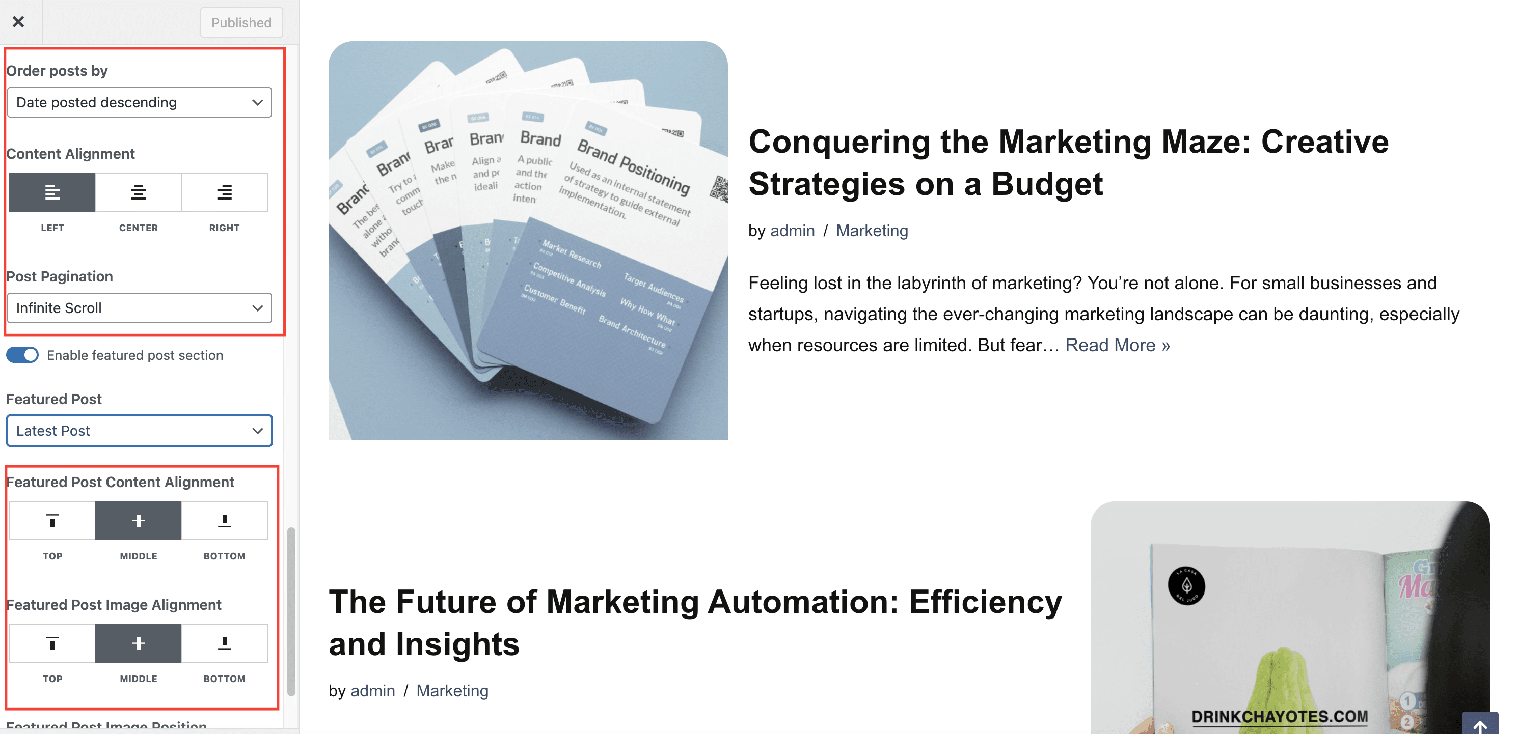
- Order posts by - Date posted descending, Date posted ascending or Date updated
- Content Alignment - Left, Center or Right
- Post Pagination - Number, Infinite Scroll or Number & Search Field
- Featured Post Alignment options
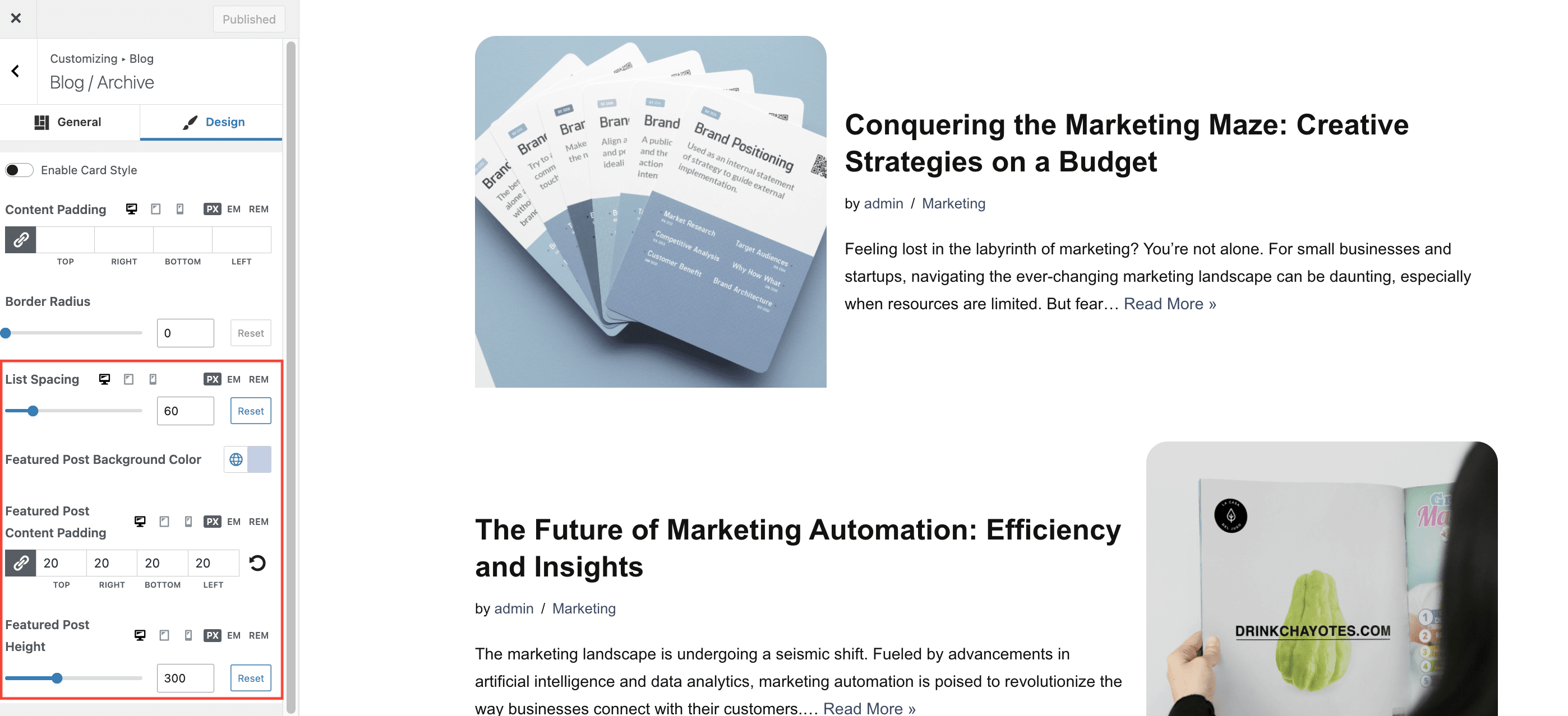
In the Design tab we can find:
- List Spacing - the height between posts, when using the List Post Cards Layout.
- Background Color/Content Padding/Height for the Featured Post area which appears at the top of the Blog page, when enabled.
Category Filtering
Blog Booster does not include a native Enable Category Filter toggle. To allow visitors to filter posts by category on your blog archive, use the standard WordPress Categories widget:
- Go to Appearance > Widgets (or Appearance > Customize > Widgets if your theme uses the live Customizer).
- Select the widget area where you want the filter to appear (for example, Sidebar or Blog Sidebar).
- Click Add a Widget (or the + icon) and search for Categories.
- Add the Categories widget and configure the display options (show as dropdown, show post counts, show hierarchy) as needed.
- Click Save or Publish.
Visitors can then click any category link to view posts filtered by that category.
Single post
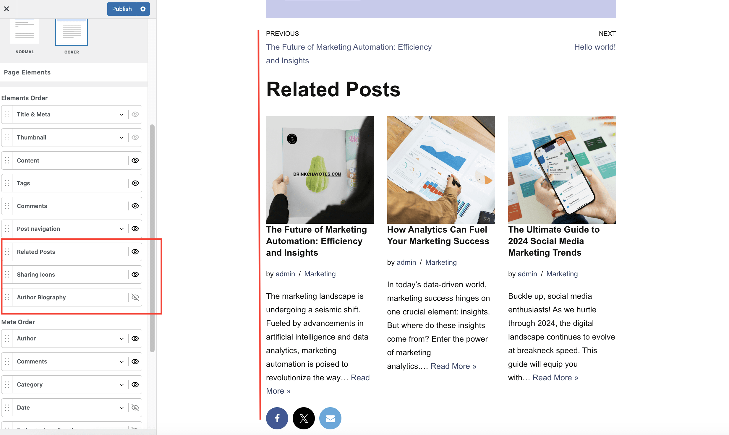
Neve PRO brings new options for the Single post page. To access those navigate to Appearance > Customize > Blog > Single Post:
- Related Posts
- Sharing Icons
- Author Biography
- Add an Estimated reading time in the post meta
- Option to change the default format for each post meta options. The default format is {meta}, which represents a magic tag. You can add your own text before and after this default format.
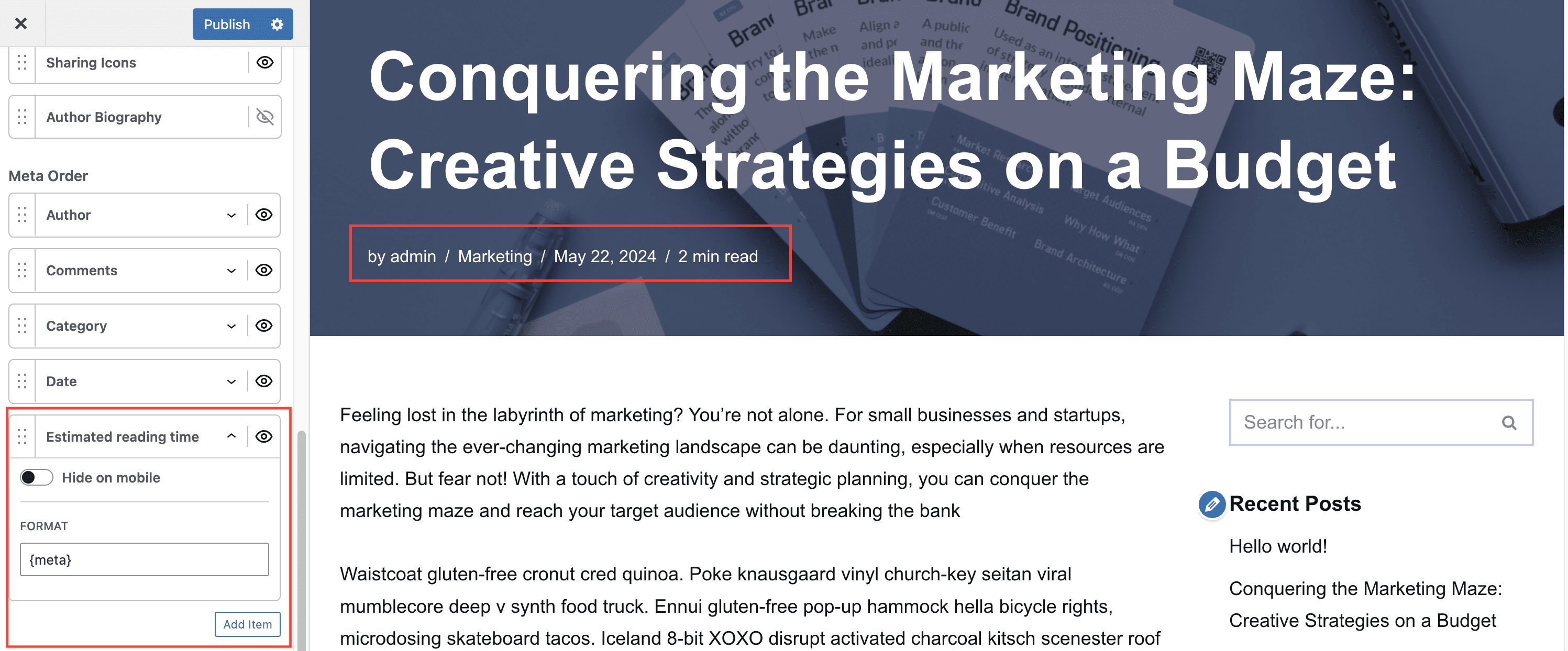
- Option to add a new meta option from a Custom Field or a Custom Taxonomy. by clicking on the Add Item button.
- For Custom Fields, Neve PRO is integrated with ACF, Meta Box, Toolset, and Pods. All fields created with the plugins will be available for selection in the post meta option.