Neve Single Post Options
For more details check out the full Neve documentation and Neve PRO documentation.
📝Note: These options are part of both Neve and Neve PRO. More advanced options can be found in Neve PRO.
Single post (article)
General options (apply to all posts)
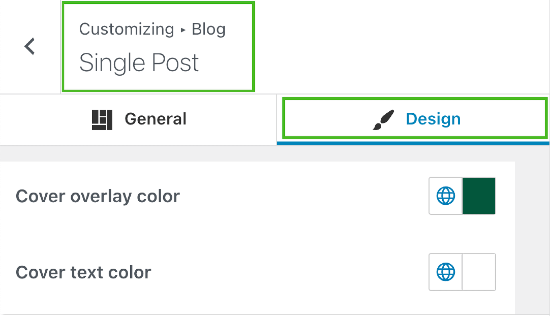
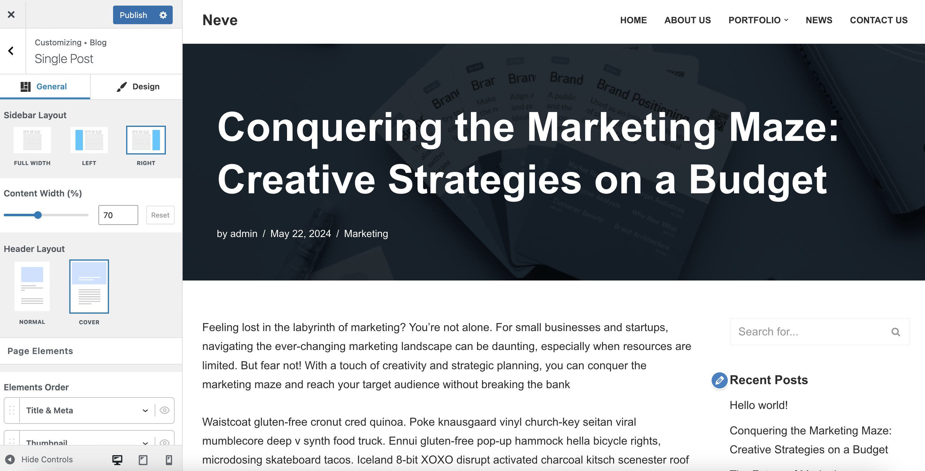
Navigate to Appearance > Customize > Blog > Single Post to access the options:
- Sidebar Layout and Content Width are two related options. When choosing a Left or Right sidebar layout, make sure to add widgets in the Sidebar, by going to Appearance > Customize > Widgets, and select a corresponding Content Width which would allow for the sidebar to show. ( e.g. 70%)
- Header Layout is the main setting of the Single post page. Depending on the selected option ( Normal or Cover ), additional dedicated options are available.
Normal layout
The Normal layout displays the post title above the content area in the standard page structure.
Cover layout
The Cover layout uses the post's featured image as a full-width hero background, with the post title overlaid on top of it.
Cover layout without a featured image
When a post does not have a featured image, the cover area displays a solid color background instead of an image. This background color is controlled by the Cover overlay color setting, which uses the Secondary Accent color from Global Colors by default. To change it, go to Appearance > Customize > Blog > Single Post and update the Cover overlay color value in the Design tab.
💡 Tip: If you prefer not to use a cover background on posts without a featured image, switch the Header Layout to Normal. This removes the full-width cover area entirely and renders the title in the standard position above the content.
📝 Note: For full control over the cover area design — including a custom background image, gradient, or advanced styling — the Custom Layouts module in Neve Pro lets you build a custom header that replaces the default cover on single posts. Learn more about Neve Pro Custom Layouts.
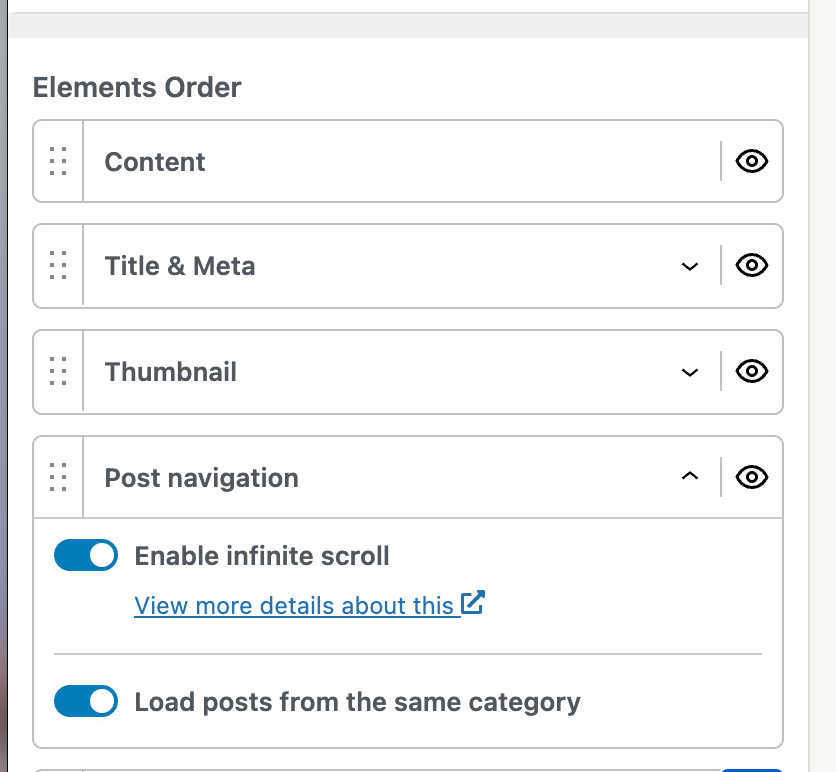
- The Elements Order and Meta Order options allows you to choose a specific layout for the elements of the single post page. Drag & drop elements to reorder them, or click on the little eye icon to show/hide them.
The Post Navigation field allows you to enable the Infinite Scroll option. Once Infinite Scroll is enabled, you can also turn on the Load posts from the same category option.
If this option is enabled, posts will be loaded from the same category. If it is disabled, the infinite scroll will load the adjacent post instead.
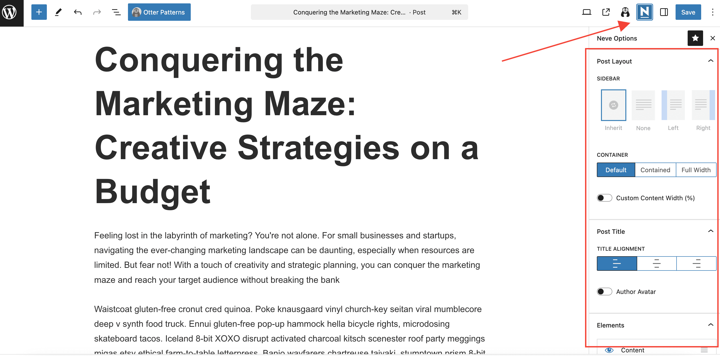
Individual options (apply to a specific post)
If needed, each post can have its own layout, overriding the general options set before. To obtain that, click on the Neve icon from the single post page, which will open a new panel of options.