PPOM Pro Input Types
📝 Note: These input types require the PPOM plugin's pro version, which you can get from here. You can also check the live demo.
This page covers every Pro field type available in PPOM. For each input you'll find what it does, the best use cases, and the key settings exposed in the field editor. The free field types are documented in PPOM Free Input Types.
In this article
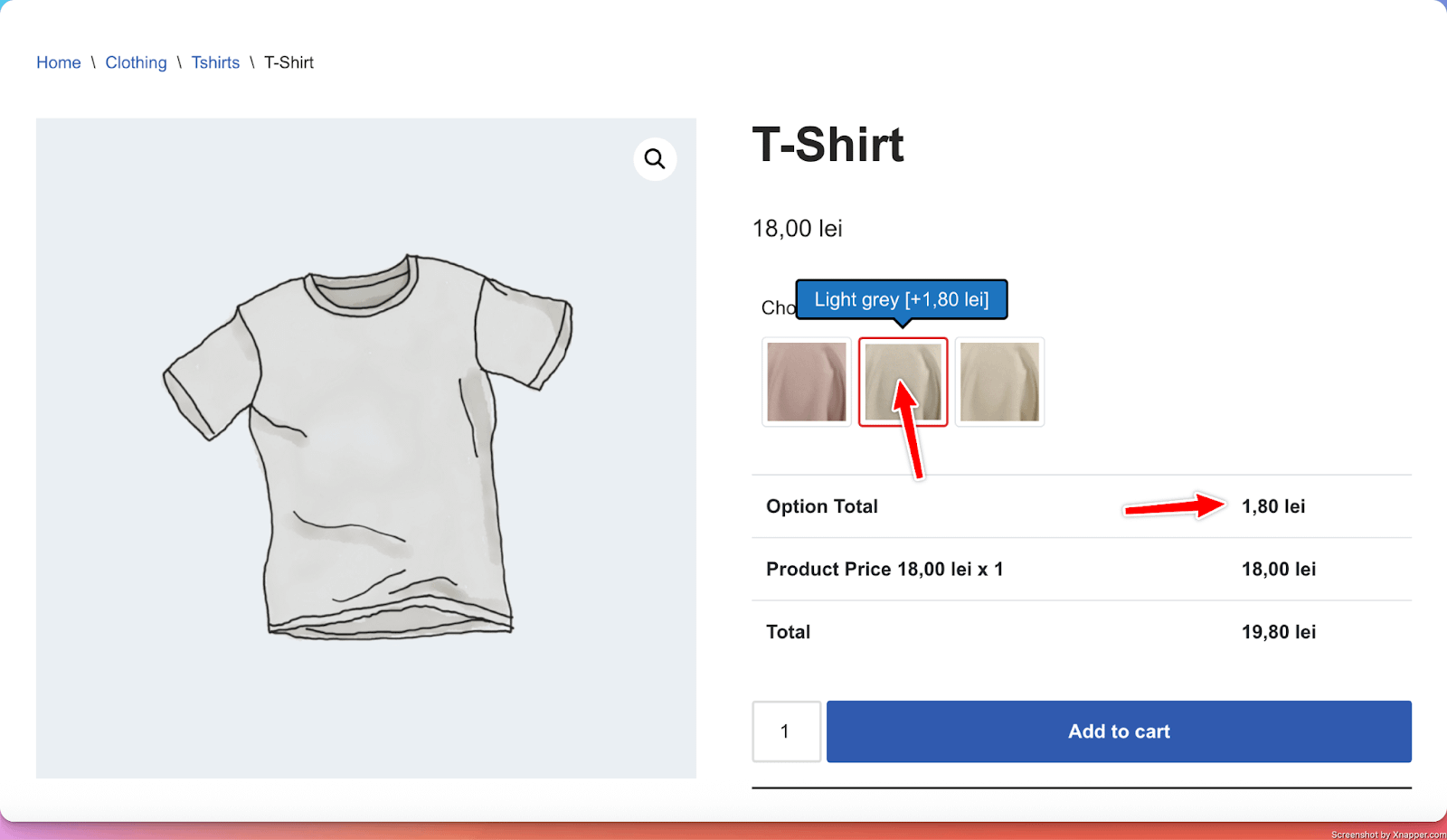
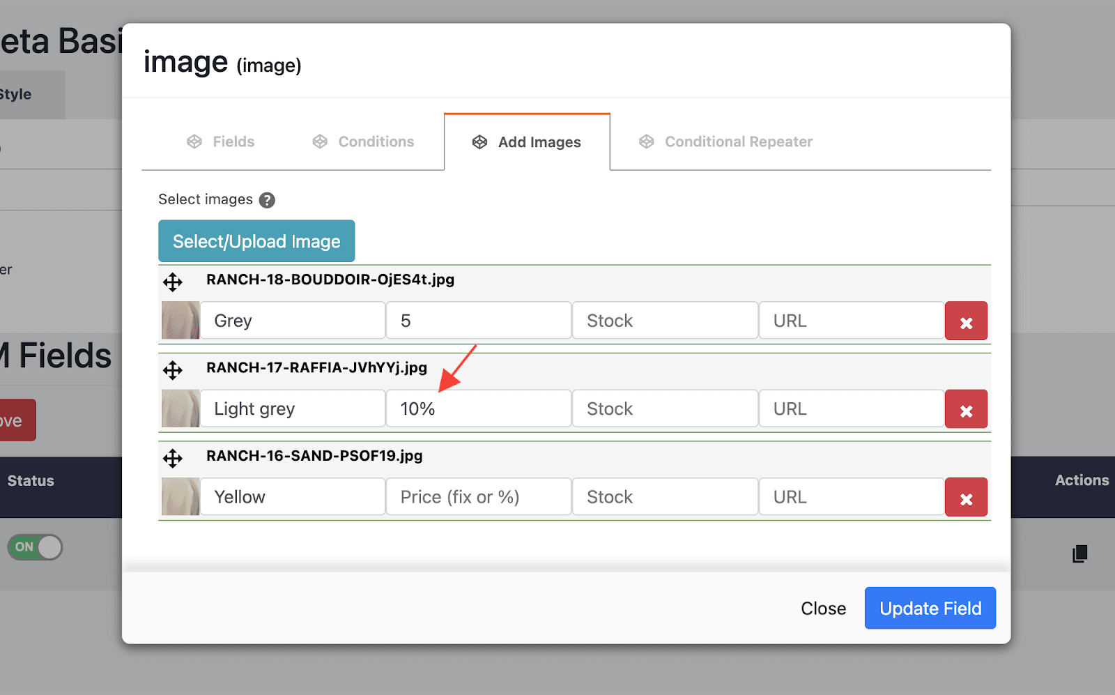
1. Images
What it does
- Adds a number of images from which the user can choose. The selected image/s get added to their order.
Perfect for
- Collecting specific information needed for custom orders (for example, color for the product)
Configuration options
- Essential: Title, make the setting required or optional
- Advanced: Multiple selections (allow users to select just one image, or multiple )
- Validation: Custom error messages
Options in detail
Add-on Price: The amount will be added to the product price once an image has been selected. The price can be fixed or in percentage.
2. Timezone Input
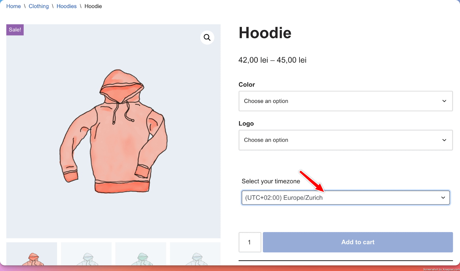
What it does
- Adds a select field with a list of predefined time zones from which customers can select their time zones that get added to their order.
Perfect for
- Collecting timezone information needed for custom orders.
Configuration options
- Essential: Title, make the setting required or optional
- Advanced: Selected option - make one option selected by default
- Validation: Custom error messages
3. File Input
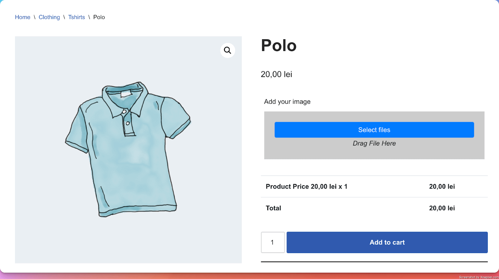
What it does
- Adds a file field where customers can upload their personalized files that get added to their order.
Perfect for
- Product personalization (images on mugs, custom engraving text)
Configuration options
- Essential: Title, make the setting required or optional
- Advanced: Image dimensions (min and max height and width values), allowed file types, and maximum file size
- Validation: Custom error messages
When File types or File size are configured, PPOM shows those limits on the product page before the customer uploads a file. For example, a field configured with jpg,pdf,zip and 1mb displays the accepted formats and maximum size next to the uploader.
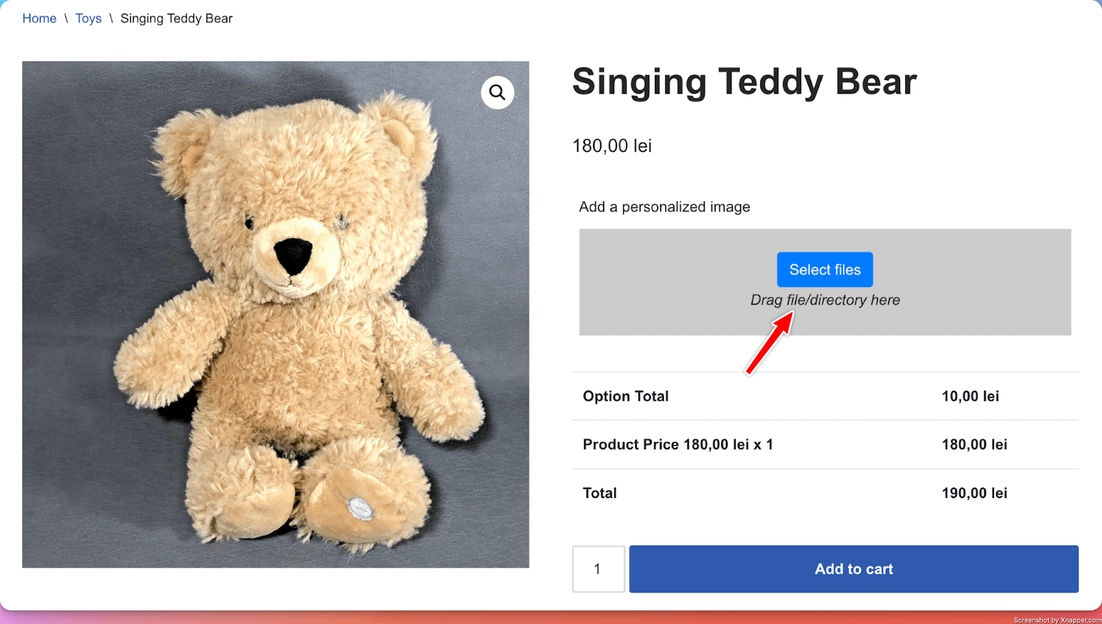
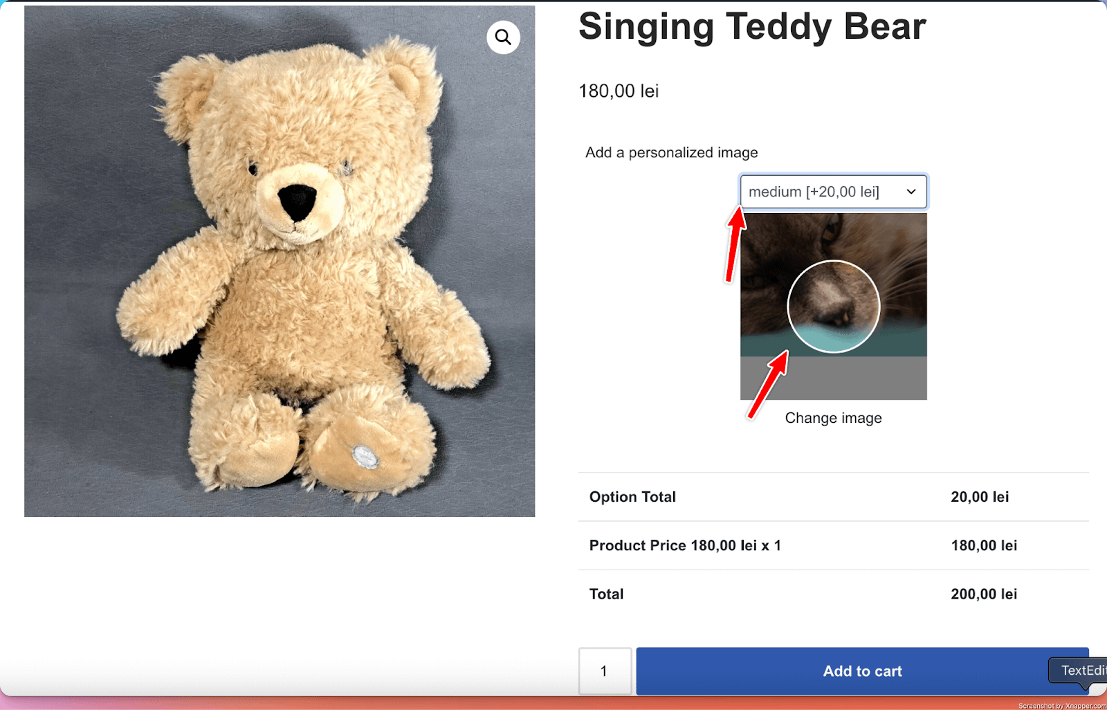
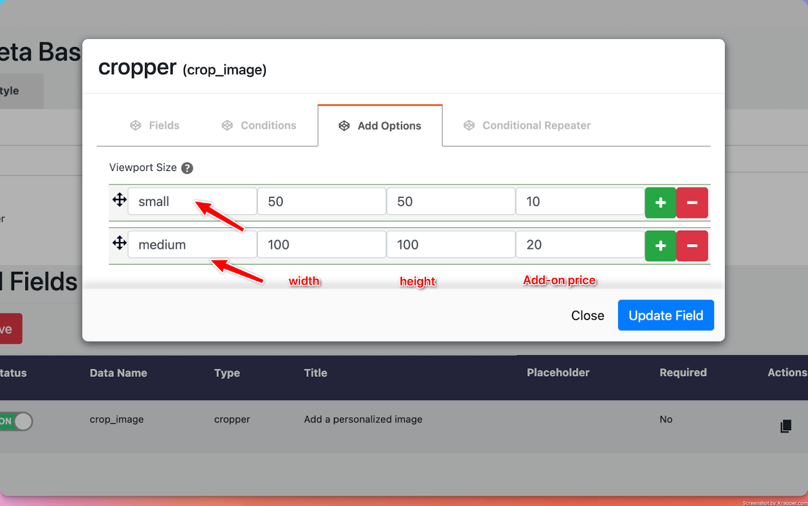
4. Image Cropper
What it does
- Adds a file field where customers can upload a personalized file that gets added to their order. Different from the simple File Input, using the Image Cropper input, the user is requested to crop the image using one of the specified sizes ( the sizes are defined in the Add Options tab - for each size, there is a name, a width, a height, and an optional add-on price ).
Perfect for
- Product personalization (images on mugs, custom engraving text)
Configuration options
- Essential: Title, make the setting required or optional
- Advanced: Viewport type ( circle or square ), Image types (type of images allowed to be uploaded)
- Validation: Custom error messages
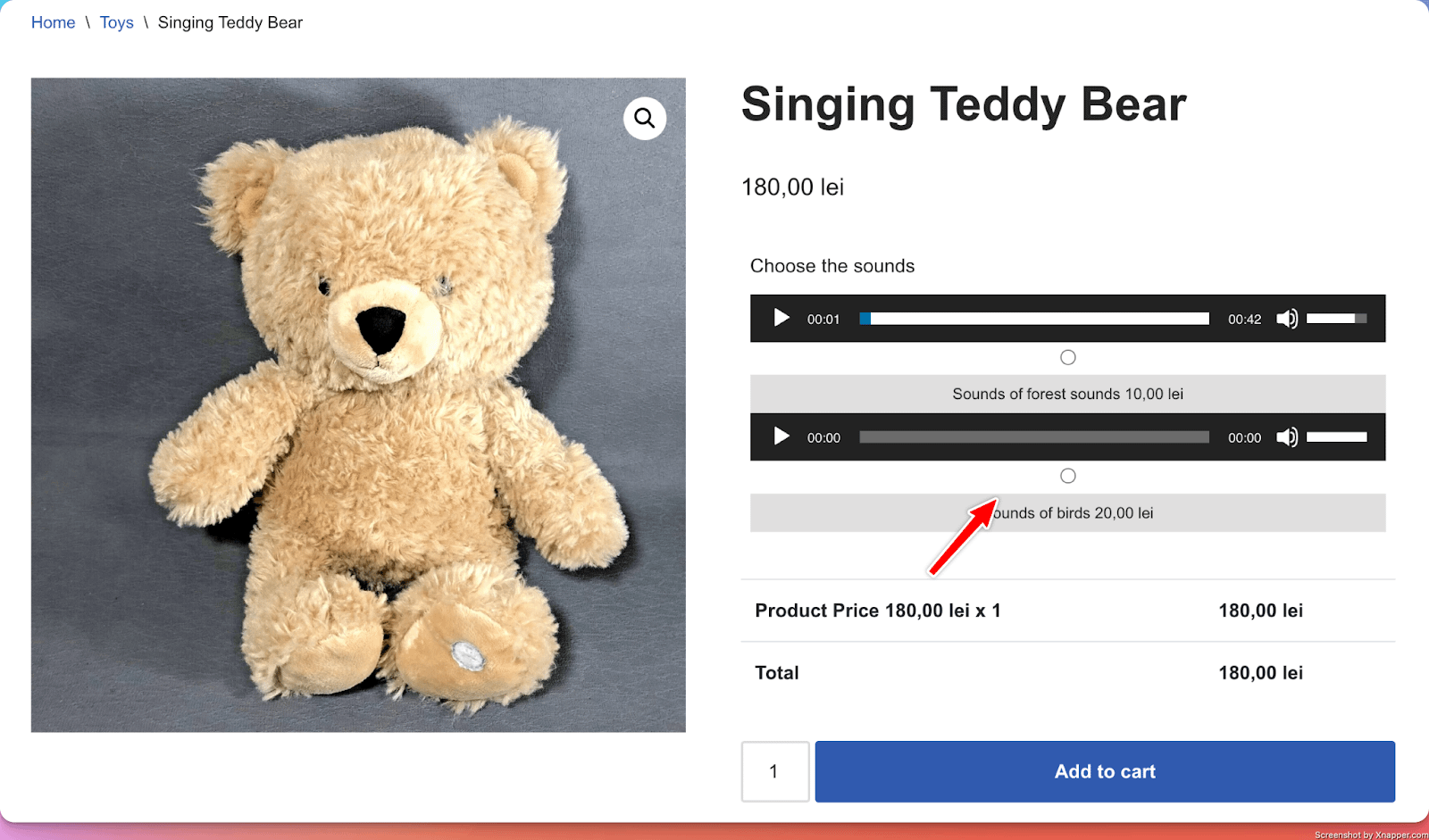
5. Audio / Video
What it does
- Adds a list of audio or video files from which the user can choose.
Perfect for
- Product personalization (for example, sounds used in a Music box, video that should show in a video montage )
Configuration options
- Essential: Title, make the setting required or optional
- Advanced: Multiple selection (allow users to select just one file, or multiple )
- Validation: Custom error messages
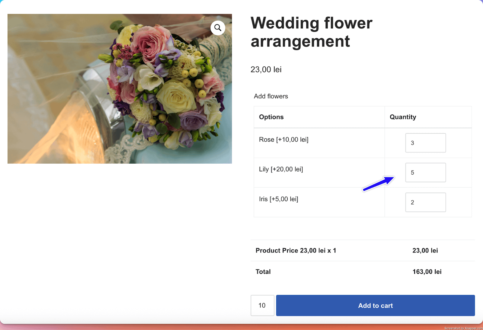
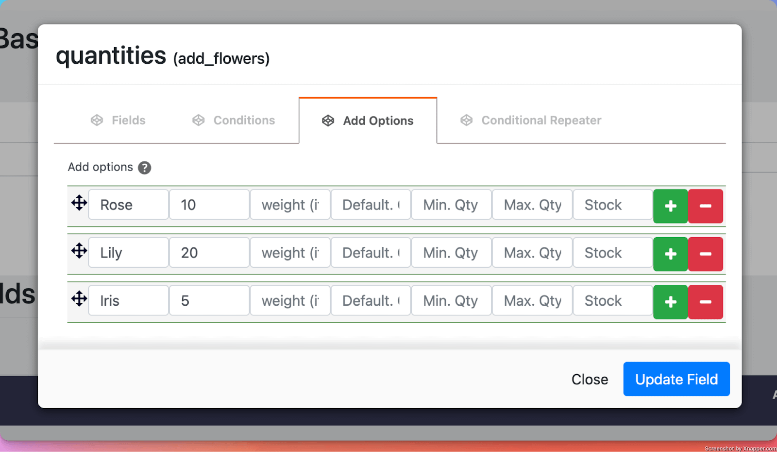
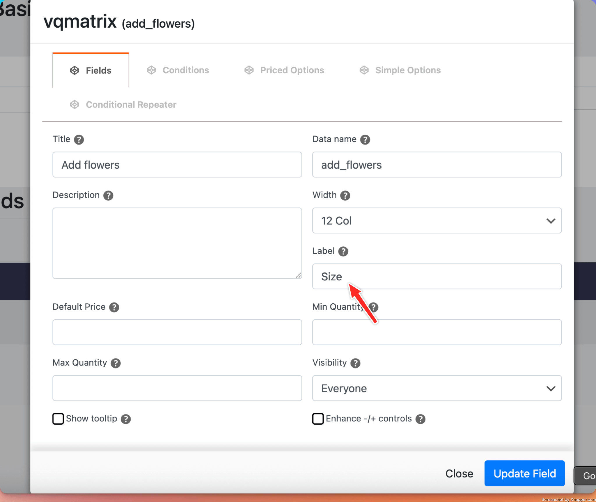
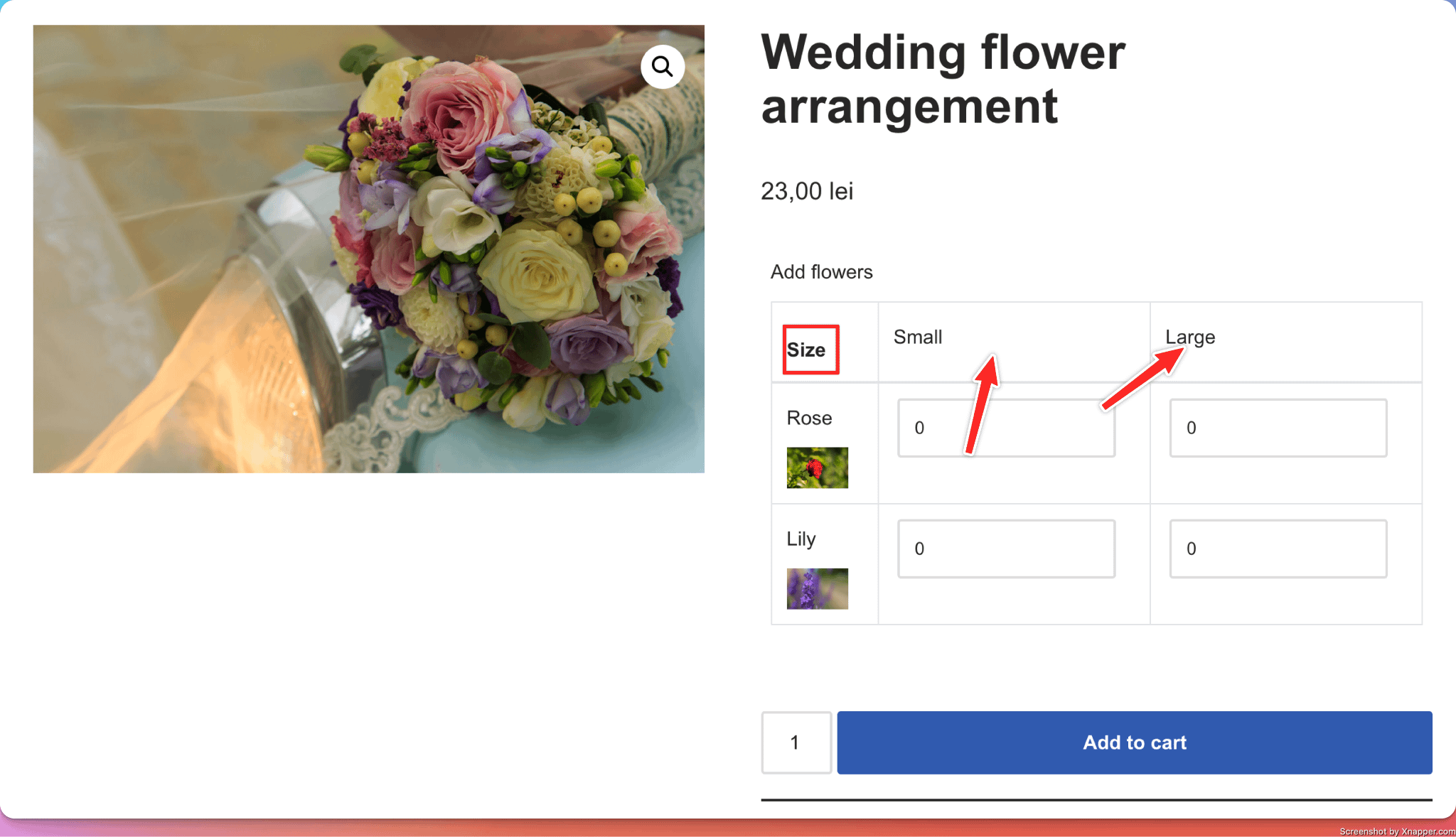
6. Variation Quantity
📝 Note: This PPOM input is available on the Plus and VIP subscriptions of the plugin, which you can get from here.
What it does
- Allow users to add different quantities for each additional option.
Perfect for
- Adding a different number of different types of flowers to a flower arrangement, which has a base price. You can add 10 roses ( each for 10 lei ), 2 lilies ( each for 20 lei ), and so on, which gets added to the base price of the product.
Configuration options
- Essential: Title, make the setting required or optional, quantity limits (Max. Quantity and Min. Quantity options)
- Advanced: Variation Layout (Vertical, Horizontal, or Grid)
- Validation: Custom error messages
Options in detail
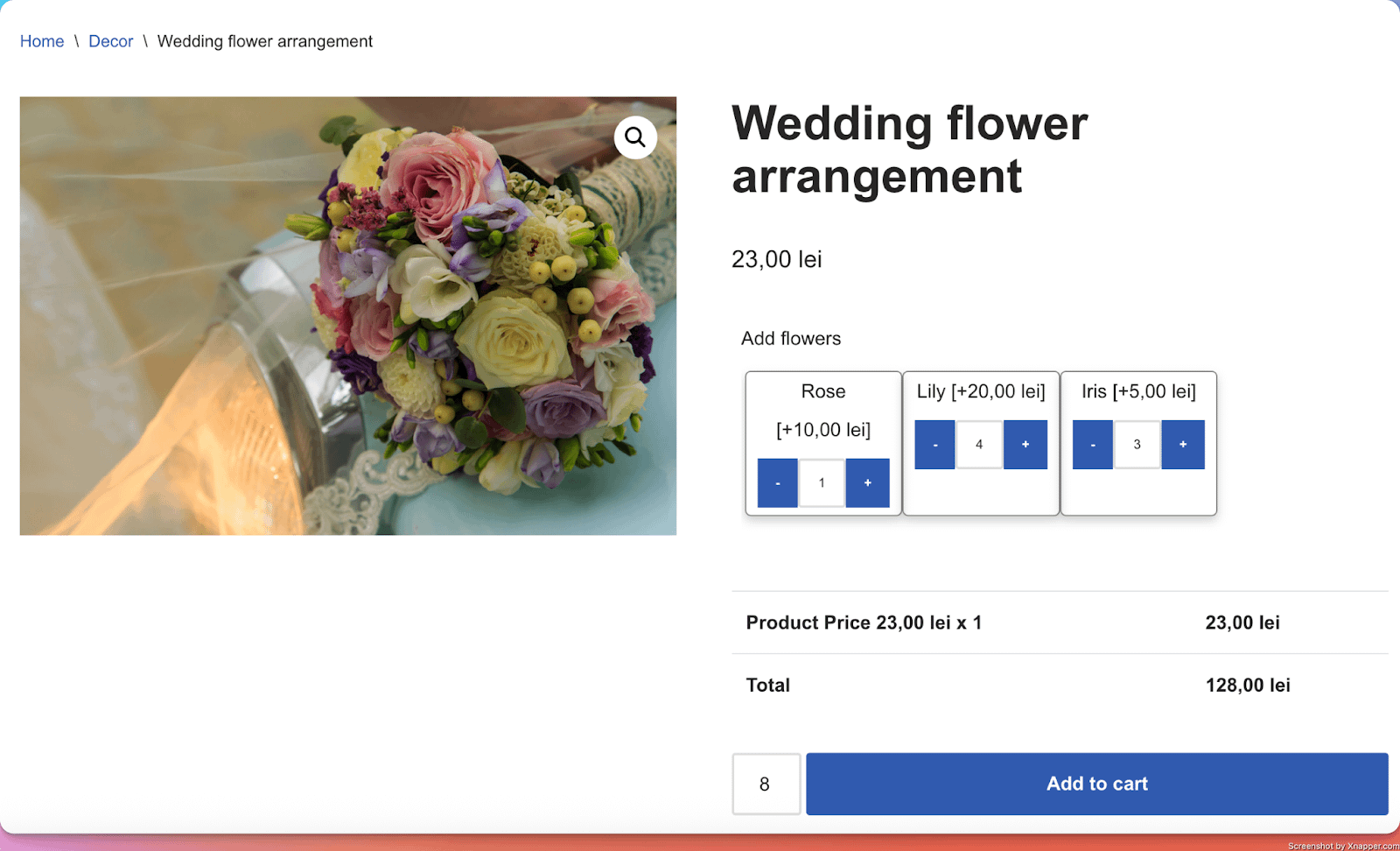
Variation Layout: Ability to change the layout of the field as follows:
Vertical Layout
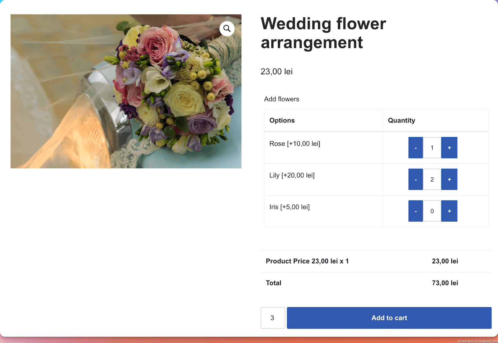
Horizontal Layout
Grid Layout
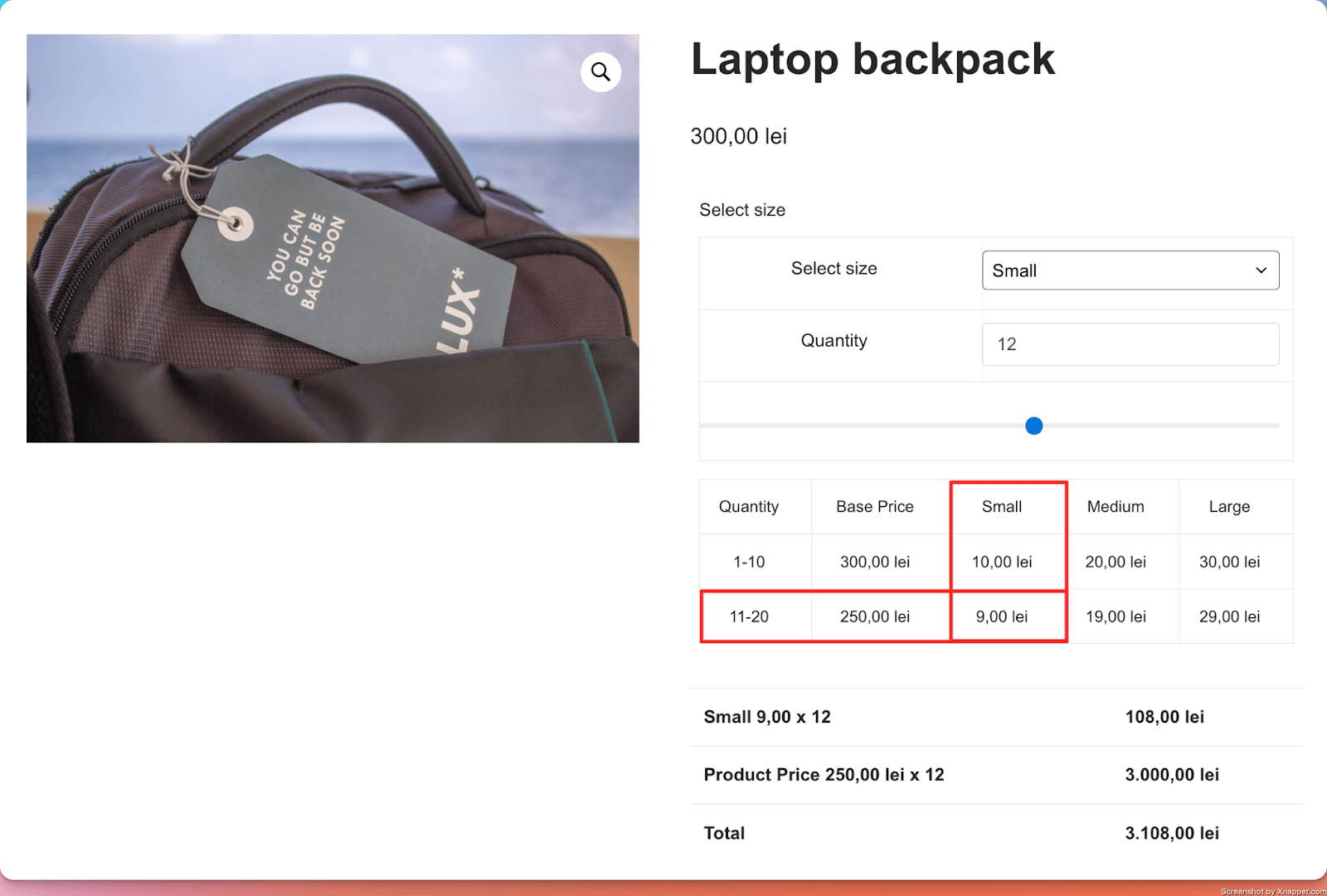
7. Price Matrix
What it does
- Allow vendors to offer different prices per product, based on the quantity of products purchased.
Perfect for
- Offering discounts for users purchasing larger quantities.
Configuration options
- Essential: Title
- Advanced: Enable Quantity Slider, Hide Price Matrix ( to not show the price matrix on the product page, just apply the mechanism in the background ), Quantity Step ( when users try to add more products by clicking on the up/down arrows, or by using the slider, this step is used, instead of the normal counting )
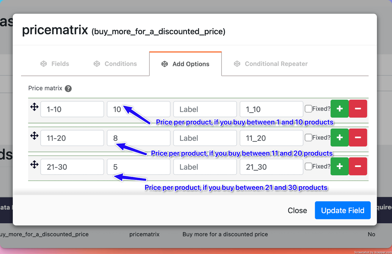
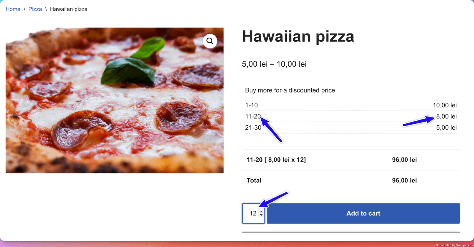
Options in detail
Enable Quantity Slider: Show a slider that can be used by customers to easily update the quantity of products to buy.
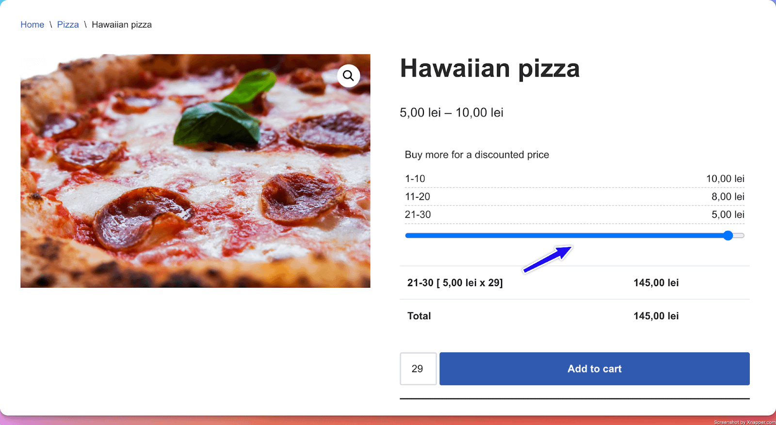
Apply as discount: When this option is checked, the price is calculated based on the initial price of the product, multiplied by the quantity of products, from which you get the discount value corresponding to the quantity from the price matrix.
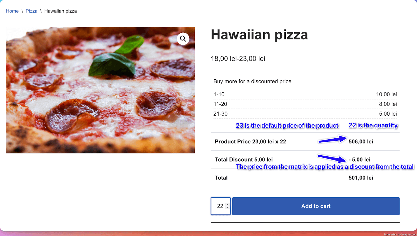
Price Matrix Row Format
Each row in the Price Matrix represents a quantity range and the corresponding price. Rows must follow the start-end format, where both start and end are whole numbers separated by a hyphen.
Valid examples:
| Range | Price |
|---|---|
| 1-10 | $10 |
| 11-50 | $8 |
| 51-100 | $6 |
Invalid formats to avoid:
- Single numbers (e.g.,
5) — a range with both start and end values is required. - Numbers with a
+suffix (e.g.,5+) — this format is not supported. - Ranges with spaces around the hyphen (e.g.,
1 - 10) — use1-10with no spaces.
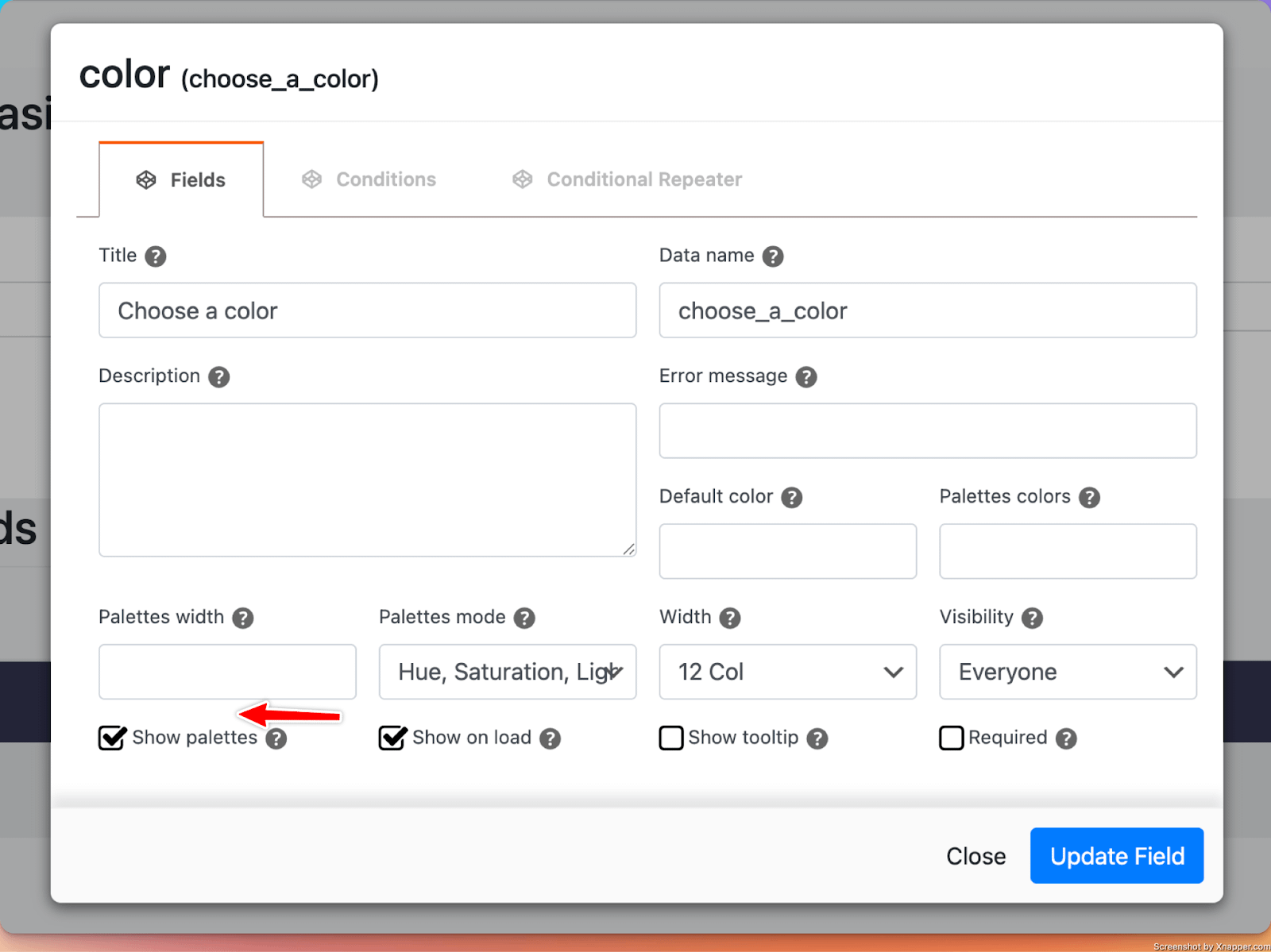
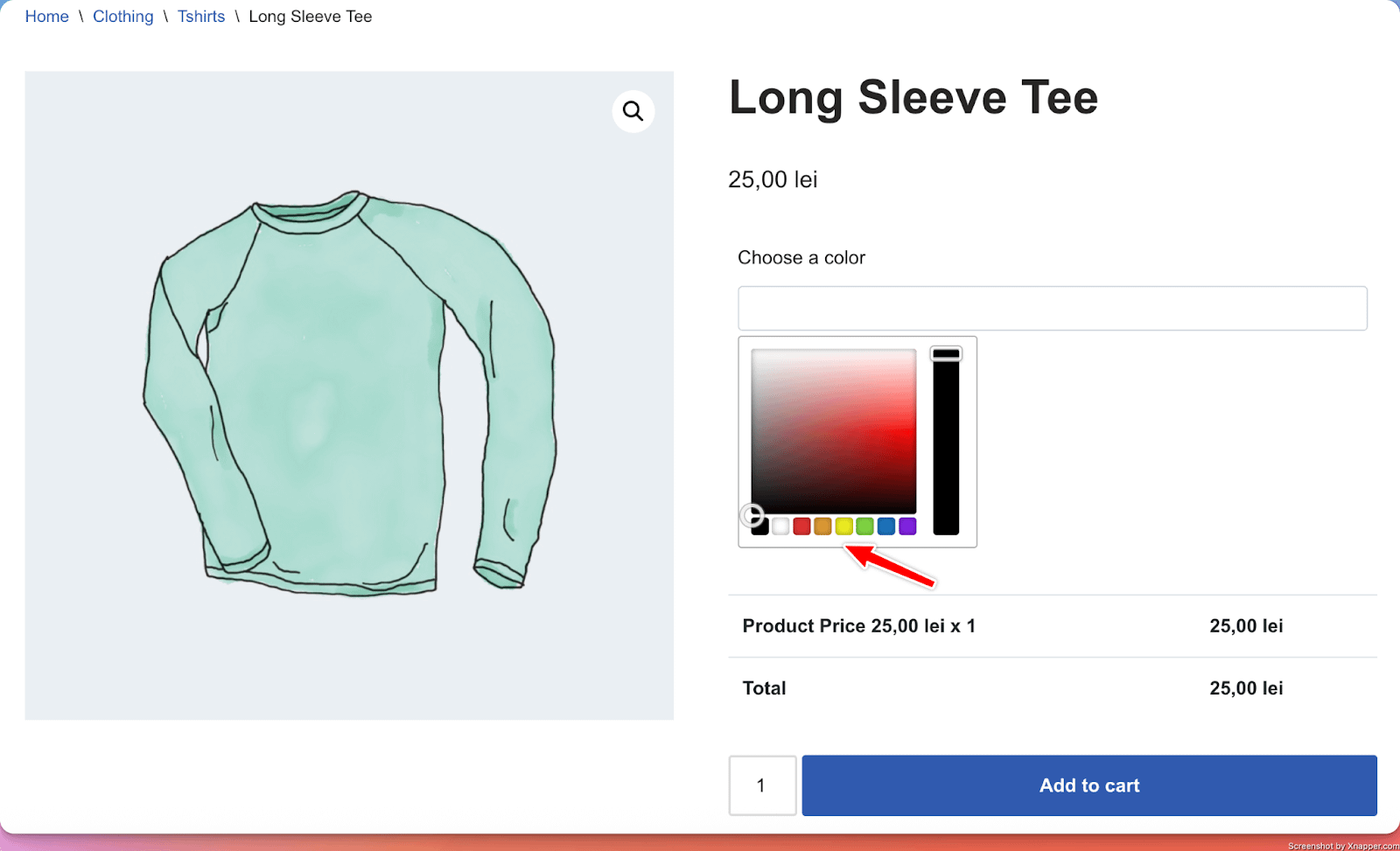
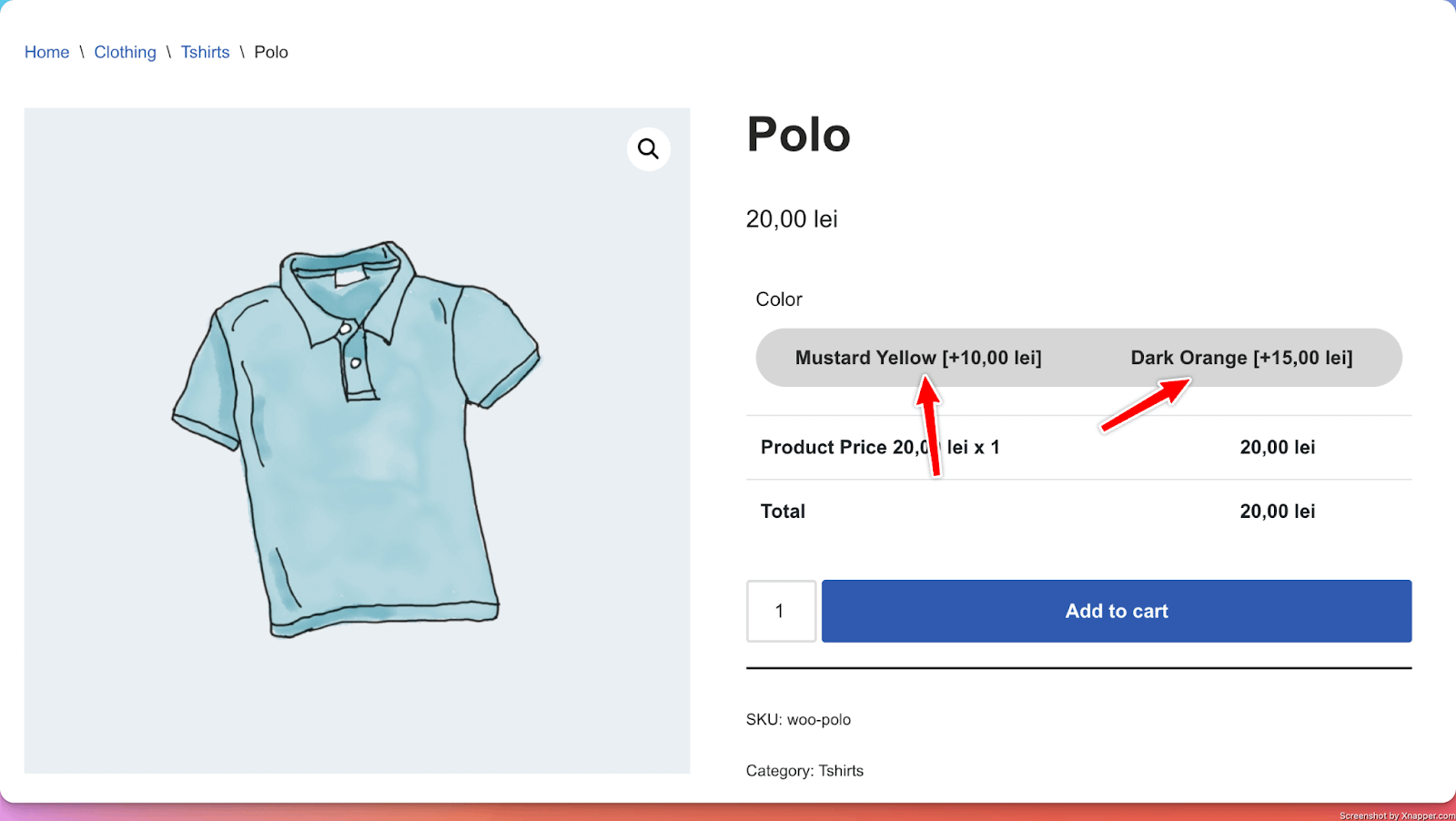
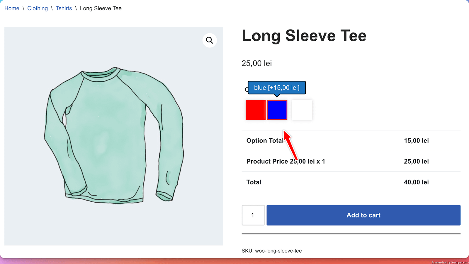
8. Color Picker
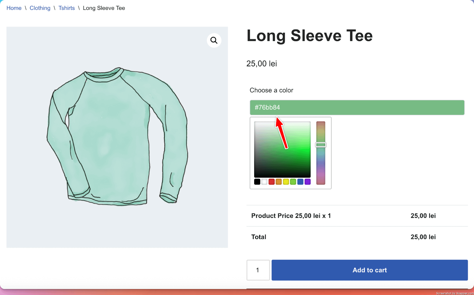
What it does
- Adds a customizable color field where customers can select a custom color that gets added to their order.
Perfect for
- Product color personalization.
Configuration options
- Essential: Title
- Advanced: Show on load (whether the color picker should be open by default or not)
- Validation: Custom error messages
Options in detail
Show palettes: Show a group of common colors from which the user can choose.
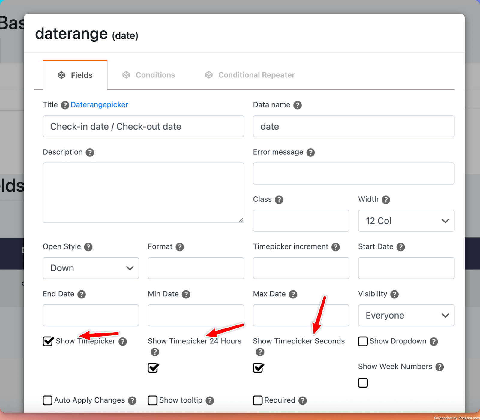
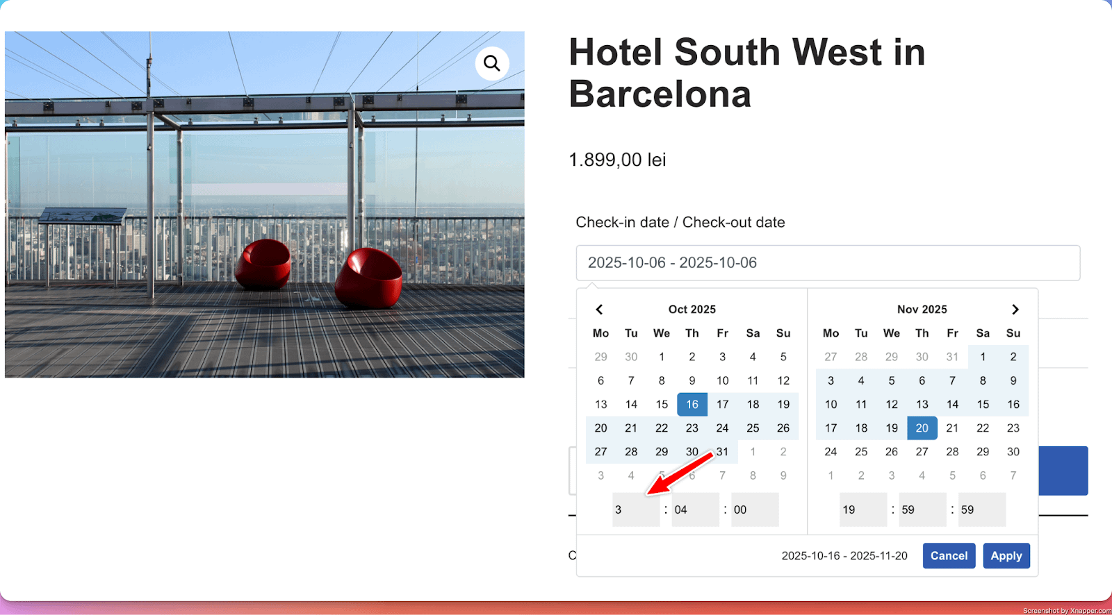
9. DateRange Input
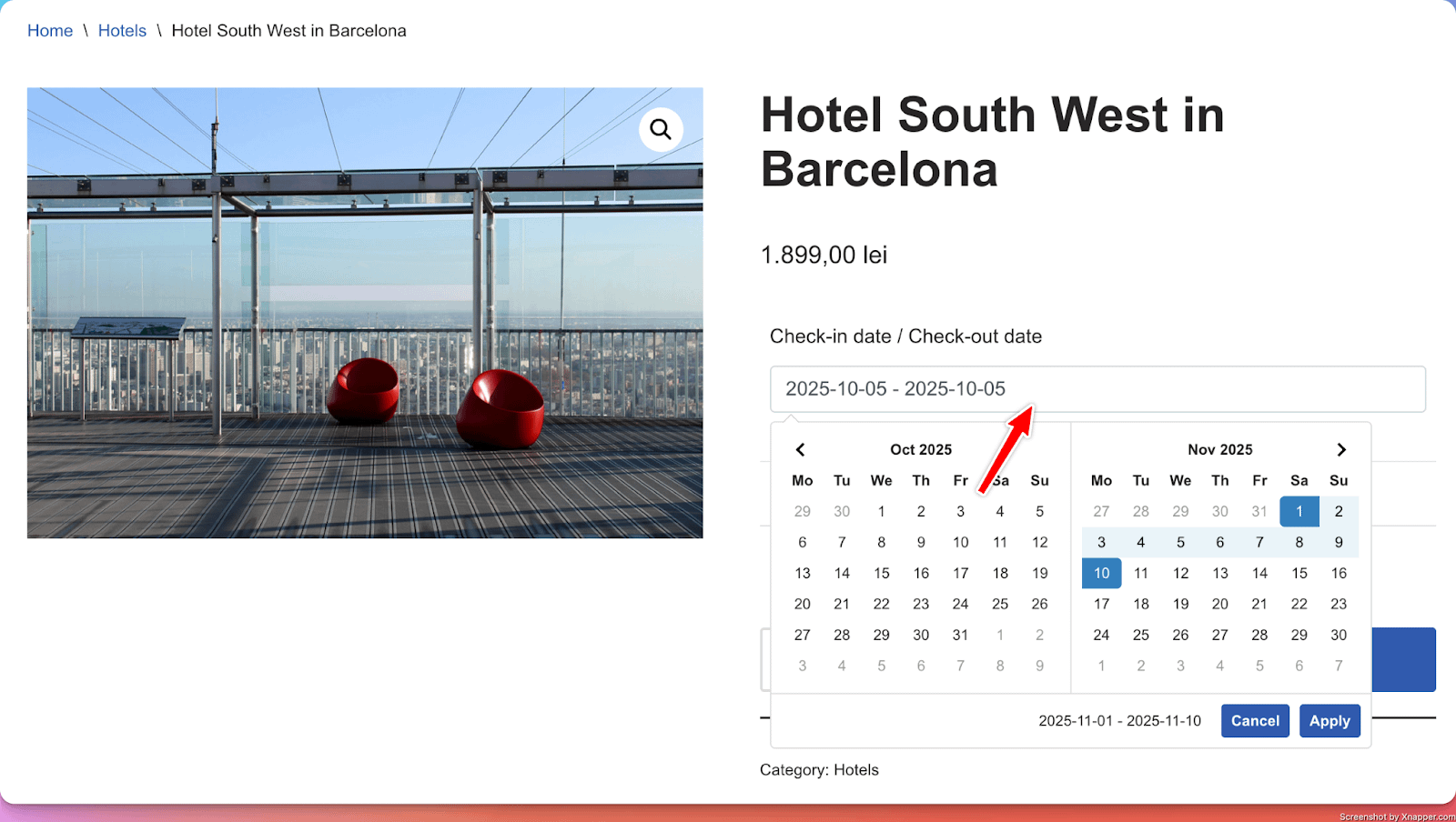
What it does
- Adds a customizable field where customers can select a range of dates that gets added to their order.
Perfect for
- Selecting check-in/check-out dates for a hotel booking.
Configuration options
- Essential: Title, make the setting required or optional
- Advanced: Show Timepicker ( allow users to select dedicated timeframes along the dates )
- Validation: Custom error messages
Options in detail
Show Timepicker: Besides selecting a range of dates, users are allowed to select timeframes as well.
10. Collapse
What it does
- The Collapse input is a special type of input that needs to be used in conjunction with other input/inputs.
- The Collapse input acts as a parent field for all fields underneath or before it (depending on the value of the Collapse Type option < Start or End>.
Perfect for
- Structuring a large number of PPOM inputs, in groups that can be collapsed when needed.
At first, options are hidden under the collapse input
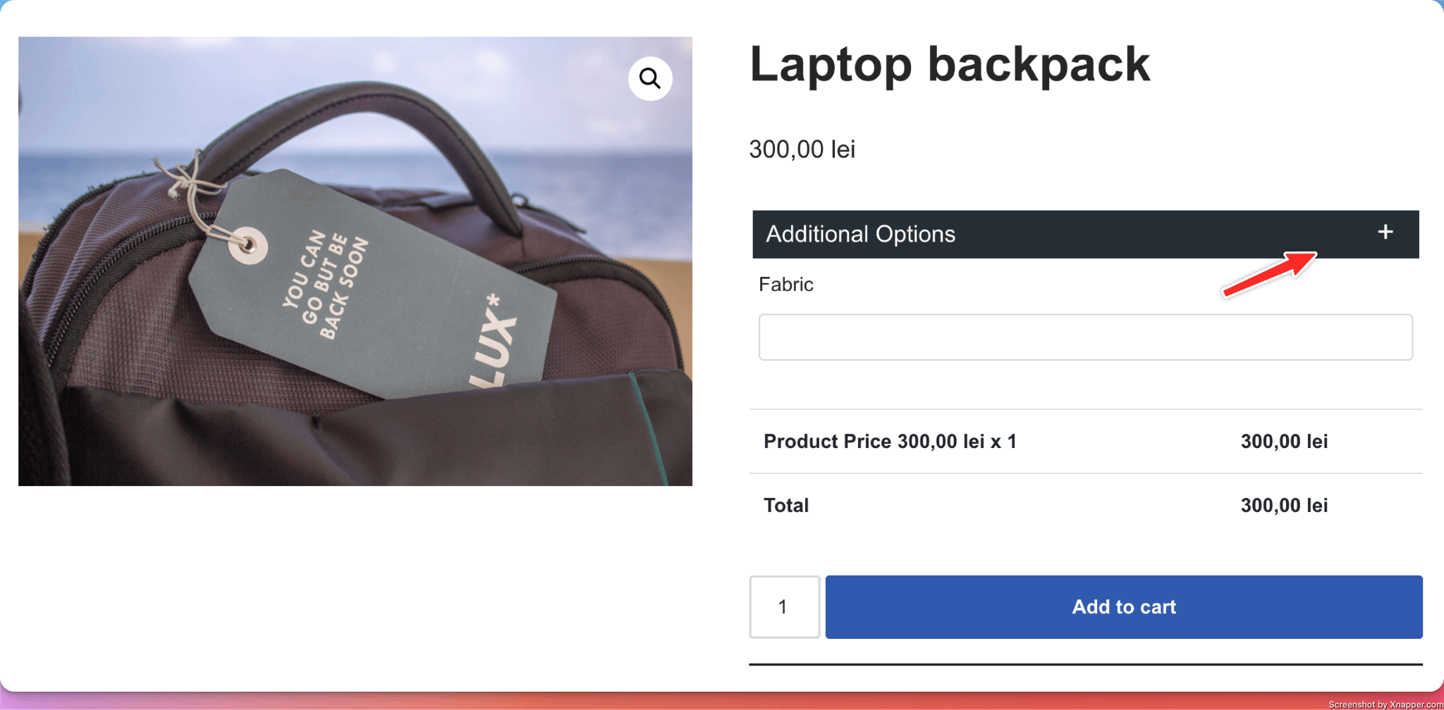
Once the collapse field is clicked, the options under it are revealed to the user.
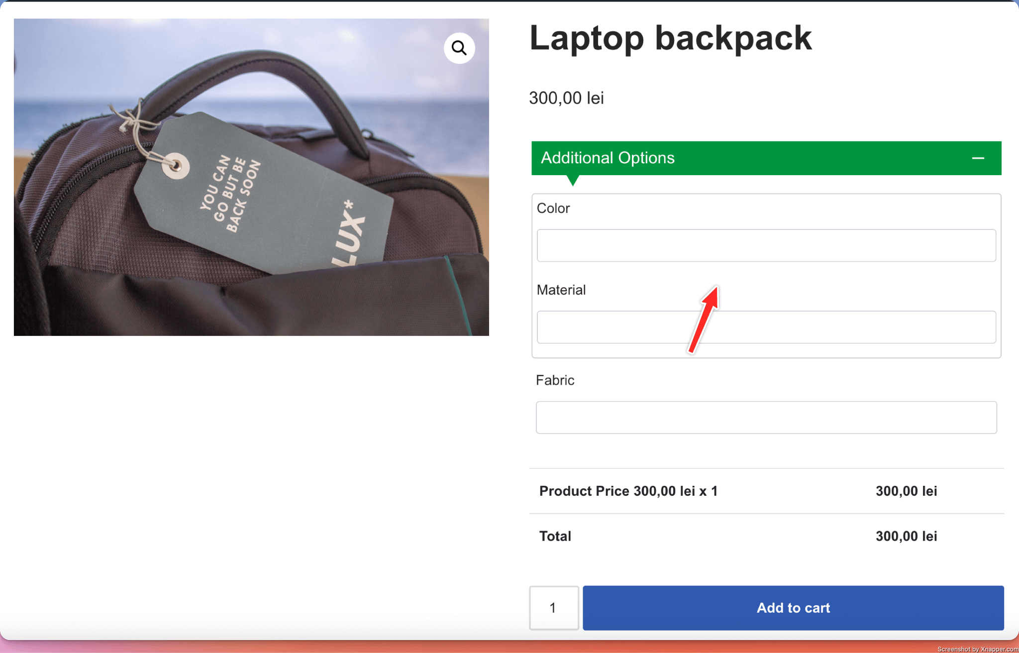
Options in detail
Collapse Type: All fields that are positioned after a Collapse field with Collapse Type = Start and before a Collapse field with Collapse Type = End will be collapsed.
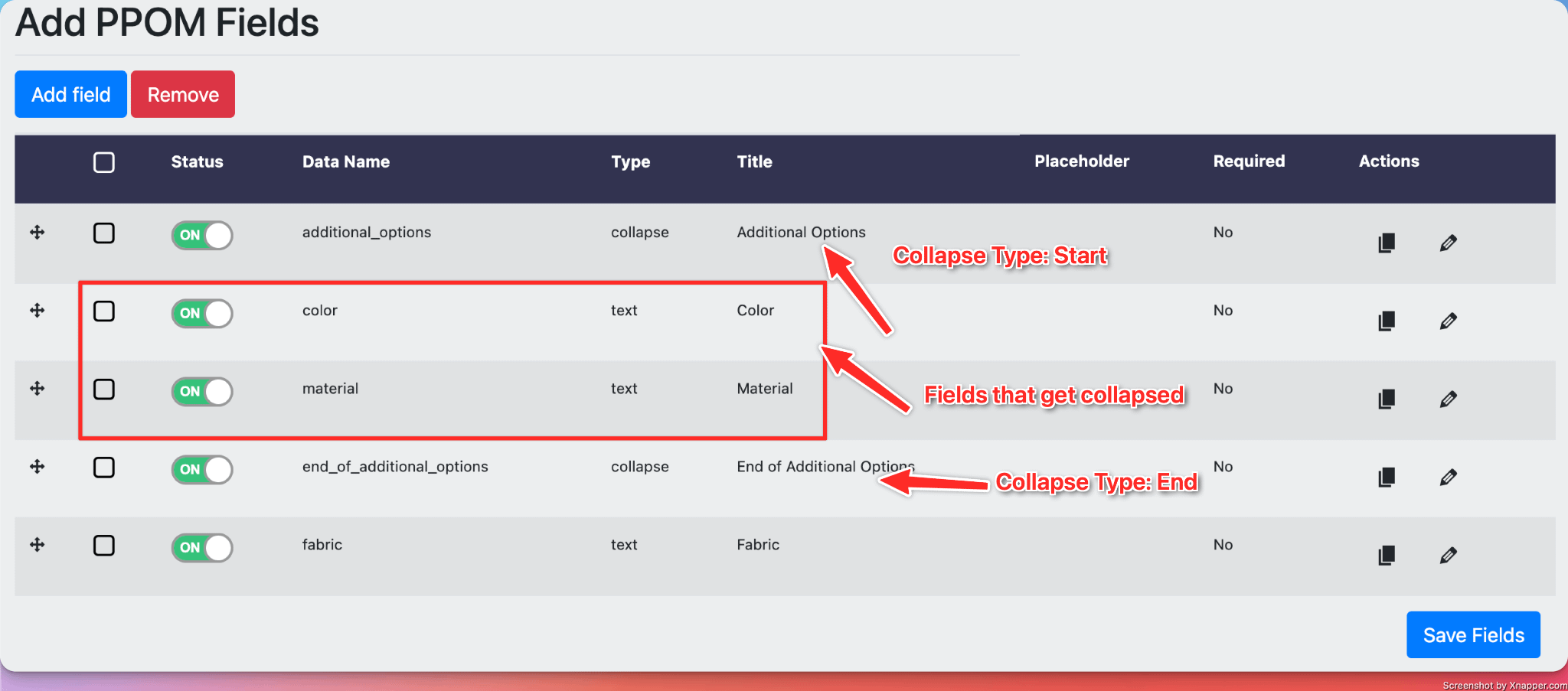
📝 Info: Most input types can be placed inside a Collapse field. Complex inputs that manage their own layout, such as the Repeater or Conditional Field Repeater, may not nest cleanly — test in a staging environment before using them inside a Collapse.
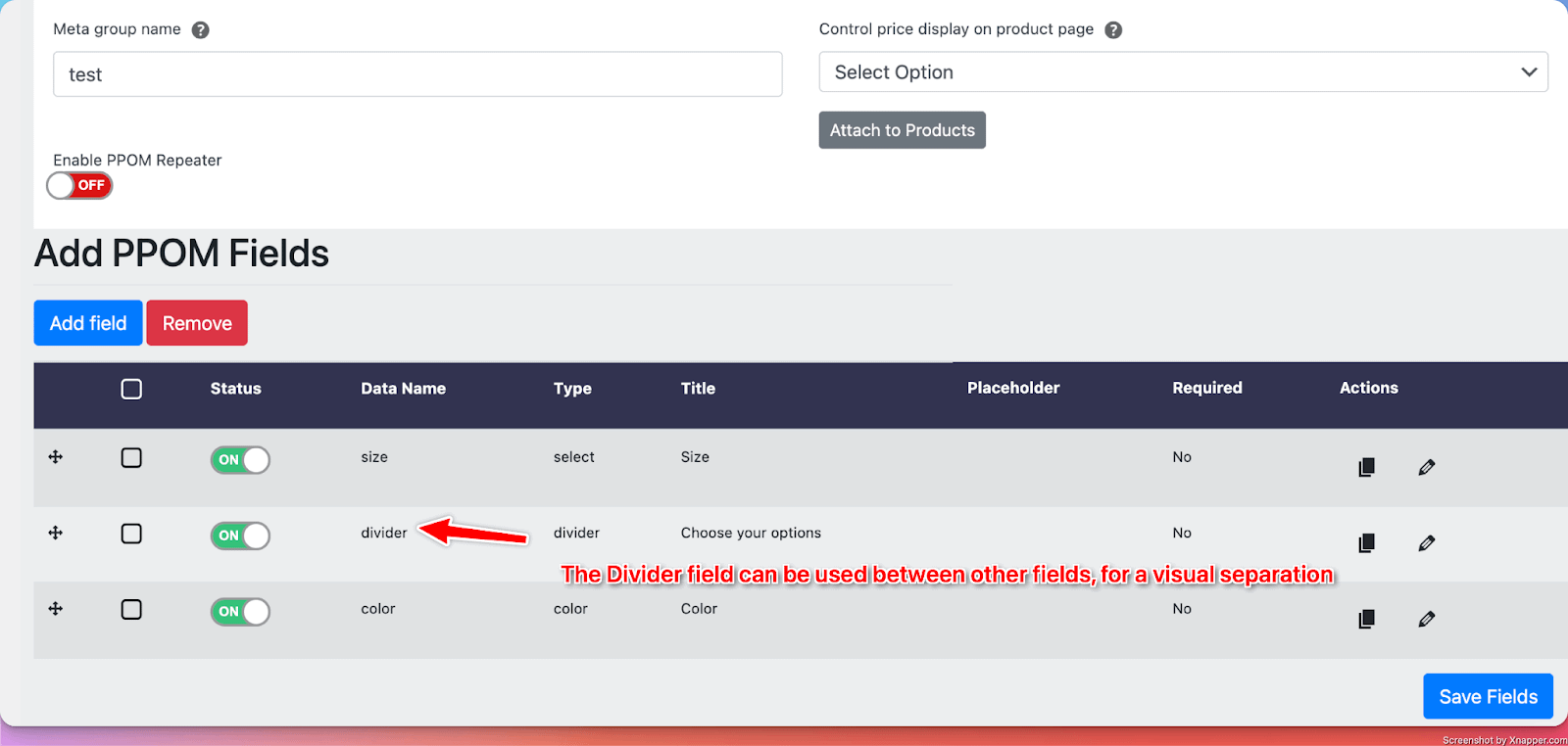
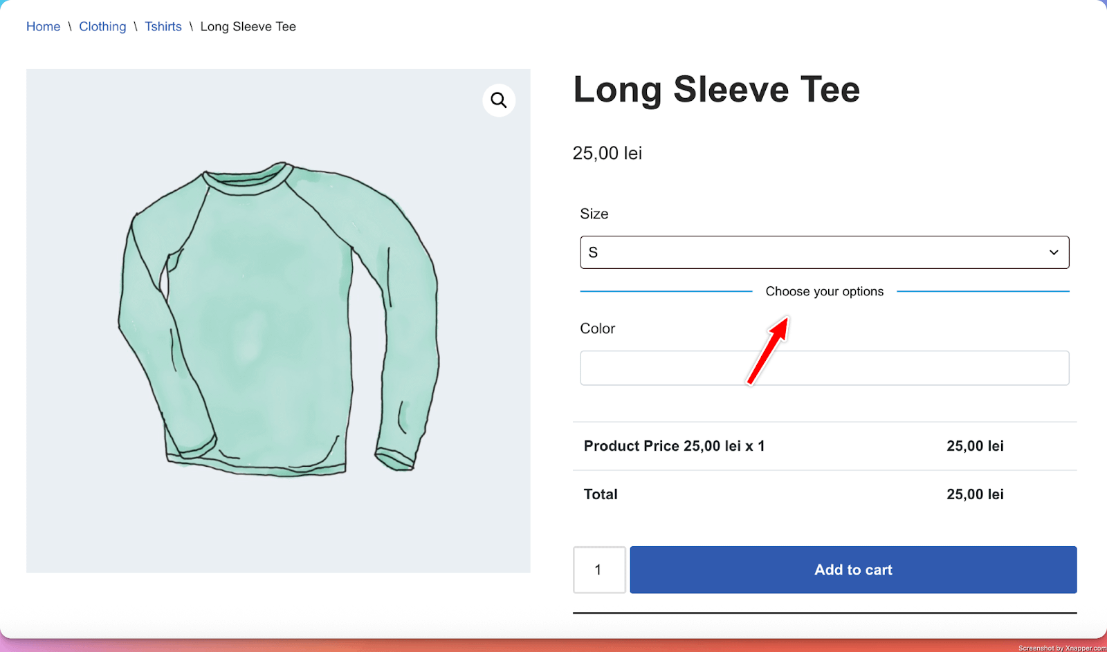
11. Divider
What it does
- The Divider field is a special type of field that can be used to visually differentiate other fields.
Perfect for
- Structuring a large number of PPOM inputs by adding a visual divider between them.
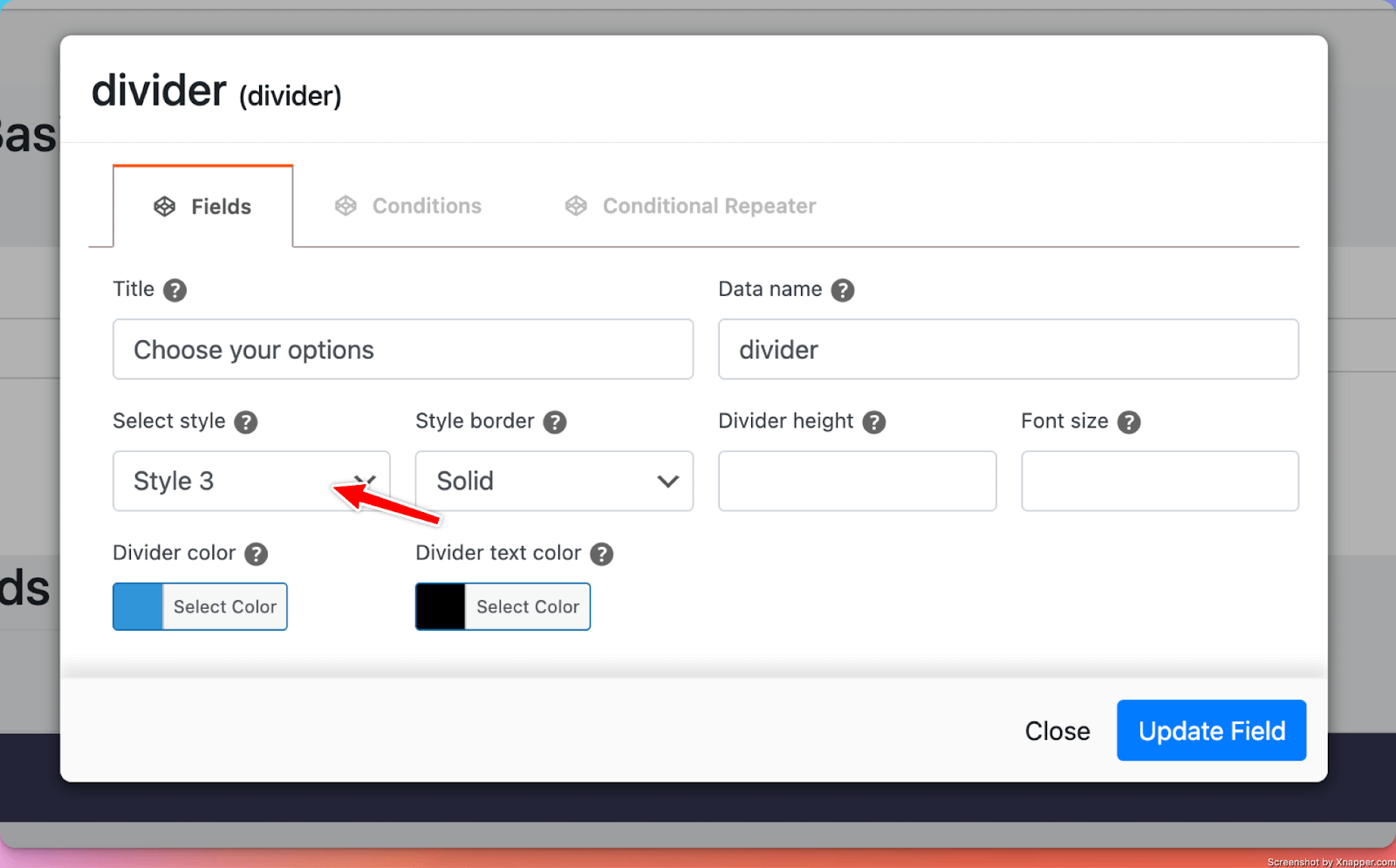
There are 5 styles available for the divider:
Style 1
Style 2
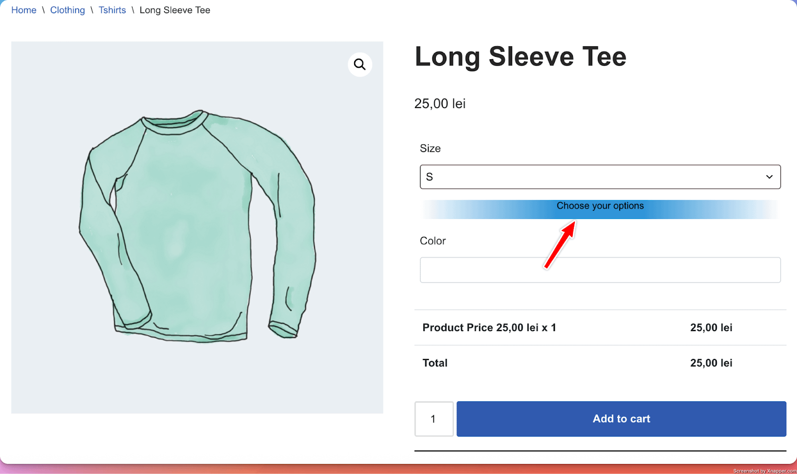
Style 3
Style 4
Style 5
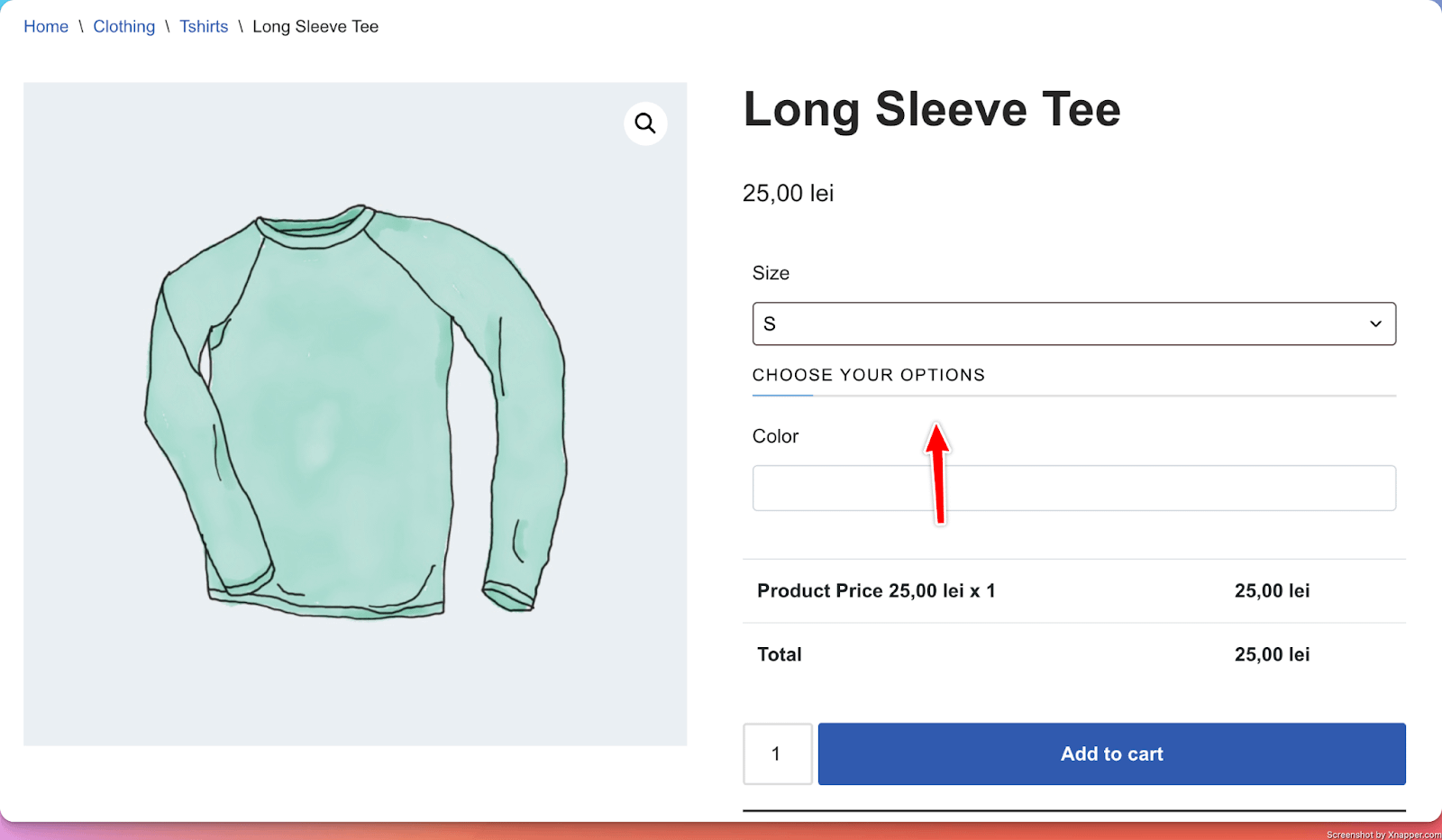
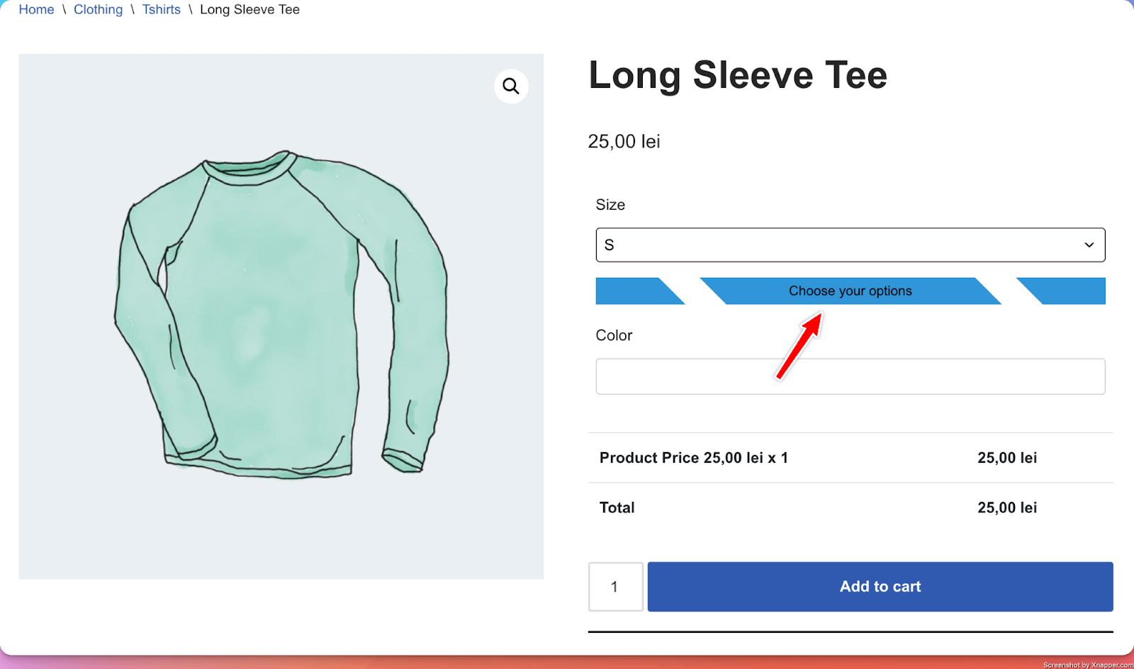
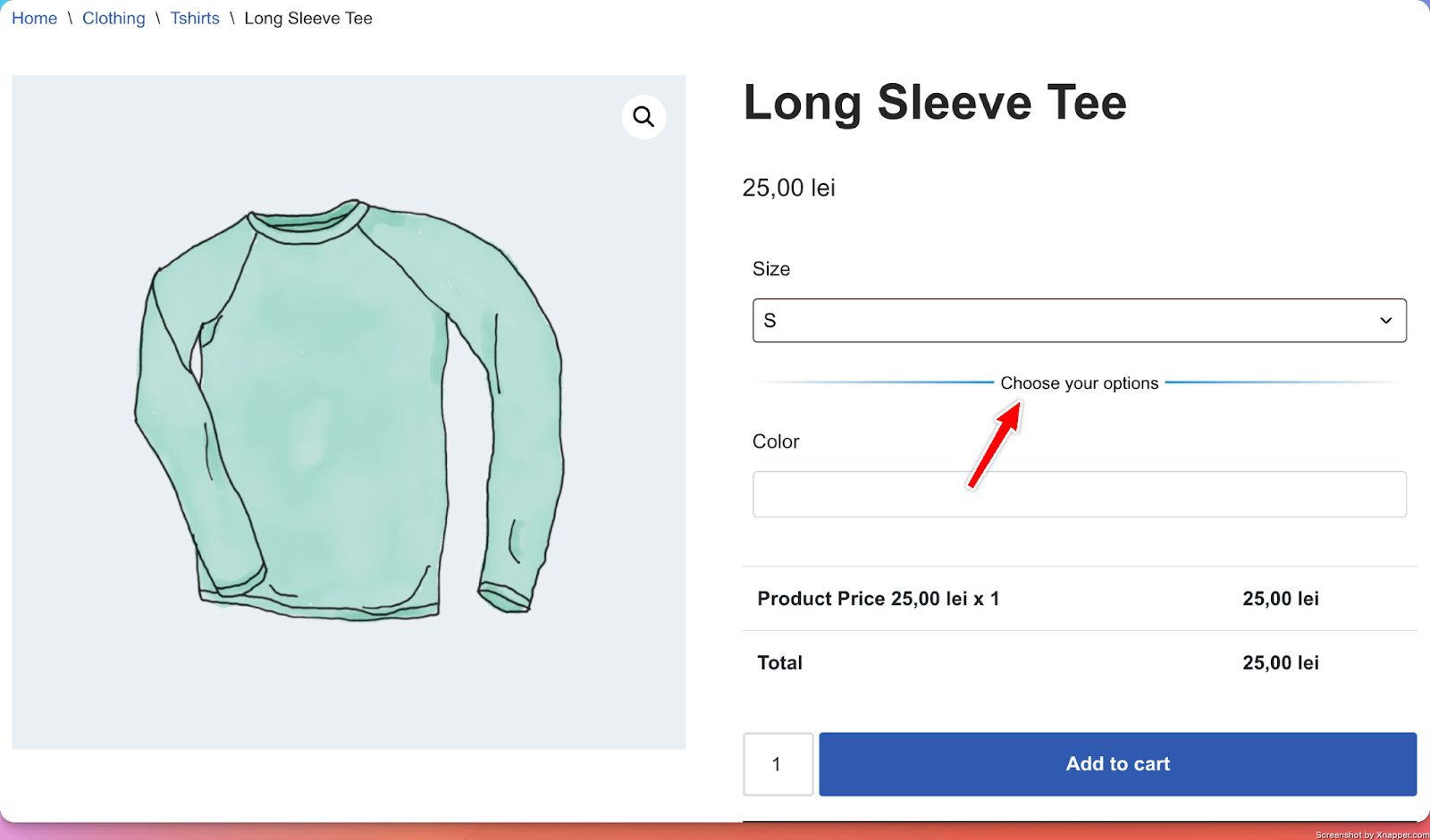
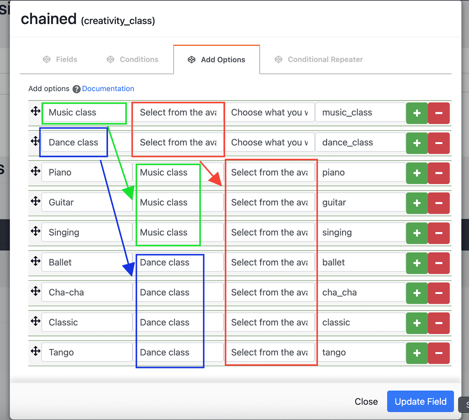
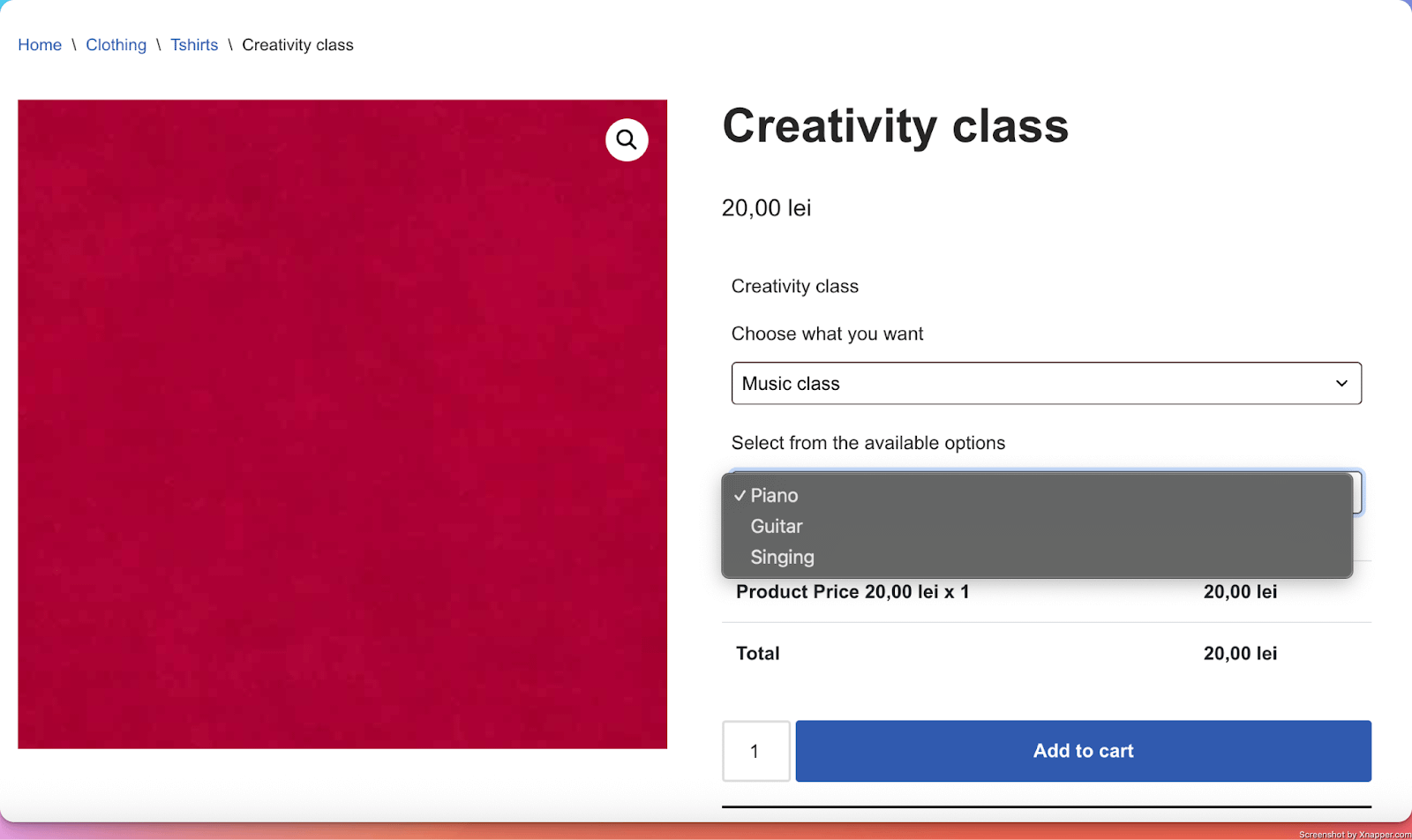
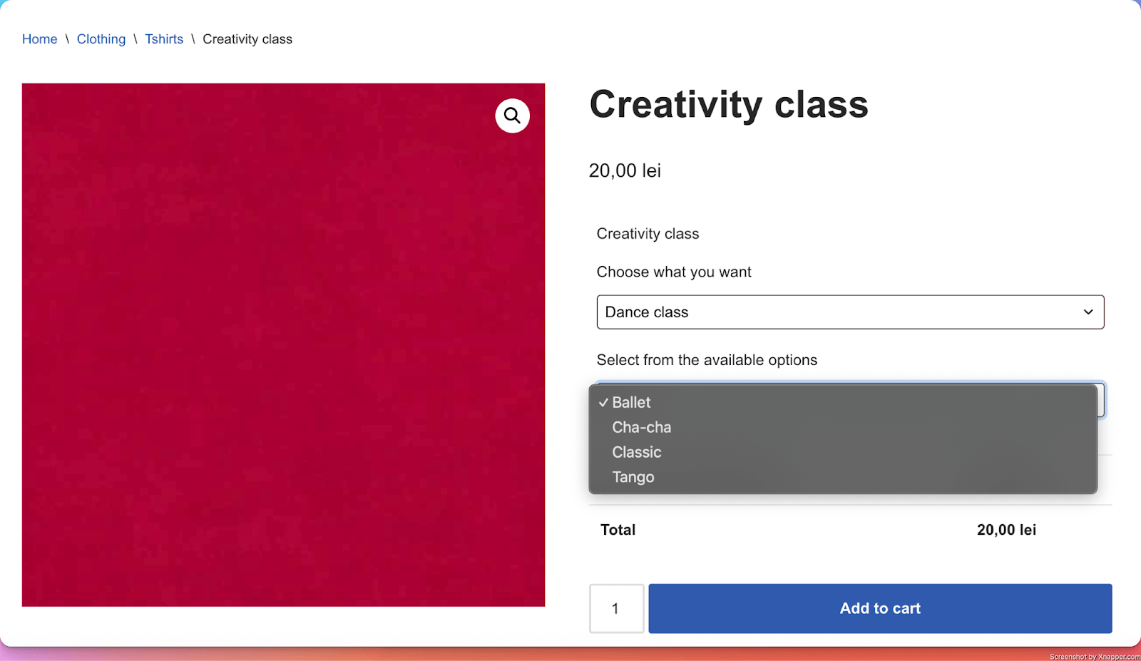
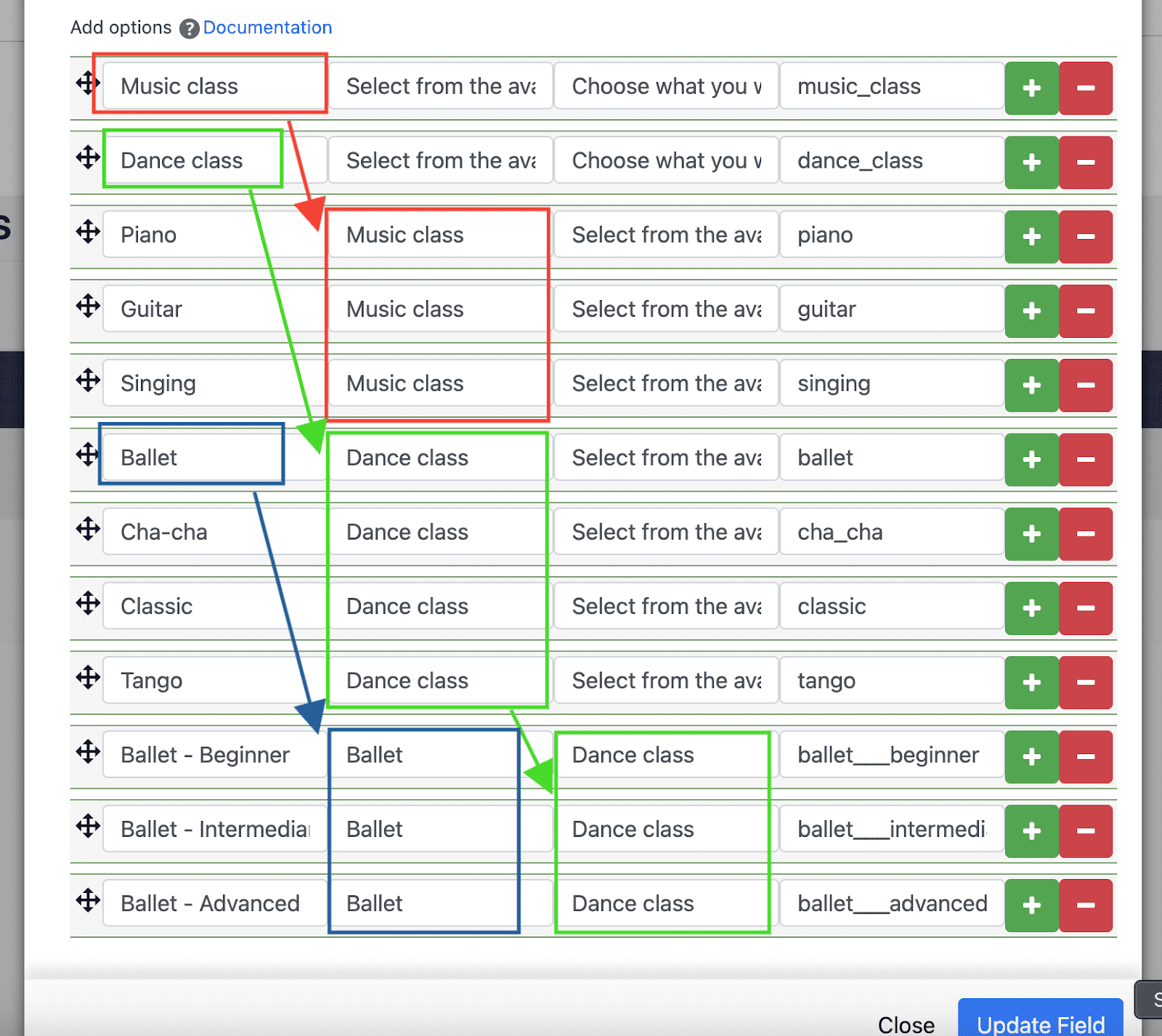
12. Chained Input
What it does
- Adds a sequence of chained ( connected ) select fields. The options of one select field are available based on what the user selects in the previous select field.
Perfect for
- Let users make selections based on specific conditions. For example, allow them to select from a list of types of activities ( dance or music ), and based on their selection, allow them to select specific activities ( if they choose dance, they can choose either ballet or tango, while if they choose music, they can choose either piano, guitar, or drums ).
Configuration options
- Essential: Title, make the setting required or optional
- Advanced: None
- Validation: Custom error messages
Example with two chained inputs
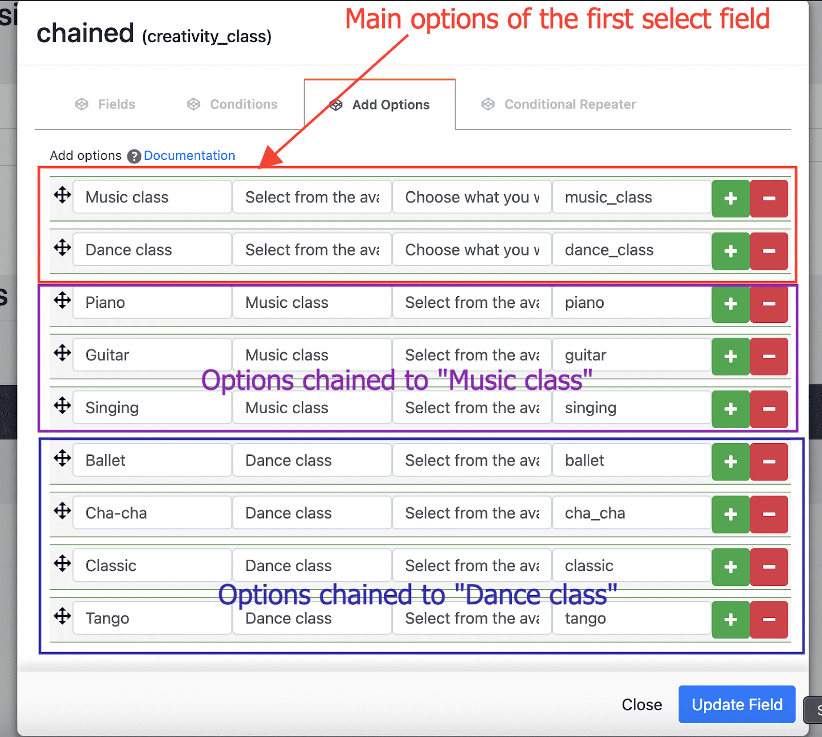
Example with three chained inputs
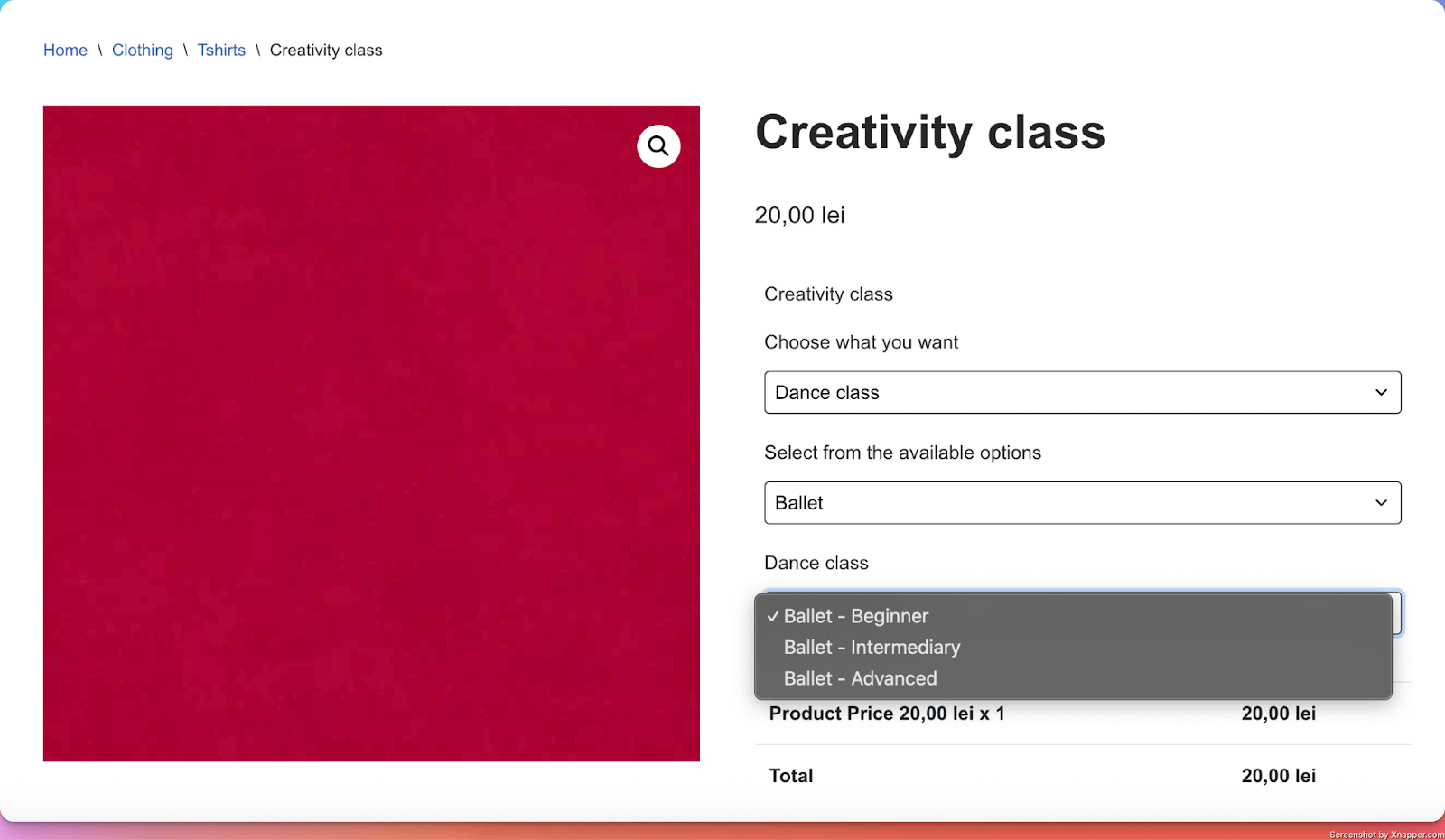
Note: More details about configuring the chained input can be found here.
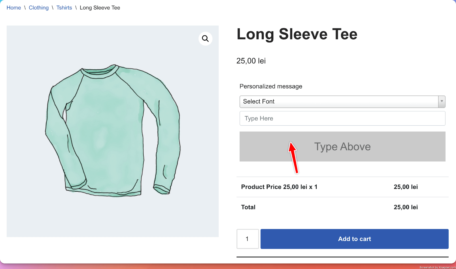
13. Fonts Picker
What it does
- Adds a list of font families from which customers can select their desired font that gets added to their order. Users can also add a text to preview the font selection.
Perfect for
- Product personalization (a personalized T-shirt with a text on it, using a specific font family, for example)
Configuration options
- Essential: Title, make the setting required or optional, Choosing a default font
- Advanced: Additional Google Font Families, Custom fonts
- Validation: Custom error messages
Options in detail
Custom Fonts: Ability to add additional custom fonts
- You need to download the font manually.
- Upload the custom font on your site ( create a “fonts” folder, if it doesn’t already exist inside the /wp-content/ or /wp-content/themes/your-theme-name/ folder ) and upload your .ttf or .otf font files to this folder.
- In the PPOM field, in the Custom Fonts tab, you need to include a @font-face rule to load the custom font.
- Example of code:
@font-face {
    font-family: 'CustomFont';
    src: url('https://www.yoursite.com/wp-content/themes/your-theme-name/fonts/font-name.ttf') format('truetype'),
         url('https://www.yoursite.com/wp-content/themes/your-theme-name/fonts/font-name.otf') format('opentype');
}
Replace 'CustomFont' with the font name.
Update the URLs to match the path of your font files on your server.
Important: use an update-safe font location
❗ Do not store custom font files inside the PPOM or PPOM Pro plugin directory. When the plugin is updated, WordPress replaces all plugin files, and any custom files you added inside the plugin folder — including custom fonts — will be permanently deleted.
Always store custom font files in a location that is not touched by plugin updates:
/wp-content/fonts/— a dedicated fonts folder outside any plugin or theme directory (recommended)./wp-content/themes/{your-child-theme-name}/fonts/— inside a child theme folder.
⚠️ Use a child theme when storing fonts in a theme folder. If you store font files inside a parent theme directory, they will be deleted when the parent theme is updated. A child theme is not overwritten by theme updates.
The src URL in your @font-face rule must point to the public absolute URL of the font file in the update-safe location. For example, if you placed your font in /wp-content/fonts/, use:
@font-face {
    font-family: 'CustomFont';
    src: url('https://www.yoursite.com/wp-content/fonts/font-name.ttf') format('truetype'),
         url('https://www.yoursite.com/wp-content/fonts/font-name.otf') format('opentype');
}
14. Emojis
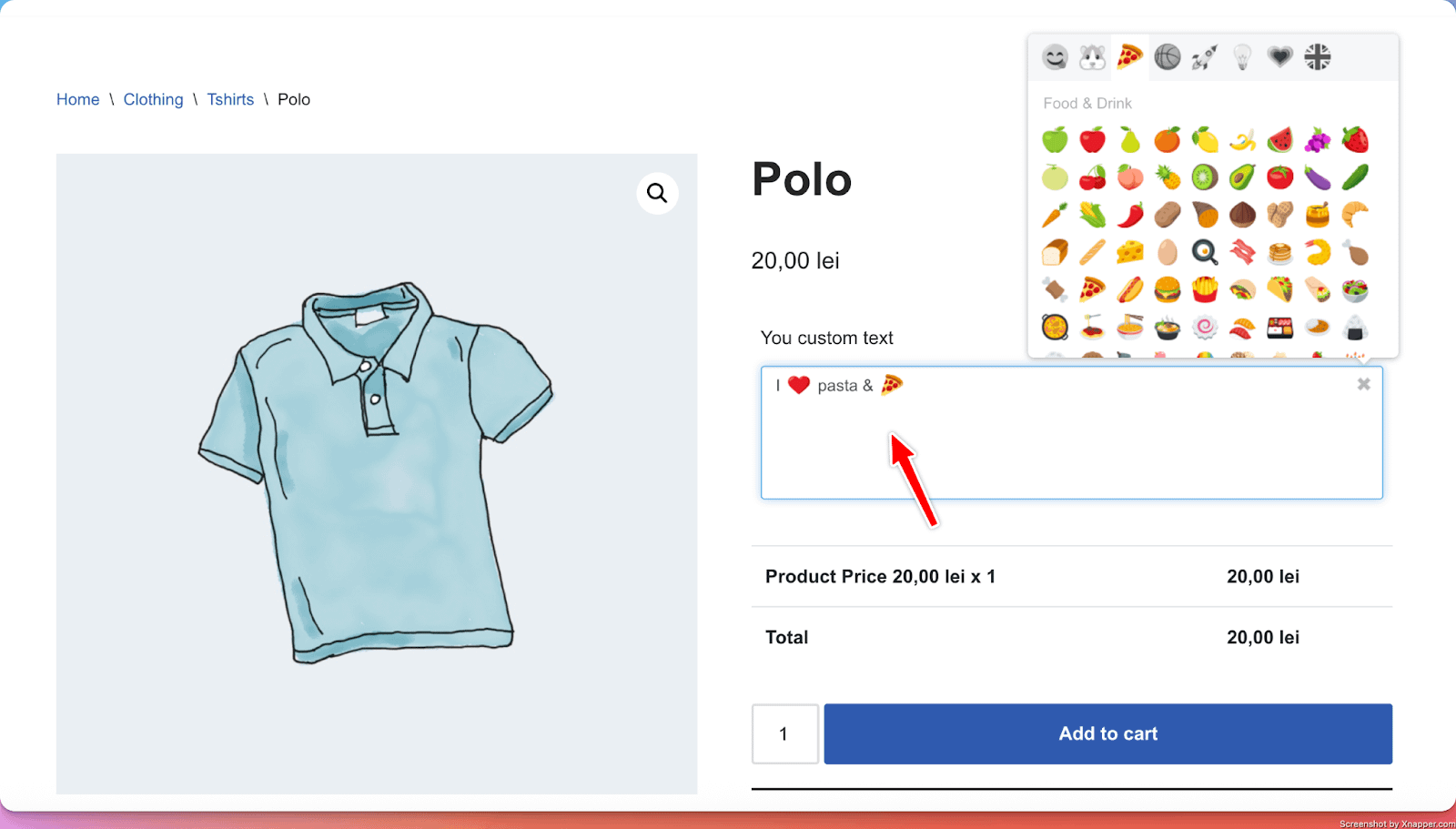
What it does
- Adds an input/textarea or dropdown field where customers can add their personalized text that gets added to their order. The main differentiator here is that the field allows for emojis.
Perfect for
- Product personalization with emojis (images on mugs, custom engraving text)
Configuration options
- Essential: Title, make the setting required or optional
- Advanced: Input type (text, textarea, or dropdown), Enable search ( to allow users to search for a specific emoji)
- Validation: Custom error messages
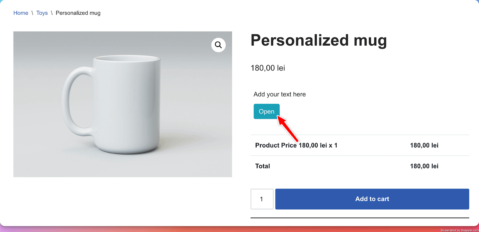
15. Personalization Preview
What it does
- Adds a way for users to add their own custom text directly on the product image.
Perfect for
- Product personalization (custom engraving text on a mug, for example).
Configuration options
- Essential: Title
- Advanced: Allow users to change the font family, Allow users to change the text alignment
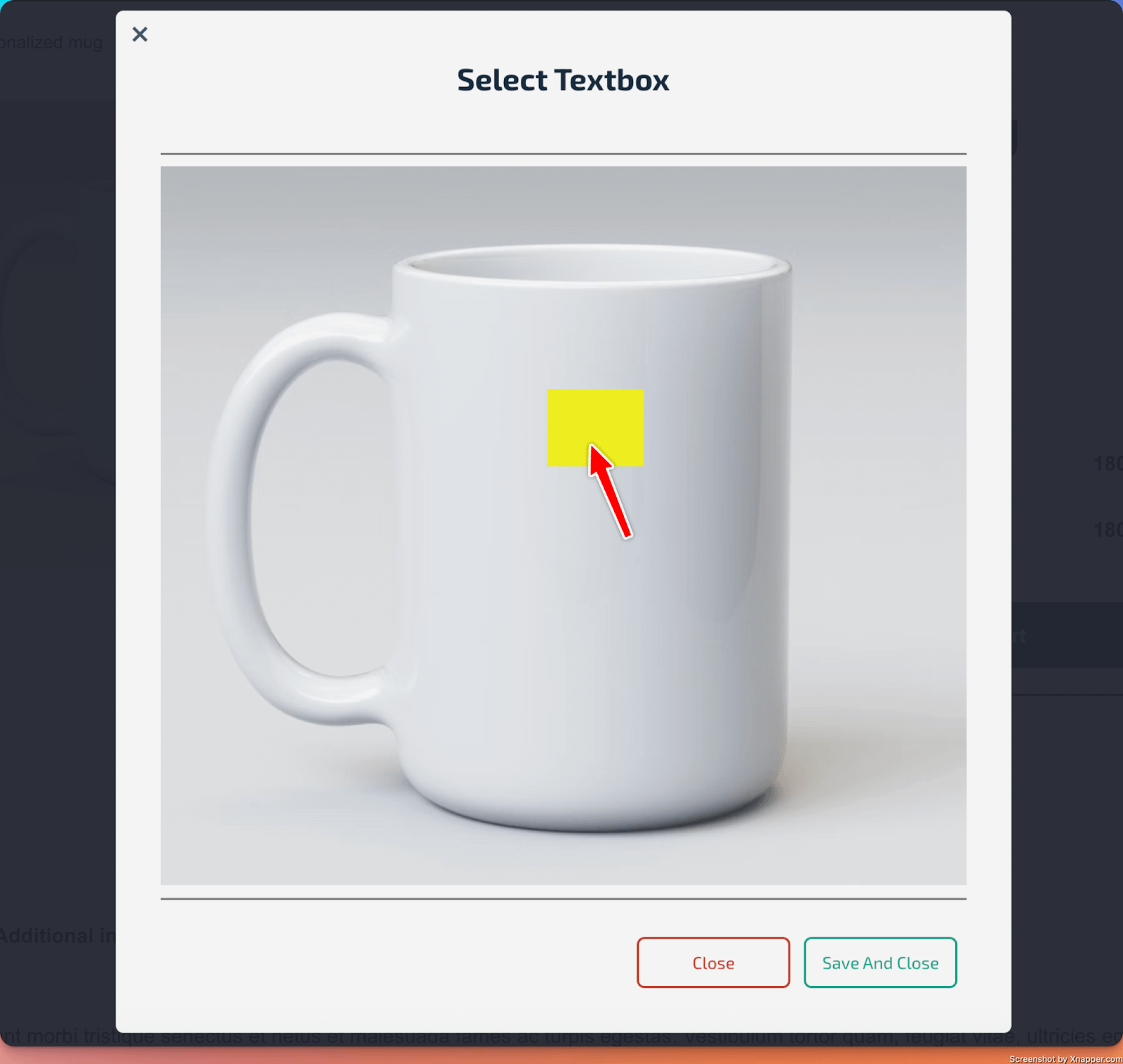
How to use it
- From the PPOM Dashboard, click on the Manage Personalization Previews button.
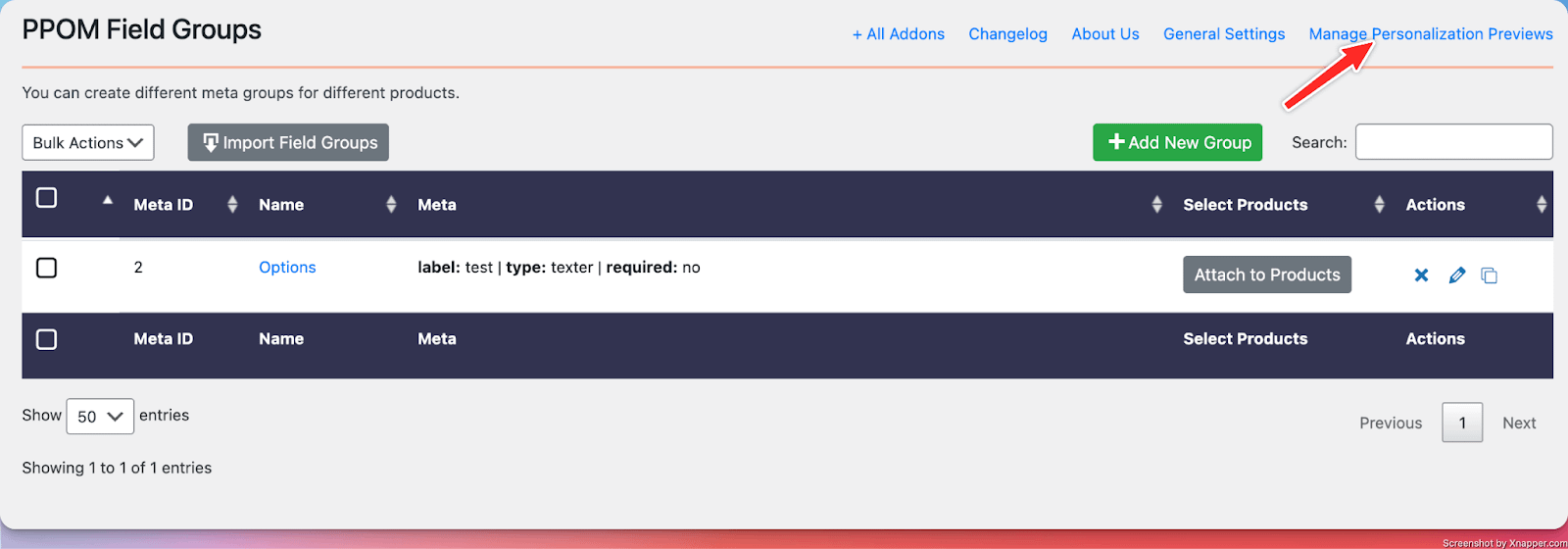
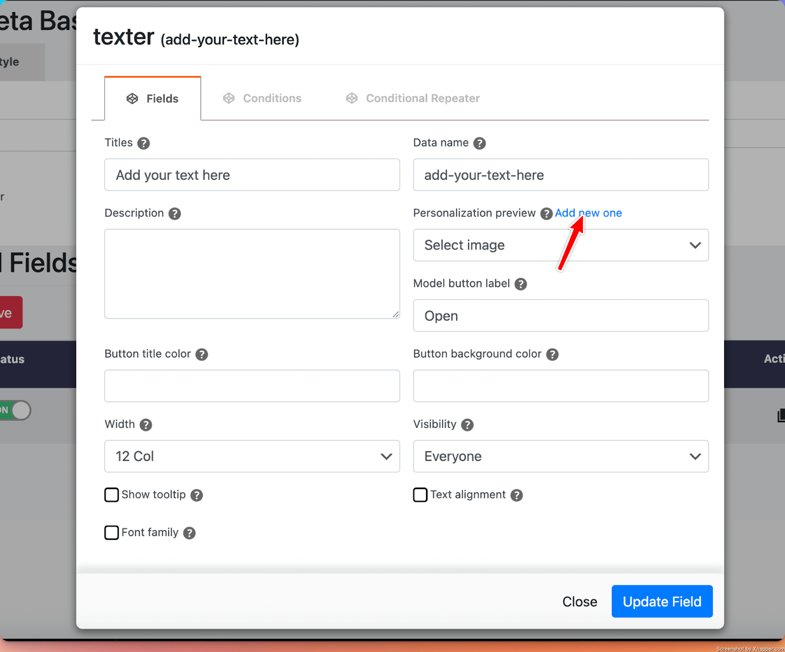
- Create a new personalization preview. Make sure you insert a title and upload an image to start customizing it.
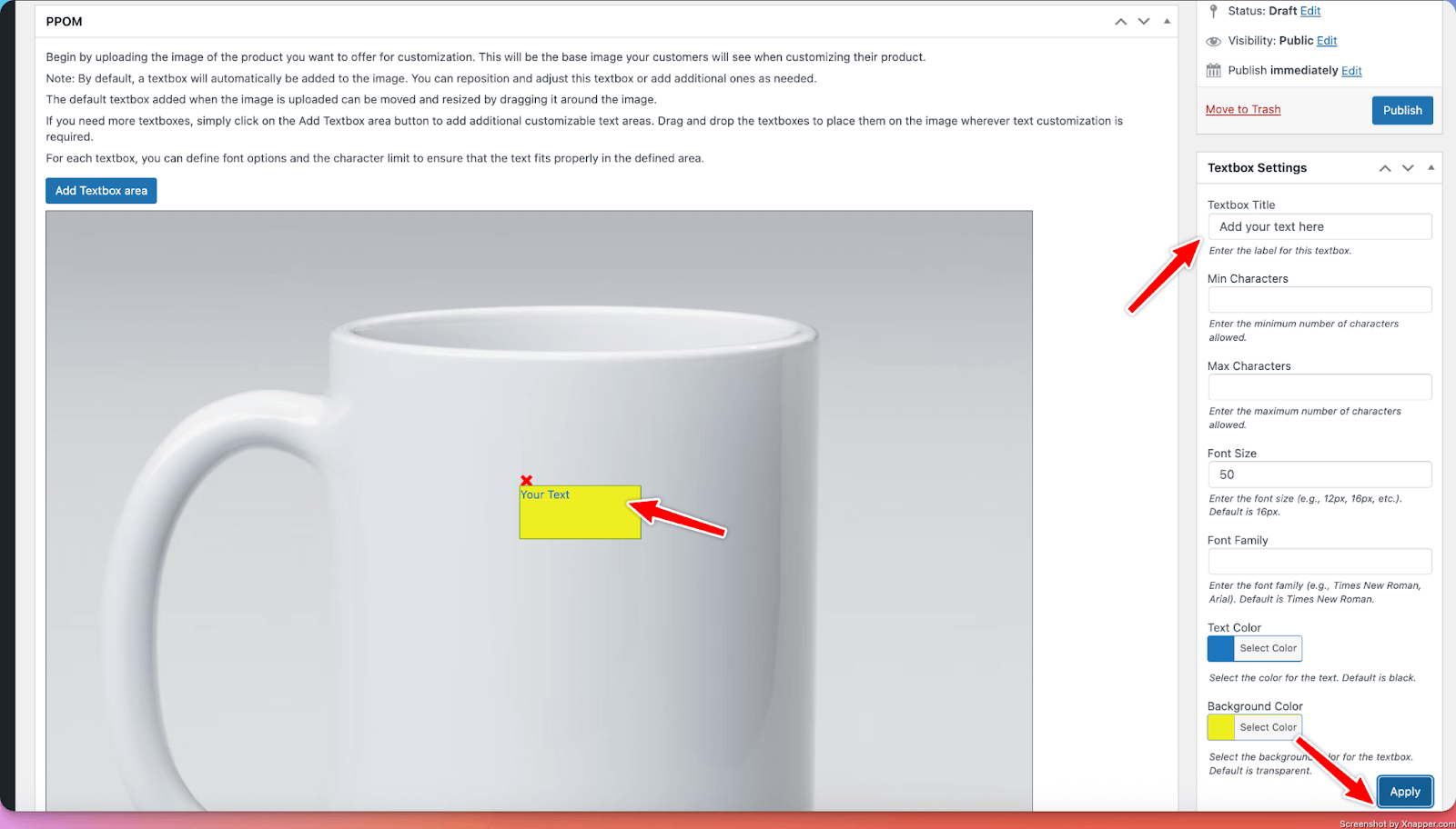
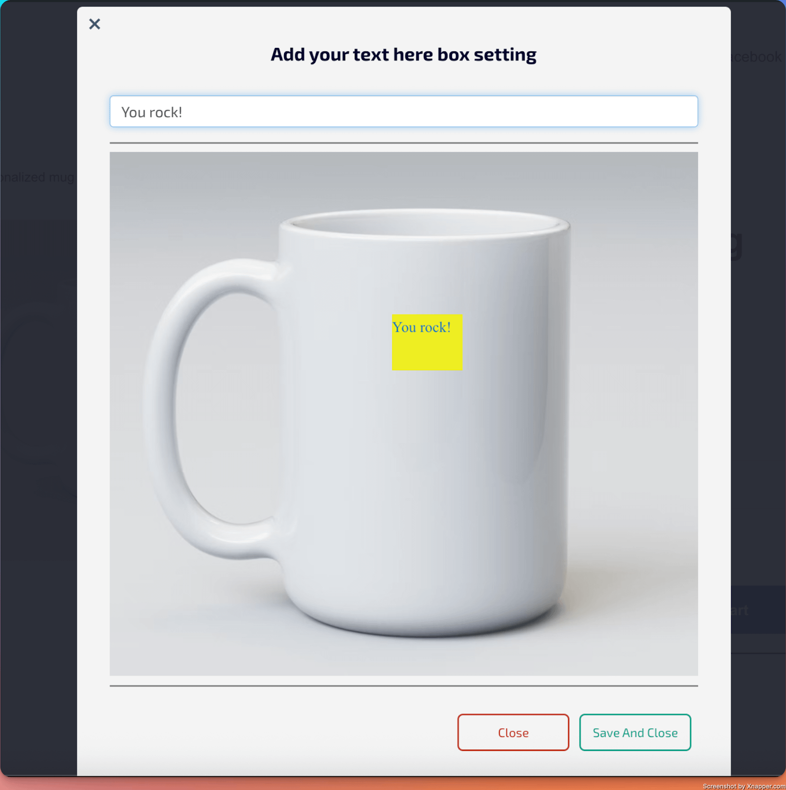
At first, it displays a textbox that you can place anywhere on the product image. Then, you can use the Add Textbox button to add more of them.
There are available settings for text, such as a title, adding min-max restraints, predefining a font size or a font family, as well as adding text and background colors.
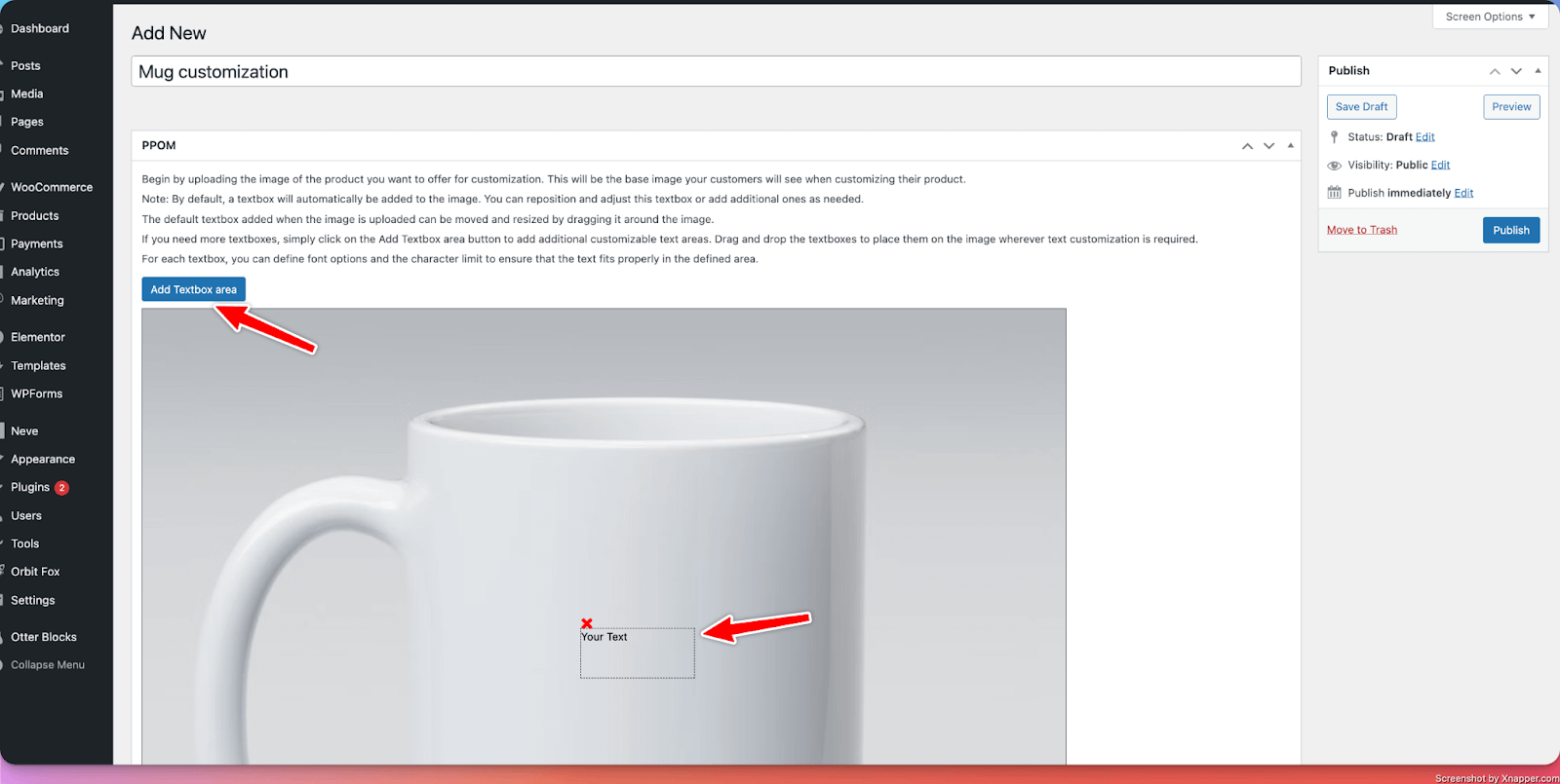
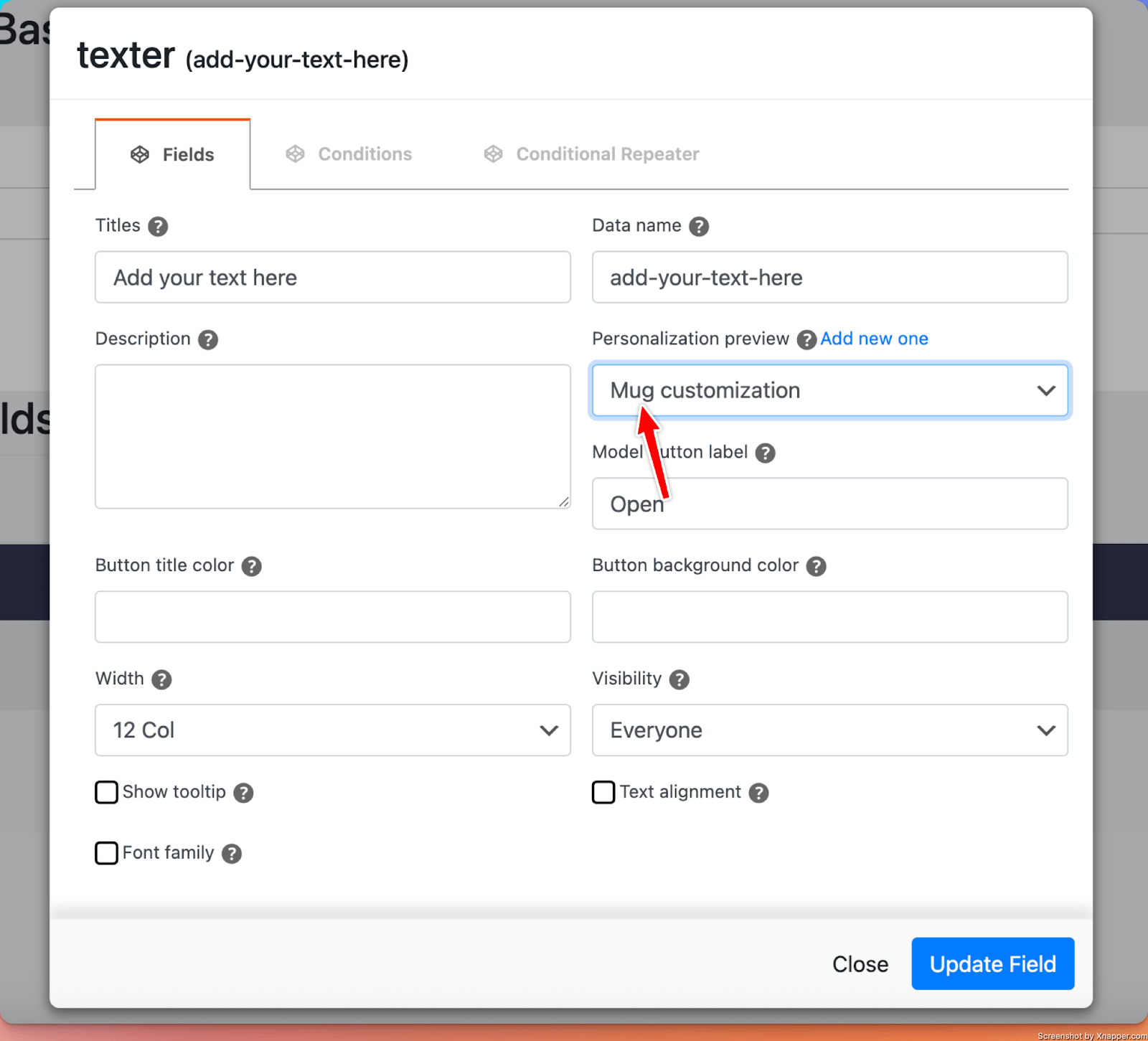
- In the Personalization Preview field, attach the newly created personalization preview.
How users see it
📝 Note: Find out more about configuring the PPOM Personalization Preview in this doc.
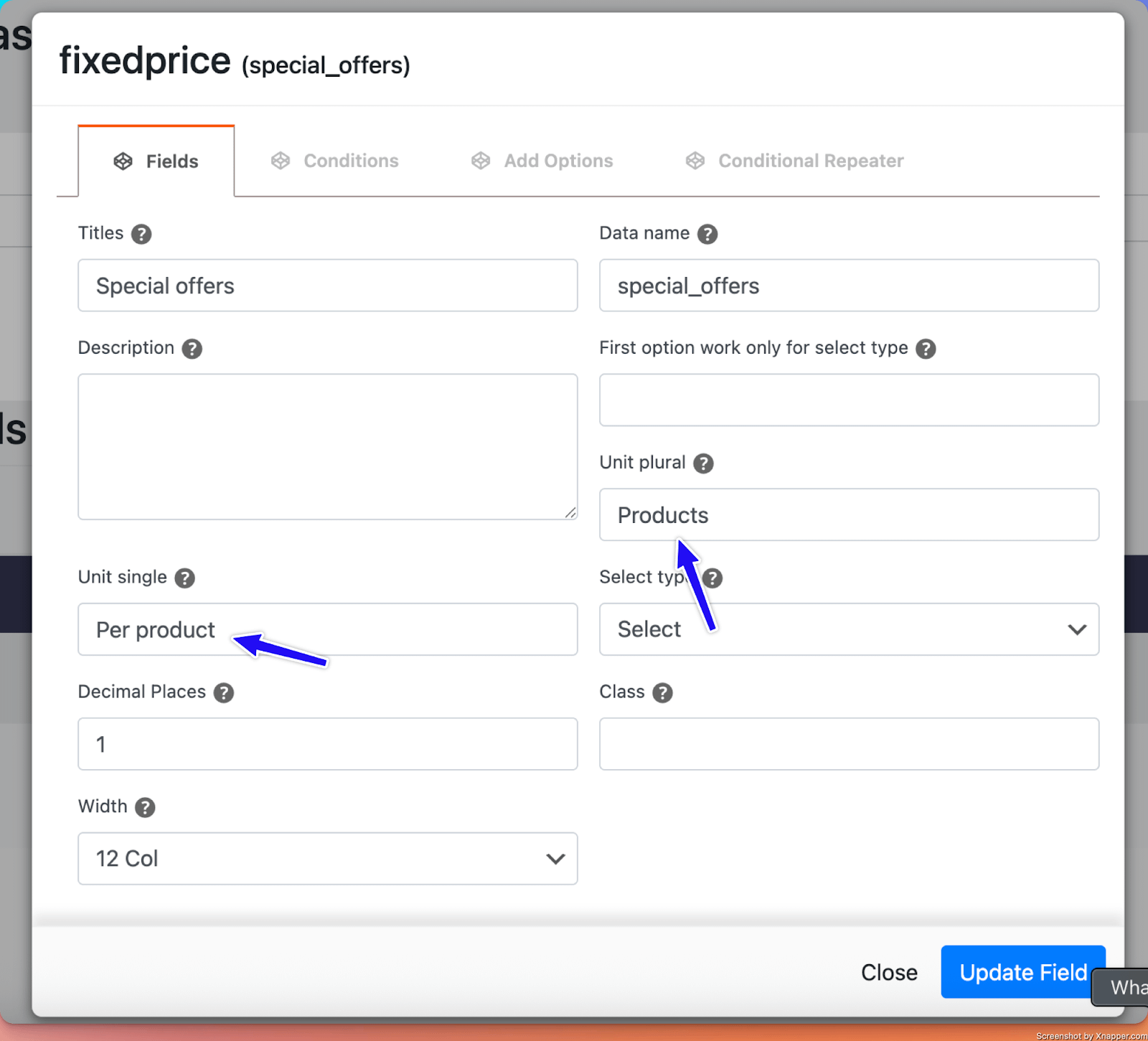
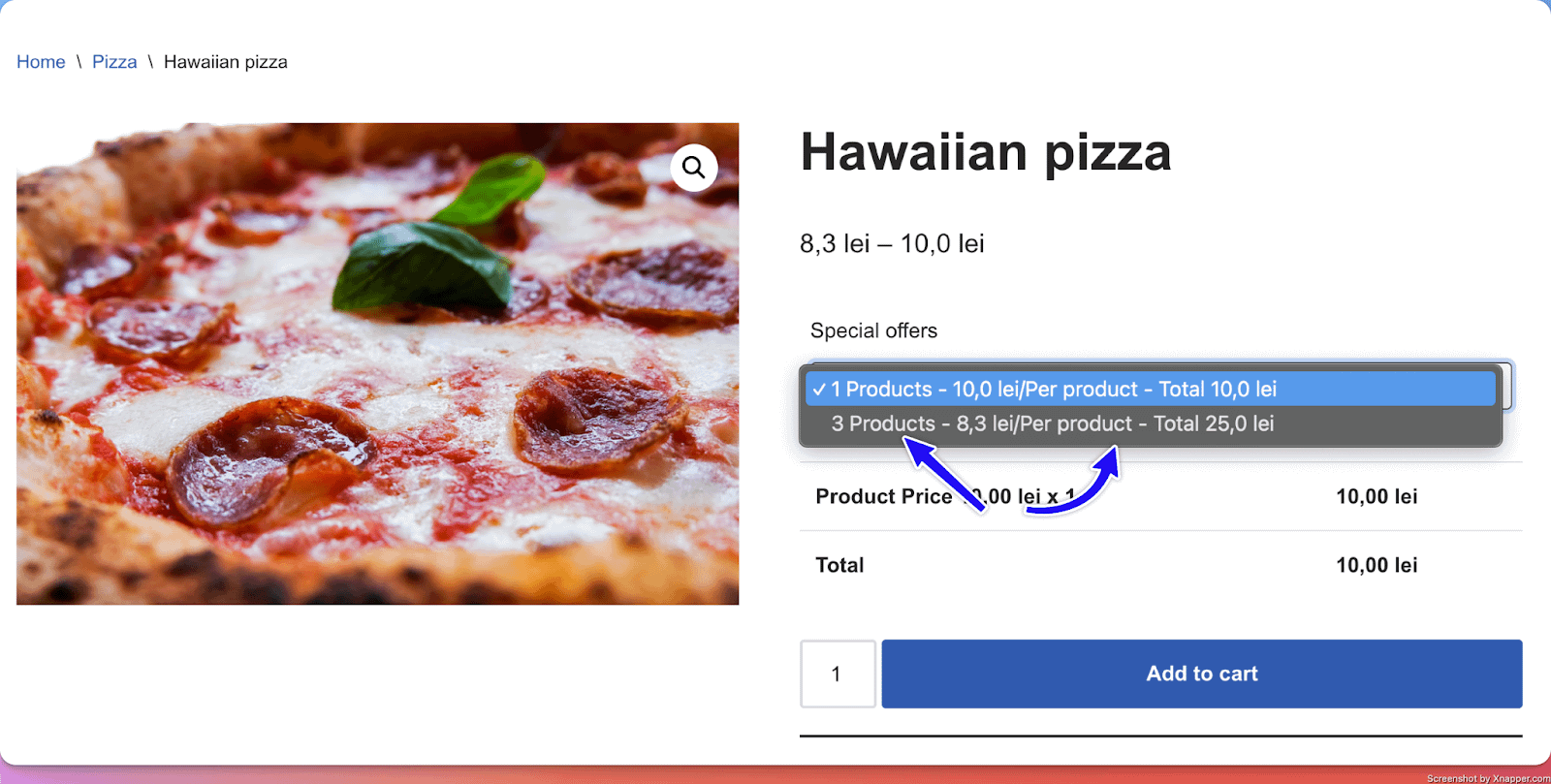
16. Fixed Price
What it does
- Allow users to select from packages with pre-defined prices for a specific number of products.
Perfect for
- Offering custom offers at dedicated prices based on the number of products.
Configuration options
- Essential: Title
- Advanced: Select Type ( Radio or Select ), Decimal Places ( How many decimals to use for the prices )
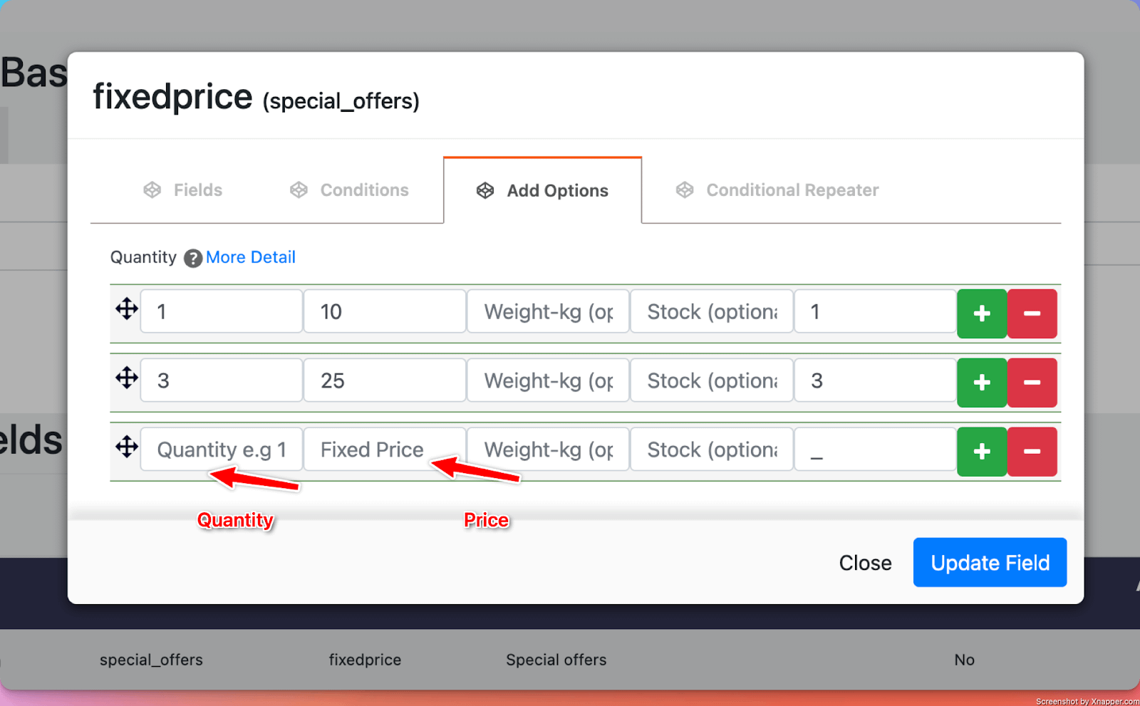
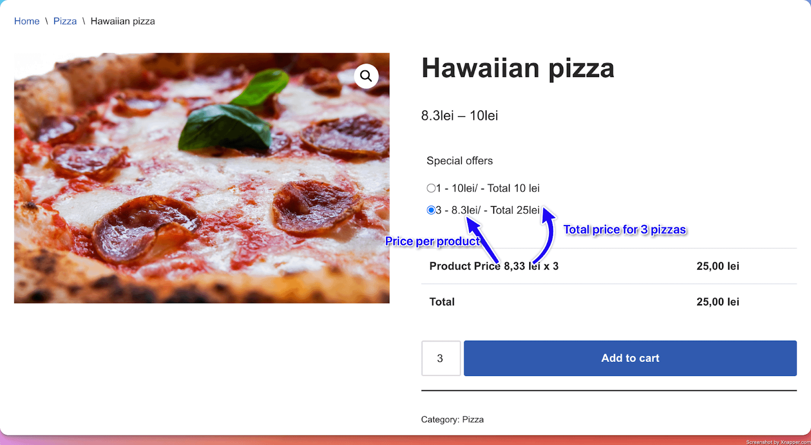
Options in detail
Unit Single and Unit Plural: Ability to add some custom texts near the quantity and price per product.
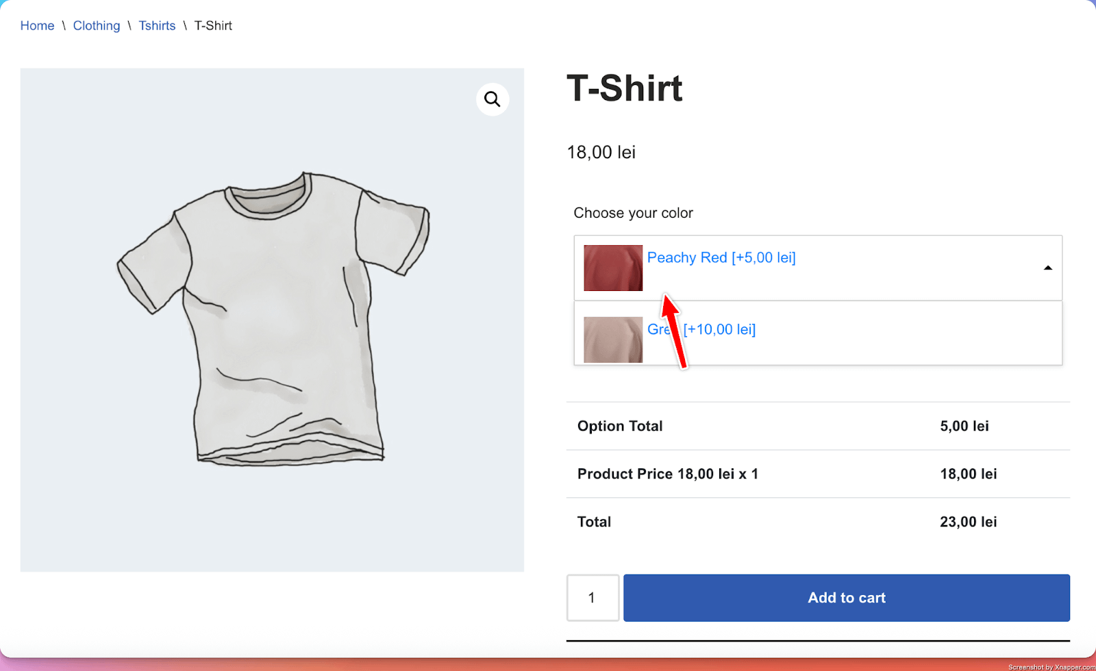
17. Image DropDown
What it does
- Similar to the Images input, it adds several images from which the user can choose. The difference is that the images are displayed in the form of a drop-down field. The selected image gets added to their order.
Perfect for
- Collecting specific information needed for custom orders (for example, the color for the product), from products that have a large number of options available.
Configuration options
- Essential: Title, make the setting required or optional
- Advanced: Enable Gallery (will add the images in the Gallery of the product), Enable Image Replacement (the selected image will replace the main product image)
- Validation: Custom error messages
Options in detail
Enable Gallery and Enable Image Replacement: when enabled, the images are added to the product gallery; The selected image replaces the main product image.
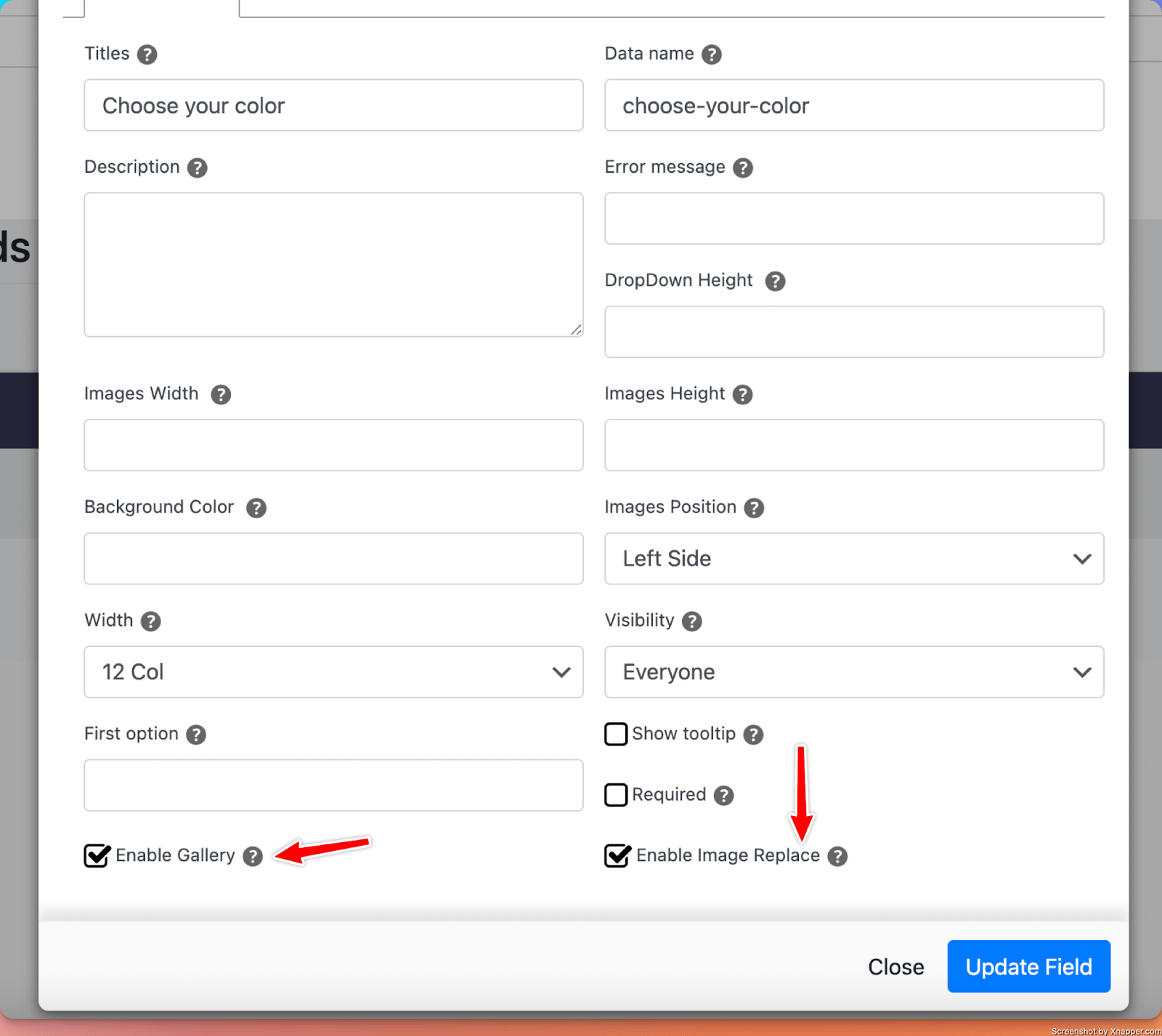
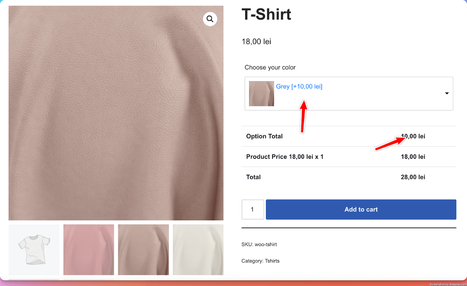
Enable Gallery and Enable Image Replacement: when disabled, the images are not added to the product gallery; The selected image does not replace the main product image.
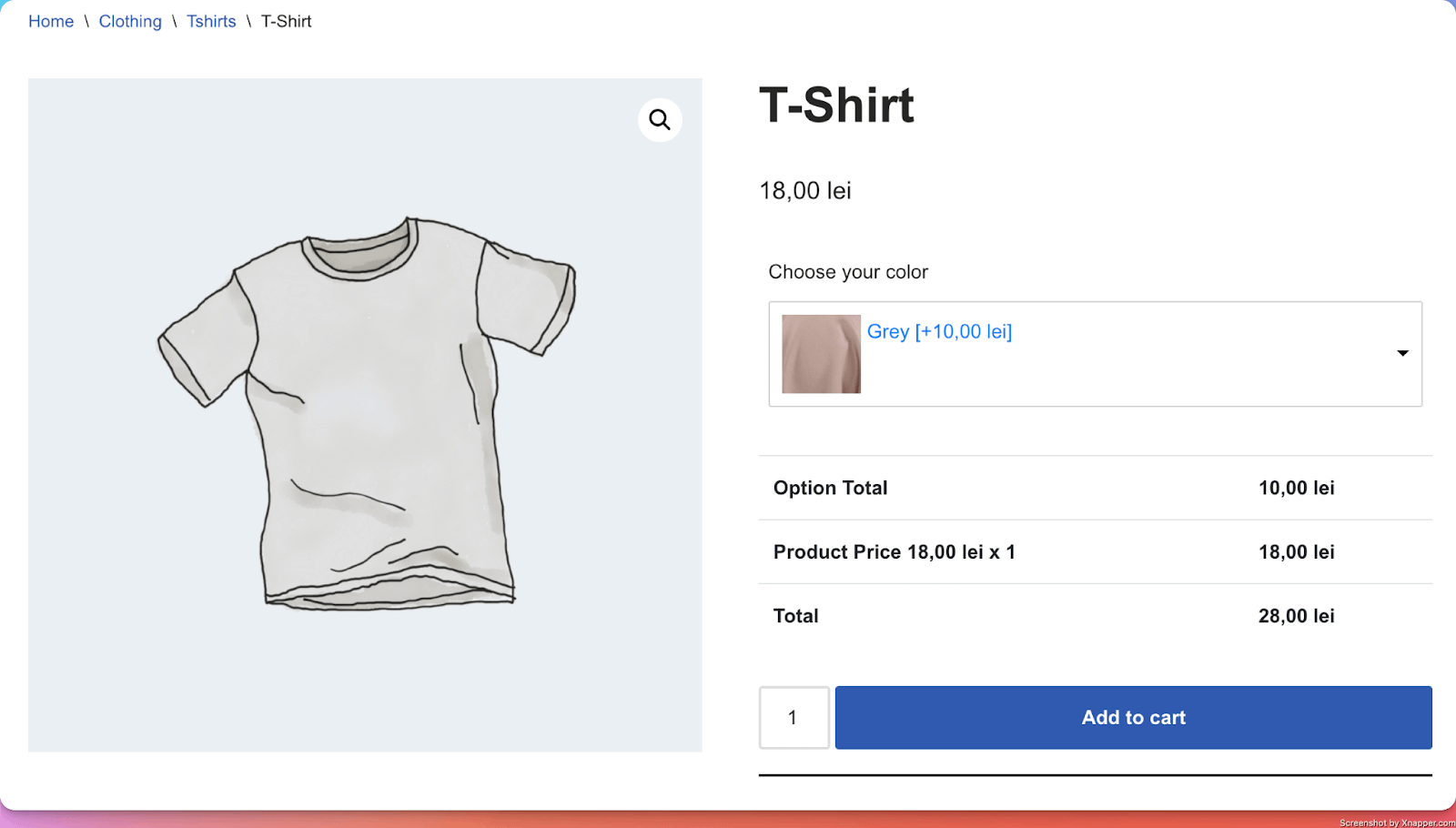
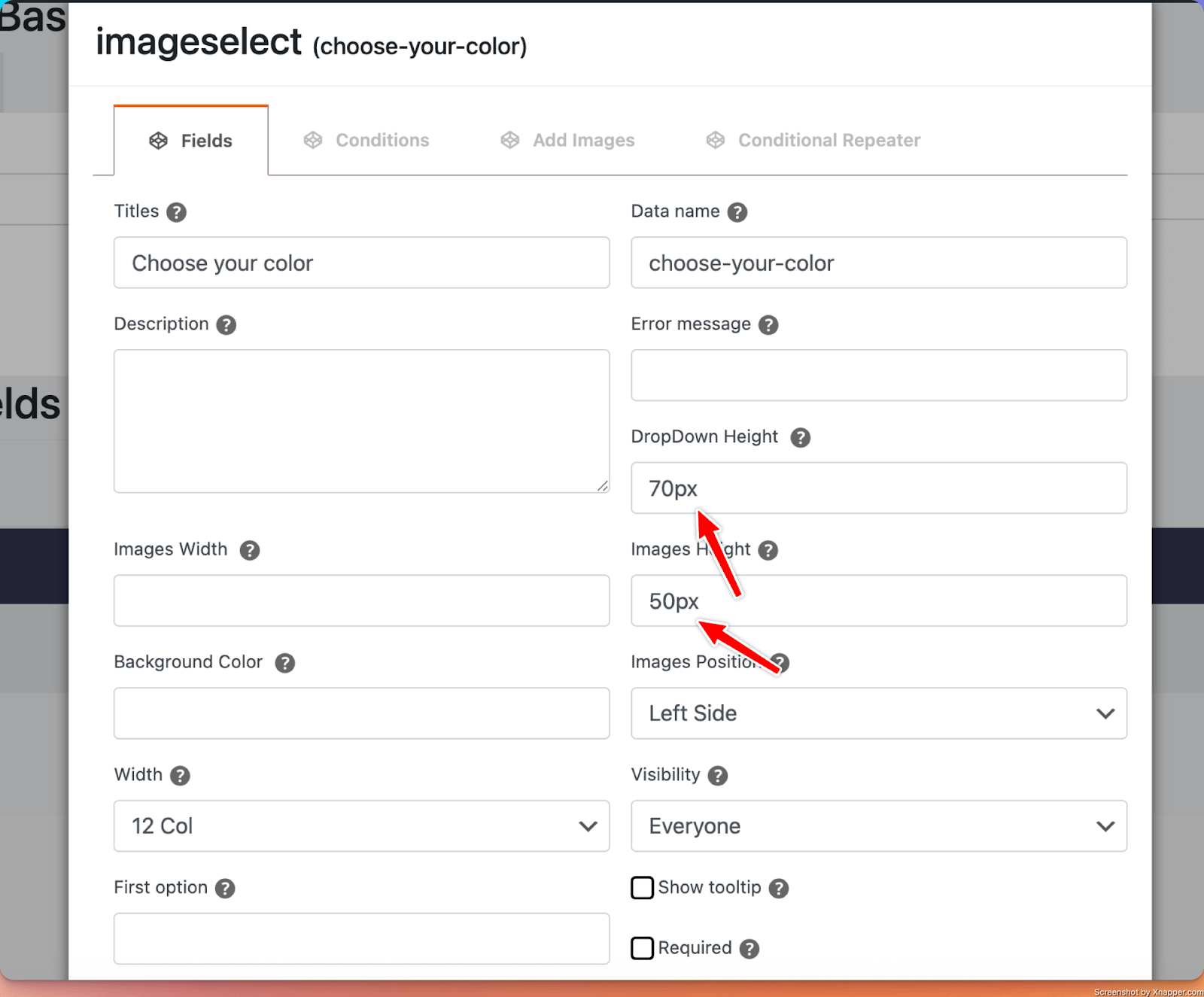
Dropdown Height and Images Height: with these options, you are able to control the height of the dropdown select and of the images appearing in the dropdown. Make sure you add “px” after the value.
18. Phone Input
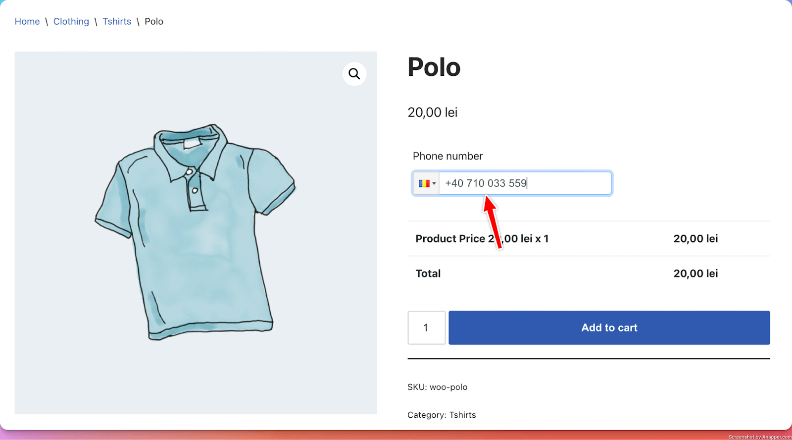
What it does
- Adds a customizable phone field where customers can enter their phone number that gets added to their order.
Perfect for
- Collecting phone numbers for custom orders.
Configuration options
- Essential: Title, make the setting required or optional
- Advanced: Enable Material design ( a different style design )
- Validation: Custom error messages
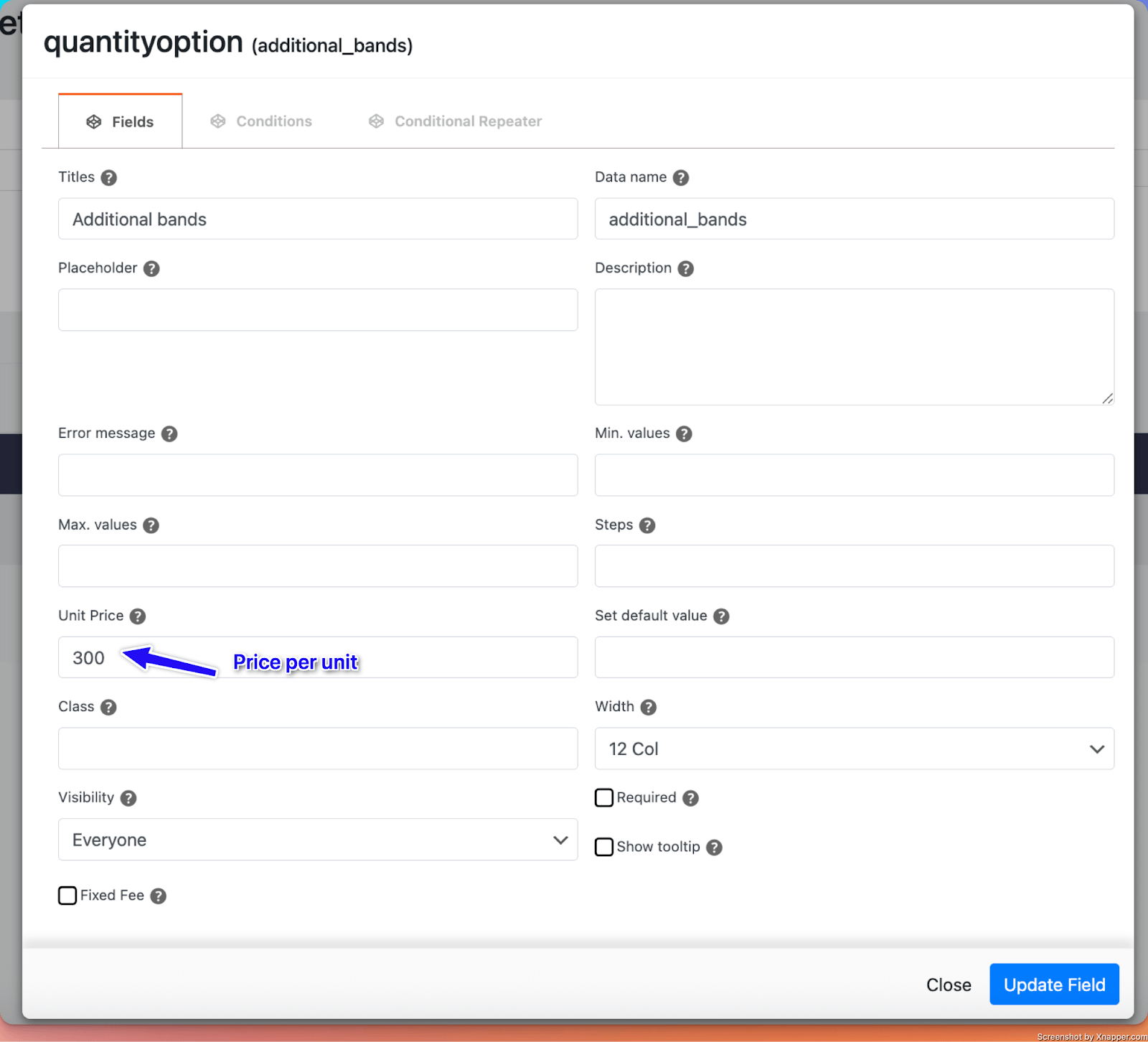
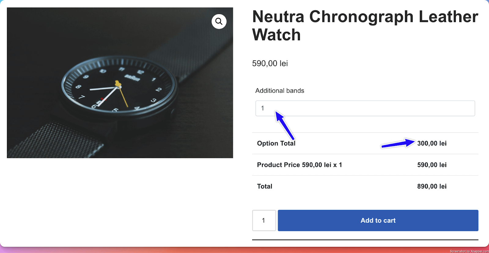
19. Quantity Option
What it does
- Adds a field where customers can add an additional number of services to the main product.
Perfect for
- Allowing users to purchase additional services. ( For example, for a watch, they can add additional bands for an extra price each ).
Configuration options
- Essential: Title, make the setting required or optional, Max and Min values
- Advanced: Unit Price (How much each additional service is charged)
- Validation: Custom error messages
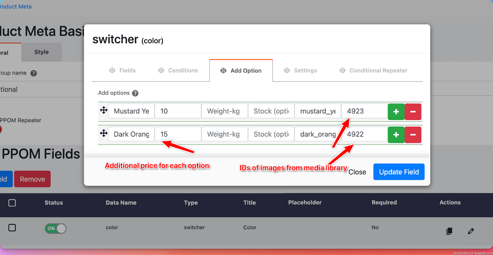
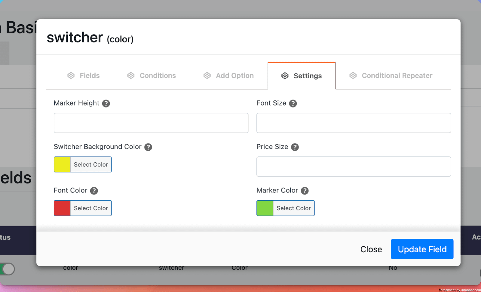
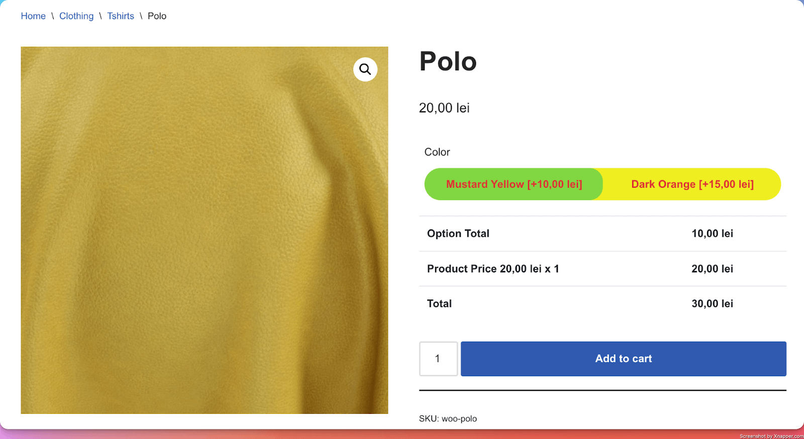
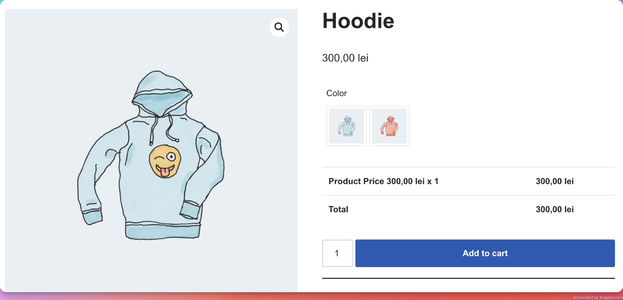
20. Radio Switcher
What it does
- Adds a customizable radio field where customers can choose from multiple options. For each option, the image of the product changes.
Perfect for
- Showing users a visual representation of their options ( for example, the colors of a T-shirt )
Configuration options
- Essential: Title, make the setting required or optional
- Advanced: Color settings
- Validation: Custom error messages
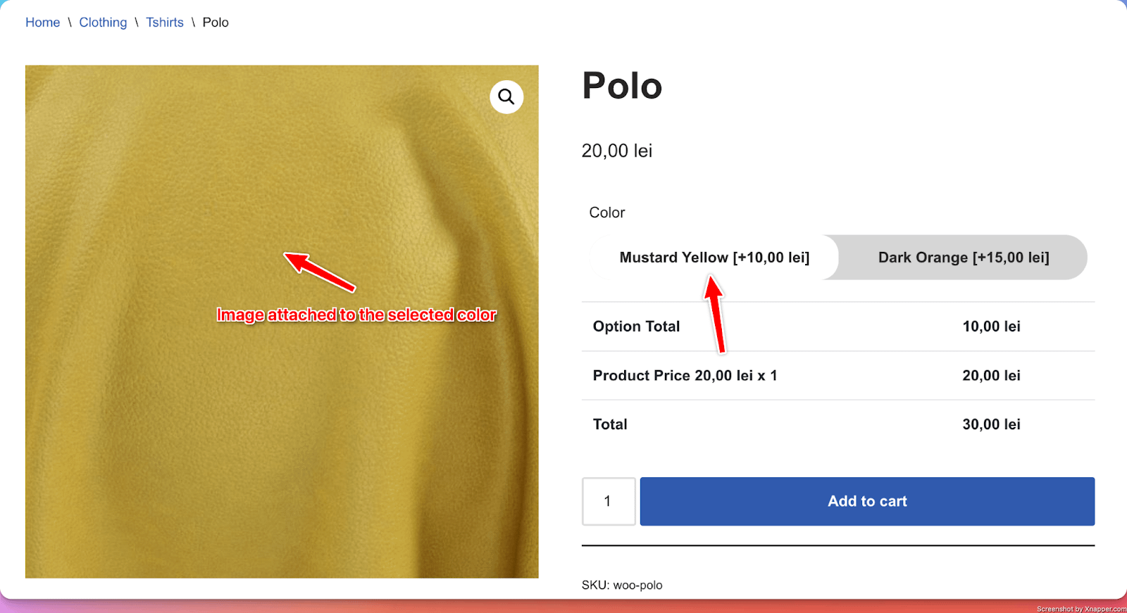
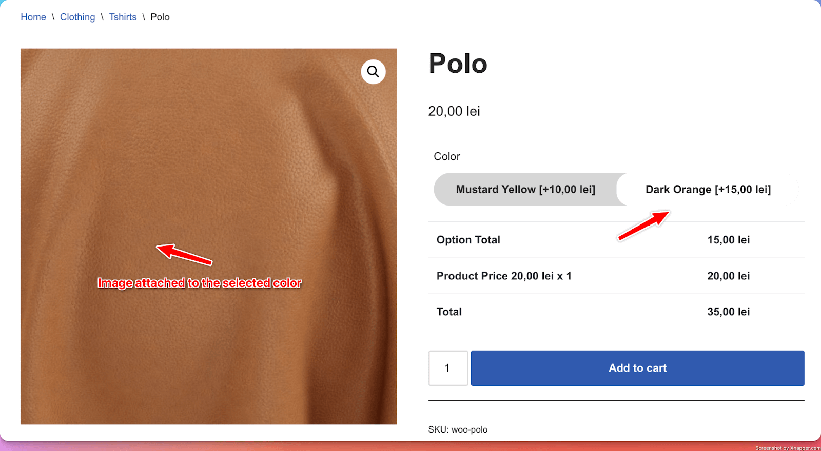
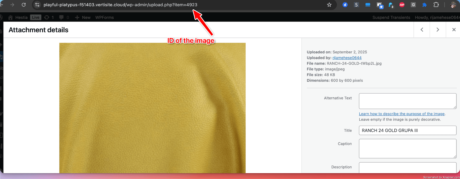
When adding options, you have the option to add Add-on prices (additional pricing for each option) and images. ( For images, you need to get their IDs from the media library ).
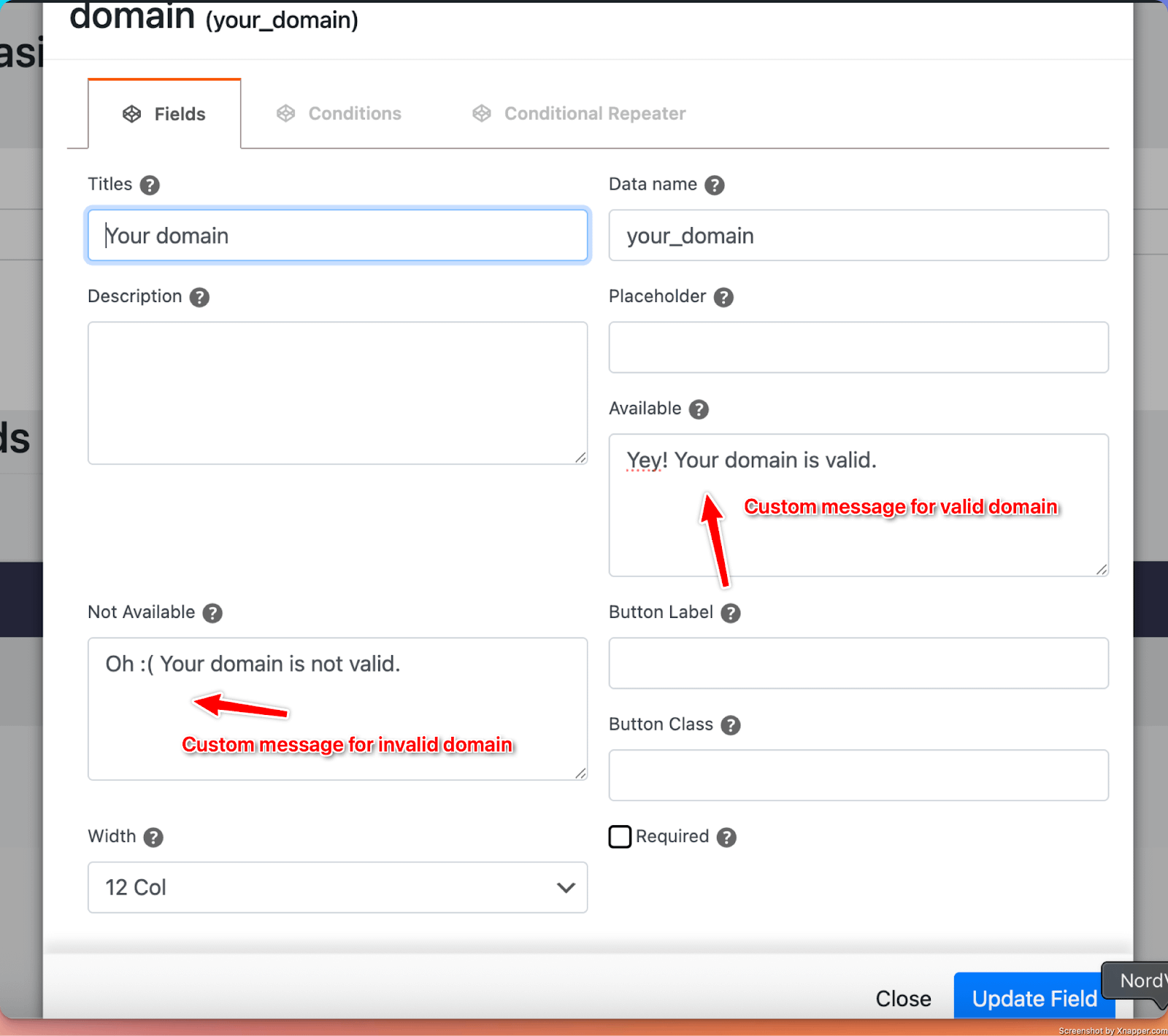
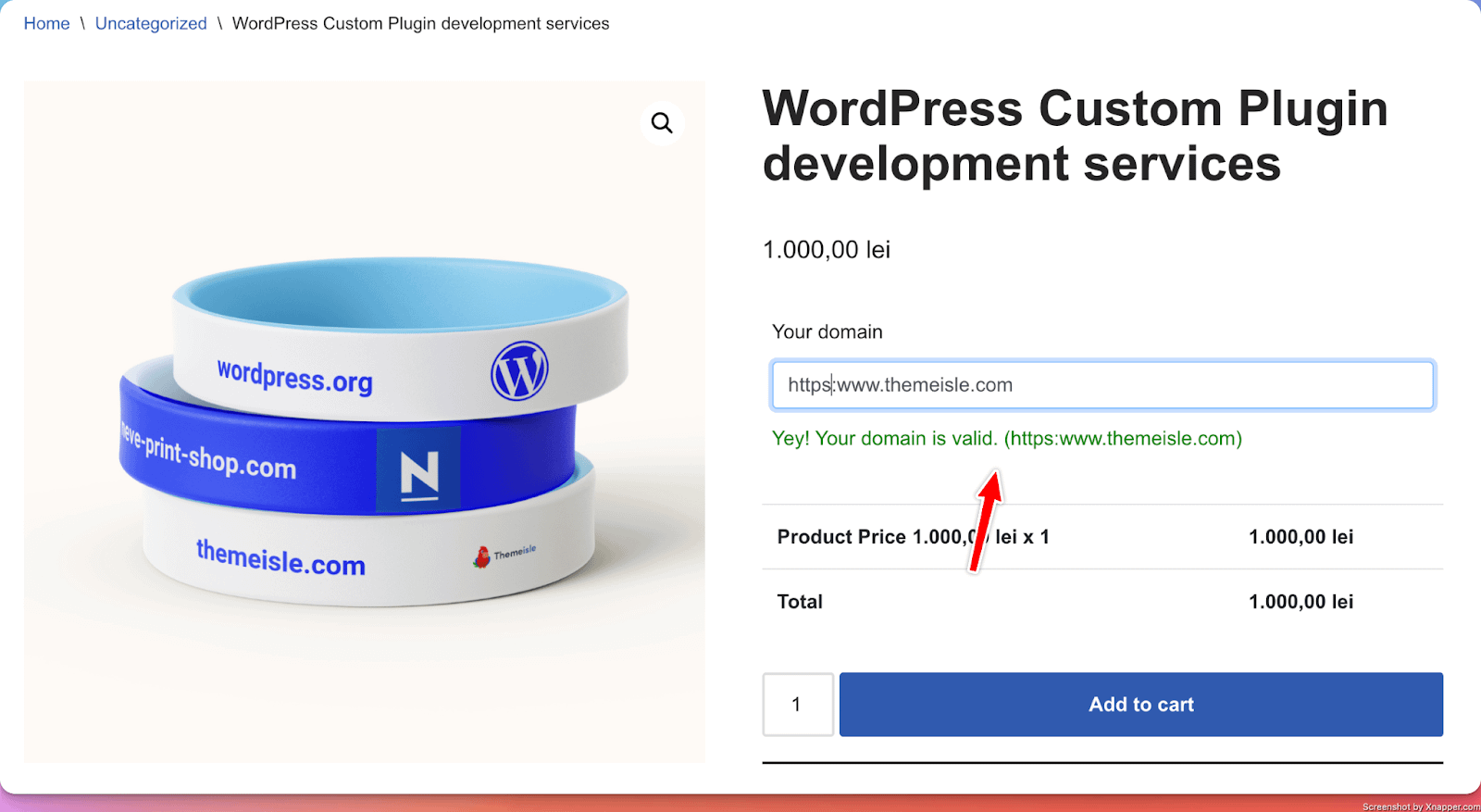
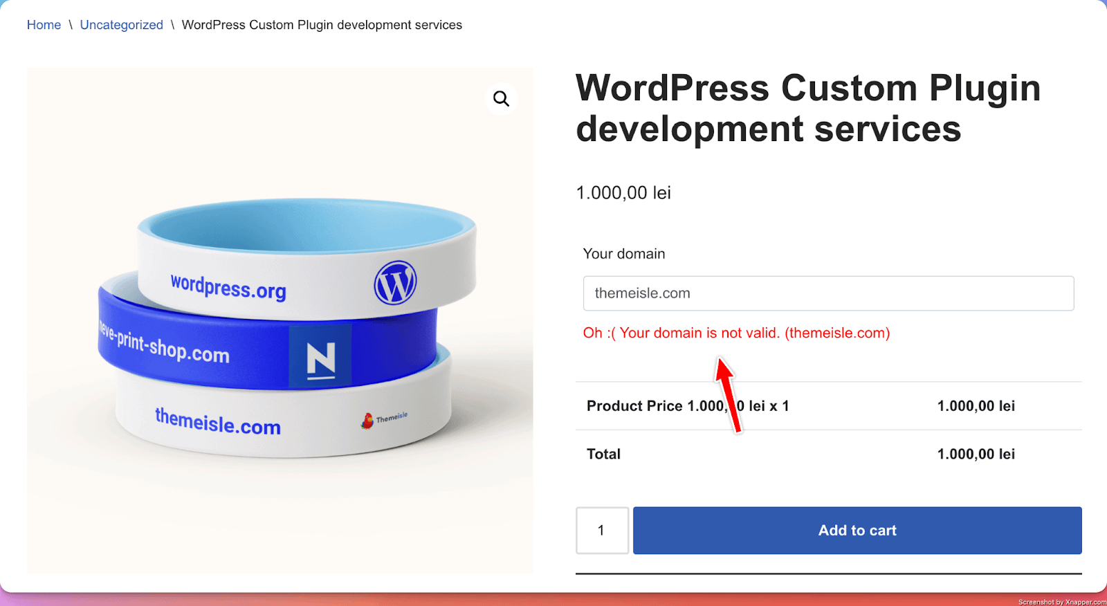
21. Domain
📝 Note: This PPOM input is available for the highest subscription (VIP) of the plugin, which you can get from here.
What it does
- Allow users to add a domain name to their order. It includes a domain name checker ( if the user clicks ENTER after adding their domain name ).
Perfect for
- Collecting specific information needed for custom orders (for example, for a Web development services company that needs to collect the domain name of the user)
Configuration options:
- Essential: Title, make the setting required or optional
- Validation: Custom error messages (for valid or invalid domains)
22. Select Option Quantity
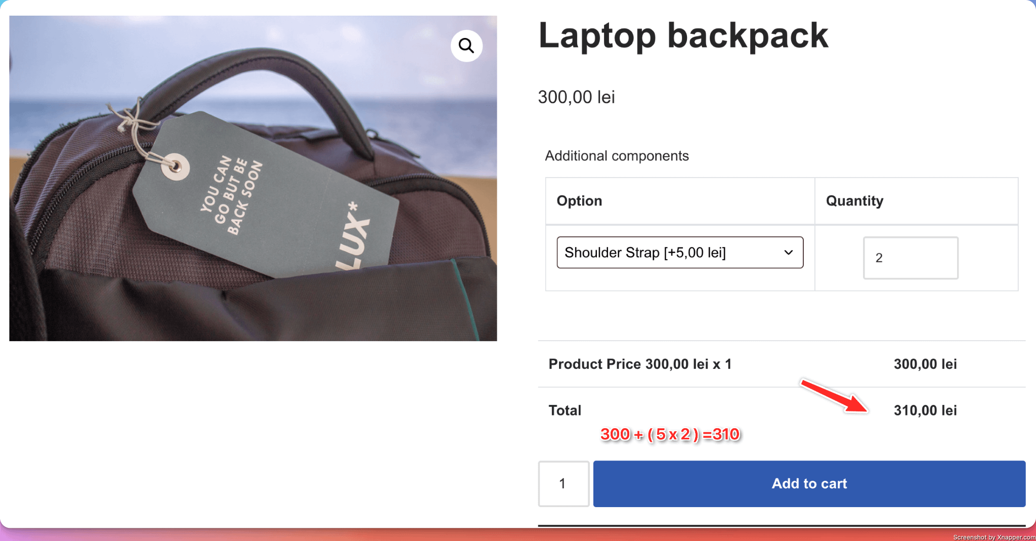
What it does
- Allow users to select from a dropdown list their desired additional option, and choose the quantity for that option.
Perfect for
- Adding additional components (with a customizable quantity) to the product.
Configuration options
- Essential: Title, make the setting required or optional
- Advanced: change the labels of options
- Validation: Custom error messages
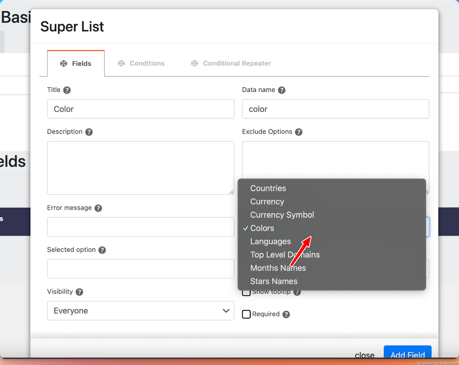
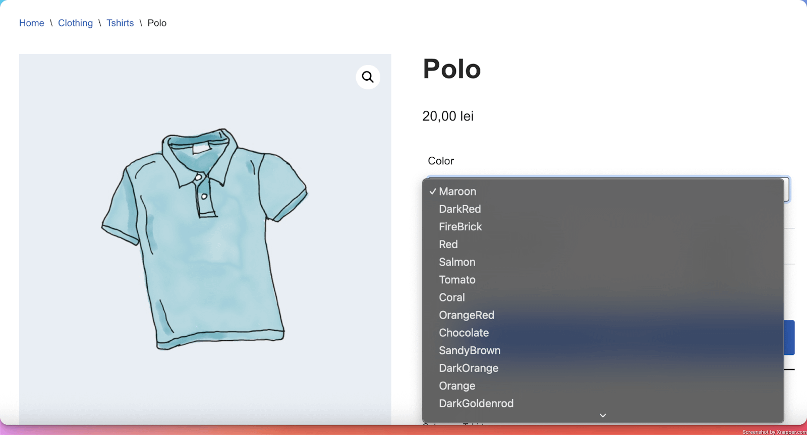
23. Super List
What it does
- Adds a select field where customers can choose from multiple available options. The difference from the Select Input is that using the Super List input, users can choose from a set of predefined lists (Colors, Languages, Months, Countries, etc)
Perfect for
- Easily gather information from users, in their orders, using predefined lists.
Configuration options
- Essential: Title, make the setting required or optional
- Advanced: Exclude options
- Validation: Custom error messages
24. Quantities Pack
What it does
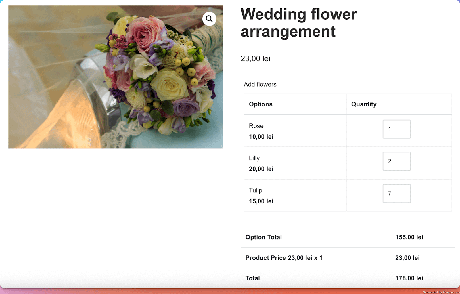
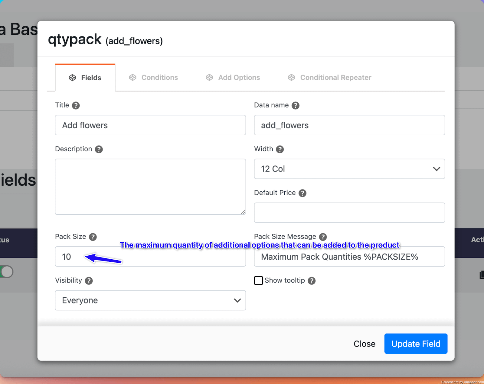
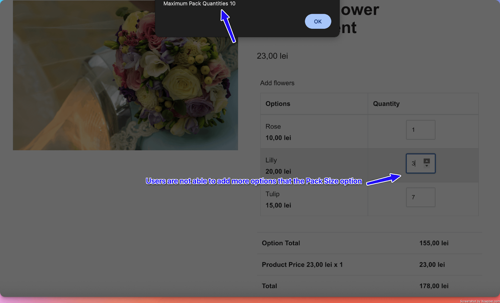
- Allow users to add different quantities for each additional option. The main difference between Quantities Pack and Variation Quantity is that here you can have a Pack Size, which is a maximum quantity for the entire package of additional options that can be added by the user.
Perfect for
- Adding a different number of different types of flowers to a flower arrangement, which has a base price. You can add 10 roses ( each for 10 lei ), 2 lilies ( each for 20 lei ), and so on, which gets added to the base price of the product. But you are limited in the number of flowers you can add by the value of the Pack Size.
Configuration options
- Essential: Title, Pack Size ( the maximum quantity of options that can be added to the product )
- Advanced: Pack Size Message (the message that shows up when users try to add more options than the Pack Size)
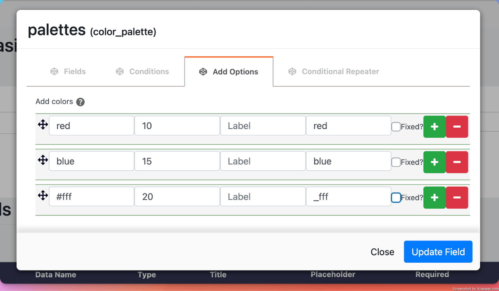
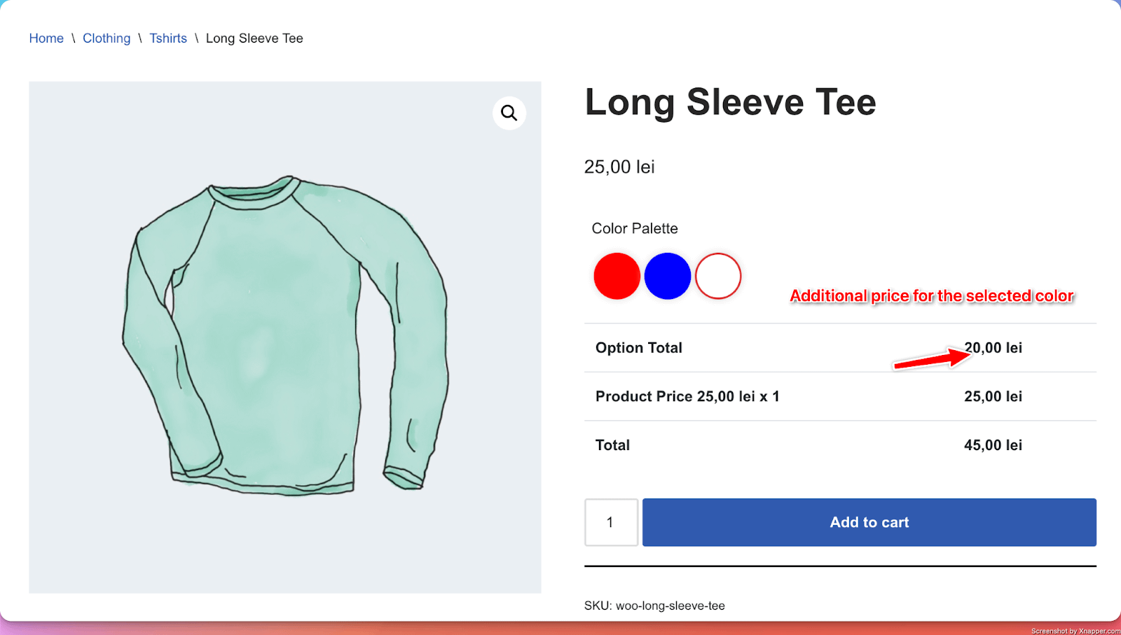
25. Color Palettes
What it does
- Adds a list of colors from which customers can select their desired color that gets added to their order.
Perfect for
- Product color personalization (from a predefined list of colors).
Configuration options
- Essential: Title, color options (for each color, you can add an additional price that gets added to the product price)
- Advanced: The border color for the selected option, Show colors as circles or squares, Allow multiple selected colors or not.
- Validation: Custom error messages
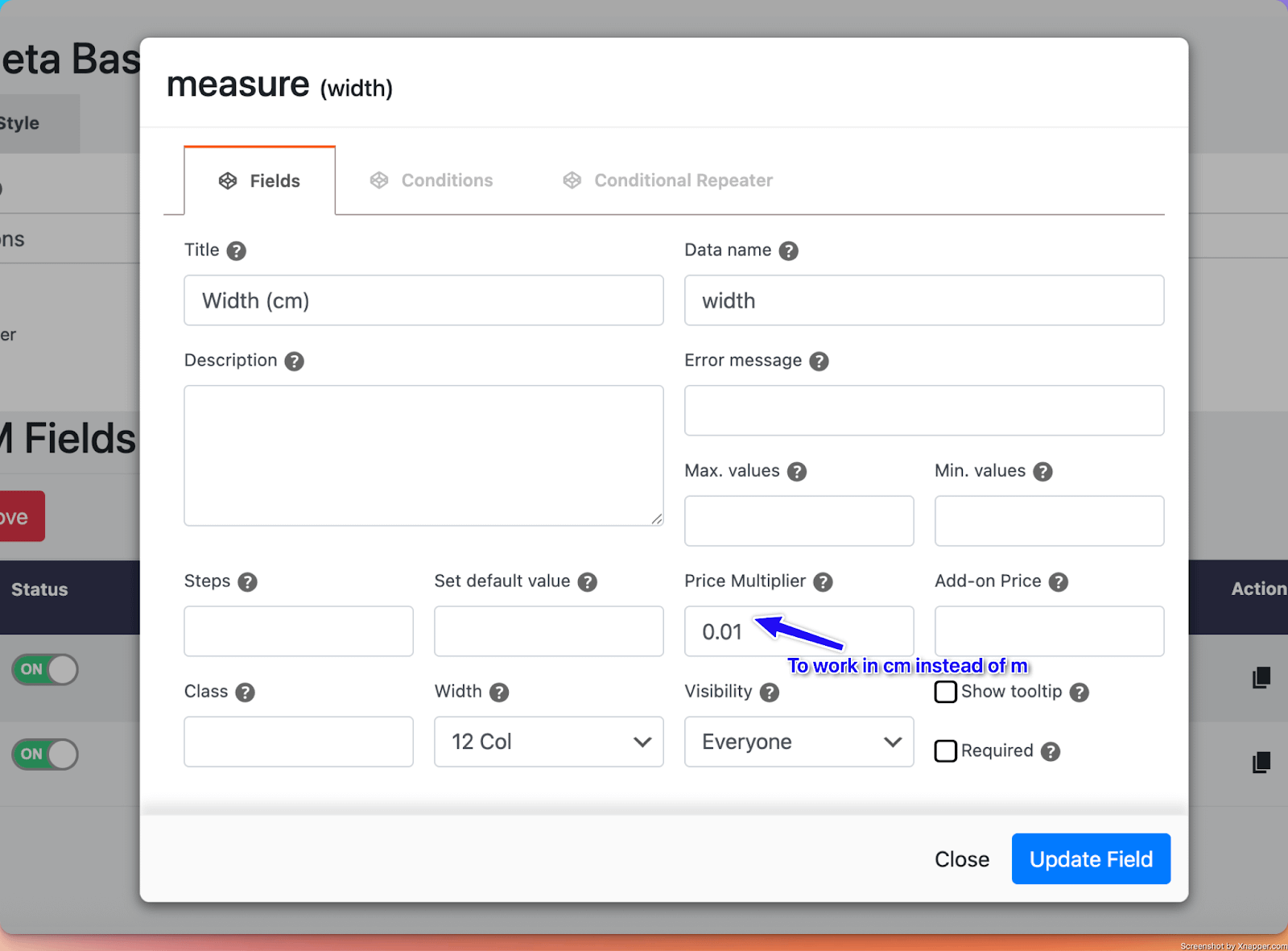
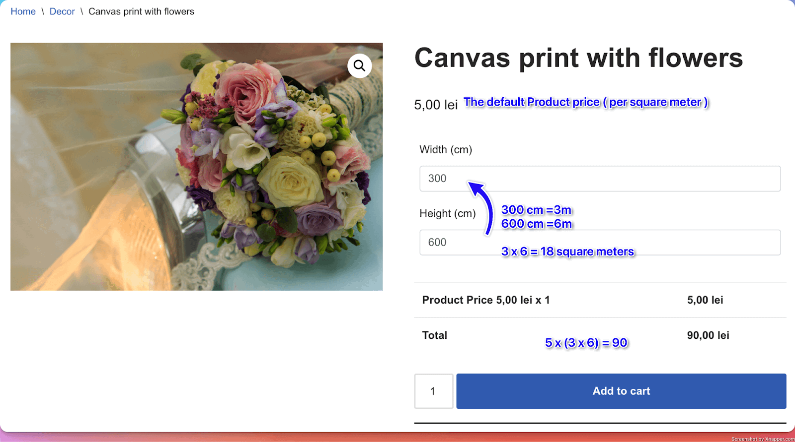
26. Measure Input
What it does
- Adds a field where customers can enter measurements.
Perfect for
- Collecting specific information needed for custom orders ( for example, for a canvas, the price will depend on its size < width and height > ).
Configuration options
- Essential: Title, make the setting required or optional, Max and Min values
- Advanced: Price multiplier (adjusting the price depending on the measurements <m or cm, for example)
- Validation: Custom error messages
Options in detail
Price multiplier:
Default behavior - measurements are calculated in meters.
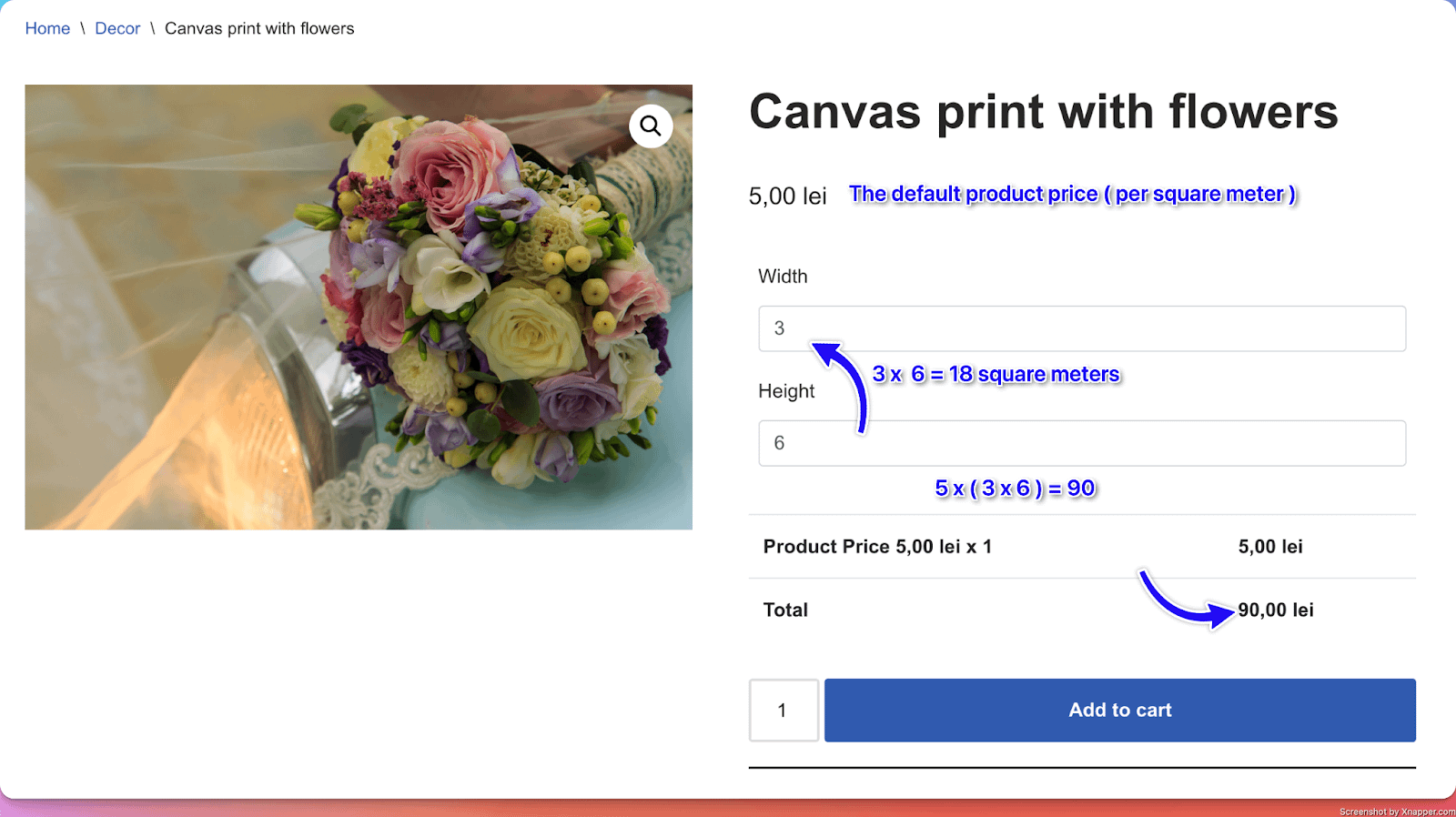
Custom behavior - When Price Multiplier is set to 0.01, the measurements are calculated in centimeters.
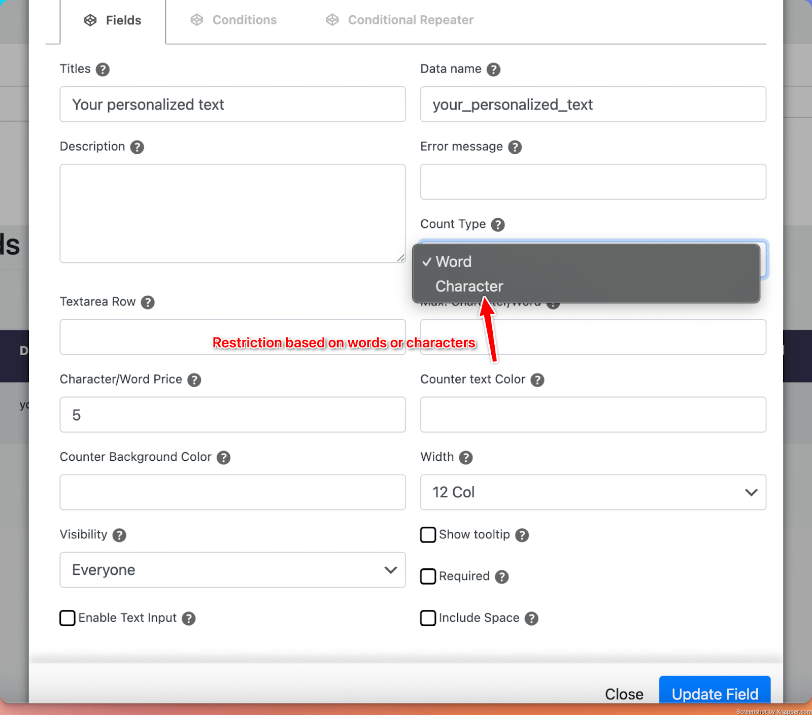
27. Text Counter
What it does
- Adds an input or textarea that can restrict the total number of words/characters.
Perfect for
- Product personalization with a limit of words/characters.
Configuration options
- Essential: Title, make the setting required or optional, Choosing restriction based on the number of characters or words
- Advanced: Additional price per word/character
- Validation: Custom error messages
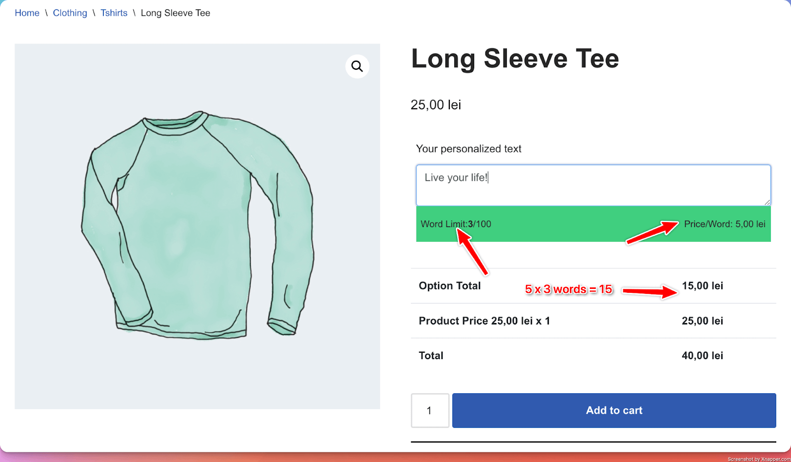
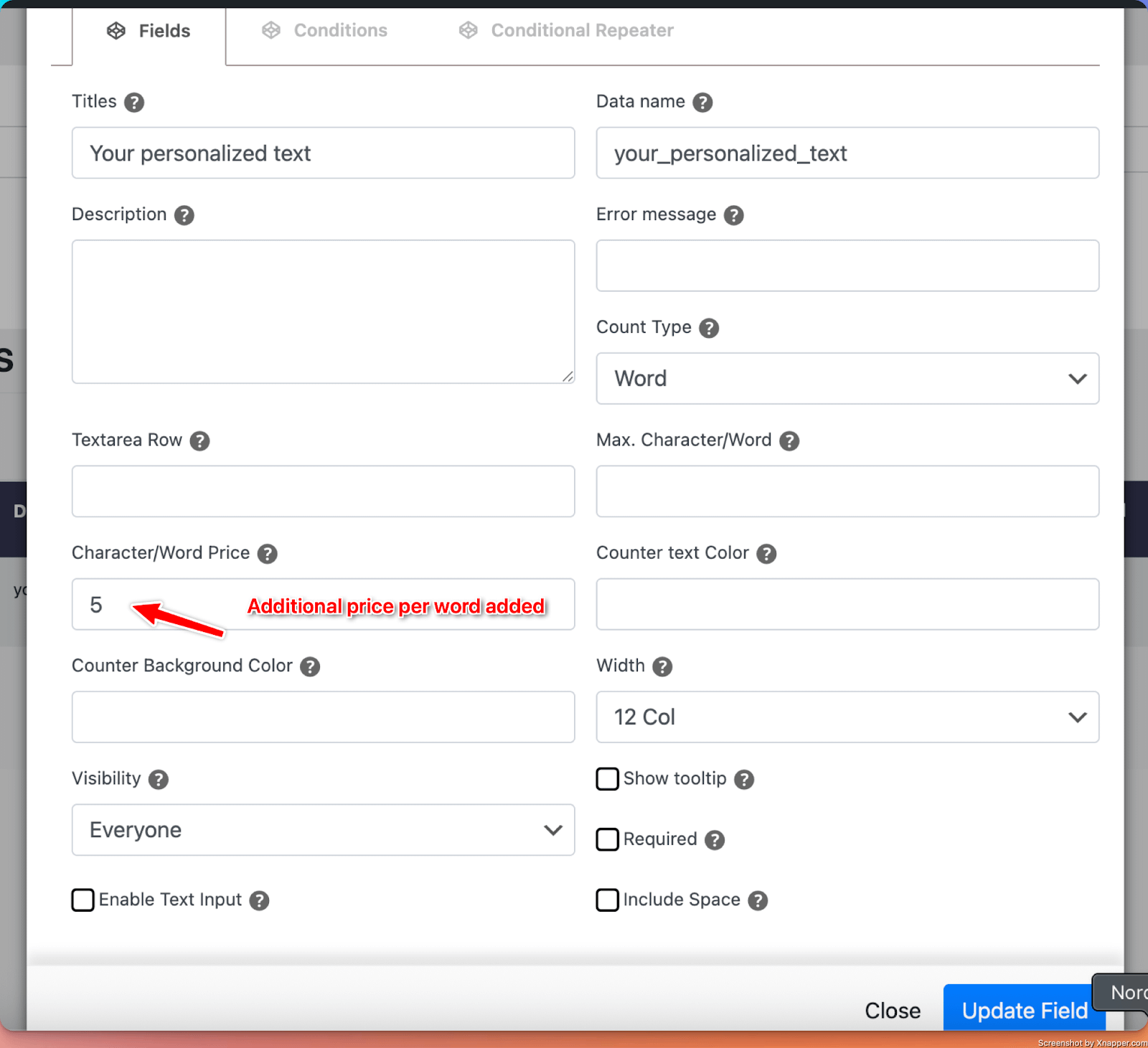
Options in detail
Count Type: Ability to choose to limit the text based on the number of characters or the number of words.
28. Variation Matrix
📝 Note: This PPOM input is available for the highest subscription (VIP) of the plugin, which you can get from here.
What it does
- Allow users to add different quantities for each additional option. One difference between the Variation Matrix and Variation Quantity is that this field also allows for each option to have an attached image.
Perfect for
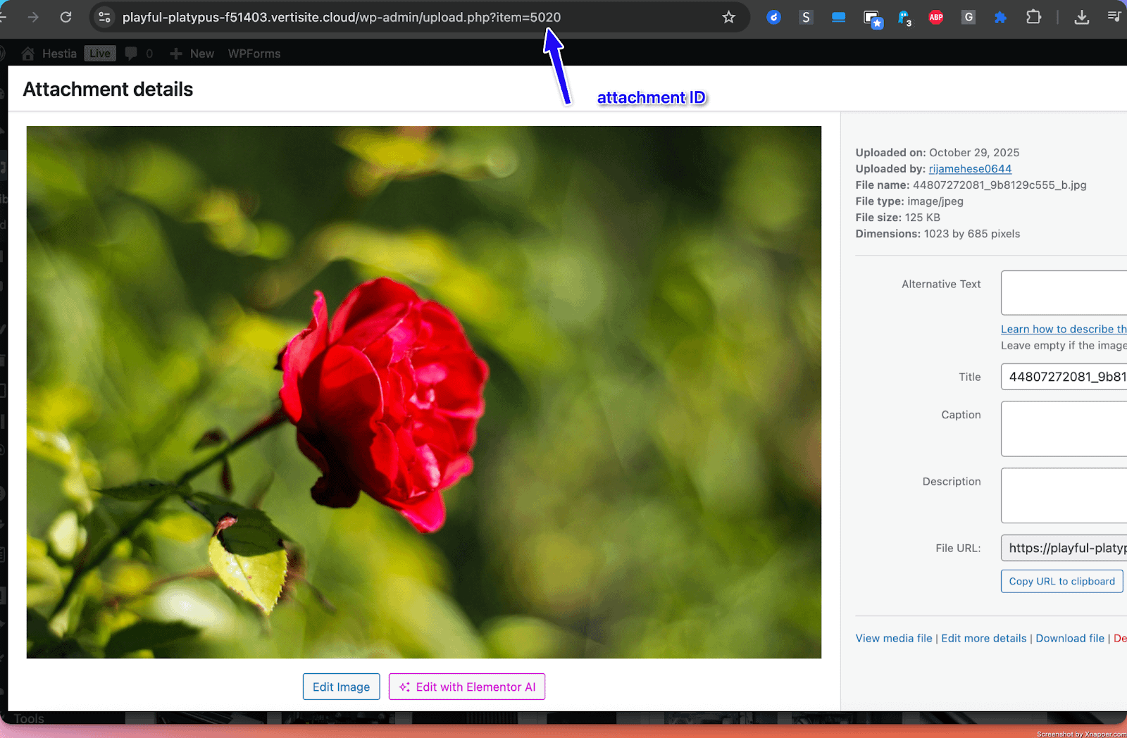
- Adding a different number of different types of flowers to a flower arrangement, which has a base price. You can add 10 roses ( each for 10 lei ), 2 lilies ( each for 20 lei ), and so on, which gets added to the base price of the product. For each flower, you can display the corresponding image by adding its attachment ID from the Media Library.
Configuration options
- Essential: Title
- Advanced: Min and Max Quantities
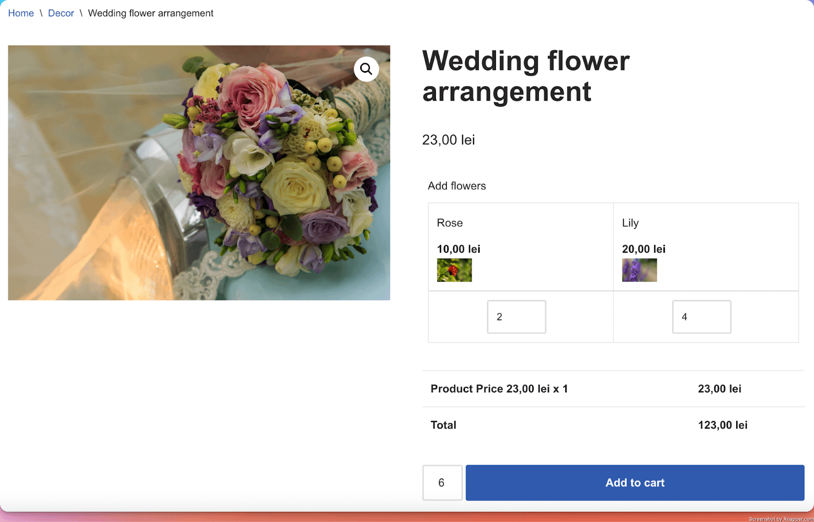
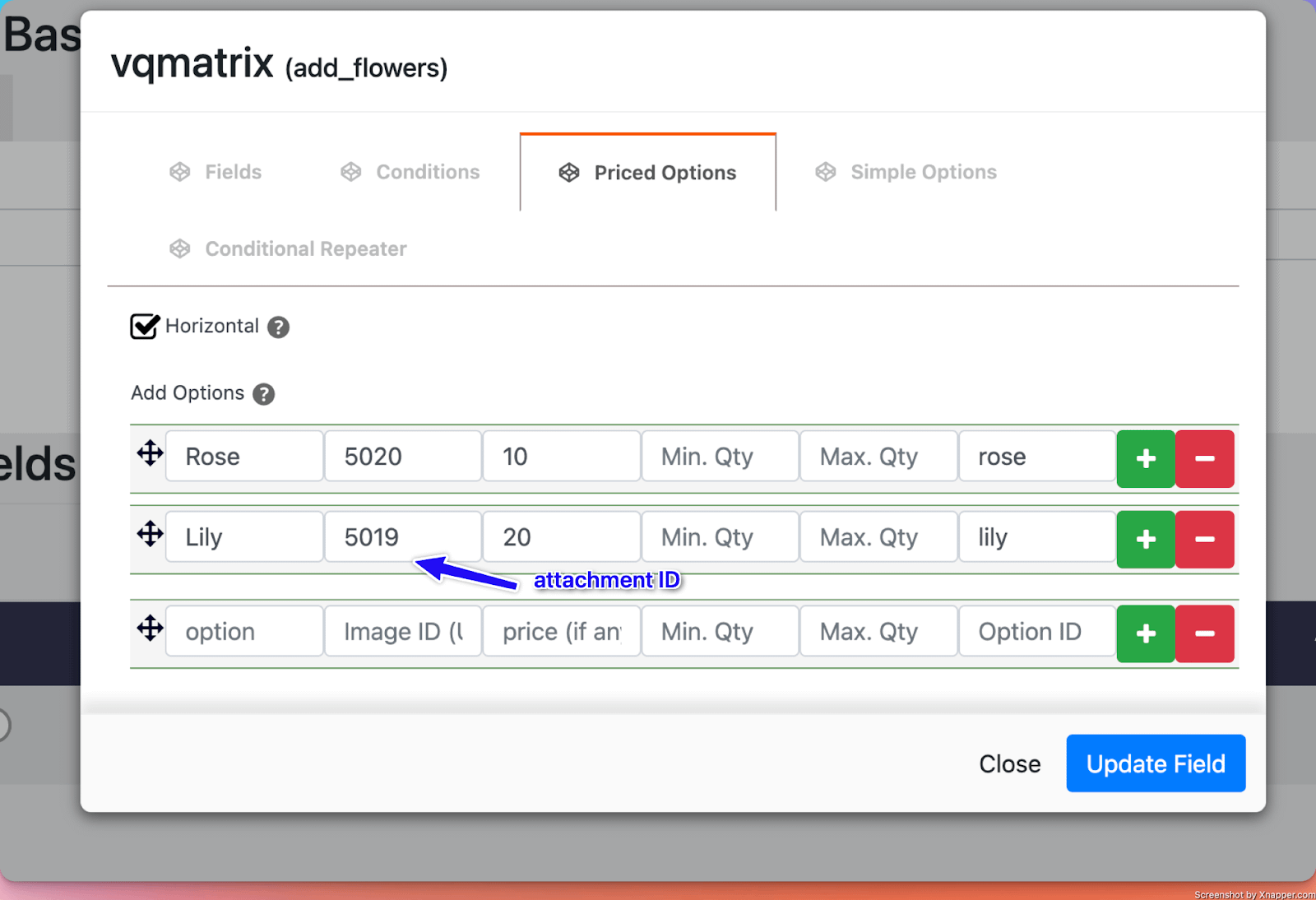
Options in detail
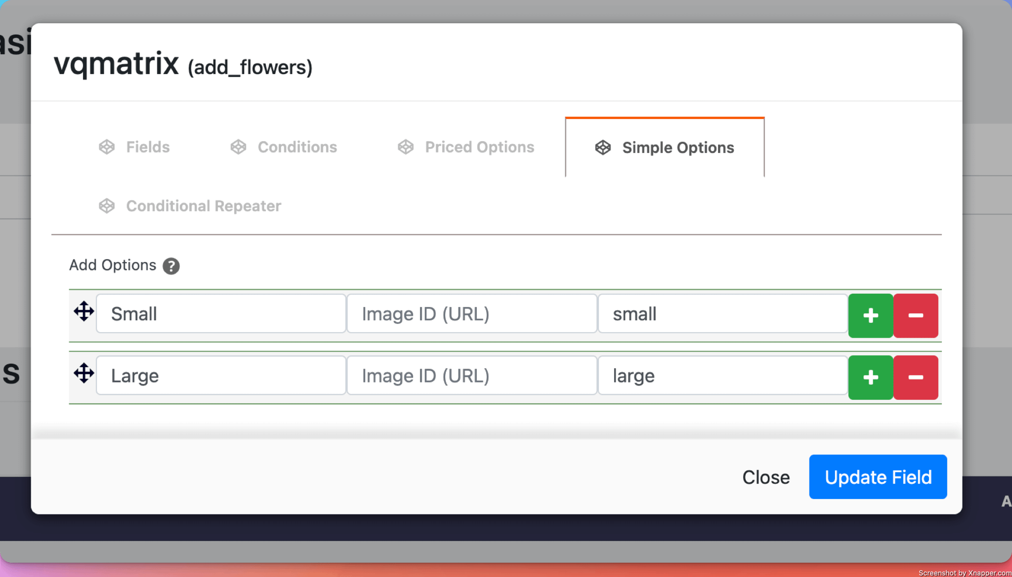
Simple Options: To add additional parameters, you can fill in the Label field and add the additional options in the Simple Options tab.
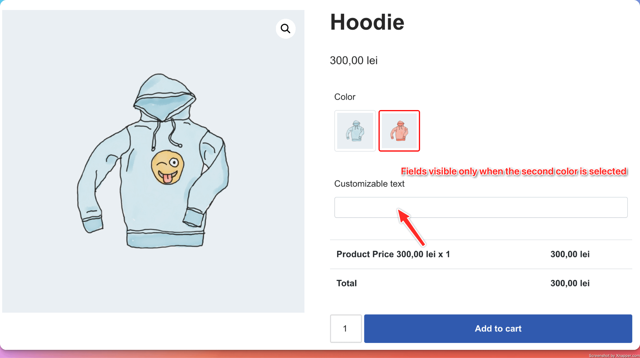
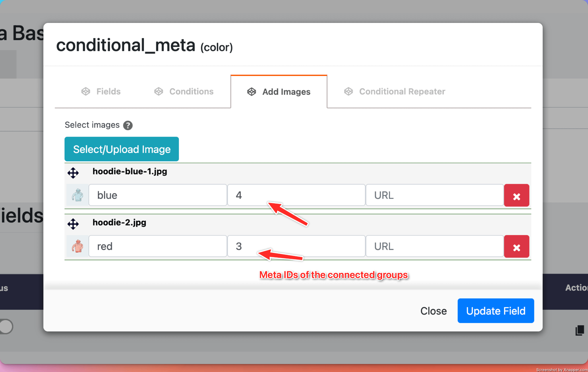
29. Conditional Images
What it does
- Adds a number of images from which the user can choose. Based on the selected image, additional inputs are displayed for the users to customize the product.
Perfect for
- Different product personalization for each product variation ( for example, you can sell Blue and Red hoodies. For the Blue one, you want users to be able to choose a size, while for the Red ones, you only have one unique size, and want users to customize a text that will show up on the hoodie ).
Configuration options
- Essential: Title
- Validation: Custom error messages
Note: For more details about the Conditional Images field, you can also see this doc.
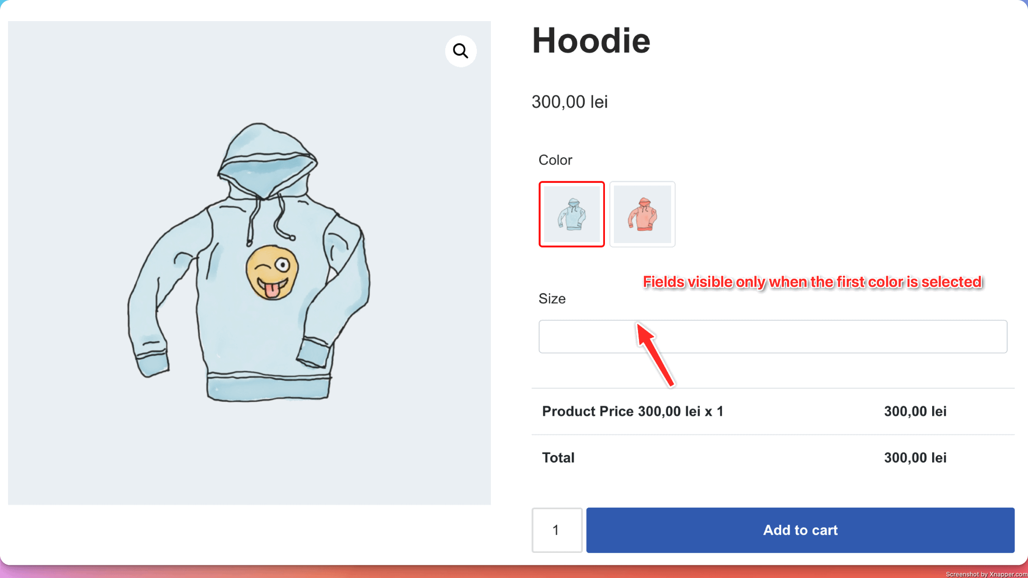
How to use it:
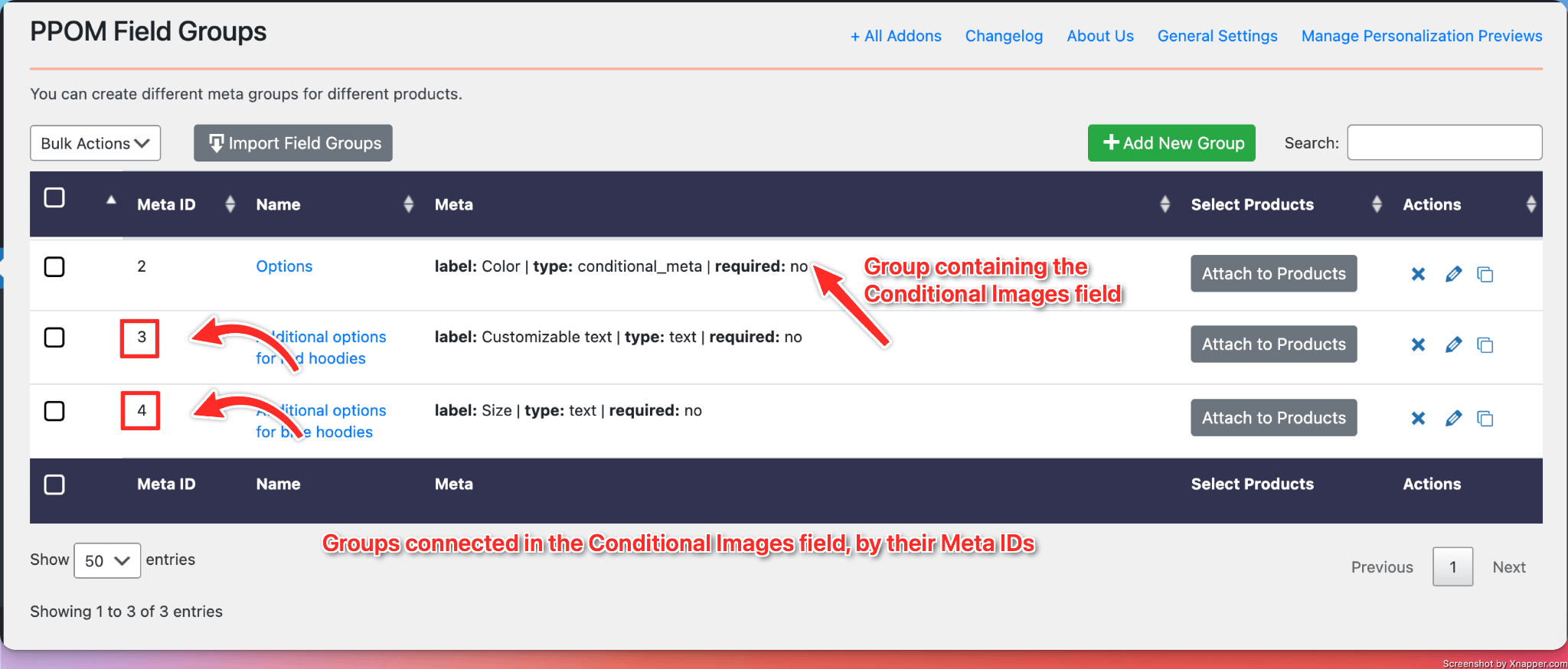
- Create a new group in which you add the Conditional Images field.
- In the Conditional Images field, add your desired images.
- For each image, you also need to add a meta ID of another PPOM group ( which fields you want to be connected with the image ).
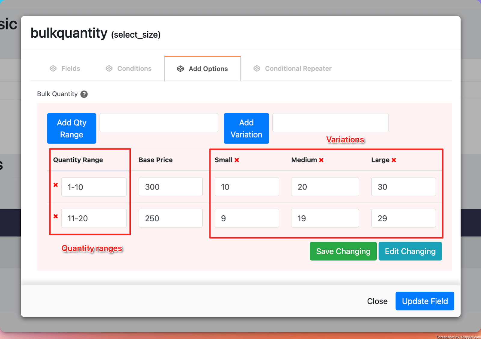
30. Bulk Quantity
What it does
- Allow vendors to offer different prices per product, based on the quantity of products purchased and specific variation of the product ( like: small, medium, or large)
Perfect for
- Offering discounts for users purchasing larger quantities, in different variations.
Configuration options
- Essential: Title
- Advanced: Hide Base Price, Show Price Range ( instead of displaying the default price of the product, show the range based on the pricing set in the options ), options to change all labels.
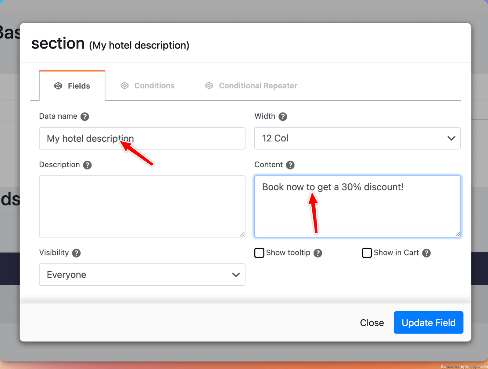
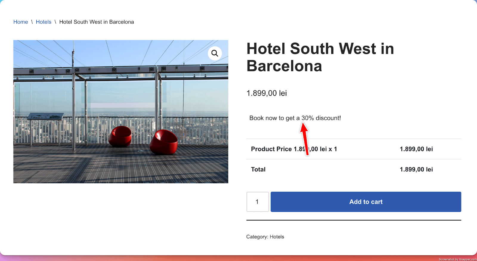
31. HTML
What it does
- It can be used to add a short message near the product's title.
Perfect for
- Showcasing a dedicated message in the product’s page.( for example, a message to let users know that the product is no longer available for users in a specific country )
Configuration options
- Essential: Title, Content
- Advanced: Show in Cart (whether to show or not the message in the Cart page)