Neve Footer Builder
Neve comes with a versatile builder for the footer area of your site. With just a few clicks you can create the desired layout.
In this article
Open the Footer Builder
1. Navigate to Neve > Customize.
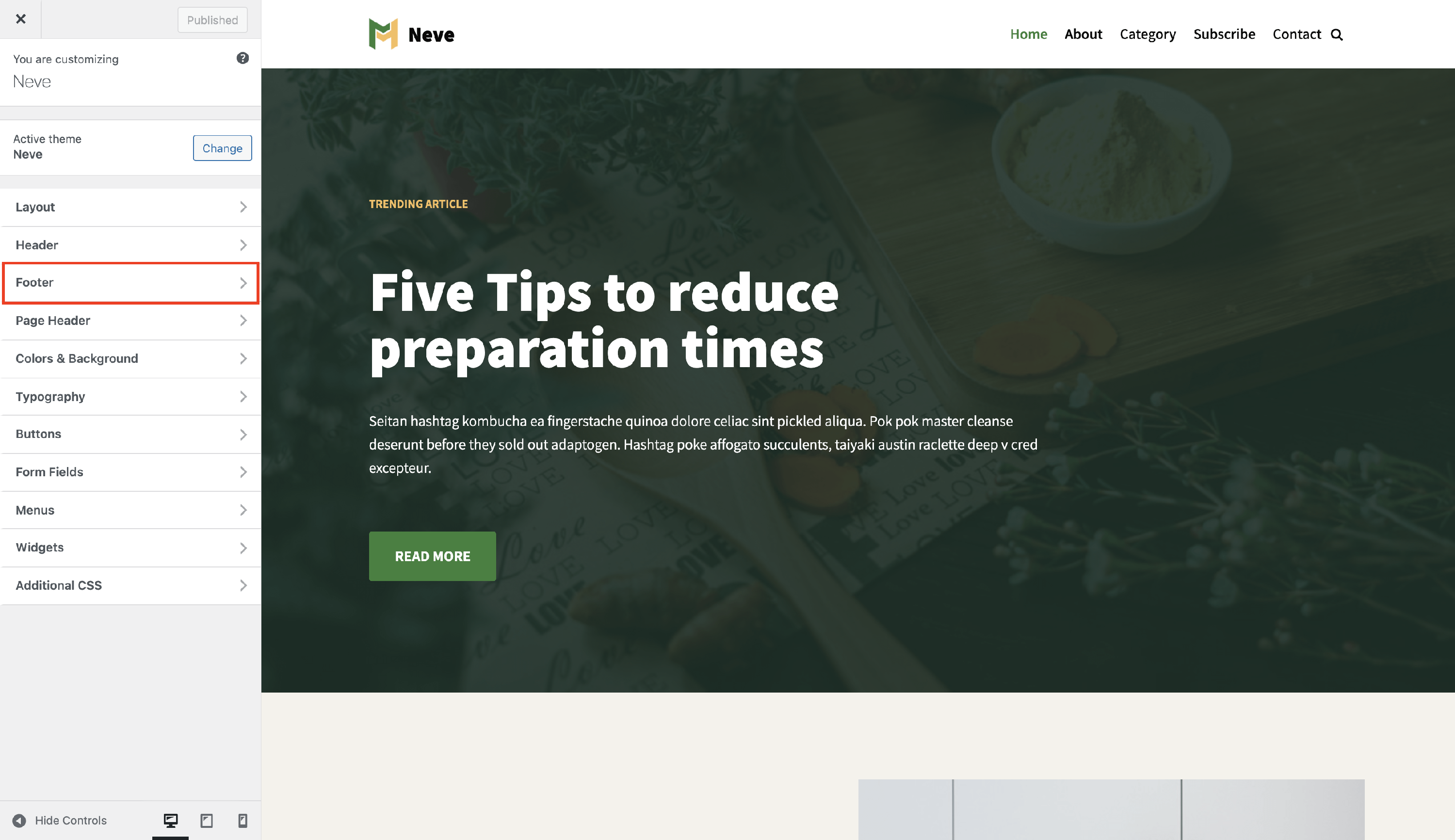
2. Click on the Footer panel to open the footer builder.
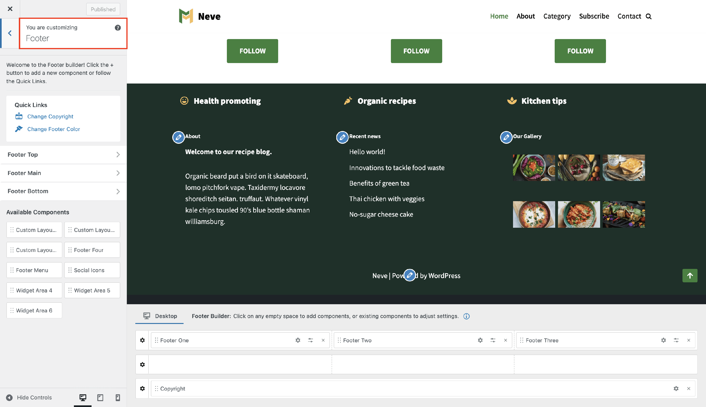
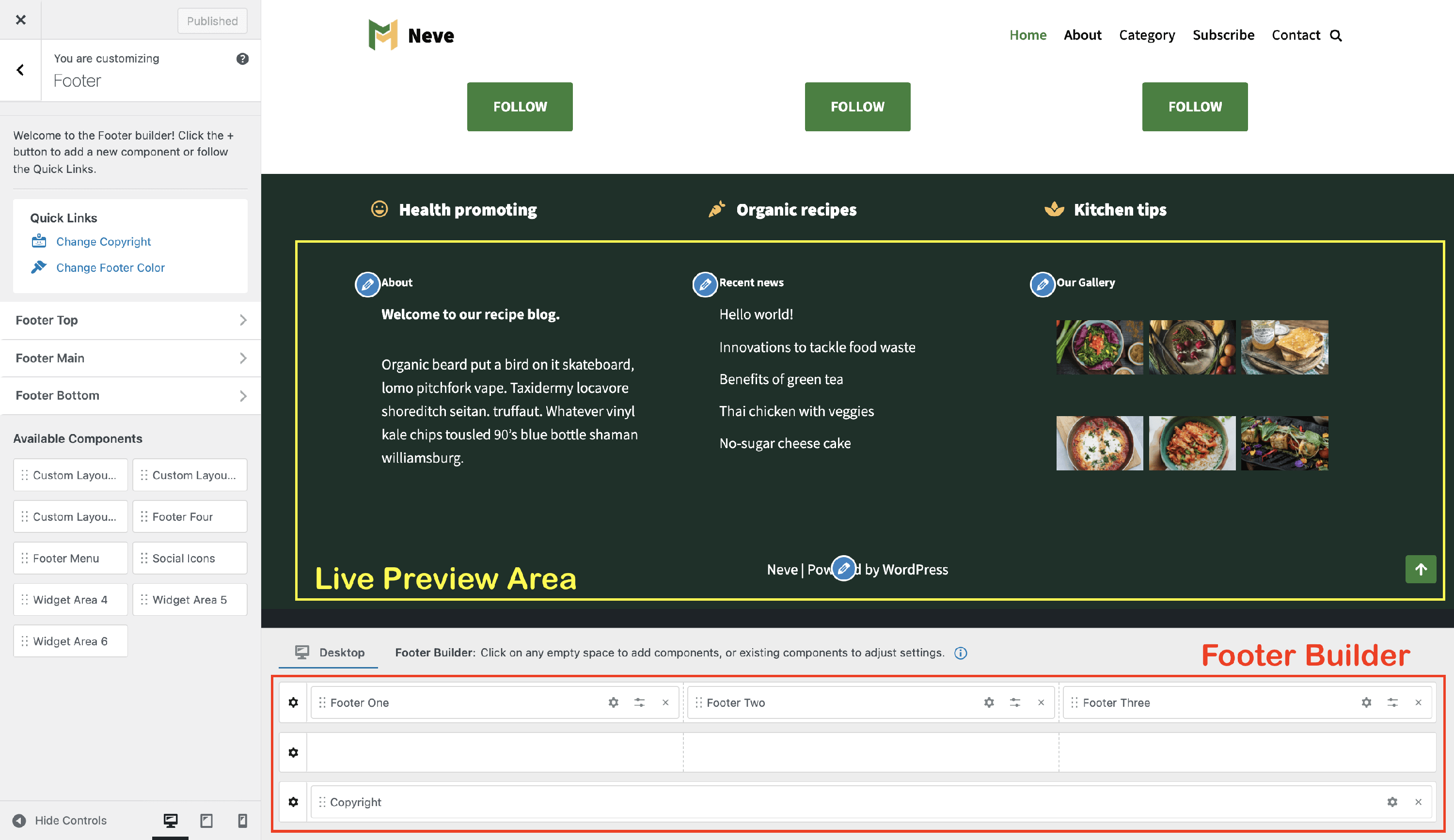
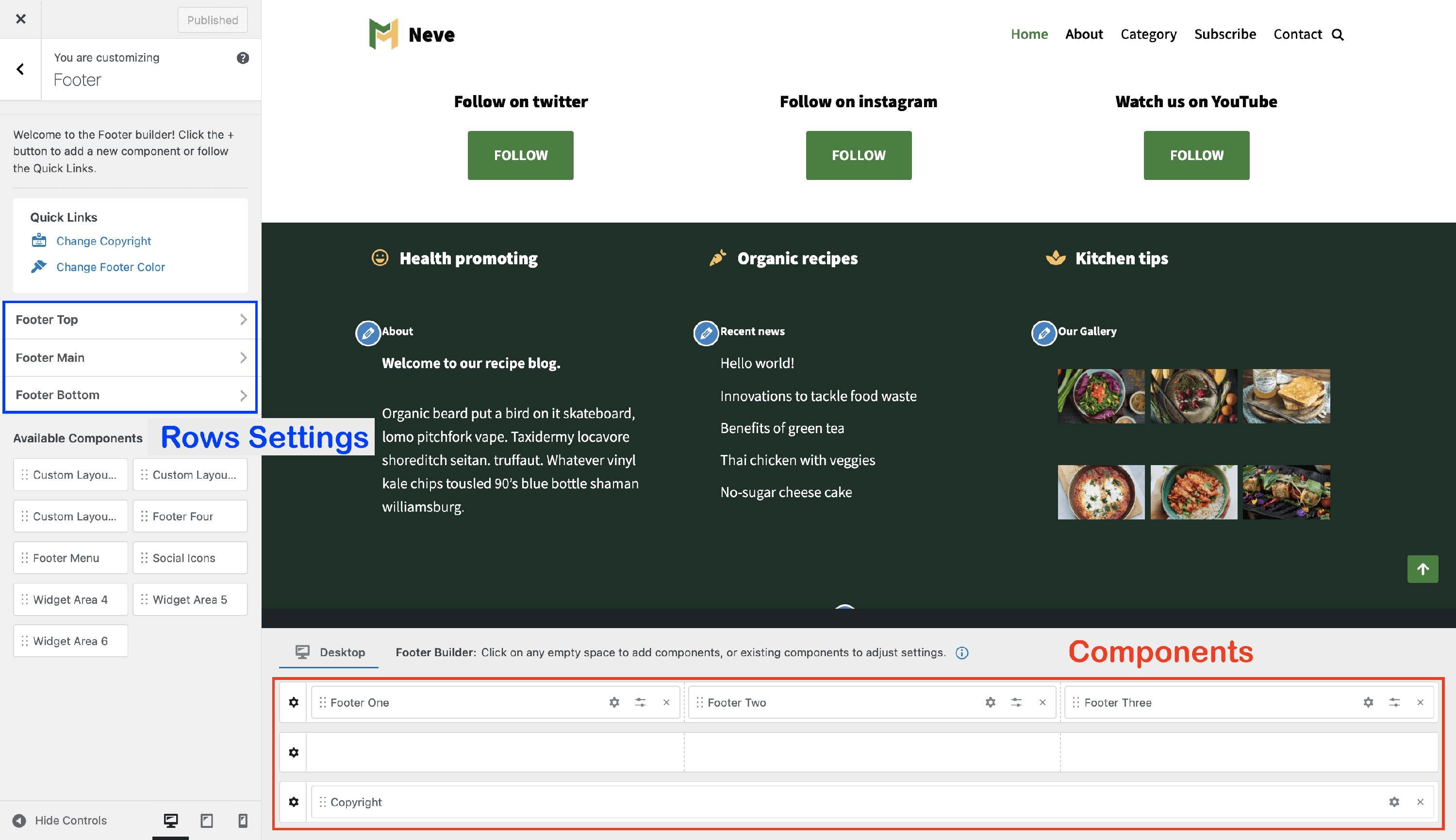
Footer Builder layout
The Footer Builder consists of two areas:
- Footer Live View Area - where you can see the live preview of how the footer will look on the site.
- Footer Builder Area - where you can add, reorder and remove components.
Desktop and Mobile views
At the top of the Footer Builder Area, there is a tab selector that lets you switch between the Desktop and Mobile views. The components you place in each view control what appears on that device type.
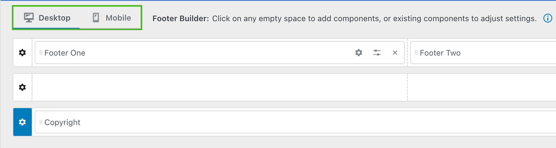
📝 Note: If a footer component (such as the Footer Menu) appears on desktop but is missing on mobile, it is likely because it has not been added to the Mobile view. Switch to the Mobile tab and add or arrange the components you want to display on smaller screens.
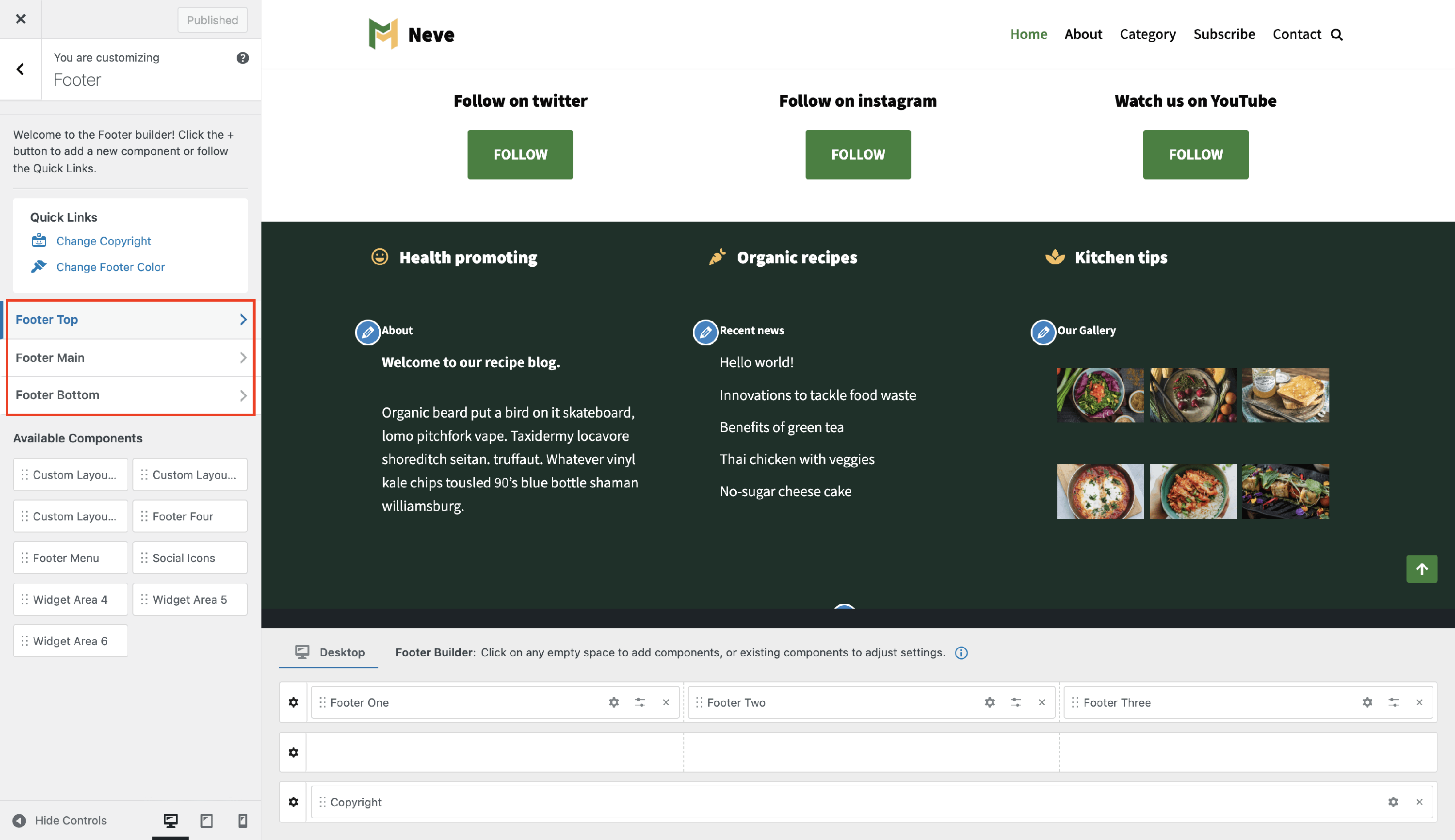
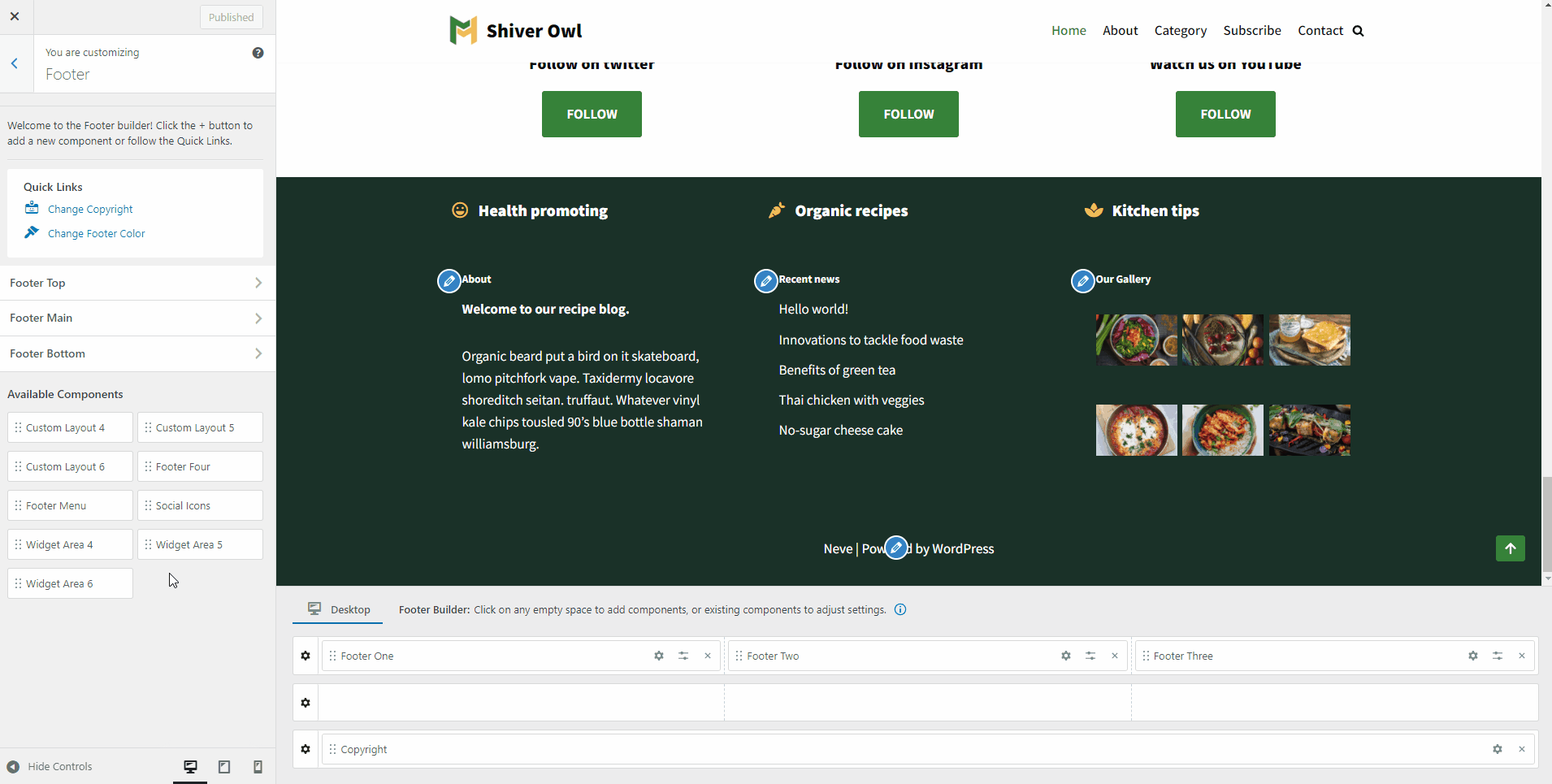
Footer Builder Rows
The footer builder area has three rows ( Footer Top, Footer Main, and Footer Bottom ) in which you can easily select and arrange the available components you can find while hovering over each division of the rows.
| Rows Structure | Rows Opening |
| Rows Customizations |
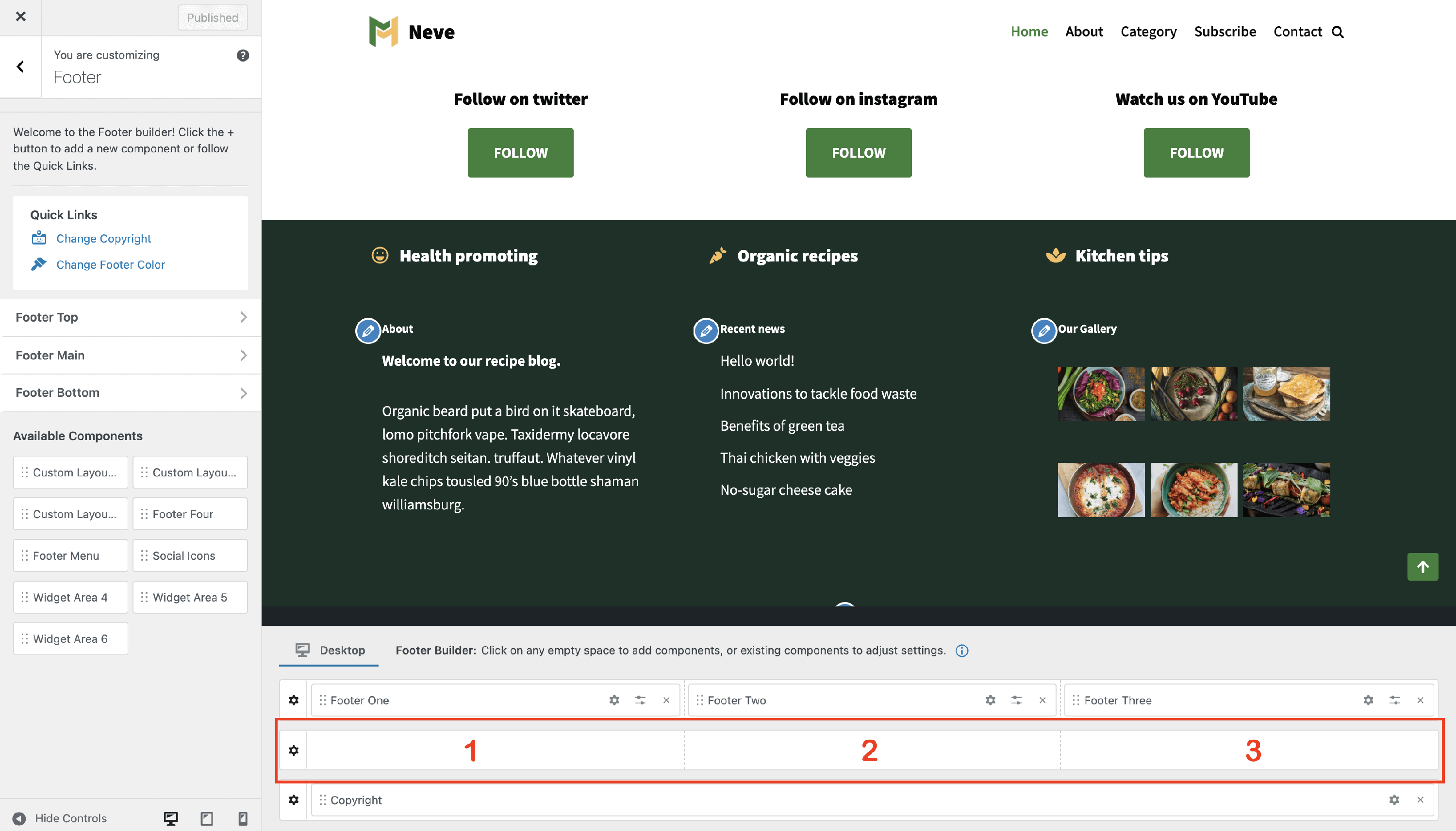
Rows Structure
Each footer row has by default three columns, with equal space where the components are added.
Rows Opening
Each of the three rows ( Footer Top, Footer Main, and Footer Bottom ) of the footer builder can be styled individually, which can be done in two ways:
- by clicking on the ⚙️icon, which appears at the beginning of the row once you hover over it.
- by clicking on any panel of the menu, on the left side (Footer Top | Footer Main | Footer Bottom).
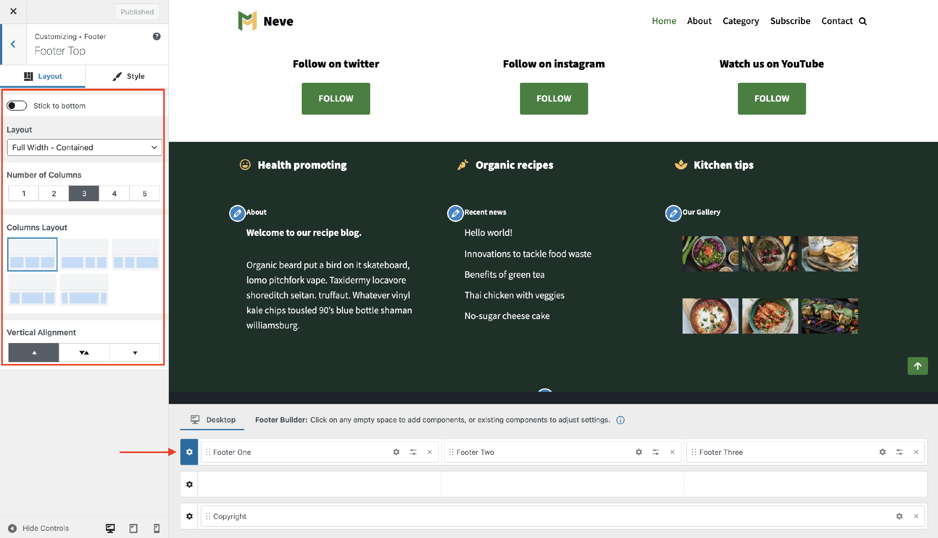
Rows Customizations
Each row has some options / settings available, divided into two tabs:
Layout Tab
- ( PRO ) Stick to bottom - Keeps the selected footer row fixed at the bottom of the viewport instead of letting it scroll into view naturally.
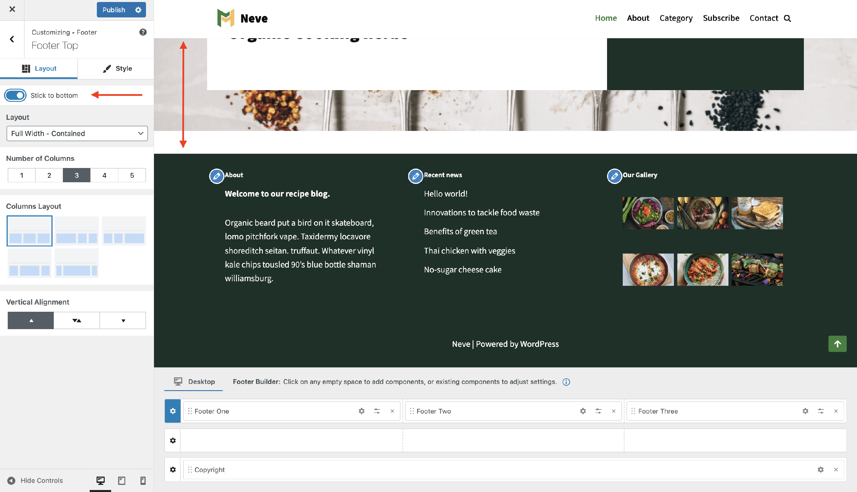
📝 Info: If a footer row pops up, appears suddenly, or seems to jump into view when you scroll near the bottom of the page, a row below it may have Stick to bottom enabled. You can disable Stick to bottom for that row, or enable it on the other footer rows as well if you want the entire footer to stay fixed on screen.
Troubleshooting: footer row appears suddenly on scroll
If a footer row appears suddenly while you scroll, the row below it is usually set to Stick to bottom.
To correct this behavior:
- Open the Footer builder in the Customizer.
- Select the row that should stay fixed (Footer Top, Footer Main, or Footer Bottom) by clicking its ⚙️ icon.
- Open the Layout tab.
- Either disable Stick to bottom for that row so the footer scrolls normally, or enable Stick to bottom on the other footer rows if you want the entire footer to stay fixed at the bottom of the screen.
- Click Publish and reload the page to confirm the footer now behaves the way you want.
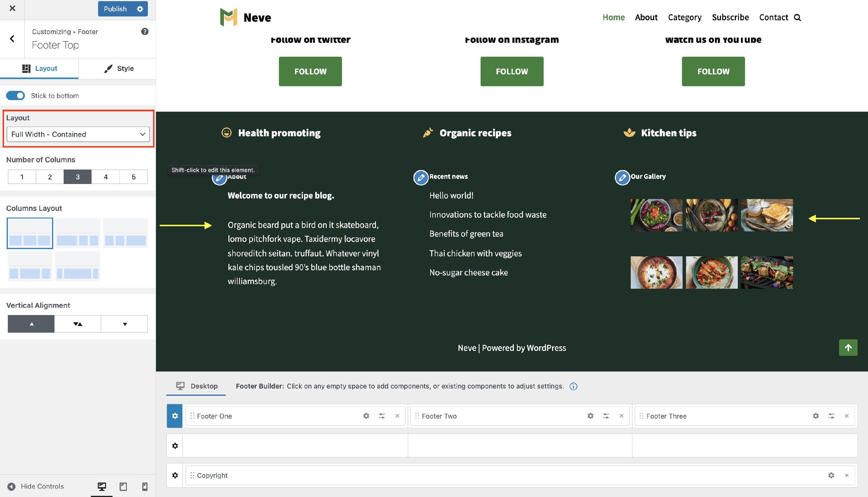
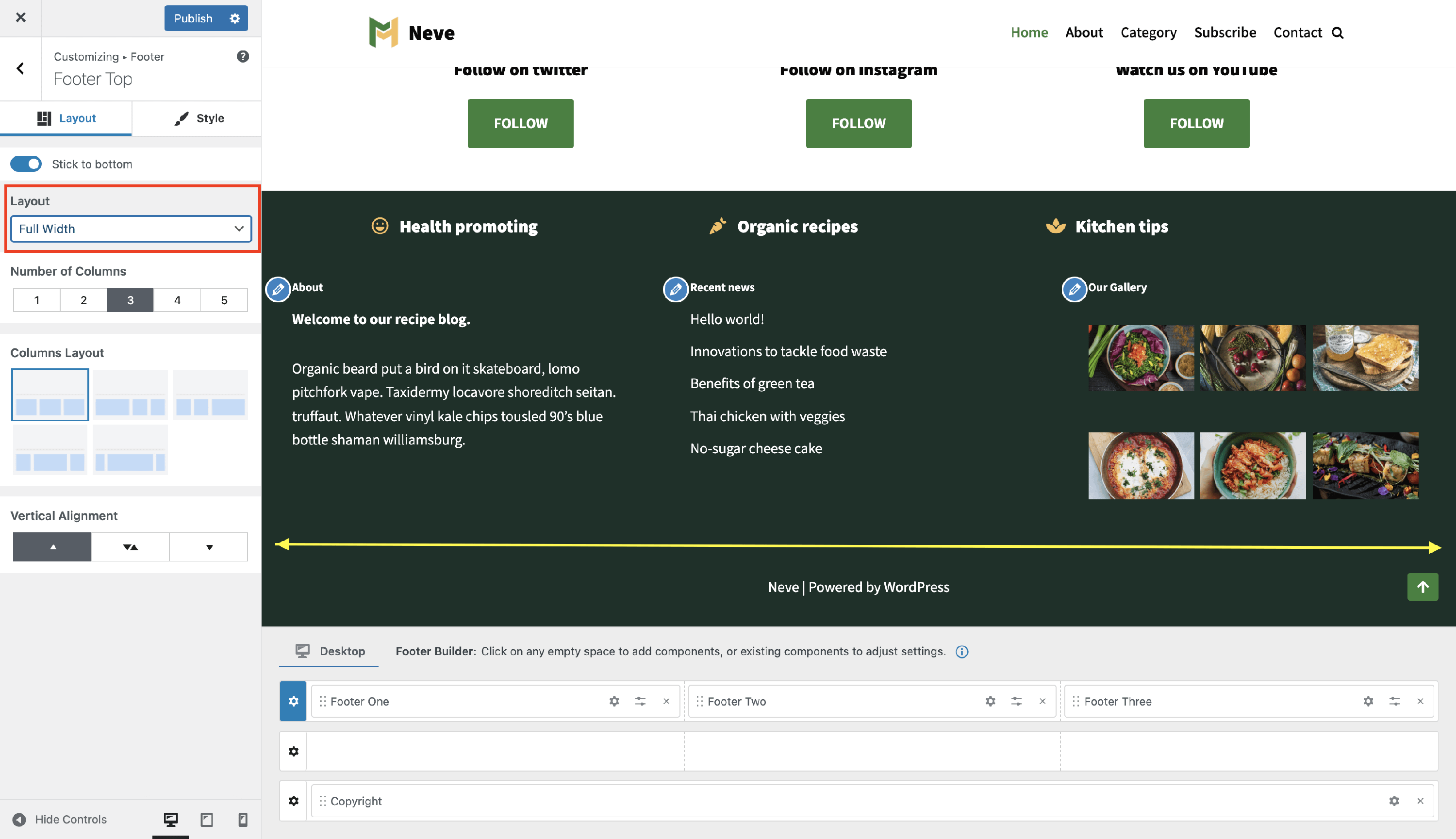
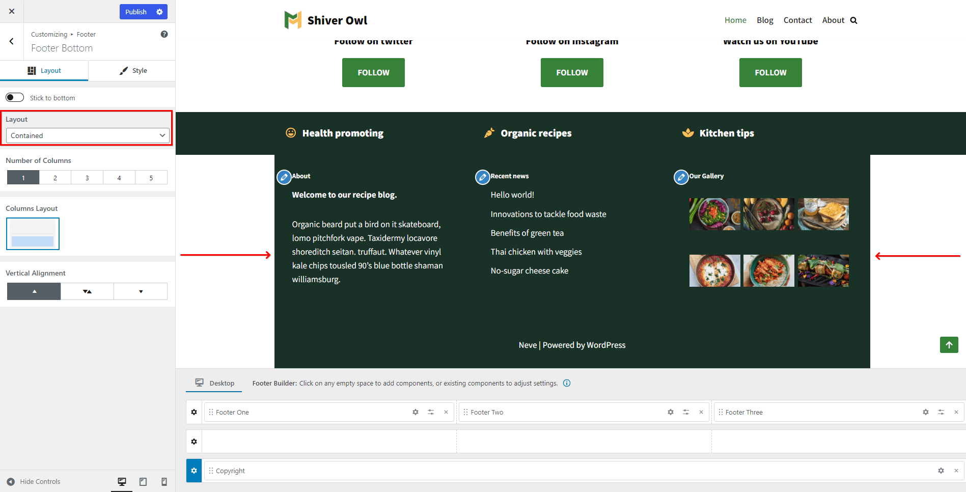
Layout - can be Full Width - Contained | Full Width | Contained - below are screenshots with each of them.
- Full Width - Contained - the row content is wrapped by the page container and the background color stretch the full width.
- Full Width - content and background color stretch the full width.
- Contained - both the content and background color are wrapped by the page container.
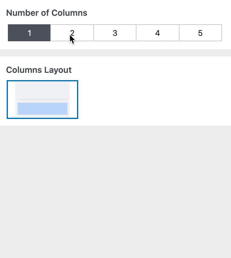
The number of columns - can vary from 1 to 5 for each row, and based on it the row layout can be different.
Columns Layout - depending on the number of columns, the layout possibilities may vary.
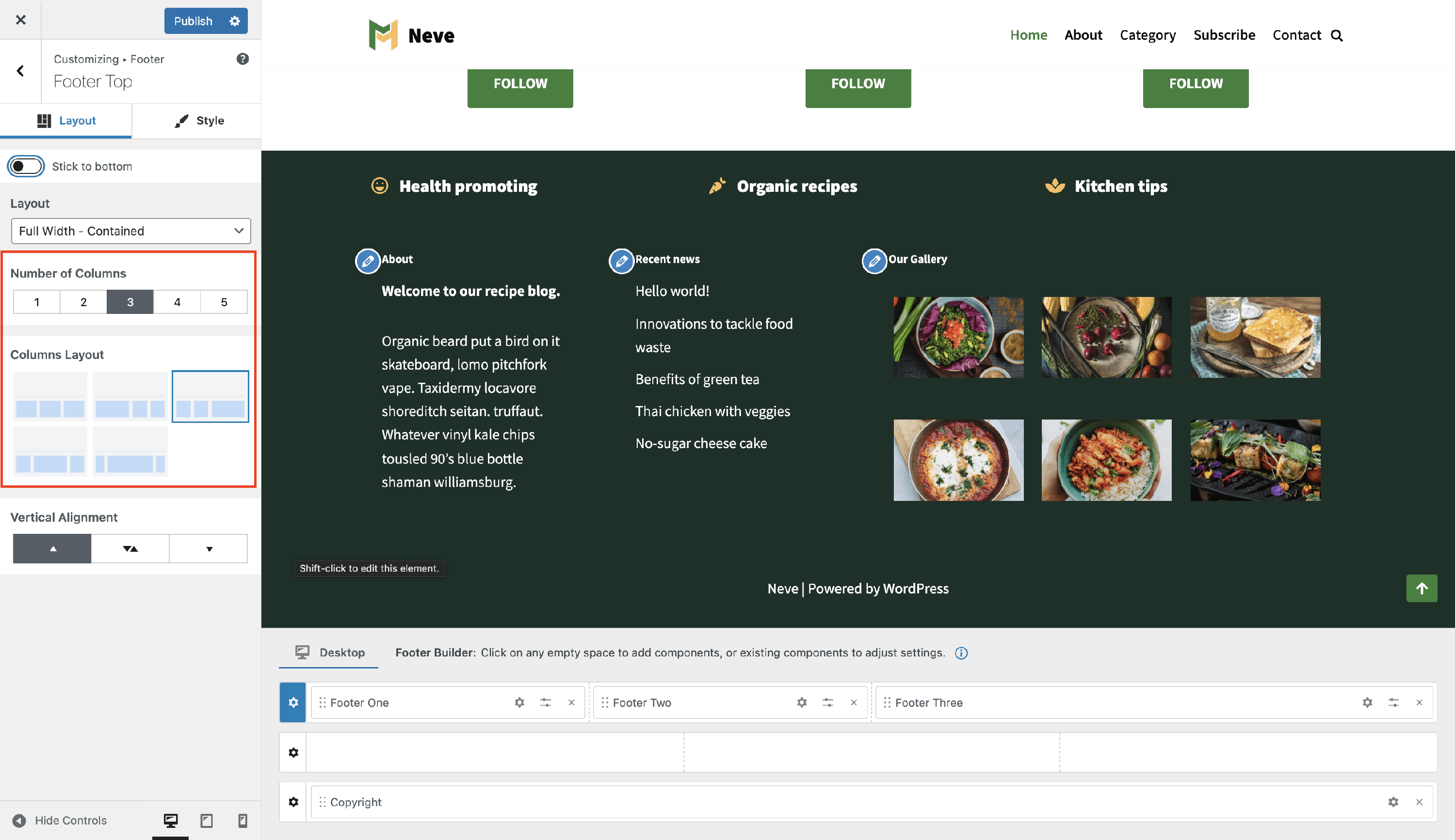
- Vertical Alignment - decide how the elements should be arranged ( top / Middle / bottom ).
📝 Note: The layout chosen will change the row columns.
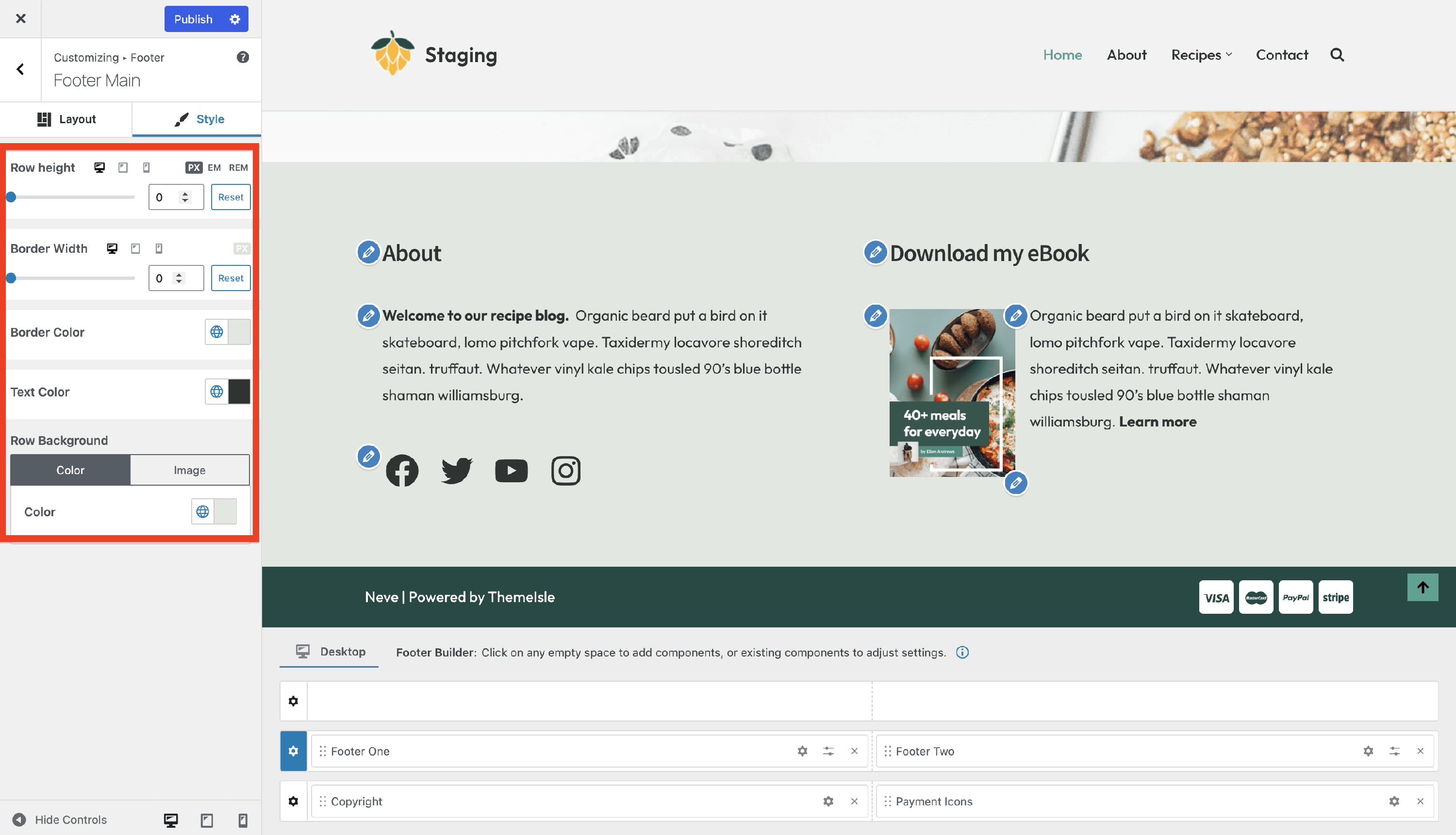
Style Tab
In the style tab are many options available:
- Row height - adjust the height of the row on desktop/tablet/mobile, using PX, EM, or REM units.
- Border Width and Color - adjust the border width that separates the page container from the footer, on desktop/tablet/mobile, using px. Color options are also available.
- Text Color - change the color of the text displayed inside the footer.
📝 Note: You can boost the footer's appearance by using the Gradient option that can be accessed from the color tab.
- Row Background - can be a static color, including gradient options, or image. Adding an image as the background - can be a static image or the featured image of the current page. When using a background image, it is also possible to set an overlay(color and transparency).
Managing the Components
| Add components | Remove components |
| Customize components | Edit existing footer content |
| Where common footer text is edited | Tip: match the component to the text you see |
Add components
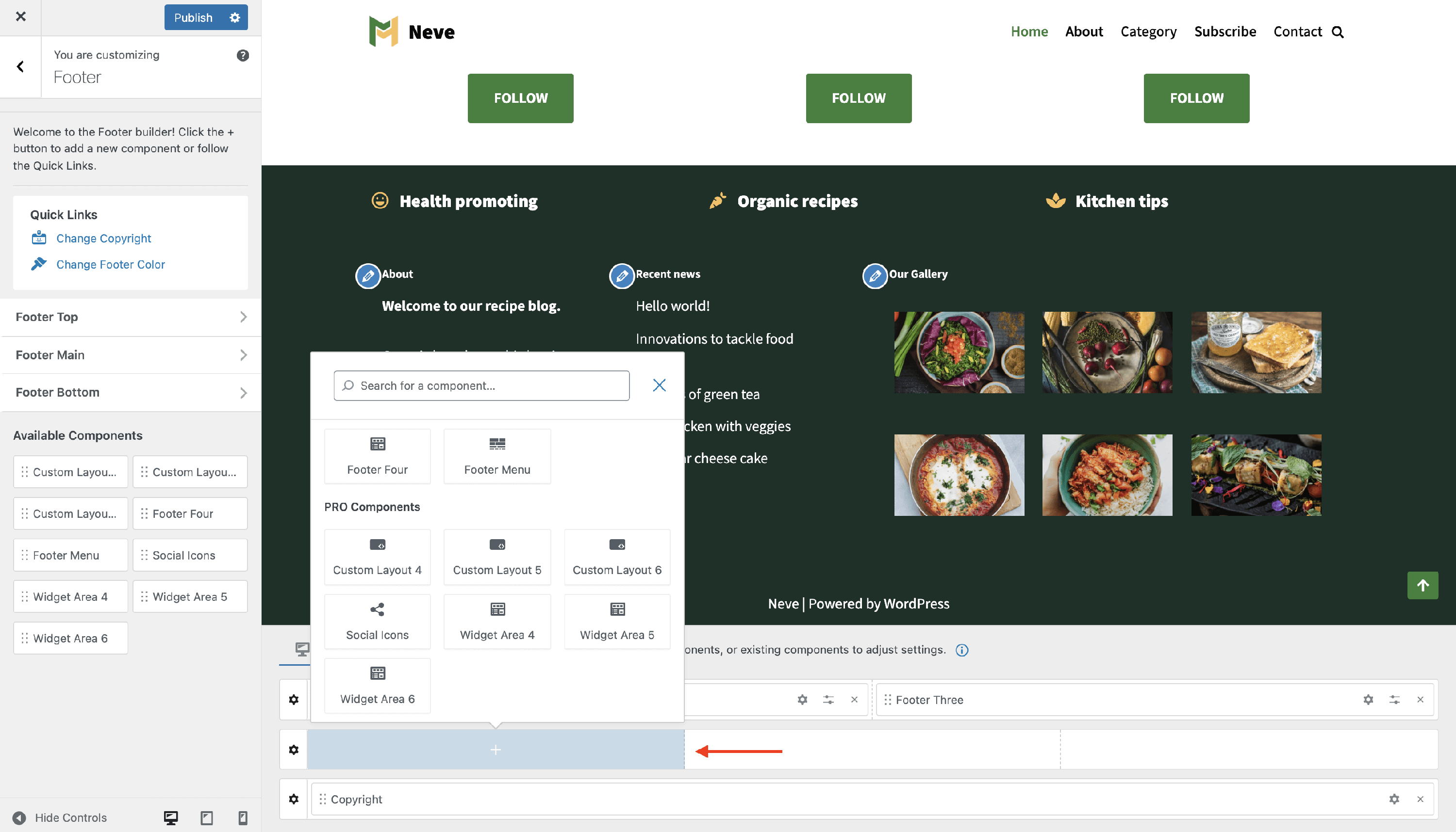
While hovering over each division of the rows, click on the ➕ sign and a list of components will appear.
Each component has specific options you can customize once that component is clicked on.
Components can be added to the rows in two ways:
- drag&drop them from the left sidebar
- directly from the footer rows
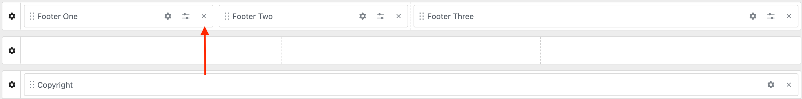
Remove components
In order to remove a component, there are two steps that need to be done:
Step 1: Hover over the component you want to remove.
Step 2: Click on the ❌ icon on the right corner of the component.
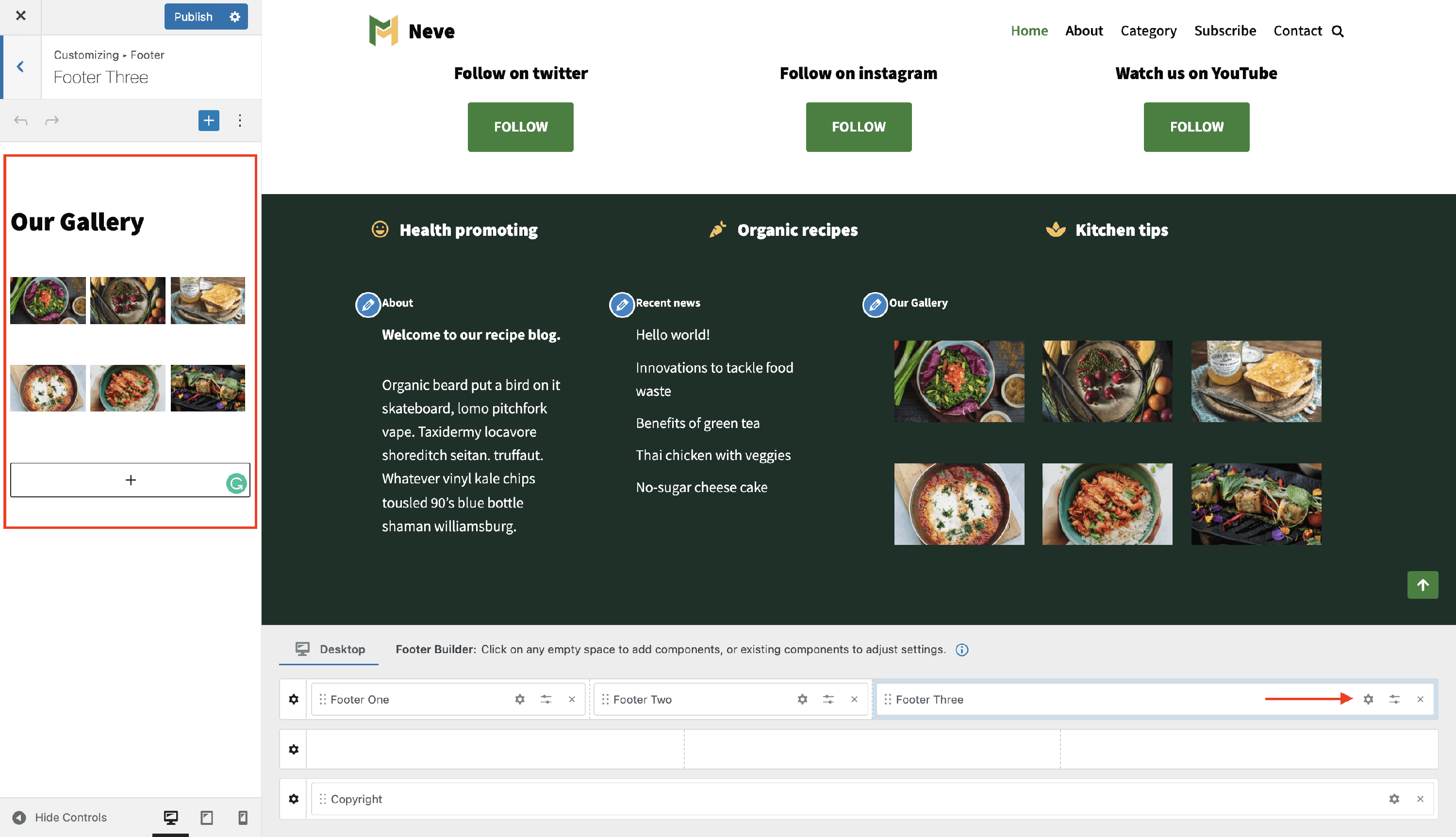
Customize components
To open customization options for any component in the footer, follow these two steps:
Step 1: Select the component that you want to customize.
Step 2: Click on the ⚙️ icon when the component is already enabled in one of the rows.
📝 Note: Component settings apply to the currently selected view. If you want a component to appear on mobile, make sure to switch to the Mobile tab in the Footer Builder and add the component there as well. See Desktop and Mobile views for details.
Edit existing footer content
If you can already see text, links, or widgets in the footer, you do not need to add a new component first. Instead, open the settings for the component that is already displayed and edit it there.
- Open Neve > Customize and click Footer.
- Find the footer content you want to change in the live preview.
- Open that component in one of these ways:
- Hover over the visible footer section in the preview and click the pencil icon.
- Find the matching component in the Footer Builder area and click its ⚙️ icon.
- Edit the settings in the left sidebar.
- Click Publish to save the changes.
Where common footer text is edited
Different footer text can come from different component types. If changing one component did not update the text you expected, check the source below.
| Footer content you see | Where to edit it |
|---|---|
| Copyright or other static text | Open the Copyright component and edit the text in its General settings. |
| Footer menu labels or links | Open the Footer Menu component, then use its General settings to open Menus and edit the menu assigned to the footer. |
| Text, blocks, or other widget content in a footer column | Open the Widget Area component and edit the specific widget or block inside that widget area. You can also manage footer widget areas from the WordPress Widgets screen or the Customizer's Widgets panel. |
| Any other footer element | Select that component in the Footer Builder and open its settings to edit the content shown there. |
Tip: match the component to the text you see
💡 Tip: The Footer Builder controls where each footer component is placed, but the visible text can come from that component's own settings, a WordPress menu, or a widget inside a widget area. For example, changing the Copyright component will not update links in the Footer Menu or text stored inside a Widget Area.
Components Library
Neve has an impressive components library that comes with specific settings. This section contains the list with all the available components and their dedicated doc:
- Footer Menu
- Widgets area (Footer One, Footer Two, Footer Three, Footer Four)
The PRO version of Neve brings in some extra components:
📝 Note: The settings of each component are common, no matter the location: Header / Footer.