HTML - Related Blocks
📝 Note: These blocks are part of the Otter Blocks plugin, which you can get from here.
📝 Note: The blocks' appearance can be improved using the Otter features, such as Transform to Sticky, Visibility conditions, Dynamic Values or Images, as well as Counting / Typing / Loading animations, and 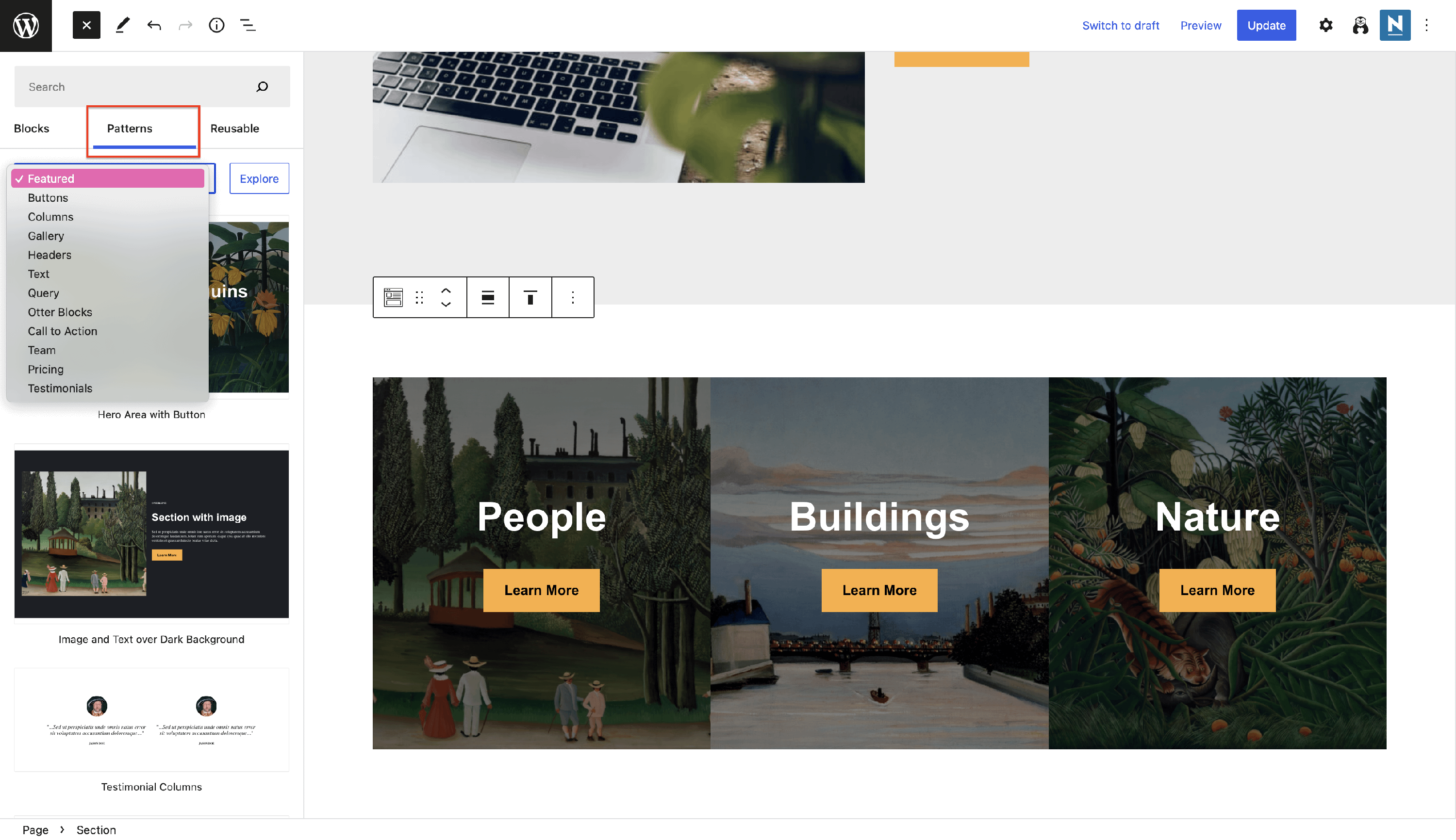 Patterns.
Create the desired design of your website using Otter's global defaults blocks:
📑 Advanced Heading
Advanced Heading gives a spin to the editor's Heading block with much-needed customization options.
- Style
General Settings - contains the color options, font size, and text alignment.
Typography Settings - enhance the heading using different font families, styles, and transform, as well as adjust the line height or letter spacing. From this area, you can add shadows to the text too.
📝Note: The Advanced Heading block inherits the Typographic styling defined in the Customizer.
- Advanced
Highlight Color - pick a suitable color for the highlight mode.
Spacing - adjust the position of the heading using padding and margin controls.
📝 Note: This block appears in the Global Defaults blocks, which means you can configure a Global Advanced Heading that will be automatically applied any time you add the block.
Designs for the Advanced Heading block
- using the section block to add a gradient background and the advanced heading
🔘 Button Group
Enhance your website's interaction, prompting visitors to take action with a button group.
This block has different customizations: you can configure general settings such as spacing and typography for the button group, and you can open multiple customizations by clicking on the button itself.
Spacing - adjust the padding and spacing and pick an alignment type for the button. Also, decide the behavior of the buttons for the devices.
Typography - configure the typography settings of the button group, choosing a font family, font size, style, transform and line height.
Styles - inherit from the predefined theme's styles ( primary / secondary ), as well as global styles ( fill / outline ).
Color - choose text and background color for the normal and hover mode.
Border & Box Shadow - boost the button's appearance by adding borders and shadows on both normal and hover mode.
Icon Settings - choose to make a more descriptive button by adding an icon and adjusting its position.
Use cases for the Button group block
- create your own design of the Download PDF button
📝 Note: Unlock more features using the PRO version of the plugin.
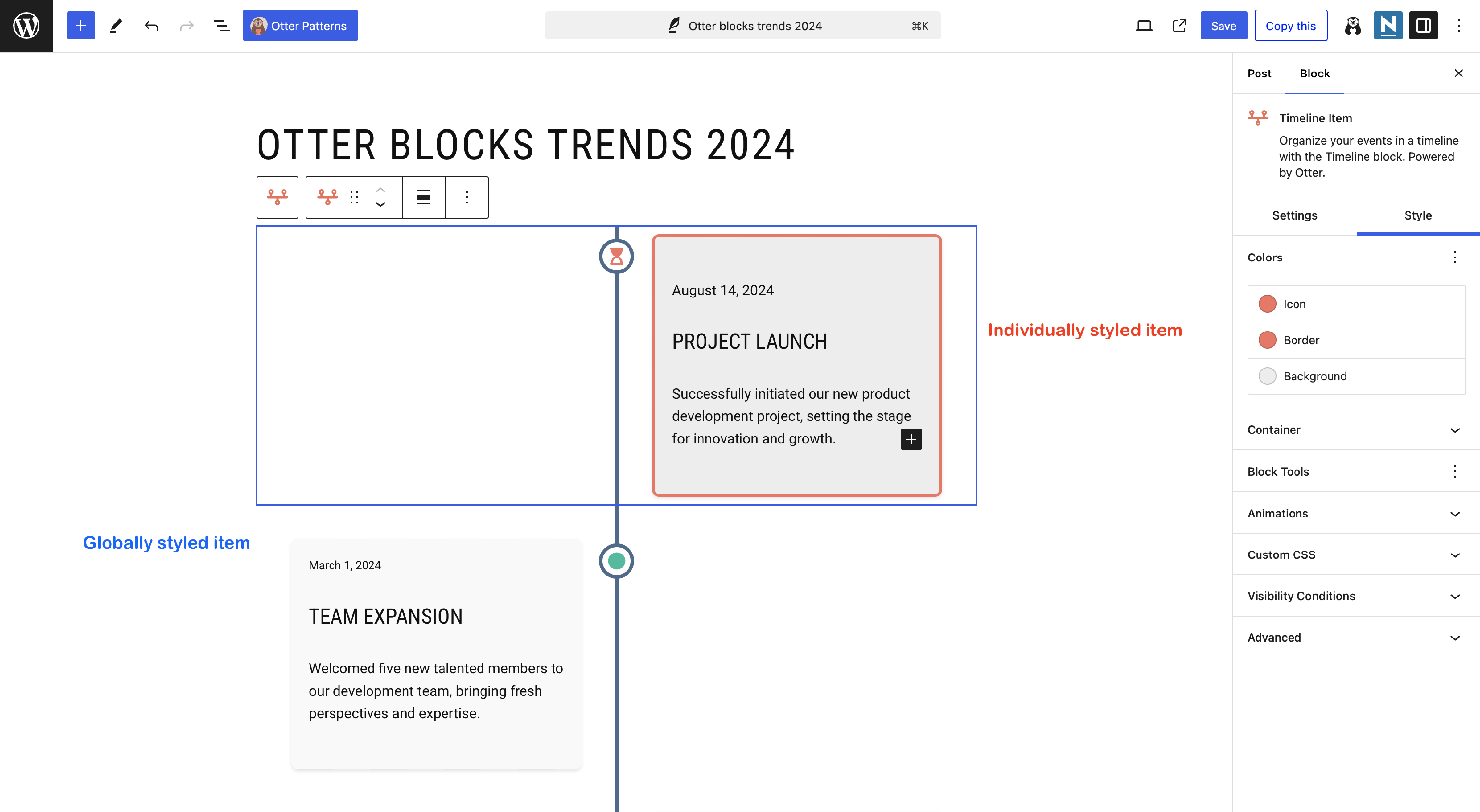
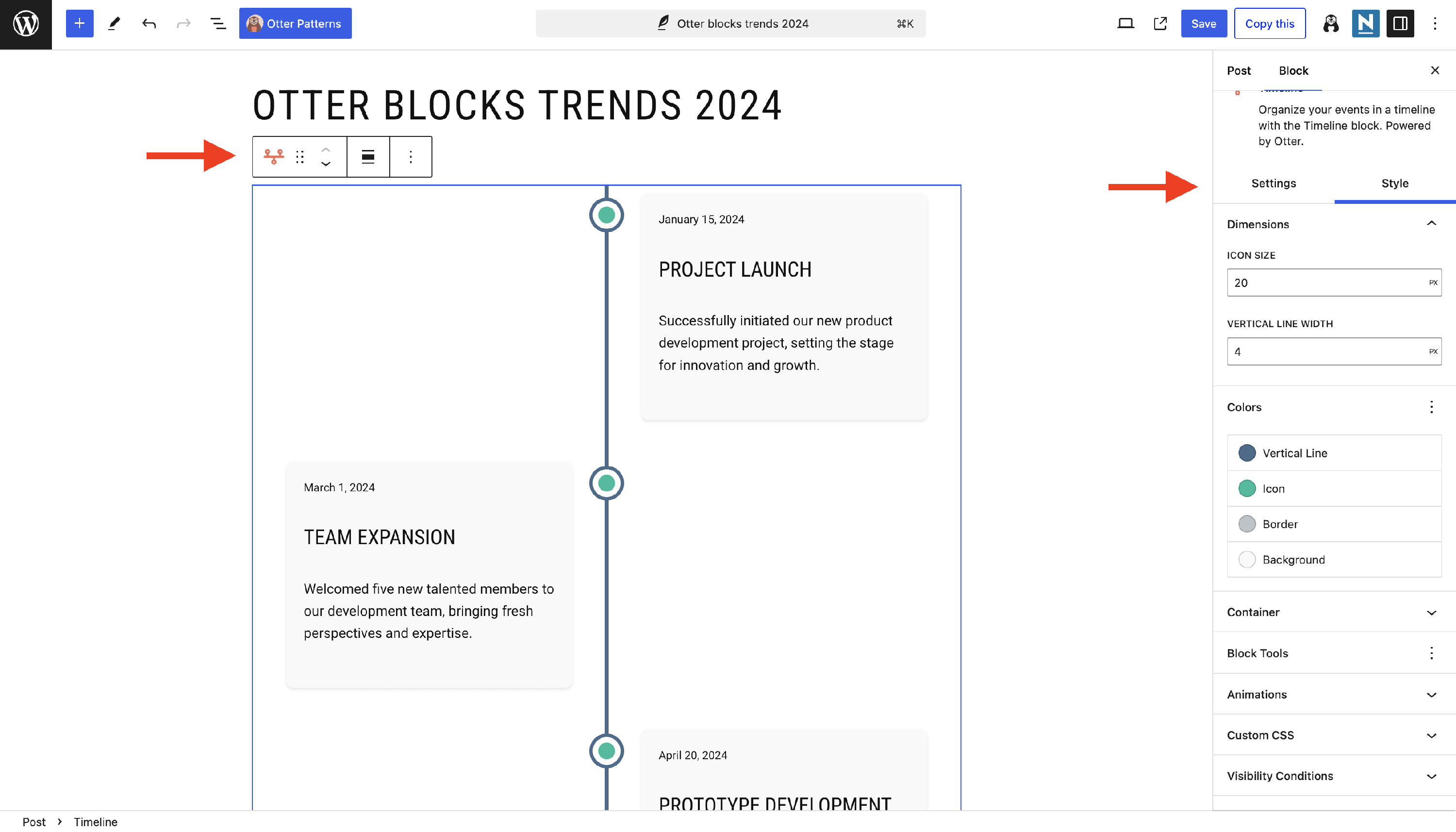
⌛️ Timeline
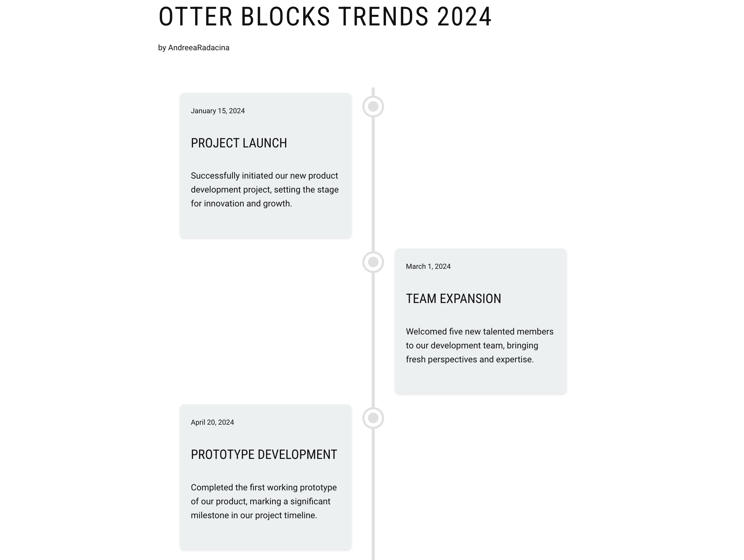
The timeline block allows you to display structured content using vertical timeline items.
Its key features include alignment, dimensions, colors, icons, and containers, as follows:
When clicking on the parent block, you can access the timeline alignment, icon size, and vertical line width, as well as colors for the vertical line, icon, border, and background:
Then, you can edit each item by clicking on it. An important note here is that you can take advantage of any Gutenberg/Otter Blocks block because those from the pattern can be easily replaced. The available settings include: changing the icon by using FontAwesome or Themeisle icons, and even custom images, adjusting the colors of icons, border, and background for specific timeline items, and container settings (border width and height):