Animated / Dynamic Blocks
📝 Note: These blocks are part of the Otter Blocks plugin, which you can get from here.
📝 Note: The blocks' appearance can be improved using the Otter features, such as Transform to Sticky, Visibility conditions, Dynamic Values or Images, as well as Counting / Typing / Loading animations, and 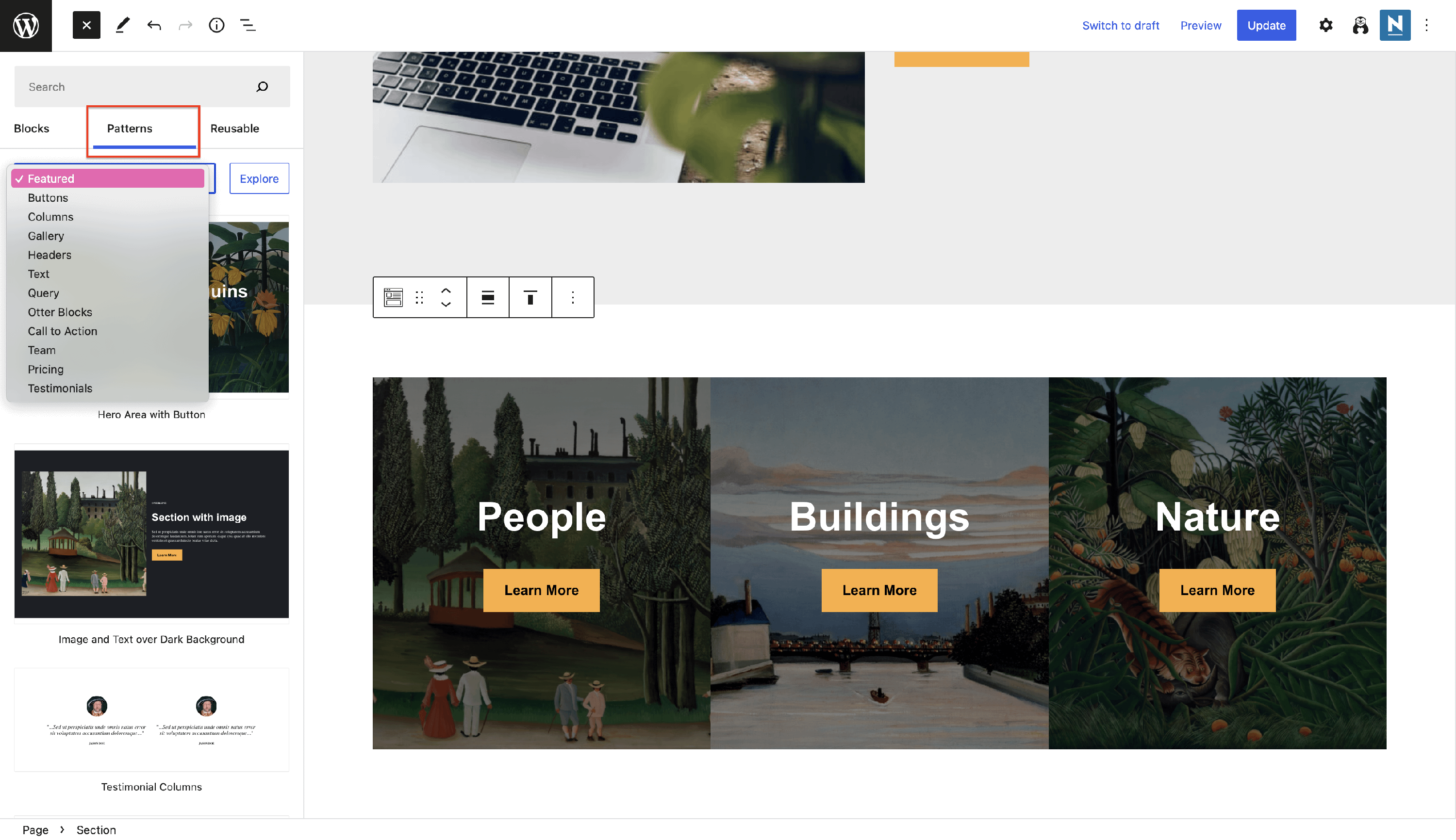 Patterns.
The Otter plugin can help with increasing your website's popularity, using the dedicated blocks:
↪️ Sharing Icons
Ensure your website's popularity by using share buttons with a suitable social sharing service. Using these, the visitor will be redirected to specific social media platforms to share content.
The specific customizations available for this block can be found in the right sidebar:
- Styles - here, you can pick predefined designs for the icons.
- Settings - adjust the items gap and icons border radius.
- Color Settings - select the most suitable colors for the background and text of the icon.
Apart from these, the social icons can be individually enabled or disabled from the tools bar. Also, in the tools bar, you can control the alignment of the icons:
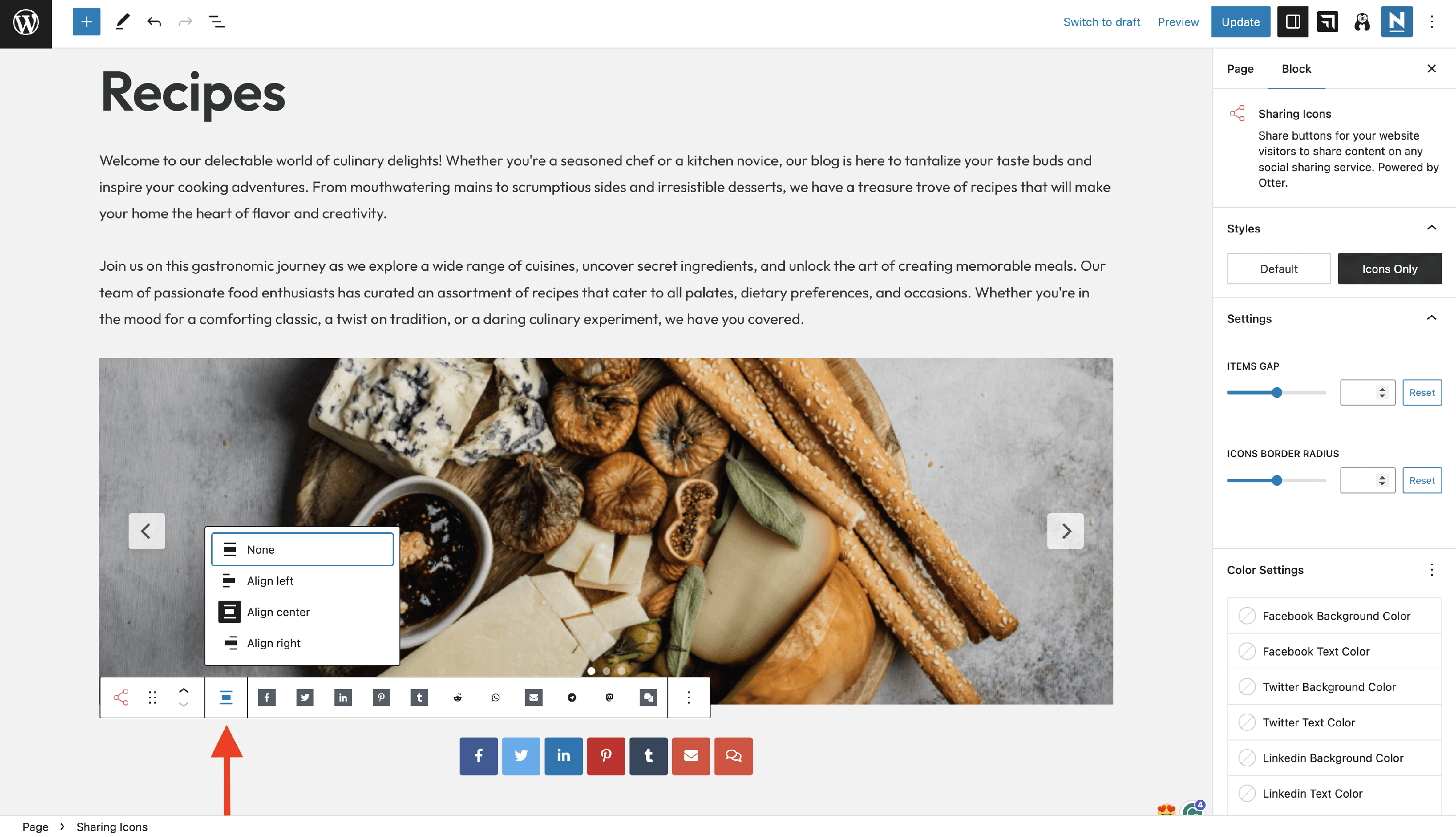
The available platforms are Facebook, Twitter, LinkedIn, Pinterest, Tumblr, Reddit, WhatsApp, Email, Telegram, Mastodon, and Comment.
📝 Note: For the Email icon, the native email application will be opened after clicking on it. If a native app is not set up, nothing will appear.
📝 Note: For the Comment icon, you have to set up a comments section on the same page first. Clicking on the Comment icon will trigger a scroll down to the comments section.
Troubleshooting: Invalid parameter(s): attributes in the editor
After an Otter Blocks update, you might see the Sharing Icons block fail in Gutenberg with Invalid parameter(s): attributes, even when the icons still display correctly on the live page. This usually means the editor is using cached block scripts or old saved block attributes that need to be re-synced.
If this happens, try these steps in order:
- Clear your browser cache.
- Clear any WordPress cache and performance/CDN cache used on your site.
- Reload the editor and check the Sharing Icons block again.
- If Gutenberg shows Attempt Block Recovery, click it.
- If recovery does not fix the block, delete the affected Sharing Icons block and insert it again.
📝 Note: If the Sharing Icons block works correctly on the frontend, this is usually an editor-side validation issue, not a frontend sharing-button issue.
Designs for the Social Icons block
- using the pill shape style and predefined colors
- using the logos only style and unique colors
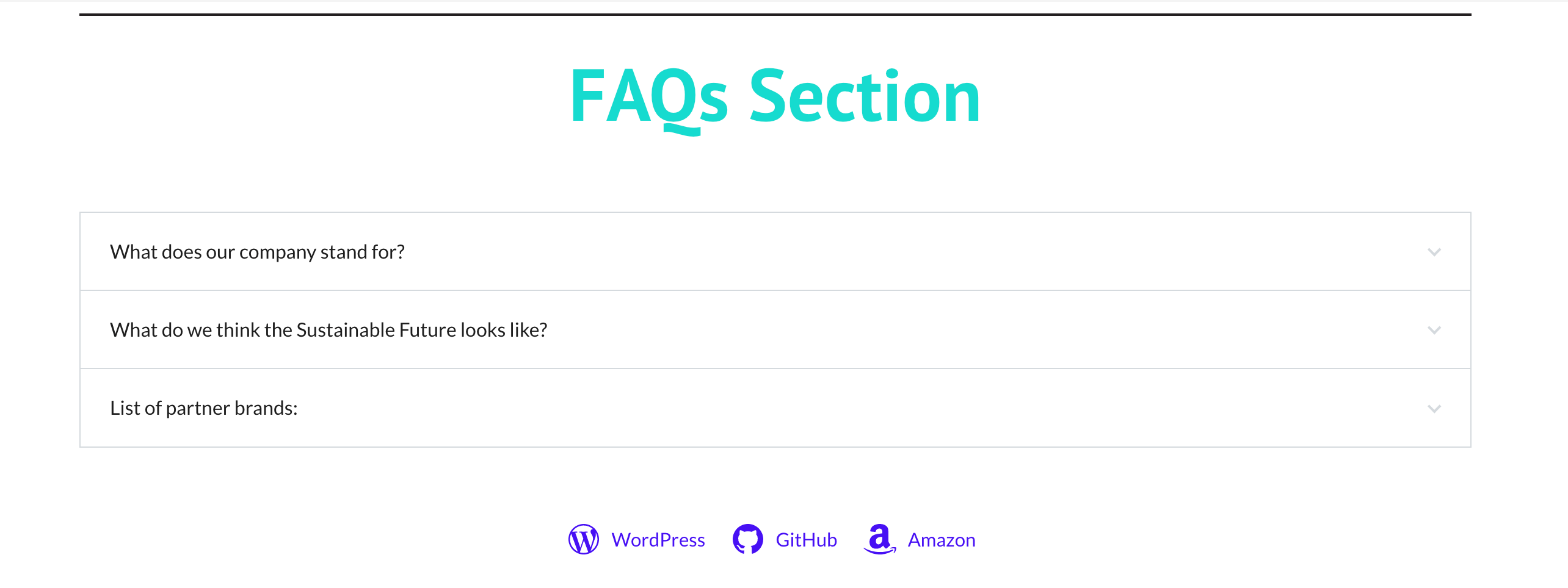
🚪 Flip Card
This block adds a different appearance to your website, allowing you to display two sections of your website inside a block.
The specific customizations available for this block cover these areas:
Settings - here you can adjust the card's width and height and switch sides.
You can customize the card's front and back, adding images and adjusting position and dimensions. Adjust the title and description font, or pick a background type.
📝 Note: To see the modifications live, click on the button below the flip card to flip to the back (1). If you encounter a problem with the long content on the back of the flip, it can be solved by setting the alignment to the 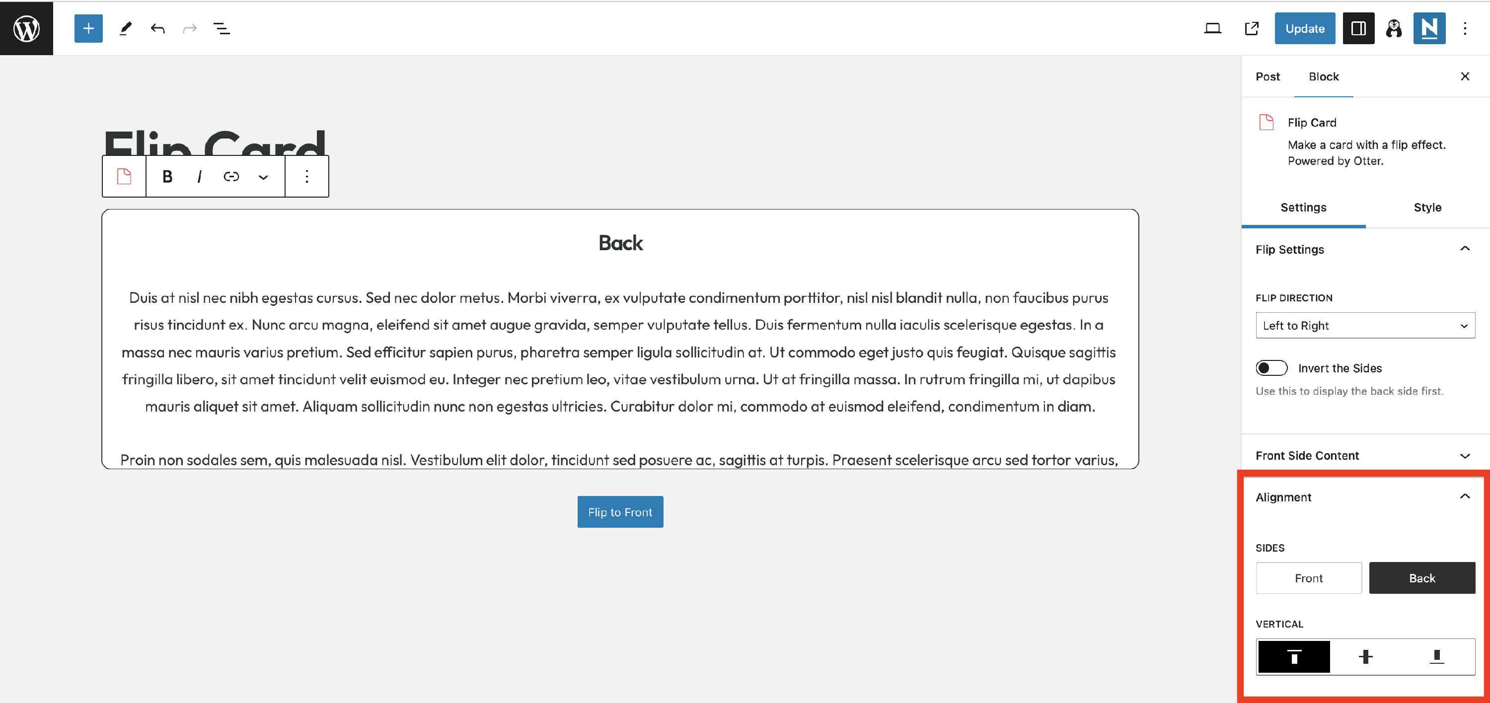 top position. On the front side, the content should respect the height constraints, as the area might
 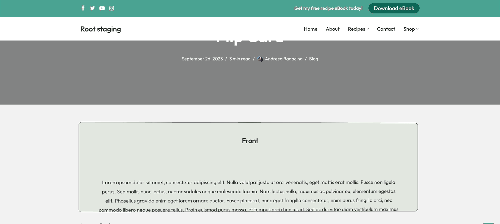 not work as expected on scroll since is the side that flips. So even if you set the alignment to the top, because the front side flips, the user will not be able to scroll and see the content.
Style - pick how the card should flip and adjust its padding and borders.
Color - add colors for the Border / Title / Description.
Box Shadow - add a shadow effect to the flip card by enabling the Shadow Properties and customizing it.
Use Cases of the Flip Card block
- create a sneak peek of your products on the Homepage
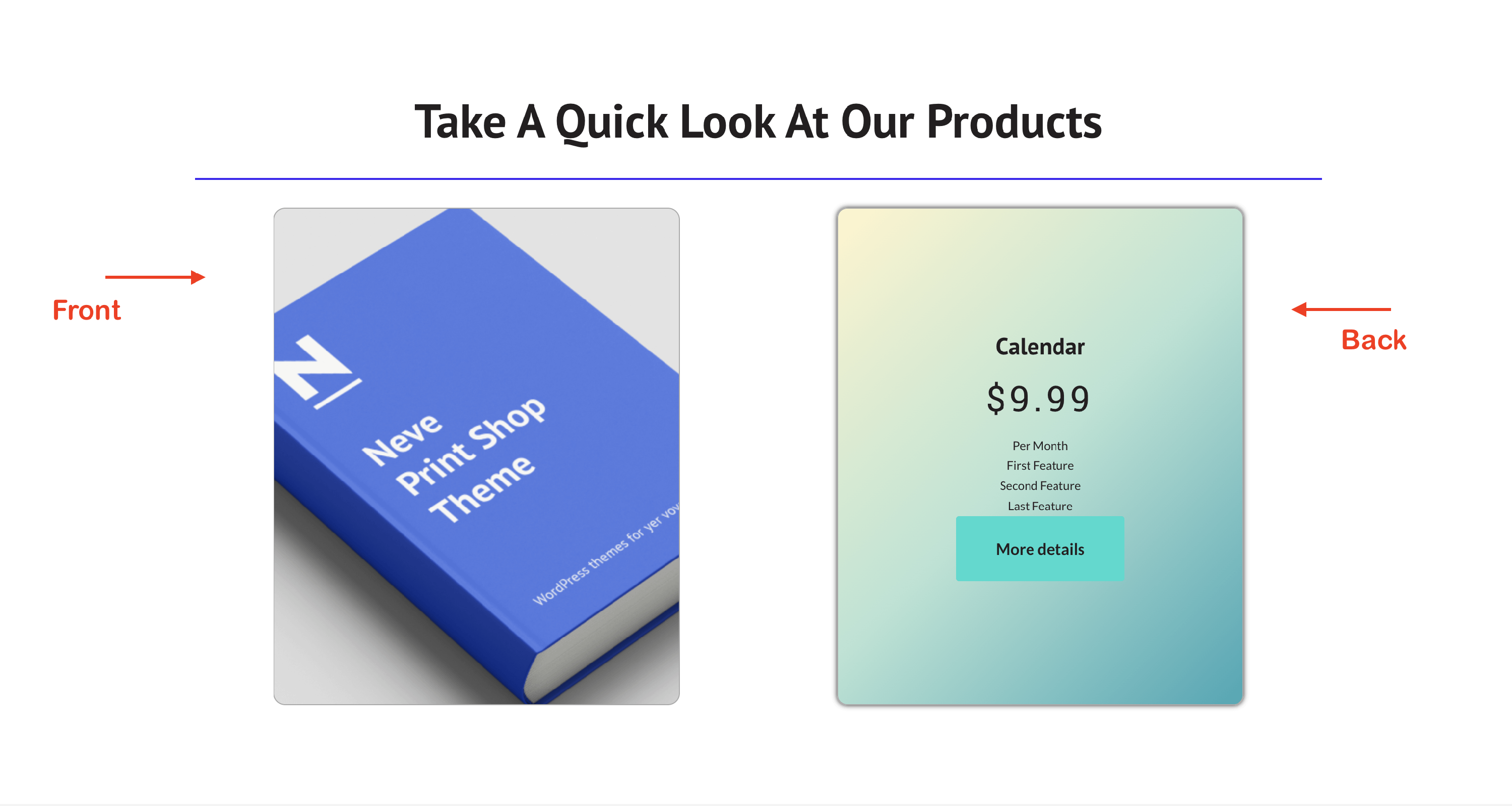
- present the administrators in a superior way
💌 Popup
📝 Note: Unlock more features using the PRO version of the plugin.
The popup is a notice that appears suddenly on the screen over another window or display.
Settings - from this area, you can configure the popup trigger, and depending on the chosen one, other settings become available ( such as wait time for the on-load trigger ). Moreover, behavior options can be enabled here, like showing a close button, closing on click, etc.
Style - this menu is responsible for the appearance of the popup, and you can set here width, background, overlay, and the appearance of the close button.
Use cases of the Popup block
- make a popular discount offer for your visitors using the popup block
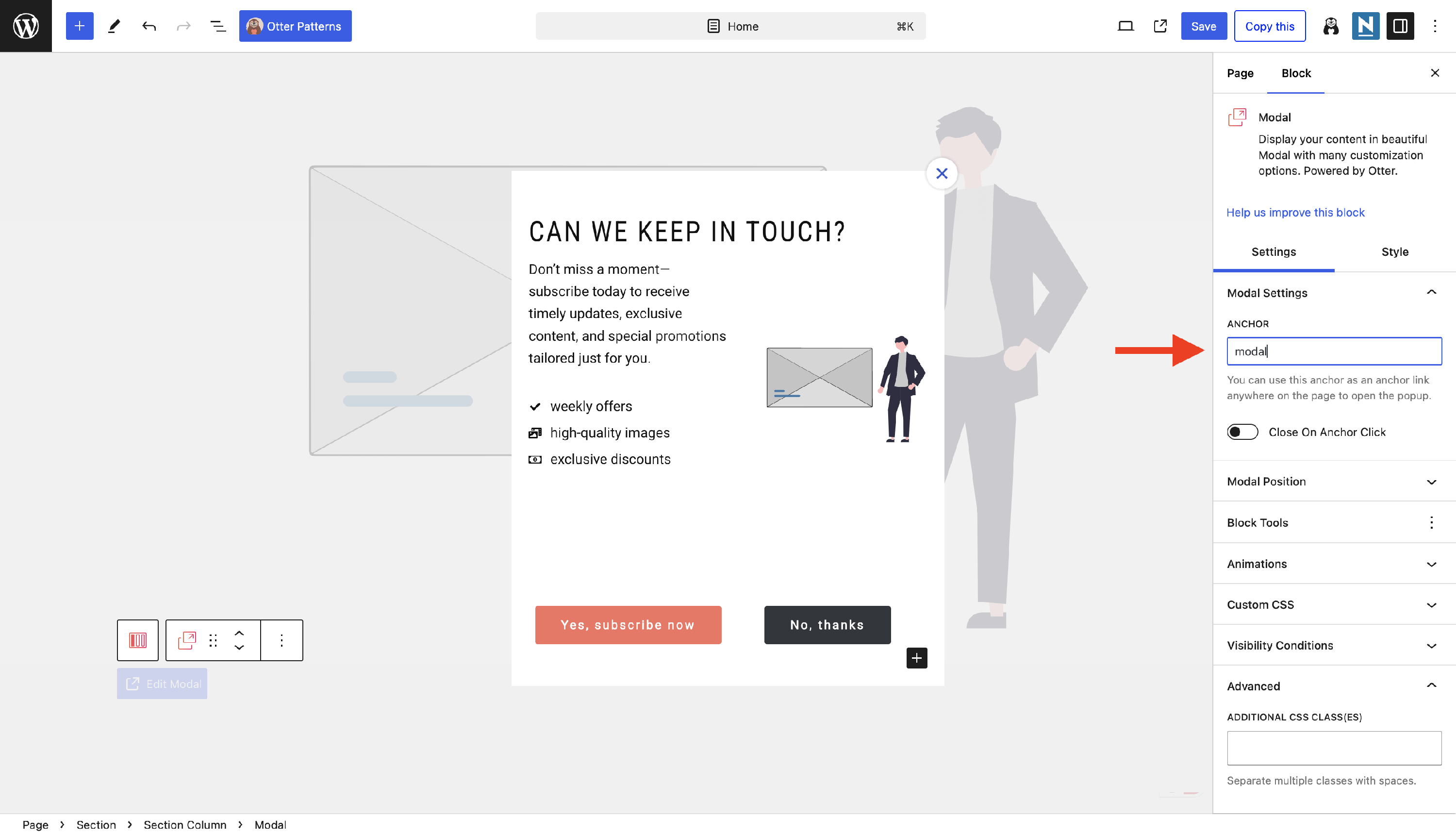
📰 Modal
📝 Note: This block is available only in the PRO version of the plugin.
A modal block is an interactive element that overlays the page, covering the content underneath until it is closed by the user. Using Otter's modal block, your users will be able to dynamically access information by clicking on a specific anchor button. A powerful feature is that you can use both Otter Blocks and core blocks to create the expected design.
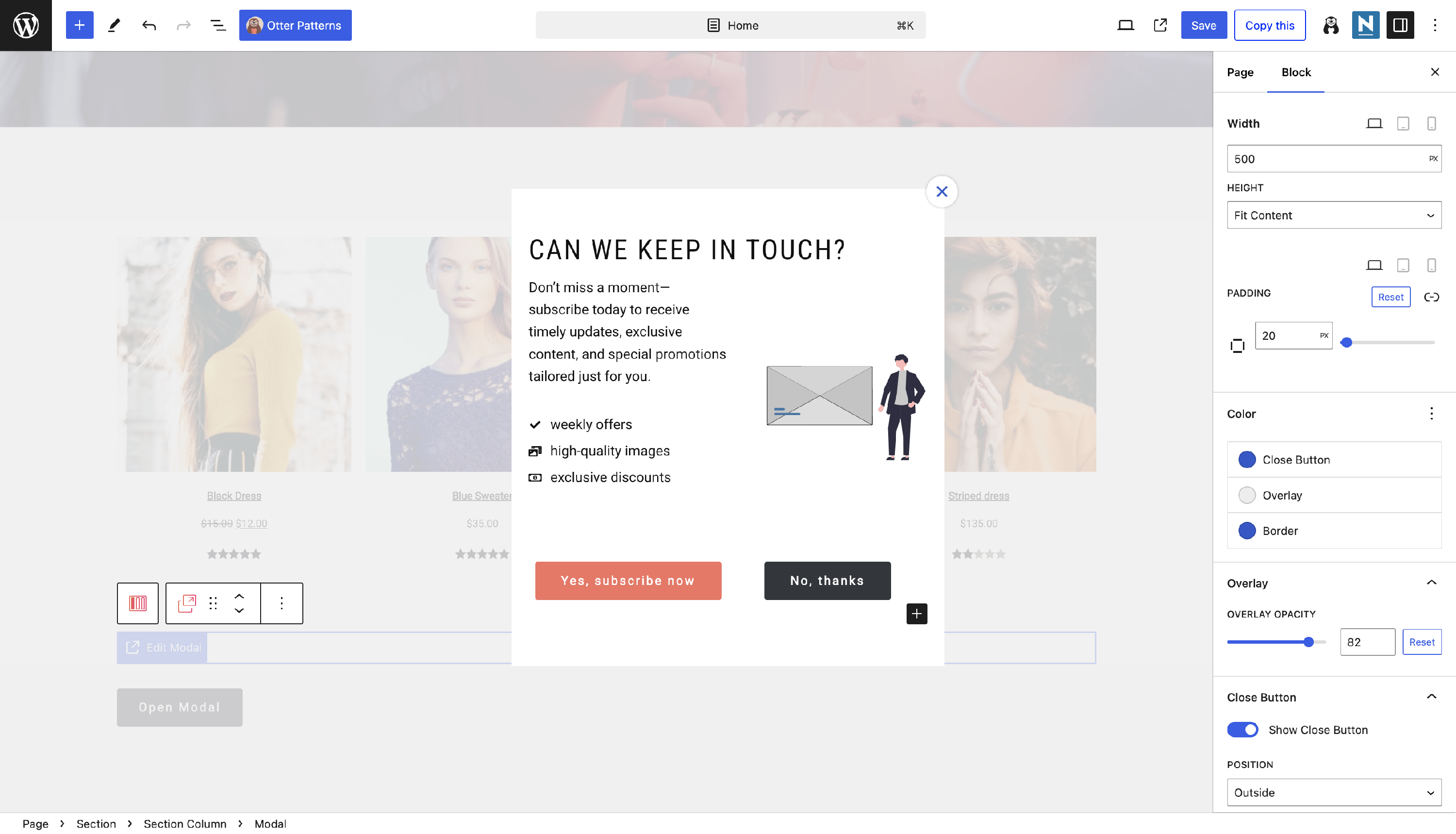
The key features include the closing behavior of the modal, modal position, dimensions, colors, overlay opacity, close button settings, and border. You can also customize the Open Modal button or even replace it with a different anchor block, as long as you correctly set the anchor.
For example, I used an Otter Pattern and linked the modal anchor to the button:
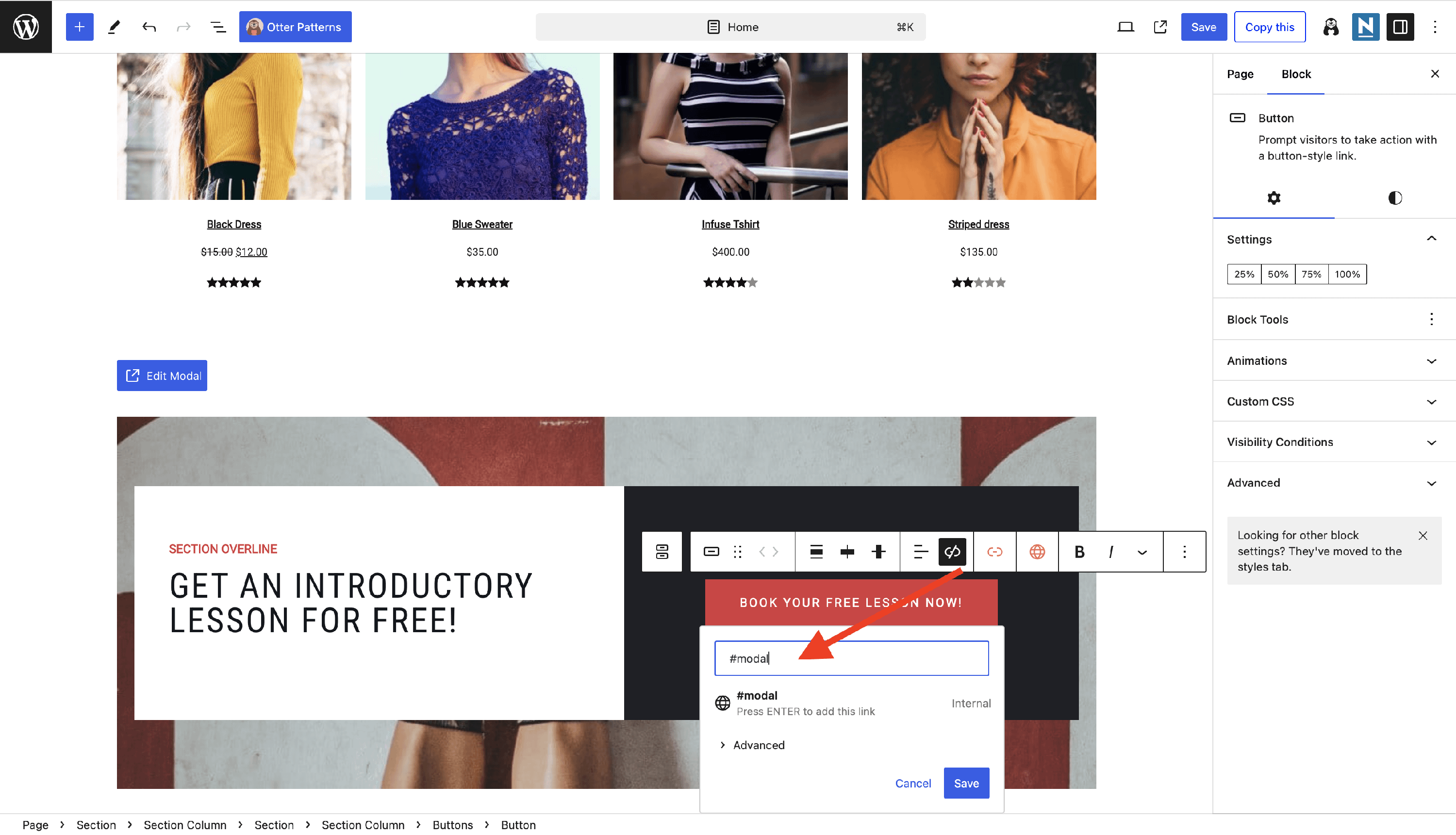
Then, in the Modal Settings > Anchor, I pasted the anchor's name: