Layout - Related Blocks
📝 Note: These blocks are part of the Otter Blocks plugin, which you can get from here.
📝 Note: The blocks' appearance can be improved using the Otter features, such as Transform to Sticky, Visibility conditions, Dynamic Values or Images, as well as Counting / Typing / Loading animations, and 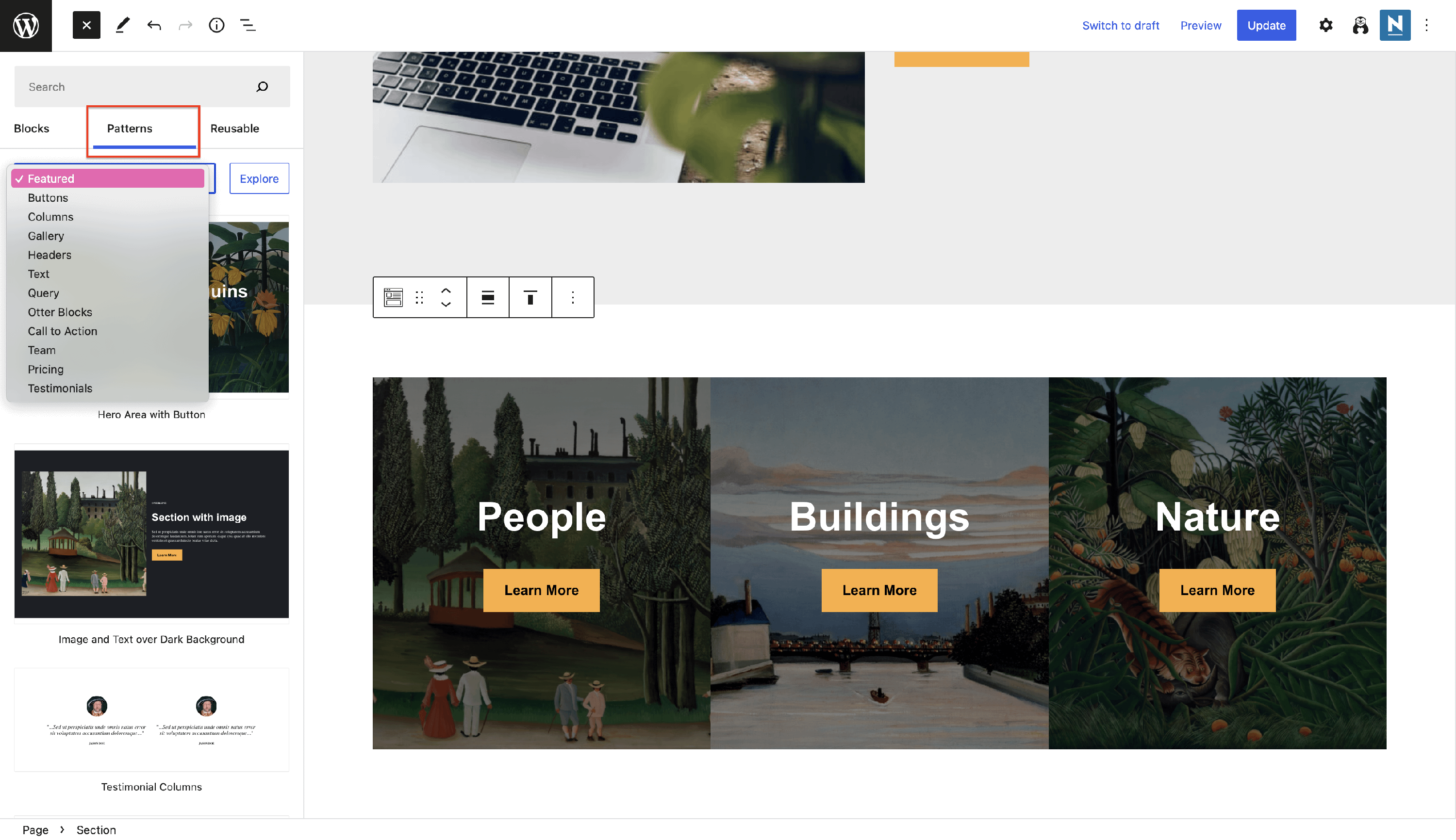 Patterns.
Make an accessible and easy to navigate website using Otter's accessibility blocks:
🔽 Accordion
The accordion helps save space on the website, collapsing the content.
- Settings of an individual item - contains a toggle that allows you to have the item initially open.
- Settings of the parent accordion - enable the expand icon on the left side, toggle for keeping multiple items expanded, to give the visitors access to all the questions, and enable the FAQ schema.
📝 Note: The FAQ schema is a key factor in the website's SEO, which will enhance search results, increase visibility, and improve user experience.
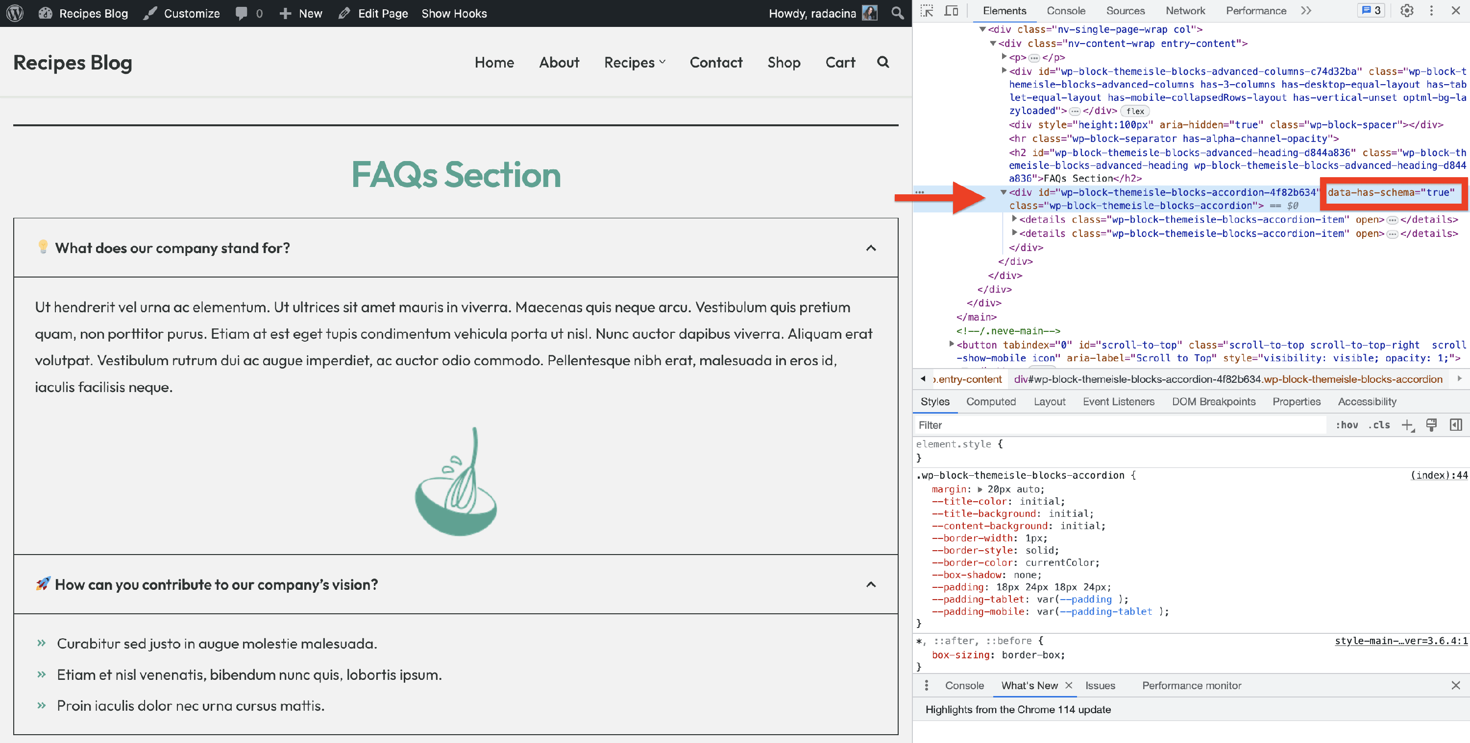
When the FAQ schema is enabled, you will be able to see that data-has-schema is set to true:
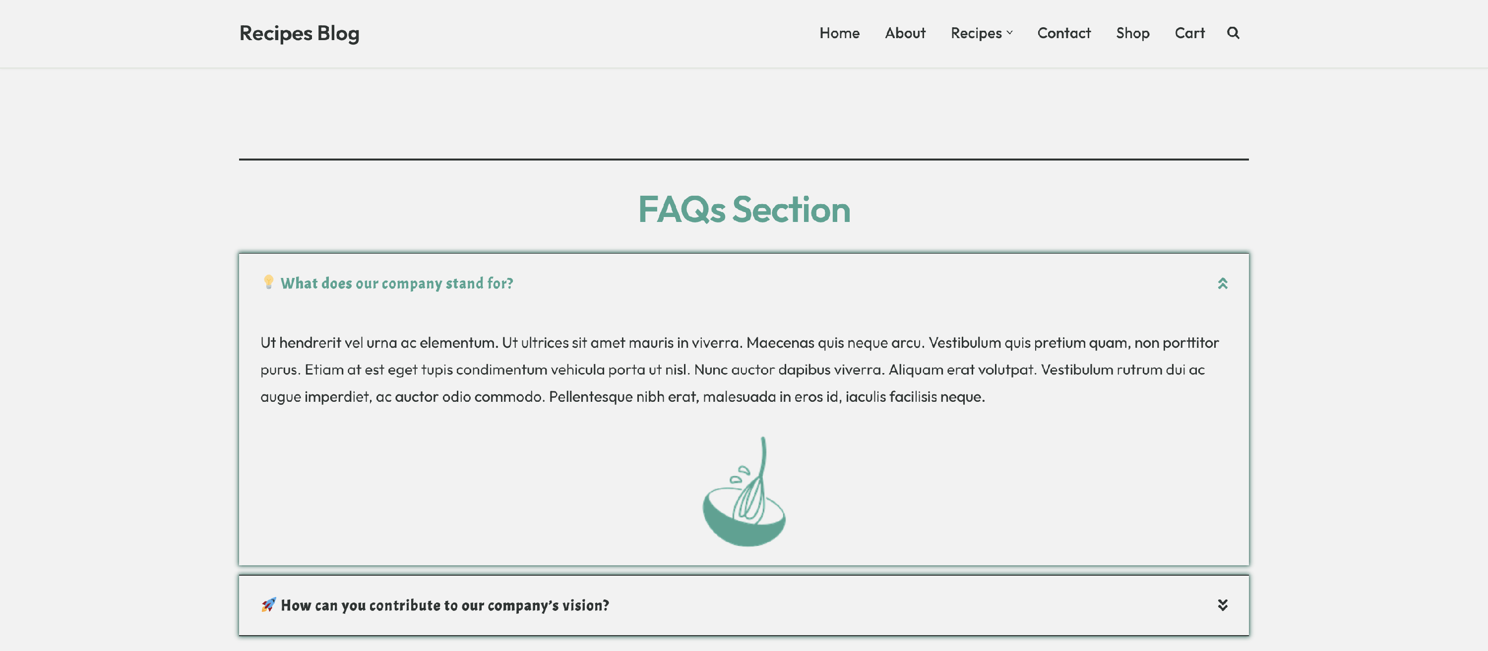
- Style options - when selecting the parent accordion, you will be able to access the style settings too. From this panel, you can configure typography options, colors, dimensions according to the device, set new icons for closed and open items, and adjust the border.
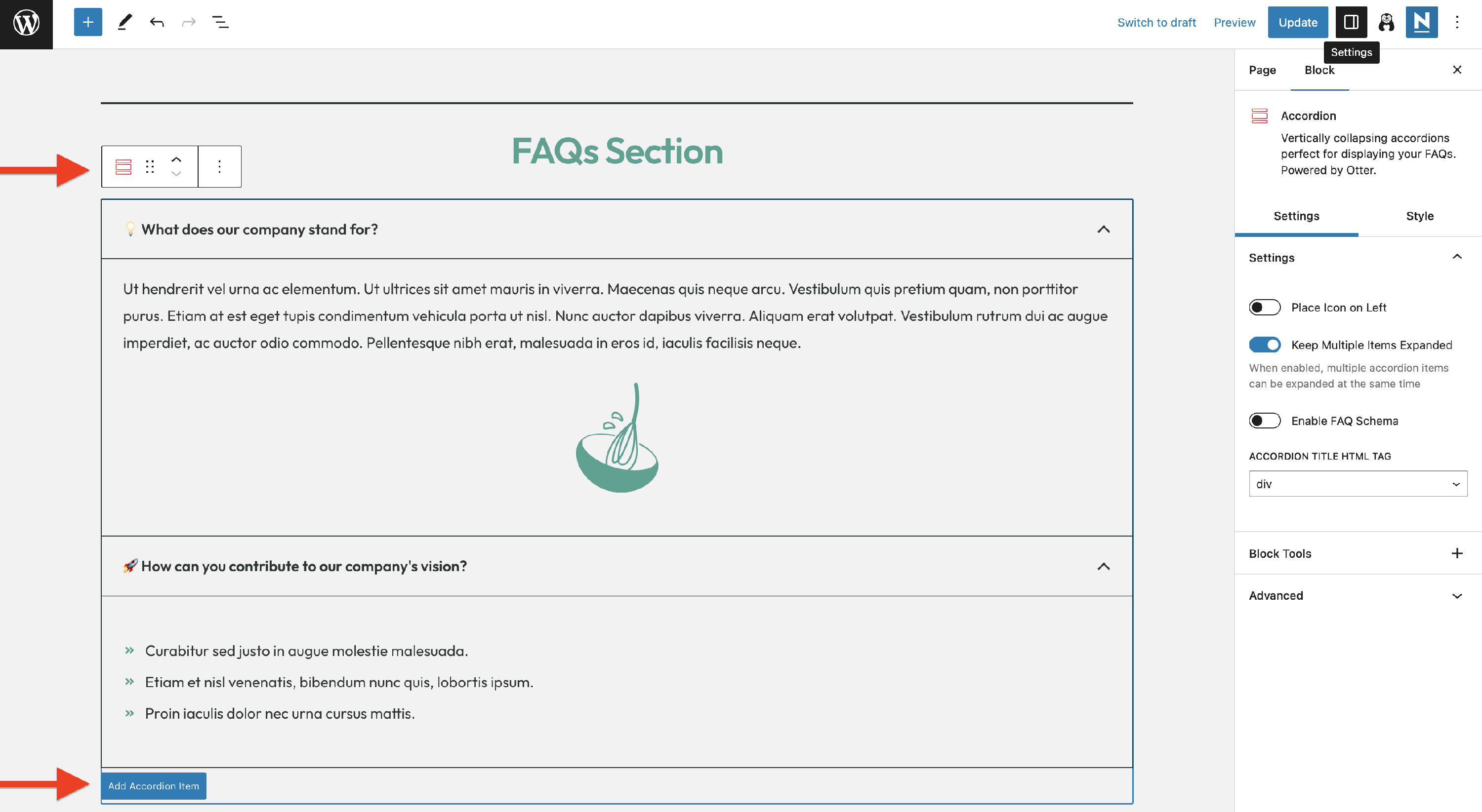
To add multiple items, select the parent accordion block, then click on the Add Accordion Item button. Also, the accordion can contain any block (e.g. paragraph, image, icon list) so that it can be shaped according to your needs.
Use cases for the Accordion block
- create an attractive FAQs section
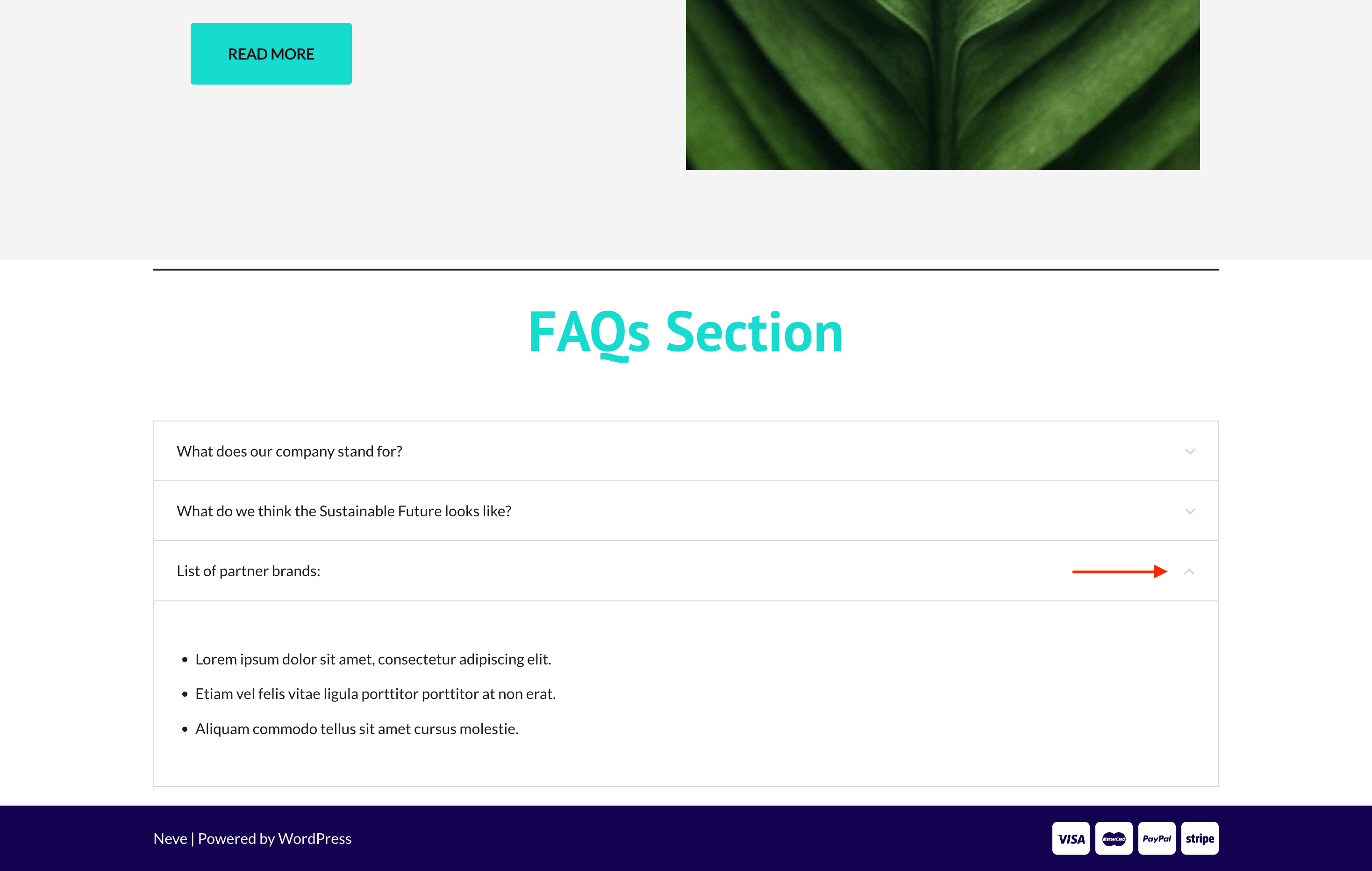
🧰 Section
The section block is a very important feature of this plugin because it allows the creation of more pleasing content by combining different blocks in multiple columns and applying this block's specific settings to make a more interesting aspect.
Use cases for the Section block
- building a stunning partners section
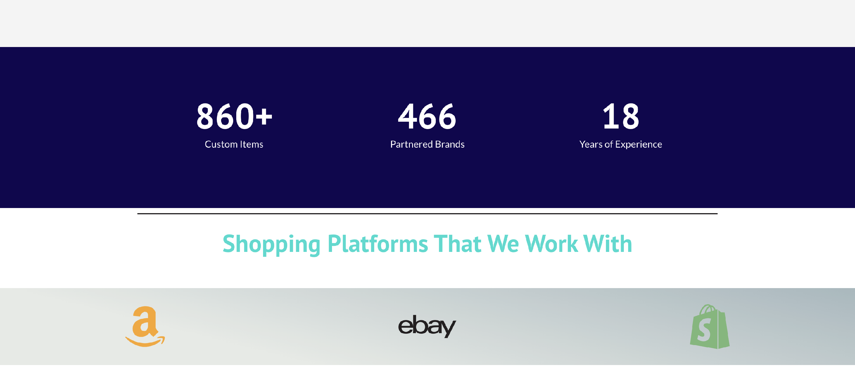
📝 Note: Learn more about the Section block from this doc.
▶️ Tabs
Using tabs optimizes navigation within a page by compressing information and displaying certain parts of the subject, allowing the possibility of switching to another one.
The specific customizations available for this block cover three areas:
Tabs Management - from this area, you can insert, edit, or delete tabs, rearrange them, and pick the initially displayed tab.
Settings - here, you can adjust the border width of the selected tab.
Color - change the colors of the background, border, or active title.
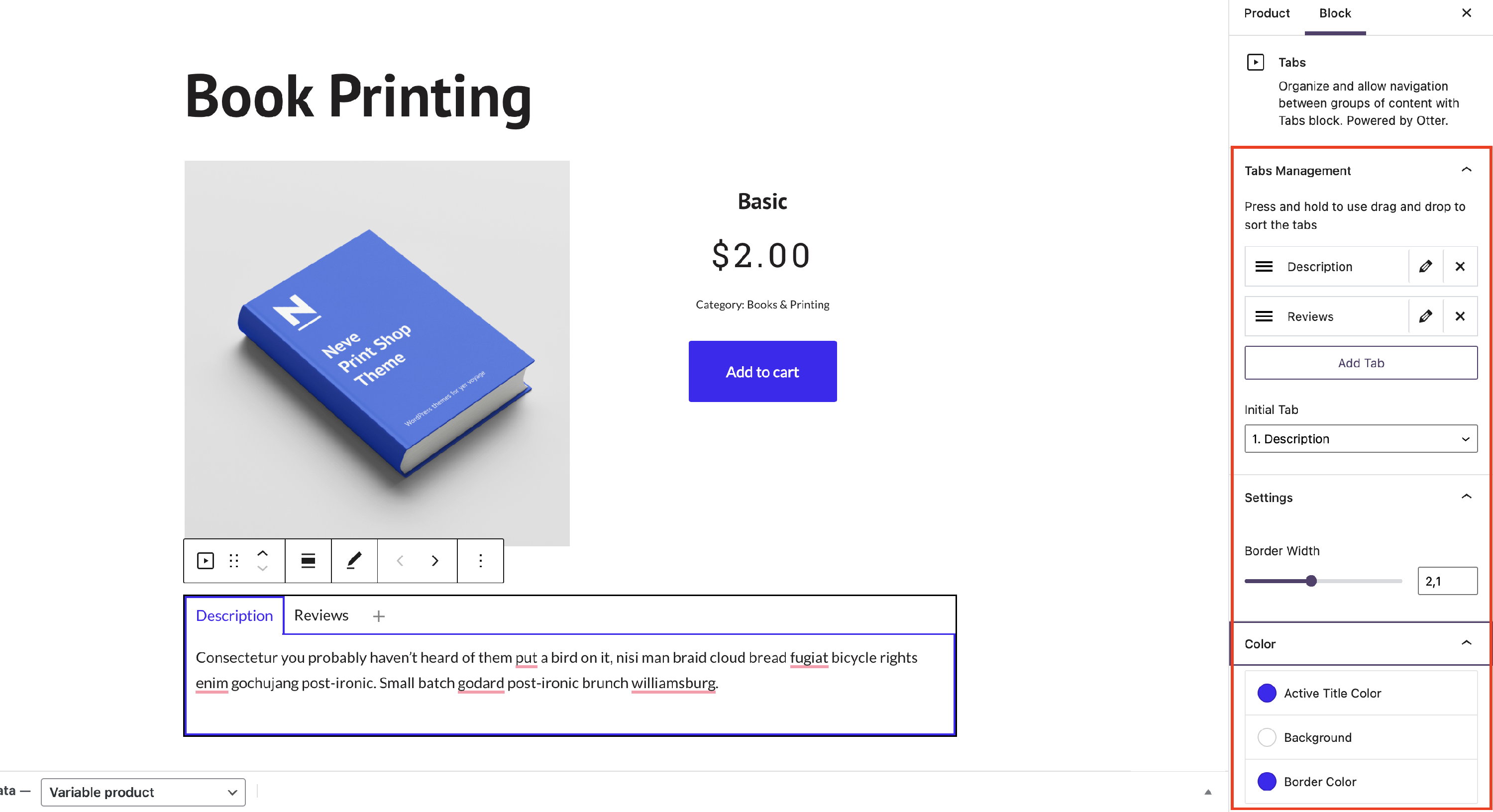
📝 Note: On mobile, the Tabs blocks will look like an accordion block to reduce the space and create a friendly website.
Use cases for the Tabs block
- building a product page using the WooCommerce Builder feature
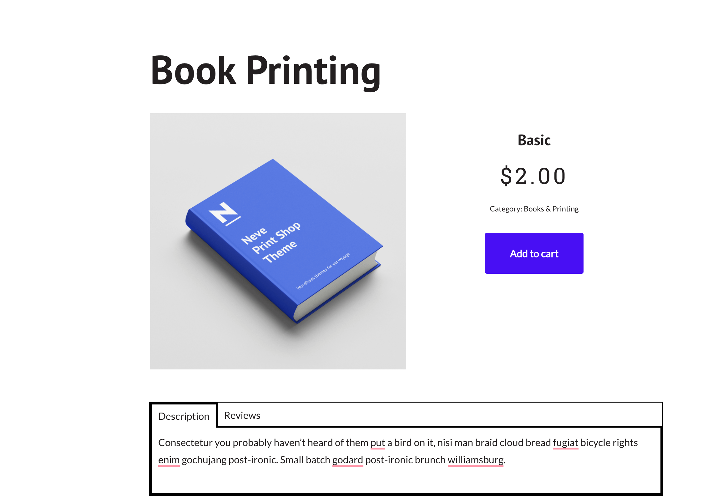
📝 Note: Unlock more features using the PRO version of the plugin.
