The HTML Component - Neve Header
For more details check out the full Neve documentation and Neve PRO documentation.
📝Note: This component is part of both Neve and Neve PRO.
🧰Using the Component
1. Start by adding the component into the rows, by clicking on the ➕ button and selecting the component.

2. Open the component's settings to customize it, by clicking on the ⚙️icon.
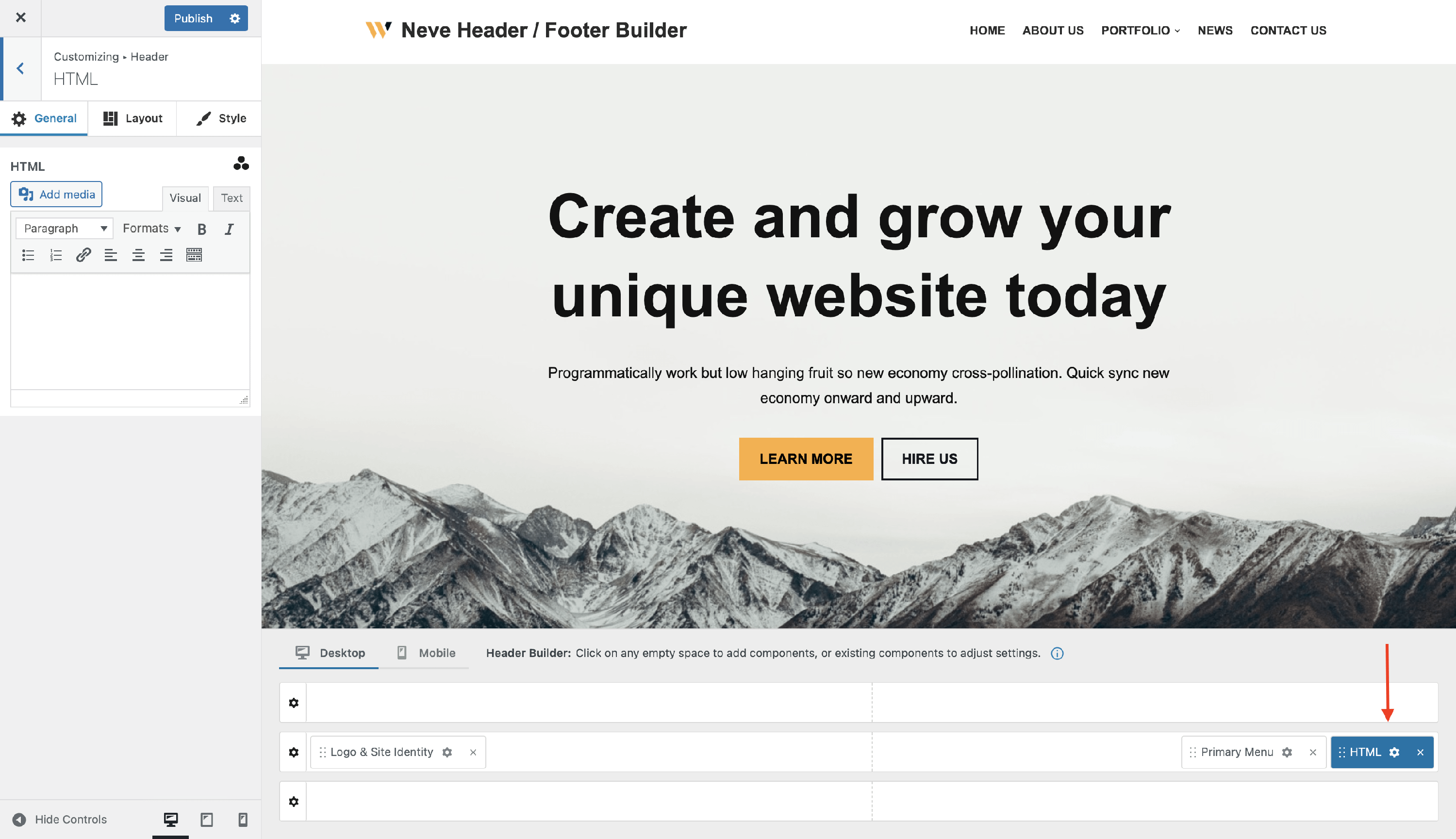
📝 Note: When using Neve PRO, this component has three available instances: HTML, HTML 1, and HTML 2.
🔮Customizing the Component
There are three panels with customizing options for this component, which allow you to create the desired header:
⚙️General Panel
When you click on the ⚙️ icon, the General tab will appear on the left side. The component allows you to add custom HTML to the Header.

Dynamic Tags are another way of adding content to the HTML component. Dynamic Tags draw content from the website, or from the current page/post, changing dynamically according to the Page or Post it’s on. To get access to the Dynamic Tags click on the three dots shaped like a triangle.
⚠️ Important: Inline JavaScript event attributes such as onclick, onload, and onmouseover are automatically removed by WordPress's built-in security filter (wp_kses). This is expected behavior and is not a Neve bug. See the JavaScript Limitations and Workarounds section below for how to add click events to HTML component elements.
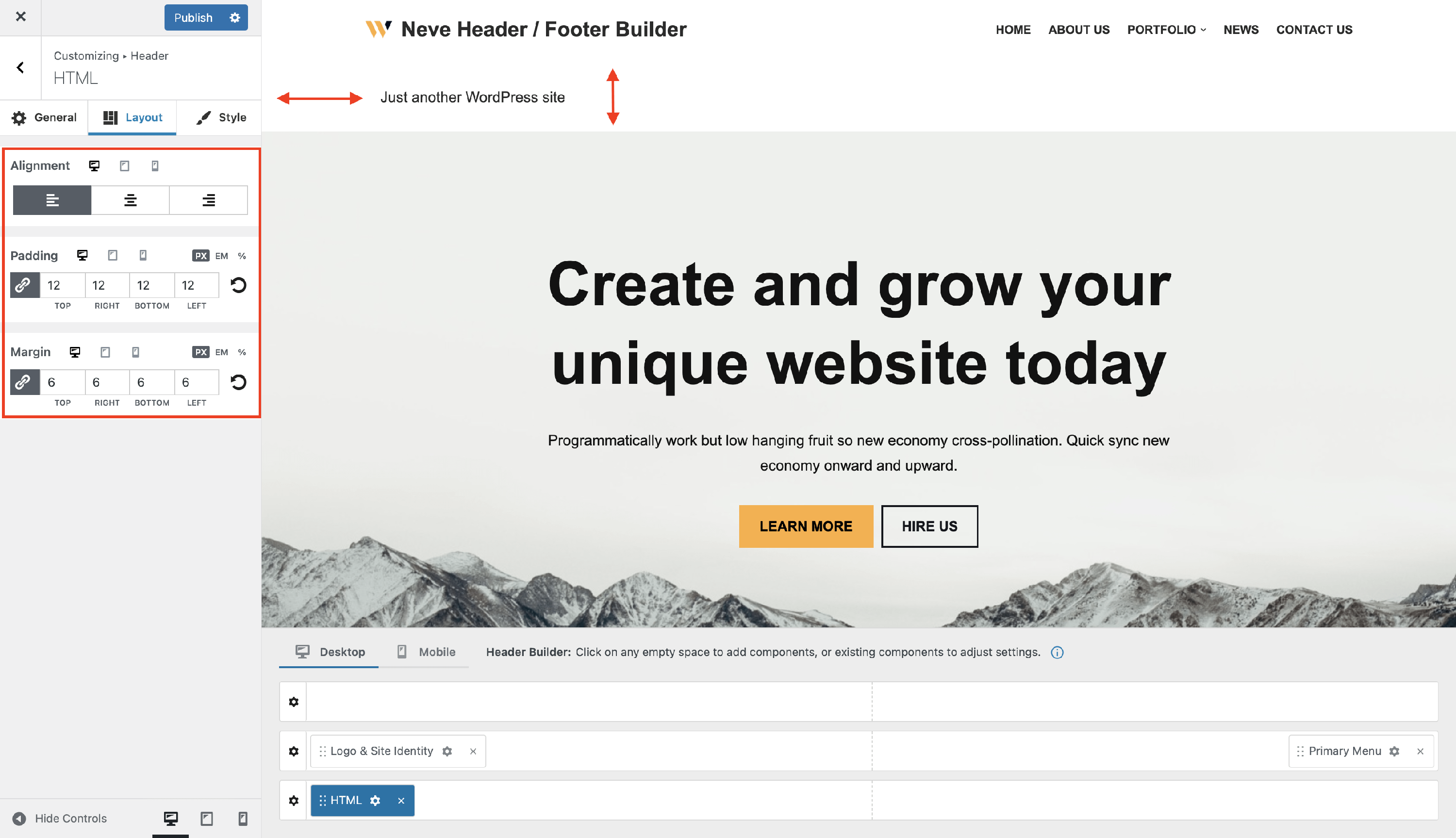
📐Layout Panel
In the Layout tab, you also have access to advanced positioning options like:
- Alignment - left / center / right, inside the header builder available space for the Menu Icon component.
- Padding and Margin - available in PX, EM, REM, and %, with a link button that helps establish the same dimension for all the directions ( Desktop | Tablet | Mobile ).
🖌 Style Panel
In this area, you will find options for customization for the HTML area.
setting colors for Text - with the option to choose one of the global colors ( theme's default colors ), by clicking on the 🌐 button. The typography subpanel found in the Style tab offers the following options:
Transform - None / Capitalise / Lowercase / Uppercase
Weight - None / 100 to 900
Font Size, Line Height (in PX / EM), Letter Spacing ( in PX) - along with a reset button ( Desktop | Tablet | Mobile ).

📝 Note: The Text Color option does not apply to links in the HTML component. To change the color of the links go to Appearance > Customize > Colors & Backgrounds > Links.
🛠️ JavaScript Limitations and Workarounds
WordPress uses a built-in security function called wp_kses to sanitize HTML output. This filter automatically strips inline JavaScript event attributes — such as onclick, onload, onmouseover, and similar — from any HTML entered in the header builder. This is a core WordPress security measure and is not a Neve bug.
For example, adding the following HTML to the component:
<a href="#" onclick="window.Vinoshipper.cartOpen()">Open Cart</a>will result in the onclick attribute being silently removed before the HTML is rendered on the page.
Adding Custom Click Events Without Inline Attributes
Instead of using inline event attributes, assign a class or ID to your HTML element and attach the JavaScript using a separate script.
Step 1 — Add a class or ID to your element
In the HTML component, enter your element without any event attributes:
<a href="#" id="cart-link">Open Cart</a>Step 2 — Add the JavaScript via a custom script
You need to load your JavaScript after the page renders. You can do this using one of the following methods:
- Orbit Fox — Header Footer Scripts: If you have the Orbit Fox plugin installed, go to Orbit Fox > Modules and enable the Scripts in Header & Footer module. Paste your script in the Footer Scripts section.
- Neve Pro — Custom Layouts: If you are using Neve PRO, go to Neve Options > Custom Layouts, create a new layout of type Hook, and set the hook to
wp_footer. Add your script there.
Step 3 — Attach the event listener in your script
In the script location you chose, add code similar to this:
document.addEventListener('DOMContentLoaded', function () {
    var cartLink = document.getElementById('cart-link');
    if (cartLink) {
        cartLink.addEventListener('click', function (e) {
            e.preventDefault();
            window.Vinoshipper.cartOpen();
        });
    }
});
This approach is compatible with all browsers and avoids the WordPress sanitization restriction.
🗂Useful Resources
Want to add social icons in the header? Check out how you can do it using the HTML component.