How to stop navigation area overlapping with header image in Hestia PRO
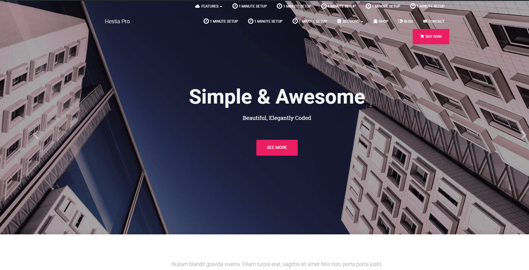
If you are using Hestia PRO, and want to use a larger logo or a longer navigation menu, you may feel that the entire navigation area is overlapping too much with the main header image, covering much of it like in the example below.
Although we strongly recommend that you use a reasonable number of items in the main navigation area, as this is influencing the entire look of the site, we'll give you a simple fix that we'll move the navigation area above the header, so the two areas don't overlap.
Hestia Pro: Turn the option off "Transparent Navbar" at Dashboard > Appearance > Customize > Header Options > Navigation - http://prntscr.com/l6b5pq.
Hestia Lite: You need to navigate to your Dashboard > Appearance > Customize > Additional CSS and add the following code and hit Save.
nav {
     position:relative !important;
     margin-bottom: 0px !important;
}
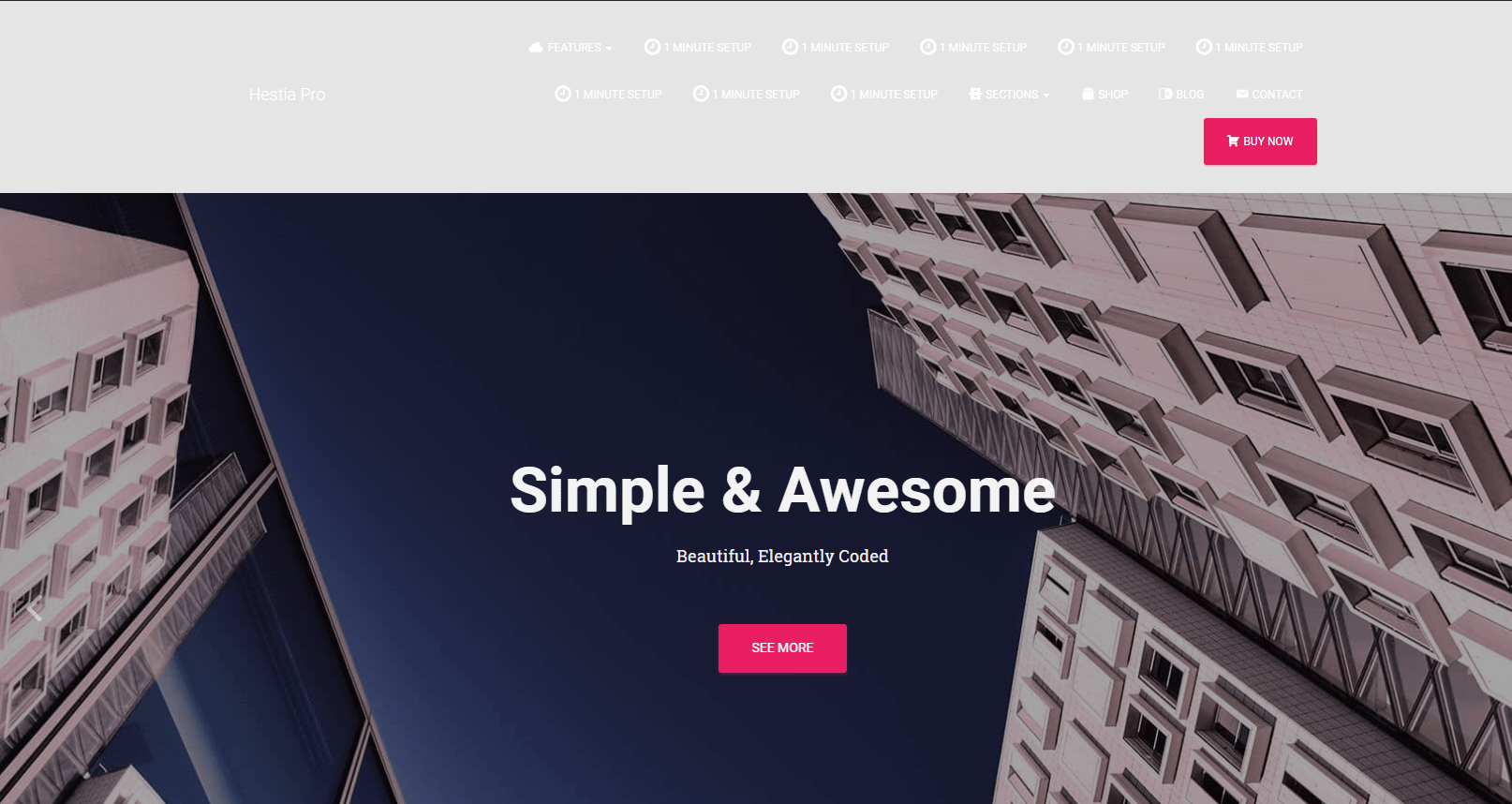
The result will be something like in the below image.
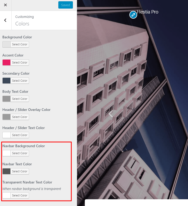
You will also need to change the colors of the main navigation area so that the content be visible.
For that, you need to go to your Dashboard > Appearance > Customize > Colors and change the colors to something that fits your site.
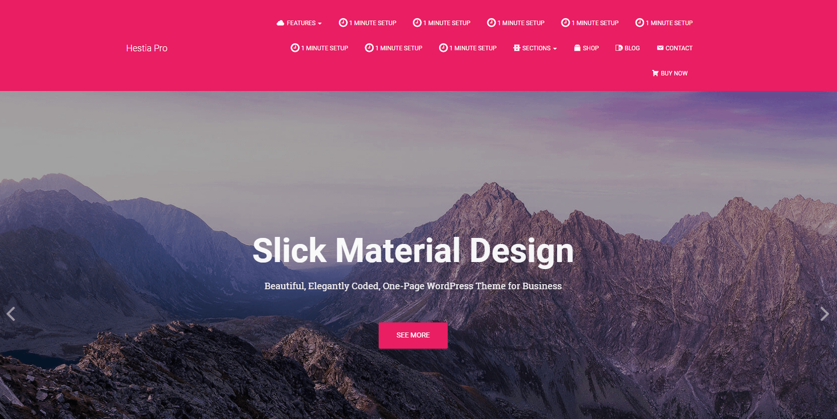
The final result will look similar to this. As you see, the entire header image is visible.
Haven't decided between Hestia and its premium version, Hestia Pro?
Here is a comparison table between their features.


