Instagram Widget - Elementor Booster
📝 Note: The Instagram Widget is part of Neve PRO's Elementor Booster module.
This one is one of the most exciting features of the Elementor Booster module. It ensures the engagement of the public by allowing the user to navigate between the website and the Instagram page, with minimal effort.
📝 Note: Your own Instagram API key is needed in order to use this widget. Below is a dedicated video on how to generate it.
In this article
Adding the Widget
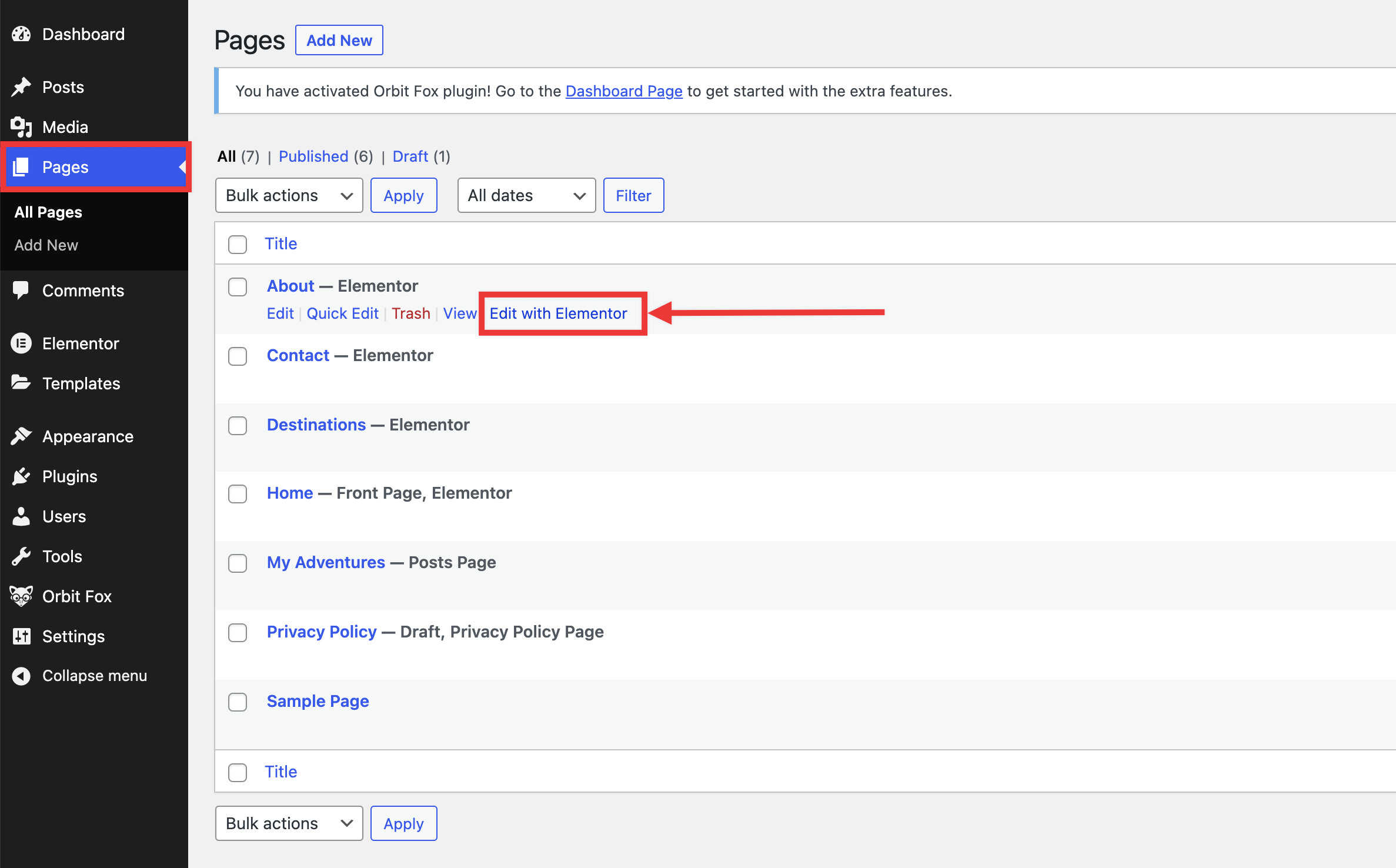
1. Navigate to Dashboard > Pages, select a page, and click on Edit with Elementor.
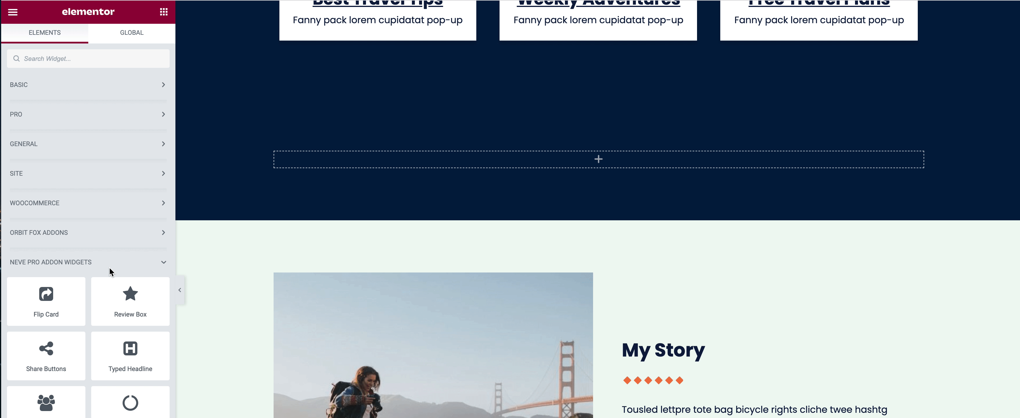
2. Once the Elementor editor has opened, insert a widget by clicking on the ➕ button.
3. Click on the left side Search area and scroll down until the Neve PRO Addon widgets.
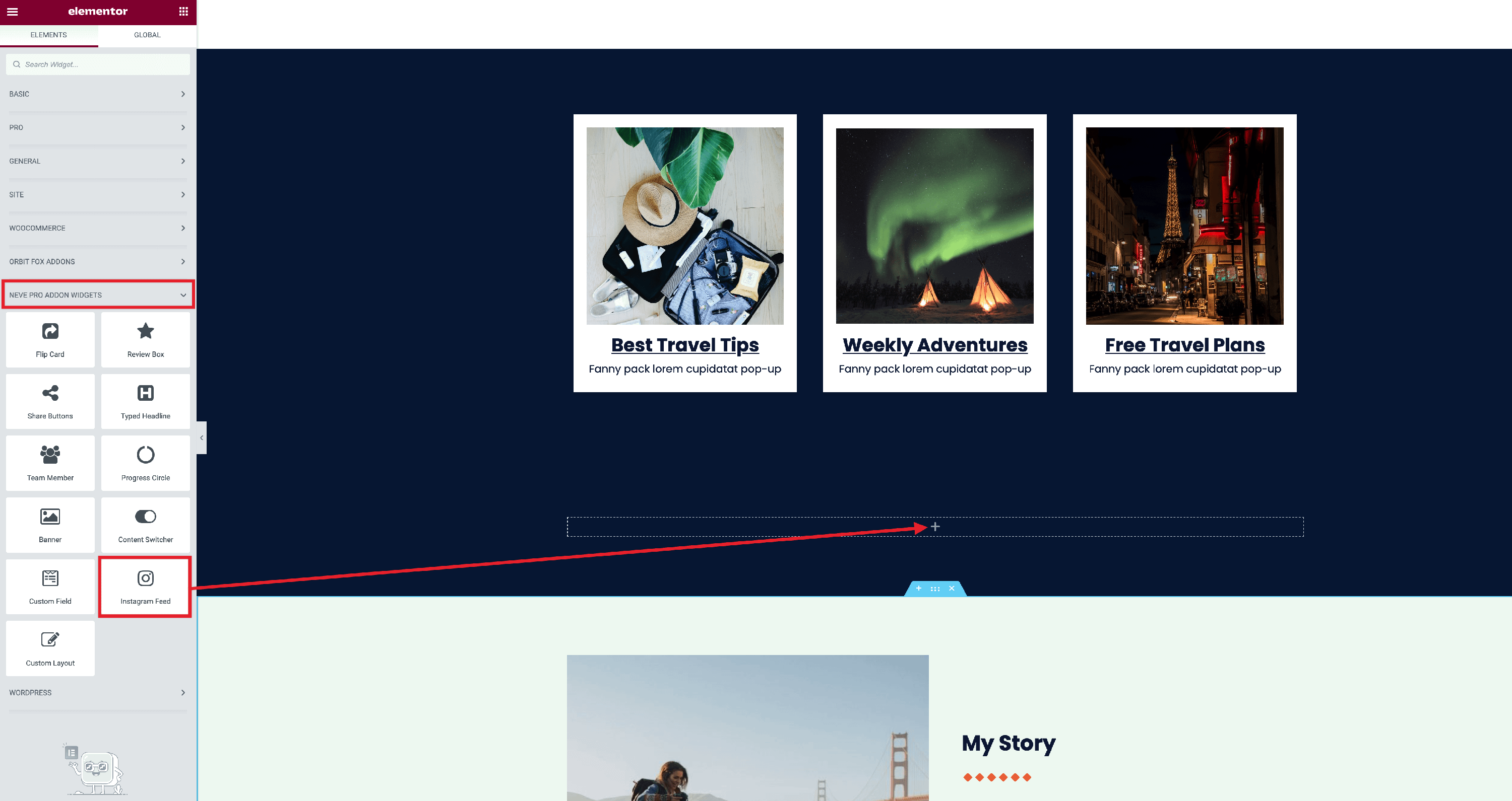
4. With a drag and drop movement, add the Instagram Feed into the widget section.
Customizing the Widget
This panel is divided into four areas with the following available settings:
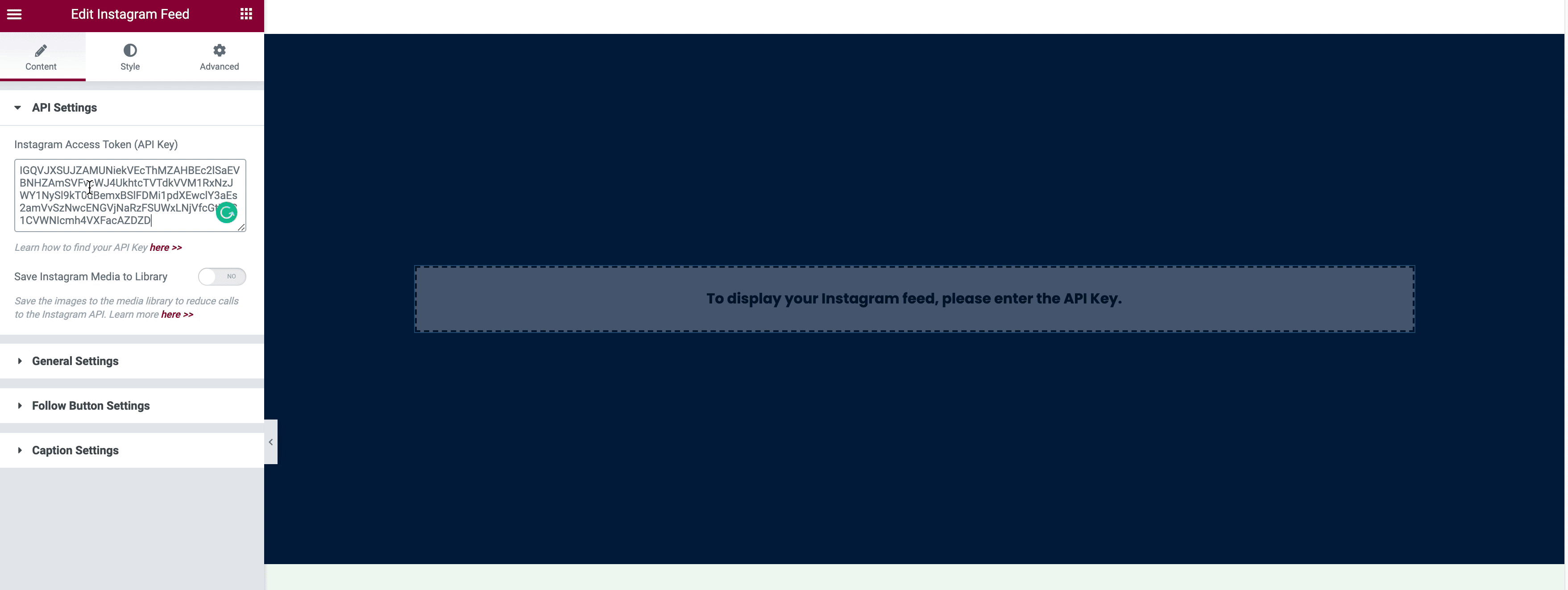
API Settings
- Instagram Access Token ( API Key ) - insert the API Key of your own into the field. If you don't know how to use it, check this video.
- Save Instagram Media to Library - save the images to the media library to reduce calls to the Instagram API.
- If you enable this option, you will have to establish the period to refresh images.
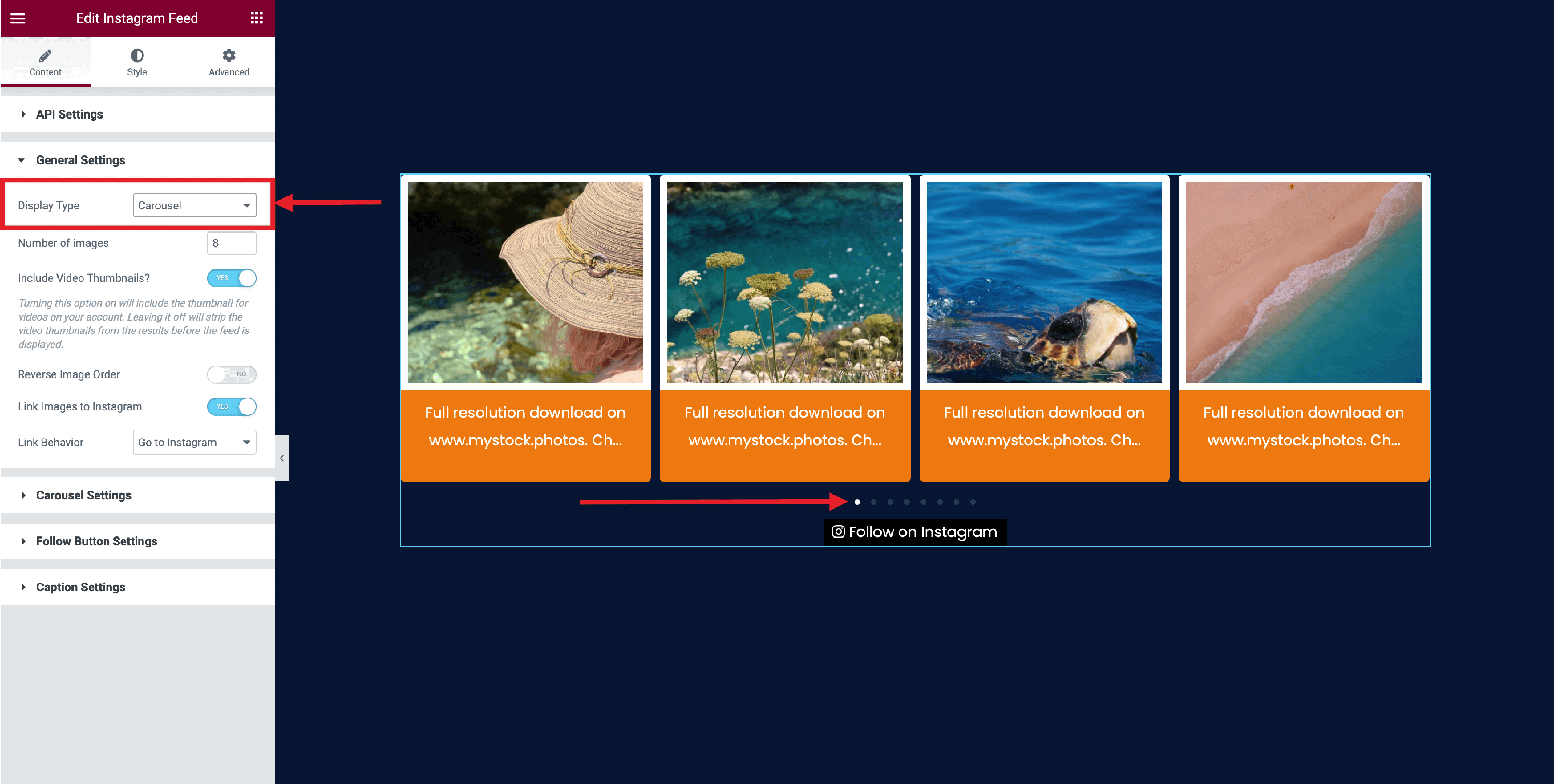
General Settings
One of the most outstanding options of the Instagram Feed widget is the possibility to choose from two types of display.
A
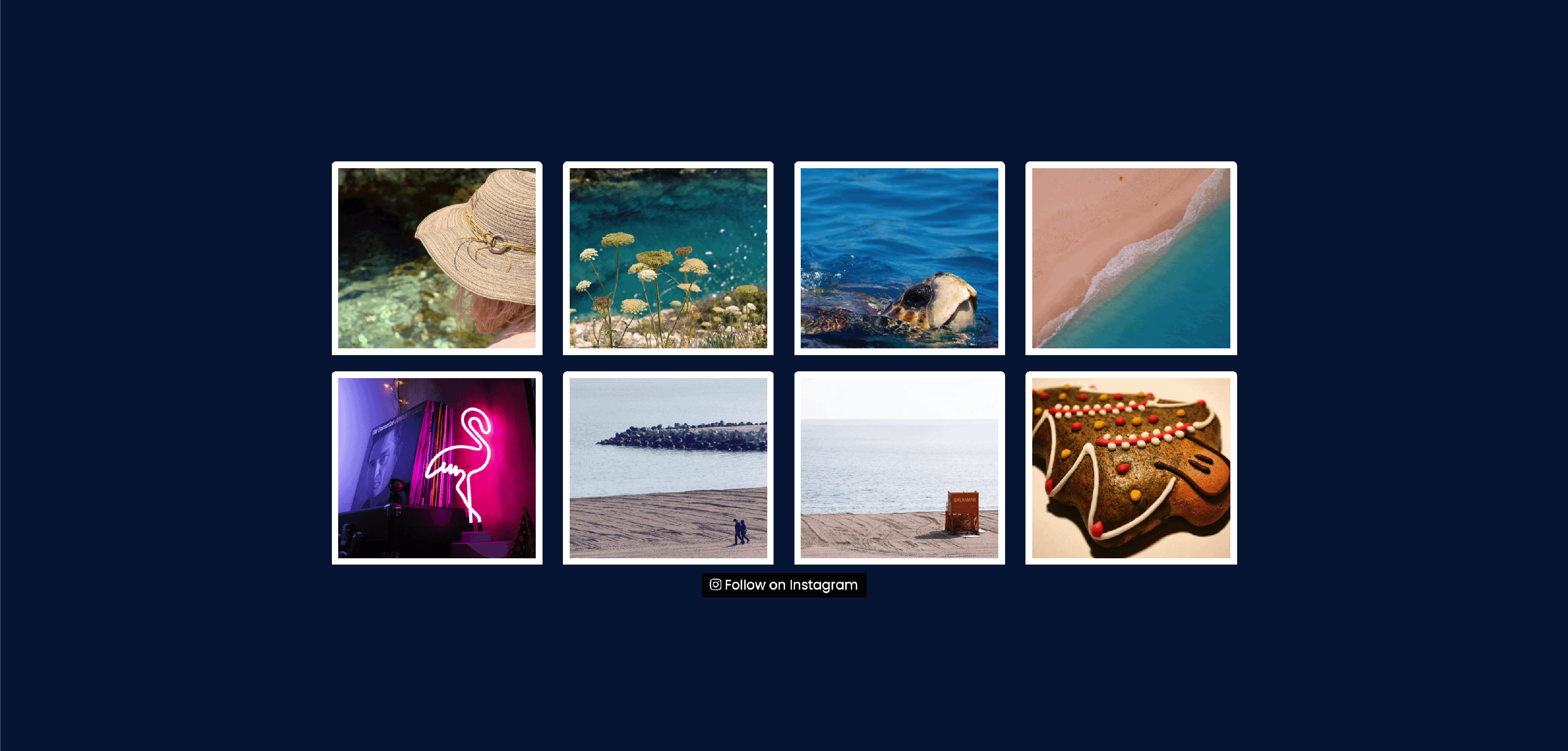
Grid
This Display Type presents all the pictures into a grid layout.
By choosing the Grid type, some options will be unlocked into the Style tab:
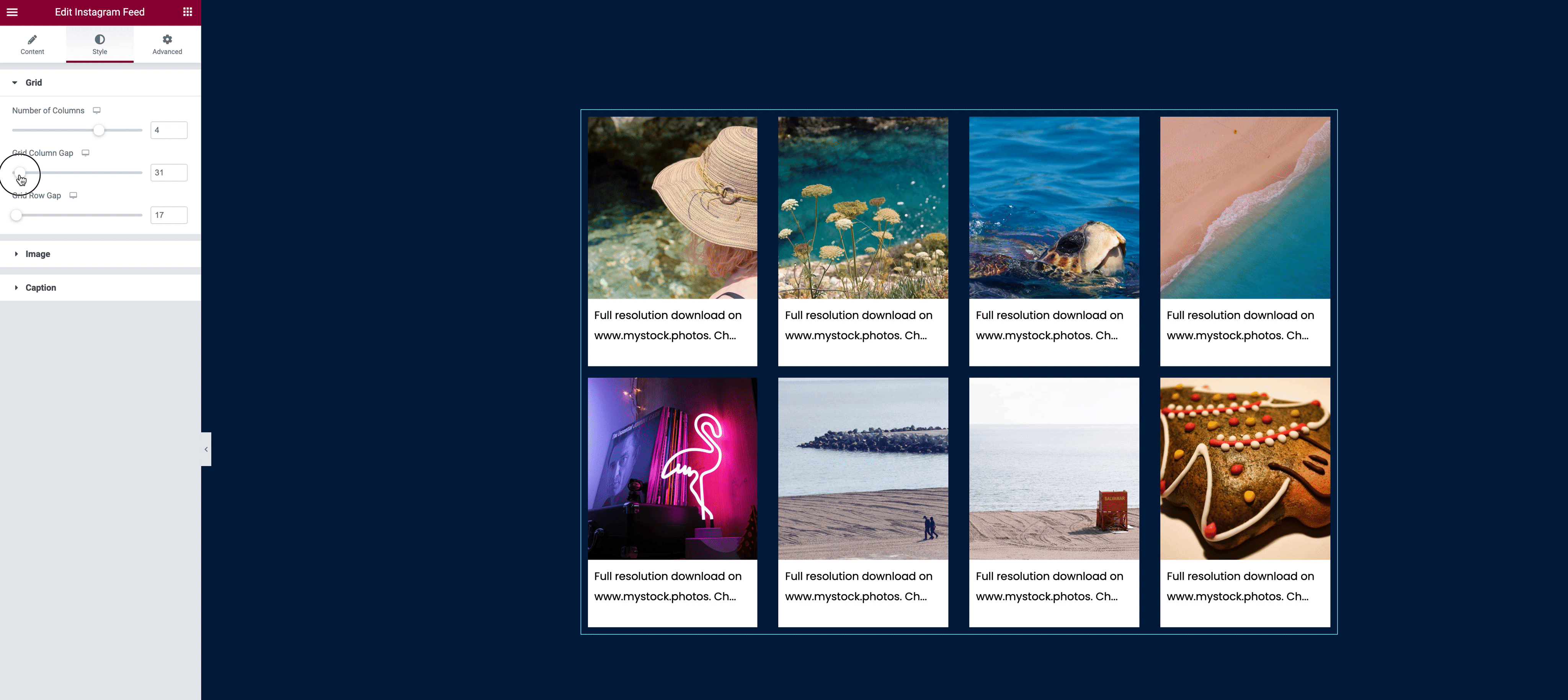
- Grid
- Number of Columns - use the slider to decide how many columns will be displayed.
- Grid Column Gap - adjust the space between the posts ( left / right ).
- Grid Row Gap - adjust the space between the posts ( top / bottom ).
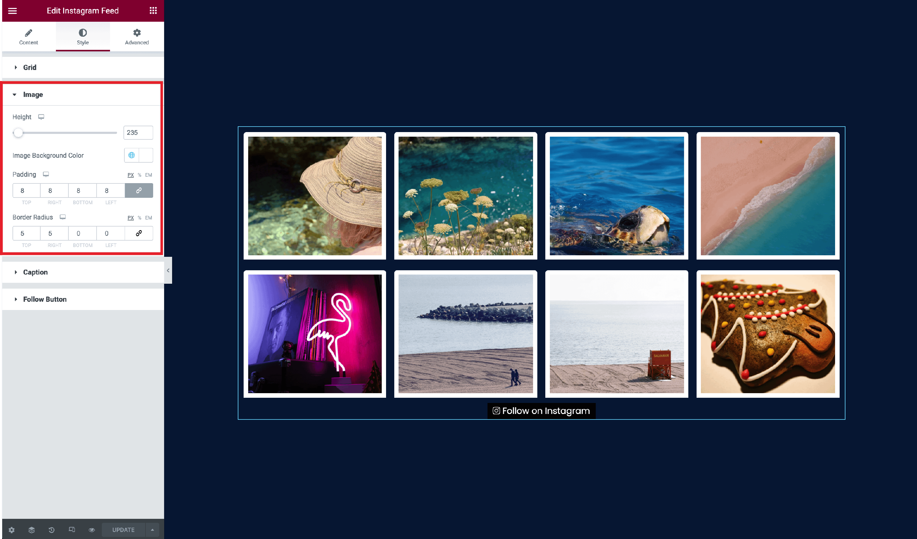
- Image
- Height - modify the height of the images.
- Image Background Color - choose a background color for the images, with the possibility to choose from Neve's Global Colors, by clicking on the 🌐 button.
- This appears when the padding of the image is not null.
- Padding - adjusts the padding of the image inside of the box.
- You have the possibility to modify all the values at the same time, by clicking on the 🔗 button, and adjusting the dimensions according to the desired device ( Desktop | Tablet | Mobile ), available in PX, percents, and EM.
- Border Radius - rounds the corners of the boxes specific to each image.
- You have the possibility to modify all the values at the same time, by clicking on the 🔗 button, and adjusting the dimensions according to the desired device ( Desktop | Tablet | Mobile ), available in PX, percents, and EM.
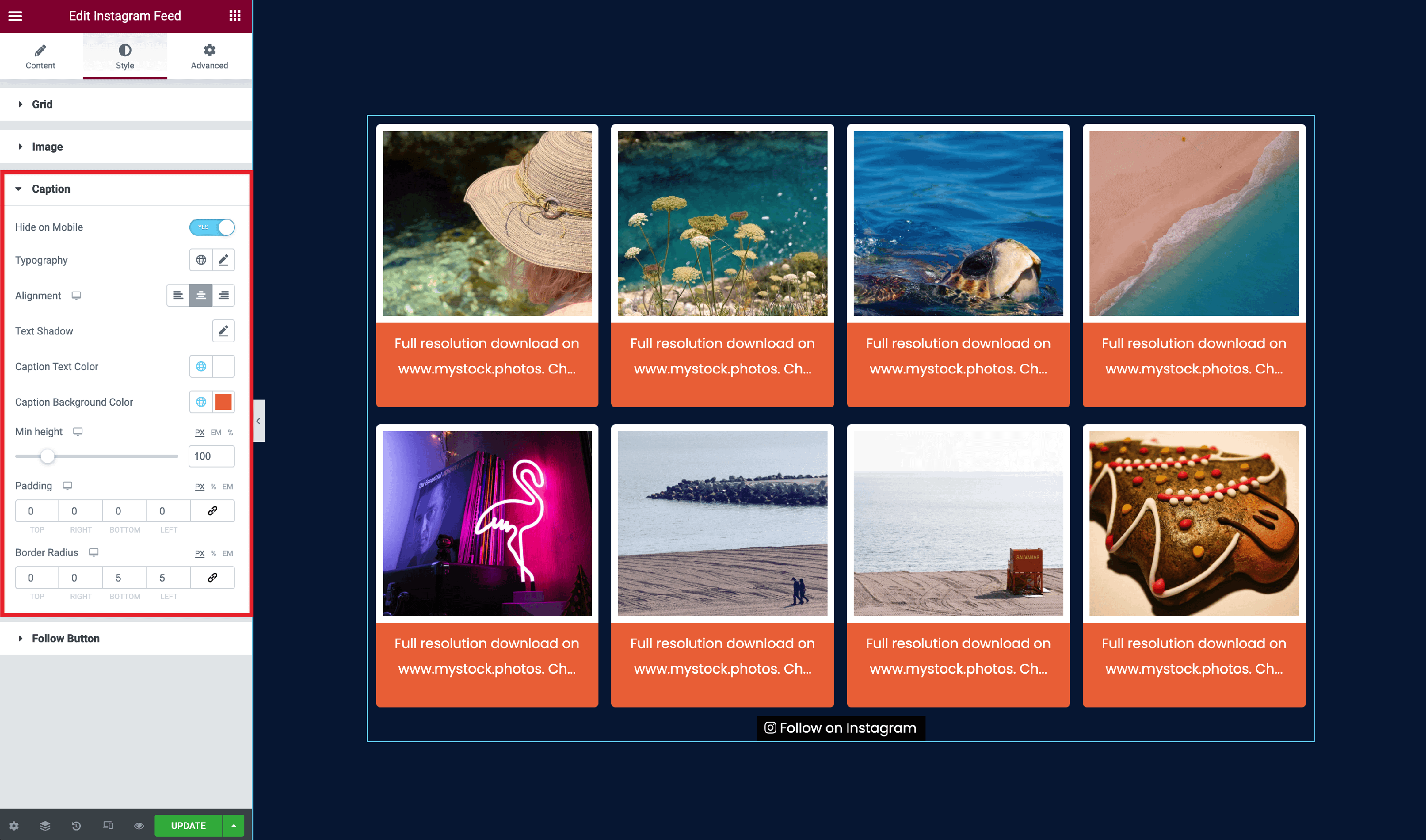
Caption
- Hide on Mobile - enable or disable the caption on mobile devices.
- Typography - change the typography of the caption.
- You have the possibility to choose from Global Fonts, by clicking on the 🌐 button.
- Alignment - modify the alignment of the caption, by choosing from the three available options: left / center / right.
- Adjust the dimensions according to the desired device ( Desktop | Tablet | Mobile ).
- Text Shadow - add a shadow to the text.
- Change its color and customize it with the following options: Blur, Horizontal, Vertical.
Caption Text Color - change the color font of the caption.
Caption Background Color - add a background color to the caption.
Min Height - adjust the height of the caption, adjusting the dimensions according to the desired device ( Desktop | Tablet | Mobile ), available in PX, percents, and EM.
Padding - adjusts the padding of the text inside of the box.
- You have the possibility to modify all the values at the same time, by clicking on the 🔗 button, and adjusting the dimensions according to the desired device ( Desktop | Tablet | Mobile ), available in PX, percents, and EM.
Border Radius - rounds the corners of the boxes specific to each caption.
- You have the possibility to modify all the values at the same time, by clicking on the 🔗 button, and adjusting the dimensions according to the desired device ( Desktop | Tablet | Mobile ), available in PX, percents, and EM.
B
Carousel
This Display Type presents a series of pictures at once and has a lot of possibilities to customize their appearance.
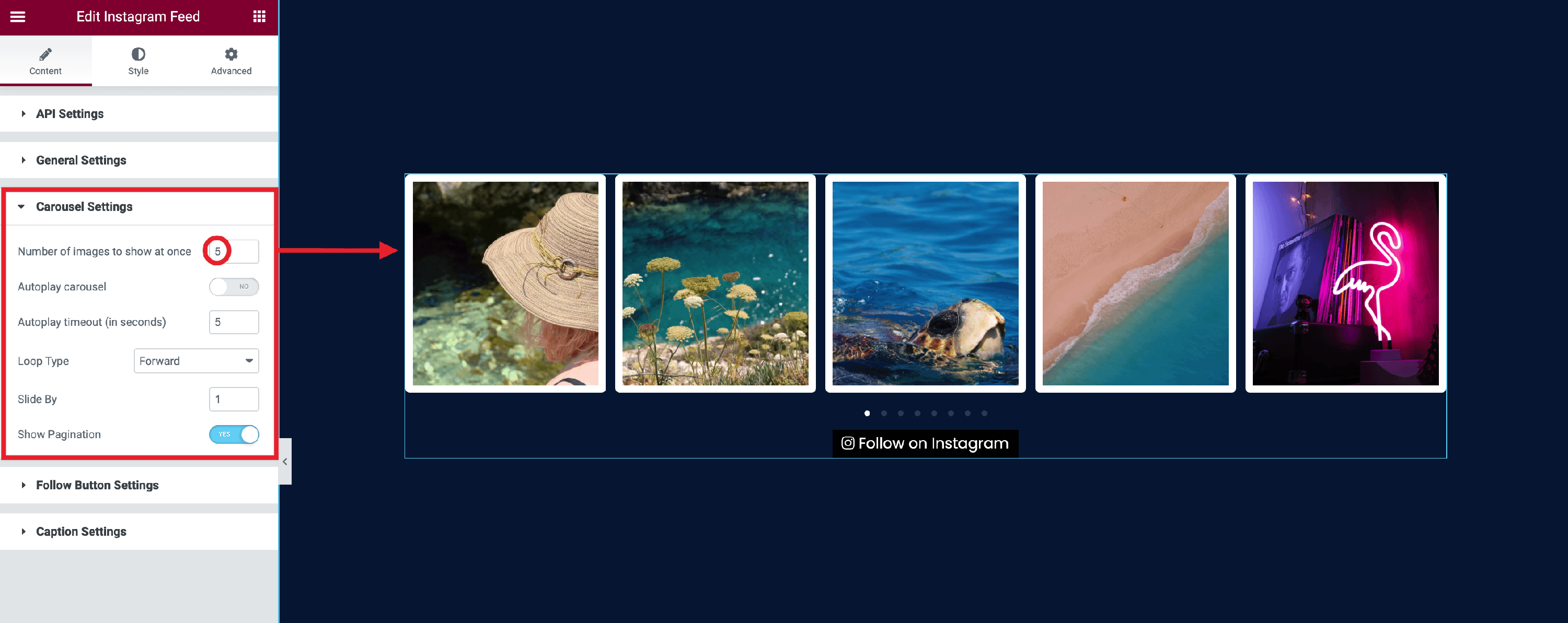
By choosing the Carousel type, some options will be unlocked into this tab, called Carousel Settings:
- Number of images to show at once - enter the number of images that you want to be displayed.
- Autoplay carousel - set whether you want the carousel to autoplay or not.
- Autoplay timeout ( in seconds ) - set the number of seconds that you want for the pictures to freeze.
- Loop Type - choose to loop the pictures in two ways ( Forward / Reverse ) or disable the option.
- Slide By - type how many pictures you want to slide by when the loop occurs.
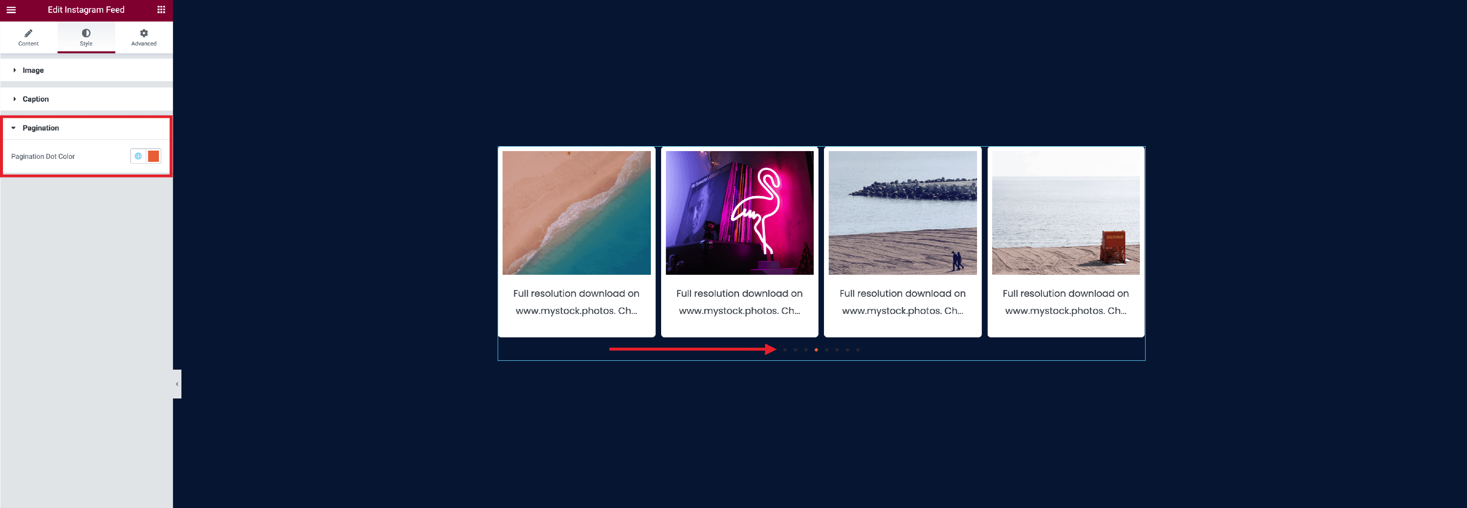
- Show Pagination - enable the dots to control the feed.
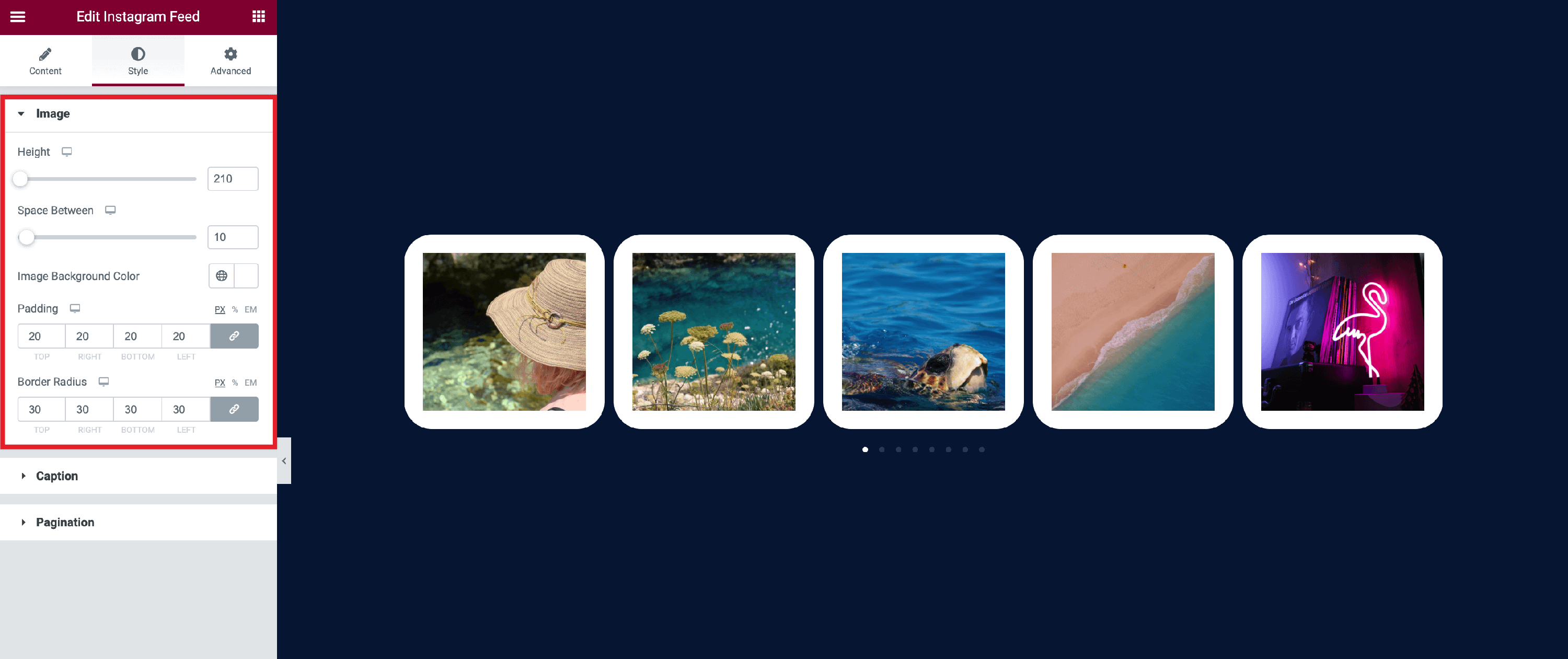
Also, similar to the Grid display type, the Carousel type generates some specific customizations into the Style tab:
- Image
- Height - modify the height of the images.
- Image Background Color - choose a background color for the images, with the possibility to choose from Neve's Global Colors, by clicking on the 🌐 button.
- This appears when the padding of the image is not null.
- Padding - adjusts the padding of the image inside of the box.
- You have the possibility to modify all the values at the same time, by clicking on the 🔗 button, and adjusting the dimensions according to the desired device ( Desktop | Tablet | Mobile ), available in PX, percents, and EM.
- Border Radius - rounds the corners of the boxes specific to each image.
- You have the possibility to modify all the values at the same time, by clicking on the 🔗 button, and adjusting the dimensions according to the desired device ( Desktop | Tablet | Mobile ), available in PX, percents, and EM.
- Caption
- Hide on Mobile - enable or disable the caption on mobile devices.
- Typography - change the typography of the caption.
- You have the possibility to choose from Global Fonts, by clicking on the 🌐 button.
- Alignment - modify the alignment of the caption, by choosing from the three available options: left / center / right.
- Adjust the dimensions according to the desired device ( Desktop | Tablet | Mobile )
- Text Shadow - add a shadow to the text.
- Change its color and customize it with the following options: Blur, Horizontal, Vertical.
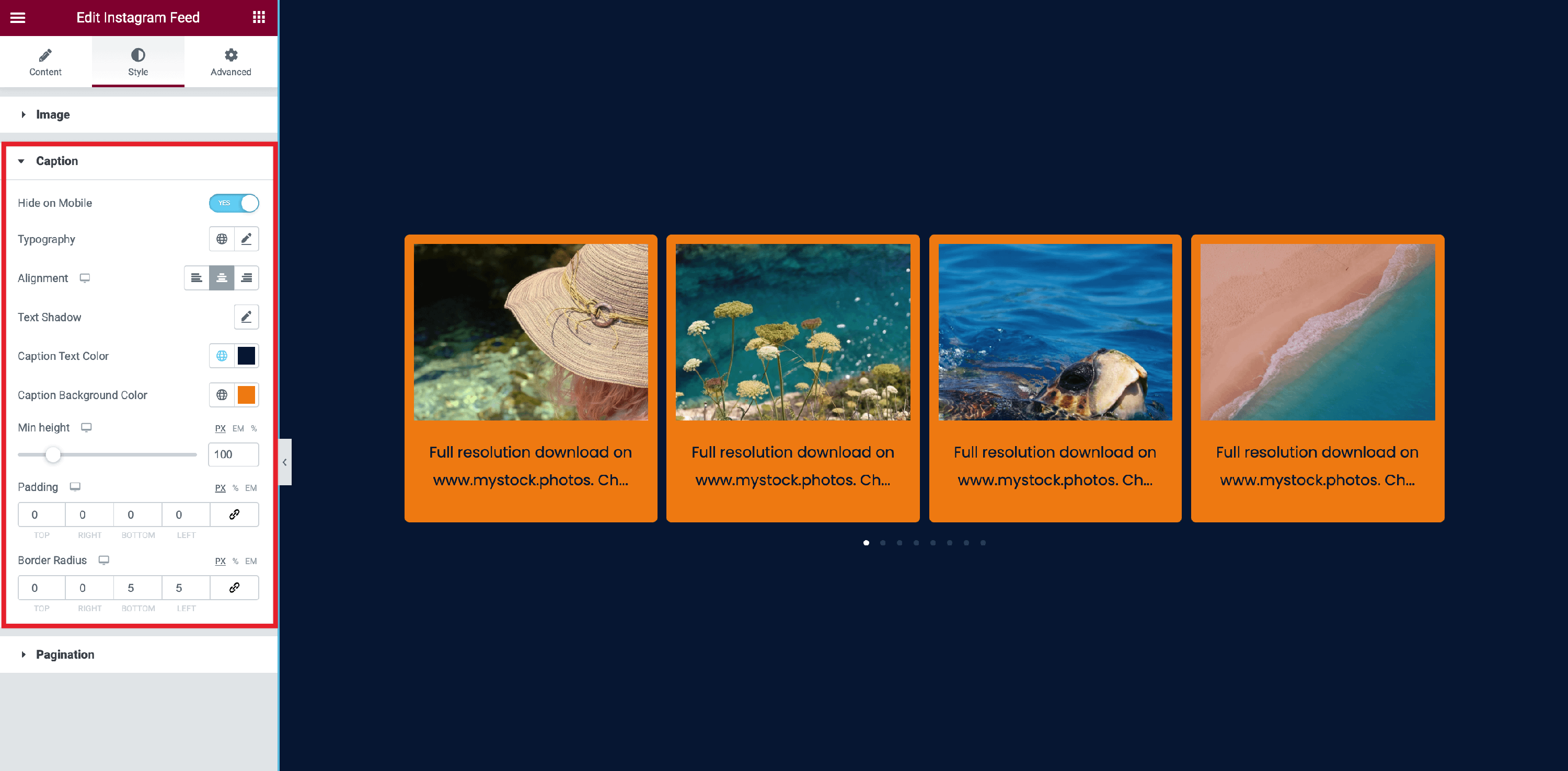
Caption Text Color - change the color font of the caption.
Caption Background Color - add a background color to the caption.
Min Height - adjust the height of the caption, adjusting the dimensions according to the desired device ( Desktop | Tablet | Mobile ), available in PX, percents, and EM.
Padding - adjusts the padding of the text inside of the box.
- You have the possibility to modify all the values at the same time, by clicking on the 🔗 button, and adjusting the dimensions according to the desired device ( Desktop | Tablet | Mobile ), available in PX, percents, and EM.
Border Radius - rounds the corners of the boxes specific to each caption.
- You have the possibility to modify all the values at the same time, by clicking on the 🔗 button, and adjusting the dimensions according to the desired device ( Desktop | Tablet | Mobile ), available in PX, percents, and EM.
Pagination
- Pagination Dot Color - choose a color for the dots, with the possibility to choose from Neve's Global Colors, by clicking on the 🌐 button.
Except for those specific settings, the General Settings also contains some common ones:
- Number of images - decide how many images to be displayed.
- Include Video Thumbnails - will include the thumbnail for videos on your account.
- Reverse Image Order - show the images in a reversed order.
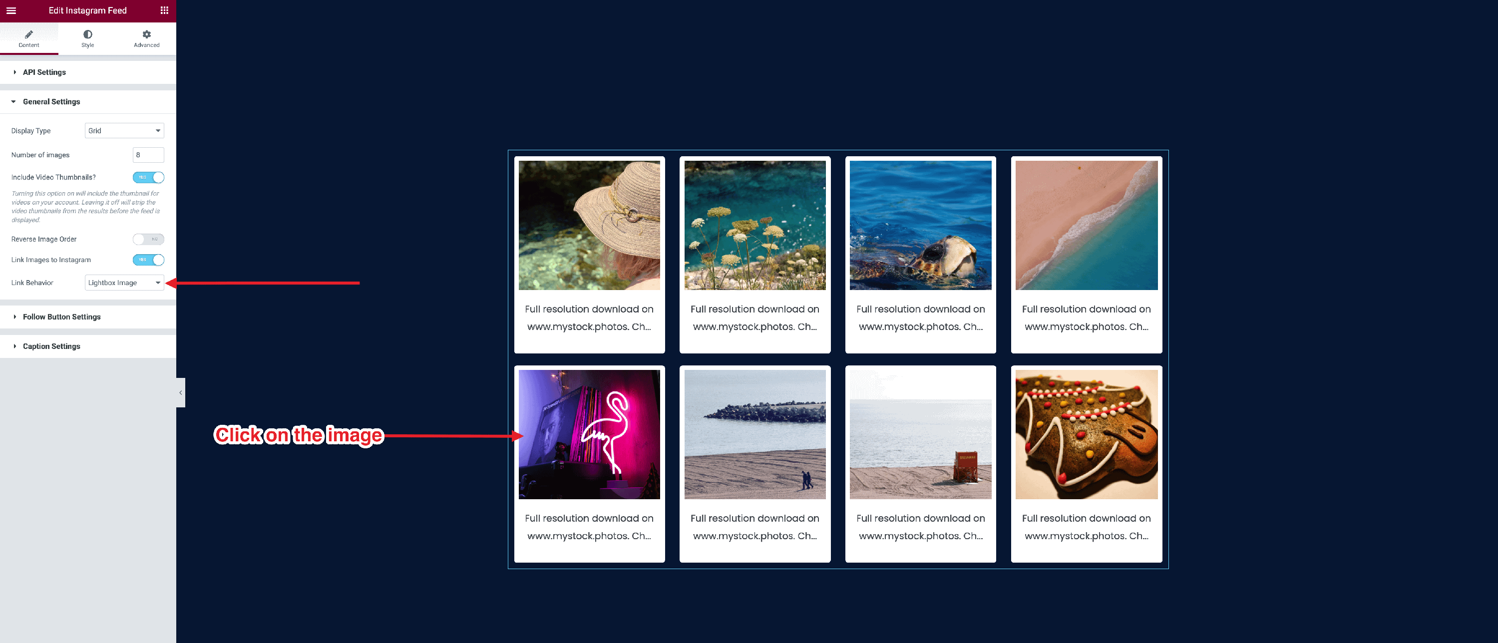
- Link Images to Instagram - attach a link to each image to Instagram.
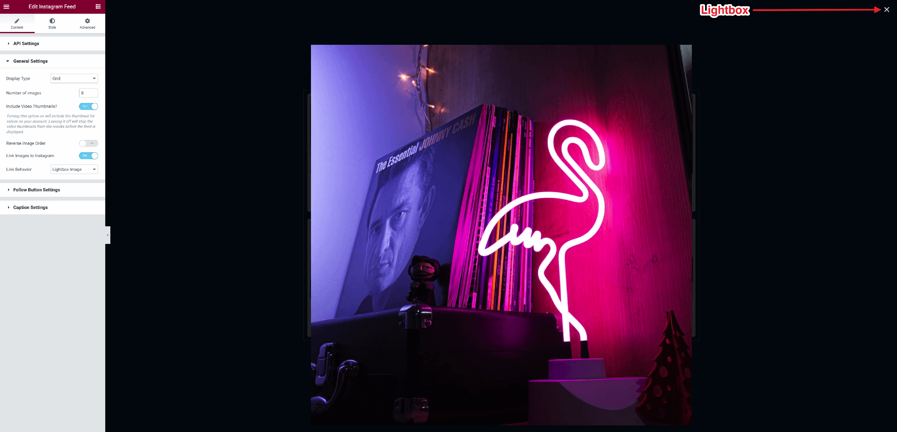
- Link Behaviour - two options: Go to Instagram / Lightbox Image ( opens the image into a lightbox ).
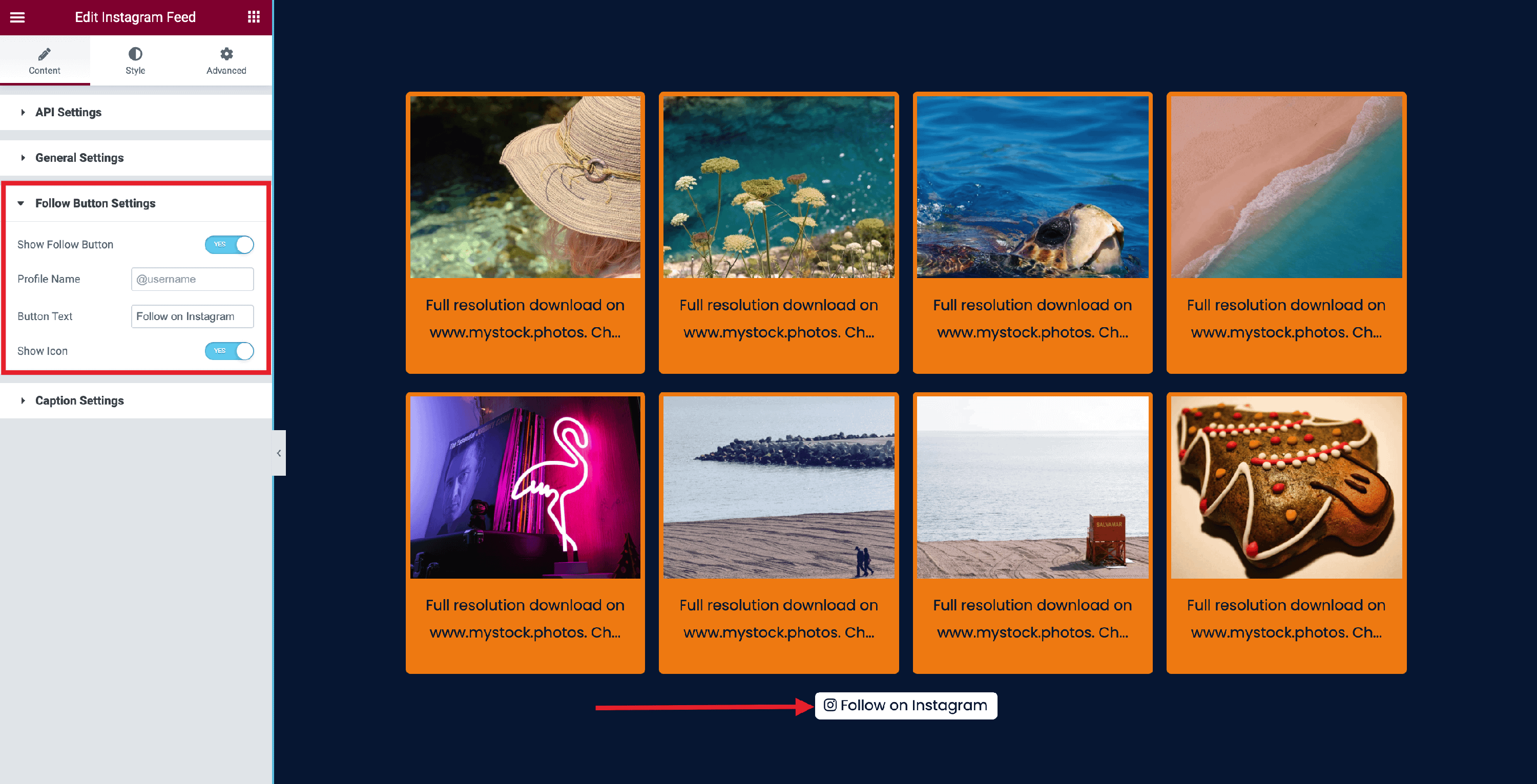
Follow Button Settings
- Show Follow Button - if enabled, it will generate a follow button with the following extra options:
- Profile Name - add the username of your Instagram profile.
- Button Text - change the text that appears on the button.
- Show Icon - shows the Instagram icon.
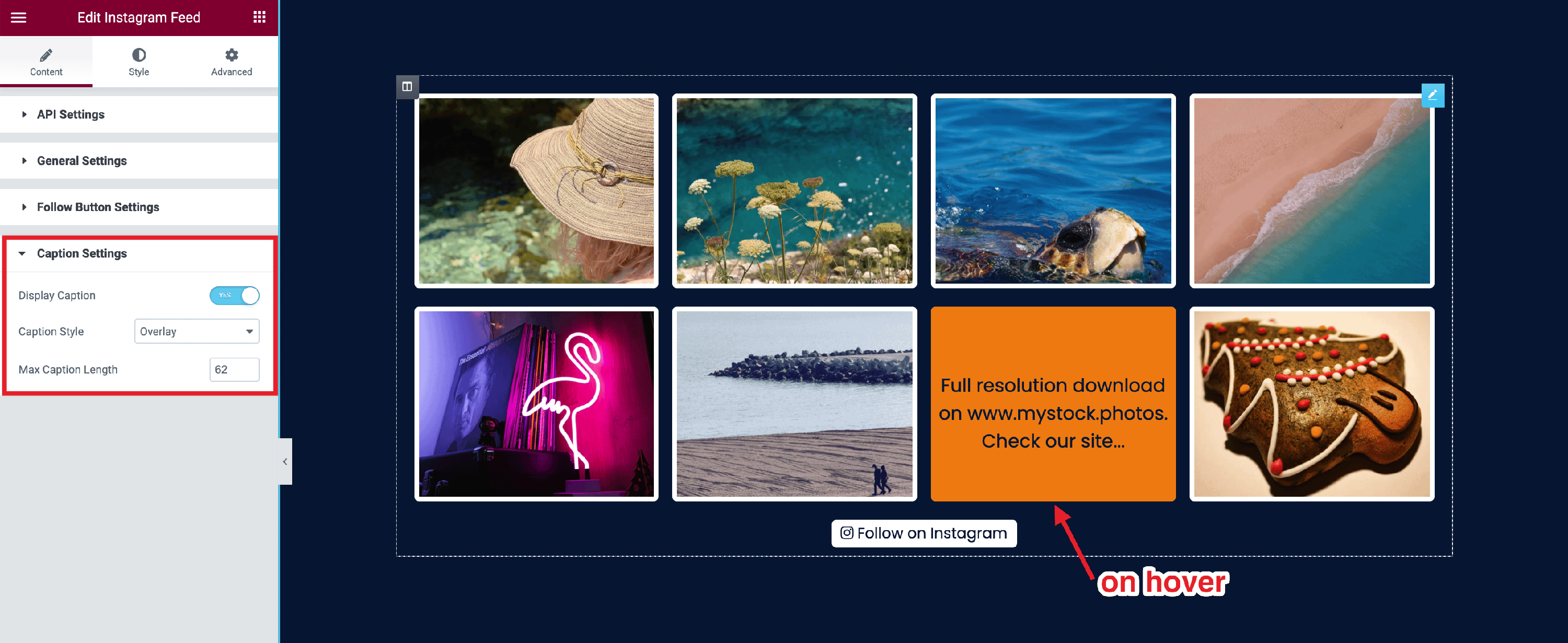
Caption Settings
The caption represents the text that describes the article in a few words.
- Display Caption - choose to enable / disable this option.
- Caption Style - choose how the caption will be displayed:
- Bottom - at the bottom of the image.
- Overlay - appears when hovering with the mouse.
- Max Caption Length - crop the content of the caption.
📝 Note: The Elementor plugin allows you to configure some other things, such as Content Protection, Motion Effects, Custom CSS, and others that can be found in the Advanced Tab.