How to automatically expand sub-menu items on mobile
This guide will teach you how to make all of your dropdown sub-menu items show up on mobile.
📝Note: This guide only works for Neve and Neve PRO. Trying the following steps with other themes might not work as expected.
Shortcuts through this guide:
What do I need to do?
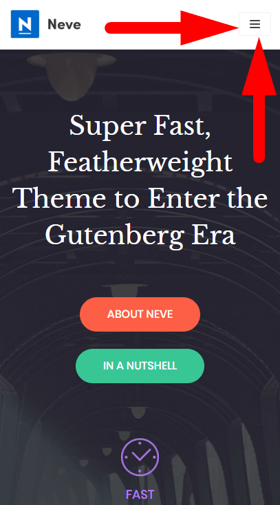
The approach here would be to expand all of the sub-menu items only when a visitor clicks on the hamburger menu toggle:

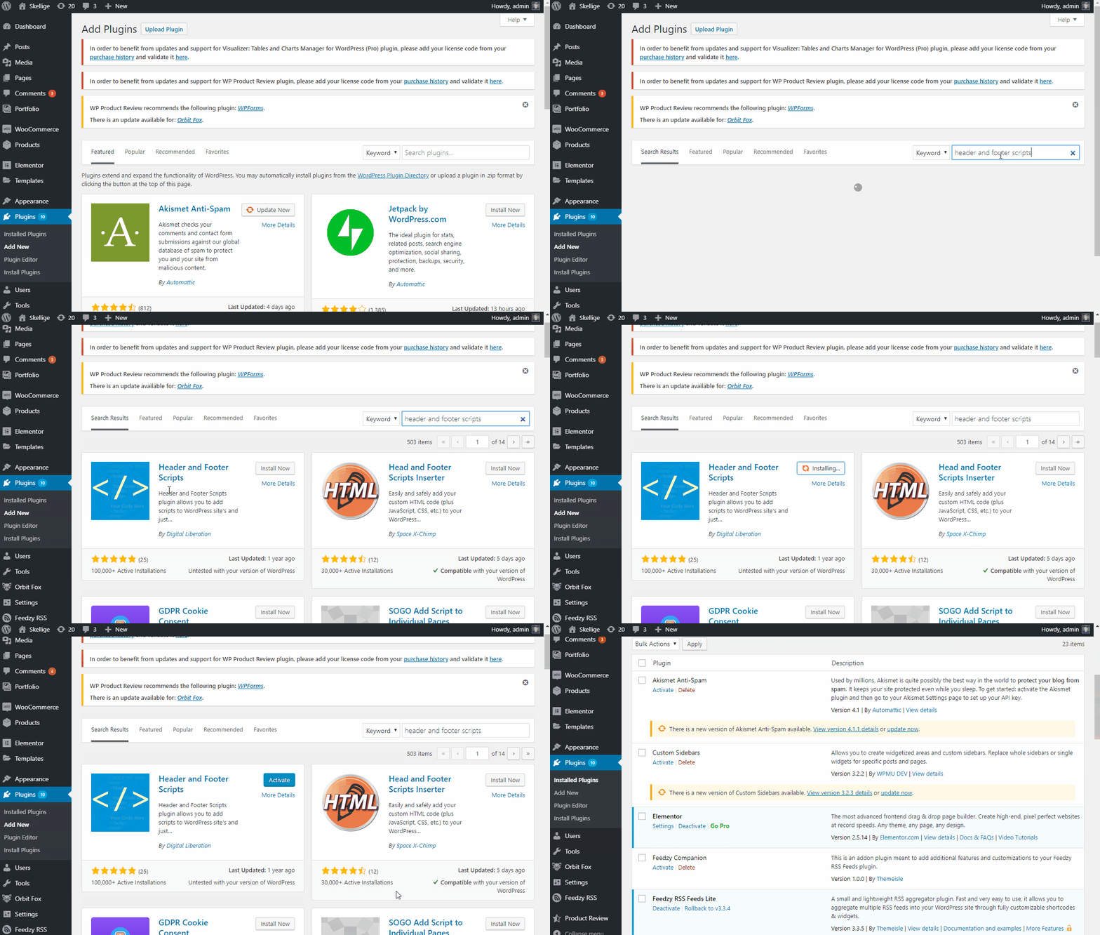
First of all, you need to install a new plugin called Header and Footer Scripts which will help us to add the code to your website. If you need any help installing new plugins on your site, this guide might come in handy -> How to install WordPress plugins. Below is a short tutorial on how to install it:

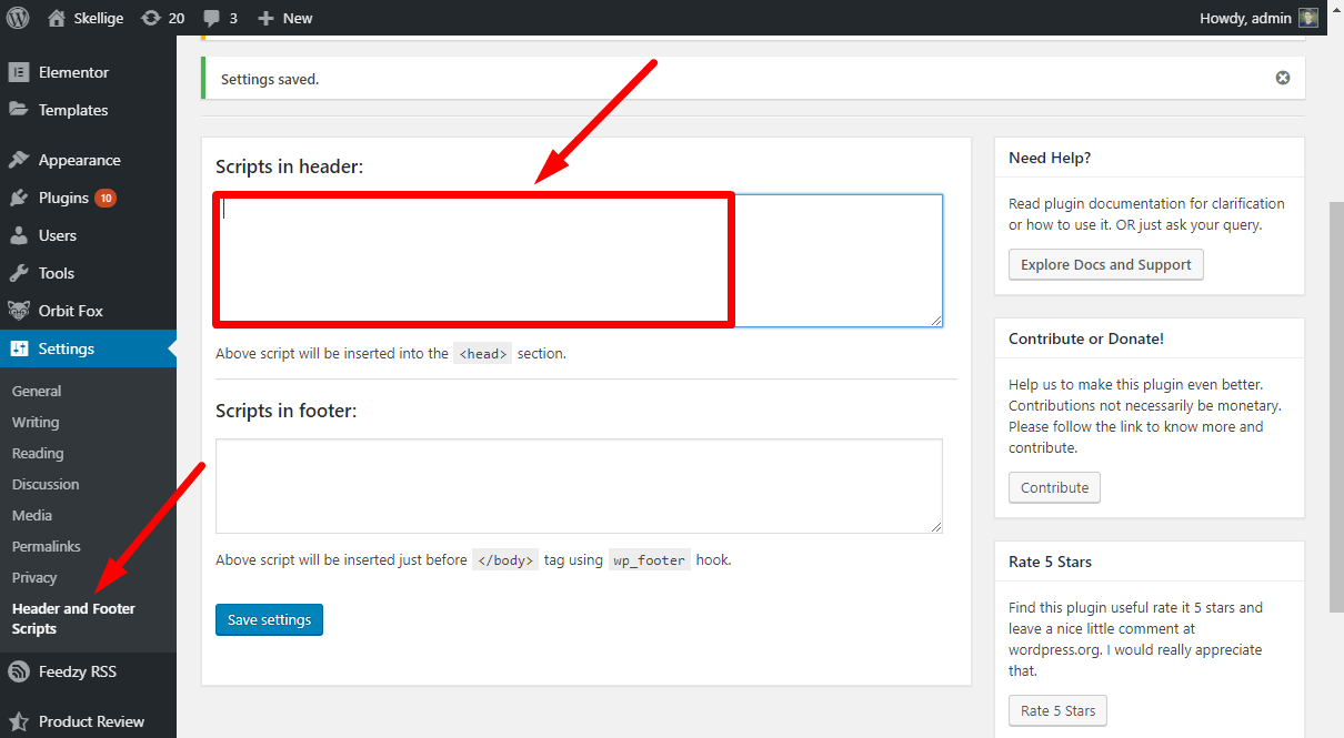
After installing and activating this plugin, you will need to navigate to Settings -> Header and Footer Scripts and you should be able to notice 2 text fields:

In one of the text fields from the picture above (either Header or Footer) add the following code:
<script type = "text/javascript" >
    window.addEventListener('DOMContentLoaded', (event) => {
        var drops = document.querySelectorAll('ul#nv-primary-navigation-sidebar > li.menu-item > ul.sub-menu');
        var carets = document.querySelectorAll('ul#nv-primary-navigation-sidebar > li.menu-item > a > div.caret-wrap');
        var toggle = document.querySelector('.menu-mobile-toggle.item-button.navbar-toggle-wrapper');
        toggle.addEventListener('click', function() {
            for (var i = 0; i < drops.length; i = i + 1) {
                if (!drops[i].classList.contains("dropdown-open") && !carets[i].classList.contains("dropdown-open")) {
                    drops[i].classList.toggle('dropdown-open');
                    carets[i].classList.toggle('dropdown-open');
                }
            }
        });
    });
</script>
After adding this code, press SAVE and that's all!
How will it look like?
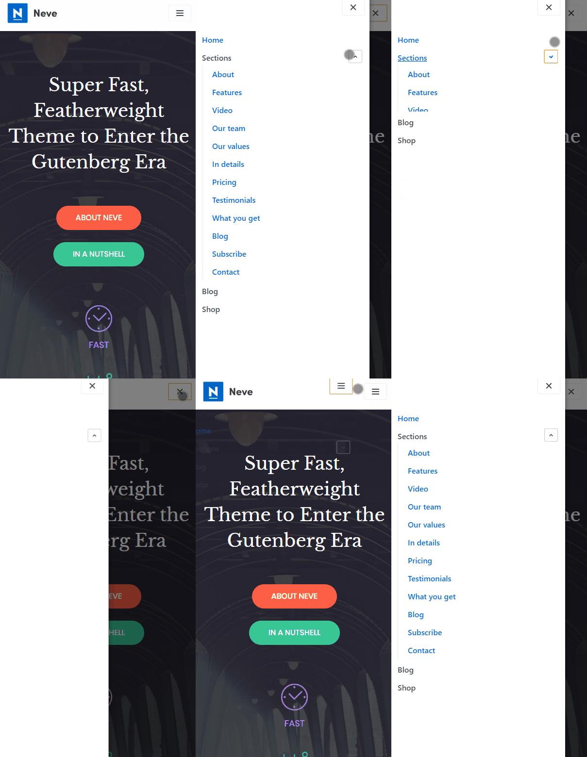
Here are the results you will obtain after following this guide:


